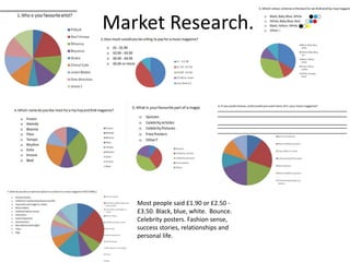
Research on music
   magazines...
Conventions
My magazine is based on RnB. I have found that
 they use a simple layout to make it look classy,
 and about 3 colours in their colour scheme. The
 artist is usually covering some of the masthead.
 The main target audience for this genre are
 teenagers. The artist on the title page normally
 has a hard expression, to intimidate the audience.
 The artists name is usually very big and stands
 out, in a different colour from the rest of the
 magazine, to show the artist’s importance.
Market Research.


   Most people said £1.90 or £2.50 -
   £3.50. Black, blue, white. Bounce.
   Celebrity posters. Fashion sense,
   success stories, relationships and
   personal life.
Reader Profile
• Kesha is a 16 year old studying her first year of media
  studies at sixth-form. She listens to R’n’B and hip hop in her
  spare time and her interests are singing and dancing, she
  can also play the guitar. She has a YouTube page where she
  has about 48 videos of her singing and has 162 subscribers.
  She would love to meet J-Cole, Rihanna, Chris Brown or any
  other R’n’B artist that she is a fan of. She downloads her
  music from iTunes and uses the internet at least an hour
  everyday. ‘Vibe’ is her favourite music magazine and she
  enjoys attending live music events of her favourite artists
  every three to six months. She has a part time job in a retail
  shop where she earns about £40 each week. Instead of
  going university, Kesha wants to get signed to a recording
  company and take off with her singing career.
Flat Plan - Front Cover
        •   I have named my magazine 'Buzzin' because I think it
            will appeal more to my target audience which are
            teenagers and to give the idea that it is a successful
            company. The model has one hand on her hip and she
            is looking down at the camera to make her look
            powerful. The artists name is on a blue background to
            make it stand out and show that she is an important
            artist. The price is £3.50 as it is not too high or low and
            it shows that the magazine has value.
        •    The colours used are not too sharp and there are not
            too many used, so that they do not clash with each
            other and so that it does not look overcrowded. I
            placed the slogan in the top left corner because that is
            where people normally read from first. The artist is in
            the centre of the page to show that a lot of the
            magazine is about her. There are a lot of teasers and
            pull quotes surrounding the artist, to make the target
            audience want to read more about a specific article,
            and buy the magazine and there are featured artists,
            so that if people like an artist from it, they would be
            more likely to buy the magazine too.
Contents Page
     • Font for the title 'Contents'
       because looks different, unique,
       so consumers would like it. The
       picture at the top links to an
       article it would make the reader
       want to read more about it. The
       head and shoulder shot of the
       artist in the bottom half of the
       page holds everything together,
       because it is big, and it bleeds to
       the end of the page and it is also
       behind the page numbers and
       teasers, so it links to everything
       on the page.
Shot List.
Double Page Spread
     Double page spread there are drop
    capitals for the letters of the artist's
 name. There is a medium long shot of
 the artist singing. The questions are in
  blue because the topic changes each
   time. I have used mainly black white
    and baby blue to keep it simple and
           consistent with the rest of the
     magazine yet decided to add some
yellow to make the title stand out, and
        it matches with black. There is a
 picture of another artist as they could
  be included in the interview. I used a
medium-close up on the second page,
          so that you can see the artist's
   expression but you can still see what
  she is wearing because people like to
              look at artists’ dress sense.

Media presentation

  • 1.
    Research on music magazines...
  • 2.
    Conventions My magazine isbased on RnB. I have found that they use a simple layout to make it look classy, and about 3 colours in their colour scheme. The artist is usually covering some of the masthead. The main target audience for this genre are teenagers. The artist on the title page normally has a hard expression, to intimidate the audience. The artists name is usually very big and stands out, in a different colour from the rest of the magazine, to show the artist’s importance.
  • 3.
    Market Research. Most people said £1.90 or £2.50 - £3.50. Black, blue, white. Bounce. Celebrity posters. Fashion sense, success stories, relationships and personal life.
  • 4.
    Reader Profile • Keshais a 16 year old studying her first year of media studies at sixth-form. She listens to R’n’B and hip hop in her spare time and her interests are singing and dancing, she can also play the guitar. She has a YouTube page where she has about 48 videos of her singing and has 162 subscribers. She would love to meet J-Cole, Rihanna, Chris Brown or any other R’n’B artist that she is a fan of. She downloads her music from iTunes and uses the internet at least an hour everyday. ‘Vibe’ is her favourite music magazine and she enjoys attending live music events of her favourite artists every three to six months. She has a part time job in a retail shop where she earns about £40 each week. Instead of going university, Kesha wants to get signed to a recording company and take off with her singing career.
  • 5.
    Flat Plan -Front Cover • I have named my magazine 'Buzzin' because I think it will appeal more to my target audience which are teenagers and to give the idea that it is a successful company. The model has one hand on her hip and she is looking down at the camera to make her look powerful. The artists name is on a blue background to make it stand out and show that she is an important artist. The price is £3.50 as it is not too high or low and it shows that the magazine has value. • The colours used are not too sharp and there are not too many used, so that they do not clash with each other and so that it does not look overcrowded. I placed the slogan in the top left corner because that is where people normally read from first. The artist is in the centre of the page to show that a lot of the magazine is about her. There are a lot of teasers and pull quotes surrounding the artist, to make the target audience want to read more about a specific article, and buy the magazine and there are featured artists, so that if people like an artist from it, they would be more likely to buy the magazine too.
  • 6.
    Contents Page • Font for the title 'Contents' because looks different, unique, so consumers would like it. The picture at the top links to an article it would make the reader want to read more about it. The head and shoulder shot of the artist in the bottom half of the page holds everything together, because it is big, and it bleeds to the end of the page and it is also behind the page numbers and teasers, so it links to everything on the page.
  • 7.
  • 8.
    Double Page Spread Double page spread there are drop capitals for the letters of the artist's name. There is a medium long shot of the artist singing. The questions are in blue because the topic changes each time. I have used mainly black white and baby blue to keep it simple and consistent with the rest of the magazine yet decided to add some yellow to make the title stand out, and it matches with black. There is a picture of another artist as they could be included in the interview. I used a medium-close up on the second page, so that you can see the artist's expression but you can still see what she is wearing because people like to look at artists’ dress sense.