Download to read offline


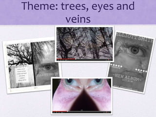
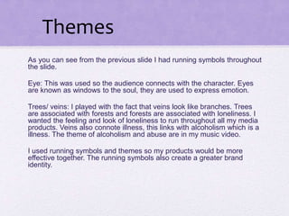
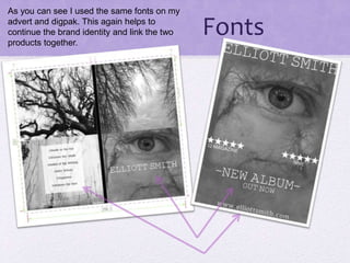
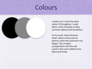

The document discusses the effectiveness of combining a main music video product with ancillary texts like advertisements and packaging. Key themes of trees, eyes, and veins were used throughout to symbolize loneliness and connect the products. Similar images, colors of black, white and grey, and same fonts were applied across all products to maintain brand identity and link the pieces together cohesively.


