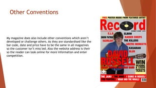
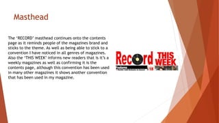
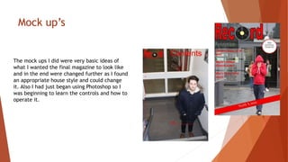
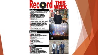
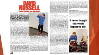
Evaluation
By JONATHAN HEAP
In what ways does your media product
use, develop or challenge forms and
conventions of real media products?
Conventions used in my music magazine on
the front cover.
• Masthead
• Main Image
• Sell lines
• Cover lines
• Pull Quote
• Bar code
• Banner
• Price line
• Date line
My Masthead
My masthead for the magazine is ‘RECORD’, this goes right across the top of
the magazine but isn’t covered up as it wouldn’t initially be a well known
magazine like NME. But it isn’t like other mastheads as its has an image in it
too replace a letter. Also the image is related to the title as it has a Vinyl
record being the ‘o’ in a magazine called ‘RECORD’. This develops normal
conventions by implementing a image into the masthead. This isn’t done in
any well known magazine as they just have the name.
Sell lines
In other music magazines the sell lines on the front are usually located in
the left third. But seen as I’d decided to go for a more central image like
I’d seen on a front cover of a NME magazine I’d used as a house style,
another part of this convention that I liked from the NME magazine is for
their sell lines they just used artists names rather than full titles like ‘Are
the Killers Returning to the UK’ but instead just having the bands. Also I
included more in a banner at the bottom, like in what I’d seen in a NME
magazine (images at bottom). I believe this is developing current
conventions of music magazines but in the same way that NME has to
allow their magazine to stand out and show more of what's inside by just
showing more artists as sell lines, rather than fewer sell lines but with
more detail.
Pull Quote and Cover Line
The Pull quote on the front cover of my magazine (top image)
follows normal conventions of being large and across the
middle of the front cover. It is big, bold and red to stand out
and draw the audience in so I very similar to other media
products and other magazines of all genres not just music.
Also it is linked to the main image being the main article in
the magazine, so it’s a main image of ‘David Russell’ and the
sell line informs you more about him and the article. This is
like the NME magazine (Bottom image) and talking about
‘Tyler the creator’.
Puff
On the front cover of my magazine (top image) I have a puff that is
informing the reader of a chance to win tickets to Leeds or Reading
festival. The shape of the puff is square which is slightly more
unconventional in magazines as it has developed from your original
obvious circle type puff like (middle image) on Q magazine and more
like(bottom image) NME’s puff on their magazine. This I believe
develops old conventions of having to have the puff as a circle and
allows more content to be put inside it. But what else is similar
between them all is the size of the text varies dependent on what
they want to stand out whether it’s ‘WIN’, ‘ZANE LOWE’ or ‘FREE’ as
all of these draw in customers to buy the magazine as they want to
win tickets or have a free poster.
Other Conventions
My magazine does also include other conventions which aren’t
developed or challenge others. As they are standardised like the
bar code, date and price have to be the same in all magazines
so the customer isn’t miss led. Also the website address is their
so the reader can look online for more information and enter
competition.
Conventions used in my music magazine
on the Contents page.
• Masthead
• Page numbers
• Article titles
• Synopsis
• Heading
• Main Images
Masthead
The ‘RECORD’ masthead continues onto the contents
page as it reminds people of the magazines brand and
sticks to the theme. As well as being able to stick to a
convention I have noticed in all genres of magazines.
Also the ‘THIS WEEK’ informs new readers that is it’s a
weekly magazines as well as confirming it is the
contents page, although this convention has been used
in many other magazines it shows another convention
that has been used in my magazine.
Main images
In the contents page of my music magazine
(image on right) I have three main images
relating to articles. This sticks to conventions of
music magazines by having images relating to
articles like Q magazine (image on left).
Furthermore they have the relevant page
numbers on top of the image so the reader can
go straight too it. Also the images are of good
quality and feature either artists or concerts.
Headings and Articles
My contents page like most is split into sections relating
to different topics. So like in this NME magazine (featured
on the right) they have News, Radar, Reviews, Live! And
Features. I have taken inspiration of this common
convention and done the same thing myself (image on
left). Furthermore these break down the magazine into
its different sections like ‘Regulars’ being certain articles
they have each week. Also the page numbers are coloured
differently in red and the title to the article is bold with
a synopsis below just like in the NME magazine which I
have used as a house style.
Conventions used in my music magazine
on the Double Page Spread.
• Main Image(s)
• Captions
• Column's
• Title
• Introduction
• Page number
• Pull quote
Double Page Spread
The main header is definitely using current
conventions, unlike having two main images that are
slightly smaller rather than one large image
dominating most of the A3 page is challenging what is
seen in most magazines, furthermore the fact theirs
no large letters as foot notes and only a single pull
quote towards the end is again a challenging
convention. But the captions on the images and the
images themselves as well as having columns and a
page number in the bottom corner is keeping and
using current conventions.
How does your media product represent
particular social groups?
Who is represented?
• Musicians
• Males
• Females
• Younger Adults ( aged 16-25)
• Alternative/Indie-Rock Genre
• Fans of featured bands/artists
• Teachers
• Producers
• Managers
How are they represented?
• Males  6 Photos of men on the magazine and the main double page
spread article is about a male artist.
• Female  a single photo
• Young adults  Nearly all photos feature those between 16-18
• Teachers, producers, managers  mentioned in Double Page Spread.
• Fans of Alternative/ Indie-Rock Genre  Genre of magazine and
content is aimed at this group
• Fans of featured bands  Bands featured with in article.
How are they represented? - Evidence
Good or Bad Representation
In the magazine there is a good and bad
representation of people, for example there
is only a single photo of a female and even
then she is a member of a band and not a
solo artist. Furthermore this is because all
the other photos are of males, as it was
easier to get photos of those class mates.
What Kind of media institution might
distribute your media product and why?
Shops and online
Shops such as W H Smiths, supermarkets and news agents would be the
main distributer of my music magazine. But also many other stores but it
would probably be dependent on the growth and success of the magazine.
However more and more people are subscribing to magazines so a online
presence where they could order the magazine directly would be used as
well as having a electronic version that can be downloaded by the customer
onto a tablet or smartphone and read off their. This is also a great way of
selling the magazine at a reduced cost as it wouldn’t have to be printed
and would cut out the distribution in stores as well as keeping up with the
market and trends. As more and more people are doing everything using
technology and using their phones and tablets.
Who would be the audience for your
media product?
My Audience
Age 16-25
Males and Females
Alternative/indie-rock
genre
Fans of
music
Musicians
students
How did you attract/address your
audience?
Attracting a audience
The audience was attracted by giving them a chance
to ‘WIN Reading and Leeds festival tickets’. Also by
giving them a ‘FREE Poster inside’. This meant that
the customer believes they are getting something for
free or could be going to a festival this summer for
free.
Addressing the audience
The audience was address as if they had been
buying the magazine for a while and the double
page spread was talking to them like they were
an old friend catching up. Also it isn’t assumed
that they have any musical experience what so
ever.
What have you learnt about technologies
from the process of constructing this
product?
Technologies used
• Blogger
• Microsoft Word
• Microsoft Publisher
• Microsoft PowerPoint
• Photoshop
• Paint
• Slide share
• Prezi
• Cannon D500 DSLR
Blogger
I have used Blogger to present my progress
through out the production of my
magazine. It has also helped me share
posts and get feedback on the preliminary
work I did.
Microsoft Word/ Publisher/ PowerPoint
I used word to write posts and checklists for the production of my
magazine, I also used PowerPoint to present posts on my blog
relating to magazines and the production of it. Finally I used
publisher to make my college magazine and mock up before being
introduced to Photoshop and being able to use that instead.
Photoshop
Photoshop was used to edit and produce my
final magazine and mock ups. It was a great
software to use and easy enough to pick up.
It also allowed me to produce a professional
looking magazine.
Canon D500 DSLR
Nearly all photos were taken in a manual setting
using this canon D500 at various locations, but also I
learnt how to use it effectively and taken good
quality photos. As by using manual settings it allowed
me to learn about aperture priority as well as shutter
speed. Furthermore I learnt a lot about photography
such as the rule of thirds and white balance.
Looking back at your preliminary task,
what do you feel you have learnt in the
progression from it to the full product?
Preliminary Work
College Magazine
When doing the college magazine I had little
experience in photography and magazine
production so I used a automatic setting on the
camera and publisher to put the magazine
together. It also seemed to all look a bit rushed
as not enough planning had gone into looking at
college magazines and finding a house style to
base the college magazine on. However this
just meant that I had learnt lots of lessons from
it. Also getting feedback from other students in
my class as well as teachers meant I could go
on and change certain aspects accordingly as
well as those I wanted to change myself. So
something I had said and noticed was that the
main cover line was no where near big enough
also some of the colour options were also a
poor choice as they clashed in places.
Mock up’s
The mock ups I did were very basic ideas of
what I wanted the final magazine to look like
and in the end were changed further as I found
an appropriate house style and could change
it. Also I had just began using Photoshop so I
was beginning to learn the controls and how to
operate it.
To the final Products
The feedback I got from other students and teachers I was able to look back at my
college magazine made in publisher to make vast improvements and feel
competent in using Photoshop rather than the basic and simple publisher. Also so I’d
become more confident using the canon D500 as well as having more idea what to
aim for with my magazines through having done more research and had a house
style to look at. Furthermore from a survey done on survey monkey and asking
people I had a good idea of what went well in my college magazine and a lot more
pointers of how it could be improved. But I know that if I hadn’t done any
preliminary work my magazine would have been of a poor standard and not look as
professional as I managed to achieve with the final product from putting in the
extra work to change the smallest details to keep to certain conventions that are
well known in all magazines and some know in specific genres of magazine.
BY JONATHAN HEAP
Evaluation

Evaluation

  • 1.
  • 2.
    In what waysdoes your media product use, develop or challenge forms and conventions of real media products?
  • 3.
    Conventions used inmy music magazine on the front cover. • Masthead • Main Image • Sell lines • Cover lines • Pull Quote • Bar code • Banner • Price line • Date line
  • 4.
    My Masthead My mastheadfor the magazine is ‘RECORD’, this goes right across the top of the magazine but isn’t covered up as it wouldn’t initially be a well known magazine like NME. But it isn’t like other mastheads as its has an image in it too replace a letter. Also the image is related to the title as it has a Vinyl record being the ‘o’ in a magazine called ‘RECORD’. This develops normal conventions by implementing a image into the masthead. This isn’t done in any well known magazine as they just have the name.
  • 5.
    Sell lines In othermusic magazines the sell lines on the front are usually located in the left third. But seen as I’d decided to go for a more central image like I’d seen on a front cover of a NME magazine I’d used as a house style, another part of this convention that I liked from the NME magazine is for their sell lines they just used artists names rather than full titles like ‘Are the Killers Returning to the UK’ but instead just having the bands. Also I included more in a banner at the bottom, like in what I’d seen in a NME magazine (images at bottom). I believe this is developing current conventions of music magazines but in the same way that NME has to allow their magazine to stand out and show more of what's inside by just showing more artists as sell lines, rather than fewer sell lines but with more detail.
  • 6.
    Pull Quote andCover Line The Pull quote on the front cover of my magazine (top image) follows normal conventions of being large and across the middle of the front cover. It is big, bold and red to stand out and draw the audience in so I very similar to other media products and other magazines of all genres not just music. Also it is linked to the main image being the main article in the magazine, so it’s a main image of ‘David Russell’ and the sell line informs you more about him and the article. This is like the NME magazine (Bottom image) and talking about ‘Tyler the creator’.
  • 7.
    Puff On the frontcover of my magazine (top image) I have a puff that is informing the reader of a chance to win tickets to Leeds or Reading festival. The shape of the puff is square which is slightly more unconventional in magazines as it has developed from your original obvious circle type puff like (middle image) on Q magazine and more like(bottom image) NME’s puff on their magazine. This I believe develops old conventions of having to have the puff as a circle and allows more content to be put inside it. But what else is similar between them all is the size of the text varies dependent on what they want to stand out whether it’s ‘WIN’, ‘ZANE LOWE’ or ‘FREE’ as all of these draw in customers to buy the magazine as they want to win tickets or have a free poster.
  • 8.
    Other Conventions My magazinedoes also include other conventions which aren’t developed or challenge others. As they are standardised like the bar code, date and price have to be the same in all magazines so the customer isn’t miss led. Also the website address is their so the reader can look online for more information and enter competition.
  • 9.
    Conventions used inmy music magazine on the Contents page. • Masthead • Page numbers • Article titles • Synopsis • Heading • Main Images
  • 10.
    Masthead The ‘RECORD’ mastheadcontinues onto the contents page as it reminds people of the magazines brand and sticks to the theme. As well as being able to stick to a convention I have noticed in all genres of magazines. Also the ‘THIS WEEK’ informs new readers that is it’s a weekly magazines as well as confirming it is the contents page, although this convention has been used in many other magazines it shows another convention that has been used in my magazine.
  • 11.
    Main images In thecontents page of my music magazine (image on right) I have three main images relating to articles. This sticks to conventions of music magazines by having images relating to articles like Q magazine (image on left). Furthermore they have the relevant page numbers on top of the image so the reader can go straight too it. Also the images are of good quality and feature either artists or concerts.
  • 12.
    Headings and Articles Mycontents page like most is split into sections relating to different topics. So like in this NME magazine (featured on the right) they have News, Radar, Reviews, Live! And Features. I have taken inspiration of this common convention and done the same thing myself (image on left). Furthermore these break down the magazine into its different sections like ‘Regulars’ being certain articles they have each week. Also the page numbers are coloured differently in red and the title to the article is bold with a synopsis below just like in the NME magazine which I have used as a house style.
  • 13.
    Conventions used inmy music magazine on the Double Page Spread. • Main Image(s) • Captions • Column's • Title • Introduction • Page number • Pull quote
  • 14.
    Double Page Spread Themain header is definitely using current conventions, unlike having two main images that are slightly smaller rather than one large image dominating most of the A3 page is challenging what is seen in most magazines, furthermore the fact theirs no large letters as foot notes and only a single pull quote towards the end is again a challenging convention. But the captions on the images and the images themselves as well as having columns and a page number in the bottom corner is keeping and using current conventions.
  • 15.
    How does yourmedia product represent particular social groups?
  • 16.
    Who is represented? •Musicians • Males • Females • Younger Adults ( aged 16-25) • Alternative/Indie-Rock Genre • Fans of featured bands/artists • Teachers • Producers • Managers
  • 17.
    How are theyrepresented? • Males  6 Photos of men on the magazine and the main double page spread article is about a male artist. • Female  a single photo • Young adults  Nearly all photos feature those between 16-18 • Teachers, producers, managers  mentioned in Double Page Spread. • Fans of Alternative/ Indie-Rock Genre  Genre of magazine and content is aimed at this group • Fans of featured bands  Bands featured with in article.
  • 18.
    How are theyrepresented? - Evidence
  • 19.
    Good or BadRepresentation In the magazine there is a good and bad representation of people, for example there is only a single photo of a female and even then she is a member of a band and not a solo artist. Furthermore this is because all the other photos are of males, as it was easier to get photos of those class mates.
  • 20.
    What Kind ofmedia institution might distribute your media product and why?
  • 21.
    Shops and online Shopssuch as W H Smiths, supermarkets and news agents would be the main distributer of my music magazine. But also many other stores but it would probably be dependent on the growth and success of the magazine. However more and more people are subscribing to magazines so a online presence where they could order the magazine directly would be used as well as having a electronic version that can be downloaded by the customer onto a tablet or smartphone and read off their. This is also a great way of selling the magazine at a reduced cost as it wouldn’t have to be printed and would cut out the distribution in stores as well as keeping up with the market and trends. As more and more people are doing everything using technology and using their phones and tablets.
  • 22.
    Who would bethe audience for your media product?
  • 23.
    My Audience Age 16-25 Malesand Females Alternative/indie-rock genre Fans of music Musicians students
  • 24.
    How did youattract/address your audience?
  • 25.
    Attracting a audience Theaudience was attracted by giving them a chance to ‘WIN Reading and Leeds festival tickets’. Also by giving them a ‘FREE Poster inside’. This meant that the customer believes they are getting something for free or could be going to a festival this summer for free. Addressing the audience The audience was address as if they had been buying the magazine for a while and the double page spread was talking to them like they were an old friend catching up. Also it isn’t assumed that they have any musical experience what so ever.
  • 26.
    What have youlearnt about technologies from the process of constructing this product?
  • 27.
    Technologies used • Blogger •Microsoft Word • Microsoft Publisher • Microsoft PowerPoint • Photoshop • Paint • Slide share • Prezi • Cannon D500 DSLR
  • 28.
    Blogger I have usedBlogger to present my progress through out the production of my magazine. It has also helped me share posts and get feedback on the preliminary work I did.
  • 29.
    Microsoft Word/ Publisher/PowerPoint I used word to write posts and checklists for the production of my magazine, I also used PowerPoint to present posts on my blog relating to magazines and the production of it. Finally I used publisher to make my college magazine and mock up before being introduced to Photoshop and being able to use that instead.
  • 30.
    Photoshop Photoshop was usedto edit and produce my final magazine and mock ups. It was a great software to use and easy enough to pick up. It also allowed me to produce a professional looking magazine.
  • 31.
    Canon D500 DSLR Nearlyall photos were taken in a manual setting using this canon D500 at various locations, but also I learnt how to use it effectively and taken good quality photos. As by using manual settings it allowed me to learn about aperture priority as well as shutter speed. Furthermore I learnt a lot about photography such as the rule of thirds and white balance.
  • 32.
    Looking back atyour preliminary task, what do you feel you have learnt in the progression from it to the full product?
  • 33.
  • 34.
    College Magazine When doingthe college magazine I had little experience in photography and magazine production so I used a automatic setting on the camera and publisher to put the magazine together. It also seemed to all look a bit rushed as not enough planning had gone into looking at college magazines and finding a house style to base the college magazine on. However this just meant that I had learnt lots of lessons from it. Also getting feedback from other students in my class as well as teachers meant I could go on and change certain aspects accordingly as well as those I wanted to change myself. So something I had said and noticed was that the main cover line was no where near big enough also some of the colour options were also a poor choice as they clashed in places.
  • 35.
    Mock up’s The mockups I did were very basic ideas of what I wanted the final magazine to look like and in the end were changed further as I found an appropriate house style and could change it. Also I had just began using Photoshop so I was beginning to learn the controls and how to operate it.
  • 36.
    To the finalProducts The feedback I got from other students and teachers I was able to look back at my college magazine made in publisher to make vast improvements and feel competent in using Photoshop rather than the basic and simple publisher. Also so I’d become more confident using the canon D500 as well as having more idea what to aim for with my magazines through having done more research and had a house style to look at. Furthermore from a survey done on survey monkey and asking people I had a good idea of what went well in my college magazine and a lot more pointers of how it could be improved. But I know that if I hadn’t done any preliminary work my magazine would have been of a poor standard and not look as professional as I managed to achieve with the final product from putting in the extra work to change the smallest details to keep to certain conventions that are well known in all magazines and some know in specific genres of magazine.
  • 40.