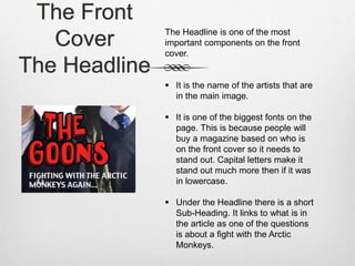
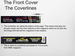
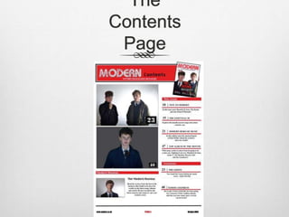
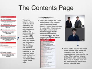
The Front
Cover
The Front Cover
The Cover Photo
 This is the main photo on the cover and it is in the
centre of the page. It is also the biggest component
on the page which makes it stand out the most.
 There is eye contact in the main
photo and this makes it more
enticing to the audience and also
gives the reader some kind of
connection.
 The background is all one colour and the shades vary
slightly but this helps everything on the page stand out
more than if it was on a background with many different
colours
The Front
Cover
The Masthead
This is the masthead and it gives the name of the music magazine.
 It is the biggest font on the page and this is because it is the name that people
have to see to know the magazine and buy it.
 It is position at the very top of the page and also in the middle. This is
because this is the most visible place for it to be placed.
 The font that has been used for the masthead is different to all of the others
on the page. It has a unique style that fits the genre of the magazine.
The Front
Cover
The Headline
The Headline is one of the most
important components on the front
cover.
 It is the name of the artists that are
in the main image.
 It is one of the biggest fonts on the
page. This is because people will
buy a magazine based on who is
on the front cover so it needs to
stand out. Capital letters make it
stand out much more then if it was
in lowercase.
 Under the Headline there is a short
Sub-Heading. It links to what is in
the article as one of the questions
is about a fight with the Arctic
Monkeys.
The Front Cover
The Coverlines
 The coverlines are along the bottom of the page. This means that they can
be seen easily and the main features of the magazine stand out as they are
the things that will sell the magazine to the readers.
 This is what my coverlines are based on. It is a cover
from NME magazine.
The
Contents
Page
The Contents Page
 This is the
features column
Each one stands
out as they are
separated from
each other with a
red line. The
numbers are also
bold and bigger
than the writing
and this makes it
quick and easy to
see what page to
turn to. The
colours also go
with the other
components of the
magazine as the
masthead is also
made up from the
same colours.
This means it has
a good house
style.
 This is the example that I used
as inspiration to my contents
page. I used it because I
thought it looked clear and easy
to read and the things such as
having the numbers and
headlines bigger then the
information about them
underneath works well. The
colours that are used also go
well together.
 These are the pictures that I used
on the contents page. There are
only two pictures and this is
because there is more room for the
writing if there are less pictures.
One of them is the featured artist
that I used on my front cover and
this is because they are the main
focus of the article also.
The Contents Page
 There are two columns in the contents
page of my magazine. This is because
if there are more then three columns it
starts to look over crowded and this
makes it look messy.
 I used many different Q magazines as
inspiration for how many columns to
include on my contents page. Most of
the Q contents page had two columns
and they are a successful magazine
producer.
 These are a couple of
examples I used for
inspiration
The Article Page
The Article Page
Images and Title
 This is the title of the article page. It
follows the house style of the magazine
and this is due to the colours that it uses.
They are the red, white and black that
are used in the rest of the magazine.
 These are the main
images on the article
page. They are large
images and take up a
large are on both
sides of the page.
They are of the same
artists that are
featured on the front
cover and it is
important to see what
they look like and not
just have writing
about them.
The Article Page
 These are some quotes that I have included on the
article page. They are each positioned on one of
the photos and this gives the reader an idea who is
saying each of the quotes.
 I have used three columns of writing for the
article. This is because this is where most of
the information will be so its important to
have lots of space for it.
Question 1 edit

Question 1 edit

  • 2.
  • 3.
    The Front Cover TheCover Photo  This is the main photo on the cover and it is in the centre of the page. It is also the biggest component on the page which makes it stand out the most.  There is eye contact in the main photo and this makes it more enticing to the audience and also gives the reader some kind of connection.  The background is all one colour and the shades vary slightly but this helps everything on the page stand out more than if it was on a background with many different colours
  • 4.
    The Front Cover The Masthead Thisis the masthead and it gives the name of the music magazine.  It is the biggest font on the page and this is because it is the name that people have to see to know the magazine and buy it.  It is position at the very top of the page and also in the middle. This is because this is the most visible place for it to be placed.  The font that has been used for the masthead is different to all of the others on the page. It has a unique style that fits the genre of the magazine.
  • 5.
    The Front Cover The Headline TheHeadline is one of the most important components on the front cover.  It is the name of the artists that are in the main image.  It is one of the biggest fonts on the page. This is because people will buy a magazine based on who is on the front cover so it needs to stand out. Capital letters make it stand out much more then if it was in lowercase.  Under the Headline there is a short Sub-Heading. It links to what is in the article as one of the questions is about a fight with the Arctic Monkeys.
  • 6.
    The Front Cover TheCoverlines  The coverlines are along the bottom of the page. This means that they can be seen easily and the main features of the magazine stand out as they are the things that will sell the magazine to the readers.  This is what my coverlines are based on. It is a cover from NME magazine.
  • 7.
  • 8.
    The Contents Page This is the features column Each one stands out as they are separated from each other with a red line. The numbers are also bold and bigger than the writing and this makes it quick and easy to see what page to turn to. The colours also go with the other components of the magazine as the masthead is also made up from the same colours. This means it has a good house style.  This is the example that I used as inspiration to my contents page. I used it because I thought it looked clear and easy to read and the things such as having the numbers and headlines bigger then the information about them underneath works well. The colours that are used also go well together.  These are the pictures that I used on the contents page. There are only two pictures and this is because there is more room for the writing if there are less pictures. One of them is the featured artist that I used on my front cover and this is because they are the main focus of the article also.
  • 9.
    The Contents Page There are two columns in the contents page of my magazine. This is because if there are more then three columns it starts to look over crowded and this makes it look messy.  I used many different Q magazines as inspiration for how many columns to include on my contents page. Most of the Q contents page had two columns and they are a successful magazine producer.  These are a couple of examples I used for inspiration
  • 10.
  • 11.
    The Article Page Imagesand Title  This is the title of the article page. It follows the house style of the magazine and this is due to the colours that it uses. They are the red, white and black that are used in the rest of the magazine.  These are the main images on the article page. They are large images and take up a large are on both sides of the page. They are of the same artists that are featured on the front cover and it is important to see what they look like and not just have writing about them.
  • 12.
    The Article Page These are some quotes that I have included on the article page. They are each positioned on one of the photos and this gives the reader an idea who is saying each of the quotes.  I have used three columns of writing for the article. This is because this is where most of the information will be so its important to have lots of space for it.