
Recommended
More Related Content
What's hot
What's hot (19)
Viewers also liked
Similar to Progress dps
Similar to Progress dps (20)
More from rovenahoxha1993
Progress dps
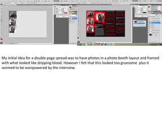
- 1. My initial idea for a double page spread was to have photos in a photo booth layout and framed with what looked like dripping blood. However I felt that this looked too gruesome plus it seemed to be overpowered by the interview.
- 2. I then decided to have the three artists spaced out on the two pages and have the interview around the them. However I had to change where I position the female, having her in the middle did make her look dominant but in reality the image would have been ruined as the page closes in the middle.
- 3. I changed the image of the female into on where she way leaning away from the middle. With the new image I wanted to create the effect that she was leaning on the words. I also made the background darker and the gradient smaller , because the background was darker I had to change the colour of my black typography into red and I changed the outline of the title from black to white as the black could not be seen. I made the decision to have the background darker because it made the photos and typography stand out more.
- 4. I changed the whole structure of my double page spread again as the previous layout was too busy, the cuttings of the images didn’t make them look professional. The new layout was more simple and easier to comprehend the text. The image didn’t need any cutting out which made it look more neat and professional.