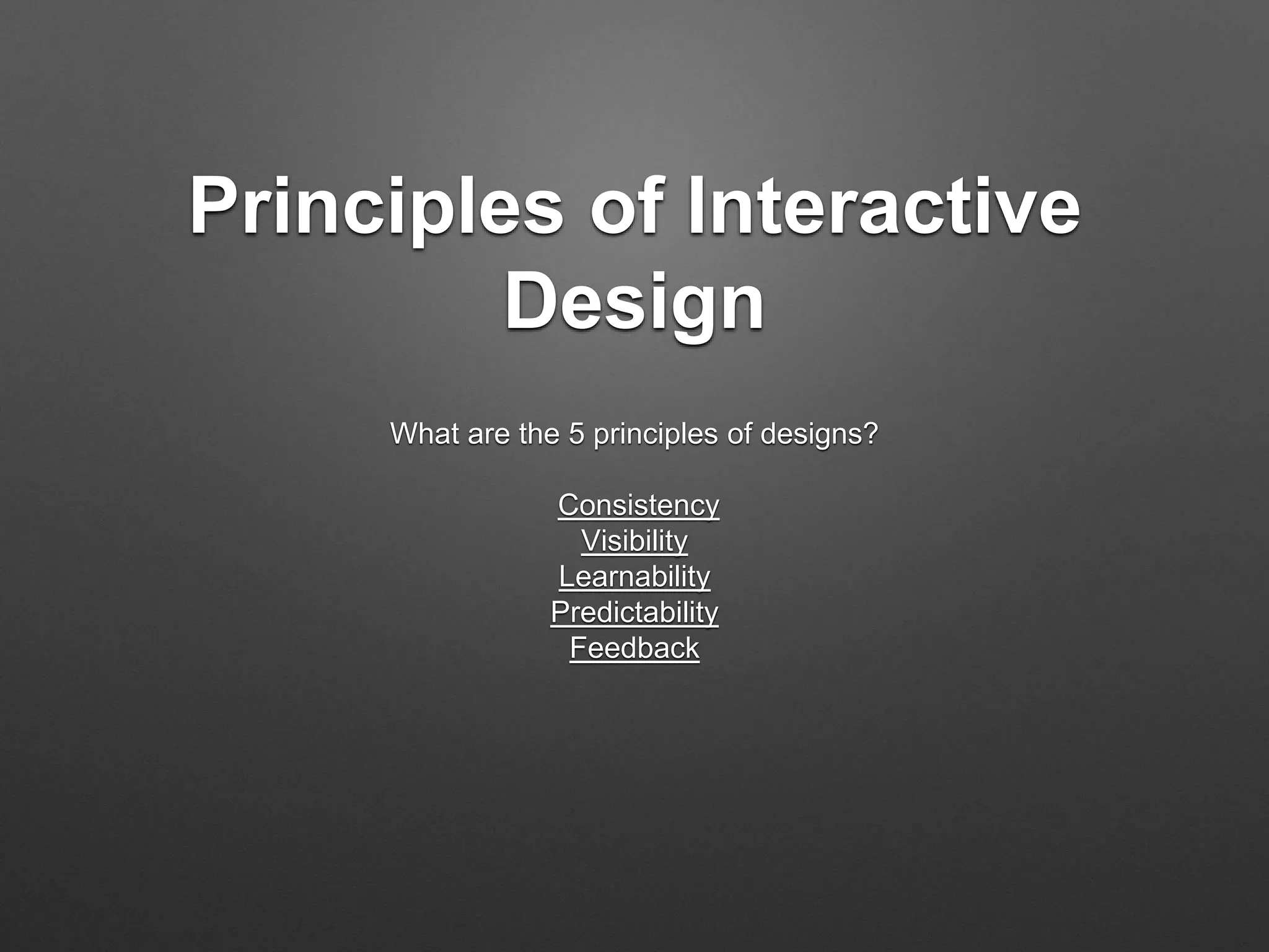
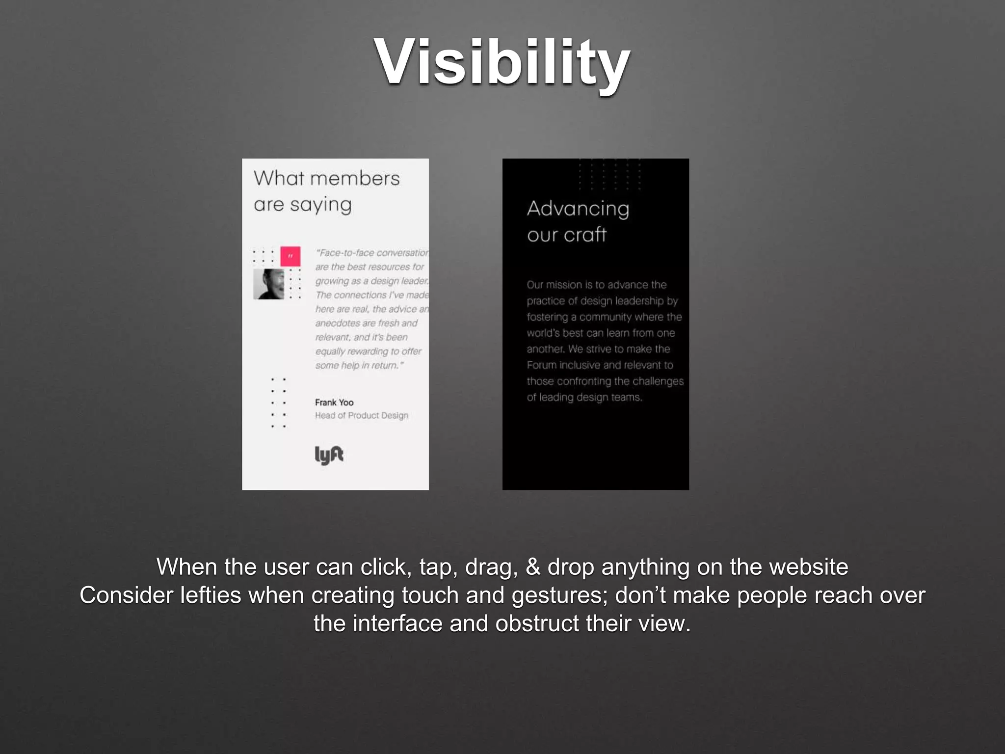
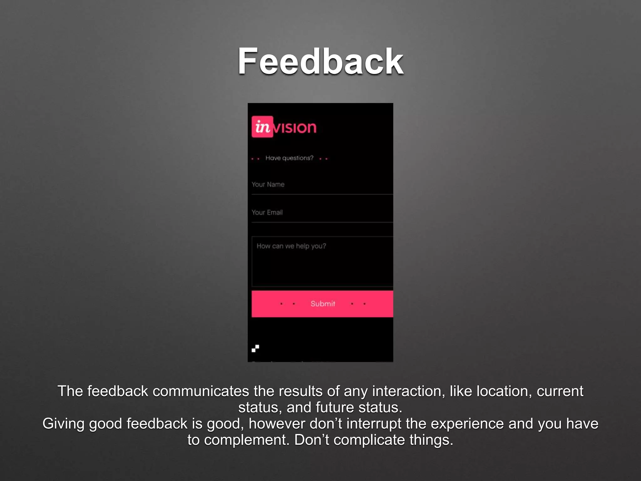
There are five principles that work together in interactive design. You will find that SlideShare will give examples of how they work together to complete a design.
Consistency is key in interactive design. Design elements like color palette, spacing, terminology, and style of content and imagery should remain stable throughout an experience to avoid distracting users from the core message. Visibility guides users through a series of tasks by indicating available actions and contextual information. Learnability means interfaces may require learning initially but become easier with use. Predictability creates a sense of comfort for users by making the experience foreseeable and feedback communicates the results of interactions to signal success or failure.
The document discusses 5 principles of interactive design:
1. Visibility - The most important elements should be visible first, with less important elements viewed later.
2. Consistency - Similar elements should look and function consistently to improve usability and learnability.
3. Learnability - How easily a software can be understood, with less training needed for easier use.
4. Predictability - Design should set expectations about what will happen with interactions.
5. Feedback - Communicating results of interactions to confirm success or failure through visual or other cues.
This document discusses principles of design including consistency, visibility, learnability, predictability, and feedback. It provides examples of how each principle is applied on various websites. Consistency is demonstrated on a website that keeps elements like color, pattern, font, and positioning consistent. Visibility is important on a website for designing Xbox controllers where users must be able to pick out colors and categories. Learnability is improved on a site about UX and product design that makes learning the topics easier. Predictability keeps users engaged on a real estate site like Zillow by giving useful information. Feedback is demonstrated on a website reviewing other websites that tells users what happened.
StartingUp - Designing Delightful ExperienceLim Donald
Lean approach to creating great user experience.
User research does not have to be expensive and extend over a long period of time.
While company can always spend more time and budget in understanding its user, they still represent opportunity cost when there is just so many things happening in a startup. That said, starting a product without basic understanding of the users breed disaster. In this set of slides, I'll share some common techniques which allow companies to learn more about its user and design an experience that is contextual to its business and users.
Web Design Through The Lens of PsychologyLim Donald
We think of ourselves as logical and creative.
However, these concept applies only when we are processing information. Fundamentally, there are still some behavior that applies to all of us, and thats how we (humans) are wired. The key intent of this presentation is share more about how our brain are wired and how we process information so we design better interface
Follow me on twitter @limdonald
This document provides an introduction to user experience (UX) design. It begins with icebreaker exercises for students to learn about each other. It then defines UX design and discusses the user-centered design process. This includes conducting user research, creating user personas and journeys, wireframing, prototyping, and usability testing. The document outlines common UX design roles and skills. It emphasizes that UX design is about understanding user needs and designing products to meet those needs through the entire development process. Students then participate in exercises to practice elements of the UX design process like research, sketching solutions, and creating a prototype.
The 8 Principles of Design – How to Leverage the Power of Design and Turn Con...Josh Levine
From the Internet Retailer Conference (IR FOCUS) in Orlando. The session's focus was to educate retailers on how to apply the 8 principles of design in order to maximize engagement with their customers and increase conversion across all platforms in their digital shopping experience.
—
Description from IRCE Conference Guide:
The Building Blocks of Design: Taking the Basics to a New Level
IRWD Design Workshop - Feb. 10, 2014
Speaker: Josh Levine - Chief Experience Officer, Co-Founder - Ai
Color, typography, placement, organization — even white space — are the visuals that can help attract shoppers’ attention, keep them engaged with the site and intrigued with the brand, and turn them into buyers — or they can turn off or confuse site visitors, detracting from the shopping experience and the brand. In this session, hear from two experienced web experts about how to master your handling of these powerful elements in site design and turn them to your advantage.
The document provides design tips for creating effective web and mobile designs. It recommends focusing on goals and audience, balancing form and function, using alignment and white space to create order and focus on content. It also suggests using typography, contrast, simplicity, and current trends while being subtle to create a delightful user experience.
15 Lesssons From Emotion Design Experience Dynamics Web SeminarExperience Dynamics
The document discusses emotion design and lessons learned from incorporating emotions into products and experiences. It provides an agenda for the seminar which includes defining emotion design, reviewing 15 lessons from emotion design case studies, and how emotion design is being used in products, websites, and to differentiate experiences. Examples of products that use emotion design are also discussed.
Presentation for startups accelerated by Wayra CEE. Presentation includes information about opportunities for designers in startup communities, aspect of design that I think is underestimated - emotional design (Aaron Walter can tell you more) and examples of successful businesses when design thinking helped overcome real world problems.
A short workshop that I put together for Hyundai Start-Up Competition where the participants and myself worked together to design a product using Lean UX. A crash course that was fun, quick and engaging. (images used are copyrighted to their respective owners, drop me a line to credit if it's yours.)
Lights! Camera! Interaction! What Designers Can Learn From FilmmakersAdam Connor
I began college as a film student. I’ve always loved storytelling, particularly visual storytelling in the forms of film and animation. Well-made films show us that they can drive engagement, communicate in subtle ways, change attitudes, and inspire us to try to change our lives.
Films succeed in evoking responses and engaging audiences only with a combination of well-written narrative and effective storytelling technique. It’s the filmmaker’s job to put this together. To do so they’ve developed processes, tools and techniques that allow them to focus attention, emphasize information, foreshadow and produce the many elements that together comprise a well-told story.
We’re responsible for creating products that aren’t just easy to use, but that people appreciate using. It stands to reason that the methods used in films to communicate with and engage audiences can serve as inspiration for designers.
With this presentation, we'’ll revisit the topic of using stories in design and expand on the technical aspects used in film to communicate. We’ll look at some tools used in film such as: cinematic patterns, beat sheets, and storyboards. We’ll consider why they’re used and how we might look to them for inspiration.
Jiff Inc. founder, James Currier, discusses how game mechanics, consumer psychology, and design thinking are revolutionizing health benefits engagement.
Learn about product design and what it is, why it's important, and methods for approaching design yourself. Slides are copyright Stephanie Engle and taken from a presentation for HackDuke at Duke University.
The document discusses the "four pleasure framework" developed by Professor Lionel Tiger, which categorizes four types of pleasure derived from products: physio-pleasure (sensory pleasure), psycho-pleasure (intellectual pleasure), socio-pleasure (social pleasure), and ideo-pleasure (ideal-based pleasure). The framework can be used to evaluate how pleasurable a product is to use and own, identify opportunities to enhance pleasure, and take a holistic approach to product design and marketing. Examples are provided for each pleasure type.
UX STRAT 2013: Aline Baeck, BEYOND WIREFRAMES How User Experience Methods Ca...UX STRAT
This document discusses how user experience methods can foster innovation and solve business problems. It provides an overview of a workshop where these methods were applied with a team at Intuit, resulting in a redirected project with a clearer purpose and definition of success. The document outlines several UX methods that were part of the workshop, including empathy maps, problem diagnostics, and ideation techniques. It argues that applying design thinking and UX strategies can help teams better understand customer needs and generate more innovative solutions.
This document discusses Lean UX design of landing pages. It emphasizes that first impressions matter, as users will form an initial impression of a website within 0.1 seconds and often leave within 10 seconds. To create a memorable landing page, the document recommends using attractive graphics and headlines, clearly listing key benefits, including social proof, and having a clear call to action. It also stresses testing assumptions about customers through personas and usability testing to improve the design through an iterative process. The overall message is that Lean UX focuses on collaboratively designing the right product features based on validated learning from customers.
UX Design. What, How and Why. [Downloadable version - English]Serena Facchinetti
Here's a Creative Commons version of my old presentation on User Experience Design. You can download it and use it if you want, if you do, drop me a line, I'd be curious to know it :)
Intro To Emotion Design- Pleasurability and Emotional Design- Experience Dyn...Experience Dynamics
1. The document discusses emotion design and its importance in user experience. It outlines how incorporating emotions can improve user satisfaction, perception of quality, and bonding with products.
2. Key aspects of emotion design include identifying pleasurability or "joy of use" and measuring emotional responses. Emotion design focuses on evoking positive emotions while usability focuses more on functionality.
3. Tools like PrEmo and LEMtool can help quantify the impact of emotions on websites and applications by measuring non-verbal responses. Designing for emotions can enhance credibility, ease of use, and performance perceptions.
Art Center Interactive Design 4 - #1 Intro to UXJoy Liu
This document provides an overview of user experience (UX) design. It discusses the different roles in UX like information architecture and interaction design. It explains that UX focuses on the end user and involves stakeholders, clients, customers, and developers. UX is about usability and ensuring a product is useful to the user. The document outlines various aspects of UX like affordances, utility, and mobile UX differences. It provides examples of app redesign projects and prompts students to select apps to redesign for a class project on improving the user experience.
This document discusses user interface (UI) and user experience (UX) design. It defines UI as what the user sees (controls, layout) and UX as how the user feels (steps in a process, wait times, shifts in attention). It emphasizes that UX design is important and measurable, not subjective, and outlines some principles for designing good UX, such as ensuring tasks are easy, frequent and purpose is obvious. It also provides tips for evaluating UX through a user's eyes and examples of colors and their symbolic meanings.
How to execute emotion driven design on your website, and why it's the conversion expert's best kept secret.
Read the full post: http://blog.reactful.com/emotion-driven-design/
Follow us:
http://twitter.com/reactful
https://www.facebook.com/reactful
http://blog.reactful.com
The document discusses five key principles of interactive design: consistency, visibility, learnability, predictability, and feedback. It provides examples of how each principle can be applied, such as keeping elements consistent to provide familiarity to users, using prompts and cues to guide users, designing for intuitive learnability, allowing users to predict outcomes, and providing feedback to communicate the results of interactions. The principles work together to create an experience where users can easily understand and navigate an interface.
This document discusses visual design and its impact on user experience. It defines visual design and its key components like lines, fonts, shapes, colors, textures and space. It explains how visual design and usability are related, with usability being important for functionality and a smooth user journey. Principles of visual design like unity, hierarchy and balance are covered. Finally, top UI design trends for 2022 like anthropomorphic animations, password-less login and bold typography are listed.
This document discusses interactive cues in flat design user interfaces. It explores how perceived affordances are learned conventions through visual cues like distinctive colors, shapes, sizes, and verbs to indicate interactivity. Common interactive elements like buttons are rectangular or circular shapes on mobile and desktop platforms. The document recommends leveraging users' existing knowledge of interface conventions and standard controls while using visual hierarchy and multiple cues to emphasize primary actions.
UX Design + UI Design: Injecting a brand persona!Jayan Narayanan
It is my try to shed light on two often heard but little understood or confused acronyms and its impact on overall brand experience. The presentation originally designed to address a group of entrepreneurs who have little knowledge in design and it's technical jargons.
https://www.linkedin.com/in/jayan-narayanan/
This document provides an introduction to becoming a designer. It discusses what design is, principles of visual design including unity, contrast, emphasis, structure and balance. It also covers composition rules like the rule of thirds. The document also defines UX as the user's emotions and attitudes about using a product, and UI as how a user interacts with an application. It gives examples of UX/UI organizing principles like balancing layouts and using rhythm and repetition in elements.
The document discusses user experience (UX) design and its importance in enhancing customer satisfaction and loyalty. It defines UX design as the process of improving usability, ease of use, and pleasure in the interaction between customers and a product. The document then discusses various myths about UX design and provides examples to bust those myths. It also discusses emerging trends in areas like interfaces, gestures, wearable devices, and how these changes are impacting UX design processes and best practices.
UI design focuses on the visual and interactive elements of a product like buttons, menus and graphics. The goal is to make the interface easy to use. UX design focuses more broadly on the overall user experience including how usable, useful and satisfying the product is for users. UX design considers interface design but also information architecture and usability testing. While UI design deals with how a product looks, UX design ensures the functionality and experience meet users' needs. Both are important but UX comes first to understand users before designing visual interfaces.
The document discusses key concepts in interaction design including usability principles, design principles, affordances, consistency, feedback and visibility. It explains that interaction design aims to develop usable products that involve users and optimize their experience through an understanding of activities, contexts and user needs. The design process requires evaluating prototypes and user testing to create satisfying, intuitive and enjoyable interactive experiences.
Frank La Vigne is an expert in user interface (UI) and user experience (UX) design with 15 years of experience working with Microsoft technologies. He is a Microsoft MVP for Tablet PC. He speaks at user groups and conferences on UI/UX design topics. He believes that good UI and UX design is measurable and important, not subjective. UI is what the user sees while UX is how the user feels when interacting with an application. Attention to details like layout, colors, fonts can improve how users interact with and understand an application.
The document discusses the differences and relationships between user interface (UI) design and user experience (UX) design. UI design focuses on visual design and interactions, while UX design considers the overall user experience. The document then provides more details on UI design elements, best practices for designing interfaces, and 10 fundamentals of UI design such as knowing the user and providing feedback.
user interaction design
There are several common mistakes to
avoid in interaction design. These include
designing for yourself instead of the user,
overloading the user with too much
information, and using animation and
microinteractions excessively. By avoiding
these mistakes and focusing on the user
experience, you can create a product that
meets user needs and exceeds their
expectations.
Building for People: 5 Practical Tip for Greating Great UXqixingz
If the 20th century is about technology functions, then the 21st century is about technology users. Building useful, usable, and attractive software applications for people is critical to win customers. User Experience (UX) is much more than just UI, it includes all key aspects of application such as performance and availability that you as developers concern. This session will start off with the ROI of great UX and why you should care. Then, 5 practical tips for creating great UX will be shared that you can take home and start improve your software UX right away.
UI design focuses on creating intuitive visual interfaces for users to interact with software. The document outlines the tasks of a UI designer such as designing each screen, creating visual elements, establishing style guides, and prototyping designs. It also explains that UI designers must understand human psychology and behavior to create intuitive experiences for users.
Ui is Communication: How to design intuitive, user-centered interfaces by foc...Everett McKay
This document discusses designing intuitive user interfaces by focusing on effective communication. It introduces the concept that the UI is a form of communication between users and technology. The speaker advocates designing UIs similar to how one would explain tasks to another person, focusing on clear, goal-oriented communication without unnecessary complexity or technical jargon. Examples are provided to illustrate intuitive versus less intuitive UI designs based on communication principles.
This document discusses various user interface design patterns used in popular mobile apps. It begins by defining UI design patterns as reusable solutions to common user problems. It then highlights some key interactive patterns like gestures and animations that power many new mobile UI designs. The document also summarizes input patterns such as smart keyboards, default values and autocomplete, immediate immersion to bypass signups, action bars for quick access to actions, and social login. Additional patterns covered include huge buttons, swiping for actions, and notifications.
The document discusses key concepts in web design including usability, user experience, and user-centered design. It defines usability as how easy a product is to use, user experience as encompassing all aspects of a user's interaction with a company or product, and user-centered design as optimizing a product around how users need or want to use it rather than forcing users to change their behavior. The document also provides examples of techniques for understanding users like personas, use cases, and usability testing to help ensure designs are focused on the user.
The document provides information on UI/UX design terms and concepts. It defines what UI, UX and UXD are, and describes common design types like skeuomorphic, flat, and material design. It also discusses the UX design process and popular UI design software. Finally, it defines and explains common UI/UX terms like wireframes, prototypes, mockups, responsive design, navigation, menus, calls-to-action buttons, loading bars, tabs, switches, pickers and checkboxes.
The document provides principles and guidelines for designing effective user interfaces (UIs). It discusses the importance of clarity, keeping users in control, direct manipulation, strong visual hierarchies, highlighting without determining with color, progressive disclosure, helping users inline, designing for the zero state, solving existing problems, invisible design, and ensuring interfaces are actually used. The overall message is that UIs should be intuitive, minimize cognitive load, and maximize usability.
UI Design Principles : 20 Essential Rules for User Interface DesignMoodLabs
The document provides principles and guidelines for designing effective user interfaces (UIs). It discusses the importance of clarity, keeping users in control, direct manipulation, strong visual hierarchies, highlighting existing problems, and designing for use rather than hypothetical situations. The overarching goal of UI design should be enabling users to achieve their goals with minimal distraction or confusion.
Revolutionizing the Digital Landscape: Web Development Companies in Indiaamrsoftec1
Discover unparalleled creativity and technical prowess with India's leading web development companies. From custom solutions to e-commerce platforms, harness the expertise of skilled developers at competitive prices. Transform your digital presence, enhance the user experience, and propel your business to new heights with innovative solutions tailored to your needs, all from the heart of India's tech industry.
Storytelling For The Web: Integrate Storytelling in your Design ProcessChiara Aliotta
In this slides I explain how I have used storytelling techniques to elevate websites and brands and create memorable user experiences. You can discover practical tips as I showcase the elements of good storytelling and its applied to some examples of diverse brands/projects..
EASY TUTORIAL OF HOW TO USE CAPCUT BY: FEBLESS HERNANEFebless Hernane
CapCut is an easy-to-use video editing app perfect for beginners. To start, download and open CapCut on your phone. Tap "New Project" and select the videos or photos you want to edit. You can trim clips by dragging the edges, add text by tapping "Text," and include music by selecting "Audio." Enhance your video with filters and effects from the "Effects" menu. When you're happy with your video, tap the export button to save and share it. CapCut makes video editing simple and fun for everyone!
Technoblade The Legacy of a Minecraft Legend.Techno Merch
Technoblade, born Alex on June 1, 1999, was a legendary Minecraft YouTuber known for his sharp wit and exceptional PvP skills. Starting his channel in 2013, he gained nearly 11 million subscribers. His private battle with metastatic sarcoma ended in June 2022, but his enduring legacy continues to inspire millions.
Connect Conference 2022: Passive House - Economic and Environmental Solution...TE Studio
Passive House: The Economic and Environmental Solution for Sustainable Real Estate. Lecture by Tim Eian of TE Studio Passive House Design in November 2022 in Minneapolis.
- The Built Environment
- Let's imagine the perfect building
- The Passive House standard
- Why Passive House targets
- Clean Energy Plans?!
- How does Passive House compare and fit in?
- The business case for Passive House real estate
- Tools to quantify the value of Passive House
- What can I do?
- Resources
Architectural and constructions management experience since 2003 including 18 years located in UAE.
Coordinate and oversee all technical activities relating to architectural and construction projects,
including directing the design team, reviewing drafts and computer models, and approving design
changes.
Organize and typically develop, and review building plans, ensuring that a project meets all safety and
environmental standards.
Prepare feasibility studies, construction contracts, and tender documents with specifications and
tender analyses.
Consulting with clients, work on formulating equipment and labor cost estimates, ensuring a project
meets environmental, safety, structural, zoning, and aesthetic standards.
Monitoring the progress of a project to assess whether or not it is in compliance with building plans
and project deadlines.
Attention to detail, exceptional time management, and strong problem-solving and communication
skills are required for this role.
PDF SubmissionDigital Marketing Institute in NoidaPoojaSaini954651
https://www.safalta.com/online-digital-marketing/advance-digital-marketing-training-in-noidaTop Digital Marketing Institute in Noida: Boost Your Career Fast
[3:29 am, 30/05/2024] +91 83818 43552: Safalta Digital Marketing Institute in Noida also provides advanced classes for individuals seeking to develop their expertise and skills in this field. These classes, led by industry experts with vast experience, focus on specific aspects of digital marketing such as advanced SEO strategies, sophisticated content creation techniques, and data-driven analytics.
Decormart Studio is widely recognized as one of the best interior designers in Bangalore, known for their exceptional design expertise and ability to create stunning, functional spaces. With a strong focus on client preferences and timely project delivery, Decormart Studio has built a solid reputation for their innovative and personalized approach to interior design.
Visual Style and Aesthetics: Basics of Visual Design
Visual Design for Enterprise Applications
Range of Visual Styles.
Mobile Interfaces:
Challenges and Opportunities of Mobile Design
Approach to Mobile Design
Patterns
Maximize Your Content with Beautiful Assets : Content & Asset for Landing Page pmgdscunsri
Figma is a cloud-based design tool widely used by designers for prototyping, UI/UX design, and real-time collaboration. With features such as precision pen tools, grid system, and reusable components, Figma makes it easy for teams to work together on design projects. Its flexibility and accessibility make Figma a top choice in the digital age.
2. Consistency
Keeping elements consistent give users the feeling of authenticity.
Components with similar behavior should have a similar appearance.
Good interactive design creates specific styles for each - font, weight, color.
Color, pattern, size, shape, behavior, tone,UI pattern are important keys of having successful consistency.
3. Visibility
When the user can click, tap, drag, & drop anything on the website
Consider lefties when creating touch and gestures; don’t make people reach over
the interface and obstruct their view.
4. Learnability
People will spend the time learning if it is something they do often. Learnability of a
product can be measured in effectiveness, efficiency, satisfaction and error
according to Joe Natoli, from givegoodux.com.
5. Predictability
Did you know that speed task completion makes people feel good about what
they’re using. It give them the comfort and the sense of accomplishment.
Labels, icons and images tells us what to do, what will happen and where you’ll go.
6. Feedback
The feedback communicates the results of any interaction, like location, current
status, and future status.
Giving good feedback is good, however don’t interrupt the experience and you have
to complement. Don’t complicate things.