Principles of Interactive Design
Consistency: Differences in design can draw attention but also distract the users from the message
you are trying to communicate. Keeping elements consistent give users the feeling of authenicity.
There are five principles that work together in interactive design. Below we will discover each one with
examples of how they work together to complete a design.
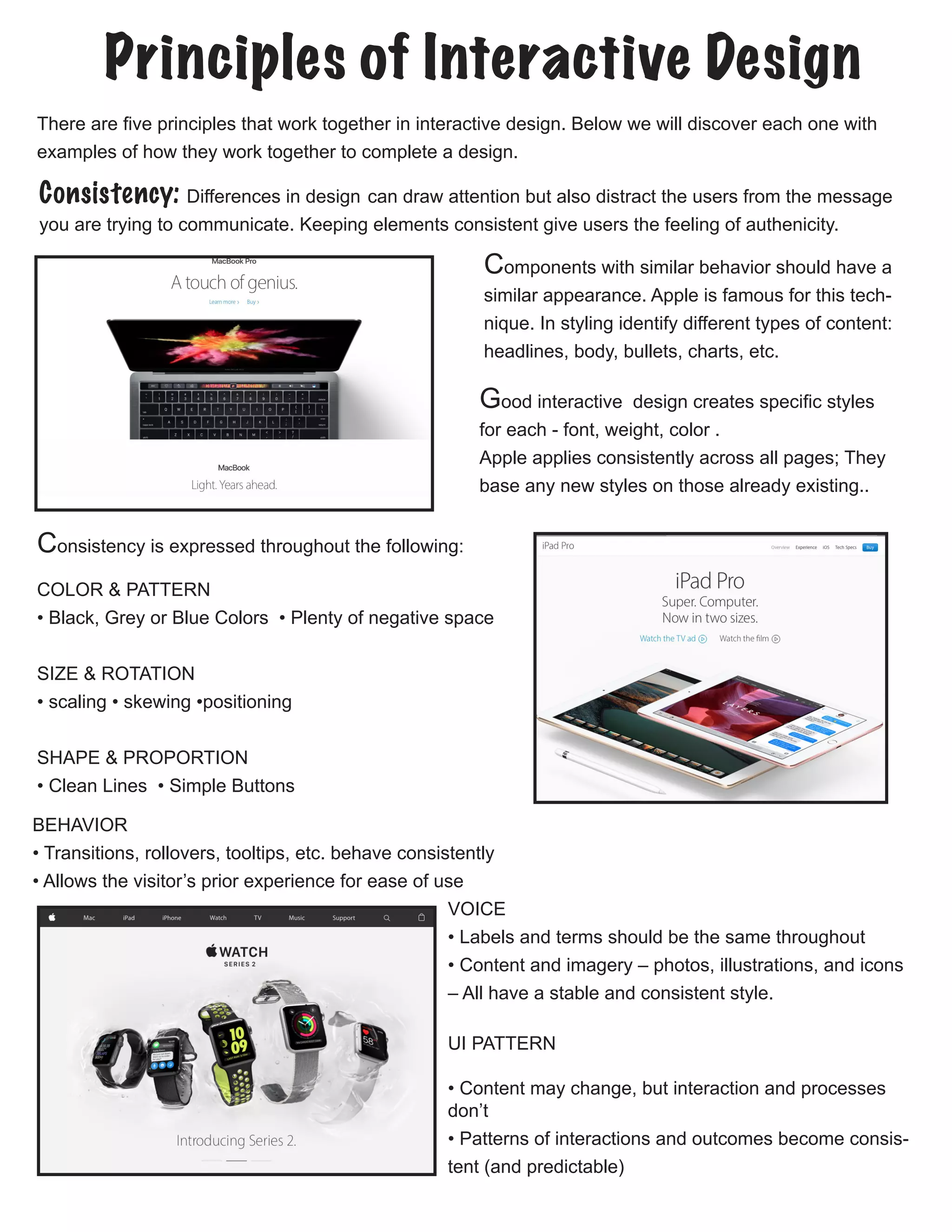
Components with similar behavior should have a
similar appearance. Apple is famous for this tech-
nique. In styling identify different types of content:
headlines, body, bullets, charts, etc.
Consistency is expressed throughout the following:
COLOR & PATTERN
• Black, Grey or Blue Colors • Plenty of negative space
SIZE & ROTATION
• scaling • skewing •positioning
SHAPE & PROPORTION
• Clean Lines • Simple Buttons
BEHAVIOR
• Transitions, rollovers, tooltips, etc. behave consistently
• Allows the visitor’s prior experience for ease of use
VOICE
• Labels and terms should be the same throughout
• Content and imagery – photos, illustrations, and icons
– All have a stable and consistent style.
UI PATTERN
• Content may change, but interaction and processes
don’t
• Patterns of interactions and outcomes become consis-
tent (and predictable)
Good interactive design creates specific styles
for each - font, weight, color .
Apple applies consistently across all pages; They
base any new styles on those already existing..
Visability: Good visibility, according to David Hogue’s principles, means that obvious prompts and
cues are present, which:
• Lead the user through an interaction
• Guide them through a series of tasks
• Indicate what possible actions are available to them
• Communicate the context of the situation.
while interaction design cues should always be made visible, requiring no conscious thought, too
many cues is often worse than none at all.
TOUCH & GESTURE

• There is no hover for touch screens.
• Consider the lefties of the world by making inter-
faces reversible.
• Don’t make people reach over the interface and
obstruct their view. 
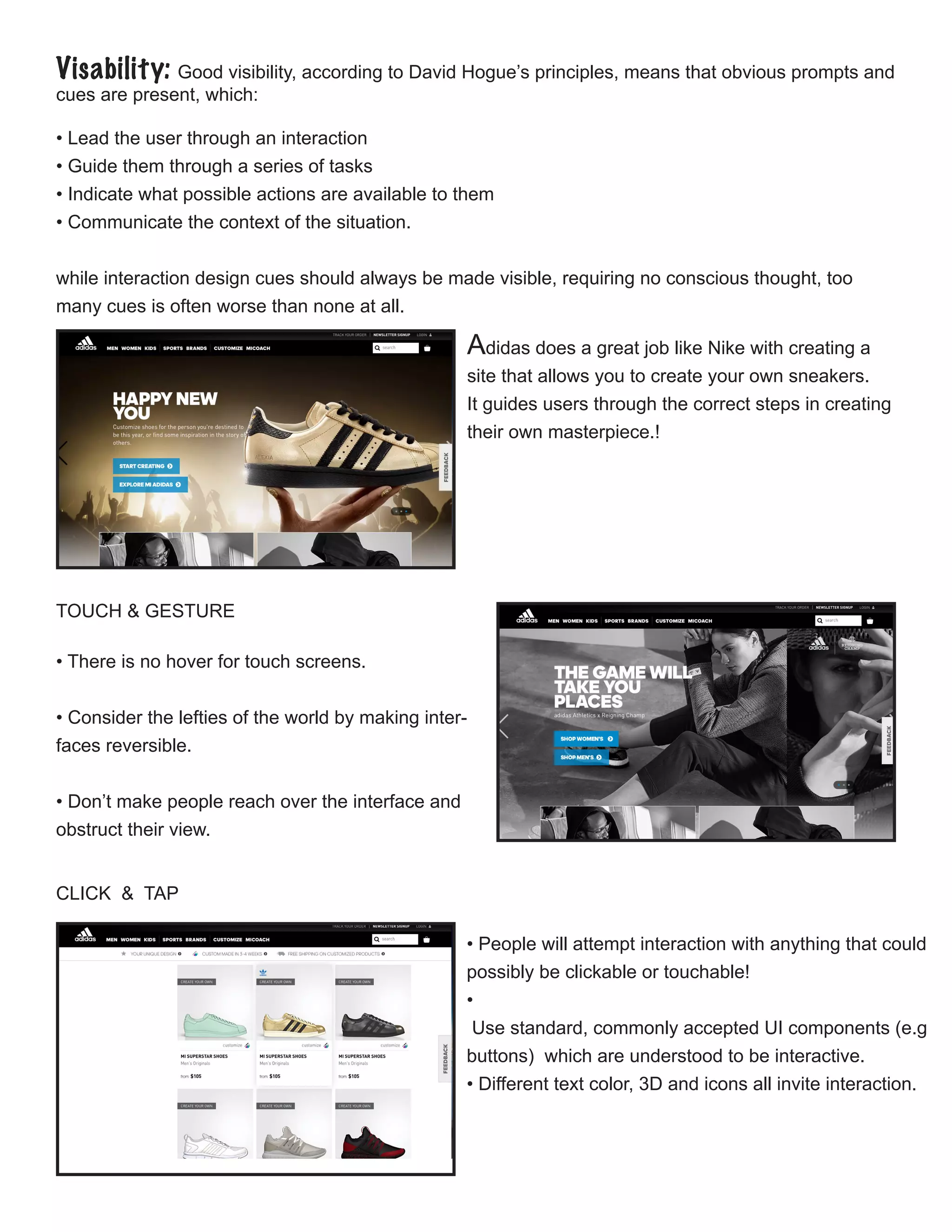
Adidas does a great job like Nike with creating a
site that allows you to create your own sneakers.
It guides users through the correct steps in creating
their own masterpiece.!
CLICK & TAP
• People will attempt interaction with anything that could
possibly be clickable or touchable!
•
Use standard, commonly accepted UI components (e.g
buttons) which are understood to be interactive.
• Different text color, 3D and icons all invite interaction.
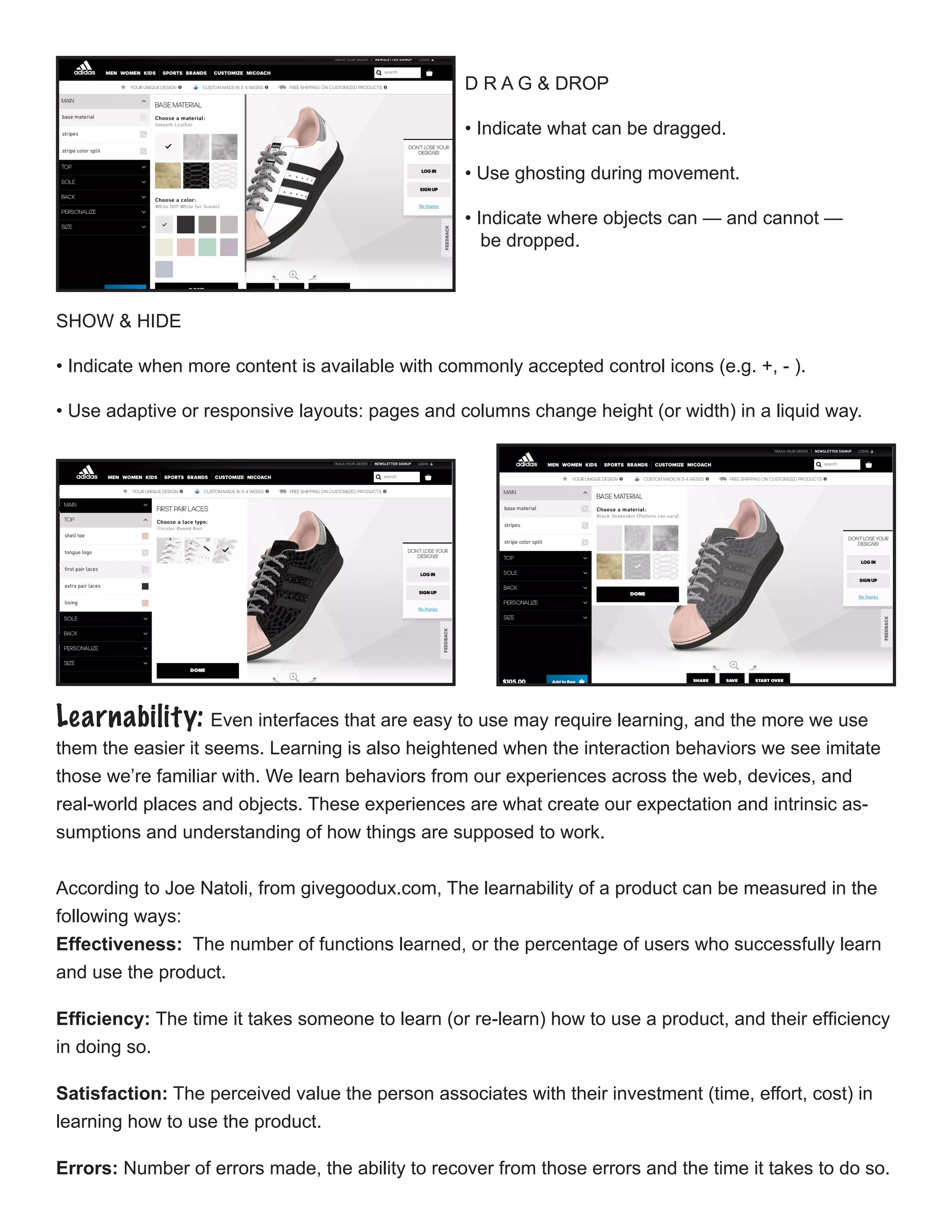
D R A G & DROP
• Indicate what can be dragged.
• Use ghosting during movement.
• Indicate where objects can — and cannot —
be dropped.
SHOW & HIDE

• Indicate when more content is available with commonly accepted control icons (e.g. +, - ).
• Use adaptive or responsive layouts: pages and columns change height (or width) in a liquid way.
Learnability: Even interfaces that are easy to use may require learning, and the more we use
them the easier it seems. Learning is also heightened when the interaction behaviors we see imitate
those we’re familiar with. We learn behaviors from our experiences across the web, devices, and
real-world places and objects. These experiences are what create our expectation and intrinsic as-
sumptions and understanding of how things are supposed to work.
According to Joe Natoli, from givegoodux.com, The learnability of a product can be measured in the
following ways:
Effectiveness: The number of functions learned, or the percentage of users who successfully learn
and use the product.
Efficiency: The time it takes someone to learn (or re-learn) how to use a product, and their efficiency
in doing so.
Satisfaction: The perceived value the person associates with their investment (time, effort, cost) in
learning how to use the product.
Errors: Number of errors made, the ability to recover from those errors and the time it takes to do so.
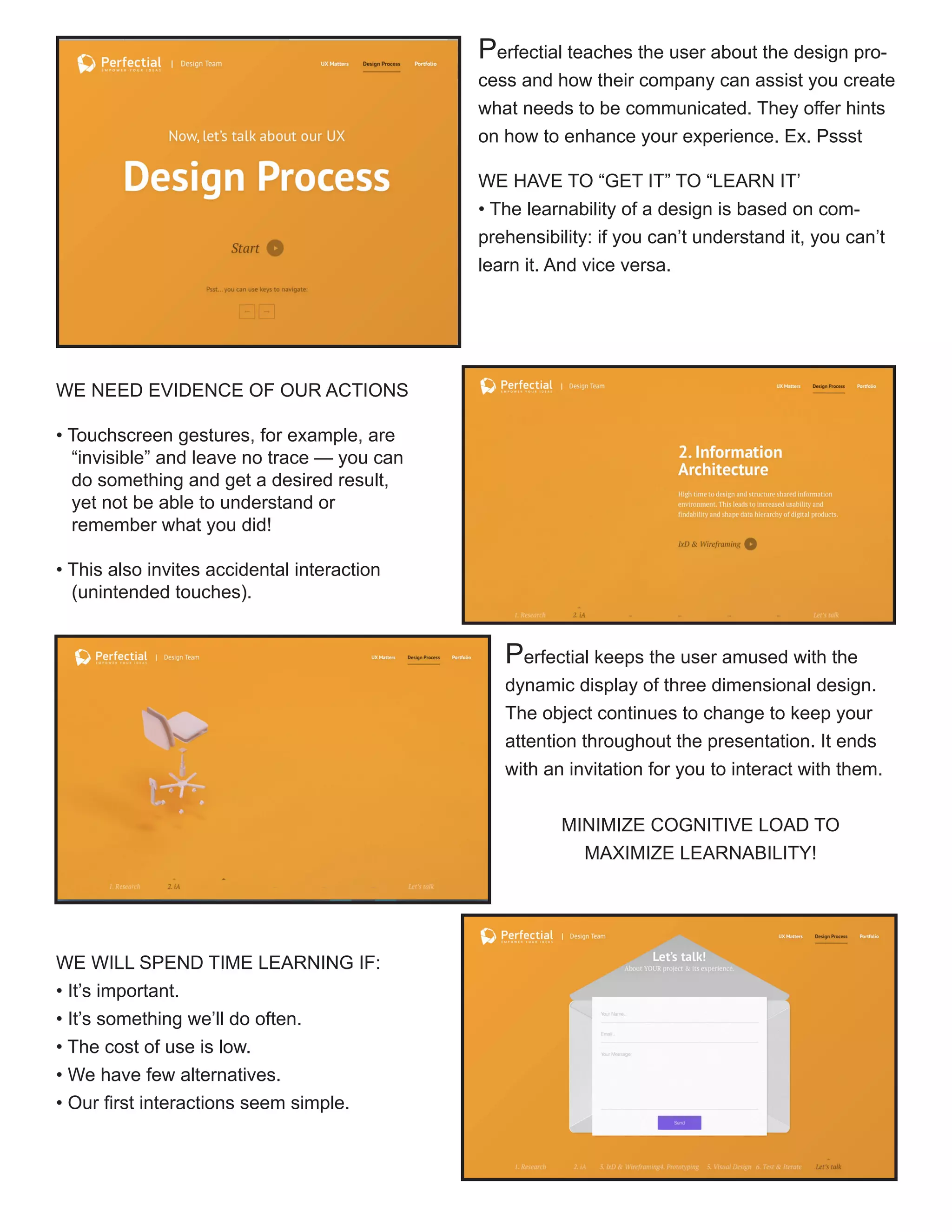
Perfectial teaches the user about the design pro-
cess and how their company can assist you create
what needs to be communicated. They offer hints
on how to enhance your experience. Ex. Pssst
WE HAVE TO “GET IT” TO “LEARN IT’
• The learnability of a design is based on com-
prehensibility: if you can’t understand it, you can’t
learn it. And vice versa.
WE NEED EVIDENCE OF OUR ACTIONS
• Touchscreen gestures, for example, are 	
“invisible” and leave no trace — you can 	
do something and get a desired result, 	
yet not be able to understand or
remember what you did!
• This also invites accidental interaction
(unintended touches).

Perfectial keeps the user amused with the
dynamic display of three dimensional design.
The object continues to change to keep your
attention throughout the presentation. It ends
with an invitation for you to interact with them.
MINIMIZE COGNITIVE LOAD TO
MAXIMIZE LEARNABILITY!
WE WILL SPEND TIME LEARNING IF:
• It’s important.
• It’s something we’ll do often.
• The cost of use is low.
• We have few alternatives.
• Our first interactions seem simple.

Predictability: Natoli states “The sense of comfort that is created as a result is a critical factor in
keeping people on the site, fully engaged and moving forward. A sense of control – which is a hard-
wired cognitive requirement in the brain – speeds task completion and makes people feel good about
what they’re using, what they’re doing and what they’ll be able to accomplish.”
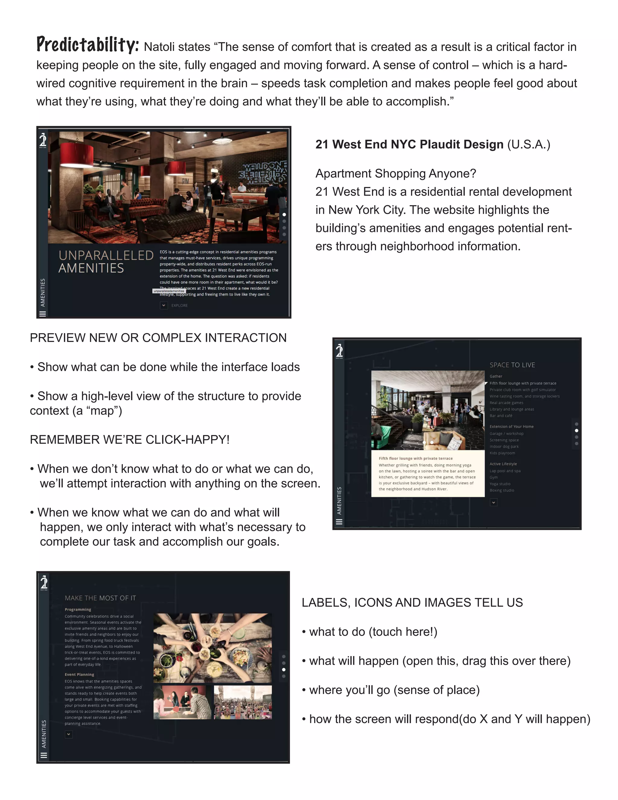
21 West End NYC Plaudit Design (U.S.A.)
Apartment Shopping Anyone?
21 West End is a residential rental development
in New York City. The website highlights the
building’s amenities and engages potential rent-
ers through neighborhood information.
PREVIEW NEW OR COMPLEX INTERACTION
• Show what can be done while the interface loads
• Show a high-level view of the structure to provide 	
context (a “map”)
REMEMBER WE’RE CLICK-HAPPY!
• When we don’t know what to do or what we can do, 		
we’ll attempt interaction with anything on the screen.
• When we know what we can do and what will
happen, we only interact with what’s necessary to 		
complete our task and accomplish our goals.
LABELS, ICONS AND IMAGES TELL US
• what to do (touch here!)
• what will happen (open this, drag this over there)
• where you’ll go (sense of place)
• how the screen will respond(do X and Y will happen)
Feedback: Feedback communicates the results of any interaction, making it visible and under-
standable. Its job is to give the user a signal that they (or the product) have succeeded or failed at
performing a task. According to Hogue, feedback answers questions across four categories:
Location: Where am I?
Current Status: What’s happening — and is it still happening?
Future Status: What will happen next?
Outcomes & Results: What just happened?
ACTIONS NEED REACTIONS
• Every action should produce a visible, understandable and 	
immediate reaction
• Let people know they have been heard (or felt or seen)
GIVE GOOD FEEDBACK
• Don’t interrupt the experience
• Complement, not complicate
• Allow undo to reverse choices(and correct mistakes)
• Mistakes are incorrect choices, but don’t always result in errors
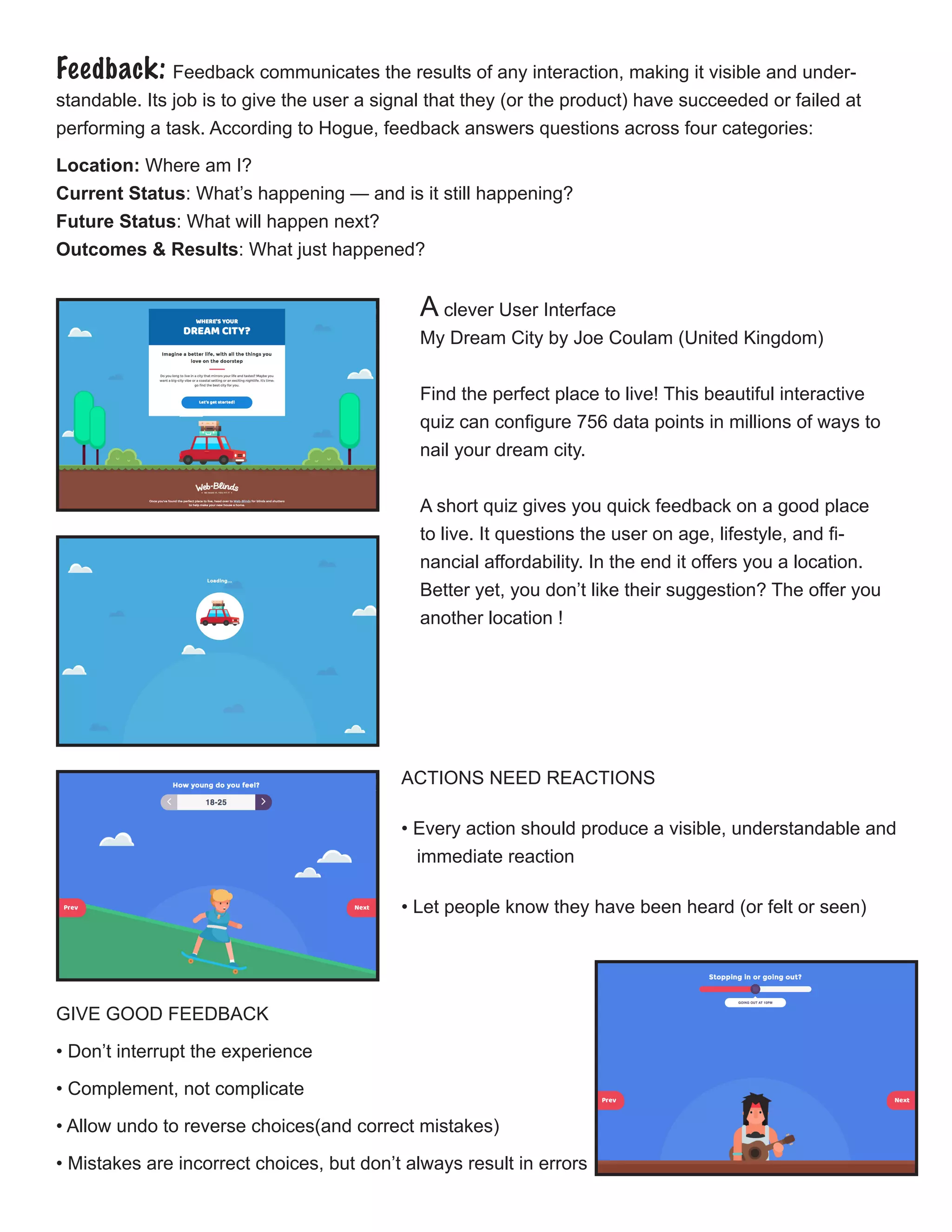
A clever User Interface
My Dream City by Joe Coulam (United Kingdom)
Find the perfect place to live! This beautiful interactive
quiz can configure 756 data points in millions of ways to
nail your dream city.
A short quiz gives you quick feedback on a good place
to live. It questions the user on age, lifestyle, and fi-
nancial affordability. In the end it offers you a location.
Better yet, you don’t like their suggestion? The offer you
another location !
GIVE GOOD ERROR MESSAGES
Error prevention is ideal, but when they do happen,
error messages should:
1. describe what happened
2. explain why it happened
3. suggest a fix
4. never blame the user
Sources:
Content/Chart: David Hogue PhD. https://www.lynda.com/Dreamweaver-tutorials/What-interaction-design
Content: Joe Natoli http://www.givegoodux.com
Websites: http://www.awwwards.com
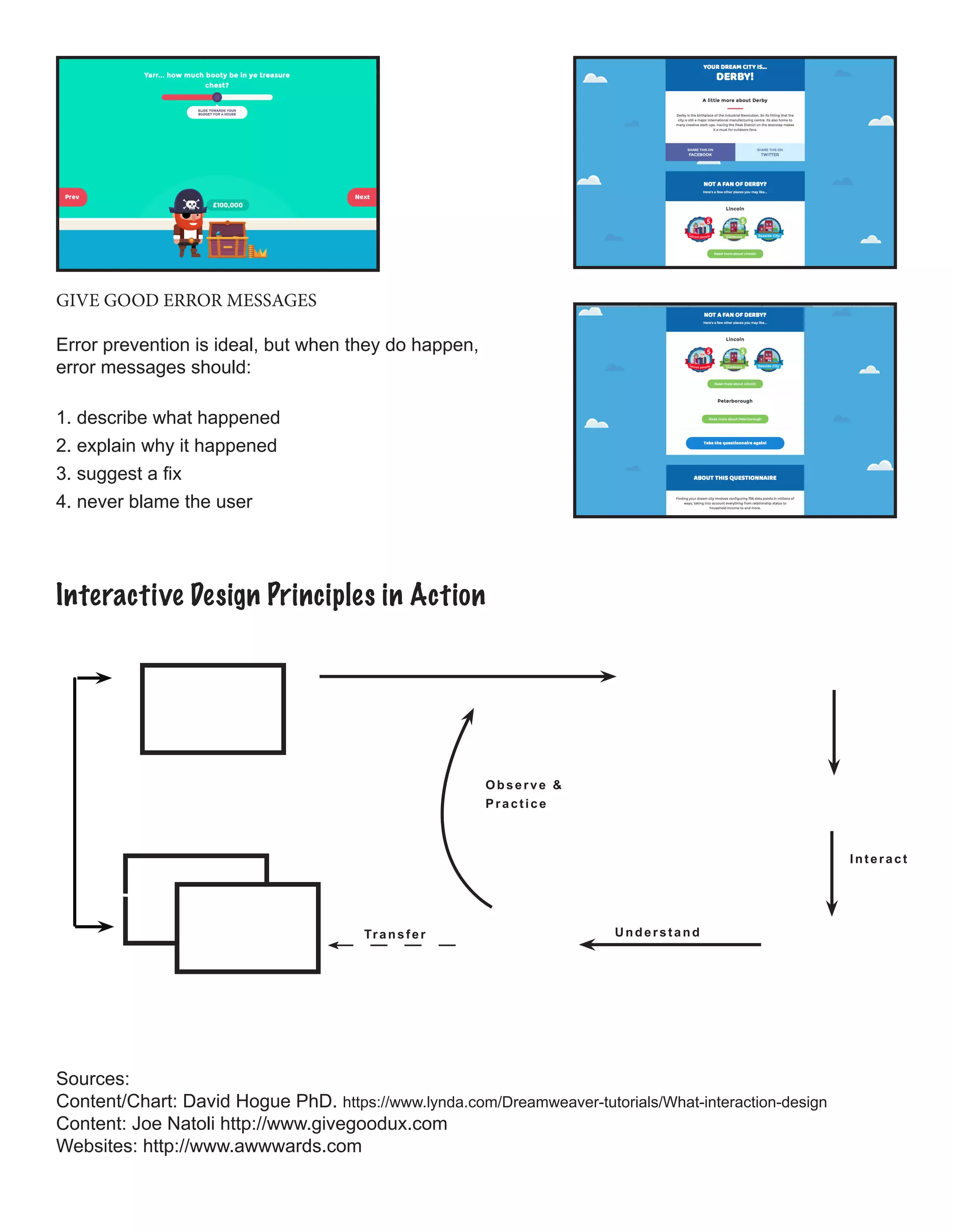
Interactive Design Principles in Action
Interact
UnderstandTransfer
Observe &
Practice

Principles of Interactive Design

  • 1.
    Principles of InteractiveDesign Consistency: Differences in design can draw attention but also distract the users from the message you are trying to communicate. Keeping elements consistent give users the feeling of authenicity. There are five principles that work together in interactive design. Below we will discover each one with examples of how they work together to complete a design. Components with similar behavior should have a similar appearance. Apple is famous for this tech- nique. In styling identify different types of content: headlines, body, bullets, charts, etc. Consistency is expressed throughout the following: COLOR & PATTERN • Black, Grey or Blue Colors • Plenty of negative space SIZE & ROTATION • scaling • skewing •positioning SHAPE & PROPORTION • Clean Lines • Simple Buttons BEHAVIOR • Transitions, rollovers, tooltips, etc. behave consistently • Allows the visitor’s prior experience for ease of use VOICE • Labels and terms should be the same throughout • Content and imagery – photos, illustrations, and icons – All have a stable and consistent style. UI PATTERN • Content may change, but interaction and processes don’t • Patterns of interactions and outcomes become consis- tent (and predictable) Good interactive design creates specific styles for each - font, weight, color . Apple applies consistently across all pages; They base any new styles on those already existing..
  • 2.
    Visability: Good visibility,according to David Hogue’s principles, means that obvious prompts and cues are present, which: • Lead the user through an interaction • Guide them through a series of tasks • Indicate what possible actions are available to them • Communicate the context of the situation. while interaction design cues should always be made visible, requiring no conscious thought, too many cues is often worse than none at all. TOUCH & GESTURE  • There is no hover for touch screens. • Consider the lefties of the world by making inter- faces reversible. • Don’t make people reach over the interface and obstruct their view.  Adidas does a great job like Nike with creating a site that allows you to create your own sneakers. It guides users through the correct steps in creating their own masterpiece.! CLICK & TAP • People will attempt interaction with anything that could possibly be clickable or touchable! • Use standard, commonly accepted UI components (e.g buttons) which are understood to be interactive. • Different text color, 3D and icons all invite interaction.
  • 3.
    D R AG & DROP • Indicate what can be dragged. • Use ghosting during movement. • Indicate where objects can — and cannot — be dropped. SHOW & HIDE  • Indicate when more content is available with commonly accepted control icons (e.g. +, - ). • Use adaptive or responsive layouts: pages and columns change height (or width) in a liquid way. Learnability: Even interfaces that are easy to use may require learning, and the more we use them the easier it seems. Learning is also heightened when the interaction behaviors we see imitate those we’re familiar with. We learn behaviors from our experiences across the web, devices, and real-world places and objects. These experiences are what create our expectation and intrinsic as- sumptions and understanding of how things are supposed to work. According to Joe Natoli, from givegoodux.com, The learnability of a product can be measured in the following ways: Effectiveness: The number of functions learned, or the percentage of users who successfully learn and use the product. Efficiency: The time it takes someone to learn (or re-learn) how to use a product, and their efficiency in doing so. Satisfaction: The perceived value the person associates with their investment (time, effort, cost) in learning how to use the product. Errors: Number of errors made, the ability to recover from those errors and the time it takes to do so.
  • 4.
    Perfectial teaches theuser about the design pro- cess and how their company can assist you create what needs to be communicated. They offer hints on how to enhance your experience. Ex. Pssst WE HAVE TO “GET IT” TO “LEARN IT’ • The learnability of a design is based on com- prehensibility: if you can’t understand it, you can’t learn it. And vice versa. WE NEED EVIDENCE OF OUR ACTIONS • Touchscreen gestures, for example, are “invisible” and leave no trace — you can do something and get a desired result, yet not be able to understand or remember what you did! • This also invites accidental interaction (unintended touches).  Perfectial keeps the user amused with the dynamic display of three dimensional design. The object continues to change to keep your attention throughout the presentation. It ends with an invitation for you to interact with them. MINIMIZE COGNITIVE LOAD TO MAXIMIZE LEARNABILITY! WE WILL SPEND TIME LEARNING IF: • It’s important. • It’s something we’ll do often. • The cost of use is low. • We have few alternatives. • Our first interactions seem simple. 
  • 5.
    Predictability: Natoli states“The sense of comfort that is created as a result is a critical factor in keeping people on the site, fully engaged and moving forward. A sense of control – which is a hard- wired cognitive requirement in the brain – speeds task completion and makes people feel good about what they’re using, what they’re doing and what they’ll be able to accomplish.” 21 West End NYC Plaudit Design (U.S.A.) Apartment Shopping Anyone? 21 West End is a residential rental development in New York City. The website highlights the building’s amenities and engages potential rent- ers through neighborhood information. PREVIEW NEW OR COMPLEX INTERACTION • Show what can be done while the interface loads • Show a high-level view of the structure to provide context (a “map”) REMEMBER WE’RE CLICK-HAPPY! • When we don’t know what to do or what we can do, we’ll attempt interaction with anything on the screen. • When we know what we can do and what will happen, we only interact with what’s necessary to complete our task and accomplish our goals. LABELS, ICONS AND IMAGES TELL US • what to do (touch here!) • what will happen (open this, drag this over there) • where you’ll go (sense of place) • how the screen will respond(do X and Y will happen)
  • 6.
    Feedback: Feedback communicatesthe results of any interaction, making it visible and under- standable. Its job is to give the user a signal that they (or the product) have succeeded or failed at performing a task. According to Hogue, feedback answers questions across four categories: Location: Where am I? Current Status: What’s happening — and is it still happening? Future Status: What will happen next? Outcomes & Results: What just happened? ACTIONS NEED REACTIONS • Every action should produce a visible, understandable and immediate reaction • Let people know they have been heard (or felt or seen) GIVE GOOD FEEDBACK • Don’t interrupt the experience • Complement, not complicate • Allow undo to reverse choices(and correct mistakes) • Mistakes are incorrect choices, but don’t always result in errors A clever User Interface My Dream City by Joe Coulam (United Kingdom) Find the perfect place to live! This beautiful interactive quiz can configure 756 data points in millions of ways to nail your dream city. A short quiz gives you quick feedback on a good place to live. It questions the user on age, lifestyle, and fi- nancial affordability. In the end it offers you a location. Better yet, you don’t like their suggestion? The offer you another location !
  • 7.
    GIVE GOOD ERRORMESSAGES Error prevention is ideal, but when they do happen, error messages should: 1. describe what happened 2. explain why it happened 3. suggest a fix 4. never blame the user Sources: Content/Chart: David Hogue PhD. https://www.lynda.com/Dreamweaver-tutorials/What-interaction-design Content: Joe Natoli http://www.givegoodux.com Websites: http://www.awwwards.com Interactive Design Principles in Action Interact UnderstandTransfer Observe & Practice