This document analyzes and summarizes the key elements and intended meanings of the artwork for three album covers:
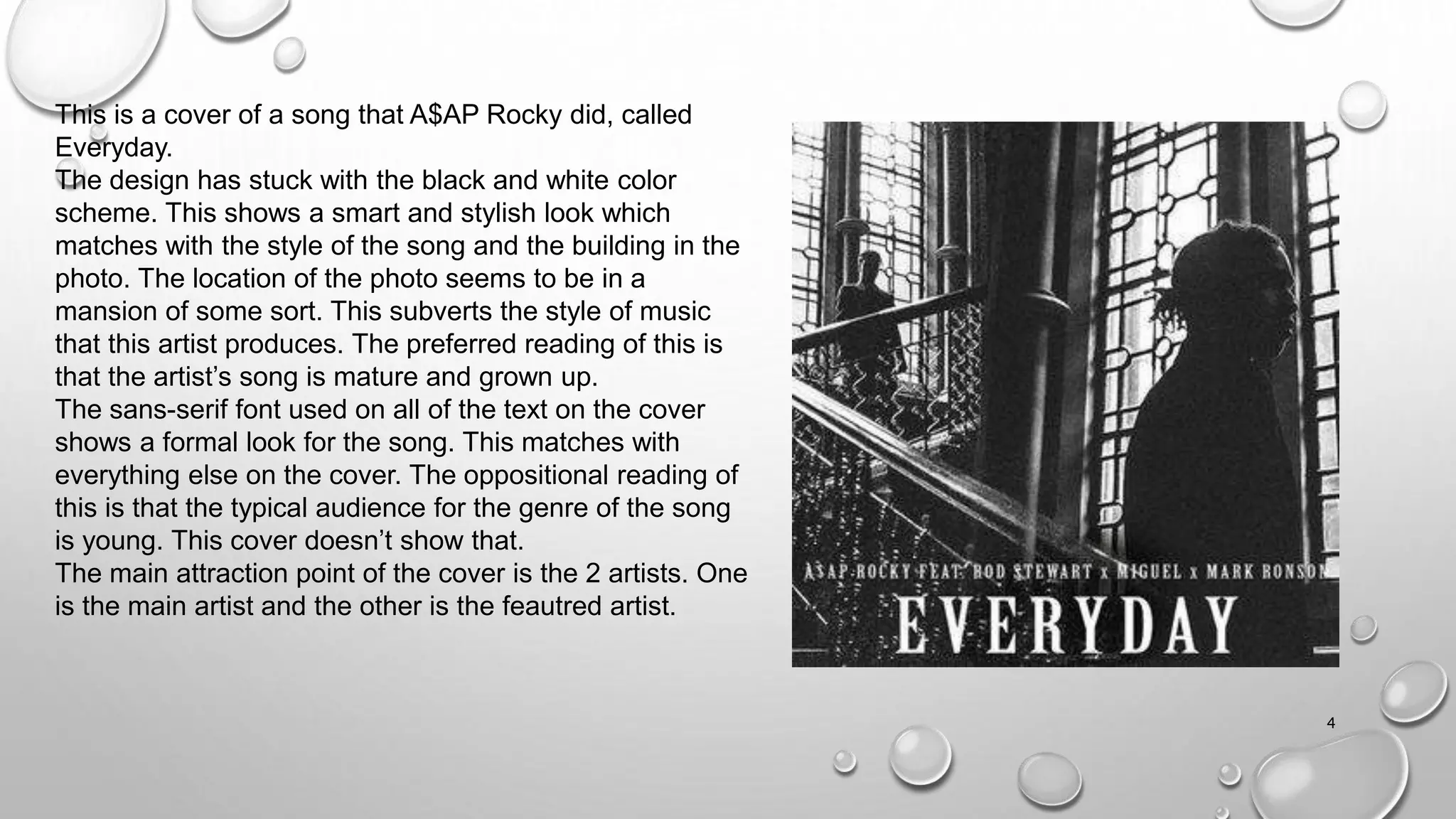
1) A$AP Rocky's "Everyday" cover features a black and white color scheme and photo location that subverts hip-hop styles to convey a mature, grown up song.
2) J. Cole's "Forest Hills Drive" uses varied colors that depart from typical hip-hop aesthetics to subvert genre stereotypes. It also features the artist looking away atypically for the genre.
3) Overall, the document discusses visual design elements, intended meanings, and how some covers conform to or oppose typical expectations for the hip-hop genre.