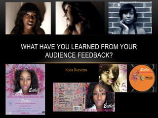
Kuda Ruzvidzo received feedback on several elements of their music video project.
For the narrative, most audience members understood the concept but some were confused by the ending. For the lyrics, people understood the theme of sadness and could connect them to the visuals.
The video effectively used flashbacks but some lighting effects made it too dark. Technical quality of the camera was also an issue.
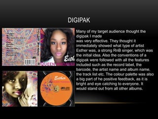
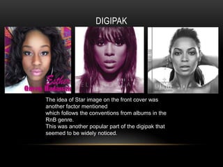
The digipak design successfully portrayed the artist as R&B and followed conventions. Color and the star image on the cover received positive comments.
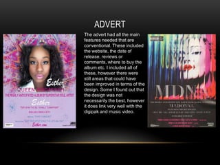
The advert included standard information but could be improved design-wise. Overall, the project followed conventions with some areas for quality and clarity improvements noted.