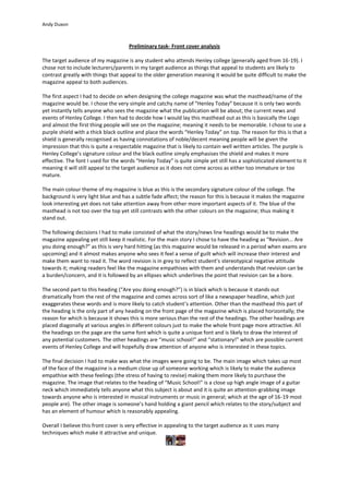
1. Preliminary task- Front cover analysis<br />The target audience of my magazine is any student who attends Henley college (generally aged from 16-19). I chose not to include lecturers/parents in my target audience as things that appeal to students are likely to contrast greatly with things that appeal to the older generation meaning it would be quite difficult to make the magazine appeal to both audiences. <br />The first aspect I had to decide on when designing the college magazine was what the masthead/name of the magazine would be. I chose the very simple and catchy name of “Henley Today” because it is only two words yet instantly tells anyone who sees the magazine what the publication will be about; the current news and events of Henley College. I then had to decide how I would lay this masthead out as this is basically the Logo and almost the first thing people will see on the magazine; meaning it needs to be memorable. I chose to use a purple shield with a thick black outline and place the words “Henley Today” on top. The reason for this is that a shield is generally recognised as having connotations of noble/decent meaning people will be given the impression that this is quite a respectable magazine that is likely to contain well written articles. The purple is Henley College’s signature colour and the black outline simply emphasises the shield and makes it more effective. The font I used for the words “Henley Today” is quite simple yet still has a sophisticated element to it meaning it will still appeal to the target audience as it does not come across as either too immature or too mature. <br />The main colour theme of my magazine is blue as this is the secondary signature colour of the college. The background is very light blue and has a subtle fade affect; the reason for this is because it makes the magazine look interesting yet does not take attention away from other more important aspects of it. The blue of the masthead is not too over the top yet still contrasts with the other colours on the magazine; thus making it stand out. <br />The following decisions I had to make consisted of what the story/news line headings would be to make the magazine appealing yet still keep it realistic. For the main story I chose to have the heading as “Revision... Are you doing enough?” as this is very hard hitting (as this magazine would be released in a period when exams are upcoming) and it almost makes anyone who sees it feel a sense of guilt which will increase their interest and make them want to read it. The word revision is in grey to reflect student’s stereotypical negative attitude towards it; making readers feel like the magazine empathises with them and understands that revision can be a burden/concern, and it is followed by an ellipses which underlines the point that revision can be a bore. <br />The second part to this heading (“Are you doing enough?”) is in black which is because it stands out dramatically from the rest of the magazine and comes across sort of like a newspaper headline, which just exaggerates these words and is more likely to catch student’s attention. Other than the masthead this part of the heading is the only part of any heading on the front page of the magazine which is placed horizontally; the reason for which is because it shows this is more serious than the rest of the headings. The other headings are placed diagonally at various angles in different colours just to make the whole front page more attractive. All the headings on the page are the same font which is quite a unique font and is likely to draw the interest of any potential customers. The other headings are “music school!” and “stationary!” which are possible current events of Henley College and will hopefully draw attention of anyone who is interested in these topics. <br />The final decision I had to make was what the images were going to be. The main image which takes up most of the face of the magazine is a medium close up of someone working which is likely to make the audience empathise with these feelings (the stress of having to revise) making them more likely to purchase the magazine. The image that relates to the heading of “Music School!” is a close up high angle image of a guitar neck which immediately tells anyone what this subject is about and it is quite an attention-grabbing image towards anyone who is interested in musical instruments or music in general; which at the age of 16-19 most people are). The other image is someone’s hand holding a giant pencil which relates to the story/subject and has an element of humour which is reasonably appealing. <br />Overall I believe this front cover is very effective in appealing to the target audience as it uses many techniques which make it attractive and unique.<br />