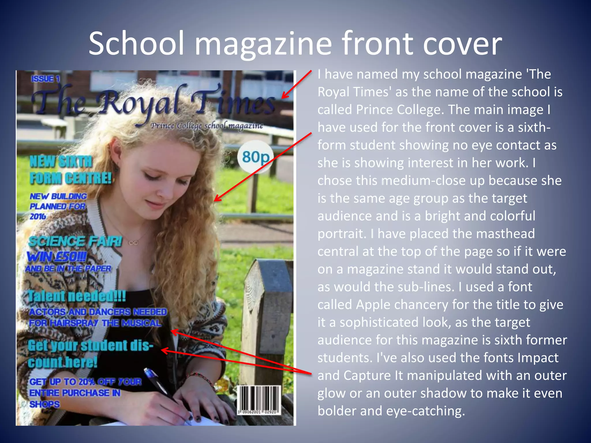
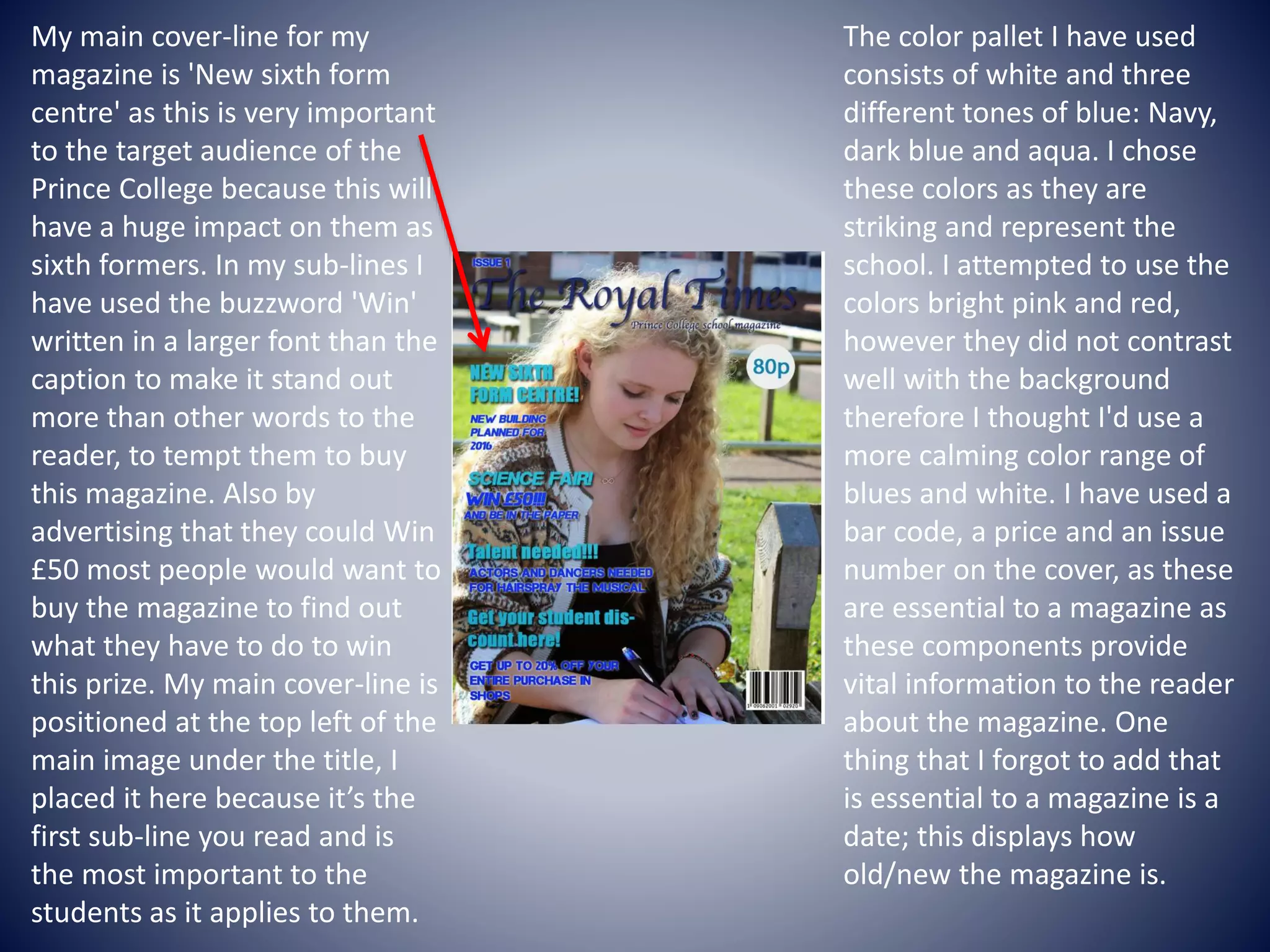
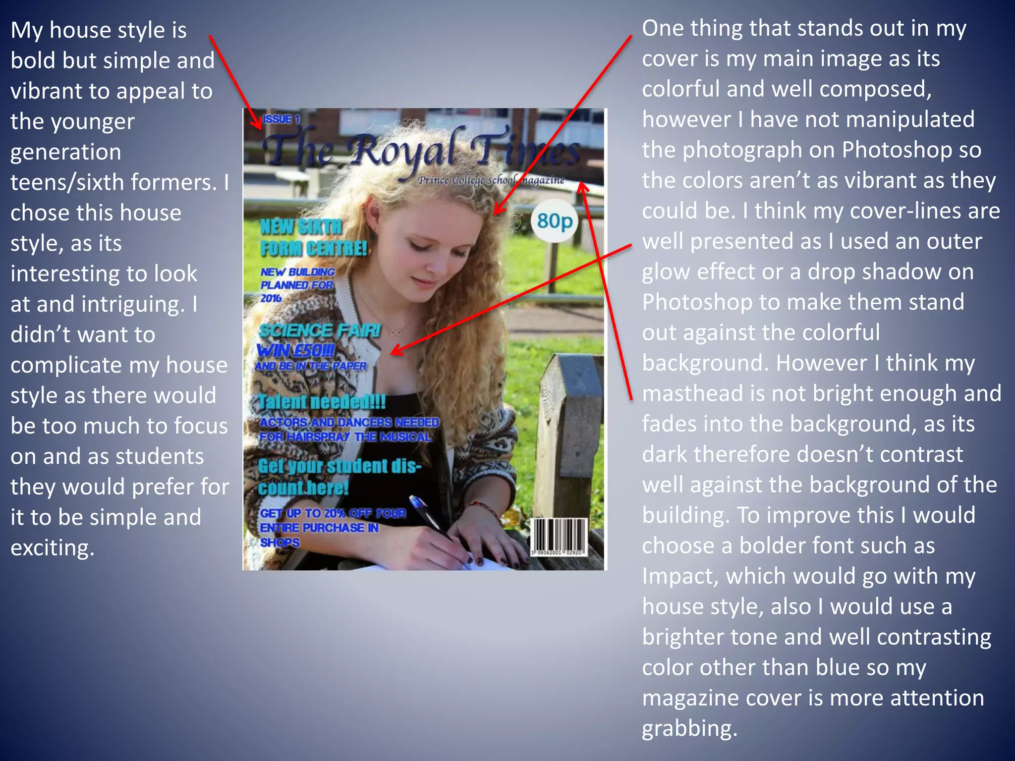
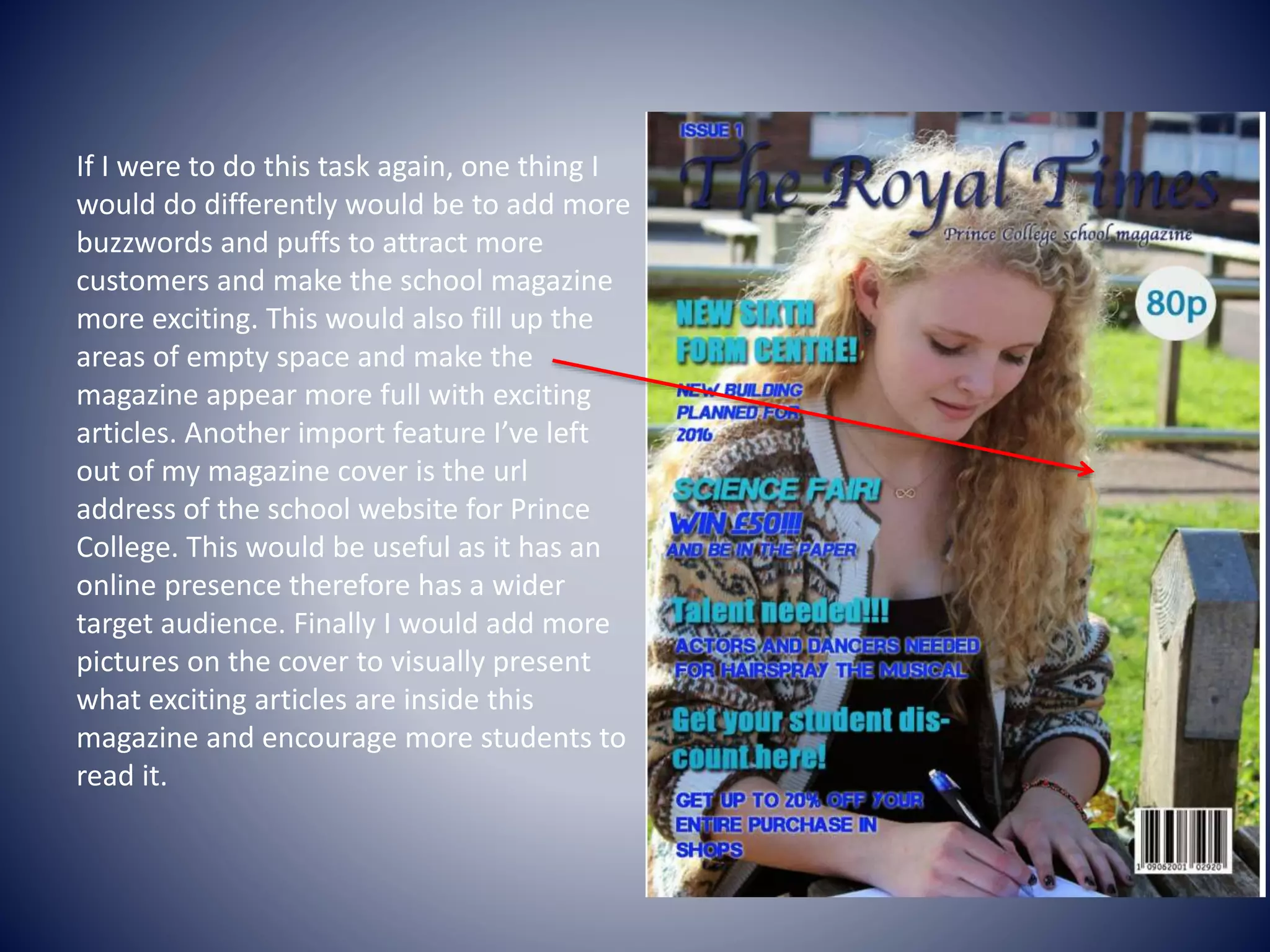
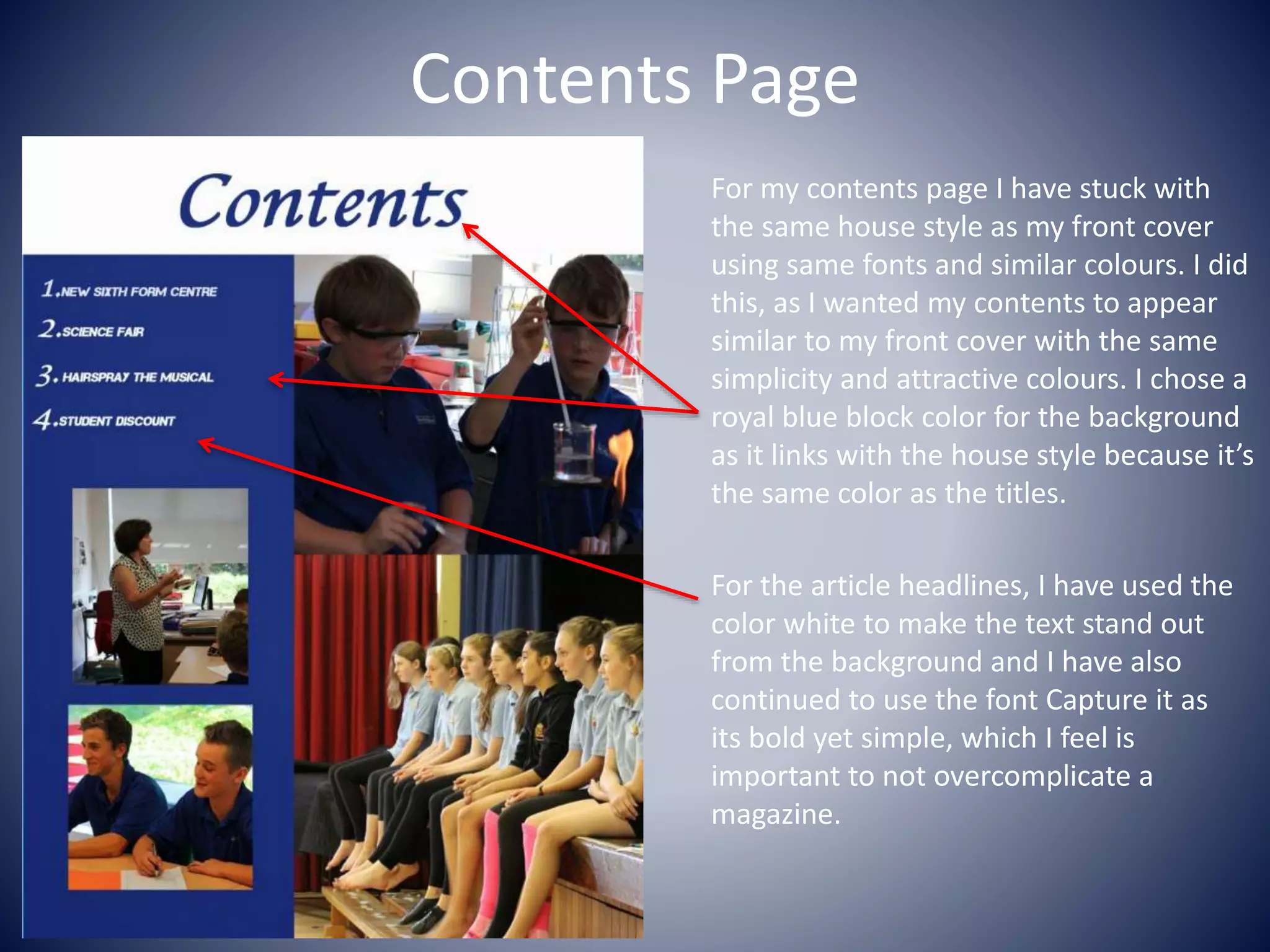
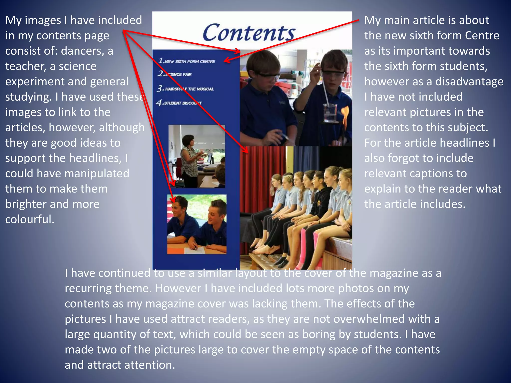
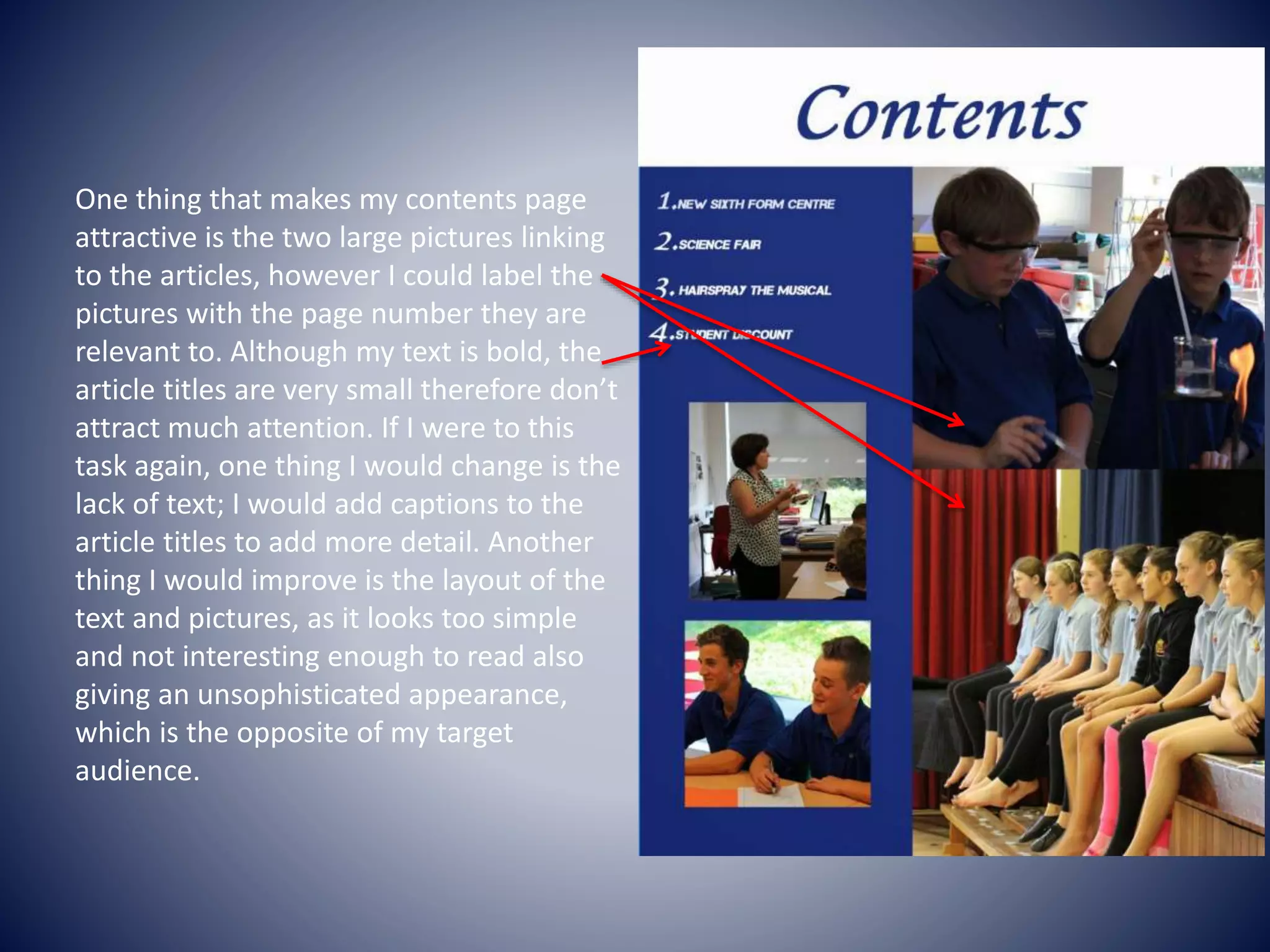
Preliminary Task
Amber Gardner
Preliminary exercise: using DPT and an image
manipulation program, produce the front page of a new
school/college magazine, featuring a photograph of a student in
medium close-up plus some appropriately laid-out text and a
masthead. Additionally candidates must produce a DPT mock-up
of the layout of the contents page to demonstrate their grasp of
the program.
School magazine front cover
I have named my school magazine 'The
Royal Times' as the name of the school is
called Prince College. The main image I
have used for the front cover is a sixth-
form student showing no eye contact as
she is showing interest in her work. I
chose this medium-close up because she
is the same age group as the target
audience and is a bright and colorful
portrait. I have placed the masthead
central at the top of the page so if it were
on a magazine stand it would stand out,
as would the sub-lines. I used a font
called Apple chancery for the title to give
it a sophisticated look, as the target
audience for this magazine is sixth former
students. I've also used the fonts Impact
and Capture It manipulated with an outer
glow or an outer shadow to make it even
bolder and eye-catching.
The color pallet I have used
consists of white and three
different tones of blue: Navy,
dark blue and aqua. I chose
these colors as they are
striking and represent the
school. I attempted to use the
colors bright pink and red,
however they did not contrast
well with the background
therefore I thought I'd use a
more calming color range of
blues and white. I have used a
bar code, a price and an issue
number on the cover, as these
are essential to a magazine as
these components provide
vital information to the reader
about the magazine. One
thing that I forgot to add that
is essential to a magazine is a
date; this displays how
old/new the magazine is.
My main cover-line for my
magazine is 'New sixth form
centre' as this is very important
to the target audience of the
Prince College because this will
have a huge impact on them as
sixth formers. In my sub-lines I
have used the buzzword 'Win'
written in a larger font than the
caption to make it stand out
more than other words to the
reader, to tempt them to buy
this magazine. Also by
advertising that they could Win
£50 most people would want to
buy the magazine to find out
what they have to do to win
this prize. My main cover-line is
positioned at the top left of the
main image under the title, I
placed it here because it’s the
first sub-line you read and is
the most important to the
students as it applies to them.
My house style is
bold but simple and
vibrant to appeal to
the younger
generation
teens/sixth formers. I
chose this house
style, as its
interesting to look
at and intriguing. I
didn’t want to
complicate my house
style as there would
be too much to focus
on and as students
they would prefer for
it to be simple and
exciting.
One thing that stands out in my
cover is my main image as its
colorful and well composed,
however I have not manipulated
the photograph on Photoshop so
the colors aren’t as vibrant as they
could be. I think my cover-lines are
well presented as I used an outer
glow effect or a drop shadow on
Photoshop to make them stand
out against the colorful
background. However I think my
masthead is not bright enough and
fades into the background, as its
dark therefore doesn’t contrast
well against the background of the
building. To improve this I would
choose a bolder font such as
Impact, which would go with my
house style, also I would use a
brighter tone and well contrasting
color other than blue so my
magazine cover is more attention
grabbing.
If I were to do this task again, one thing I
would do differently would be to add more
buzzwords and puffs to attract more
customers and make the school magazine
more exciting. This would also fill up the
areas of empty space and make the
magazine appear more full with exciting
articles. Another import feature I’ve left
out of my magazine cover is the url
address of the school website for Prince
College. This would be useful as it has an
online presence therefore has a wider
target audience. Finally I would add more
pictures on the cover to visually present
what exciting articles are inside this
magazine and encourage more students to
read it.
Contents Page
For my contents page I have stuck with
the same house style as my front cover
using same fonts and similar colours. I did
this, as I wanted my contents to appear
similar to my front cover with the same
simplicity and attractive colours. I chose a
royal blue block color for the background
as it links with the house style because it’s
the same color as the titles.
For the article headlines, I have used the
color white to make the text stand out
from the background and I have also
continued to use the font Capture it as
its bold yet simple, which I feel is
important to not overcomplicate a
magazine.
My main article is about
the new sixth form Centre
as its important towards
the sixth form students,
however as a disadvantage
I have not included
relevant pictures in the
contents to this subject.
For the article headlines I
also forgot to include
relevant captions to
explain to the reader what
the article includes.
My images I have included
in my contents page
consist of: dancers, a
teacher, a science
experiment and general
studying. I have used these
images to link to the
articles, however, although
they are good ideas to
support the headlines, I
could have manipulated
them to make them
brighter and more
colourful.
I have continued to use a similar layout to the cover of the magazine as a
recurring theme. However I have included lots more photos on my
contents as my magazine cover was lacking them. The effects of the
pictures I have used attract readers, as they are not overwhelmed with a
large quantity of text, which could be seen as boring by students. I have
made two of the pictures large to cover the empty space of the contents
and attract attention.
One thing that makes my contents page
attractive is the two large pictures linking
to the articles, however I could label the
pictures with the page number they are
relevant to. Although my text is bold, the
article titles are very small therefore don’t
attract much attention. If I were to this
task again, one thing I would change is the
lack of text; I would add captions to the
article titles to add more detail. Another
thing I would improve is the layout of the
text and pictures, as it looks too simple
and not interesting enough to read also
giving an unsophisticated appearance,
which is the opposite of my target
audience.

Preliminary task

  • 1.
    Preliminary Task Amber Gardner Preliminaryexercise: using DPT and an image manipulation program, produce the front page of a new school/college magazine, featuring a photograph of a student in medium close-up plus some appropriately laid-out text and a masthead. Additionally candidates must produce a DPT mock-up of the layout of the contents page to demonstrate their grasp of the program.
  • 2.
    School magazine frontcover I have named my school magazine 'The Royal Times' as the name of the school is called Prince College. The main image I have used for the front cover is a sixth- form student showing no eye contact as she is showing interest in her work. I chose this medium-close up because she is the same age group as the target audience and is a bright and colorful portrait. I have placed the masthead central at the top of the page so if it were on a magazine stand it would stand out, as would the sub-lines. I used a font called Apple chancery for the title to give it a sophisticated look, as the target audience for this magazine is sixth former students. I've also used the fonts Impact and Capture It manipulated with an outer glow or an outer shadow to make it even bolder and eye-catching.
  • 3.
    The color palletI have used consists of white and three different tones of blue: Navy, dark blue and aqua. I chose these colors as they are striking and represent the school. I attempted to use the colors bright pink and red, however they did not contrast well with the background therefore I thought I'd use a more calming color range of blues and white. I have used a bar code, a price and an issue number on the cover, as these are essential to a magazine as these components provide vital information to the reader about the magazine. One thing that I forgot to add that is essential to a magazine is a date; this displays how old/new the magazine is. My main cover-line for my magazine is 'New sixth form centre' as this is very important to the target audience of the Prince College because this will have a huge impact on them as sixth formers. In my sub-lines I have used the buzzword 'Win' written in a larger font than the caption to make it stand out more than other words to the reader, to tempt them to buy this magazine. Also by advertising that they could Win £50 most people would want to buy the magazine to find out what they have to do to win this prize. My main cover-line is positioned at the top left of the main image under the title, I placed it here because it’s the first sub-line you read and is the most important to the students as it applies to them.
  • 4.
    My house styleis bold but simple and vibrant to appeal to the younger generation teens/sixth formers. I chose this house style, as its interesting to look at and intriguing. I didn’t want to complicate my house style as there would be too much to focus on and as students they would prefer for it to be simple and exciting. One thing that stands out in my cover is my main image as its colorful and well composed, however I have not manipulated the photograph on Photoshop so the colors aren’t as vibrant as they could be. I think my cover-lines are well presented as I used an outer glow effect or a drop shadow on Photoshop to make them stand out against the colorful background. However I think my masthead is not bright enough and fades into the background, as its dark therefore doesn’t contrast well against the background of the building. To improve this I would choose a bolder font such as Impact, which would go with my house style, also I would use a brighter tone and well contrasting color other than blue so my magazine cover is more attention grabbing.
  • 5.
    If I wereto do this task again, one thing I would do differently would be to add more buzzwords and puffs to attract more customers and make the school magazine more exciting. This would also fill up the areas of empty space and make the magazine appear more full with exciting articles. Another import feature I’ve left out of my magazine cover is the url address of the school website for Prince College. This would be useful as it has an online presence therefore has a wider target audience. Finally I would add more pictures on the cover to visually present what exciting articles are inside this magazine and encourage more students to read it.
  • 6.
    Contents Page For mycontents page I have stuck with the same house style as my front cover using same fonts and similar colours. I did this, as I wanted my contents to appear similar to my front cover with the same simplicity and attractive colours. I chose a royal blue block color for the background as it links with the house style because it’s the same color as the titles. For the article headlines, I have used the color white to make the text stand out from the background and I have also continued to use the font Capture it as its bold yet simple, which I feel is important to not overcomplicate a magazine.
  • 7.
    My main articleis about the new sixth form Centre as its important towards the sixth form students, however as a disadvantage I have not included relevant pictures in the contents to this subject. For the article headlines I also forgot to include relevant captions to explain to the reader what the article includes. My images I have included in my contents page consist of: dancers, a teacher, a science experiment and general studying. I have used these images to link to the articles, however, although they are good ideas to support the headlines, I could have manipulated them to make them brighter and more colourful. I have continued to use a similar layout to the cover of the magazine as a recurring theme. However I have included lots more photos on my contents as my magazine cover was lacking them. The effects of the pictures I have used attract readers, as they are not overwhelmed with a large quantity of text, which could be seen as boring by students. I have made two of the pictures large to cover the empty space of the contents and attract attention.
  • 8.
    One thing thatmakes my contents page attractive is the two large pictures linking to the articles, however I could label the pictures with the page number they are relevant to. Although my text is bold, the article titles are very small therefore don’t attract much attention. If I were to this task again, one thing I would change is the lack of text; I would add captions to the article titles to add more detail. Another thing I would improve is the layout of the text and pictures, as it looks too simple and not interesting enough to read also giving an unsophisticated appearance, which is the opposite of my target audience.