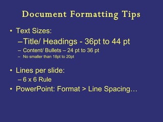
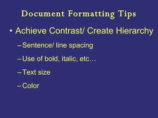
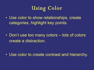
The document provides guidelines for creating effective PowerPoint presentations, including:
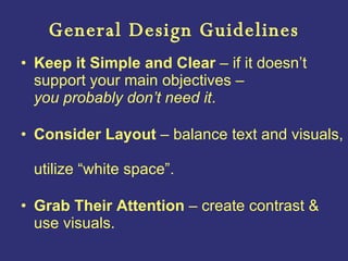
- Designing slides for clarity and simplicity, balancing text and visuals, and grabbing audience attention.
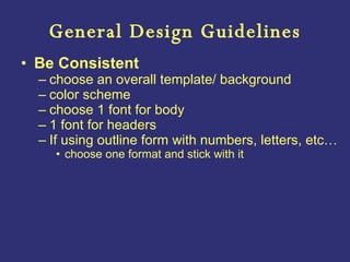
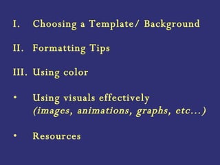
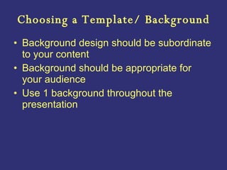
- Choosing consistent templates and backgrounds that support readability and do not distract from content.
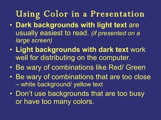
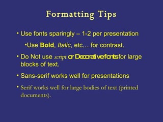
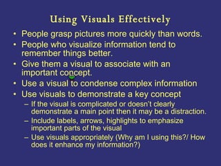
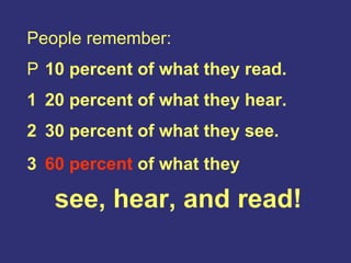
- Using fonts, formatting, colors and visuals like images and graphs to emphasize key points and aid recall.
- Incorporating visuals strategically to enhance understanding when they clearly support the content.


![6 Presentation Guidelines[1]](https://cdn.slidesharecdn.com/ss_thumbnails/6presentationguidelines1-1219184269613460-8-thumbnail.jpg?width=640&height=640&fit=bounds)


