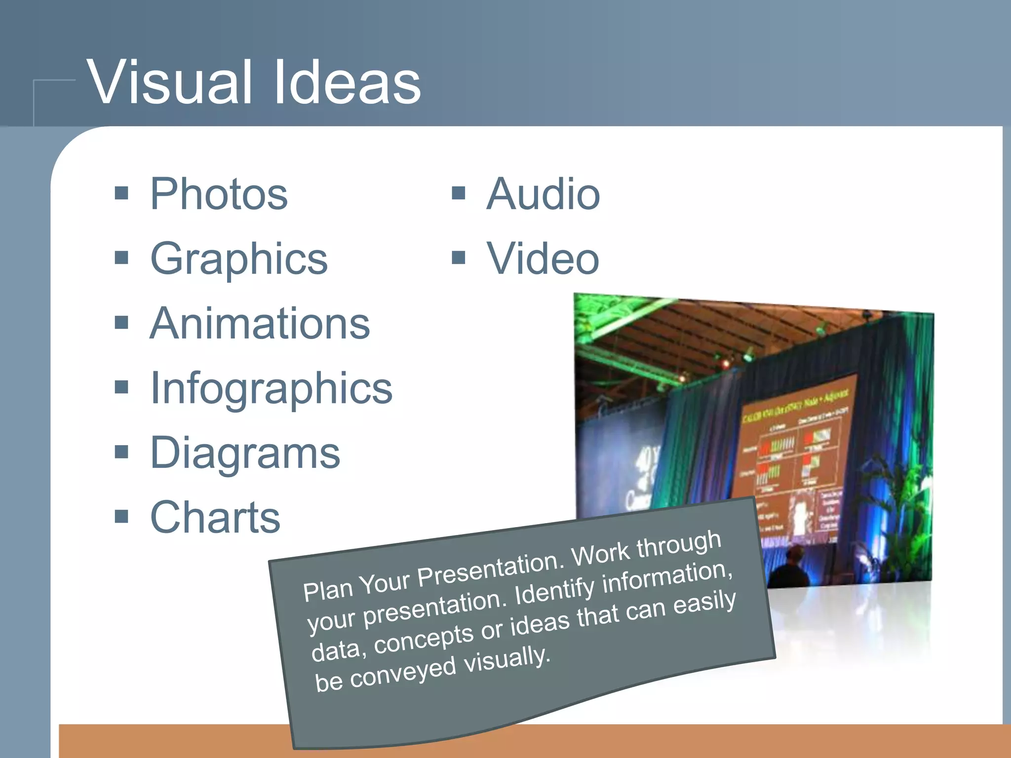
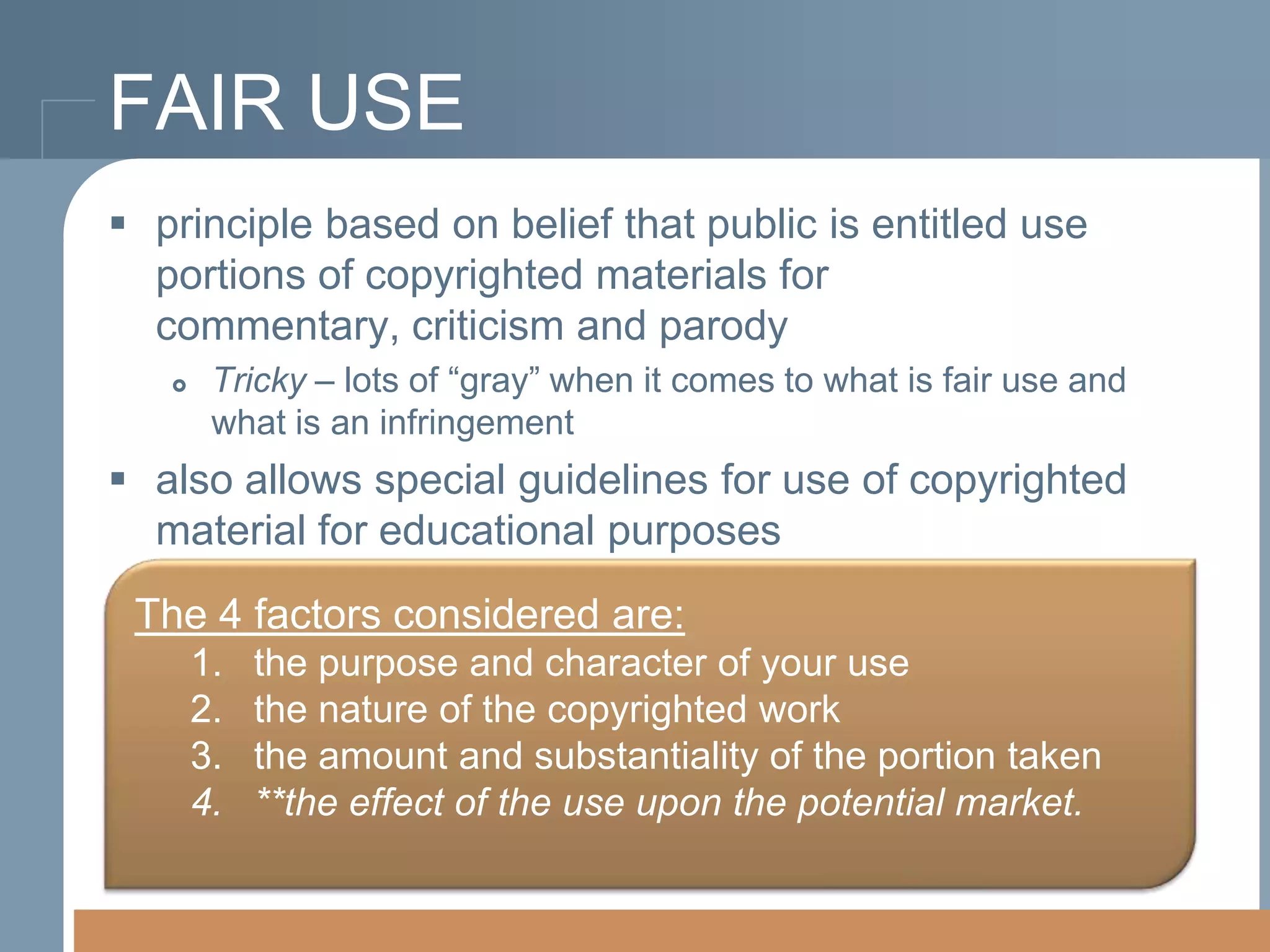
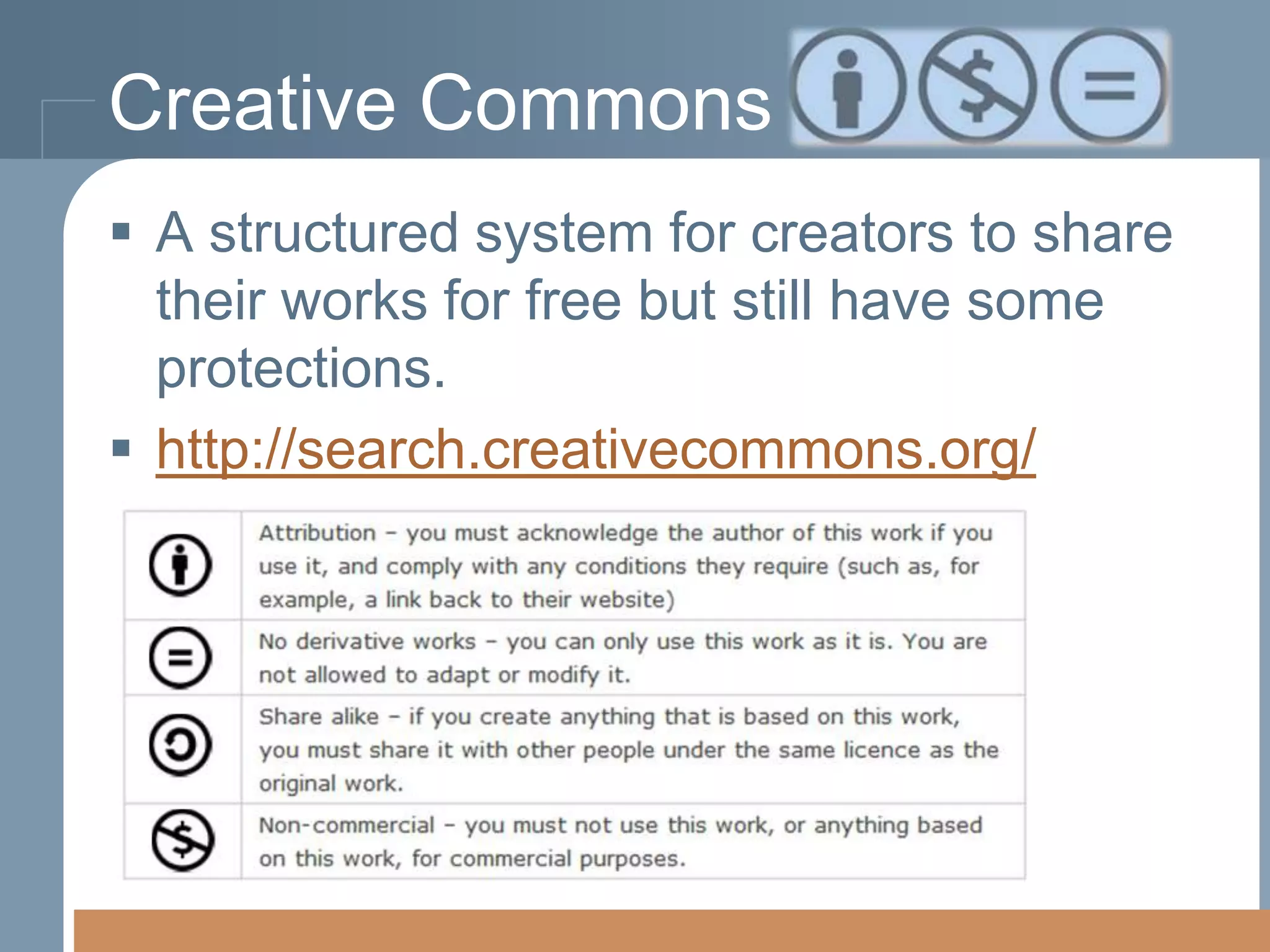
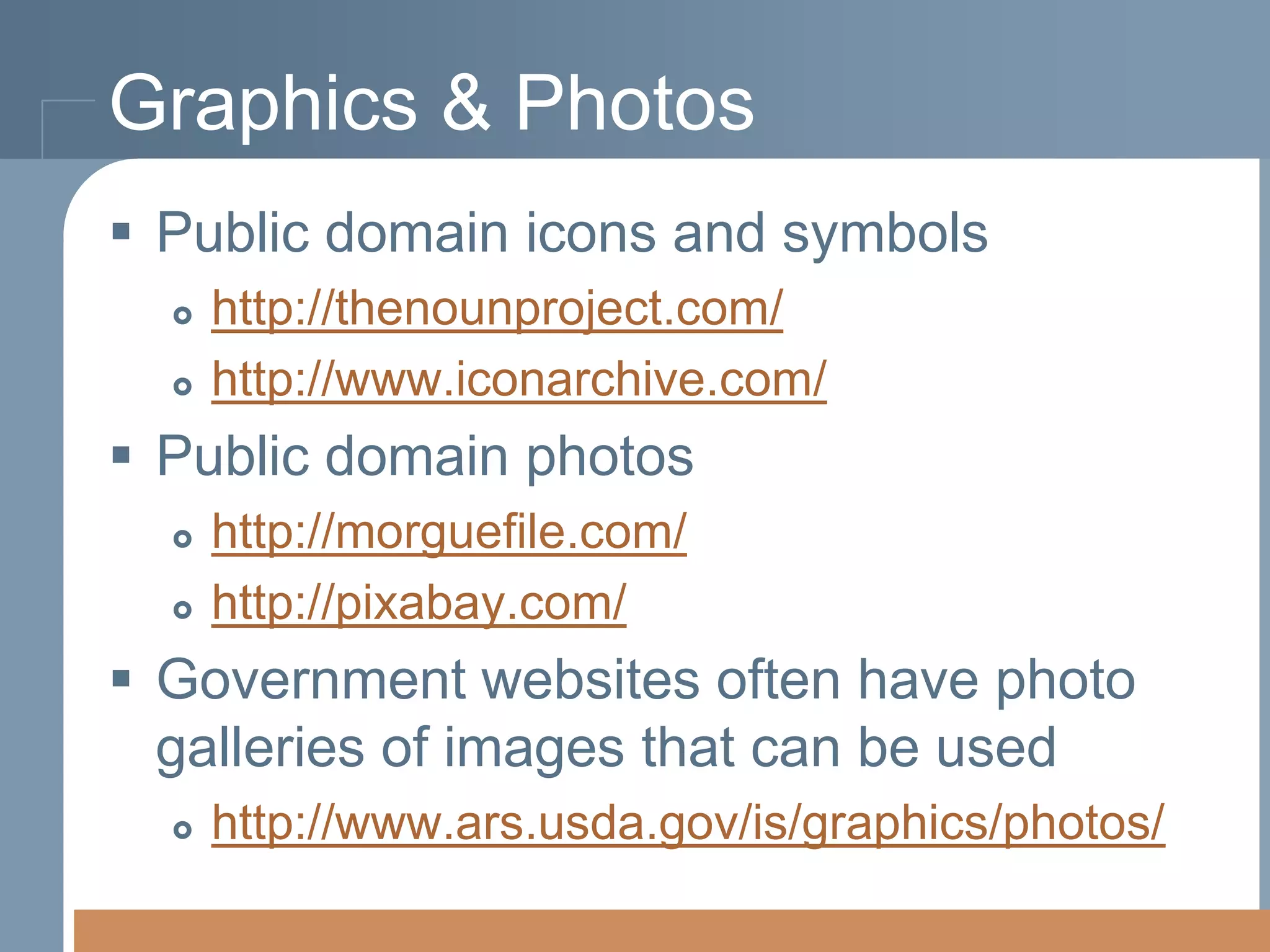
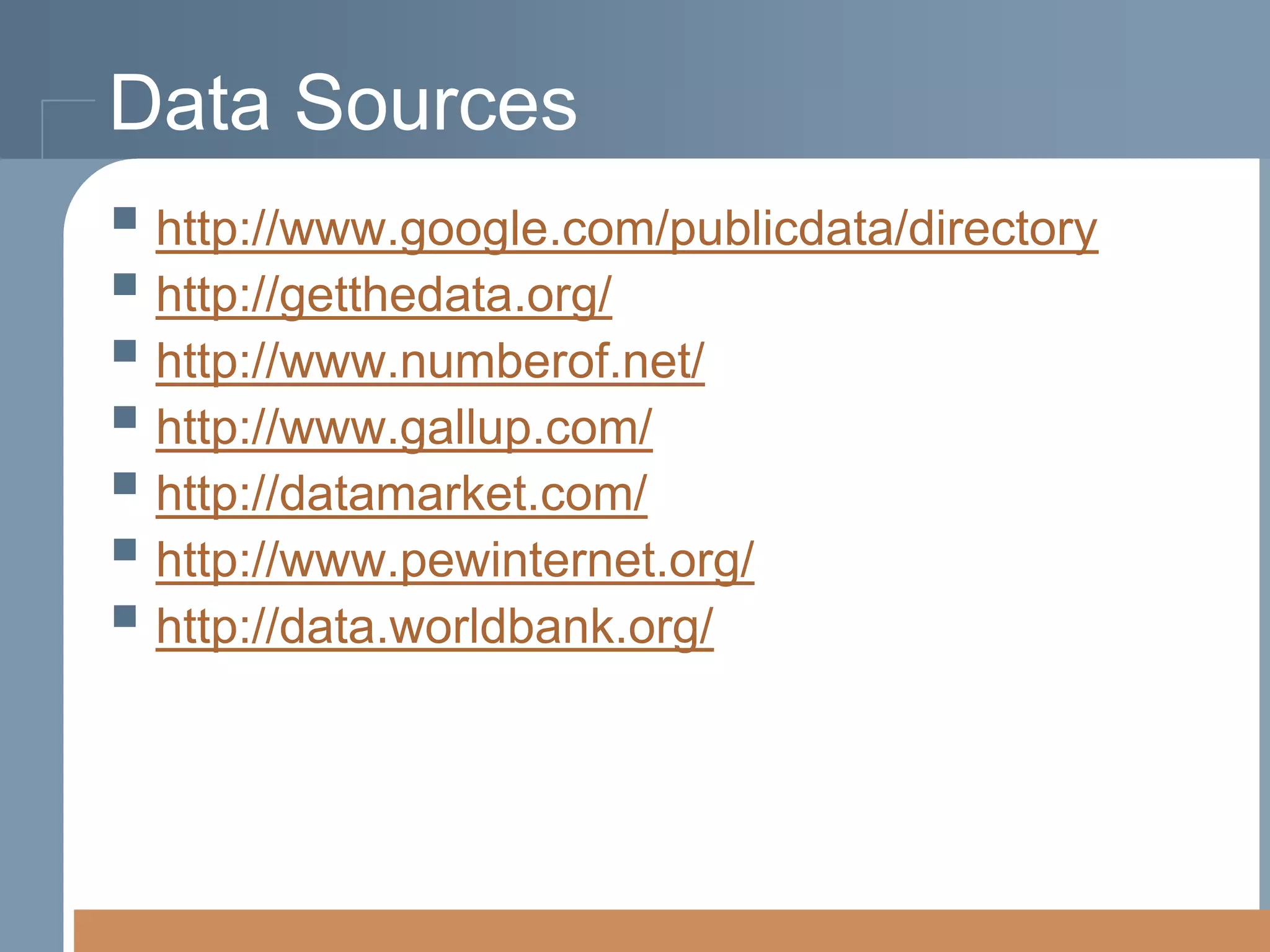
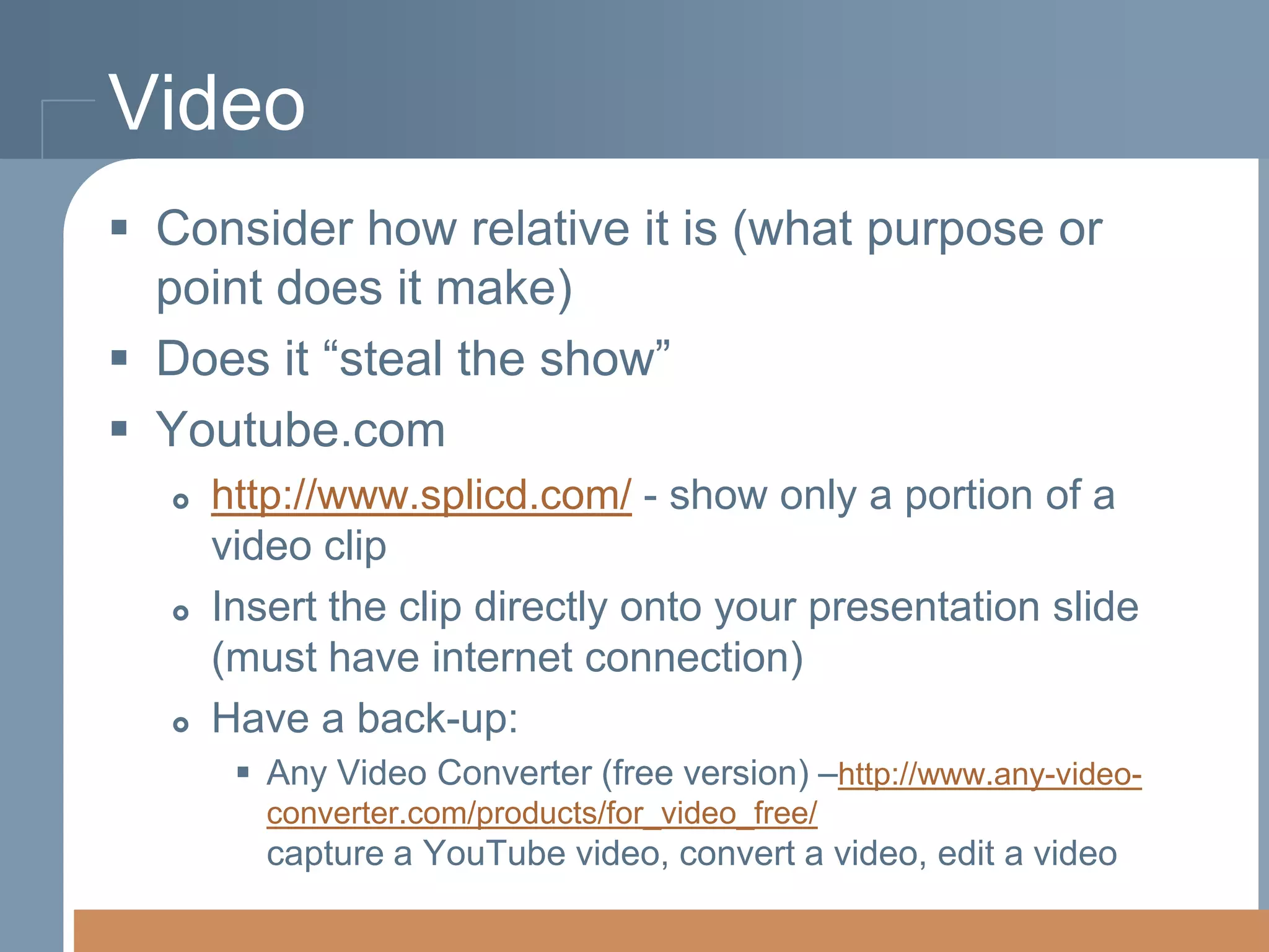
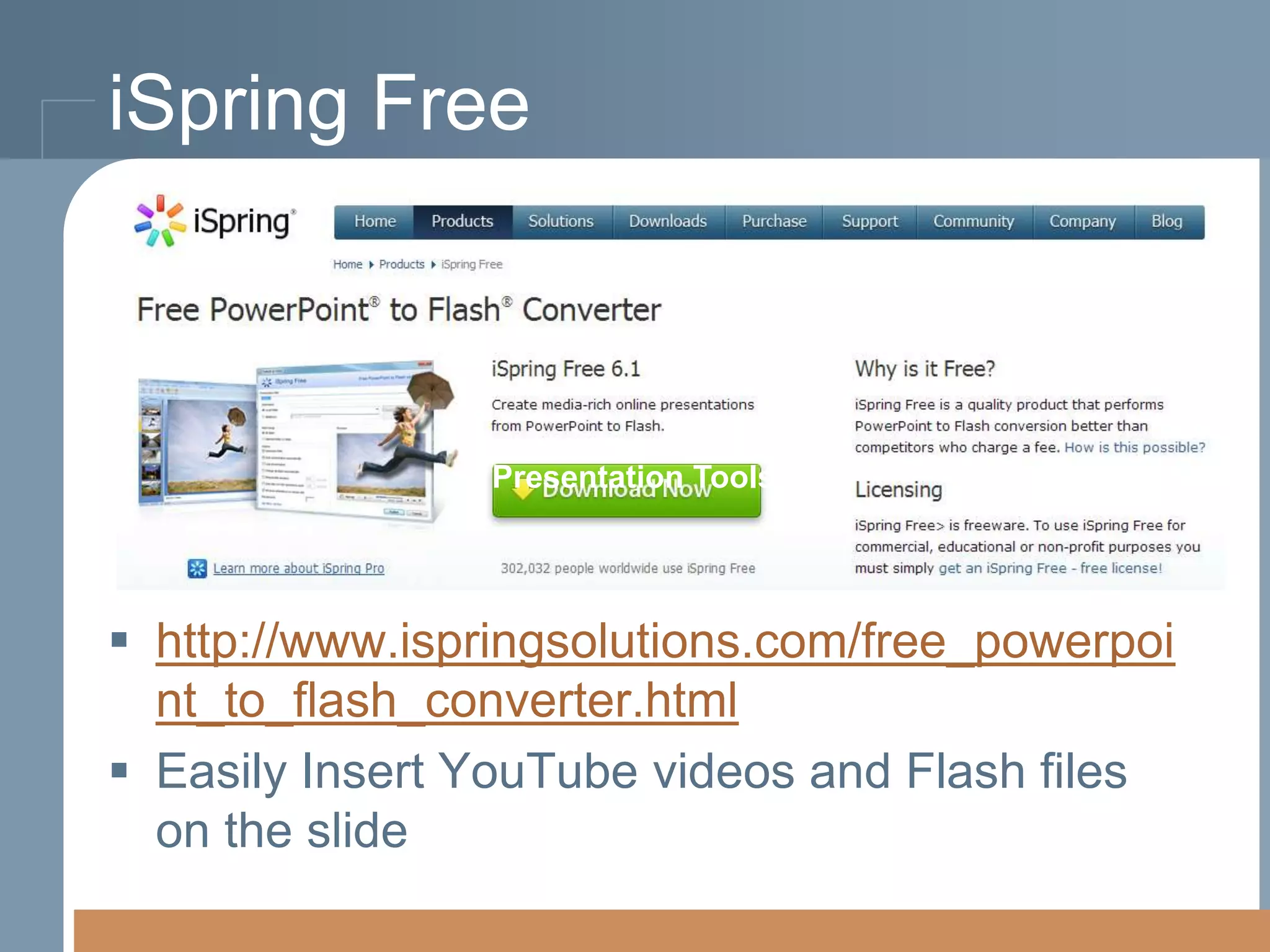
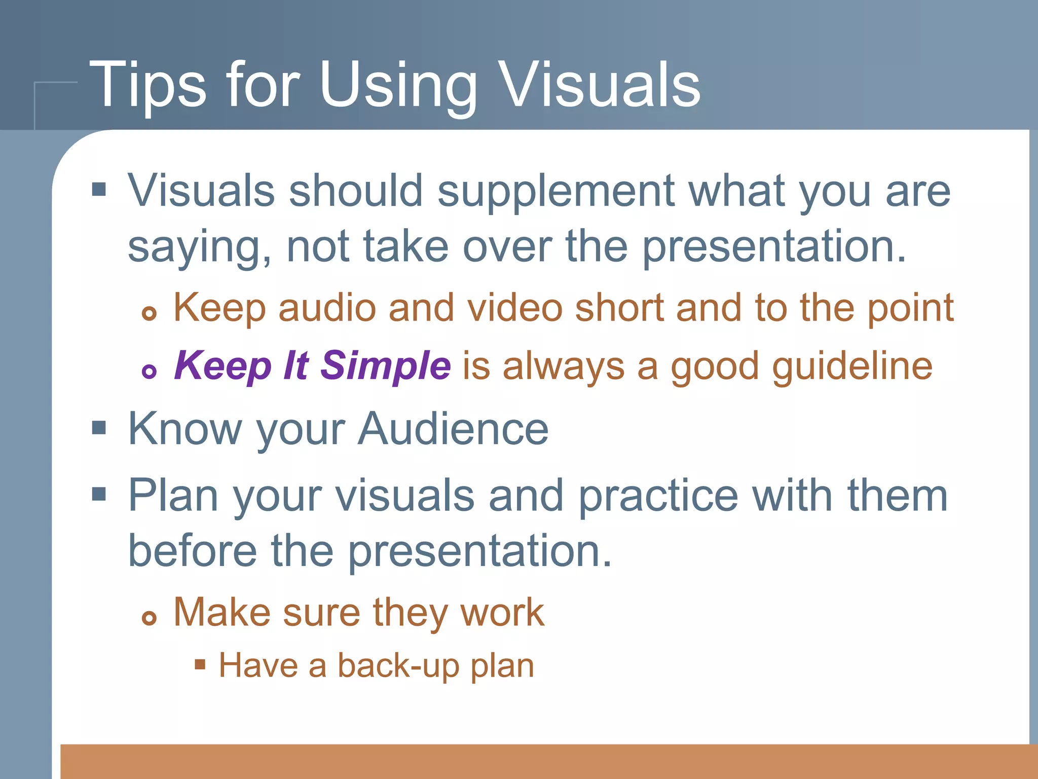
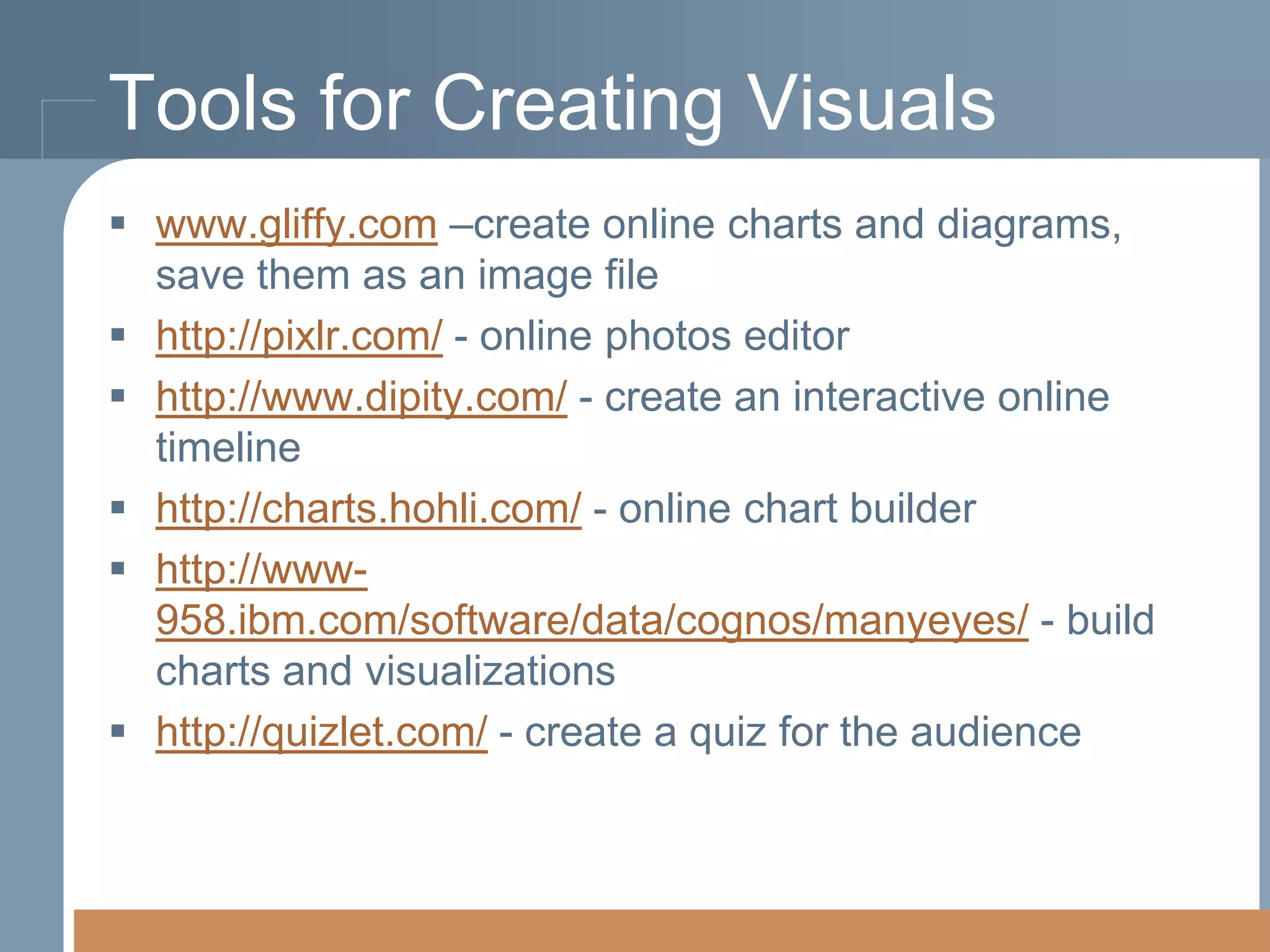
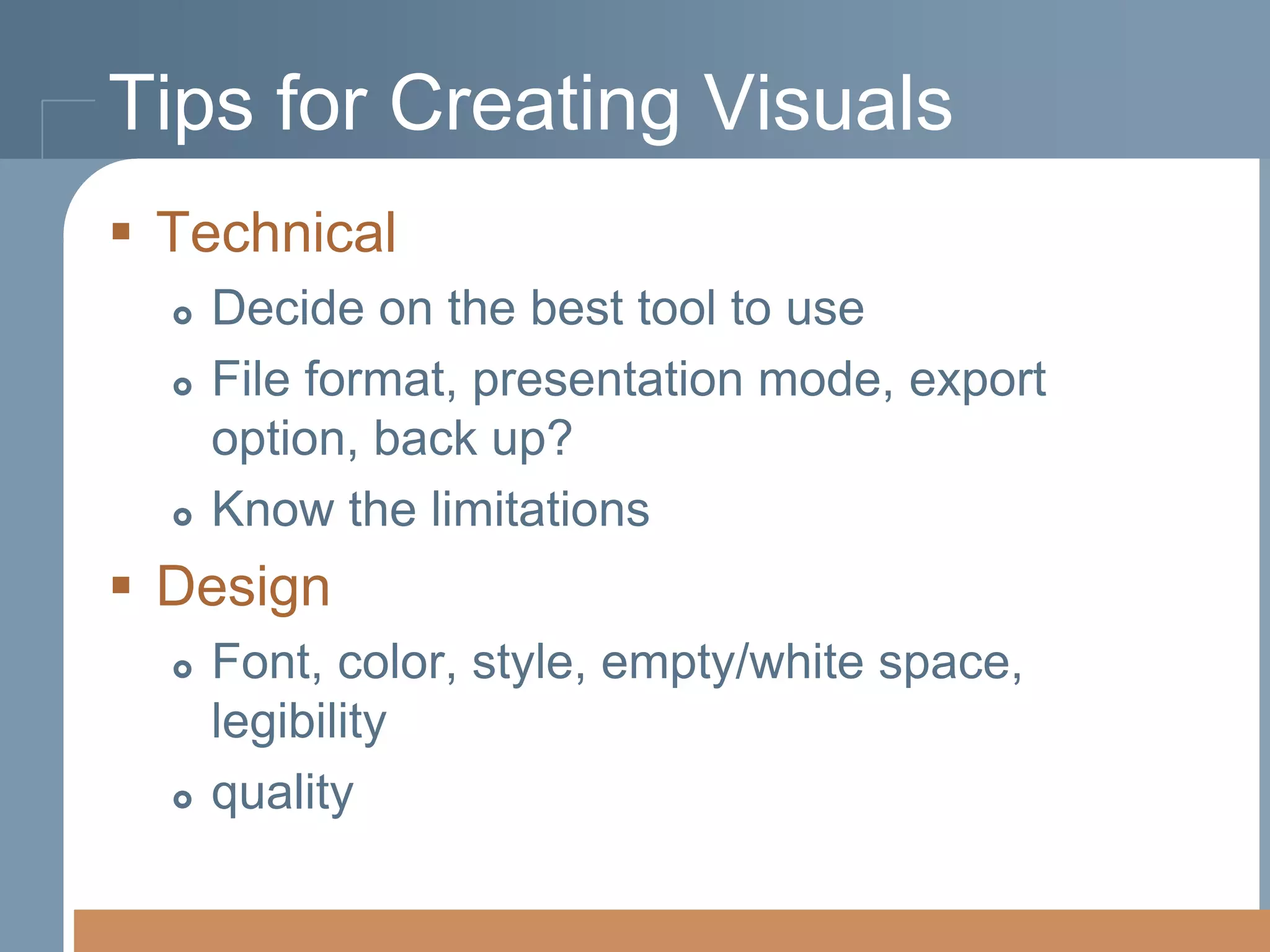
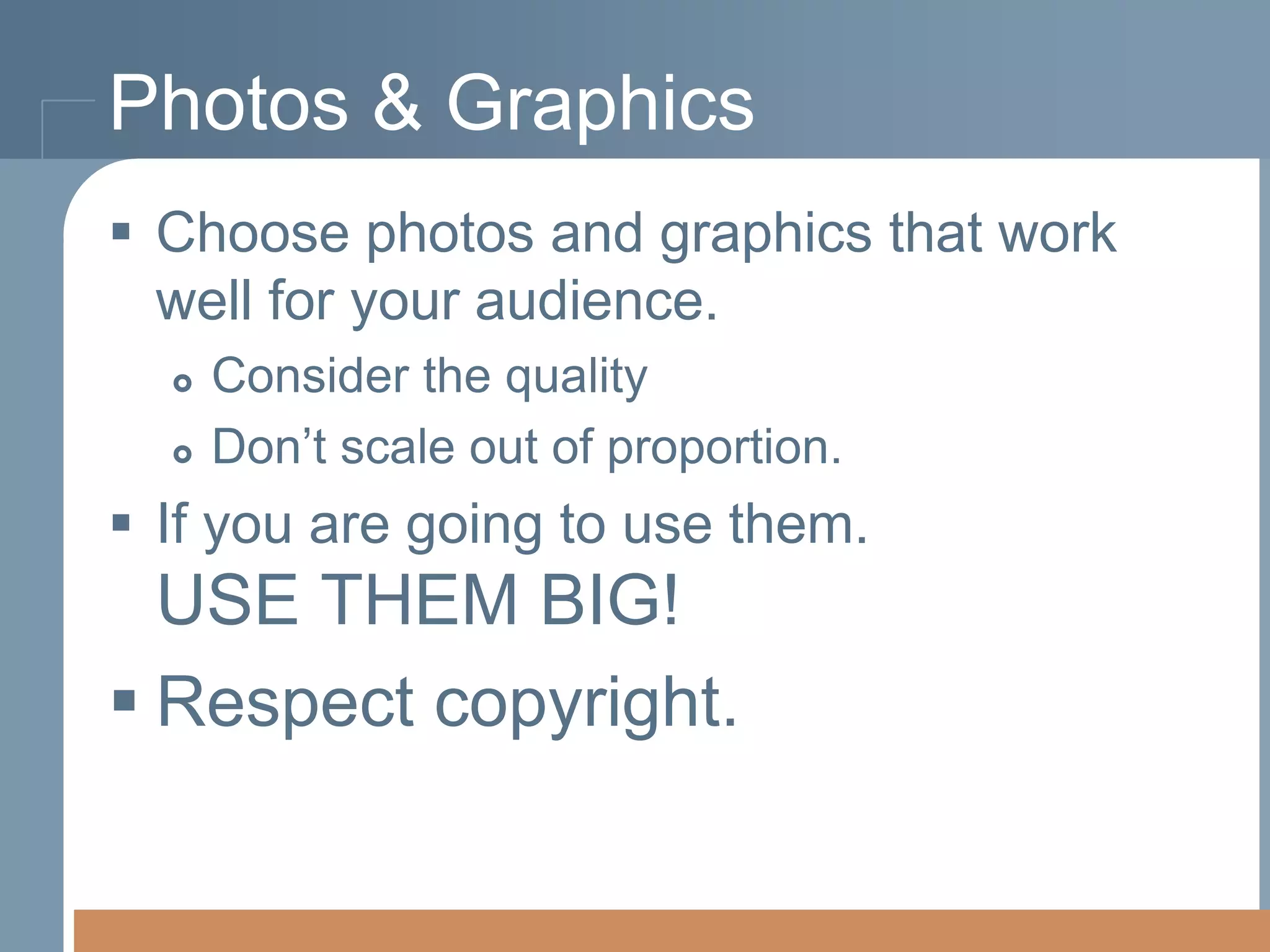
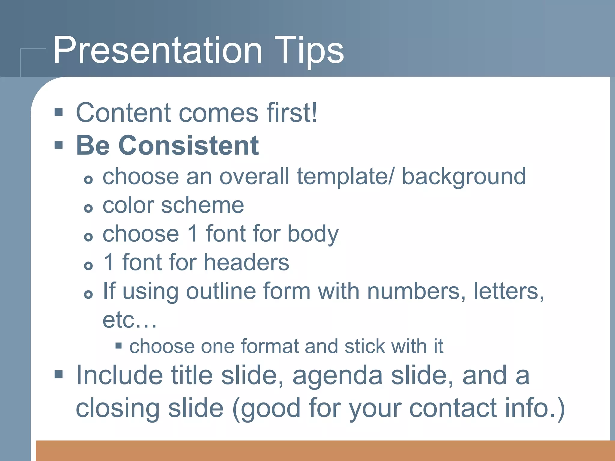
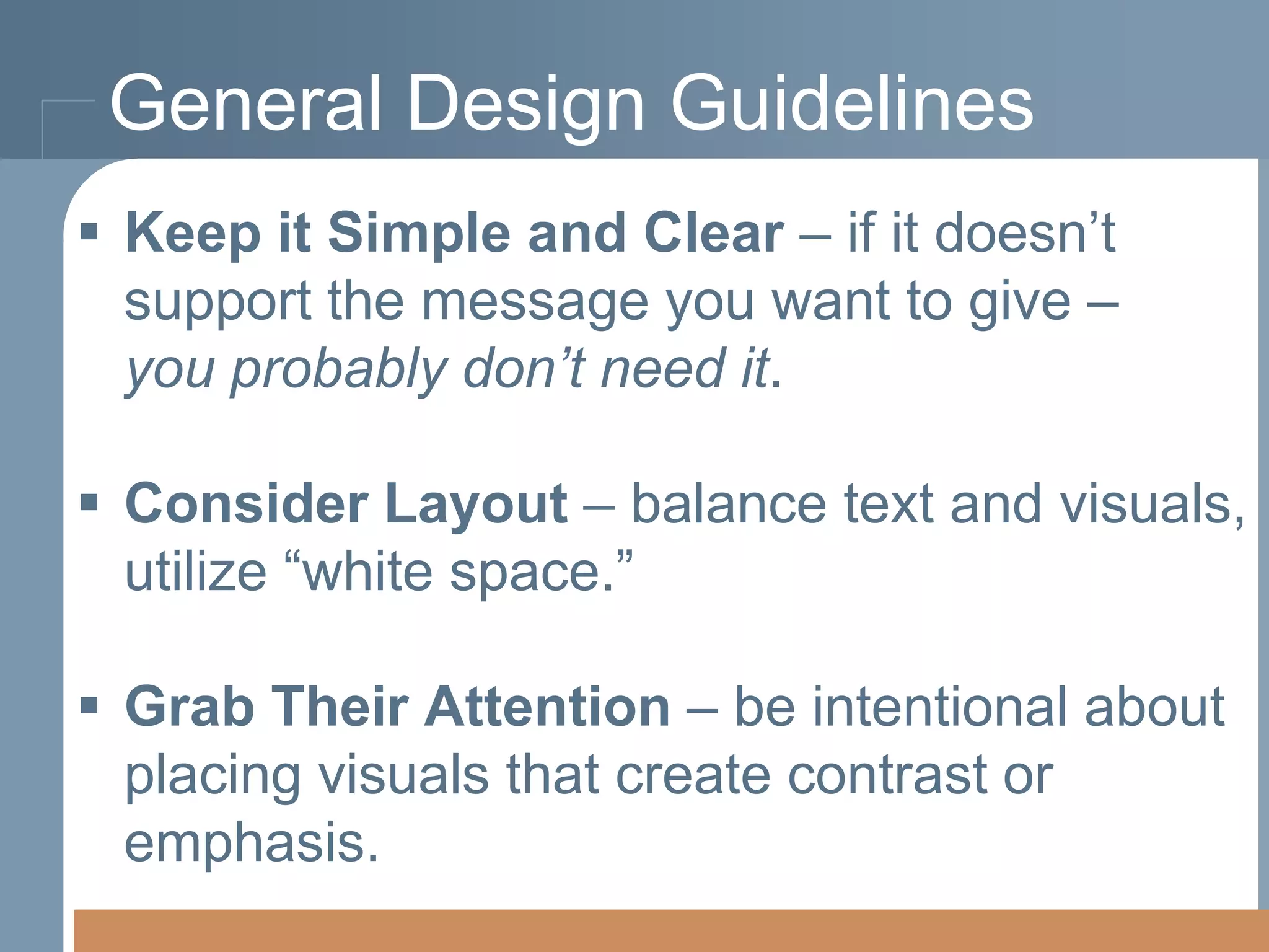
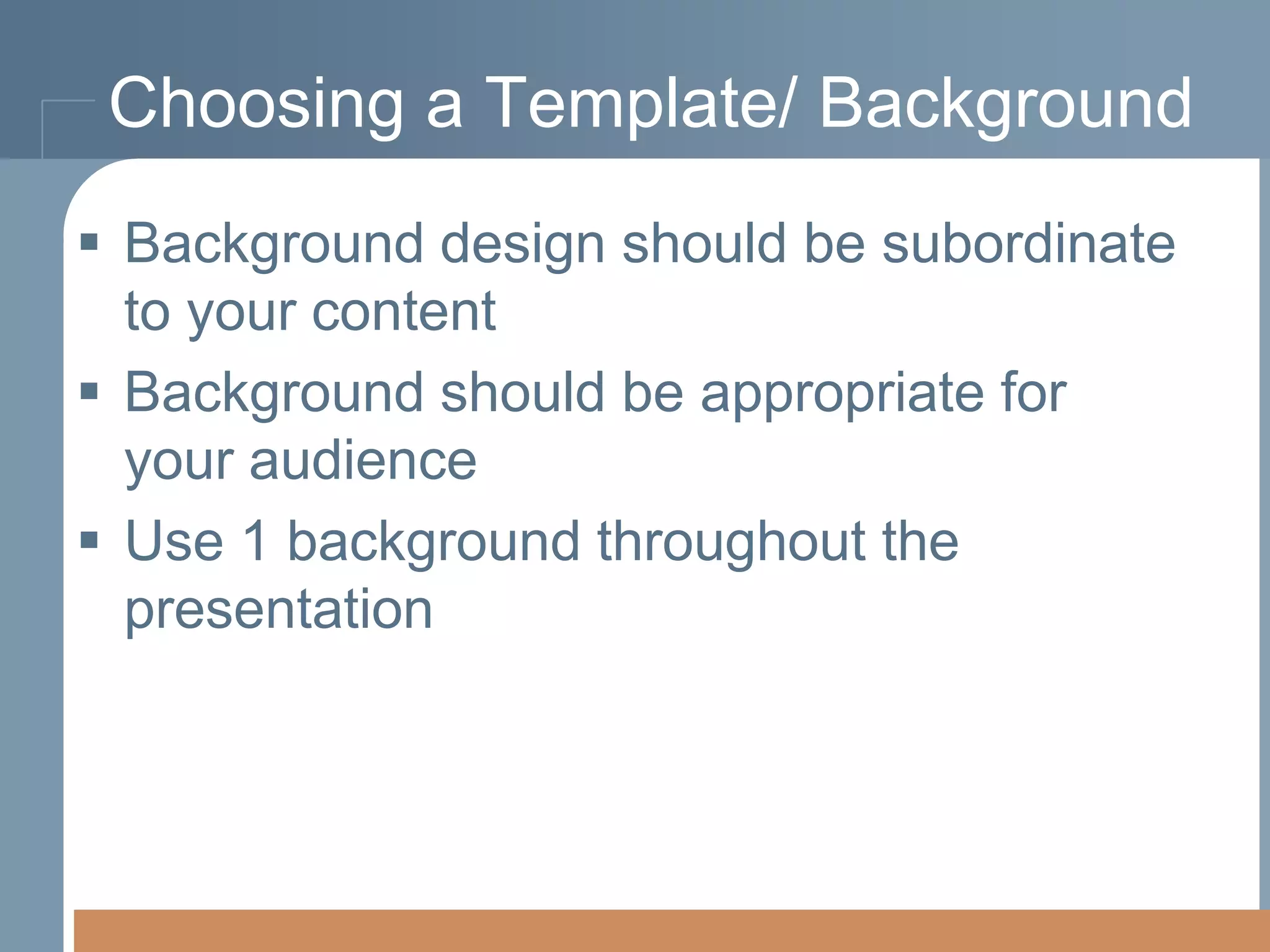
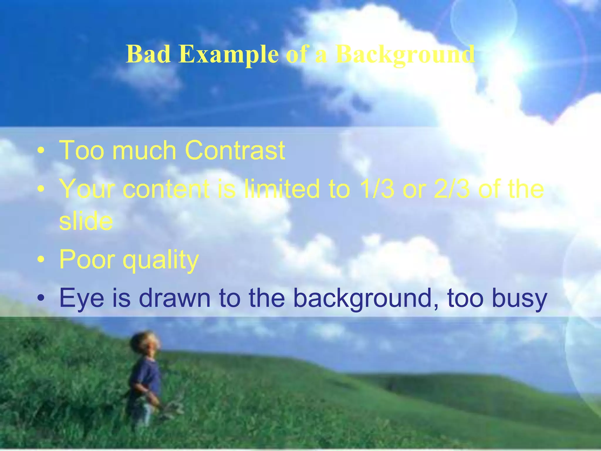
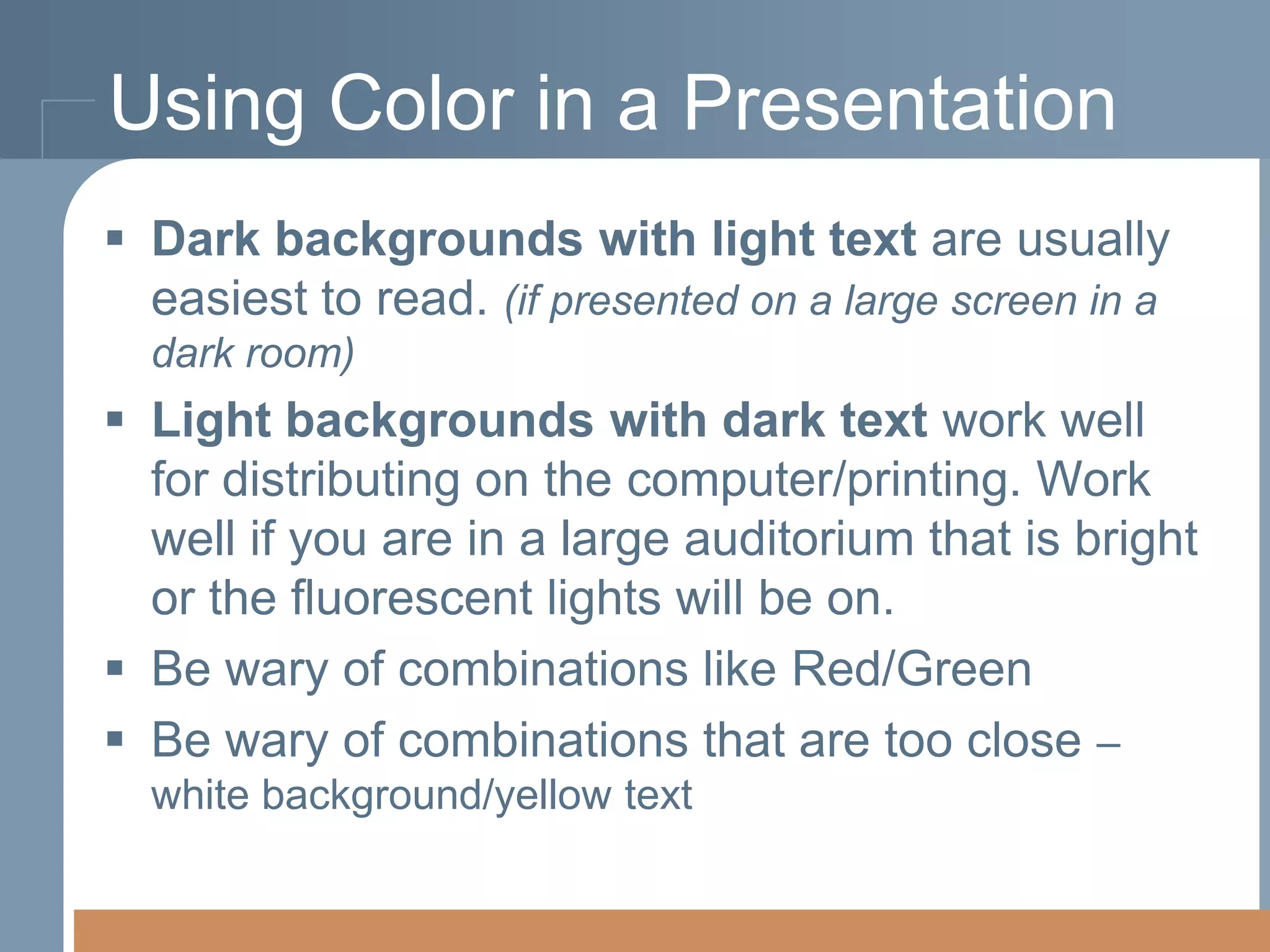
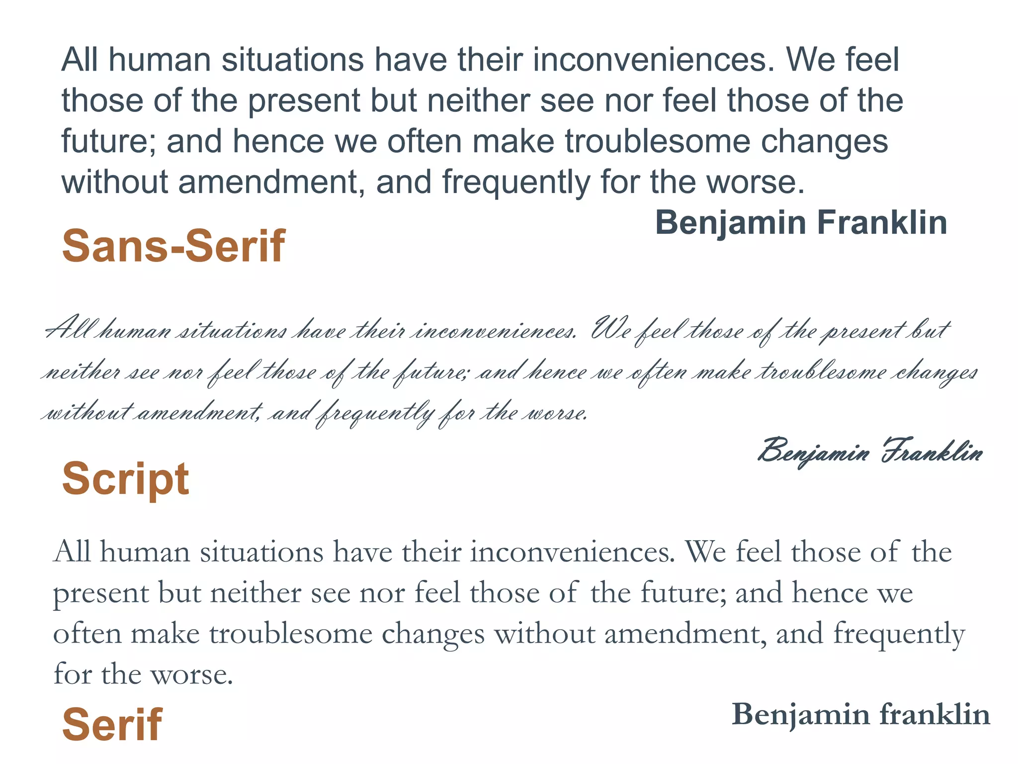
This document provides tips and tools for creating and using visuals effectively in presentations. It discusses finding and using existing visuals such as photos, graphics and videos. It also provides tips for creating visuals using tools like online chart builders and photo editors. Guidelines are given for designing visuals with considerations for layout, color, font and keeping the visuals simple and clear. The document also discusses using visuals appropriately for different audiences and topics. Overall presentation tips are provided such as including an agenda, title slide and contact information.
4. The supply-demand model is one of the
fundamental concepts of economics.
The price level of a good essentially is determined
by the point at which quantity supplied equals
quantity demand. This point is called equilibrium.
If the quantity supplied is greater than the quantity
demanded, then there is a surplus of goods. If the
quantity supplied is less than the quantity
demanded, the there is a shortage of goods.
5.
6. FAIR USE
principle based on belief that public is entitled use
portions of copyrighted materials for commentary,
criticism and parody
Tricky – lots of “gray” when it comes to what is fair use and
what is an infringement
also allows special guidelines for use of copyrighted
material for educational purposes
The 4 factors considered are:
1.
2.
3.
4.
the purpose and character of your use
the nature of the copyrighted work
the amount and substantiality of the portion taken
**the effect of the use upon the potential market.
7. Creative Commons
A structured system for creators to share
their works for free but still have some
protections.
http://search.creativecommons.org/
8. Graphics & Photos
Public domain icons and symbols
http://thenounproject.com/
http://www.iconarchive.com/
Public domain photos
http://morguefile.com/
http://pixabay.com/
Government websites often have photo
galleries of images that can be used
http://www.ars.usda.gov/is/graphics/photos/
10. Infographics
Data visualizations that present complex
information quickly and clearly.
Great way to present data during a
presentation
Examples:
http://www.mint.com/blog/
trends/hamburger-10122010/
http://visual.ly/can-socialmedia-predict-electionoutcomes
http://googlemobile.blogspot.com/
2010/06/google-voice-for-everyone.html
14. Video
Consider how relative it is (what purpose or
point does it make)
Does it “steal the show”
Youtube.com
http://www.splicd.com/ - show only a portion of a
video clip
Insert the clip directly onto your presentation slide
(must have internet connection)
Have a back-up:
Any Video Converter (free version) –http://www.any-videoconverter.com/products/for_video_free/
capture a YouTube video, convert a video, edit a video
16. iSpring Free
Presentation Tools
http://www.ispringsolutions.com/free_powerpoi
nt_to_flash_converter.html
Easily Insert YouTube videos and Flash files
on the slide
17. Audio
http://www.jamendo.com/en/ - audio files
that can be downloaded or embedded
http://audacity.sourceforge.net/ - free
software for editing audio
http://www.brainybetty.com/soundsforpo
werpoint.htm - more free audio and
sound effects
18. Tips for Using Visuals
Visuals should supplement what you are
saying, not take over the presentation.
Keep audio and video short and to the point
Keep It Simple is always a good guideline
Know your Audience
Plan your visuals and practice with them
before the presentation.
Make sure they work
Have a back-up plan
21. Tools for Creating Visuals
www.gliffy.com –create online charts and diagrams,
save them as an image file
http://pixlr.com/ - online photos editor
http://www.dipity.com/ - create an interactive online
timeline
http://charts.hohli.com/ - online chart builder
http://www958.ibm.com/software/data/cognos/manyeyes/ - build
charts and visualizations
http://quizlet.com/ - create a quiz for the audience
22. Tips for Creating Visuals
Technical
Decide on the best tool to use
File format, presentation mode, export
option, back up?
Know the limitations
Design
Font, color, style, empty/white space,
legibility
quality
23. Photos & Graphics
Choose photos and graphics that work
well for your audience.
Consider the quality
Don’t scale out of proportion.
If you are going to use them.
USE THEM BIG!
Respect copyright.
24. Professional
Web Designers
Conference 2012
Software Techniques Conference
A presentation design for professional web designers.
Is the crayon clip art appropriate?
Is it dated?
Does it reflect the audience?
Is it relevant to the topic being presented?
25. American Institute of
Graphic Artists
Software Techniques Conference
2012
A presentation design for
professional web designers.
Yes the kitties are cute. Are they
appropriate?
Is it dated?
Does it reflect the audience?
Is it relevant to the topic being
presented?
26. Presentation Tips
Content comes first!
Be Consistent
choose an overall template/ background
color scheme
choose 1 font for body
1 font for headers
If using outline form with numbers, letters,
etc…
choose one format and stick with it
Include title slide, agenda slide, and a
closing slide (good for your contact info.)
27. General Design Guidelines
Keep it Simple and Clear – if it doesn’t
support the message you want to give –
you probably don’t need it.
Consider Layout – balance text and visuals,
utilize “white space.”
Grab Their Attention – be intentional about
placing visuals that create contrast or
emphasis.
28. Choosing a Template/ Background
Background design should be subordinate
to your content
Background should be appropriate for
your audience
Use 1 background throughout the
presentation
29. Bad Example of a Background
• Too much Contrast
• Your content is limited to 1/3 or 2/3 of the
slide
• Poor quality
• Eye is drawn to the background, too busy
30. Using Color in a Presentation
Dark backgrounds with light text are usually
easiest to read. (if presented on a large screen in a
dark room)
Light backgrounds with dark text work well
for distributing on the computer/printing. Work
well if you are in a large auditorium that is bright
or the fluorescent lights will be on.
Be wary of combinations like Red/Green
Be wary of combinations that are too close –
white background/yellow text
32. Slide Formatting Tips
Text Sizes:
Title/ Headings - 36pt to 44 pt
Content/ Bullets – 24 pt to 36 pt
No smaller than 18pt to 20pt
Lines per slide:
6 x 6 Rule: no more than 6 lines about 6
words per line
PowerPoint: Home Ribbon > Line Spacing…
33. ALL UPPERCASE IS HARD TO READ
ALL HUMAN SITUATIONS HAVE THEIR
INCONVENIENCES. WE FEEL THOSE
OF THE PRESENT BUT NEITHER SEE
NOR FEEL THOSE OF THE FUTURE;
AND HENCE WE OFTEN MAKE
TROUBLESOME CHANGES WITHOUT
AMENDMENT, AND FREQUENTLY FOR
THE WORSE.
BENJAMIN FRANKLIN
34. All Uppercase is Hard To Read
All human situations have their
inconveniences. We feel those ofof the
inconveniences. We feel those the present
but neither see nor feel thosefeel those of
present but neither see nor of the future;
and hence we often make troublesome
the future; and hence we often make
changes without amendment, and frequently
troublesome changes without amendment,
for thefrequently for the worse.
and worse.
Benjamin Franklin
Benjamin Franklin
35. Formatting Tips
Font Choice is important.
This is a Script.
This is a Sans-serif.
This is a Serif.
This is a Decorative font.
36. Formatting Tips
• Use fonts sparingly – 1-2 per presentation
•Use Bold, Italic, etc… for contrast.
• Do Not use script or Decorative fonts for
large blocks of text.
• Sans-serif works well for presentations
• Serif works well for large bodies of text (printed
documents).
37. All human situations have their inconveniences. We feel
those of the present but neither see nor feel those of the
future; and hence we often make troublesome changes
without amendment, and frequently for the worse.
Benjamin Franklin
Sans-Serif
All human situations have their inconveniences. We feel those of the present but
neither see nor feel those of the future; and hence we often make troublesome changes
without amendment, and frequently for the worse.
Benjamin Franklin
Script
All human situations have their inconveniences. We feel those of the
present but neither see nor feel those of the future; and hence we
often make troublesome changes without amendment, and frequently
for the worse.
Benjamin franklin
Serif
39. Presentation Tools
There are lots of them available online.
Consider the technical aspects of them.
Some host a PowerPoint slide on the web.
Some allow you to build the entire
presentation on the web.
How will you present it?
Features needed? Does it need to support
audio and video?
44. References
Worcester Polytechnic Institute Best Practices for Presentation Design
http://www.wpi.edu/academics/ATC/Collaboratory/HowTo/PowerPoint/design.html
3 Steps to Choosing the Best Presentation Colors
http://www.presentationxpert.com/articles/3-steps-to-choosing-the-bestpresentation-colors
Choose the right colors for your PowerPoint Presentation
http://office.microsoft.com/en-us/powerpoint-help/choose-the-right-colors-foryour-powerpoint-presentation-HA001012072.aspx
Tips for giving better presentations http://www.thinkoutsidetheslide.com/
Ellen Fikelstein PowerPoint Tips, Techniques and Tutorials
http://www.ellenfinkelstein.com/powerpoint_tips.html
Key Steps to an Effective Presentation
http://www.theegglestongroup.com/writing/keystep1.php
5 Rules for More Effective Presentations, Michael Hyatt http://michaelhyatt.com/5-rules-formore-effective-presentations.html
12 tips for creating better PowerPoint Presentations
http://www.microsoft.com/atwork/skills/presentations.aspx#fbid=UMGbQMh-GCK
Book: Beyond Bullet Points: Using Microsoft PowerPoint to Create Presentations That Inform,
Motivate, and Inspire by Cliff Atkinson http://www.amazon.com/exec/obidos/ASIN/0735620520
45. PRESENTATION VISUALS
Tips & tools for creating and using visuals effectively
Illinois Central College
Brandy Thatcher, Instructional Media Developer
Teaching & Learning Center
bhtatcher@icc.edu / @bthat (twitter)
Editor's Notes
Create an outline or the text – concepts of your presentation first. Work through the presentation – mark or identify key points, ideas, concepts, especially any place that you need to share a lot of data or hard facts. Is there a way to display it visually? Is there anything in the presentation that makes you think of a visual? A visual can be used to help your audience quickly understand complex data or facts. Image from http://morguefile.com/archive/display/24623 by clarita
The supply-demand model is one of the fundamental concepts of economics. The price level of a good essentially is determined by the point at which quantity supplied equals quantity demand. This point is called equilibrium. If the quantity supplied is greater than the quantity demanded, then there is a surplus of goods. If the quantity supplied is less than the quantity demanded, the there is a shortage of goods.
Note that there is a difference between free and royalty-free – be aware of this when searching for images. Royalty-free still has a cost of purchase, but you are not going to pay royalties to use it.
If you are giving a factual presentation. You are likely going to need to present some data, some hard numbers. That can be a challenge. How do you keep the audience awake and get the numbers to them. Use visuals, graphs, charts, diagrams, infographics. Interactive or live data is great
If you are going to show a video, think about what purpose it serves in your presentation and how it will impact your audienceHow long is it? If you are giving a 10 minute presentation and the video clip is 7 minutes long, isn’t it doing the presenting for you? People came to hear you. Consider cutting the video to the most important point – teaser/introduction videos are a good way to engage the audience And http://www.tubechop.com/ - another youtube video chopper – show only a portion of a videoThere are many video sources beyond on youtube – most news stations have a video gallery, many government sites, vimeo, teachertube.
The authorstream add-in offers several features for developing your presentation – it’s a free download – just watch to make sure you download the free one – there is another one on their site that requires a purchase after a 30 day trial. This free one – adds an extra tab in your PowerPoint software – if you have an authorstream account you can use the publish feature on the tab to upload your presentation directly to the website
Be careful with sound effects – this can be really overwhelming to some people
You never know when you present what technical problems you are going to run into. Have a back up plan and a back up plan for that. Know your audience, the visuals you choose to supplement a presentation for a group of young college students is going to be drastically different than the visuals you would choose to supplement a presentation to a group of senior citizens
The wonderful presentation tools and software to create visuals come with all kinds of “eye candy” – use it appropriately!! Just because it looks cool or fun is not a good reason to use it in your presentation. 1.) It could be that distraction from the message you are wanting the audience to leave with 2.) It could offend the audience, if they are professionals or listening to a sensitive subject 3.) We have all been so exposed to “eye candy” that it tends to annoy us rather than help us understand and appreciate your message For example, the dancing hamster does little for us if you presentation is on how to detect breast cancerIce breakers and humor are wonderful assets to a presentation just be very weary of what message it sends to your audience. The timing make sure it is appropriate in the flow of your message.
Choose a graphic style that fits your audience.It doesn’t do any good to fill your presentation with photos no one can see or make sense of. Respect copyright. Don’t go to Google images and start searching and pulling any and every image you see. For one reason alone, no one wants to sit in a court room and try to explain themselves. Another good reason, we want our presentation and creations to be respected by others, don’t we? This doesn’t mean you can’t use the visual, it means there might be a chance you can’t use it and will need to find something else or that you just need to go the right way about using it.
A slide will only keep your audience’s attention for a very short period of time. You don’t want your audience reading. You want them listening to you! Think of this illustration. How fast are these cars going by on a busy interstate where they have other things to pay attention to? Let’s say they are going 40 mph. How much of that bulletin board are they going to be able to read?
PowerPoint is simply a tool. IT can’t be evil, but how the tool used can be. These funny clips by the comedian Don McMillan have been around for awhile now. While they are meant to be funny and sarcastic, there’s a lot of truth in them.
Think carefully about the technology you choose to supplement your presentation. Will you have internet connection where you are presenting? Will you need an actual file of the presentation at any point?
Good to host a large presentation – url and channel make it an easy way to distribute your presentation without killing lots of trees!
Authorstream is a free presentation hosting site. I use this site the most because it has always had the ability to make a presentation private and then embed it into our course management system, blackboard and that’s how I utilize it the most. You can also upload presentations up to 1 GB in size. It is also the easiest to create narrated PowerPoint files. You can record your narration in PowerPoint and upload the PowerPoint file and it’ll recognize the audio.
Online slide builder – lot of good tools – can use it through google drive and save it there – need good internet connection – makes it easy to insert multimedia from the web – at last check – no way to export it out of sliderocket
Be careful with animation in prezi – prezi is known for its ability to zoom, fly and spin all over the place. Work through the animation and movement from node to node several times and make sure it is not too much. You don’t want to make your audience sick or cause a seizure. It can be a good tool for a quick visual presentation. Best for simple text and images or links to other resources. Limit the text and detail. Keep it very simple and the animation very simple. Others – present.me – many slideshow apps available – plug an ipad into the podium?? Online slideshow tools - http://www.kizoa.com/http://slide.ly/http://animoto.com/ video, audio, photos