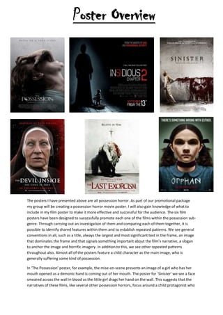
Poster Overview

The posters I have presented above are all possession horror. As part of our promotional package
my group will be creating a possession horror movie poster. I will also gain knowledge of what to
include in my film poster to make it more effective and successful for the audience. The six film
posters have been designed to successfully promote each one of the films within the possession subgenre. Through carrying out an investigation of them and comparing each of them together, it is
possible to identify shared features within them and to establish repeated patterns. We see general
conventions in all, such as a title, always the largest and most significant text in the frame, an image
that dominates the frame and that signals something important about the film’s narrative, a slogan
to anchor the image and horrific imagery. In addition to this, we see other repeated patterns
throughout also. Almost all of the posters feature a child character as the main image, who is
generally suffering some kind of possession.
In ‘The Possession’ poster, for example, the mise-en-scene presents an image of a girl who has her
mouth opened as a demonic hand is coming out of her mouth. The poster for ‘Sinister’ we see a face
smeared across the wall in blood as the little girl drags her hand on the wall. This suggests that the
narratives of these films, like several other possession horrors, focus around a child protagonist who
then becomes possessed and whose role is to present the threat to the family. In many cases, the
evil spirit attacks a family as a whole, this scares the audience more as the audience have their own
family, and they then worry that these things could happen to them and their families also.
In five of the six posters we see a possessed child, this reinforces the idea that such characters are
common in possession horrors and that children often appear as conduits of evil. This could be
because children are supposed to be innocent and pure, as children to not tend to be terrifying. In
each of the four posters, the four children have their back facing us or you can’t see the face. This
suggests that the innocence inside of them has been taken away from them and evil lurks within.
The images presented in the six posters are horrific and designed to both to tell the audience what
horror genre the film belongs to and to scare the audience.
In the poster for ‘The Possession’ we see a disturbing image of a decomposed hand coming out of
the girl’s mouth and are clawing at her face. This will terrify the audience as it is not normal to see a
hand emerging from someone’s mouth. From what the girl is wearing, the dirty green gown suggests
to the audience that the film could place in a hospital because you see patients in those green
gowns. In the six posters we don’t see any masked protagonists wielding knives and no bloodied
victims. Instead we see decaying hands, ghostly figures, tormented souls and bending of the body
and this suggestion is that the threat in these films is the evil spirit that is never seen.
In two of the posters all the girls are wearing gowns which could suggest the main characters
innocence’s. There is a consistent pattern with regards to colour too. They use cold colours, lots of
red, black and white, there are also some greys. They are common to help and create a sinister and
terrifying look, makes the audience feel unwelcomed. On the following posters ‘the last Exorcism’,
‘The Possession’ and ‘Insidious: Chapter 2’ the protagonist seems to be disappearing or blending into
the cool colours of the background. This shows that the protagonist is being consumed by the evil
around them and they are being taken into a world of darkness and it’s hard to escape from there.
In each poster, the title is the largest text on the page and is placed in a conspicuous position. In five
of the six posters the title is placed at the bottom of the poster, beneath the image this is usual
because the image is meant to grab the audience attention and then draw their attention to the
title. For every title on the posters they are presented in uppercase font that is bold, simple or
merging with the background.
They also use text effects such as on The Possession title, the title looks like it’s been scratched and
distorted as if someone has tried to hide what the text reads, as if trying to hide a terrible secret, In
the same way ‘The Orphan’ poster does this also. Four of the six posters introduce the production
information that is placed at the bottom of the poster and all six posters have a tagline to anchor or
reinforce the meaning of the image or to reveal more about the narrative to the audience. The
tagline on the sinister poster says ‘Once you see him nothing can save you’ which matches the fact
of the antagonist smeared across the wall in blood. Other text, such as ‘Based on a True Story’ or
‘from the makers of Paranormal Activity and Saw’, is used to draw the audience in. The idea that a
film is based on true story by a real possession makes the film so much scarier and more real to the
audience. It makes the audience feel that the same thing could happen to them. All the posters
presented are effective, they have a lot in common and have minimal text and an image that
dominates the whole poster. The image lures the audience in and the title and slogan is stuck in their
minds.

Poster overview

  • 1.
    Poster Overview The postersI have presented above are all possession horror. As part of our promotional package my group will be creating a possession horror movie poster. I will also gain knowledge of what to include in my film poster to make it more effective and successful for the audience. The six film posters have been designed to successfully promote each one of the films within the possession subgenre. Through carrying out an investigation of them and comparing each of them together, it is possible to identify shared features within them and to establish repeated patterns. We see general conventions in all, such as a title, always the largest and most significant text in the frame, an image that dominates the frame and that signals something important about the film’s narrative, a slogan to anchor the image and horrific imagery. In addition to this, we see other repeated patterns throughout also. Almost all of the posters feature a child character as the main image, who is generally suffering some kind of possession. In ‘The Possession’ poster, for example, the mise-en-scene presents an image of a girl who has her mouth opened as a demonic hand is coming out of her mouth. The poster for ‘Sinister’ we see a face smeared across the wall in blood as the little girl drags her hand on the wall. This suggests that the narratives of these films, like several other possession horrors, focus around a child protagonist who
  • 2.
    then becomes possessedand whose role is to present the threat to the family. In many cases, the evil spirit attacks a family as a whole, this scares the audience more as the audience have their own family, and they then worry that these things could happen to them and their families also. In five of the six posters we see a possessed child, this reinforces the idea that such characters are common in possession horrors and that children often appear as conduits of evil. This could be because children are supposed to be innocent and pure, as children to not tend to be terrifying. In each of the four posters, the four children have their back facing us or you can’t see the face. This suggests that the innocence inside of them has been taken away from them and evil lurks within. The images presented in the six posters are horrific and designed to both to tell the audience what horror genre the film belongs to and to scare the audience. In the poster for ‘The Possession’ we see a disturbing image of a decomposed hand coming out of the girl’s mouth and are clawing at her face. This will terrify the audience as it is not normal to see a hand emerging from someone’s mouth. From what the girl is wearing, the dirty green gown suggests to the audience that the film could place in a hospital because you see patients in those green gowns. In the six posters we don’t see any masked protagonists wielding knives and no bloodied victims. Instead we see decaying hands, ghostly figures, tormented souls and bending of the body and this suggestion is that the threat in these films is the evil spirit that is never seen. In two of the posters all the girls are wearing gowns which could suggest the main characters innocence’s. There is a consistent pattern with regards to colour too. They use cold colours, lots of red, black and white, there are also some greys. They are common to help and create a sinister and terrifying look, makes the audience feel unwelcomed. On the following posters ‘the last Exorcism’, ‘The Possession’ and ‘Insidious: Chapter 2’ the protagonist seems to be disappearing or blending into the cool colours of the background. This shows that the protagonist is being consumed by the evil around them and they are being taken into a world of darkness and it’s hard to escape from there. In each poster, the title is the largest text on the page and is placed in a conspicuous position. In five of the six posters the title is placed at the bottom of the poster, beneath the image this is usual because the image is meant to grab the audience attention and then draw their attention to the title. For every title on the posters they are presented in uppercase font that is bold, simple or merging with the background. They also use text effects such as on The Possession title, the title looks like it’s been scratched and distorted as if someone has tried to hide what the text reads, as if trying to hide a terrible secret, In the same way ‘The Orphan’ poster does this also. Four of the six posters introduce the production information that is placed at the bottom of the poster and all six posters have a tagline to anchor or reinforce the meaning of the image or to reveal more about the narrative to the audience. The tagline on the sinister poster says ‘Once you see him nothing can save you’ which matches the fact of the antagonist smeared across the wall in blood. Other text, such as ‘Based on a True Story’ or ‘from the makers of Paranormal Activity and Saw’, is used to draw the audience in. The idea that a film is based on true story by a real possession makes the film so much scarier and more real to the audience. It makes the audience feel that the same thing could happen to them. All the posters presented are effective, they have a lot in common and have minimal text and an image that dominates the whole poster. The image lures the audience in and the title and slogan is stuck in their minds.