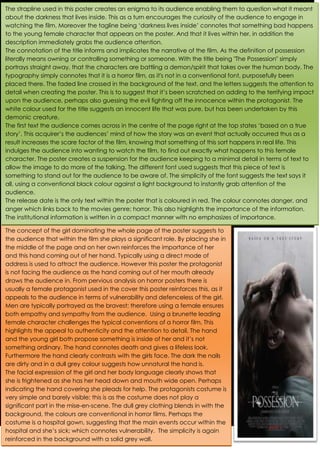
The strapline used in this poster creates an enigma to its audience enabling them to question what it meant
about the darkness that lives inside. This as a turn encourages the curiosity of the audience to engage in
watching the film. Moreover the tagline being ‘darkness lives inside’ connotes that something bad happens
to the young female character that appears on the poster. And that it lives within her, in addition the
description immediately grabs the audience attention.
The connotation of the title informs and implicates the narrative of the film. As the definition of possession
literally means owning or controlling something or someone. With the title being "The Possession" simply
portrays straight away, that the characters are battling a demon/spirit that takes over the human body. The
typography simply connotes that it is a horror film, as it's not in a conventional font, purposefully been
placed there. The faded line crossed in the background of the text, and the letters suggests the attention to
detail when creating the poster. This is to suggest that it’s been scratched on adding to the terrifying impact
upon the audience, perhaps also guessing the evil fighting off the innocence within the protagonist. The
white colour used for the title suggests an innocent life that was pure, but has been undertaken by this
demonic creature.
The first text the audience comes across in the centre of the page right at the top states ‘based on a true
story’. This acquirer’s the audiences’ mind of how the story was an event that actually occurred thus as a
result increases the scare factor of the film, knowing that something of this sort happens in real life. This
indulges the audience into wanting to watch the film, to find out exactly what happens to this female
character. The poster creates a suspension for the audience keeping to a minimal detail in terms of text to
allow the image to do more of the talking. The different font used suggests that this piece of text is
something to stand out for the audience to be aware of. The simplicity of the font suggests the text says it
all, using a conventional black colour against a light background to instantly grab attention of the
audience.
The release date is the only text within the poster that is coloured in red. The colour connotes danger, and
anger which links back to the movies genre; horror. This also highlights the importance of the information.
The institutional information is written in a compact manner with no emphasizes of importance.
The concept of the girl dominating the whole page of the poster suggests to
the audience that within the film she plays a significant role. By placing she in
the middle of the page and on her own reinforces the importance of her
and this hand coming out of her hand. Typically using a direct mode of
address is used to attract the audience. However this poster the protagonist
is not facing the audience as the hand coming out of her mouth already
draws the audience in. From pervious analysis on horror posters there is
usually a female protagonist used in the cover this poster reinforces this, as it
appeals to the audience in terms of vulnerability and defenceless of the girl.
Men are typically portrayed as the bravest; therefore using a female ensures
both empathy and sympathy from the audience. Using a brunette leading
female character challenges the typical conventions of a horror film. This
highlights the appeal to authenticity and the attention to detail. The hand
and the young girl both propose something is inside of her and it’s not
something ordinary. The hand connotes death and gives a lifeless look.
Furthermore the hand clearly contrasts with the girls face. The dark the nails
are dirty and in a dull grey colour suggests how unnatural the hand is.
The facial expression of the girl and her body language clearly shows that
she is frightened as she has her head down and mouth wide open. Perhaps
indicating the hand covering she pleads for help. The protagonists costume is
very simple and barely visible; this is as the costume does not play a
significant part in the mise-en-scene. The dull grey clothing blends in with the
background, the colours are conventional in horror films. Perhaps the
costume is a hospital gown, suggesting that the main events occur within the
hospital and she’s sick; which connotes vulnerability. The simplicity is again
reinforced in the background with a solid grey wall.

The possession poster analysis

  • 1.
    The strapline usedin this poster creates an enigma to its audience enabling them to question what it meant about the darkness that lives inside. This as a turn encourages the curiosity of the audience to engage in watching the film. Moreover the tagline being ‘darkness lives inside’ connotes that something bad happens to the young female character that appears on the poster. And that it lives within her, in addition the description immediately grabs the audience attention. The connotation of the title informs and implicates the narrative of the film. As the definition of possession literally means owning or controlling something or someone. With the title being "The Possession" simply portrays straight away, that the characters are battling a demon/spirit that takes over the human body. The typography simply connotes that it is a horror film, as it's not in a conventional font, purposefully been placed there. The faded line crossed in the background of the text, and the letters suggests the attention to detail when creating the poster. This is to suggest that it’s been scratched on adding to the terrifying impact upon the audience, perhaps also guessing the evil fighting off the innocence within the protagonist. The white colour used for the title suggests an innocent life that was pure, but has been undertaken by this demonic creature. The first text the audience comes across in the centre of the page right at the top states ‘based on a true story’. This acquirer’s the audiences’ mind of how the story was an event that actually occurred thus as a result increases the scare factor of the film, knowing that something of this sort happens in real life. This indulges the audience into wanting to watch the film, to find out exactly what happens to this female character. The poster creates a suspension for the audience keeping to a minimal detail in terms of text to allow the image to do more of the talking. The different font used suggests that this piece of text is something to stand out for the audience to be aware of. The simplicity of the font suggests the text says it all, using a conventional black colour against a light background to instantly grab attention of the audience. The release date is the only text within the poster that is coloured in red. The colour connotes danger, and anger which links back to the movies genre; horror. This also highlights the importance of the information. The institutional information is written in a compact manner with no emphasizes of importance. The concept of the girl dominating the whole page of the poster suggests to the audience that within the film she plays a significant role. By placing she in the middle of the page and on her own reinforces the importance of her and this hand coming out of her hand. Typically using a direct mode of address is used to attract the audience. However this poster the protagonist is not facing the audience as the hand coming out of her mouth already draws the audience in. From pervious analysis on horror posters there is usually a female protagonist used in the cover this poster reinforces this, as it appeals to the audience in terms of vulnerability and defenceless of the girl. Men are typically portrayed as the bravest; therefore using a female ensures both empathy and sympathy from the audience. Using a brunette leading female character challenges the typical conventions of a horror film. This highlights the appeal to authenticity and the attention to detail. The hand and the young girl both propose something is inside of her and it’s not something ordinary. The hand connotes death and gives a lifeless look. Furthermore the hand clearly contrasts with the girls face. The dark the nails are dirty and in a dull grey colour suggests how unnatural the hand is. The facial expression of the girl and her body language clearly shows that she is frightened as she has her head down and mouth wide open. Perhaps indicating the hand covering she pleads for help. The protagonists costume is very simple and barely visible; this is as the costume does not play a significant part in the mise-en-scene. The dull grey clothing blends in with the background, the colours are conventional in horror films. Perhaps the costume is a hospital gown, suggesting that the main events occur within the hospital and she’s sick; which connotes vulnerability. The simplicity is again reinforced in the background with a solid grey wall.