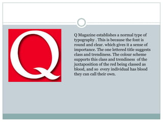
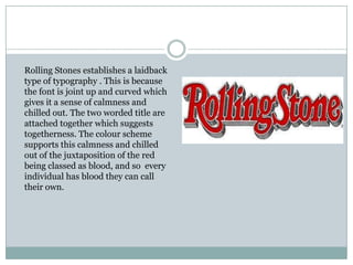
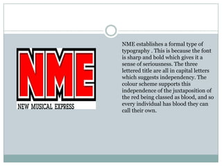
This document analyzes the mastheads of three magazines - Q Magazine, Rolling Stones, and NME. It finds that Q Magazine establishes an important and trendy style with its round, clear font and single letter title. Rolling Stones has a calm and relaxed feel from its curved, joint font and two-word attached title. NME establishes a serious and independent tone with its sharp, bold font and capitalized three-letter title. All three magazines' color schemes support the ideas of individuality and ownership represented by the image of blood.