
Uploaded byLewis Fennell
Poster Analysis
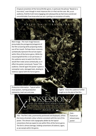
The document discusses conventions of the horror/thriller genre in film posters. It notes that posters for these genres often claim films are "based on a true story" even if not true, as audiences find true stories more engaging and scary. The document then analyzes elements of a sample horror film poster, including the title using a mono-chromatic color scheme and rustic font implying violence. It also discusses the tagline, production details, date and main image showing a screaming protagonist projecting moths from her mouth, likely symbolizing the film's evil in a way that "teases" audiences.
More Related Content


Similar to Poster Analysis


Poster Analysis
- 1. A typical conventionof the horror/thriller genre, in particular the phrase “Based on a true story”, even though in most instances this is in fact not the case. We, as an audience, find the truth more engaging and subsequently we feel more scared and uncomfortable if we know what we see is perhaps an emulation of reality. Title - The film’s title, prominently positioned and displayed, utilises the mono-chromatic colour scheme consistent with the rest of the poster. The almost rustic typography abides by the typical conventions that we expect to see within films of the horror genre. The font is almost damage, holding conventions of violence, again, as we except within the genre. Tagline - Gives the audience further insight as to the plot of the film. Production Information - Typical within most posters, naming production companies, lead cast and crew. Date - Feature on almost every poster. Main Image - The main image features presumably the protagonist/antagonist of the film screaming while projecting moths out of her mouth. Perhaps these creatures symbolically represent the evil we expect within films of the horror genre. While the reasoning behind this is not yet known, if the audience were to watch the film this would then make sense contextually; so in effect the poster consciously “teases” the audience. Overall again the poster is given a somewhat rustic, damaged look, alluding to violence; typical with the horror genre.