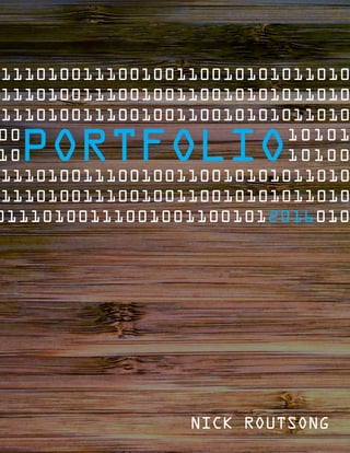
This document contains Nick Routsong's portfolio which includes various design projects such as magazine covers, presentations, photos, logos, websites, and brochures. The portfolio demonstrates Nick's skills in programs like Photoshop, Illustrator, InDesign, and HTML/CSS and his ability to create visual designs for print and digital media. Each project includes a brief description of the objective, programs used, process, and screenshots of the final design.
Linas Eriksonas, Social networks of startup entrepreneurs: the case of the s...Linas Eriksonas
The presentation given at the 3rd international conference "Entrepreneurship, innovation and regional development", September 24-25, 2015. ISM University of Management and Economics, Vilnius
BYU-I Comm-130 Visual Communications class final portfolio. Project were Magazine cover, prezi.com , montage, business identity, web page mock-up , web page coding, info-graphic, brochure.
You could be a professional graphic designer and still make mistakes. There is always the possibility of human error. On the other hand if you’re not a designer, the chances of making some common graphic design mistakes are even higher. Because you don’t know what you don’t know. That’s where this blog comes in. To make your job easier and help you create better designs, we have put together a list of common graphic design mistakes that you need to avoid.
Between Filth and Fortune- Urban Cattle Foraging Realities by Devi S Nair, An...Mansi Shah
This study examines cattle rearing in urban and rural settings, focusing on milk production and consumption. By exploring a case in Ahmedabad, it highlights the challenges and processes in dairy farming across different environments, emphasising the need for sustainable practices and the essential role of milk in daily consumption.
Dive into the innovative world of smart garages with our insightful presentation, "Exploring the Future of Smart Garages." This comprehensive guide covers the latest advancements in garage technology, including automated systems, smart security features, energy efficiency solutions, and seamless integration with smart home ecosystems. Learn how these technologies are transforming traditional garages into high-tech, efficient spaces that enhance convenience, safety, and sustainability.
Ideal for homeowners, tech enthusiasts, and industry professionals, this presentation provides valuable insights into the trends, benefits, and future developments in smart garage technology. Stay ahead of the curve with our expert analysis and practical tips on implementing smart garage solutions.
White wonder, Work developed by Eva TschoppMansi Shah
White Wonder by Eva Tschopp
A tale about our culture around the use of fertilizers and pesticides visiting small farms around Ahmedabad in Matar and Shilaj.
Transforming Brand Perception and Boosting Profitabilityaaryangarg12
In today's digital era, the dynamics of brand perception, consumer behavior, and profitability have been profoundly reshaped by the synergy of branding, social media, and website design. This research paper investigates the transformative power of these elements in influencing how individuals perceive brands and products and how this transformation can be harnessed to drive sales and profitability for businesses.
Through an exploration of brand psychology and consumer behavior, this study sheds light on the intricate ways in which effective branding strategies, strategic social media engagement, and user-centric website design contribute to altering consumers' perceptions. We delve into the principles that underlie successful brand transformations, examining how visual identity, messaging, and storytelling can captivate and resonate with target audiences.
Methodologically, this research employs a comprehensive approach, combining qualitative and quantitative analyses. Real-world case studies illustrate the impact of branding, social media campaigns, and website redesigns on consumer perception, sales figures, and profitability. We assess the various metrics, including brand awareness, customer engagement, conversion rates, and revenue growth, to measure the effectiveness of these strategies.
The results underscore the pivotal role of cohesive branding, social media influence, and website usability in shaping positive brand perceptions, influencing consumer decisions, and ultimately bolstering sales and profitability. This paper provides actionable insights and strategic recommendations for businesses seeking to leverage branding, social media, and website design as potent tools to enhance their market position and financial success.
Expert Accessory Dwelling Unit (ADU) Drafting ServicesResDraft
Whether you’re looking to create a guest house, a rental unit, or a private retreat, our experienced team will design a space that complements your existing home and maximizes your investment. We provide personalized, comprehensive expert accessory dwelling unit (ADU)drafting solutions tailored to your needs, ensuring a seamless process from concept to completion.
3. DATE
4
MAGAZINECOVER101001011011010
0101010101010101010100101001
DESCRIPTION
PROGRAMS
COURSE & SECTION
INSTRUCTOR
Bianca Rodriguez
PROCESS
COMM 130 - Section 16
OBJECTIVE
DATE
Work @ Home is a fictional
magazine put together
while learning InDesign.
Photoshop, InDesign
September 28th 2016
I started by sketching out a few potential layouts for the magazine cover. I focused on putting
together a set of articles that would make sense for use in this kind of magazine. I then created
a shape map in Adobe InDesign. I captured a photo that placed me in my work environment
at home. I imported the photo into Photoshop and adjusted the contrast and color values.The
photo was cropped to take out the items that were unnecessary for the magazine cover.
I created a new document in InDesign, 8.5” x 11” with a default gutter setting to ensure that my
content was evenly spaced around the edge. I placed the photo into the InDesign document. I
then added my title and aligned it with the top gutter, added the article titles, page numbers,
etc.
I received critiques from class mates, my instructor as well as my spouse. Upon completing all
my changes from the various sets of feedback, I printed the design cover and cut the edges to
ensure a full bleed for the cover.
Design a magazine cover that showcases a self-portrait as well
as 3-5 articles about yourself.
4. DATE
6
DESCRIPTION
PROGRAMS
COURSE & SECTION
INSTRUCTOR
Bianca Rodriguez
PROCESS
COMM 130 - Section 16
OBJECTIVE
DATE
PREZI10100101101010100101010
0101010101010101010100101001
Prezi, Photoshop
October 4th 2016
My Prezi presentation takes
a user through the reasons
why to pick WordPress as
their default CMS.
I utilized Prezi to put the presentation together. I played around with a few of the samples and
was pretty impressed what you could do with their software with fairly minimal effort.
I work on WordPress a lot, and tend to have a discussion with new clients regarding why I
choose to go with it as my default content management system. I started a new text document
and did some research on 10 points that I could make to put the presentation together. By
preparing the talking points ahead of time, it allowed me to better visualize what I would need
to put together to complete the project in terms of images needed, overall flow, etc.
I then sketched out the flow of the presentation on paper. I wanted the presentation to
provide the user with parts and glimpses of the WordPress logo as they were flown around
the presentation. All points surrounded the WordPress logo which was to be placed in the
background. After sketching out the idea, I went ahead and got started with testing which fonts
I wanted to utilize and what kind of spacing I should plan on.
Full presentation can be viewed here: http://prezi.com/vxkxqjkhufy5/ or scan the code below
with your mobile device.
Create an instructional presentation using the Prezi software
to demonstrate it’s features and capabilities.
5. DATE
8
DESCRIPTION
PROGRAMS
COURSE & SECTION
INSTRUCTOR
Bianca Rodriguez
PROCESS
COMM 130 - Section 16
OBJECTIVE
DATE
PHOTO DESIGN10100101101010100
0101010101010101010100101001
October 4th 2016
Photoshop
My backyard provided
the central image for this
inspirational message. Each
new day brings with it new
opportunities to live.
I wanted to take a photo utilizing elements that I can see from my backyard. I knew that I would
be able to capture green, yellow, and red – purple was a bit unexpected to be honest, but sure
enough it made it in the photo. Going off the tip of utilizing the last two hours or the first two
hours of sunlight in the day, I grabbed my camera and took a few shots.
I had to do a lot of work to the photo to bring out the green in the leaves and to make it a more
captivating photo. I added some sharpness to the edges of the leaves to bring out the natural
outer glow in them.
I then started laying out some elements, taking colors from the photo itself. I searched around
for some quotes to put on the photo. I didn’t find one that I wanted, so I instead pulled ideas
from a few sources and made a new one. I then ended up resizing after the fact when I was
prepping more for print and had to re-arrange some things to make it all come together.
ORIGINAL PHOTO
CAPTURED BY
NICK ROUTSONG
By using photography and design skills, create a project that
encompasses a consistent color scheme from the image.
6. DATE
10
DESCRIPTION
PROGRAMS
COURSE & SECTION
INSTRUCTOR
Bianca Rodriguez
PROCESS
COMM 130 - Section 16
OBJECTIVE
DATE
MONTAGE1010010110101100100
0101010101010101010100101001
Photoshop
The backdrop for this photo
was captured at the Phoenix
Children’s Zoo.The message
centers on communication
with the savior each day.
October 19th 2016
To begin this project, I opened the images in Photoshop individually. Outlined them with the
lasso/selection tool and added a 100px feather value. I then dragged the selected portion into
the main image using the move tool.
I worked at blending the images into the main photo by creating a layer mask over each image.
I then selected the brush tool, while having black as the foreground color. I varied the opacity
and hardness of the brush until I was satisfied with the blending.
I enlarged the image of Christ to fill half of the layout to add a greater focus of connecting his
image with the focal point of the image, the orange text, ‘Him’. Previously I had the hands
up higher on the image, but I decided to move the hands to the bottom right to place less
importance/emphasis on the praying hands, making them more of a secondary piece of the
message.
I applied a strong Smart Sharpen filter to both of the images that I am including in on top of the
background and it added a sharp detailed look to both of the photos.
ORIGINAL PHOTO
CAPTURED BY
NICK ROUTSONG
Design a spiritual photo montage utilizing layer masks.
7. DATE
12
DESCRIPTION
PROGRAMS
COURSE & SECTION
INSTRUCTOR
Bianca Rodriguez
PROCESS
COMM 130 - Section 16
OBJECTIVE
DATE
BUSINESS IDENTITY010100100101
1001000100100100100111001011
Illustrator, InDesign
LaunchCrew is a brand that
I’ve considered building for
assisting companies in their
digital launch of products.
October 26th 2016
The logo that is displayed in these materials was created as part of a prior project in the course. I
imported it into a new InDesign document and the fun began.
I started playing around with arrangements of the triangle above the C on the front of the
business card, figuring that I wanted to incorporate that more into the overall design and
branding. After finishing up the front of the card, I created a new page within InDesign and
started placing elements that I wanted to put on the back. Mainly extra information that wasn’t
a required element of the front of the card – what services are offered, web address – separate
from the email.
After the business cards were in place, I created another page in the project and started laying
out the letterhead. I kept it consistent with the business cards, modern, clean and sharp.
I moved all elements into Photoshop to create a package image to be able to better view all the
business identity items at once.
Create a logo for a company/service/organization and
establish a visual identity across documents.
8. DATE
14
DESCRIPTION
PROGRAMS
COURSE & SECTION
INSTRUCTOR
Bianca Rodriguez
PROCESS
COMM 130 - Section 16
OBJECTIVE
DATE
I N F O G R A P H I C0 1 0 1 0 0 1 0 0 1 0 1 1
1001000100100100100111001011
Illustrator
My (now) home state,
Arizona, is the land of
the Grand Canyon.The
infographic tells of some
less known factoids.
November 2nd 2016
I created a new document and started searching out different facts and figures that could be
used as part of this project. Initially, I was planning on doing an infographic for all of Arizona,
but after I looked around a bit I could see that there would be too many things to fit in. I
narrowed it down to the Grand Canyon while still incorporating some Arizona elements into my
design – Arizona flag starburst, stars.
I drew up a couple layout ideas and defined my color scheme. I went to work in Illustrator
creating the graphics. I had to search around a bit to figure out how to do some of the things I
wanted to accomplish, such as rounding the text around the globe at the top. I took the circle
that I had created as the background of the globe and emptied out the background. I then
clicked on the path to type. I copied that path and added the other for the bottom, using the
Selection Tool to flip the text to write on the inside of the circle for the bottom.That took more
time than I am willing to disclose.
Overall this was a really fun project to work on and was my first attempt at creating an
infographic. I frequently see them online and find them very useful at capturing attention and
providing facts on topics that aren’t always that engaging.
Create an infographic that organizes data in a visually
pleasing way.
9. DATE
16
DESCRIPTION
PROGRAMS
COURSE & SECTION
INSTRUCTOR
Bianca Rodriguez
PROCESS
COMM 130 - Section 16
OBJECTIVE
DATE
C O D I N G 1 0 1 0 0 1 0 0 1 0 1 1 1 0 1 0 1 1
1001000100100100100111001011
Illustrator
Coding is my comfort zone.
For this project I aimed for
a modern yet light hearted
page design. Houston... we
have lift off.
November 9th 2016
The logo utilized in the project was designed as part of a former project in the course. I resized
my logo to be no longer than 350px on the long side. I then created my html, css files and
exported my logo from Illustrator, saving it as logo.png. I inserted all needed tags and content
and completed initial styling.
I then worked on a background image in Illustrator and set it up to be a repeating image for the
design. Keeping it light gray as to not detract from the message. I incorporated feedback from
my instructor by spacing out sections more to add better proximity, as well as changing the
headline colors to orange, rather than a blue color that they were previously.
After completion I tested the HTML and CSS using WC3 validators. I had a few tweaks to make,
but overall, not many changes were required. I zipped up the files and took a screenshot. I
placed the screenshot into Adobe Photoshop and added a shadow.
Code a custom webpage with HTML and CSS.
10. DATE
18
DESCRIPTION
PROGRAMS
COURSE & SECTION
INSTRUCTOR
Bianca Rodriguez
PROCESS
COMM 130 - Section 16
OBJECTIVE
DATE
WEB PAGE MOCKUP010100100101011
1001000100100100100111001011
Photoshop
Design a website homepage
using a grid.
November 16th 2016
I knew the feel that I wanted to go for with this design, but wasn’t quite sure on what kind of
layout I desired for the page. I looked up a few different page layout ideas online and found
several as my inspiration. I drew up 3 sketches with different layouts.
After drawing the sketches, I selected the one that I felt would best stick with the modern feel
that I wanted to have to complement the logo and vibe of the company. I downloaded a 960 grid
layout, 12 column and began drawing the different elements. After completing the wireframe,
I began the digital mockup in photoshop, replacing the wireframe elements with those that I
wanted to have in the mockup.
I’m tempted to actually code this one up so that I can further play around with a few of the
design elements.The space background at the bottom would look great as a parallax image,
moving around as you scroll through the page.
Design a website homepage using a grid.
11. DATE
20
DESCRIPTION
PROGRAMS
COURSE & SECTION
INSTRUCTOR
Bianca Rodriguez
PROCESS
COMM 130 - Section 16
OBJECTIVE
DATE
BROCHURE0101001001010101011
1001000100100100100111001011
Photoshop, InDesign, Illustrator
This design was out of my
comfort zone. Ma & Me is
another fictional (for now)
company that is calling for
further attention!
November 30th 2016
My wife recently put together an activity books for our kids to play with and so this design was
inspired as a potential company that could create such products for families. I created a set of
logos in Illustrator and asked for feedback from family. After deciding on the logo, I went into
InDesign and started to layout my brochure.
I found multiple images and saved each as a Photoshop file so that I could place the images into
InDesign, while still having the ability to modify them in Photoshop if desired since they were
linked into InDesign. After placing the photos into the InDesign brochure, I selected one to have
a text wrap around it on the back of the brochure which added a bit of interest to it.
After submitting this assignment, there was something about it that was bugging me. I came
back to it and modified the location of the Activity Books on the header to be located at the
top. Previously it was located just above the footer banner on the front.This change provided a
better flow for the brochure.
Design a brochure for a company.
12. DATE
22
DESCRIPTION
PROGRAMS
COURSE & SECTION
INSTRUCTOR
Bianca Rodriguez
PROCESS
COMM 130 - Section 16
OBJECTIVE
DATE
ADDITIONAL MONTAGE01101010111
1001000100100100100111001011
Photoshop
Spiritual montage that
focuses on Christ as the
brightest source of light. December 6th 2016
I recently purchased a new camera and have been playing around with different lenses and
settings, trying to learn more about what each can do and when would be an applicable
situation to use which. While sitting around the Christmas tree I took a picture that was out of
focus at the colored lights on the tree, creating a “bokeh“ effect.This photo is included in the
montage.
I then searched for a photo of the Christus to use as a base image for the montage, to include
into this portfolio as a final project. I played around with different overlays and masks within
Photoshop. I cut out the christus out with a 100px feather around it to be able to better blend
the images together.
I included a font that consisted of little stars composing each letter for the BRIGHTEST text. I
duplicated that text layer 3 times and have them overlaying one another to better stand out
than the single layer did. I added a yellow drop shadow behind it to further illustrate the word.
ORIGINAL PHOTO
CAPTURED BY
NICK ROUTSONG
Create an additional project for this portfolio that took at least
2 hours to create.