Genre: Pop

Released: 16th July
2010

Producer: Nigel Wright
& Paul Chandler

Length: 35:11

Label: Universal
Music International

Recorded: 2010 SMP
Studios (Surrey)
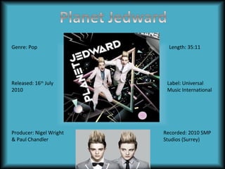
Front Cover
Genre: We can instantly distinguish the genre of the album from
its front cover. The main background color is black but there are
vibrant colors in forms of lighting rays and shapes which make it
appear like Jedward are at a disco.
Image: At the centre of the cover, we have Jedward hovering
with their hands out as if they are dancing. This tells us that they
are energetic, young, free and have a sense of humor and this
really appeals to the young target audience.. Both men are
looking straight at the camera which shows their confidence and
cheeky nature as they their mouths open. This links in with their
personality as we know that they are like comedians Also, they
are wearing casual trainers (converse) suggesting that they are
young and have freedom. There clothing consists of a smart
casual pink suit to show that they are unique and may be trying
to steal the limelight which is common for this genre. The
amount of color infers that this album would be suitable for
people in their teens and early twenties. Their hairstyles indicate
their age as it is very long and spiked which is bizarre but this
suggests that the album is suitable for a young target audience.
Text: The text in this album is simple yet effective, solely made
of capital letters, the writing looks bigger and sharper thus
making it stand out for the audience. The white lettering is eyecatching as it stands out with the contrasting black background.
In addition, the words are tilted and at an angle which isn’t a
usual placement in most albums.
Here we have
Jedward slinging
from a pink rope
which infers that
they are young and
are always looking
to have fun.
There appears to be a
huge pink disco ball
on the top left which
helps to resemble the
genre of this album
(pop)

Back Cover

The song list is numbered
1-11 and each number is
coloured following the
pattern of pink, blue,
yellow, green. The colours
are in a neon style which
contrasts well with the
dark background.

From judging the back
cover, I have noticed
that the typography
has remained
Song List:
consistent and the
Record label
white font of the song
Mention of a website
1.Under Pressure
situated on the
Even the barcode list contrasts well with
to find out more
2.All the small things
bottom left hand
has been tilted so the black background.
information etc.
3.Everybody
corner of the
it matches with
(synergy)
4.Ghostbusters
album (absolute)
the song list,
5.Fight for your right to
album name etc.
party
6.I want candy
The eleven songs included in this album are all
7.Jump
songs from other artists so Jedward do not own
8.I like to move it
these and have therefore covered the songs, this
9.Rock DJ
could suggest their inability to create their own
10.Teenage kicks
music.
11.Pop Muzik
Inside Panes
This album comes
with one disk only as
there only eleven
songs but some
albums come with
two disks

Both artists are looking
straight towards you which
signifies their confidence.

As you open the album, you are
greeted by John and Edward in smart
clothing, John wearing a bow-tie and
Edward with a standard tie to show
that they have different personalities
despite the fact they are twins. It also
indicates their closeness as they are
standing next to each other which
shows the strength of their relationship
as they are brothers.

The disk is titled
‘Planet Jedward’ and
the same font remains
making the typography
within the album
constant.

The album booklet is crucial as it provides
image for the front cover and also contains
further images of the twins and information
about the songs as well as a personal
message from the artists. The presentation
of this album is visually appealing, the disk
contrasts with purple and black
background as it’s rounded with a light
pink.
Spine
The spine of this is album is very simple
but does its job correctly in terms of having
the album name in the same font creating
a degree of consistency throughout the
whole album exterior.

It incorporates a slight pattern as
there are thick black and white
lines on both edges of the spine
which gradually become thinner.

The spine is important in an album
exterior as when stacked together,
you can easily find the album you
need.

Planet jedward

  • 1.
    Genre: Pop Released: 16thJuly 2010 Producer: Nigel Wright & Paul Chandler Length: 35:11 Label: Universal Music International Recorded: 2010 SMP Studios (Surrey)
  • 2.
    Front Cover Genre: Wecan instantly distinguish the genre of the album from its front cover. The main background color is black but there are vibrant colors in forms of lighting rays and shapes which make it appear like Jedward are at a disco. Image: At the centre of the cover, we have Jedward hovering with their hands out as if they are dancing. This tells us that they are energetic, young, free and have a sense of humor and this really appeals to the young target audience.. Both men are looking straight at the camera which shows their confidence and cheeky nature as they their mouths open. This links in with their personality as we know that they are like comedians Also, they are wearing casual trainers (converse) suggesting that they are young and have freedom. There clothing consists of a smart casual pink suit to show that they are unique and may be trying to steal the limelight which is common for this genre. The amount of color infers that this album would be suitable for people in their teens and early twenties. Their hairstyles indicate their age as it is very long and spiked which is bizarre but this suggests that the album is suitable for a young target audience. Text: The text in this album is simple yet effective, solely made of capital letters, the writing looks bigger and sharper thus making it stand out for the audience. The white lettering is eyecatching as it stands out with the contrasting black background. In addition, the words are tilted and at an angle which isn’t a usual placement in most albums.
  • 3.
    Here we have Jedwardslinging from a pink rope which infers that they are young and are always looking to have fun. There appears to be a huge pink disco ball on the top left which helps to resemble the genre of this album (pop) Back Cover The song list is numbered 1-11 and each number is coloured following the pattern of pink, blue, yellow, green. The colours are in a neon style which contrasts well with the dark background. From judging the back cover, I have noticed that the typography has remained Song List: consistent and the Record label white font of the song Mention of a website 1.Under Pressure situated on the Even the barcode list contrasts well with to find out more 2.All the small things bottom left hand has been tilted so the black background. information etc. 3.Everybody corner of the it matches with (synergy) 4.Ghostbusters album (absolute) the song list, 5.Fight for your right to album name etc. party 6.I want candy The eleven songs included in this album are all 7.Jump songs from other artists so Jedward do not own 8.I like to move it these and have therefore covered the songs, this 9.Rock DJ could suggest their inability to create their own 10.Teenage kicks music. 11.Pop Muzik
  • 4.
    Inside Panes This albumcomes with one disk only as there only eleven songs but some albums come with two disks Both artists are looking straight towards you which signifies their confidence. As you open the album, you are greeted by John and Edward in smart clothing, John wearing a bow-tie and Edward with a standard tie to show that they have different personalities despite the fact they are twins. It also indicates their closeness as they are standing next to each other which shows the strength of their relationship as they are brothers. The disk is titled ‘Planet Jedward’ and the same font remains making the typography within the album constant. The album booklet is crucial as it provides image for the front cover and also contains further images of the twins and information about the songs as well as a personal message from the artists. The presentation of this album is visually appealing, the disk contrasts with purple and black background as it’s rounded with a light pink.
  • 5.
    Spine The spine ofthis is album is very simple but does its job correctly in terms of having the album name in the same font creating a degree of consistency throughout the whole album exterior. It incorporates a slight pattern as there are thick black and white lines on both edges of the spine which gradually become thinner. The spine is important in an album exterior as when stacked together, you can easily find the album you need.
  • 6.
    Spine The spine ofthis is album is very simple but does its job correctly in terms of having the album name in the same font creating a degree of consistency throughout the whole album exterior. It incorporates a slight pattern as there are thick black and white lines on both edges of the spine which gradually become thinner. The spine is important in an album exterior as when stacked together, you can easily find the album you need.