Download as PDF, PPTX
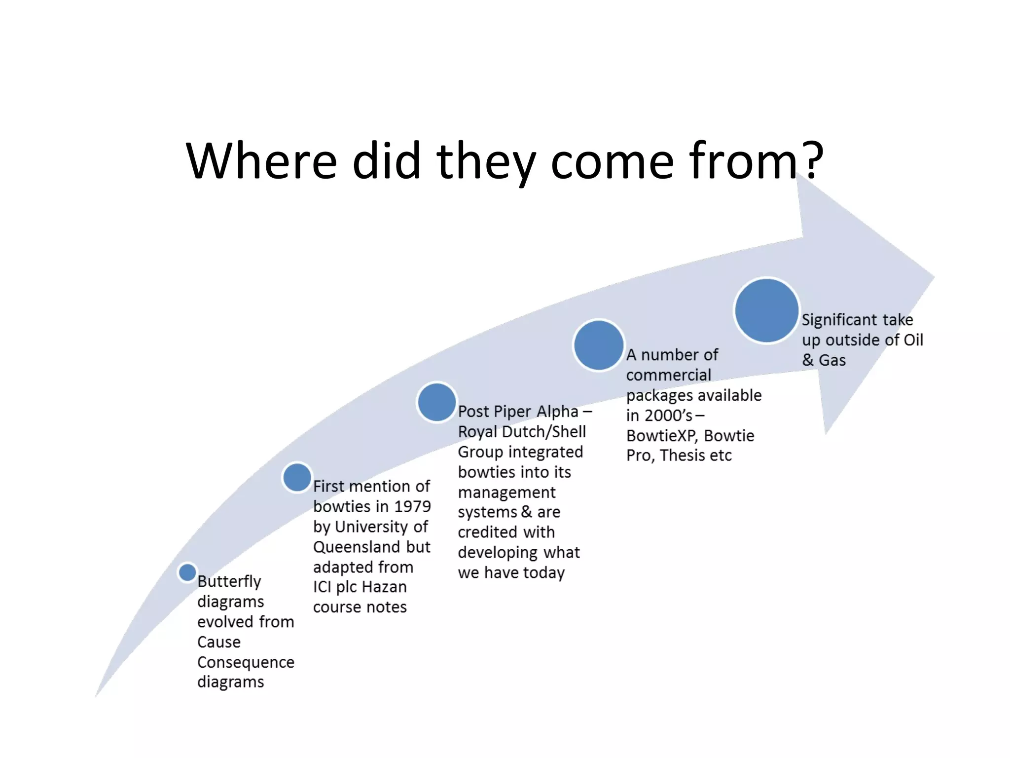
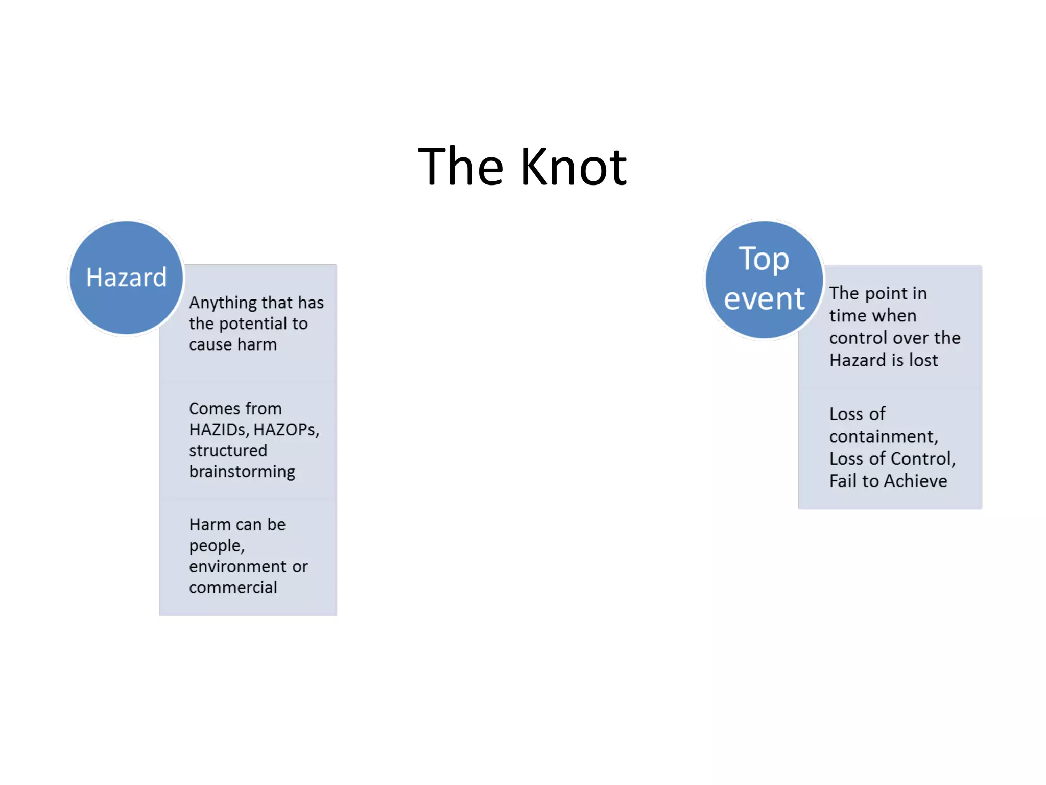
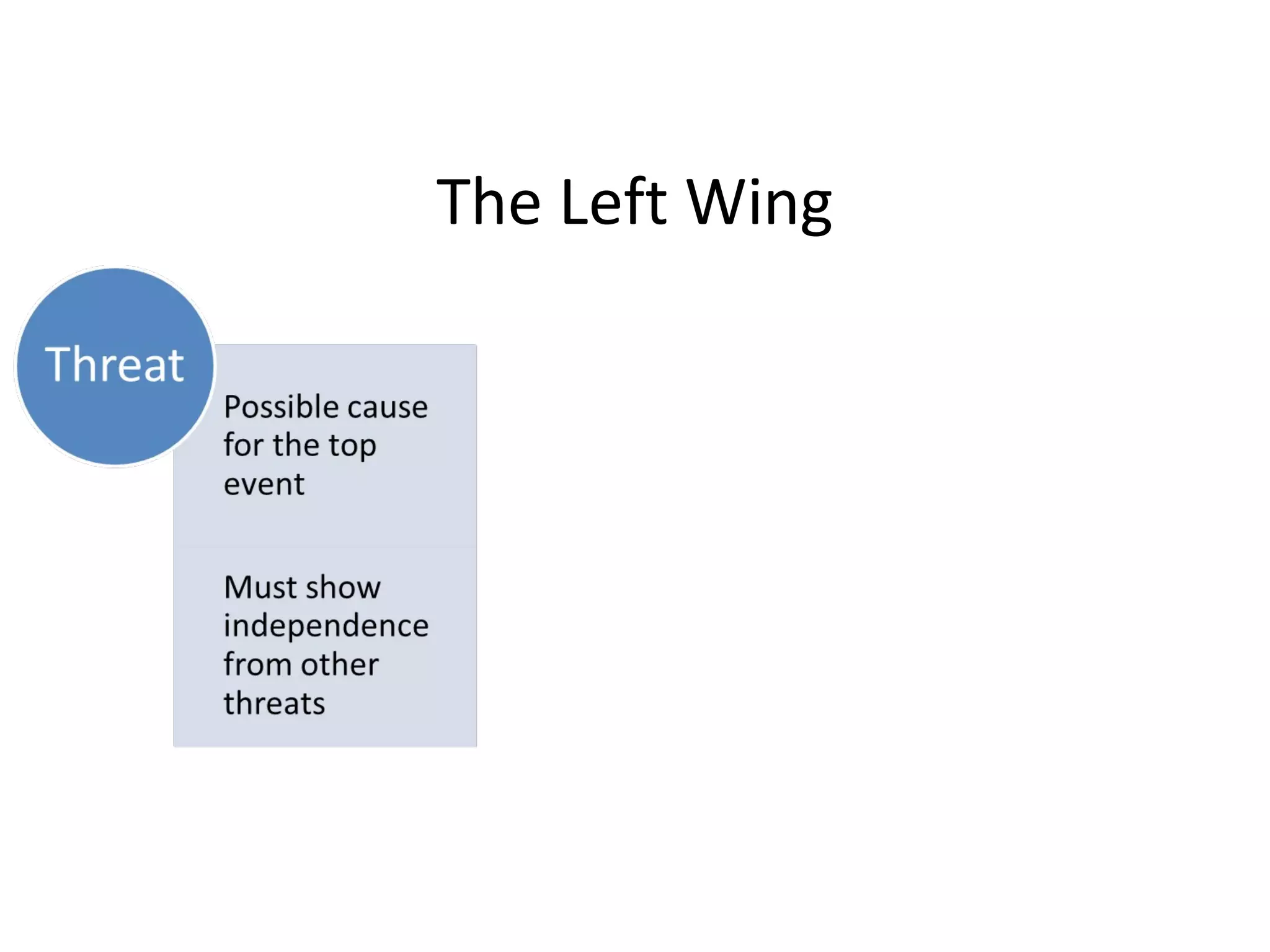
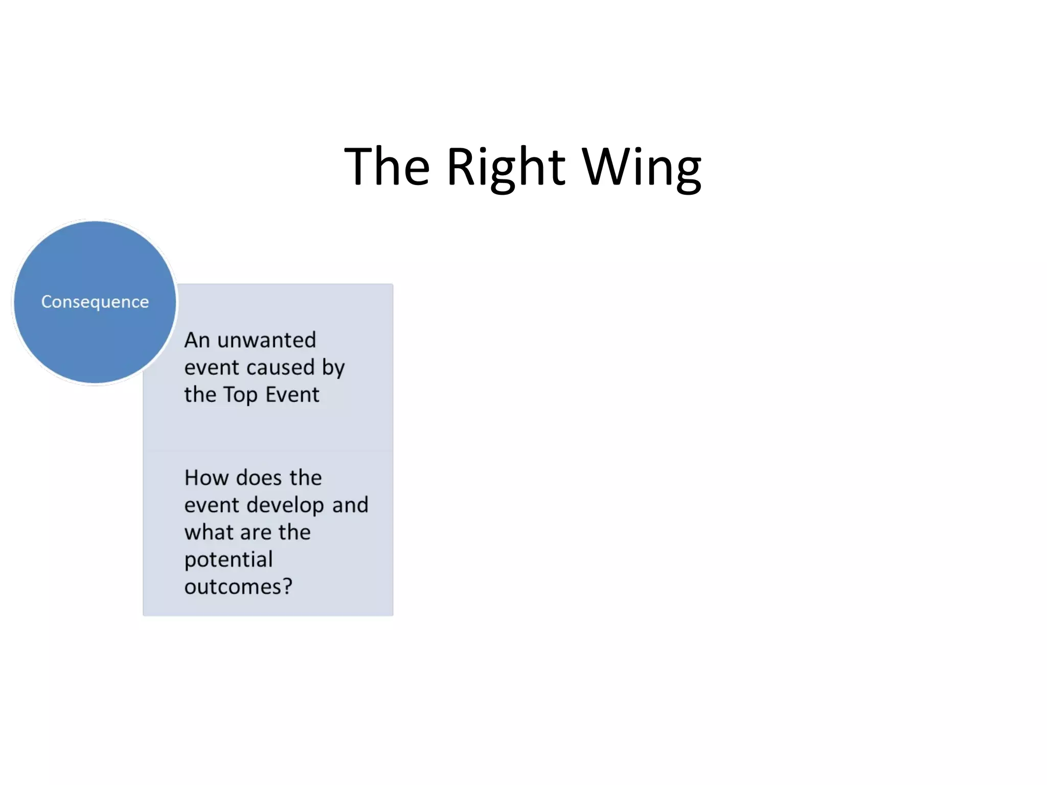
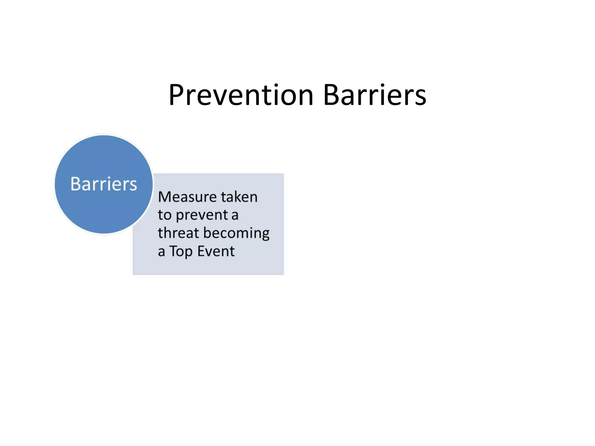


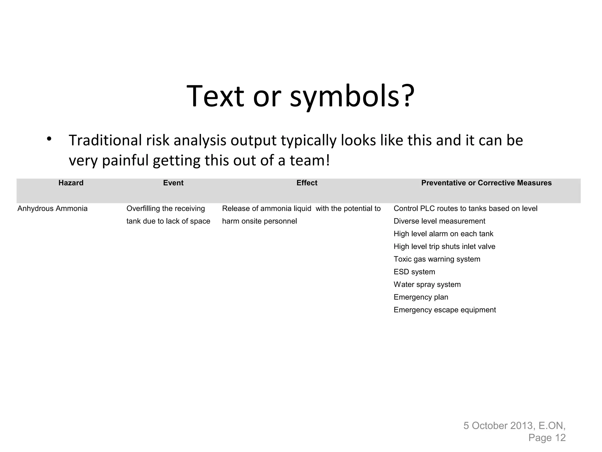
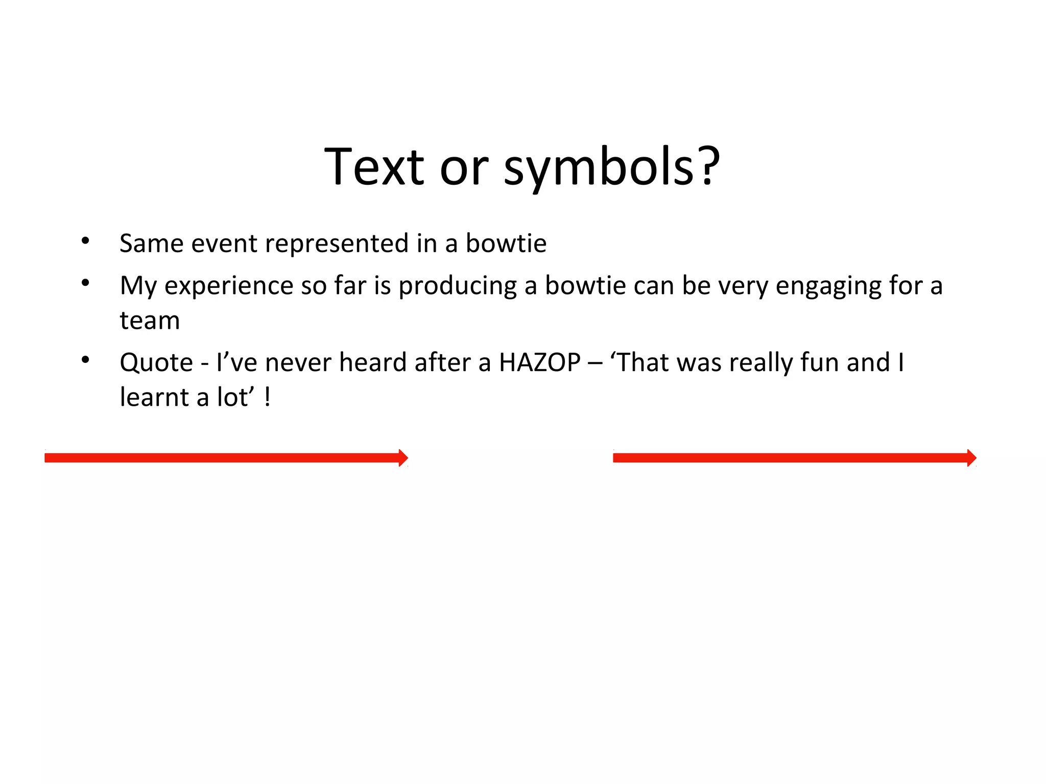

This document provides an overview of bowtie diagrams and how they are used for risk management. It discusses the origins of bowtie diagrams, which evolved from cause-consequence diagrams. Bowtie diagrams visually represent hazards, threats, consequences, and prevention/recovery barriers on a diagram shaped like a bowtie. They provide a clear visual representation of risk that can be more engaging for teams to discuss than traditional text-based risk analysis outputs. The document notes that bowtie diagrams have significant usage outside of oil and gas and that commercial software is available to create them.