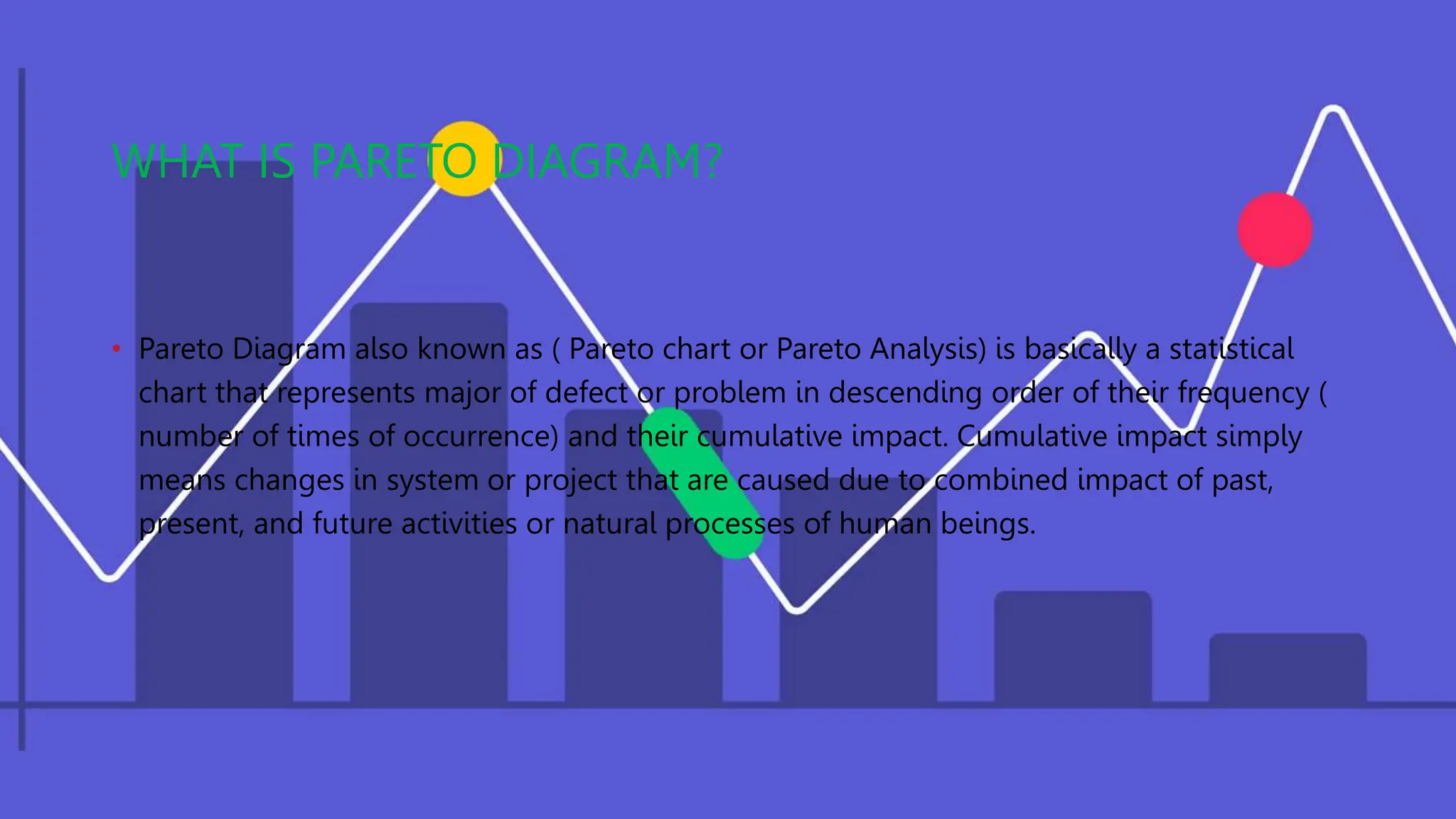
A Pareto diagram is a statistical chart that represents problems or defects in descending order of frequency, with their cumulative impact. It separates significant issues from trivial ones to help teams direct improvement efforts. Benefits include effective communication, efficiency, problem-solving skills, and decision-making. Pareto diagrams can identify root causes of defects, prioritize issues, and explain priorities to stakeholders. They are used to organize large amounts of data and analyze defects. While simple to create, they only show past qualitative data and may require additional tools for root cause analysis.