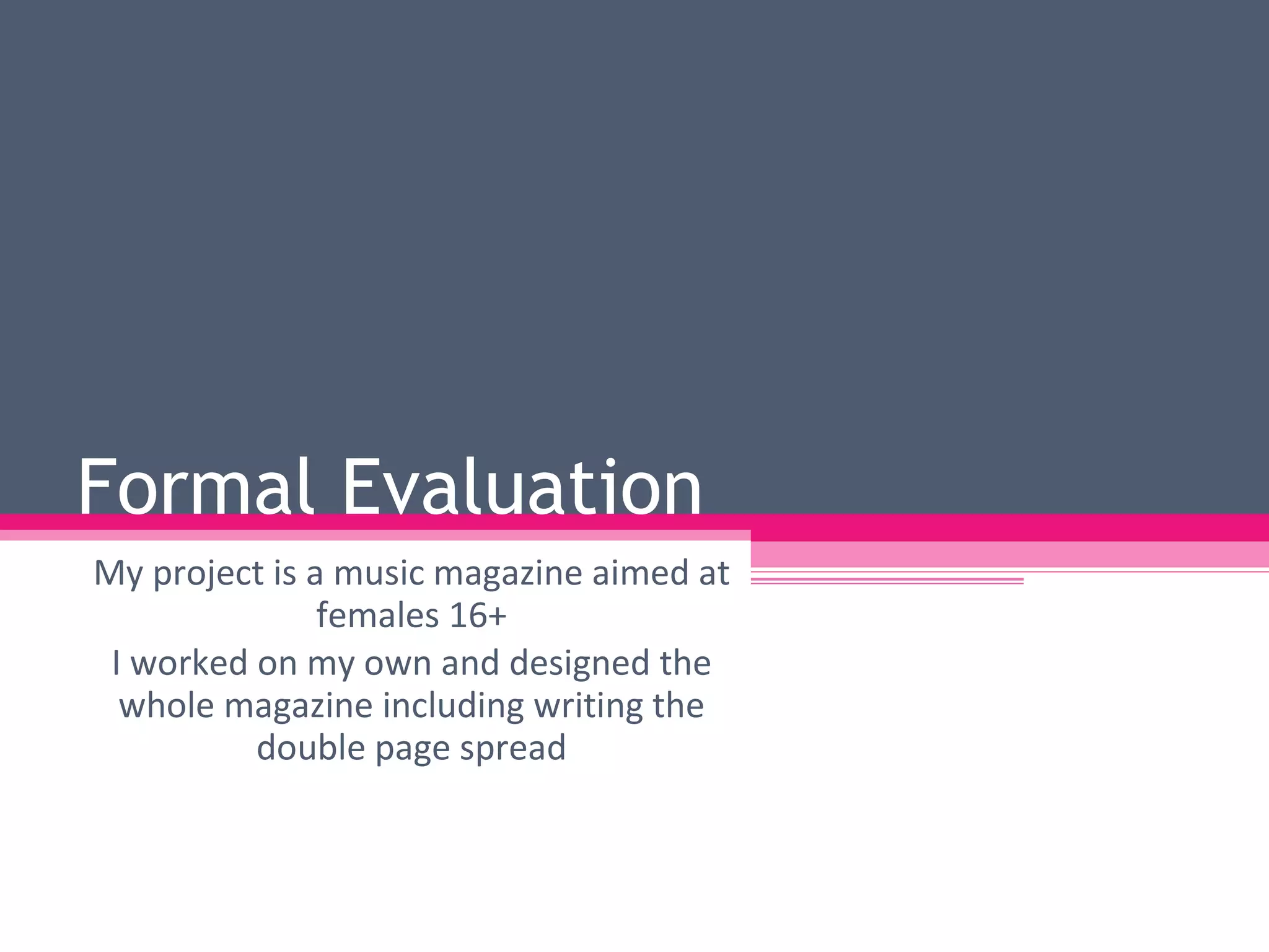
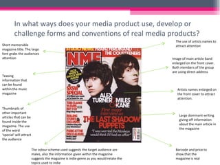
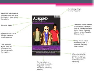
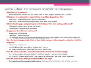
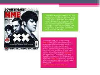
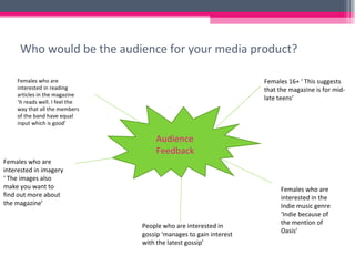
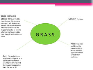
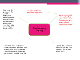
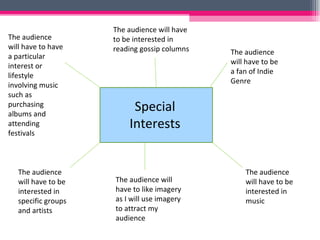
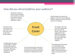
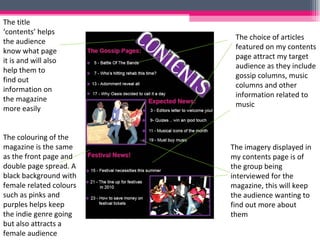
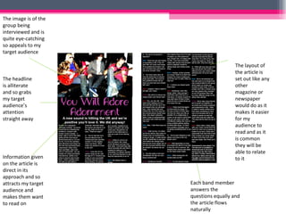
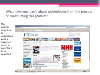
The document summarizes a music magazine project aimed at females aged 16 and older. Key details include:
- The magazine focuses on the indie music genre and features interviews with a band.
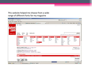
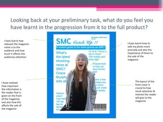
- Effort was put into the magazine design, including the memorable title, eye-catching cover image, and use of color scheme and fonts.
- Feedback indicates the magazine looks professional and genuine, and would attract its target audience.


![Codes[1]](https://cdn.slidesharecdn.com/ss_thumbnails/codes1-110701045540-phpapp02-thumbnail.jpg?width=640&height=640&fit=bounds)
![As media studies_editing_powerpoint[1]](https://cdn.slidesharecdn.com/ss_thumbnails/asmediastudieseditingpowerpoint1-110701045536-phpapp02-thumbnail.jpg?width=640&height=640&fit=bounds)