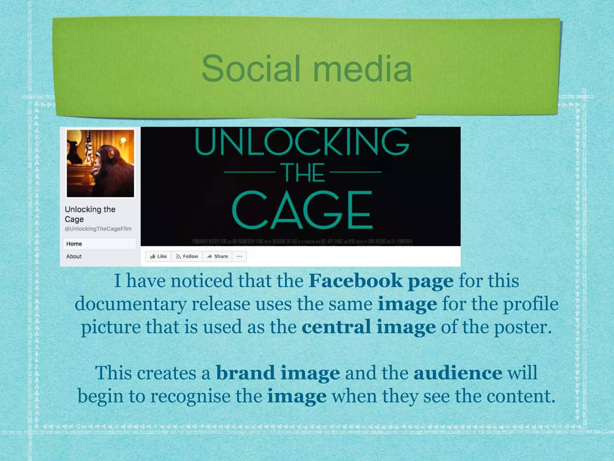
Ella Chapman
What am I analysing?
I have decided to analyse a documentary poster. This specific
one is ‘Unlocking The Cage’ which is a documentary released in
2016.
The purpose
The purpose of this poster is to advertise the product
to a wide audience who will want to watch the
documentary.
It also gives the documentary a brand name, so the
target audience will automatically recognise the
central image on the poster when walking along the
street.
This ensures they receive the amount of attention they
deserve.
The masthead
The typography of the masthead
is capitalised, which makes it an
important part of the poster and will
be one of the first thing one will
notice.
The size of the font ‘cage’ is slightly
larger, which highlights the idea that
this object will play a large part in the
storyline of the documentary.
The colour palette with regards to
the green font, stands out well
against the colour of the animal
featuring on the poster.
The strap-line
There is also a strap-line on the poster. This isn’t a
very obvious addition to the piece, due to the colour
palette and font type not allowing it to stand out as
much as the masthead does.
However, the strap-line is in the form of an
interrogative, which engages with the audience. It
has the aim of making them wonder what events are
going to unfold.
Brand name
This is placed at the very top of the poster, and appears to place
the brand in a good light. They have ensured that the names of
the other films are in a bold font and stand out from the
remaining text.
Also, the second person pronoun ‘you’ portrays how they are
aiming to form a personal relationship with the audience. They
have an aim to fulfil their wants and needs.
The central image
The central image is the
main focus of this poster.
The background is blurred
out, which means the
animal on the front can be
clearly seen.
Also, this has the aim of
providing the audience
with information with
regards to what the
documentary is going to
involve.
The background
The colour palette with regards to
the background is bright, which is in
juxtaposition to the central image
on the front.
However, due to the shallow focus
shot type, the attention is on the
image in focus which is the
chimpanzee.
It appears that there is a court scene
taking place in the background, which
could hold negative connotations
in terms of the preferred reading.
Reviews
The poster also includes reviews from
well known brands such as the Daily
Mail, and also people such as John
Stewart.
This portrays this documentary as being
good enough for other well known brands
to watch, so it must be worth consuming.
The capitalised words stand out and
make the statement more exciting to read.
Featuring names
At the very bottom of the poster there is a list of names with
regards to who was involved with the production of the
documentary.
However, the font is so small that it is not something that
people notice straight away.
The shape
The overall shape of the the
poster is shaped like a
postcard This is unusual as
many other posters I have
come across follow the typical
conventions of being more
like a vertical rectangle.
However, this looks effective
and more niche than others
that already exist.
Social media
I have noticed that the Facebook page for this
documentary release uses the same image for the profile
picture that is used as the central image of the poster.
This creates a brand image and the audience will
begin to recognise the image when they see the content.
Usage of the poster
The poster has been used on the
online website ‘IMDb’
The documentary has a rating of
7.0/10 with many reviews to go
towards this.
The poster provides the
audience with recognition as to
what they are reviewing, due to
having most likely seen the
image several times prior to this
stage
Positive reviews
These are two of the reviews from the IMBd website,
which contributed to the overall 7.0/10 rating of the
film.
Stuart Hall- theory
Stuart Hall looked into the way the
audience responds to a text.
Just by looking at the poster itself,
there is a clear preferred reading:
the audience will feel sorry for the
chimpanzee on the front of the poster
due to the sad expression it is
portraying.
Also, the connotations of the lexis
within the masthead creates negative
connotations that makes the animal
look at risk, resulting in sympathy
being felt.

Documentary poster analysis final

  • 1.
  • 2.
    What am Ianalysing? I have decided to analyse a documentary poster. This specific one is ‘Unlocking The Cage’ which is a documentary released in 2016.
  • 3.
    The purpose The purposeof this poster is to advertise the product to a wide audience who will want to watch the documentary. It also gives the documentary a brand name, so the target audience will automatically recognise the central image on the poster when walking along the street. This ensures they receive the amount of attention they deserve.
  • 4.
    The masthead The typographyof the masthead is capitalised, which makes it an important part of the poster and will be one of the first thing one will notice. The size of the font ‘cage’ is slightly larger, which highlights the idea that this object will play a large part in the storyline of the documentary. The colour palette with regards to the green font, stands out well against the colour of the animal featuring on the poster.
  • 5.
    The strap-line There isalso a strap-line on the poster. This isn’t a very obvious addition to the piece, due to the colour palette and font type not allowing it to stand out as much as the masthead does. However, the strap-line is in the form of an interrogative, which engages with the audience. It has the aim of making them wonder what events are going to unfold.
  • 6.
    Brand name This isplaced at the very top of the poster, and appears to place the brand in a good light. They have ensured that the names of the other films are in a bold font and stand out from the remaining text. Also, the second person pronoun ‘you’ portrays how they are aiming to form a personal relationship with the audience. They have an aim to fulfil their wants and needs.
  • 7.
    The central image Thecentral image is the main focus of this poster. The background is blurred out, which means the animal on the front can be clearly seen. Also, this has the aim of providing the audience with information with regards to what the documentary is going to involve.
  • 8.
    The background The colourpalette with regards to the background is bright, which is in juxtaposition to the central image on the front. However, due to the shallow focus shot type, the attention is on the image in focus which is the chimpanzee. It appears that there is a court scene taking place in the background, which could hold negative connotations in terms of the preferred reading.
  • 9.
    Reviews The poster alsoincludes reviews from well known brands such as the Daily Mail, and also people such as John Stewart. This portrays this documentary as being good enough for other well known brands to watch, so it must be worth consuming. The capitalised words stand out and make the statement more exciting to read.
  • 10.
    Featuring names At thevery bottom of the poster there is a list of names with regards to who was involved with the production of the documentary. However, the font is so small that it is not something that people notice straight away.
  • 11.
    The shape The overallshape of the the poster is shaped like a postcard This is unusual as many other posters I have come across follow the typical conventions of being more like a vertical rectangle. However, this looks effective and more niche than others that already exist.
  • 12.
    Social media I havenoticed that the Facebook page for this documentary release uses the same image for the profile picture that is used as the central image of the poster. This creates a brand image and the audience will begin to recognise the image when they see the content.
  • 13.
    Usage of theposter The poster has been used on the online website ‘IMDb’ The documentary has a rating of 7.0/10 with many reviews to go towards this. The poster provides the audience with recognition as to what they are reviewing, due to having most likely seen the image several times prior to this stage
  • 14.
    Positive reviews These aretwo of the reviews from the IMBd website, which contributed to the overall 7.0/10 rating of the film.
  • 15.
    Stuart Hall- theory StuartHall looked into the way the audience responds to a text. Just by looking at the poster itself, there is a clear preferred reading: the audience will feel sorry for the chimpanzee on the front of the poster due to the sad expression it is portraying. Also, the connotations of the lexis within the masthead creates negative connotations that makes the animal look at risk, resulting in sympathy being felt.