Download to read offline
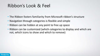
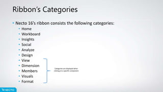


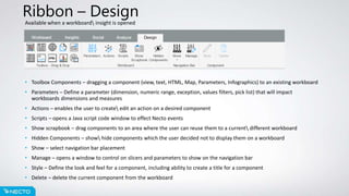
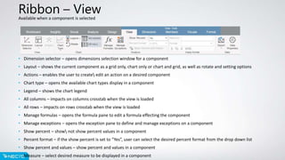
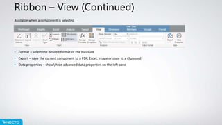


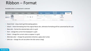

The ribbon provides navigation and controls for Necto 16. It consists of categories like Home, Workboard, Insights, etc. Each category contains icons for common tasks in that area, like creating a new workboard, exploring insights, formatting visuals, and more. The ribbon allows customizable organization and hiding of categories to optimize workspace.


![Welding 2[EDocFind.com]](https://cdn.slidesharecdn.com/ss_thumbnails/cef0456c-72db-4c24-9232-061dfa358ef1-151012162903-lva1-app6892-thumbnail.jpg?width=640&height=640&fit=bounds)


