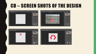
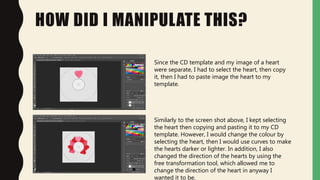
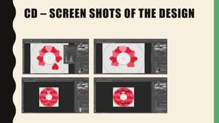
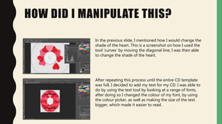
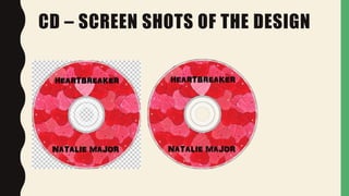
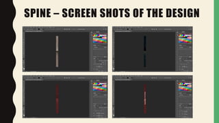
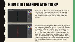
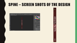
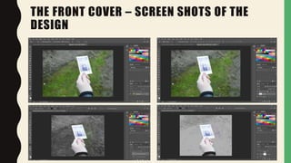
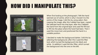
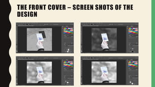
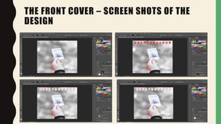
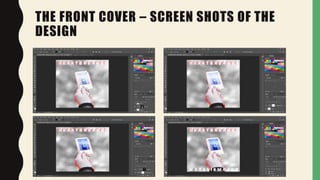
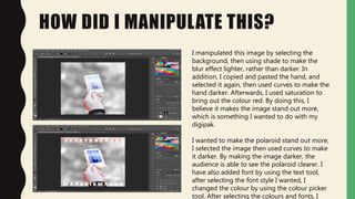
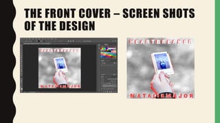
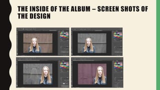
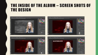
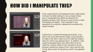
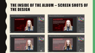
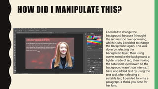
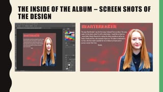
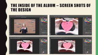
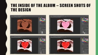
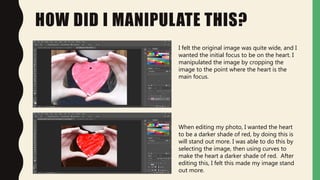
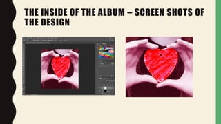
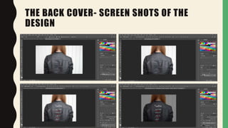
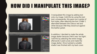
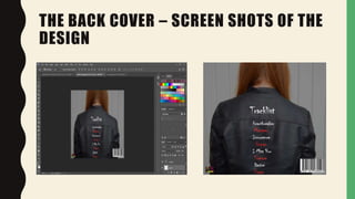
3. HOW DID I MANIPULATE THIS?
Since the CD template and my image of a heart
were separate, I had to select the heart, then copy
it, then I had to paste image the heart to my
template.
Similarly to the screen shot above, I kept selecting
the heart then copying and pasting it to my CD
template. However, I would change the colour by
selecting the heart, then I would use curves to make
the hearts darker or lighter. In addition, I also
changed the direction of the hearts by using the
free transformation tool, which allowed me to
change the direction of the heart in anyway I
wanted it to be.
5. HOW DID I MANIPULATE THIS?
In the previous slide, I mentioned how I would change the
shade of the heart. This is a screenshot on how I used the
tool ‘curves’ by moving the diagonal line, I was then able
to change the shade of the heart.
After repeating this process until the entire CD template
was full, I decided to add my text for my CD. I was able to
do by using the text tool by looking at a range of fonts,
after doing so I changed the colour of my font, by using
the colour picker, as well as making the size of the text
bigger, which made it easier to read.
8. HOW DID I MANIPULATE THIS?
I was able to change the original colour of my spine by
selecting the image, then using curves to making a
darker shade. After this I used saturation to get rid of
the existing colour, which allowed me to get to this
colour.
However, when looking back at the rest of my digipak, I
felt the spine seemed out of place, due to this I decided
change the colour of the spine to red by selecting the
image, getting rid of the original saturation and to add
colour to it, then I used curves to make it a darker red.
After this, I used the text tool to add text to my spine, I
used transformation to change the direction of the text,
afterwards I decided to use the colour white because I
felt it would stand out more rather than the colour
black.
11. HOW DID I MANIPULATE THIS?
When first looking at the photograph, I felt the hand
seemed out of centre, which is why I moved it to the
centre of the image. I did this by using select, then
copying the image, after this I added new layer, copied
the selected hand into that layer, after this I deleted
the hand from the original layer and used the fill tool
to fill into the place where the hand had been. Then I
used the move tool, and positioned the hand in a
suitable position.
I decided to make the background darker. I did this by
selecting the background, after this I used the filter
tool, which turned the background into black and
white. In addition I used the blur filter, which turned
the background into the one on the left.
15. HOW DID I MANIPULATE THIS?
I manipulated this image by selecting the
background, then using shade to make the
blur effect lighter, rather than darker. In
addition, I copied and pasted the hand, and
selected it again, then used curves to make the
hand darker. Afterwards, I used saturation to
bring out the colour red. By doing this, I
believe it makes the image stand out more,
which is something I wanted to do with my
digipak.
I wanted to make the polaroid stand out more,
I selected the image then used curves to make
it darker. By making the image darker, the
audience is able to see the polaroid clearer. I
have also added font by using the text tool,
after selecting the font style I wanted, I
changed the colour by using the colour picker
tool. After selecting the colours and fonts, I
17. THE INSIDE OF THE ALBUM – SCREEN SHOTS OF
THE DESIGN
18. THE INSIDE OF THE ALBUM – SCREEN SHOTS OF
THE DESIGN
19. HOW DID I MANIPULATE THIS?
In the original photo, the background was a light shade
of brown, but after editing it’s now a shade of dark
pink. I manipulated this photo by selecting the
background layer, after doing so I used curves to make
the background lighter. Then I decided to use
saturation, by using this it allowed me to achieve the
shade I wanted.
Furthermore, I wanted the background darker, I was
able to do so by selecting the image, using saturation
to make it red, then I used curves to make the shade a
dark red, which I was pleased about. In addition, I also
copied and pasted Katie, then add a filter to her to
make her a darker shade of red, I decided to do this
because I wanted an outline of her. I also used the text
tool to add my text on the picture, which I was pleased
about.
20. THE INSIDE OF THE ALBUM – SCREEN SHOTS OF
THE DESIGN
21. HOW DID I MANIPULATE THIS?
I decided to change the
background because I thought
the red was too over-powering,
which is why I decided to change
the background again. This was
done by selecting the
background layer, then using
curves to make the background a
lighter shade of red, then making
the saturation level lower, so the
background wasn’t too intense. I
have also added text by using the
text tool. After selecting a
suitable text, I decided to write a
paragraph, a thank you note for
her fans.
22. THE INSIDE OF THE ALBUM – SCREEN SHOTS OF
THE DESIGN
23. THE INSIDE OF THE ALBUM – SCREEN SHOTS OF
THE DESIGN
24. THE INSIDE OF THE ALBUM – SCREEN SHOTS OF
THE DESIGN
25. HOW DID I MANIPULATE THIS?
I felt the original image was quite wide, and I
wanted the initial focus to be on the heart. I
manipulated the image by cropping the
image to the point where the heart is the
main focus.
When editing my photo, I wanted the heart
to be a darker shade of red, by doing this is
will stand out more. I was able to do this by
selecting the image, then using curves to
make the heart a darker shade of red. After
editing this, I felt this made my image stand
out more.
26. THE INSIDE OF THE ALBUM – SCREEN SHOTS OF
THE DESIGN
28. HOW DID I MANIPULATE THIS IMAGE?
I manipulated this image by adding text
onto my image. I did this by using the text
tool, consequently, this gave me a variety of
font styles, after selecting the font ‘Chiller’ I
alternated between the colours red and
white because I felt they stood out against
the leather jacket.
In addition, I decided to make the whole
image darker because I felt it was ‘too light’.
I did this by selecting the entire image,
afterwards I used curves and made the
image darker. Once I picked a suitable
shade I was finished with my back cover.