
Recommended
More Related Content
What's hot
What's hot (19)
Viewers also liked
Similar to Movie poster research
Similar to Movie poster research (20)
Recently uploaded
Recently uploaded (16)
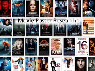
Movie poster research
- 2. This is a character specific poster, it has the characters name above of the film name. They have done a few of these for the different main characters of the movie. Movie title, with the same logo from the movie Coming soon date clearly see The image of Katniss they have used helps to create a familiarity with the character before the movie is released but also they have used the lighting on the image has been done well because there is a shadowed part of her which helps to create mystery.
- 3. ‘From the director of...’ this caption makes the film have a larger audience because people who liked his other films will want to come see this one too. Sub-lines are connected to the movie and the viewer of the poster drawn in to it more. The forest background really stands out and makes a earring feeling to the overall poster. We can not seen the girls face which adds a element of mystery to the overall poster. The use of the red cape in the a dark environment helps to make the bright red really stand out. The title for the movie has been done in the same red as the cloak to make it stand out. The release date (but there is no day that it will be out on)
- 4. Looking at these helped me to think about what I would like to do in my own movie poster, ready so that I can make it. Hunger Games: I found this poster a little boring if I am honest, though it looks very pretty I think that they could have done a poster that could connect to the movie more. Red Riding Hood: I really loved the way that they used the colour of the red against a the darker colours on the poster, it really makes it stand out and I really like the use of the sub-line text on this poster. For my genre of film both these poster showed the use of a dark background and the shading helps to join the dark background together with the images used for the images of the characters. From this research I have decided that for my own Movie Poster i am going to try and keep it simple, show the key characters in my trailer and try to keep the atmosphere somewhat shadowed and dark to go with the one is have looked into.