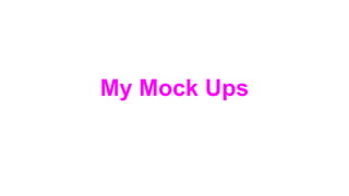
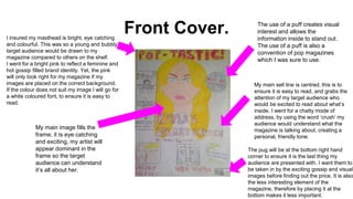
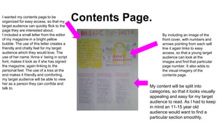
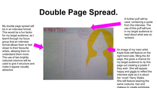
2. Front Cover.I insured my masthead is bright, eye catching
and colourful. This was so a young and bubbly
target audience would be drawn to my
magazine compared to others on the shelf.
I went for a bright pink to reflect a feminine and
hot gossip filled brand identity. Yet, the pink
will only look right for my magazine if my
images are placed on the correct background.
If the colour does not suit my image I will go for
a white coloured font, to ensure it is easy to
read.
The use of a puff creates visual
interest and allows the
information inside to stand out.
The use of a puff is also a
convention of pop magazines
which I was sure to use.
My main image fills the
frame, it is eye catching
and exciting, my artist will
appear dominant in the
frame so the target
audience can understand
it’s all about her.
My main sell line is centred, this is to
ensure it is easy to read, and grabs the
attention of my target audience who
would be excited to read about what’s
inside. I went for a chatty mode of
address, by using the word ‘crush’ my
audience would understand what the
magazine is talking about, creating a
personal, friendly tone.
The pug will be at the bottom right hand
corner to ensure it is the last thing my
audience are presented with. I want them to
be taken in by the exciting gossip and visual
images before finding out the price. It is also
the less interesting element of the
magazine, therefore by placing it at the
bottom makes it less important.
3. Contents Page.I wanted my contents page to be
organized for easy access, so that my
target audience can quickly flick to the
page they are interested about.
I included a small letter from the editor
of my magazine in a bright yellow
bubble. The use of this letter creates a
friendly and chatty feel for my target
audience which they would love. The
use of her name ‘Anna x’ being in script
font, makes it look as if she has signed
the magazine, again linking to the
personal feel. The use of a kiss at the
end makes it friendly and comforting,
my target audience will be able to view
her as a person they can confide and
talk to.
By including an image of the
front cover, with numbers and
arrows pointing from each sell
line it again links to easy
access, so that a young target
audience can look at the
images and find that particular
page number. It also adds to
the visual imagery of the
contents page.
My content will be split into
categories, so that it looks visually
appealing and easy for my target
audience to read. As I had to keep
in mind an 11-15 year old
audience would want to find a
particular section smoothly.
4. Double Page Spread.
My double page spread will
be in an interview format.
This would be a fun factor
for my target audience, as I
learnt through my focus
group that an interview
format allows them to feel
closer to their favourite
artists, allowing them to
understand them more.
The use of two brightly
coloured columns will be
used to give it structure and
make it appear visually
attractive.
An image of my main artist
Kayla Kole will feature on the
right hand side, filling the A4
page, this gives a chance for
my target audience to rip this
page out creating a poster if
they wish. She will appear,
happy and giggly to reflect the
interview style as it is about
her ‘crush’ Harry Styles.
She will feature wearing the
same costume, hair and
A further puff will be
used, containing a quote
from the interview. The
use of this puff will lure
in my target audience to
read about what was so
‘embara’.
5. Why I Carried Out Mock Ups?
The creation of mock ups allows me to have a structured
plan for the production of my practical task. Furthermore, it
gives me a plan in how I would like to set out my pieces.
However, I will only use my mock ups as a guide and may
end up changing the layout when I produce my practicals
as it may not work.