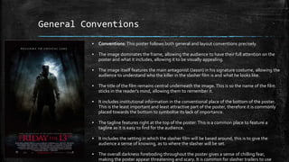
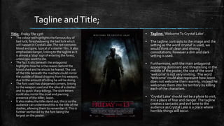
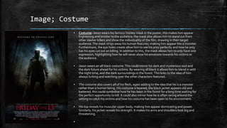
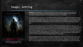
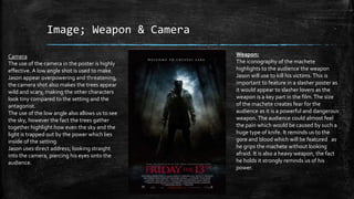
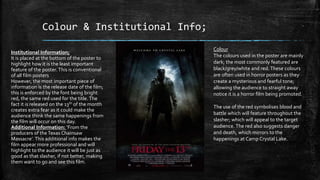
2. General Conventions
▪ Conventions: This poster follows both general and layout conventions precisely.
▪ The image dominates the frame, allowing the audience to have their full attention on the
poster and what it includes, allowing it to be visually appealing.
▪ The image itself features the main antagonist (Jason) in his signature costume, allowing the
audience to understand who the killer in the slasher film is and what he looks like.
▪ The title of the film remains central underneath the image.This is so the name of the film
sticks in the reader's mind, allowing them to remember it.
▪ It includes institutional information in the conventional place of the bottom of the poster.
This is the least important and least attractive part of the poster, therefore it is commonly
placed towards the bottom to symbolise its lack of importance.
▪ The tagline features right at the top of the poster.This is a common place to feature a
tagline as it is easy to find for the audience.
▪ It includes the setting in which the slasher film will be based around, this is to give the
audience a sense of knowing, as to where the slasher will be set.
▪ The overall darkness foreboding throughout the poster gives a sense of chilling fear,
making the poster appear threatening and scary. It is common for slasher trailers to use
3. ▪ Tagline: ‘Welcome To Crystal Lake’ .
▪ The tagline contrasts to the image and the
setting as the word ‘crystal’ is used, we
would think of clean and shining
connotations; however a dim and dark
setting is used.
▪ Furthermore, with the main antagonist
appearing dominant and threatening in the
middle of the poster, the use of the word
‘welcome’ is not very inviting. The word
‘Welcome’ could also represent how Jason
does not welcome them warmly, instead he
welcomes them into his territory by killing
each of the characters.
▪ ‘Crystal Lake’ should not be a place to visit,
it is a place of fear and danger. The tagline
creates a sarcastic and evil tone to the
audience as Crystal Lake is a place where
horrible things will occur.
Tagline andTitle;
Title: FridayThe 13th
• The colour red highlights the famous day of
bad luck, foreshadowing the bad luck which
will happen in Crystal Lake.The red connotes
blood and gore; typical of a slasher film. It also
emphasises danger, linking to the tagline as it
is almost a ‘stop’ sign of entering the forest,
unless you want to die.
• The fact it sits beneath the antagonist
highlights how he is the reason behind the
blood shed and he should be feared.The use
of the title beneath the machete could mirror
the puddle of blood dripping from his weapon,
due to the amount of killing he will be doing.
• The font used has sharpened corners, linking
to the weapon used and the idea of a slasher
and its quick sharp killings.The slick letters
could also mirror the cruel and piercing
presence of the killer; Jason.
• It also makes the title stand out, this is so the
audience can understand this is the title of the
slasher, allowing them to remember it.This is
further reinforced by the font being the
largest on the poster.
4. Image; Costume
▪ Costume: Jason wears his famous hockey mask in the poster, this makes him appear
frightening and sinister to the audience; the mask also allows him to stand out from
other slasher killers and show the individuality of the film, drawing in their target
audience.The mask strips away his human features, making him appear like a monster.
Furthermore, the eye holes create allow him to see his prey perfectly and how he only
has his eyes cut out on killing. In addition to this, the mask allows him to only have one
expression; highlighting how he will never show his emotions towards his victims or
the audience.
▪ Jason wears an all black costume.This could mirror his dark and mysterious soul and
the dark future ahead for his victims. By wearing all black it allows him to blend in with
the night time, and the dark surroundings in the forest.This links to the idea of him
always lurking and watching over the other characters featured.
▪ The costume also covers all of his flesh, again adding to the idea that he is a monster
rather than a human being. His costume is layered, the black jacket appears old and
battered, this could symbolise how he has been in the forest for a long time waiting for
the perfect opportunity to kill. It could also mirror how he is often racing around the
setting to catch his victims and how his costume has been open to his environment.
▪ His top reveals his muscular upper body, making him appear dominating and power.
Similarly, his jacket reveals his strength. It makes his arms and shoulders look big and
threatening.
▪
5. Image; Setting
▪ Setting: Surrounding Jason is a forest and a lake.The forest is dark and gloomy with a misty fog
surrounding him, this could symbolise the evil which will commence inside the forest and could
foreshadow a dark and unlikely future for the other characters in the slasher.
▪ The fog allows Jason to hide even more effectively as it restricts the view ahead.This makes the setting
more fearful for the audience as we worry that the characters will not be able to run away as they cannot
see where they are going. Furthermore, the fog lurks throughout the image, mirroring the behavior of
the antagonist and further reinforcing how even the setting is evil and threatening for the characters
lives.
▪ The trees are thin yet they tower over everything, blocking out the ambient light from the moon this
makes them too appear powerful and threatening as they have power over the amount of light entering
the forest; this could mirror the hopeless future for the characters and how there may not be a light at
the end of the tunnel for any of them.They also stand in unison with Jason, showing how they are on his
side and they will help in the involvement of the killings as Jason is aware of his surroundings and knows
the perfect places to lurk and watch over his victims. However, the powerful stance of Jason makes the
trees look weak compared to him, as he appears larger in his strength.
▪ The use of a lake creates a symbiosis to the tagline ‘Welcome to Crystal Lake’ however the colour of the
lake contrasts to the word ‘crystal’. Connotations of crystals are clean, shiny purity however, the lake is
used for a sinister purpose in FridayThe 13th as one of the characters is killed there. Furthermore, the
lake in the poster appears dark and gloomy, mirroring the gloomy foreboding across the entire setting.
6. Image; Weapon & Camera
Weapon:
The iconography of the machete
highlights to the audience the weapon
Jason will use to kill his victims.This is
important to feature in a slasher poster as
it would appear to slasher lovers as the
weapon is a key part in the film.The size
of the machete creates fear for the
audience as it is a powerful and dangerous
weapon. The audience could almost feel
the pain which would be caused by such a
huge type of knife. It reminds us to the
gore and blood which will be featured as
he grips the machete without looking
afraid. It is also a heavy weapon, the fact
he holds it strongly reminds us of his
power.
Camera
The use of the camera in the poster is highly
effective. A low angle shot is used to make
Jason appear overpowering and threatening,
the camera shot also makes the trees appear
wild and scary, making the other characters
look tiny compared to the setting and the
antagonist.
The use of the low angle also allows us to see
the sky, however the fact the trees gather
together highlight how even the sky and the
light is trapped out by the power which lies
inside of the setting.
Jason uses direct address; looking straight
into the camera, piercing his eyes onto the
audience.
7. Colour & Institutional Info;
Colour
The colours used in the poster are mainly
dark; the most commonly featured are
black/grey/white and red.These colours
are often used in horror posters as they
create a mysterious and fearful tone;
allowing the audience to straight away
notice it is a horror film being promoted.
The use of the red symbolises blood and
battle which will feature throughout the
slasher; which will appeal to the target
audience. The red also suggests danger
and death, which mirrors to the
happenings at Camp Crystal Lake.
Institutional Information;
It is placed at the bottom of the poster to
highlight how it is the least important
feature of the poster.This is conventional
of all film posters
However, the most important piece of
information is the release date of the film;
this is enforced by the font being bright
red, the same red used for the title.The
fact it is released on the 13th of the month
creates extra fear as it could make the
audience think the same happenings from
the film will occur on this day.
Additional Information: ‘From the
producers of theTexas Chainsaw
Massacre’. This additional info makes the
film appear more professional and will
highlight to the audience it will be just as
good as that slasher, if not better, making
them want to go and see this film.
8. Conclusion:
▪ In conclusion; the poster for FridayThe 13th follows slasher poster
conventions; making the poster look like a familiar slasher, appealing
to its target audience.
▪ Overall, it looks exciting and spine tingling due to the use of colour
and camera angle, making the antagonist appear threatening and
fearful.