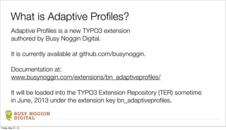
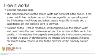
SlideShare a Scribd company logo
1 of 12
Moving beyond responsive design
with Adaptive Profiles
BUSY NOGGIN DIGITAL
serious websites for those who mean business
Friday, May 31, 13
BUSY NOGGIN
DIGITAL
Adaptive Profiles is a new TYPO3 extension
authored by Busy Noggin Digital.
It is currently available at github.com/busynoggin.
Documentation at:
www.busynoggin.com/extensions/bn_adaptiveprofiles/
It will be loaded into the TYPO3 Extension Repository (TER) sometime
in June, 2013 under the extension key bn_adaptiveprofiles.
What is Adaptive Profiles?
Friday, May 31, 13
BUSY NOGGIN
DIGITAL
It provides a powerful, yet easy, methodology for creating
and serving TYPO3 pages that adapt to different sized
screens. It moves beyond simple responsive design by
serving not only CSS tailored to the screen size, but also
custom HTML, image sizes and content.
What does it do?
Friday, May 31, 13
BUSY NOGGIN
DIGITAL
More and more of the visitor’s to your web site
are using devices other than desktop computers.
This is not where things are headed. This is
where things are.
Web Reality Check
Friday, May 31, 13
BUSY NOGGIN
DIGITAL
The real question confronting developers today is not, “Should my site use
responsive design.” The real question is “How should we accommodate
the many different devices accessing our site.?”
Historically, tackling that issue meant either building multiple sites (desktop
& mobile) or responsive design.
The real issue
Friday, May 31, 13
BUSY NOGGIN
DIGITAL
Usually this means a desktop site and a mobile site. It
has the advantage of being able to individually craft the
users’ experience and content, but means having two
sites to maintain and run.
Providing multiple sites
Friday, May 31, 13
BUSY NOGGIN
DIGITAL
It has the advantage to having only one site to
build, maintain and run, but has issues with
image sizes being larger than needed for many
screens and other limitations.
Responsive design
Friday, May 31, 13
BUSY NOGGIN
DIGITAL
What the terms “responsive” and “adaptive” mean to web developers is
still being sorted out. For this presentation, this is what they mean.
Responsive: using CSS to adjust the presentation of a web page based
on the screen width.
Adaptive: providing different HTML, CSS or content by the server to the
browser based on screen width.
Responsive could be considered a subset of adaptive and adaptive and
responsive techniques can be used together.
Our terminology
Friday, May 31, 13
A Demonstration of Adaptive Profiles
Friday, May 31, 13
BUSY NOGGIN
DIGITAL
• Browser requests page
• The extension checks if the screen width has been set in the cookie. If the
screen width has not been set and the user agent is compared against
the 51degrees.mobi library and a best guess for profile is made and a
page based on that profile is sent to browser.
• As soon as the HTML is rendered, JavaScript looks at the screen width
and determines the true profile needed and that screen width is set in the
cookie. If this matches the originally selected profile the browser continues
to render the page by downloading the images and the assets. If it does
not match a new request is sent to the browser for the properly profiled
page.
How it works
Friday, May 31, 13
BUSY NOGGIN
DIGITAL
• On the second page request, the same process is followed, but since the
profile set in the session matches the profile calculated by JavaScript then
the page is only generated and served once.
• The one exception to this is when the user has changed the orientation of
their tablet or phone. In that case, it will be caught by the JavaScript
check, a new profile determined and a request sent to the server. The user
will end up with a properly sized page.
• So, there will be occasions where a page will be generated / served twice
but it does not happen often. When it does it is invisible to the user and
does not take long as not all the assets on the first request are
downloaded.
How it works
Friday, May 31, 13
BUSY NOGGIN
DIGITAL
• Instructions are in the manual
• Install
• Create profiles
• Write conditional TS for each profile
• Set profiles on content elements
Installation and Setup
Friday, May 31, 13

More Related Content

What's hot

Building with goo engine
Building with goo engineBuilding with goo engine
Building with goo engineoskarasbrink
 
DevCon5 HTML5 Summit: Device Specific vs Browser Based Development
DevCon5 HTML5 Summit:  Device Specific vs Browser Based DevelopmentDevCon5 HTML5 Summit:  Device Specific vs Browser Based Development
DevCon5 HTML5 Summit: Device Specific vs Browser Based Developmentbossmojo
 
Page Experience: Google's New Search Algorithm Update
Page Experience: Google's New Search Algorithm UpdatePage Experience: Google's New Search Algorithm Update
Page Experience: Google's New Search Algorithm UpdateDBS Interactive
 
On-Page SEO for Mobile
On-Page SEO for MobileOn-Page SEO for Mobile
On-Page SEO for MobileRaven Tools
 
Nmc11 html5 zobrist
Nmc11 html5 zobristNmc11 html5 zobrist
Nmc11 html5 zobristBill Zobrist
 
Digibury: SciVisum - Making your website fast - and scalable
Digibury: SciVisum - Making your website fast - and scalableDigibury: SciVisum - Making your website fast - and scalable
Digibury: SciVisum - Making your website fast - and scalableLizzie Hodgson
 
Tech Talk #2: Optimize Images For Web Site/App Performance
Tech Talk #2: Optimize Images For Web Site/App Performance Tech Talk #2: Optimize Images For Web Site/App Performance
Tech Talk #2: Optimize Images For Web Site/App Performance Nexus FrontierTech
 

What's hot (9)

Building with goo engine
Building with goo engineBuilding with goo engine
Building with goo engine
 
Responsive web design and eCommerce
Responsive web design and eCommerceResponsive web design and eCommerce
Responsive web design and eCommerce
 
DevCon5 HTML5 Summit: Device Specific vs Browser Based Development
DevCon5 HTML5 Summit:  Device Specific vs Browser Based DevelopmentDevCon5 HTML5 Summit:  Device Specific vs Browser Based Development
DevCon5 HTML5 Summit: Device Specific vs Browser Based Development
 
Page Experience: Google's New Search Algorithm Update
Page Experience: Google's New Search Algorithm UpdatePage Experience: Google's New Search Algorithm Update
Page Experience: Google's New Search Algorithm Update
 
On-Page SEO for Mobile
On-Page SEO for MobileOn-Page SEO for Mobile
On-Page SEO for Mobile
 
Nmc11 html5 zobrist
Nmc11 html5 zobristNmc11 html5 zobrist
Nmc11 html5 zobrist
 
Introducing gutenberg
Introducing gutenbergIntroducing gutenberg
Introducing gutenberg
 
Digibury: SciVisum - Making your website fast - and scalable
Digibury: SciVisum - Making your website fast - and scalableDigibury: SciVisum - Making your website fast - and scalable
Digibury: SciVisum - Making your website fast - and scalable
 
Tech Talk #2: Optimize Images For Web Site/App Performance
Tech Talk #2: Optimize Images For Web Site/App Performance Tech Talk #2: Optimize Images For Web Site/App Performance
Tech Talk #2: Optimize Images For Web Site/App Performance
 

Viewers also liked

TYPO3camp 2009 - Einführung in Fluid
TYPO3camp 2009 - Einführung in FluidTYPO3camp 2009 - Einführung in Fluid
TYPO3camp 2009 - Einführung in Fluiddie.agilen GmbH
 
Developing a typo3 template strategy
Developing a typo3 template strategyDeveloping a typo3 template strategy
Developing a typo3 template strategybusynoggin
 
T3CON09 - Certified TYPO3 Integrator
T3CON09 - Certified TYPO3 IntegratorT3CON09 - Certified TYPO3 Integrator
T3CON09 - Certified TYPO3 Integratordie.agilen GmbH
 
Comparision of CMS : Improving TYPO3 functionality
Comparision of CMS : Improving TYPO3 functionalityComparision of CMS : Improving TYPO3 functionality
Comparision of CMS : Improving TYPO3 functionalityFedir RYKHTIK
 
TYPO3: Menüs Mit Typoscript
TYPO3: Menüs Mit TyposcriptTYPO3: Menüs Mit Typoscript
TYPO3: Menüs Mit TyposcriptTina Gasteiger
 
TYPO3 Certified Integrator - Teste dein Wissen
TYPO3 Certified Integrator - Teste dein WissenTYPO3 Certified Integrator - Teste dein Wissen
TYPO3 Certified Integrator - Teste dein WissenAlex Kellner
 

Viewers also liked (7)

TYPO3camp 2009 - Einführung in Fluid
TYPO3camp 2009 - Einführung in FluidTYPO3camp 2009 - Einführung in Fluid
TYPO3camp 2009 - Einführung in Fluid
 
Developing a typo3 template strategy
Developing a typo3 template strategyDeveloping a typo3 template strategy
Developing a typo3 template strategy
 
T3CON09 - Certified TYPO3 Integrator
T3CON09 - Certified TYPO3 IntegratorT3CON09 - Certified TYPO3 Integrator
T3CON09 - Certified TYPO3 Integrator
 
Comparision of CMS : Improving TYPO3 functionality
Comparision of CMS : Improving TYPO3 functionalityComparision of CMS : Improving TYPO3 functionality
Comparision of CMS : Improving TYPO3 functionality
 
Templating 3.0 in TYPO3
Templating 3.0 in TYPO3Templating 3.0 in TYPO3
Templating 3.0 in TYPO3
 
TYPO3: Menüs Mit Typoscript
TYPO3: Menüs Mit TyposcriptTYPO3: Menüs Mit Typoscript
TYPO3: Menüs Mit Typoscript
 
TYPO3 Certified Integrator - Teste dein Wissen
TYPO3 Certified Integrator - Teste dein WissenTYPO3 Certified Integrator - Teste dein Wissen
TYPO3 Certified Integrator - Teste dein Wissen
 

Similar to Adaptive profiles t3 con13 sf

Why should we build our website responsive
Why should we build our website responsiveWhy should we build our website responsive
Why should we build our website responsiveOmkarsoft Bangalore
 
Responsive Web Design ~ Best Practices for Maximizing ROI
Responsive Web Design ~ Best Practices for Maximizing ROIResponsive Web Design ~ Best Practices for Maximizing ROI
Responsive Web Design ~ Best Practices for Maximizing ROIJuan Carlos Duron
 
Mobile SEO (English Version)
Mobile SEO (English Version)Mobile SEO (English Version)
Mobile SEO (English Version)ssuserd60633
 
Using Responsive Web Design To Make Your Web Work Everywhere
Using Responsive Web Design To Make Your Web Work EverywhereUsing Responsive Web Design To Make Your Web Work Everywhere
Using Responsive Web Design To Make Your Web Work EverywhereChris Love
 
Responsive Web Design
Responsive Web DesignResponsive Web Design
Responsive Web Designmary huston
 
Adaptive design: what is it and why should I be using it?
Adaptive design: what is it and why should I be using it?Adaptive design: what is it and why should I be using it?
Adaptive design: what is it and why should I be using it?Muhamad Izwan
 
Mobile Search Queries Start to Surpass Desktop: Here's What You Can Do About It
Mobile Search Queries Start to Surpass Desktop: Here's What You Can Do About It Mobile Search Queries Start to Surpass Desktop: Here's What You Can Do About It
Mobile Search Queries Start to Surpass Desktop: Here's What You Can Do About It Mohamed Mahdy
 
Demystifying Mobile SEO - 2014 Search Engine Strategies Atlanta Session
Demystifying Mobile SEO - 2014 Search Engine Strategies Atlanta SessionDemystifying Mobile SEO - 2014 Search Engine Strategies Atlanta Session
Demystifying Mobile SEO - 2014 Search Engine Strategies Atlanta SessionTim Cannon
 
Stop Damning Your Users: How UX Can Save Your Mobile Soul
Stop Damning Your Users: How UX Can Save Your Mobile SoulStop Damning Your Users: How UX Can Save Your Mobile Soul
Stop Damning Your Users: How UX Can Save Your Mobile Soulmartytdx
 
SES Chicago 2013 - Responsive, Dynamic, Serving Mobile: Which Path is Right f...
SES Chicago 2013 - Responsive, Dynamic, Serving Mobile: Which Path is Right f...SES Chicago 2013 - Responsive, Dynamic, Serving Mobile: Which Path is Right f...
SES Chicago 2013 - Responsive, Dynamic, Serving Mobile: Which Path is Right f...Benu Aggarwal
 
Carousel30: Optimizing for the mobile user experience whitepaper
Carousel30: Optimizing for the mobile user experience whitepaperCarousel30: Optimizing for the mobile user experience whitepaper
Carousel30: Optimizing for the mobile user experience whitepaperCarousel30
 
5 Reasons to go Responsive
5 Reasons to go Responsive5 Reasons to go Responsive
5 Reasons to go ResponsiveTier10
 
Major Cross Browser Compatibility issues faced by the Developers
Major Cross Browser Compatibility issues faced by the DevelopersMajor Cross Browser Compatibility issues faced by the Developers
Major Cross Browser Compatibility issues faced by the DeveloperspCloudy
 
Bootstrap 4 Online Training Course Book Sample
Bootstrap 4 Online Training Course Book SampleBootstrap 4 Online Training Course Book Sample
Bootstrap 4 Online Training Course Book SampleBootstrap Creative
 
Responsive vs. adaptive vs. device-specific: which one is best?
Responsive vs. adaptive vs. device-specific: which one is best?Responsive vs. adaptive vs. device-specific: which one is best?
Responsive vs. adaptive vs. device-specific: which one is best?Catalyst
 

Similar to Adaptive profiles t3 con13 sf (20)

Why should we build our website responsive
Why should we build our website responsiveWhy should we build our website responsive
Why should we build our website responsive
 
Responsive Web Design ~ Best Practices for Maximizing ROI
Responsive Web Design ~ Best Practices for Maximizing ROIResponsive Web Design ~ Best Practices for Maximizing ROI
Responsive Web Design ~ Best Practices for Maximizing ROI
 
Mobile SEO (English Version)
Mobile SEO (English Version)Mobile SEO (English Version)
Mobile SEO (English Version)
 
Using Responsive Web Design To Make Your Web Work Everywhere
Using Responsive Web Design To Make Your Web Work EverywhereUsing Responsive Web Design To Make Your Web Work Everywhere
Using Responsive Web Design To Make Your Web Work Everywhere
 
Responsive Web Design
Responsive Web DesignResponsive Web Design
Responsive Web Design
 
Adaptive design: what is it and why should I be using it?
Adaptive design: what is it and why should I be using it?Adaptive design: what is it and why should I be using it?
Adaptive design: what is it and why should I be using it?
 
8 web design facts that we know
8 web design facts that we know8 web design facts that we know
8 web design facts that we know
 
Sbwire 531031
Sbwire 531031Sbwire 531031
Sbwire 531031
 
Velocity dust
Velocity dustVelocity dust
Velocity dust
 
Mobile Search Queries Start to Surpass Desktop: Here's What You Can Do About It
Mobile Search Queries Start to Surpass Desktop: Here's What You Can Do About It Mobile Search Queries Start to Surpass Desktop: Here's What You Can Do About It
Mobile Search Queries Start to Surpass Desktop: Here's What You Can Do About It
 
Demystifying Mobile SEO - 2014 Search Engine Strategies Atlanta Session
Demystifying Mobile SEO - 2014 Search Engine Strategies Atlanta SessionDemystifying Mobile SEO - 2014 Search Engine Strategies Atlanta Session
Demystifying Mobile SEO - 2014 Search Engine Strategies Atlanta Session
 
Stop Damning Your Users: How UX Can Save Your Mobile Soul
Stop Damning Your Users: How UX Can Save Your Mobile SoulStop Damning Your Users: How UX Can Save Your Mobile Soul
Stop Damning Your Users: How UX Can Save Your Mobile Soul
 
SES Chicago 2013 - Responsive, Dynamic, Serving Mobile: Which Path is Right f...
SES Chicago 2013 - Responsive, Dynamic, Serving Mobile: Which Path is Right f...SES Chicago 2013 - Responsive, Dynamic, Serving Mobile: Which Path is Right f...
SES Chicago 2013 - Responsive, Dynamic, Serving Mobile: Which Path is Right f...
 
Carousel30: Optimizing for the mobile user experience whitepaper
Carousel30: Optimizing for the mobile user experience whitepaperCarousel30: Optimizing for the mobile user experience whitepaper
Carousel30: Optimizing for the mobile user experience whitepaper
 
Responsive Web Design Whitepaper
Responsive Web Design WhitepaperResponsive Web Design Whitepaper
Responsive Web Design Whitepaper
 
5 Reasons to go Responsive
5 Reasons to go Responsive5 Reasons to go Responsive
5 Reasons to go Responsive
 
DOC
DOCDOC
DOC
 
Major Cross Browser Compatibility issues faced by the Developers
Major Cross Browser Compatibility issues faced by the DevelopersMajor Cross Browser Compatibility issues faced by the Developers
Major Cross Browser Compatibility issues faced by the Developers
 
Bootstrap 4 Online Training Course Book Sample
Bootstrap 4 Online Training Course Book SampleBootstrap 4 Online Training Course Book Sample
Bootstrap 4 Online Training Course Book Sample
 
Responsive vs. adaptive vs. device-specific: which one is best?
Responsive vs. adaptive vs. device-specific: which one is best?Responsive vs. adaptive vs. device-specific: which one is best?
Responsive vs. adaptive vs. device-specific: which one is best?
 

Adaptive profiles t3 con13 sf

  • 1. Moving beyond responsive design with Adaptive Profiles BUSY NOGGIN DIGITAL serious websites for those who mean business Friday, May 31, 13
  • 2. BUSY NOGGIN DIGITAL Adaptive Profiles is a new TYPO3 extension authored by Busy Noggin Digital. It is currently available at github.com/busynoggin. Documentation at: www.busynoggin.com/extensions/bn_adaptiveprofiles/ It will be loaded into the TYPO3 Extension Repository (TER) sometime in June, 2013 under the extension key bn_adaptiveprofiles. What is Adaptive Profiles? Friday, May 31, 13
  • 3. BUSY NOGGIN DIGITAL It provides a powerful, yet easy, methodology for creating and serving TYPO3 pages that adapt to different sized screens. It moves beyond simple responsive design by serving not only CSS tailored to the screen size, but also custom HTML, image sizes and content. What does it do? Friday, May 31, 13
  • 4. BUSY NOGGIN DIGITAL More and more of the visitor’s to your web site are using devices other than desktop computers. This is not where things are headed. This is where things are. Web Reality Check Friday, May 31, 13
  • 5. BUSY NOGGIN DIGITAL The real question confronting developers today is not, “Should my site use responsive design.” The real question is “How should we accommodate the many different devices accessing our site.?” Historically, tackling that issue meant either building multiple sites (desktop & mobile) or responsive design. The real issue Friday, May 31, 13
  • 6. BUSY NOGGIN DIGITAL Usually this means a desktop site and a mobile site. It has the advantage of being able to individually craft the users’ experience and content, but means having two sites to maintain and run. Providing multiple sites Friday, May 31, 13
  • 7. BUSY NOGGIN DIGITAL It has the advantage to having only one site to build, maintain and run, but has issues with image sizes being larger than needed for many screens and other limitations. Responsive design Friday, May 31, 13
  • 8. BUSY NOGGIN DIGITAL What the terms “responsive” and “adaptive” mean to web developers is still being sorted out. For this presentation, this is what they mean. Responsive: using CSS to adjust the presentation of a web page based on the screen width. Adaptive: providing different HTML, CSS or content by the server to the browser based on screen width. Responsive could be considered a subset of adaptive and adaptive and responsive techniques can be used together. Our terminology Friday, May 31, 13
  • 9. A Demonstration of Adaptive Profiles Friday, May 31, 13
  • 10. BUSY NOGGIN DIGITAL • Browser requests page • The extension checks if the screen width has been set in the cookie. If the screen width has not been set and the user agent is compared against the 51degrees.mobi library and a best guess for profile is made and a page based on that profile is sent to browser. • As soon as the HTML is rendered, JavaScript looks at the screen width and determines the true profile needed and that screen width is set in the cookie. If this matches the originally selected profile the browser continues to render the page by downloading the images and the assets. If it does not match a new request is sent to the browser for the properly profiled page. How it works Friday, May 31, 13
  • 11. BUSY NOGGIN DIGITAL • On the second page request, the same process is followed, but since the profile set in the session matches the profile calculated by JavaScript then the page is only generated and served once. • The one exception to this is when the user has changed the orientation of their tablet or phone. In that case, it will be caught by the JavaScript check, a new profile determined and a request sent to the server. The user will end up with a properly sized page. • So, there will be occasions where a page will be generated / served twice but it does not happen often. When it does it is invisible to the user and does not take long as not all the assets on the first request are downloaded. How it works Friday, May 31, 13
  • 12. BUSY NOGGIN DIGITAL • Instructions are in the manual • Install • Create profiles • Write conditional TS for each profile • Set profiles on content elements Installation and Setup Friday, May 31, 13