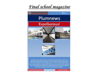
The document describes the process of creating a school magazine based on survey feedback. Key decisions that were made include:
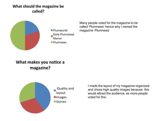
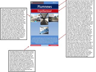
- Choosing the name "Plumnews" as this was the most popular vote.
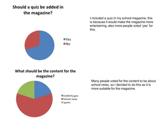
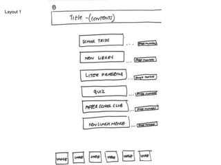
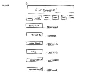
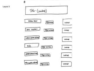
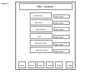
- Including sections on school news, trips, and a quiz as these were supported by student votes.
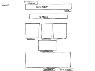
- Using the school colors in the design as many suggested this would make the magazine more suitable.
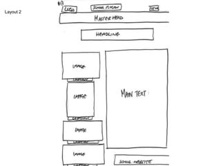
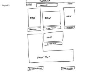
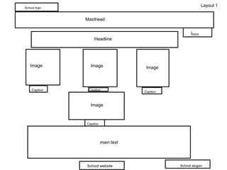
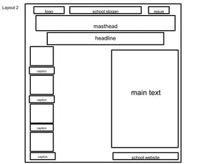
- Choosing layouts, fonts, and images that would attract and engage the audience based on survey responses. The final magazine was organized with a focus on readability and visual appeal.