2. Creative Ideas That Worked Well
• They used an institution reference at the start of the trailer which is Khong, C.A
Productions. Including this makes the trailer seem more realistic.
• Credits are written in red capital letters which allows them to stand out from the
dark almost colourless footage. Red connotes danger and blood. It could suggest
that there is going to be some sort of violence in the film. This works well as the
written text suits the mood of the trailer.
• In the shot where the boy is pulling his hood up, he is looking almost directly at
the name that pops up on the left hand side of the screen. This draws attention to
the name. A second time on the landing text is placed on the left hand side and
the character walks towards it before turning his back on the camera. This again
draws attention to the text.
• Jump cuts are used effectively when the character is walking down the stairs. It
helps to keep the pace of the film up as we don’t have to watch him walk all the
way.
• The knife is shown for a few seconds with the boy running his fingers along it.
This draws emphasis towards the knife and strongly suggests that the boy could
be using it for a weapon.
• The variety of camera shots used makes the trailer visually interesting to watch.
3. Editing
• Institutional reference fades in.
• Fading out the institutional reference to show footage.
• Editing is done fairly in time with the background score. It
makes it feel like the soundtrack was meant for the trailer.
• Jump cuts are used which help to keep the pace of the
film up and therefore reduces the risk of loosing viewers
interest.
4. Camera Techniques
• Close- up photograph of the digital clock at the start of the trailer to indicate that the beeping
heard is coming from the clock.
• A mid- shot of a character in bed shows him reaching for the alarm clock and turning it off.
• Showing the boys feet moving onto the floor is a quick way to show that he is getting up. It
also creates some suspicion as we haven’t seen the characters face yet.
• We see a close- up of the characters body but again not his face. It is hiding the characters
identity still building suspicion.
• A close- up shot is then used to show the characters face but as it is fairly dark in the room,
some of his facial features are not clear. This shot teases viewers as they can see the face of
this boy but cannot see him clearly. The fact that we cannot see him clearly indicates that this
person keeps himself to himself and doesn’t like to interact with others. He is someone to
avoid.
• A point of view shot is used to show us walking into the kitchen and opening a draw. The
point of view shot makes us feel like we are part of what this mysterious person is doing and
we as viewers cannot stop his actions.
• A long shot shows the person going back up the stairs. Leaves viewers wondering what the
man has done. Viewers are left feeling curious.
• He is very rarely shown looking towards the camera and if he is, his facial features are not
clear. This is to keep the looks of the character a mystery to create suspense for viewers
leaving them wanting to know who this person is.
5. Mise- en- Scene
• The lighting at the start of the trailer is fairly dark suggesting that this
character could be someone to avoid. Darkness creates a sense of
mystery. Shadows are also shown suggesting that this person might have
a dark side that they’re hiding.
• The boy is wearing a hoody. A stereotype of people who wear hoody's is
that they are people to avoid as they are either a part of a gang or they
want to hide their identity as they have done or will be doing something
illegally. This is why some people avoid teenagers wearing a hoody with
the hood up.
• Lighting changes as the boy walks out onto the landing. It gets brighter
then gets darker as the character
reaches the bottom of the stairs.
• The character is wearing simple clothing
suggesting he doesn’t have much money
or a fancy life style.
• No other characters are seen in the
house implying he spends most of his
time by himself.
6. Sound
• No sound was used while showing the institutional
reference.
• Silence was broken by a digital alarm clock beeping.
• Once the boy turns off the alarm by flicking down a switch,
a piano is heard in time with the hand moving downwards
which is the start of the background score.
• Sound effects are heard such as the boys hoody rustling
as he puts it on and a door squeaking as he opens it.
• Background score cuts out when the text “(Verb. To
Suffer)” pops up under the title of the film. This draws
attention to the text. The silence then adds tension while
viewing the trailer as viewers wonder if anything else is
going to come up.
7. What Didn’t Work Well
• I thought the light change from the darkness of the boys room to the rest of
the footage was a dramatic change. I think it would have worked better if they
kept with the dull lighting throughout. A sunny day represents happiness
whereas a raining dull day could represent danger which would have suited
this trailer. It would have helped to keep the person a bit more mysterious
leaving audiences wanting to find out more about him and his looks.
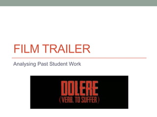
• I don’t think it looks very professional having the definition of the title “(Verb.
To Suffer)” of the film in brackets under the title “Dolere”. They should have
either kept the title as it is with a mysterious title with a definition that not
many people would know (which matches the mysterious character scene) or
picked a different title.
• I think they should have included a release date or said which month or year
it would be released.
• Possibly the age certificate could be included to make it clearer to audiences
who the target audience is and who it would appeal to.
• Showing other characters that would feature in the film would help to draw
attention. Possibly show the victim to allow the audience to sympathises with
making them want to go and see the film to finds out if the victim survives.
8. How Successful Was It?
• I think the trailer was successful by the variety of camera techniques
used.
• The background score went well with the footage and the editing was
done in time with the music.
• The trailer was successful in the way it created suspense and tension
yet techniques such as jump cuts were used to ensure the risk of
loosing audiences attention was reduced.
• I liked the way in which the character remained a mystery as you
didn’t get a chance to see his facial features clearly. This intrigued
viewers making them wanting to find out who this person is.
• I think the trailer could have been more successful by including
helpful information for viewers such as the age certificate and a
release date. Including the release date will allow viewers to know
when to expect the film to be out and look for it in cinemas.
• A little bit more of the plot line could have been given away. Maybe
introduce other character so we could get to know the film more. This
would give viewers a clearer idea of what to expect from the film.