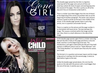
This double page spread has the title in a big font, 
covering half of the page and a picture of Amy Lee 
covering a whole A4 sheet of paper and overlapping onto 
the second of the pages. The title is partly cut off at the 
top and it has an introduction underneath it. 
There is a kicker (one letter bigger than the rest of them) 
at the beginning of the article and another later on at the 
beginning of another paragraph. The writer uses columns 
and has a quote to break up the text in the middle of the 
article. In this double page spread, there is just a big 
article, not in a question and answer format. 
There is a caption on the picture and the page number is 
on the bottom left hand corner. The text overlaps the 
image. This causes a contrast within the image and the 
text. Also, there is a small reference in the side of the 
image. 
In this double page spread, again there is a kicker and a big 
title yet the title is fully on the page and there is only one 
kicker and this is at the beginning of the text. The 
introduction is yet again underneath the title yet it has bold 
sections in different colours such as “Taylor Momsen” and 
“The Pretty Reckless” so it would seen that only the names 
are in bold. 
The format is in a question and answer layout and the image 
is big and as it overlaps into the second page, it starts to 
fade before it gets to the text. 
Unlike the double page spread above, this one has the 
quote on the side with the picture and is much bigger than 
the rest of the text. It catches your eye.
Both double pages use columns and have one page number in the bottom left hand corner. They have 
a quote somewhere on the page and both have kickers. There are introductions to the article under 
the title and the titles are quite big. 
I shall use this information by making sure that my double page spread has columns and has a big title 
with an introduction underneath it. My double page spread shall have a caption and a quote 
somewhere on the page. 
The circled areas need to 
be changed so either 
something is added or 
taken away or even just 
edited so it looks a bit 
different. 
• Caption changed 
• Quote added 
• Kicker 
• Page number taken away 
• Page number smaller

Media Double Page Spread Analysis

  • 1.
    This double pagespread has the title in a big font, covering half of the page and a picture of Amy Lee covering a whole A4 sheet of paper and overlapping onto the second of the pages. The title is partly cut off at the top and it has an introduction underneath it. There is a kicker (one letter bigger than the rest of them) at the beginning of the article and another later on at the beginning of another paragraph. The writer uses columns and has a quote to break up the text in the middle of the article. In this double page spread, there is just a big article, not in a question and answer format. There is a caption on the picture and the page number is on the bottom left hand corner. The text overlaps the image. This causes a contrast within the image and the text. Also, there is a small reference in the side of the image. In this double page spread, again there is a kicker and a big title yet the title is fully on the page and there is only one kicker and this is at the beginning of the text. The introduction is yet again underneath the title yet it has bold sections in different colours such as “Taylor Momsen” and “The Pretty Reckless” so it would seen that only the names are in bold. The format is in a question and answer layout and the image is big and as it overlaps into the second page, it starts to fade before it gets to the text. Unlike the double page spread above, this one has the quote on the side with the picture and is much bigger than the rest of the text. It catches your eye.
  • 2.
    Both double pagesuse columns and have one page number in the bottom left hand corner. They have a quote somewhere on the page and both have kickers. There are introductions to the article under the title and the titles are quite big. I shall use this information by making sure that my double page spread has columns and has a big title with an introduction underneath it. My double page spread shall have a caption and a quote somewhere on the page. The circled areas need to be changed so either something is added or taken away or even just edited so it looks a bit different. • Caption changed • Quote added • Kicker • Page number taken away • Page number smaller