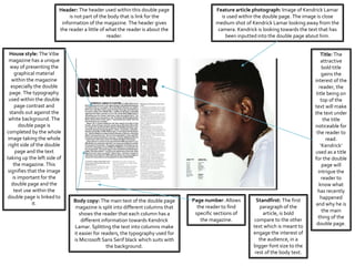
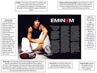
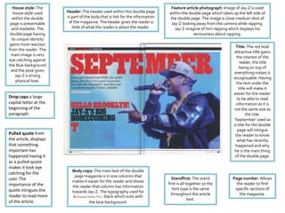
A level Media Studies
By Nfalie Nyumah
Feature article photograph: Image of Kendrick Lamar
is used within the double page. The image is close
medium shot of Kendrick Lamar looking away from the
camera. Kendrick is looking towards the text that has
been inputted into the double page about him.
Header: The header used within this double page
is not part of the body that is link for the
information of the magazine. The header gives
the reader a little of what the reader is about the
reader.
House style: The Vibe
magazine has a unique
way of presenting the
graphical material
within the magazine
especially the double
page. The typography
used within the double
page contrast and
stands out against the
white background. The
double page is
completed by the whole
image taking the whole
right side of the double
page and the text
taking up the left side of
the magazine. This
signifies that the image
is important for the
double page and the
text use within the
double page is linked to
it.
Page number: Allows
the reader to find
specific sections of
the magazine.
Standfirst: The first
paragraph of the
article, is bold
compare to the other
text which is meant to
engage the interest of
the audience, in a
bigger font size to the
rest of the body text.
Title: The
attractive
bold title
gains the
interest of the
reader, the
title being on
top of the
text will make
the text under
the title
noticeable for
the reader to
read.
‘Kendrick’
used as a title
for the double
page will
intrigue the
reader to
know what
has recently
happened
and why he is
the main
thing of the
double page.
Body copy: The main text of the double page
magazine is split into different columns that
shows the reader that each column has a
different information towards Kendrick
Lamar. Splitting the text into columns make
it easier for readers, the typography used for
is Microsoft Sans Serif black which suits with
the background.
House style:
For this double
page the house style
used has a colour
scheme of red, black
and white which
matches the
clothing of Eminem
in the image.
Eminem is the main
image of the left
side of the double
page magazine. The
text on the right side
on the image looks
neat as it doesn’t go
other the image
without making
harder for the user
not to read.
Header: The header used within this double page
is not part of the body that is link for the
information of the magazine. The header gives
the reader a little of what the reader is about the
reader.
Feature article photograph: Image of Eminem is used
within the double page. The image is medium shot of
Eminem straight towards the us. The image takes up
the most of the article that allows us to know
Title: The
title used for
the double
page
intrigues the
reader. The
title is very
bold with two
different
colour to
display artist
name making
the audience
know that the
article is
about the
famous artist
‘Eminem’
Body copy: The main text of the double page magazine is split in 6
columns with different text explaining different things about
‘Eminem’. The typograph is the same throughout the article except
the quote that is used to explain ‘Eminem’. The white Franklin Gothic
Book font type used on the black background stands out and allows
the user to be able to know what the text is.
Page number: Allows
the reader to find
specific sections of
the magazine.
Stand first: A stand first within this
double page article starts with a
quote that will intrigued the reader.
House style: The
house style used
within the double
page is presentable
and readable. The
double page having
its unique identity
gains more reaction
from the reader. The
main image is very
eye catching against
the blue background
and the pose gives
Jay-Z a strong
physical look.
Body copy: The main text of the double
page magazine is in one columns that
makes it easier for the reader and shows
the reader that column has information
towards Jay-Z. The typography used for
is Kozuka Gothic Pro L black which suits with
the blue background.
Standfirst: The stand
first is all together so the
font type is the same
throughout the article
text.
Page number: Allows
the reader to find
specific sections of
the magazine.
Title: The red bold
attractive title gains
the interest of the
reader, the title
being on top of
everything makes it
recognizable. Having
the text under the
title will make it
easier for the reader
to be able to read
information as it is
not the same size as
the title.
‘September’ used as
a title for the double
page will intrigue
the reader to know
what has recently
happened and why
he is the main thing
of the double page.
Feature article photograph: Image of Jay-Z is used
within the double page which takes up the left side of
the double page. The image is close medium shot of
Jay-Z looking away from the camera while rapping.
Jay-Z imagine of him rapping which displays his
seriousness about rapping.
Header: The header used within this double page
is part of the body that is link for the information
of the magazine. The header gives the reader a
little of what the reader is about the reader.
Pulled quote from
the article, displays
that something
important has
happened having it
as a pulled quote
makes it look eye
catching for the
user. The
importance of the
quote intrigues the
reader to read more
of the article.
Drop caps a large
capital letter at the
beginning of the
paragraph.

Double page analysis

  • 1.
    A level MediaStudies By Nfalie Nyumah
  • 2.
    Feature article photograph:Image of Kendrick Lamar is used within the double page. The image is close medium shot of Kendrick Lamar looking away from the camera. Kendrick is looking towards the text that has been inputted into the double page about him. Header: The header used within this double page is not part of the body that is link for the information of the magazine. The header gives the reader a little of what the reader is about the reader. House style: The Vibe magazine has a unique way of presenting the graphical material within the magazine especially the double page. The typography used within the double page contrast and stands out against the white background. The double page is completed by the whole image taking the whole right side of the double page and the text taking up the left side of the magazine. This signifies that the image is important for the double page and the text use within the double page is linked to it. Page number: Allows the reader to find specific sections of the magazine. Standfirst: The first paragraph of the article, is bold compare to the other text which is meant to engage the interest of the audience, in a bigger font size to the rest of the body text. Title: The attractive bold title gains the interest of the reader, the title being on top of the text will make the text under the title noticeable for the reader to read. ‘Kendrick’ used as a title for the double page will intrigue the reader to know what has recently happened and why he is the main thing of the double page. Body copy: The main text of the double page magazine is split into different columns that shows the reader that each column has a different information towards Kendrick Lamar. Splitting the text into columns make it easier for readers, the typography used for is Microsoft Sans Serif black which suits with the background.
  • 3.
    House style: For thisdouble page the house style used has a colour scheme of red, black and white which matches the clothing of Eminem in the image. Eminem is the main image of the left side of the double page magazine. The text on the right side on the image looks neat as it doesn’t go other the image without making harder for the user not to read. Header: The header used within this double page is not part of the body that is link for the information of the magazine. The header gives the reader a little of what the reader is about the reader. Feature article photograph: Image of Eminem is used within the double page. The image is medium shot of Eminem straight towards the us. The image takes up the most of the article that allows us to know Title: The title used for the double page intrigues the reader. The title is very bold with two different colour to display artist name making the audience know that the article is about the famous artist ‘Eminem’ Body copy: The main text of the double page magazine is split in 6 columns with different text explaining different things about ‘Eminem’. The typograph is the same throughout the article except the quote that is used to explain ‘Eminem’. The white Franklin Gothic Book font type used on the black background stands out and allows the user to be able to know what the text is. Page number: Allows the reader to find specific sections of the magazine. Stand first: A stand first within this double page article starts with a quote that will intrigued the reader.
  • 4.
    House style: The housestyle used within the double page is presentable and readable. The double page having its unique identity gains more reaction from the reader. The main image is very eye catching against the blue background and the pose gives Jay-Z a strong physical look. Body copy: The main text of the double page magazine is in one columns that makes it easier for the reader and shows the reader that column has information towards Jay-Z. The typography used for is Kozuka Gothic Pro L black which suits with the blue background. Standfirst: The stand first is all together so the font type is the same throughout the article text. Page number: Allows the reader to find specific sections of the magazine. Title: The red bold attractive title gains the interest of the reader, the title being on top of everything makes it recognizable. Having the text under the title will make it easier for the reader to be able to read information as it is not the same size as the title. ‘September’ used as a title for the double page will intrigue the reader to know what has recently happened and why he is the main thing of the double page. Feature article photograph: Image of Jay-Z is used within the double page which takes up the left side of the double page. The image is close medium shot of Jay-Z looking away from the camera while rapping. Jay-Z imagine of him rapping which displays his seriousness about rapping. Header: The header used within this double page is part of the body that is link for the information of the magazine. The header gives the reader a little of what the reader is about the reader. Pulled quote from the article, displays that something important has happened having it as a pulled quote makes it look eye catching for the user. The importance of the quote intrigues the reader to read more of the article. Drop caps a large capital letter at the beginning of the paragraph.