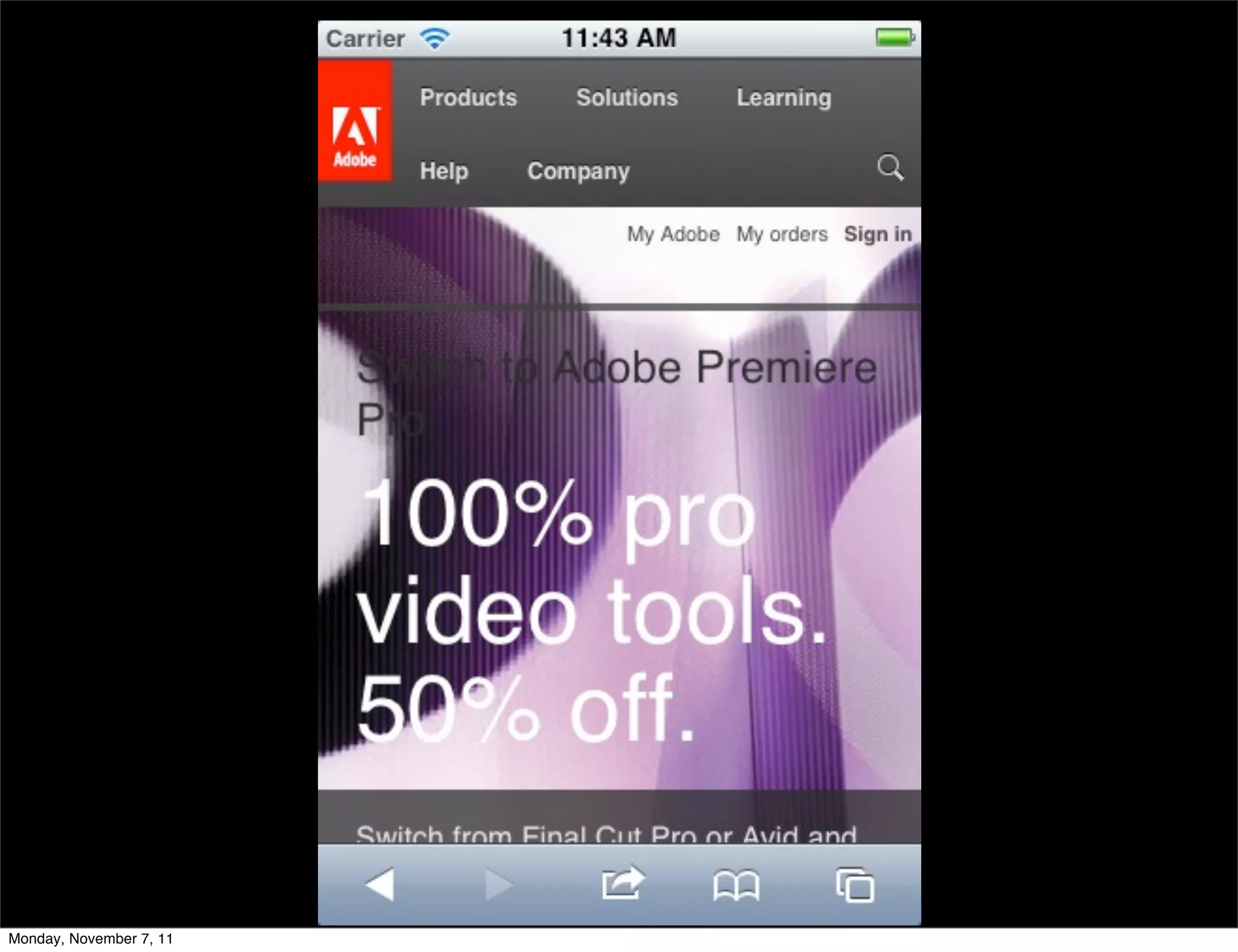
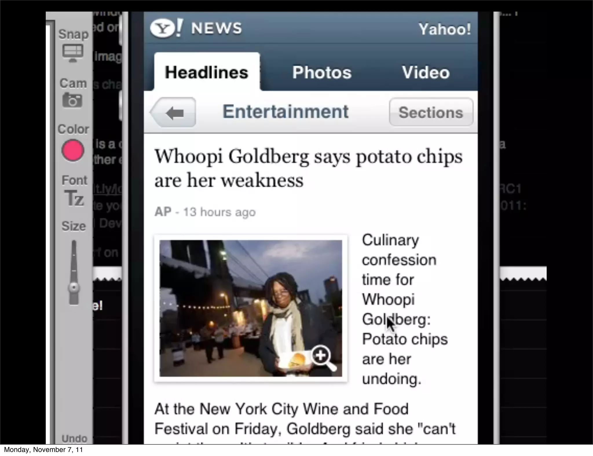
The document discusses the content-focused web and responsive web design. It emphasizes designing for a variety of screen resolutions rather than sizes and building a unified code base. Key aspects of content-focused and responsive design include optimizing images, using easy to touch controls, and clear navigation. The document provides examples of responsive design in Adobe's, Twitter's, and Yahoo's mobile sites and introduces several frameworks for responsive web development, including jQTouch, Sencha Touch, Dojo Mobile, and jQuery Mobile.