2. Responsive web design (RWD) is a website design approach to create websites
that support multiple devices with a single layout based on the device type.
Browsing using smart phones and other mobile devices has increased
exponentially in the last few years and is influencing the way websites are built
today. Website owners want to give their users a similar user experience across a
wide range of devices. Responsive Web Design (RWD) is predicted to be the
solution to the future of web design.
As the web evolves and more people begin accessing websites using multiple
devices, web designers have to become more adept at helping the form follow the
function. These changes in web design have resulted in the creation of what is
called Responsive Web Design.
Since the beginning of the graphical web, designers have been creating websites
to function within a “context”: the screen or device on which a person would view
or interact with the web. That context has changed over time: from the early years,
where a monitor’s pixel width resembled the specs of a modern Smartphone, to
the myriad of devices where users can explore the web today.
Key Concept Intro of responsive
Design
3. Types of Responsive Design
There are three types of RWD layouts that differ
slightly but offer a great user experience.
Basic Fluid layout : Content adjusts to
different screen sizes but the text and image sizes
remain the same
Adaptive layout : Predefined sizes are
used, so whenever screen sizes change these pre-
defined sizes take effect
Responsive layout: The most popular
layout today, this is a hybrid of the basic fluid layout
and the adaptive layout. There are predefined break
points, in between which content expands or
contracts.
4. Amazing User Experience
Responsive web design provides simple
and streamlined user interfaces (UIs) to
users.
Smartphone users tend to stick to sites
that offer proper visibility, simple
browsing, and easy-to-understand
browsing features
Simply makes the users happy and
opens up a gateway for more business
leads.
5. Cost Cutting in Mobile Development
Responsive web design is one of the best gains
when it comes to investment
One design can work on various devices, without
the need of developing website for every gadget
Mobile website development also saves a lot of
time, enabling developers to embed code into a
single document to make the site work smoothly
in every screen
It provides double benefit by reducing time and
saving mobile development cost.
6. Improvement in Mobile Search Results
A responsive site dramatically reduces workload
and time when it comes to maintaining the site
SEO experts say that maintaining your one
mobile site will be easier with a single pack of
hypertext links, allowing SEO teams to focus on
expanding your business though an effective
SEO strategy.
SEO programs are long time process but having a
responsive web design helps the professionals to
focus on a single site with the unified codes
across devices
SEO helps increase the visibility of your website
on the search engines and improves search
results.
7. Boosts Sales and Conversion Rates
With mobile shopping becoming
increasingly popular, more and more
eCommerce mobile apps are coming to the
market – and audiences can’t get enough
Businesses are looking to target more
prospective customers, and at the present
scenario, responsive web design is their best
tool to increase sales and meeting
customers where they are
8. Simple and Easy Site Management
It’s a lot easier to maintain website once it’s developed in responsive
design.
It provides complete access to site administration to manage,
change and update necessary changes in images, videos, and
layouts when needed
It’s good for your business to have a website that’s easy to manage
without the help of any professional.
9. Provides Quick and Easy Reporting
Responsive design also provides easy monitoring and analyzing
With a single website, you’ll be less burdened as customer tracking,
conversion paths and redirection streamlines
As the time goes on, Google Analytics will be optimized to handle
various devices and reporting., integrating all of the results into a
single report.
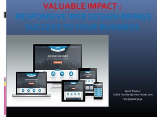
10. See Responsive Design in Action
Here is the best websites created with a responsive design. Try viewing
these on different contexts or devices to see how they flex:
www.fboxer.com
Let's Work Together & Build an incredible Website
for Your Business!
We understand the brand's Web Design, Development, Mobile App, Marketing and all things in between. We’re an unpretentious, flexible,
and easy-to-work-with close knit team. And we believe in transforming business through creativity. Let us help you accomplish your goals.
Contact us at : info@fboxer.com