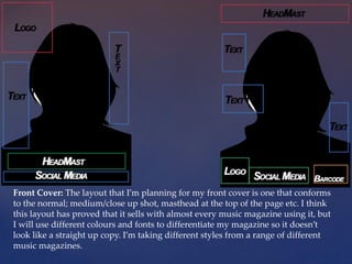
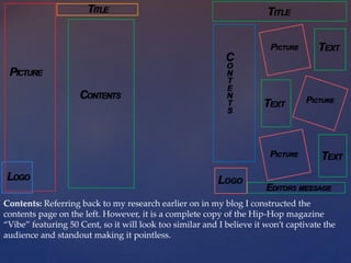
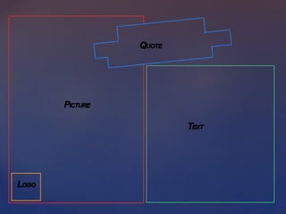
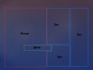
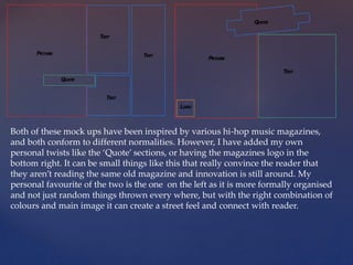
{
Music Magazine
Mock ups
By Nathan Brown
Front Cover: The layout that I’m planning for my front cover is one that conforms
to the normal; medium/close up shot, masthead at the top of the page etc. I think
this layout has proved that it sells with almost every music magazine using it, but
I will use different colours and fonts to differentiate my magazine so it doesn’t
look like a straight up copy. I’m taking different styles from a range of different
music magazines.
Contents: Referring back to my research earlier on in my blog I constructed the
contents page on the left. However, it is a complete copy of the Hip-Hop magazine
“Vibe” featuring 50 Cent, so it will look too similar and I believe it won’t captivate the
audience and standout making it pointless.
Both of these mock ups have been inspired by various hi-hop music magazines,
and both conform to different normalities. However, I have added my own
personal twists like the ‘Quote’ sections, or having the magazines logo in the
bottom right. It can be small things like this that really convince the reader that
they aren’t reading the same old magazine and innovation is still around. My
personal favourite of the two is the one on the left as it is more formally organised
and not just random things thrown every where, but with the right combination of
colours and main image it can create a street feel and connect with reader.

Music magazine mock ups

  • 1.
  • 2.
    Front Cover: Thelayout that I’m planning for my front cover is one that conforms to the normal; medium/close up shot, masthead at the top of the page etc. I think this layout has proved that it sells with almost every music magazine using it, but I will use different colours and fonts to differentiate my magazine so it doesn’t look like a straight up copy. I’m taking different styles from a range of different music magazines.
  • 3.
    Contents: Referring backto my research earlier on in my blog I constructed the contents page on the left. However, it is a complete copy of the Hip-Hop magazine “Vibe” featuring 50 Cent, so it will look too similar and I believe it won’t captivate the audience and standout making it pointless.
  • 6.
    Both of thesemock ups have been inspired by various hi-hop music magazines, and both conform to different normalities. However, I have added my own personal twists like the ‘Quote’ sections, or having the magazines logo in the bottom right. It can be small things like this that really convince the reader that they aren’t reading the same old magazine and innovation is still around. My personal favourite of the two is the one on the left as it is more formally organised and not just random things thrown every where, but with the right combination of colours and main image it can create a street feel and connect with reader.