
Download to read offline


![motif for a Bible publisher, look out from the
corners.
At the time, there was no consensus on
how to treat the top of a tall building and all
kinds of variations on historicist styles were
attempted, from Gothic spires to Greek temples.
These richly detailed sculptural cornices became
obsolete when buildings regularly were 30 and
40 stories tall.
T
w o c o m p e t i n g styles of archi-
tecture predominated in the United
States when the American Tract Society
Building was completed. The earlier
style was Richardsonian Romanesque, named
for Henry Hobson Richardson, critically consid-
ered to be our first native-born architect of
world-class genius. Richardson combined the
massive, lithic qualities of the Roman stone arch
with his own uncanny sense of flowing, organic
energy and balanced asymmetry. The other style,
called Sullivanesque for Louis Henry Sullivan,
represented a break with the past because it was
an expression of the new tall building as a verti-
cal design.
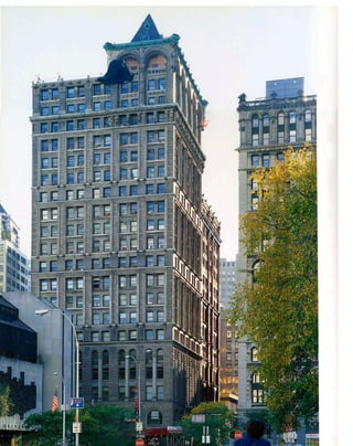
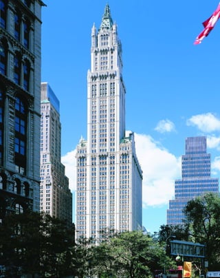
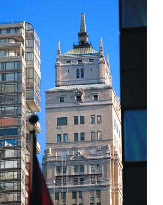
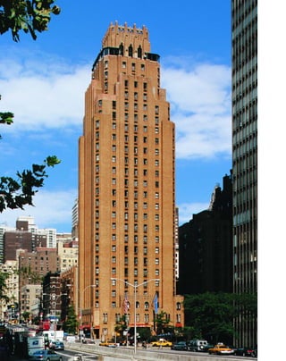
R. H. Robertson’s 23-story American Tract
Society Building is a premodern skyscraper in
that its primary organization is horizontal. The
arcaded, rock-faced granite ashlar base takes its
inspiration from Florentine palazzi, an appropri-
ate image for the expanding mercantile and
industrial empire of the United States. The
building was commissioned by the American
Tract Society, which published Bibles in the
interest of promoting a universal, nondenom-
inational Protestantism, the culture of the
emerging business class. Robertson was an eccle-
siastical architect, familiar with the then-popular
Romanesque style, so it was natural for him to
design a Romanesque skyscraper.
Robertson made no attempt to unify the
building vertically, as Sullivan would have done.
The styling of the squarish tower on a 100-by-
94-foot site is Renaissance, with stacked, hori-
zontal layers separated by numerous beltcourses
and window moldings. At 291 feet tall, the
building was skyscraper height for its day (the
world’s record was still held by the 302-foot-tall
Masonic Temple of 1892 by Burnham & Root in
Chicago). However, its relatively low scale and
proportions of 3:1 make the Renaissance styling
visually appealing.
The three-story crown at the corner of
Nassau and Spruce Streets adds visual interest by
[ 1] A typical pamphlet published by the American Tract Society.
1
American Tract Society Building
150 NASSAU STREET » R. H. ROBERTSON, 1896
breaking up the roofline against the sky, an early
eclectic forebear of the fanciful Art Deco
crowns. A double-arcaded window with deep
intrados is supported by a three-quarter-round
brick Corinthian column and heavy scroll
brackets. A curved copper cornice decorated
with egg-and-dart molding and lion’s heads sur-
mounts the hollow double arches, and terra-
cotta winged angel caryatids, an appropriate
1](https://image.slidesharecdn.com/catzl6xr7qjbywzl3adu-signature-ec0ec1356cdf1cf66b46a9db24b432b8b8c5d53476da6de461fc6b32c36da610-poli-180116170250/85/Manhattan-skyscrapers-17-320.jpg)
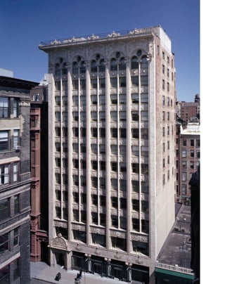
![mullions. The regular, square-headed windows
of the open, glassy façade visually recede into the
background behind the organizing vertical lines
of white terra cotta. The piers themselves are
decorated with fluted piping that further
enhances the vertical line.
The thin curtain wall of terra cotta that
expresses the inner steel skeleton was a radical
departure from the heavy masonry walls of the
period. Montgomery Schuyler, a leading critic of
the time, wrote of the Bayard, “Everywhere the
drapery of baked clay is a mere wrapping, which
clings so closely to the frame as to reveal it, and
even to emphasize it....The Bayard Building is
the nearest approach yet made, in New York, at
least, to solving the problem of the skyscraper.”
Though known for saying “form ever fol-
lows function,” Sullivan was a poet rather than a
pure functionalist at heart. The six spread-
winged angels at the cornice express the build-
ing’s soaring aspirations, making it part of an
oneiric cityscape.
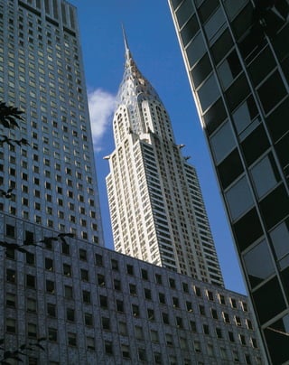
L
o u i s h e n r y s u l l i va n ’ s
graceful, terra-cotta-clad Bayard-
Condict Building does not quite qual-
ify as a skyscraper at only 13 stories, but
Sullivan revolutionized the way architects think
about tall buildings. As Frank Lloyd Wright told
the story, Louis Sullivan invented the modern
skyscraper after a walk through Chicago’s Loop,
when in three minutes he dashed off an esquisse
for the Wainwright Building (1891) in St. Louis.
“I was perfectly aware of what had happened,”
wrote Wright, who was then Sullivan’s appren-
tice. “This was Louis Sullivan’s greatest
moment—his greatest effort. The ‘skyscraper’ as
a new thing under the sun, an entity with...
beauty all its own, was born.”
Sullivan’s contribution was nothing less
than to overthrow the heritage of Greek and
Roman architecture. Before the age of elevators
and structural steel, buildings were low to the
ground and the emphasis was on the horizontal
line. Even when new technologies allowed archi-
tects to build vertically, they adhered to the
[ 1] Richly ornamental terra-cotta panels incorporate classical and Celtic motifs. [ 2] Breathtakingly modern, the Bayard
dates to the horse-and-carriage era.
3
Bayard-Condict Building
65–69 BLEECKER STREET » LOUIS H. SULLIVAN, 1898
horizontal “layer-cake” construction of the clas-
sical model. Rather than counteract the inherent
verticality of a tall building by imposing a hori-
zontal plan, Sullivan realized that a skyscraper
“must be tall, every inch of it tall....It must be
every inch a proud and soaring thing, rising in
sheer exaltation that from bottom to top it is a
unit without a single dissenting line.”
This commercial office building, the only
example of Sullivan’s work in New York, appears
much taller than its neighbors because of its ele-
gantly organized façade. The structural piers
that run the entire length of the façade from the
ground floor to the deep overhanging cornice
are distinguished by their heft and thickness. In
contrast, the three-quarter-round colonettes that
serve as window mullions begin at the second
floor, above open spaces, denoting their decora-
tive rather than structural function.
Sullivan created a new visual lexicon for
the tall building, in which everything is subordi-
nated to the vertical expression. The surface of
the spandrels is suppressed behind the piers and
1
2
©sylvieball](https://image.slidesharecdn.com/catzl6xr7qjbywzl3adu-signature-ec0ec1356cdf1cf66b46a9db24b432b8b8c5d53476da6de461fc6b32c36da610-poli-180116170250/85/Manhattan-skyscrapers-19-320.jpg)
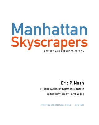
![buildings over 10 stories tall in New York; by
1908, when the title of world’s tallest building
was ceded to Ernest F. Flagg’s 47-story, 612-foot-
tall Singer Building, there were 538 buildings
over 10 stories. The benchmark of 10 stories
rapidly became meaningless in the explosion
of commercial construction. An apostate,
Robertson recanted the skyscraper aesthetic in
1900, and argued for a return to the Beaux-Arts
scale, in which new buildings should be no
higher than 150 feet on avenues (roughly the tra-
ditional cornice level of Park Avenue), and 100
feet on side streets.
The Park Row’s lobby is a period gem, well
worthy of landmark designation, although it is
not one. Nearly perfectly preserved, it is lined
with marble panels that would become the
trademark of New York office buildings until
well into the 1960s, under a gilded, coffered ceil-
ing. Ten remarkable wedge-shaped elevator cabs
fan out to form a semicircle.
Developed as a speculative commercial
office venture by a syndicate of investors, the
Park Row contained nearly 1,000 office spaces
and accommodated 4,000 workers. It was
emblematic of the gigantism to come. Munsey’s
magazine called it “a city and a world within
four towering walls. ..a footprint of the twenti-
eth century.”
T
h e v i c t o r i a n culture that pro-
duced the first skyscrapers was an odd
mix of forward-looking technology
and romantic nostalgia for the bucolic
past that technology was replacing. The 30-story,
391-foot-tall Park Row Building, for nine years
the world’s tallest building, was constructed with
an internal steel cage frame pioneered by the
Chicago School, but its cluttered classical revival
façade works to disguise its height rather than
accentuate it.
R. H. Robertson drew on metaphors from
an age before steel construction. Four massive
limestone caryatids at the fourth-four level,
sculpted by John Massey Rhind, emphasize an
illusion of masonry support in the buff-brick
and limestone façade, even though steel girders
can be plainly seen bracing the light courts. The
vertical organization of the building is confused
by horizontal divisions of stringcourses and
heavily bracketed balconies at many levels.
Robertson apparently could not decide
between presenting the building as a free-stand-
ing tower or a simple infill. As a result, the
building partakes of both and has virtually no
distinguishing silhouette. The presentation is
almost entirely oriented toward its 104-foot-
wide Park Row façade, except for the narrow 20-
foot-wide front on Ann Street to the south. Ells
sprawl octopus-like, covered only by bare brick
party walls.
Diminutive, copper-covered cupolas that
once served as a public observatory are a won-
derful romantic holdover, but also reveal a mis-
comprehension of the impact of classical
decoration on a tall building. Seen from street
level, the tiny turrets only work to lessen the
scale of the building. The design problem of
topping off a tall building led to eclectic and at
times eccentric variations before the setback
silhouette was arrived upon in response to the
Zoning Code of 1916.
In 1890, less than a decade before the
Park Row was completed, there were only six
[ 1] The Park Row Building’s semicircular lobby features wedge-shaped elevator cabs. [ 2] The building’s steel structure
is belied by its masonry motifs.
5
Park Row Building15 PARK ROW » R. H. ROBERTSON, 1899
1
2
©sylvieball](https://image.slidesharecdn.com/catzl6xr7qjbywzl3adu-signature-ec0ec1356cdf1cf66b46a9db24b432b8b8c5d53476da6de461fc6b32c36da610-poli-180116170250/85/Manhattan-skyscrapers-21-320.jpg)
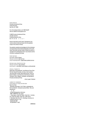
![masks is a link with a classical past. At the fourth
story, foliated ovals alternate with roundels that
contain mysterious Greek masks of women. The
terra-cotta blocks are deeply incised and richly
patterned, creating a florid play of light and
shadow over the entire surface. The windows, set
in deep reveals, seem like somber voids in the
surface. Eight-story oriels, relatively rare in New
W
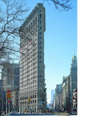
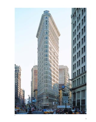
e l l p a s t World War I, the
steamship continued to be the
most powerful metaphor for the
twentieth century. Nautical
design demanded that no space be wasted, no
gesture be superfluous, and that an object’s
form be subordinated to its use. It is not coinci-
dental that the Flatiron Building so much
resembles a steamship fashioned out of stone.
Alfred Stieglitz, who took one of the best-
known images of the sheer, thin wall of the
Flatiron floating weightlessly above the snow of
Madison Square Park, wrote that the building
“appeared to be moving toward me like the bow
of a monster ocean steamer—a picture of new
America still in the making.” With its undulat-
ing French Renaissance terra-cotta cladding, the
Flatiron seems to swim out of a dream of a clas-
sical past toward the future of the steel sky-
scraper. It is a perfect snapshot of the skyscraper
as a Janus-faced evolutionary object, looking
back to the past, but anticipating the future.
Originally built as the headquarters of the
George A. Fuller construction company, the
building was only briefly called the Fuller
Building and soon became known as the
Flatiron because of its distinctive shape. The
company built some of the most important
buildings in the city, including the original
Pennsylvania Station, the Plaza Hotel, and Lever
House and the Seagram Building in the post–
World War II era. The 21-story, 307-foot-tall
building was the tallest skyscraper north of Wall
Street when it was built.
Buckminster Fuller rightly remarked that
the Flatiron dated to an era when “architects
were still pretending there was no steel,” but
the Chicago architectural firm of Daniel H.
Burnham was already one step ahead. Burnham
maximized the delta-shaped site to establish the
skyscraper as a freestanding sculptural object,
but the viewer intuits that the walls are too sheer
to support its weight. The onlooker cannot help
but be swept into the vortex of its six-foot-wide
[ 1] The underlying steel skeleton stands exposed in this construction photo.
7
Flatiron Building175 FIFTH AVENUE » DANIEL H. BURNHAM, 1902
apex at the intersection of Broadway and Fifth
Avenue. The radically narrow corner seems to
compress space, making the viewer look up for
the lost volume of the building, further adding
to a sense of overwhelming height.
Sometimes called “Burnham Baroque,”
the rippling terra-cotta curtain wall decorated
with lion’s heads, wreaths, and architectural
1](https://image.slidesharecdn.com/catzl6xr7qjbywzl3adu-signature-ec0ec1356cdf1cf66b46a9db24b432b8b8c5d53476da6de461fc6b32c36da610-poli-180116170250/85/Manhattan-skyscrapers-23-320.jpg)
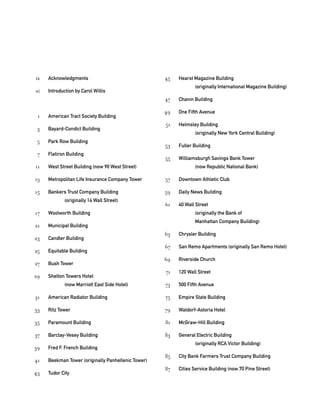
![York office buildings but more common in
Chicago skyscrapers such as Burnham’s Fisher
Building of 1896, give an undulating rhythm to
the façade. The banded rustication of the walls
enhances the sense of many layers stacked on
top of one another.
The Flatiron is one of the most aggressive
formulations of the tall building as a classical
column, with a defined, anchoring base, a regu-
lar shaft, and an ornamental capital. The base,
which can be read as four or five stories because
of the double-height ground floor, is distin-
guished by heavily rusticated limestone blocks.
Burnham capped his building with a massive,
projecting dentiled cornice topped by flat
balustrades interspersed with squat piers. The
fact that from certain angles the building can
be perceived as a column is a marvelously
literal demonstration of the essence of the free-
standing tower.
The column form was the summa for a sky-
scraper of this height, but at greater distances of
30 and 40 stories that tall buildings soon attained,
heavy, classical cornices became unwieldy. Ely
Jacques Kahn, one of the most prolific architects
of the setback style, perhaps now remains alone
in his judgment, but wrote: “Consider the
Flatiron, theTribuneTower, the World Building
as notable shafts of a generation ago and find how
little reason exists for most of their decoration
and how feebly they stop.The cornice, once of
stone and purporting to shed rain water from the
face of the building, became a distorted and
ridiculous affair of tin, copper, sheet iron, terra
cotta, tied on with wires and merely lasting as a
weak reminder of mere classicism.”
But the Flatiron is a thoroughly modern
object in that it requires the viewer to complete
the picture. There is no single image of the build-
ing; it depends on your point of view. From
head-on it is a flying wedge; from close up it is a
dizzying wall that seems to have no more depth
than a standing column; and from broadside, the
190-foot-wide façade on Broadway presents a
palazzo of almost unimaginable scale. The wall is
as massive yet knifelike as the prow of a ship. The
image is not stable, resonating between stasis and
motion, giving a sense of dynamism to the whole
that predicted the restless forward momentum of
the twentieth century.
[ 1] The Flatiron’s dynamic apex appears to be a pure column. [ 2] From uptown, the Flatiron looks like either a sheer,
six-foot-thick wall, or a steamship prow.
8
1
©sylvieball](https://image.slidesharecdn.com/catzl6xr7qjbywzl3adu-signature-ec0ec1356cdf1cf66b46a9db24b432b8b8c5d53476da6de461fc6b32c36da610-poli-180116170250/85/Manhattan-skyscrapers-24-320.jpg)
![Set around a rear light court, the U-shaped
building is now hemmed in by the superscale
One World Trade Center just across narrow
Liberty Street, but originally commanded a
more prominent site at what was then the edge
of the Hudson River. The first occupants were
members of the proliferating railroad and ferry
industries. Cesar Pelli paid a contextual tribute
to this festive holdover from the ancien régime
by echoing the West Street Building in the deco-
rative glass mastaba crown of his No. 1 World
Financial Center.
T
h e w e s t s t r e e t b u i l d i n g
is a Gilded Age skyscraper, a celebration
of wealth and culture in terra cotta, but
also incorporates some of the most for-
ward-looking ideas in skyscraper design. From
Louis Sullivan, Cass Gilbert took the idea of
clearly expressing the underlying steel structure:
broad piers that support the West Street Building
rise without interruption from street level to an
arcaded crown, while decorative, three-quarter-
round colonettes run only the length of the shaft.
The shaft’s overall verticality is emphasized by its
simple lines and recessed spandrels. Rows of win-
dows between the piers form nearly uninter-
rupted perpendicular strips of glazing, adding to
the airiness and openness of the façade.
Following Burnham, Gilbert treated the
tall building as a classical column, with a three-
story limestone base, Gothic ornamentation,
unaccented modernistic shaft, and crown that
resembles a fireworks explosion in terra cotta. In
an advance in skyscraper design, the West Street
Building presents its crown rather than the
detailing of the whole façade as the image of the
[ 1] Illuminated at night, the West Street’s attic is a monument to the Gilded Age. [ 2] The West Street Building
dominated the Hudson River waterfront before the landfill. [3] A relatively plain base and shaft lead up to the
crown’s visual pyrotechnics.
11
West Street Building(now 90 West Street) CASS GILBERT, 1907
building. In his Woolworth Building six years
later, Gilbert took this idea a step further by
making the silhouette the overall symbol of the
skyscraper. With a sculptor’s sense for visual pro-
gression, Gilbert leads the eye up from the West
Street Building’s massive white granite base,
through the sweeping verticals of the matching
white terra-cotta shaft to the six-story crown,
where the gaze becomes lost in a cannonade of
French and Belgian Gothic detail. Red granite
columns flanking the entrances, windows
framed in green cast iron, and the lushly tinted,
overscale, polychrome terra-cotta rosettes in the
intrados of the arches play vibrantly against the
building’s stark white skin. The eye devours the
surface, seeking a resting point, traveling up the
blank piers only to be brought earthward again
by the grand three-story arches in the capital,
then returning upward to seek out the finer
details of corbels, turrets, dormers, and pinna-
cles in the crown. The festive composition is
framed by the rigorously simple roofline and
heavy corner piers, a great visual balancing act
between the tension of curved and straight lines.
21
3](https://image.slidesharecdn.com/catzl6xr7qjbywzl3adu-signature-ec0ec1356cdf1cf66b46a9db24b432b8b8c5d53476da6de461fc6b32c36da610-poli-180116170250/85/Manhattan-skyscrapers-27-320.jpg)
![overall silhouette become more critical to its
appearance at great distances than the façade
detailing.
Experimenting with eclectic styles contin-
ued into the late 1950s, culminating in the Neo-
Renaissance crown of 40 Wall Street, which
Philip Johnson recently admired as “among New
York’s prettiest towers.” LeBrun was less confi-
dent about the future of the skyscraper:
“Whether architects are working toward the
right evolution of a tall building, irreverently
termed ‘skyscraper design,’ the verdict of time
only can determine.”
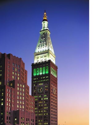
W
i t h o u t a clear precedent for
what the world’s tallest building
should look like, Pierre L.
LeBrun of Napoleon LeBrun &
Sons reached back to one of the best-known
buildings in history—the campanile of St.
Mark’s in Venice—for his model. The scale
problems of transposing an historical style to a
skyscraper are immediately apparent: stretching
700 feet, one inch, from the sidewalk, the
Met Life Tower does not seem particularly tall
or distinctive.
In the American race to outdo all the
records of the Old World, at least in sheer size,
the Met Life Tower is more than twice the
height of the original 325-foot-tall Campanile.
The Met Life’s proportions are that of a Doric
column applied to a 52-story building. The shaft
is organized into three bays of three windows
each, bracketed by rusticated quoins, ending in
an arcaded loggia at the thirty-first floor.
However, the height of the new tower is coun-
[ 1] Met Life executives prepare to drive in the ceremonial last rivet in 1908. [ 2] The Metropolitan Life Tower’s familiar
outline fights the impact of its height. [3] The executive gym, complete with medicine balls and Indian clubs.
13
Metropolitan Life Insurance Company Tower
ONE MADISON AVENUE » NAPOLEON LEBRUN & SONS, 1909
teracted, because the mind’s eye inevitably
shrinks it back down to the scale of sixteenth-
century Venice.
Ornamentation was not meant to be
viewed so far from the ground. The four-sided,
26.5-foot-in-diameter clock faces with four-foot-
tall numerals and minute hands weighing half a
ton lose their impact at such distances. The high
pyramidal roof with ocular windows is topped
with a cupola and glazed lantern that was lit at
night. Dolphin’s head balustrades and lion’s
heads once adorned the now-severe lines of the
shaft. The tower, originally sheathed in
Tuckahoe marble, was stripped in a 1964 renova-
tion and recovered in plain limestone. However,
the architect’s drawing is still preserved inside a
14.5-foot-tall frame at the 320 Park Avenue
entrance. The simple fact of skyscraper design,
that details had to be outscaled to be perceived
at all, may have contributed as much to the
spare, modernist style as much as any structural
considerations. The building’s massing and its
1 2
3](https://image.slidesharecdn.com/catzl6xr7qjbywzl3adu-signature-ec0ec1356cdf1cf66b46a9db24b432b8b8c5d53476da6de461fc6b32c36da610-poli-180116170250/85/Manhattan-skyscrapers-29-320.jpg)
![bolized in the bronze gate inside the lobby,
which was renovated in 1931–33: a tipping vat
of molten ore represents metallurgy; a helm
interlaced with rigging stands for shipping; a
derrick ball and rivets stand for construction; a
generator with zigzag lightning bolts that antici-
pates Expressionist motifs stands for power; and
an ox-head, engine valves, and shovel-head with
paired sticks of dynamite represent agriculture,
manufacturing, and mining, respectively.
T
h e p e r va d i n g metaphor for the
skyscraper in the eclectic era was mon-
umentality. As a powerful but young
nation, America felt a need to compete
with the landmarks of history. If not in age, we
could outdo the past in sheer size and height:
The Met Life Tower was twice as big as the orig-
inal in Venice; the Woolworth outdid London’s
Houses of Parliament and the cathedrals of
Europe as the world’s tallest building. Trow-
bridge & Livingston turned to one of the best
known images from antiquity—the pyramidal
Mausoleum at Halicarnassus (c. 352 b.c.)—to
cap off their 37-story skyscraper at the corner of
Wall and Nassau Streets. At 539 feet tall, but
with fronts measuring only 94 by 97 feet, it was
considered the world’s tallest structure on so
small a site.
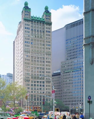
The formidable four-story granite base,
sited on one of the most valuable intersections
in the world at the corner of Wall and Nassau
Streets, is patterned like a colonnade atop a clas-
sical stylobate. Three-story-tall, three-quarter-
round Ionic columns marching across the façade
above Greek fretwork are interrupted by gar-
landed beltcourses, and support an echinated,
dentiled cornice decorated with rosettes and
lion’s heads.
Above the highly decorative base, derived
from the Erectheum Ionic order, the plain, cur-
tain-walled shaft that houses office rental space
rises for 20 stories. The light gray granite façades
of the square tower are organized into five bays
of two windows, with little decoration other
than the flat voussoirs surmounting the win-
dows. Deep reveals give an impression of lithic
solidity.
In a strange synchronicity, the crown seems
to anticipate the jagged figure-ground effects of
the later setback style. The granite-clad pyramid,
which housed record rooms and storage space,
caught the public’s eye, and soon was claimed as
the registered trademark for the bank. The pyra-
mid top is also one of the most influential
[ 1] The pyramidal top is one of the most influential designs on downtown skyscrapers.
15
Bankers Trust Company Building
(originally 14 Wall Street) 14 –16 WALL STREET » TROWBRIDGE & LIVINGSTON, 1912
designs on other downtown skyscrapers,
repeated in the 480-foot-high Standard Oil
Building (Carrère & Hastings and Shreve, Lamb
& Blake, 1922) and Kevin Roche John
Dinkeloo, & Associates’ glassy postmodern
Morgan Bank Headquarters (1988) at 60 Wall
Street.
The Bankers Trust Company was founded
to provide fiduciary services in cooperation
rather than competition with commercial banks.
The mighty enterprises of capitalism are sym-
3](https://image.slidesharecdn.com/catzl6xr7qjbywzl3adu-signature-ec0ec1356cdf1cf66b46a9db24b432b8b8c5d53476da6de461fc6b32c36da610-poli-180116170250/85/Manhattan-skyscrapers-31-320.jpg)
![The Woolworth rises from a 29-story plat-
form to become a tower inset on all four sides at
the forty-second story. Like a medieval spire, the
tower metamorphoses from a square to an octa-
gon at the forty-eighth story, and culminates in a
three-story, 125-foot-tall, copper-clad roof. The
Woolworth stands out among its contemporaries
because Gilbert resolved the problem of placing
a smaller tower on top of a base by integrating
the tower into the front façade. The building was
designed to be seen as a free-standing tower, so
all four sides were treated architecturally.
The three-story limestone base with gran-
ite at street level is topped by creamy, ivory-col-
ored terra-cotta cladding anchored to a brick
backing. Terra cotta, a light and decorative—
rather than structural—material, emphasizes the
steel cage that supports the building. The
straight, structural lines of the piers end in the
tower decorated with gargoyles, turrets, pinna-
cles, buttresses, and delicately colored terra-cotta
panels in shades of green, cobalt blue, sienna,
and deep rose. Gilbert skillfully used poly-
chromy to bring out the relief of the façade.
The Woolworth was the era’s most promi-
nent example of the confluence of advertising
and ego that went into skyscraper development.
Frank Winfield Woolworth, the founder of the
Woolworth retail chain, specifically instructedS
k y s c r a p e r s a r e not only
objects of their own time, but have
an uncanny knack for pointing the
way to the future. Cass Gilbert’s
Woolworth Building is the most successfully
realized skyscraper of the eclectic era, but also
seems to anticipate the setback designs of the
Art Deco skyscrapers. At 55 stories, the
Woolworth was the tallest and most recogniz-
able skyscraper in the world for 16 years until it
was topped by the Chrysler Building. Many
heights are given for the building, but its highest
point is 793.5 feet on the Barclay Street side. The
owner had the building measured himself to
make sure it was the tallest in the world. The
stories that vary from 11 to 20 feet high are the
equivalent of about 80 modern-day stories.
Gilbert decided on the Flamboyant Gothic
style of fifteenth-century France to express the
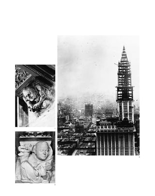
[ 1] The world’s tallest building at the time pierces the clouds.
[ 2] A 1910 study for the Woolworth; the owner rejected many early versions.
17
Woolworth Building233 BROADWAY » CASS GILBERT, 1913
building’s height because he liked the visual
interest of the style’s summits. The skyscraper,
he wrote, “is a monument whose masses must
become more and more inspired the higher it
rises. The Gothic style gave us the possibility of
expressing the greatest degree of aspiration...
the ultimate note of the mass gradually gaining
in spirituality the higher it mounts.”
The building soon became known as the
“Cathedral of Commerce,” a designation that
Gilbert bristled at, because the sources of his
inspiration had all been secular northern Gothic
structures. The Gothic style influenced early
skyscraper architects because it was the only his-
toricist style that emphasized height and verti-
cality. The tallest manmade point in Manhattan
for more than half a century was the 284-foot
steeple of Trinity Church, designed by Richard
Upjohn in 1846.
2
1](https://image.slidesharecdn.com/catzl6xr7qjbywzl3adu-signature-ec0ec1356cdf1cf66b46a9db24b432b8b8c5d53476da6de461fc6b32c36da610-poli-180116170250/85/Manhattan-skyscrapers-33-320.jpg)
![his architect to “make it 50 feet taller than the
Metropolitan Tower,” so that his new building
would beat the record. Woolworth recognized
the symbolic and advertising function of the
world’s tallest building: “I do not want a mere
building,” he said after revising dozens of
Gilbert’s sketches. “I want something that will
be an ornament to the city.”
Gilbert felt to a large degree that his design
was simply a logical expression of the demands
of the project, as did William Lamb with the
Empire State Building. “The economic condi-
tions which call for the use of every bit of avail-
able space and at the same time provide ample
light for rooms leave little opportunity for the
arrangement of the masses,” Gilbert said.
Nonetheless, the Woolworth abounds with
details that transcend the merely functional. The
lobby is ahistorically designed in a Romanesque
style featuring barrel-vaulted ceilings with glass
mosaics patterned after the early Christian mau-
soleum Galla Placidia in Ravenna, Italy. The
polished steel doors with gold backgrounds at
street level were produced by the Tiffany
Studios, and the walls are lined with dark, fine-
veined marble from the Greek island of Skyros.
The extraordinary corbel grotesques in the
lobby form a parable of how a skyscraper is
financed and constructed. There is the developer,
the mustachioed Frank Woolworth, counting
out the coins of his five-and-ten-cent fortune.
(Woolworth actually paid the $13.5 million con-
struction costs in cash as the building proceeded,
so that it opened without a mortgage or debt of
any kind.) A bespectacled Cass Gilbert cradles a
scale model of his setback tower, and the struc-
tural engineer, Gunwald Aus, who also worked
on Gilbert’s West Street Building, measures a
steel girder. Louis J. Horowitz, head of the
Thompson-Starrett Building Company, lam-
bastes a contractor over the telephone, and
Edward J. Hogan, the rental agent, peruses a
lease.
[ 1] F. W. Woolworth counts out his five-and-dime fortune in a corbel caricature. [ 2] The builder, in a monk’s hood,
talks into a stand-up telephone. [3] The Woolworth’s terra-cotta cladding accentuates the underlying steel structure.
[4] The tower’s electrifying modernistic impact is often overlooked because of its Gothic styling.
19
4](https://image.slidesharecdn.com/catzl6xr7qjbywzl3adu-signature-ec0ec1356cdf1cf66b46a9db24b432b8b8c5d53476da6de461fc6b32c36da610-poli-180116170250/85/Manhattan-skyscrapers-35-320.jpg)
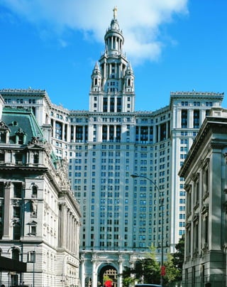
![T
h e m u n i c i p a l b u i l d i n g
was the first skyscraper constructed by
McKim, Mead & White, in the wan-
ing years of the firm’s influential
Beaux-Arts career. The 40-story building, which
contains 650,000 square feet of city offices, was
designed by the partner William Mitchell
Kendall. Charles McKim himself was averse to
skyscrapers and the trend towards gigantism and
said, “I think the skyline of New York daily
grows more hideous.” The Municipal Building
features some of the best aspects of Beaux-Arts
architecture, which sought to be both monu-
mental and an integral part of the city’s fabric.
The 559-foot-tall building, including a 15-story
tower, is superbly metropolitan: it straddles the
extension of Chambers Street (now closed to
traffic) with a Roman triumphal arch like a
modern-day Colossus of Rhodes. The 24-story
wings of the U-shaped court, covered in light-
colored Maine granite, reach out to embrace
City Hall.
The Municipal Building is both ceremo-
nial and sheltering. Adolph A. Weinman’s 20-
foot-high gilded statue of “Civic Fame,” the
largest statue in the city, holds aloft a crown
with five turrets, symbolizing the five boroughs
of New York City. A giant Corinthian colon-
nade, modeled after Giovanni Lorenzo Bernini’s
colonnade at St. Peter’s, marches across the
entrance, a protective yet penetrable perimeter.
Vaults of Guastavino tile protect commuters in a
loggia on the south concourse of the subway.
Although the Woolworth Building was the first
to provide sheltered subway entrances from the
sidewalks of the side streets, the Municipal
Building was the first to incorporate a subway
station as an integral part of its base.
Henry Hope Reed exulted that the
Municipal Building was “the nation’s finest sky-
scraper,” but here we see the Beaux-Arts style
stretching at the seams to cope with the new
demand for height. The insistent horizontal
styling of classical architecture fights with the
[ 1] The gold-leafed statue of “Civic Fame” atop the Municipal Building. [ 2] The Municipal Building, near completion in
1912, is a monument to civic pride.
21
Municipal BuildingCENTRE STREET AT CHAMBERS STREET » MCKIM, MEAD & WHITE, 1914
sense of height, so that the building appears
more like a massive wall with a tower, rather
than a tall building.
The crown of a Corinthian drum adapted
from the Choregic Monument of Lysicrates in
Athens of 334 b.c. is a kind of funerary monu-
ment for historical styles. There were simply too
few models left to copy, and skyscraper design
had to move forward instead of back. A compar-
ison with developments in the other arts is
telling: in 1913, the Armory Show featured new
works by Picasso, Braque, and Duchamp, and
James Joyce published Dubliners.
However, the building’s Imperial Roman
image was enormously influential in other cities,
and was a prototype for Chicago’s Wrigley
Building (1924) and Cleveland’s Terminal Tower
(1930), both by Graham, Anderson, Probst &
White; the Fisher Building in Detroit (Albert
Kahn, 1928); and—strangely enough at such a
late date—the main building of Moscow
University (L. V. Rudnev, S. E. Chernyshov,
P. V. Abrosimov, and A. F. Khryakov, 1949‒53).
The Municipal Building houses a Dickensian
maze of old-fashioned city offices, and dozens of
couples still marry here every week.
1
2](https://image.slidesharecdn.com/catzl6xr7qjbywzl3adu-signature-ec0ec1356cdf1cf66b46a9db24b432b8b8c5d53476da6de461fc6b32c36da610-poli-180116170250/85/Manhattan-skyscrapers-37-320.jpg)
![almost invisible from street level. A perforated
railing of addorsed, overscaled sea horses and
winged griffins at the top cornice compensates
for the distance. This kind of ornamentation
might cause one to speculate that American
businessmen were furnishing an empyrean realm
meant only for each other.
T
h e p r o t o - s e t b a c k silhouette
of the Candler Building seems to sum-
mon the future in a dream form, with
its embryonic winged base, its plain,
functional shaft, and its indented crown. The
Candler sets an important precedent, because it
was one of the most successful solutions to the
problem of building on a midblock site. The
architects solved the problem of how to make a
tower stand out among lower flanking buildings
by setting it off on its own base, a model that
neatly adapted itself to the requirements of the
setback zoning code of 1916. Because of this
organization, the outlines of the Candler pre-
dominate over its surface ornament.
Neglected by the public and critics alike
for much of its 75-year history, the 24-story
Candler Building, clad in gleaming white terra
cotta, has become a showpiece of the recent
Times Square revival. The Candler is a fascinat-
ing transitional form between the fussiness of
classical revival skyscraper design and the emerg-
ing spare lines of modernism. Nominally
Spanish Renaissance, the design is more impor-
tant because the configuration of base, shaft,
and crown anticipates the silhouette of the set-
back skyscraper.
Built as the New York headquarters of the
Coca-Cola Company, and named after its
founder Asa Candler, the tower rises from a five-
story, 78-foot-wide arcaded base attached to the
main shaft by unusual wings that give it the
appearance of a finned 1950s rocket ship. Above
the decorative fourth-floor spandrels, the shaft
rises in three uninterrupted bays of metal-framed
double windows for 13 stories, ending in arches
that echo the base. The lines of the shaft are
remarkably clean cut, without the stringcourses,
colonettes, and gewgaws of its predecessors.
The crown above the projecting twentieth-
floor cornice is not fully setback as later build-
ings would be, but is massed with corner
indentations so that it is perceived as a separate
section, surmounted by a pyramidal copper roof
[ 1] Both of the base’s embryonic “wings” are intact in this early photo.
23
Candler Building220 WEST 42ND STREET » WILLAUER, SHAPE & BREADY, 1914
352 feet above street level with a 36-foot flagpole.
The Candler was the tallest building north of the
Metropolitan Life Tower at 24th Street, and rep-
resented Manhattan’s inexorable march uptown.
Much of the terra-cotta detailing of
cherub’s heads, architectural masks set in
roundels, and well-articulated diapering is
1](https://image.slidesharecdn.com/catzl6xr7qjbywzl3adu-signature-ec0ec1356cdf1cf66b46a9db24b432b8b8c5d53476da6de461fc6b32c36da610-poli-180116170250/85/Manhattan-skyscrapers-39-320.jpg)
![The Equitable was unpopular because of
its banality as well as its bulk. Its unornamented
23-story shaft rises through sheer numbing repe-
tition of layers of square-headed windows sepa-
rated by piers of shallow pilasters. A course of
undersized lion’s heads at the twenty-fourth-
story cornice seems to be an afterthought. The
setback silhouette combined with the zigzag
geometry of the 1925 Exposition Internationale
des Arts Décoratifs et Industriels Modernes in
Paris led to the astonishing richness of visual
design in skyscrapers of the 1920s, a match made
in the heavens.
[ 1] The Equitable rises through sheer multiplication of its one-acre site. [ 2] The steel skeleton of the Equitable Building
tops out in August 1914. [3] The H-shaped Equitable stands out in bright contrast to the shadows of Lower Manhattan.
25
Equitable Building120 BROADWAY » ERNEST R. GRAHAM, 1915
T
h o u g h f r e q u e n t l y singled
out as the behemoth that brought
about the 1916 Zoning Code, the
Equitable Building was still on the
drawing boards when city planners were looking
for ways to increase the amount of sunlight and
air circulation to the streets. You need only stand
on Pine Street to understand the problem: the
sky is reduced to a narrow stretch of ribbon
between the cornice of the 41-story Equitable
and the 19-story 100 Broadway, less than 35 feet
apart. The Equitable rises, cliff-like, straight
from the sidewalk for 542 feet. The experience
is like standing at the bottom of a man-made
canyon. Even at noon in midsummer, the streets
are half-plunged in shadow.
Before the advent of fluorescent office
lighting, what most determined the value of
office space (after location) was the amount of
natural light it received. When the Equitable
went up in 1915, it cast a shadow for four blocks
uptown, causing surrounding real-estate values
to plummet. Falling real-estate values meant
falling tax assessments, and the city required a
remedy, so that market logic as much as environ-
mental concerns led to the zoning reform, the
first of its kind in the nation. The timing of the
1916 Zoning Code was fortuitous, because archi-
tects working in eclectic styles were running out
of ideas about how to treat the tall building. The
code forced architects to think about skyscrapers
in fresh ways.
Henry James meant buildings like the
Equitable when he called skyscrapers “giants of
the mere market.” The Equitable packs in an
astonishing 1.2 million square feet of rental
space, or 30 times the area of its site, which is
slightly less than an acre. The barrel-vaulted,
block-long arcade of stores in the lobby was
innovative, but its colossal scale, the ceiling
studded with giant plaster rosettes, and the icy
corridor lined in lustrous marble make you feel
mouse-sized even today.
1
3
2](https://image.slidesharecdn.com/catzl6xr7qjbywzl3adu-signature-ec0ec1356cdf1cf66b46a9db24b432b8b8c5d53476da6de461fc6b32c36da610-poli-180116170250/85/Manhattan-skyscrapers-41-320.jpg)
![Corbett was clear about his plans for Bush
Tower: “We were determined it should be a
thing complete in itself, with fine, clean, upris-
ing lines; a building that could be looked at
from every angle, sides and back as well as
front.” In a brilliant design stroke, the Gothic
styling of the party walls becomes a purely two-
dimensional representation. In monochromatic
brick, Corbett limned white piers that seem to
cast a black “shadow,” continuing the insistent
verticality of the façade. On the eastern party
wall, an overscaled pointed arch spanning the
light court adds an upward-thrusting visual
impact to what would have otherwise been a
strictly utilitarian feature. The building is often
photographed from this angle rather than from
the main façade.
The symbolic Gothic trimming was an
economical way of resolving the problem of
whether the building would be perceived as a
tower or piece of infill. At the same time, it was
a statement by Corbett that the eclectic era’s lit-
eral interpretation of historical styling was no
longer necessary and that architects were free to
use only what they needed from the past to cre-
ate the future.
[ 1] Corbett watched the development of 42nd Street from his top-floor office. [ 2] In 1927 Bush Tower signified
the business district’s shift to midtown.
27
Bush Tower130 WEST 42ND STREET » HARVEY WILEY CORBETT, 1918
T
h e n a r r o w 32-story Bush Tower
was the first skyscraper built after the
Zoning Code of 1916, but it had been
designed before the code went into
effect. Nonetheless, Harvey Wiley Corbett accu-
rately foresaw how architects would respond to
the new setback envelope presented by the code.
Like the Candler Building one block to
the west, Bush Tower’s most expressive feature is
its lines rather than its surface ornament.
Corbett clearly chose the English Gothic style
for its emphasis on vertical lines. Much of the
building’s impact is due to its exiguous siting,
with a 480-foot-tall sheer tower on a front only
50 feet wide and 90 feet deep. The decoration of
the base and shaft is remarkably stripped down,
confined to four limestone corbel gargoyles at
street level that caricature the Bush Terminal
Company’s role in the shipping industry. The
gargoyles depict a navigator with his sextant, a
hardy helmsman wearing a sou’wester, a fright-
ened cabin boy holding on to the mast, and a
strangely apathetic sailor entangled with an
anchor. Flush with the World War I effort, the
Bush shipping and warehousing concern at one
time occupied 150 buildings and eight piers on
the west side of midtown.
Projecting triangular buff-brick mullions
subdivide three deeply incised window bays.
From an oblique angle, the reveals are so deep
that the spandrels disappear entirely, giving the
impression of a façade composed entirely of
skinny vertical lines. John Mead Howells adapted
this method of scraping lines into the façade to
add verticality to his Beekman Tower in 1928.
A kind of proto-setback is formed at the
twenty-fourth-story cornice line, where a six-
story section is chamfered and set off by copper
pinnacles at the four corners. Above the double-
height top floor with pointed arch windows, a
shallow mansard disguises a water tower.
Corbett moved his offices into the top floor to
watch his prophecies for the development of
42nd Street come true.
2
1](https://image.slidesharecdn.com/catzl6xr7qjbywzl3adu-signature-ec0ec1356cdf1cf66b46a9db24b432b8b8c5d53476da6de461fc6b32c36da610-poli-180116170250/85/Manhattan-skyscrapers-43-320.jpg)
![not appear to sag. Projecting brick headers add a
texture of shadows. Shallow projecting 14-story
bays form lights courts on three sides, around a
central shaft that sets back at the twentieth-story
cornice. Structural girders span a deep rear light
court, but the building is meant to be perceived
from all sides as a tower. The crown continues
for an additional 10 stories, ending in a double
arcade at the thirty-second floor. Griffins sejant
face outward at the four corners. The surface is
highly variegated, with the reveals of the piers
standing out at different thicknesses. In direc-
tional light, the piers cast deep perpendicular
lines of shadow that lend the building a sense of
tapering height.
Except for its delightful limestone gar-
goyles, the Shelton is relatively free of ornamen-
tation. Blind corbeled arcades line the cornice
divisions, topped by a double-story crown under
a mansard roof. The carved capitals of the three-
story-tall columns at the base denote the
Shelton’s origins as an athletic club for men.
One figure in a toga is ready to serve up a tennis
ball, and another towels off after a swim.
Stieglitz and O’Keeffe were enormously
fond of their nest in the sky. He took pho-
tographs of the raw new steel structures in
midtown such as the Waldorf-Astoria. O’Keeffe
painted abstracts of industrial views of the
East River far below, and employed photo-
graphic techniques, such as the flare created by
direct light in a camera lens, to paint The
Shelton with Sunspots.
W
i t h t h e Shelton Towers
Hotel, the first tall building
specifically designed to conform
to the setback code, the sky-
scraper comes into its own as a symbol of mod-
ernism. The role of the Shelton’s two most
famous occupants—the painter Georgia
O’Keeffe and her photographer husband Alfred
Stieglitz—cannot be discounted in this process.
The couple moved into a tiny, two-room apart-
ment on the twenty-eighth floor with views
of the East River shortly after their marriage
in 1924.
Arthur Loomis Harmon was the first
architect to exploit the aesthetic possibilities of
the new zoning code envelope. Warren &
Wetmore’s 23-story Heckscher Building (1921,
now the Crown) was actually the first skyscraper
built after the code, but was really a 14-story
classical revival tower with three-story wings set
on a broad nine-story platform rather than a
true setback. Harmon later joined Shreve &
[ 1] Fanciful gargoyles and capitals adorn the base of this modernist milestone.
29
Shelton Towers Hotel(now Marriott East Side Hotel) 525 LEXINGTON AVENUE » ARTHUR LOOMIS HARMON, 1924
Lamb to design the archetypal skyscraper, the
Empire State Building.
Architects turned to ever more recondite
sources from history and prehistory to fill the
demand for buildings that met the code.
Harmon adapted the massively lithic Lombard
revival style of the Church of Sant’Ambrogio in
Milan. His design is particularly successful
because it relies on the overall grouping of large
masses to form the building’s image rather than
ornamentation.
The warm, yellow-brick façade of the 32-
story Shelton is treated as a single surface, so
that the eye is drawn to the sculptural outlines
of the cornices and setbacks. The tripartite
grouping, set on a corner site, seems taller than
it is because of a few tricks of classical masonry.
The two-story limestone base slopes away from
the viewer at street level, counteracting the sense
that the building looms overhead. Upper stories
employ entasis, the method of adding a slight
bulge to long vertical elements so that they do
1](https://image.slidesharecdn.com/catzl6xr7qjbywzl3adu-signature-ec0ec1356cdf1cf66b46a9db24b432b8b8c5d53476da6de461fc6b32c36da610-poli-180116170250/85/Manhattan-skyscrapers-45-320.jpg)
![continuous, wrapped surface. Gold-colored
stone highlights the shifts in the setbacks.
The building’s image was dramatically
reversed at night, when glowing windows
burned in the black façade and the crown was lit
up, an attention-getting metaphor for the head-
quarters of a company that specialized in home
heating. Playful, classically styled corbel figures
at the third-story cornice, including a pipe fitter
with a wrench, refer to great moments in the
history of steam heat.
E
a c h m a j o r work in Raymond
Hood’s compressed, prolific career—
cut short by his death at 53—is a fasci-
nating metamorphosis from the
skyscraper’s Gothic roots to his early champi-
onship of the International Style in America.
Hood and his collaborator John Mead Howell’s
winning entry for the highly visible Chicago
Tribune Building competition in 1922 was a 36-
story, 460-foot-tall version of Rouen Cathedral’s
Butter Tower in France, complete with eight
overscaled flying buttresses. Sensitive to criticism
that Eliel Saarinen’s stripped-down, “styleless”
(read modern) second-place entry was the supe-
rior design, Hood combined Gothic and modern
styles in his American Radiator Building (though
designed after the Tribune Building, the
Radiator was actually completed a year earlier).
The Art Deco towers of midtown
Manhattan were built within about a decade of
one another and are textbook examples of how
buildings learn from each other through synthe-
sis. For his 22-story tower on a midblock site,
Hood used the Candler’s device of setting off
the tower on a platform so that it would be free-
standing.The Gothic style, stripped down to its
symbolic essentials, is indebted to Corbett’s Bush
Tower. At the same time, Hood incorporated the
clean, modernist lines of Saarinen’sTribune entry.
The Radiator is pivotal in the develop-
ment of the skyscraper because it is the first true
[ 1] Barrel-vaulted arches led to the showroom floor. [ 2] Georgia O’Keeffe celebrated the tower in RADIATOR BUILDING AT
NIGHT—NEW YORK, 1927. [ 3] The pilaster bases reiterate the setback motif in miniature.
31
American Radiator Building
40 WEST 40TH STREET » RAYMOND HOOD, 1924
expression of the Art Deco skyscraper silhouette.
You can almost see the struggle to arrive at the
form. From a complicated series of shallow set-
backs at the sixteenth- and twentieth-story cor-
nices, the distinctive step-like profile of the Art
Deco skyscraper springs forth breathtakingly
against the sky at the twenty-first floor. After the
Radiator Building, architects would deal with
the arrangement of large masses as solids set
against the void of the sky. Hood intuitively
understood this break with the past, and colored
his building with black brick to emphasize that
it should be perceived as a single, massive form.
Usually, fenestration appears as darker holes
in a light-colored building; here Hood makes
the windows blend into the façade. The shaft’s
sculptural mass is intensified by the chamfered
corners, which make the eye read it as a
1
2 3](https://image.slidesharecdn.com/catzl6xr7qjbywzl3adu-signature-ec0ec1356cdf1cf66b46a9db24b432b8b8c5d53476da6de461fc6b32c36da610-poli-180116170250/85/Manhattan-skyscrapers-47-320.jpg)
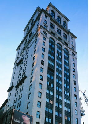
![seem homey and familiar. He brought in
Thomas Hastings, the surviving member of the
great Beaux-Arts team of Carrère & Hastings, to
decorate the façade with Italian Renaissance
designs typical of Park Avenue’s palazzo-like
apartment buildings. Bronze-trimmed coach
lanterns at the street level of the three-story rus-
ticated limestone base welcome home the resi-
dents, and raised panels of putti and a winged
cherub’s head over the entrance symbolize home
and family.
Roth seemed embarrassed about the vertical
elements of the building, which emerge nakedly,
like the limbs of an adolescent undergoing a
growth spurt. No attempt was made to integrate
the plain, unaccented, buff-brick shafts of square-
headed windows with the ponderous balustrades,
obelisks, cartouches, and broken pediments.The
overall image of the building is a classical obelisk,
but the form seems to stutter at every cornice,
afraid to let the setbacks spring free.The crown,
with its superfluous attic story under a mansard
roof and heavy capping obelisk that recapitulates
the overall parti looks as if it is trying to put a lid
on the building’s unseemly height.
New Yorkers, however, took to skyscraper
living like ducks to the Lake in Central Park.
The new status symbol was no longer a brown-
stone on a quiet side street, but a room with a
view. The duplexes in the tower offered double-
height, 40-foot-long living rooms with uninter-
rupted 25-mile views in all directions. The Ritz
is an interesting transition from the cluttered
comforts of the Edwardian era to the emerging
slim lines of the Jazz Age. Roth achieved a more
satisfying synthesis of styles in later designs for
twin towers such as the San Remo and El
Dorado apartment buildings, which look as if
they have always belonged along Central Park
West’s skyline.
[ 1] The Ritz’s Renaissance base abounds with symbols of domesticity. [ 2] The Ritz is a giant obelisk, decorated
with smaller obelisks.
33
Ritz Tower109 EAST 57TH STREET AT PARK AVENUE » EMERY ROTH AND CARRÈRE & HASTINGS, 1925
T
h e 5 4 6 - f o o t tall, 41-story Ritz
Tower, now lost in a shuffle of midsize
buildings, was the first residential sky-
scraper in the world. Emery Roth,
whose main concern was to provide the com-
forts of Park Avenue living to its residents, seems
to have done everything in his power to disguise
the building’s height. The resulting parfait is
easy to find fault with: heavy, classical revival
layers alternate with a few starkly bare stretchers
thrown in for height. The Ritz is exactly the
kind of building Ayn Rand scorned in her dizzy
paean to the skyscraper, The Fountainhead, that
“looked like a Renaissance palace made of rub-
ber and stretched to the height of forty stories.”
In an unpublished autobiography quoted
in Steven Ruttenbaum’s Mansions in the Clouds:
The Skyscraper Palazzi of Emery Roth, the archi-
tect admitted, “It took years for me to forsake
my early love and to forget Renaissance palaces
and Greek and Roman temples.” In the Ritz,
Roth was trying to accomplish the contradictory
goal of making the brand-new skyscraper form
1
2](https://image.slidesharecdn.com/catzl6xr7qjbywzl3adu-signature-ec0ec1356cdf1cf66b46a9db24b432b8b8c5d53476da6de461fc6b32c36da610-poli-180116170250/85/Manhattan-skyscrapers-49-320.jpg)
![B
y t h e mid-1920s, architects were
no longer trying to disguise their
buildings under layers of classical
design, but instead were looking for
new ways to show off the setback style. Rapp &
Rapp wanted to display a form that had never
been seen before, at least outside of Meso-
america. Their 33-story ziggurat in Times Square,
then the tallest building on Broadway north of
the Woolworth Building, is a fascinating transi-
tion from classical revival to Art Deco styling.
Best known for their opulent, Neo-
Baroque movie palaces, Rapp & Rapp designed
the crown of Paramount Picture’s East Coast
headquarters for maximum show-biz impact.
Eight pyramidal buff-brick setbacks, capped by
squat limestone obelisks, cascade down from a
clock tower surmounted by a 19-foot-in-diame-
ter glass globe, illuminated from within. The set-
back below the clock faces is flanked by three-
story-tall scrolls, making the whole look like an
overscaled desk clock. At night, the setbacks were
spotlit to form the classic wedding-cake tiers of a
New York skyscraper floating above Broadway.
Art Deco and classical revival styles are not
fully integrated in the Paramount. The presenta-
tion of the jazzy crown is almost entirely frontal,
so that from side angles it seems top heavy and
almost two-dimensional, like a theatrical prop
rather than an essential design element. The
classical detailing of cartouches and low-relief
scrollwork in the crown are smooth and blank,
almost vestigial, as if on their way to extinction.
In contrast, the street level is completely classical
revival in flavor, from the exterior sheath of
black granite to the plaster rosettes in the small-
ish, barrel-vaulted lobby. The Paramount repre-
sents the dual persona of an office building in an
entertainment capital: a sobersided workplace
in the daytime, and an illuminated fantasyland
by night.
The ornamentation reflects the glamour of
the movie business. The globe symbolizes
Paramount’s worldwide interests, and the power
[ 1] A 1926 ad for the Paramount promotes “daylight-flooded space in the tower.” [ 2] The fabled Paramount Theater’s
entrance and marquee are visible at left.
35
Paramount Building1501 BROADWAY » RAPP & RAPP, 1926
of its medium—light. The glowing, 25-foot-in-
diameter clock faces feature five-pointed stars,
which surround the mountain peak in the
Paramount logo. It is not too much of a stretch
to associate the mountain-like massing of
Mayan architecture with the Paramount peak.
The lively arts motif is carried through at street
level, where bronze relief masks of Comedy and
Tragedy are placed above the entrance, and
bronze panels above the elevators show classical
figures playing harps and bagpipes.
The illuminated, bowed canopy of the
legendary Paramount Theater, where bobby-
soxers swooned for Frank Sinatra, once stood on
Broadway near the corner of West 43rd Street.
The 10-story, triple-balconied space, where every
major act from Benny Goodman to Buddy Holly
played, was gutted in a renovation in the early
1960s to make offices, but the entrance is still
marked by two bays of filled-in windows at the
top of the four-story limestone base. The glass
globe was restored in 1998, and plans are afoot to
install a replica of the old theater marquee.
1
2](https://image.slidesharecdn.com/catzl6xr7qjbywzl3adu-signature-ec0ec1356cdf1cf66b46a9db24b432b8b8c5d53476da6de461fc6b32c36da610-poli-180116170250/85/Manhattan-skyscrapers-51-320.jpg)
![Today, it is a bit difficult to comprehend
the impact of the Barclay-Vesey, which looks
pebble-sized at the foot of the World Trade
Center. The year after it was completed, it was
given the Architectural League of New York’s
prestigious Gold Medal, the first modern design
in the city to win the award. Raymond Hood
celebrated: “The modernist has always been the
underdog, but when a distinctly modern struc-
ture like the new telephone building wins the
League’s gold medal of honor, his position and
that of the classicist has been reversed.”
W
h i l e m o s t architects in the
late 1920s sported ever more fan-
ciful crowns on their buildings—
like bonnets in an Easter
parade—Ralph Walker was more interested in
the 1916 Zoning Code’s effect on a building’s
overall massing. The outcome was the truest ful-
fillment of the skyscraper theorist Hugh Ferriss’s
febrile visions of buildings as “mountain-like
masses.” Le Corbusier liked the Barclay-Vesey’s
treatment of surface, mass, and volume so much
that he made it the frontispiece of his seminal
book Towards a New Architecture (1931).
The requirements for the 31-story tower
were unusual: it occupies an entire rhomboid-
shaped block, and was built to accommodate
office space for 6,000 workers and to be a center
of long-distance telephone switching equipment.
As a result, the 52,000-square-foot base was
much deeper than other buildings of the time,
because there was less need for natural lighting.
A square, 18-story tower is pivoted in rela-
tion to the 11-story platform, which gives a
corkscrew tension to the whole composition.
The viewer is constantly presented with two
conflicting images of the building: an oblique-
angled, lithic mass, and a flat, steel-supported
façade with acute angles as sharp as paper
creases. From the West Street front, the 17-story
wings, angled along the baseline, seem shallow
and precipitous, but this is belied by the cav-
ernous depth of the light court. The massively
arcaded Moorish-style pedestrian loggia that
penetrates the thin Washington Street façade is
so deep that it looks like a core sampling, almost
an optical illusion.
The Barclay-Vesey’s key departure was to
present the skyscraper as an arrangement of
masses. The façade is reduced to a surface of
shallow, buff-brick pilasters, a continuous wrap-
ping for the volume it contains, the aesthetic
promoted by Le Corbusier. But Walker was less
of a purist than his Internationalist counterparts;
the Barclay-Vesey is playfully decorated with
[ 1] Elephant heads, pineapples, and sunflowers adorn the Barclay-Vesey’s crown.
37
Barclay-Vesey Building
140 WEST STREET » RALPH WALKER, 1926
zoomorphic figures in machine-cast stone.
Babar-like elephant heads gaze out from the
cornices, and ram’s heads and pineapple tops
decorate the crown. American wildlife com-
bined with flora and fauna from around the
world symbolize the company’s role in long-
distance communications. The landmarked
lobby is a splendid display of Art Deco decora-
tion. At the center of the gilded ceiling panels
depicting historical scenes is an image of the
acme of technology in 1927: a stand-up Bell tele-
phone with the earpiece hanging on a hook.
1](https://image.slidesharecdn.com/catzl6xr7qjbywzl3adu-signature-ec0ec1356cdf1cf66b46a9db24b432b8b8c5d53476da6de461fc6b32c36da610-poli-180116170250/85/Manhattan-skyscrapers-53-320.jpg)
![N
o w t h at the modernists held
sway over New York’s skyline, archi-
tects sought to overthrow the
axioms of Beaux-Arts design. Jazz
Age architects experimented with brilliant poly-
chromy in reaction to what they saw as the ster-
ile whiteness of classical revival. (Of course,
Greek temples in their time were riotously color-
ful; it was only the leaching effects of time that
made them seem so pale.)
The architects for the headquarters of the
Fred F. French real-estate company looked back
to mist-enshrouded Babylon for inspiration, not
only for its dazzling glazed polychromy and bold
decorative motifs, but for the jagged ziggurat
profiles of its architecture. The developer Fred
French, who had a penchant for the occult,
commissioned brilliantly colored terra-cotta
murals for the crown of his 38-story office head-
quarters, the tallest building on Fifth Avenue
[ 1] The slab’s lateral orientation influenced later adjacent towers on Fifth Avenue. [ 2] The tower seems to incorporate a
miniature skyline at its base.
39
Fred F. French Building
551 FIFTH AVENUE » FRED F. FRENCH CO., H. DOUGLAS IVES, AND SLOAN & ROBERTSON, 1927
when it was completed. In low-relief faïence,
griffins face each other across a vermilion rising
sun, flanked by golden beehives against a spring-
green background. The symbolism was overt, as
deciphered by H. Douglas Ives, the in-house
architect for the French Company: “The central
motif of the large panels on the north and south
sides is a rising sun, progress, flanked on either
side by two winged griffins, integrity and watch-
fulness. At either end are two beehives with
golden bees, the symbols of thrift and industry.
The panels on the east and west sides contain
heads of Mercury, the messenger, spreading the
message of the French Plan.” (The image of
Mercury, the god of commerce, was applied
with almost superstitious abandon throughout
midtown.)
A 17-story-tall slab, only two bays wide,
rises straight from a multitude of small setbacks
grouped at its foot to a triplex penthouse, an
unusual and visually distinctive interpretation of
the setback envelope. Set on a lot only 79 by 200
feet, the French Building was codesigned by Ives
and Sloan & Robertson, who also built the
Chanin Building, another thin slab set on a
base. The russet-brick façade is richly trimmed
in limestone and polychromatic faïence at the
cornices. The French Building is also one of the
first Deco skyscrapers with a flat roof, anticipat-
ing the look of Internationalist slabs. (The cap-
ping sunburst mosaic may also be the world’s
most elaborate disguise for a water tower.)
With its bronze lobby motifs patterned
after the Gate of Ishtar, the French Building was
the most literal interpretation yet of Manhattan
as a Babylon on the Hudson. Kneeling oxen
decorate the capitals of the revolving door. The
bas-relief bronze panels of the elevator doors
depict a bricklayer against a background of pyra-
mid-topped, setback towers and a bare-breasted
woman holding aloft an architect’s model of a
setback building. Fred French did not consider
it grandiose to compare himself to the fabled
builder Nebuchadnezzar II by building a
Babylonian tower in his own name. As the
inscription of the original Ishtar Gate reads: “I
hung doors of cedar adorned with bronze at all
the gate openings. I placed wild bulls and fero-
cious dragons in the gateways and thus adorned
them with luxurious splendor so that people
might gaze on them in wonder.”
1
2](https://image.slidesharecdn.com/catzl6xr7qjbywzl3adu-signature-ec0ec1356cdf1cf66b46a9db24b432b8b8c5d53476da6de461fc6b32c36da610-poli-180116170250/85/Manhattan-skyscrapers-55-320.jpg)
![by frozen-fountain motifs in cast stone. The
crown features an open arcade that resembles
bubbles in the corona of a fountain, but the cor-
nices of the setbacks are starkly undecorated,
except for a slight battering, a development that
would in turn influence Hood’s Daily News
Building. The surface of orange brick is wonder-
fully responsive to the qualities of New York
light—sharply etched in the morning and
warmly lambent at sunset. Recessed spotlights in
the crown add a touch of Gothic mystery at
night. A more recent addition of a glassed-in
restaurant, the Top of the Tower, complicates the
last setback at the twenty-sixth floor, but the
original outlines can still be determined.
[ 1] A low annex, left, sets off the Beekman Tower from neighboring buildings.
41
Beekman Tower(originally Panhellenic Tower) 3 MITCHELL PLACE » JOHN MEAD HOWELLS, 1928
J
o h n m e a d h o w e l l ’ s power-
fully vertical BeekmanTower is the lineal
descendant of Hood & Howell’s Chicago
Tribune Building and Hood’s American
Radiator Building, fused with Eliel Saarinen’s
“astylar” entry for theTribune competition.The
23-story tower jumps straight from its three-story
base in a series of unbroken piers.
Prominently situated on a corner site
against an open sky, the setbacks seem to taper
into lofty distances. The impact of the silhouette
is striking for the building’s relatively low height.
Square windows with plain spandrels are set
behind deep reveals that look as if they have
been gouged into a clay surface with a palette
knife. From oblique angles, the windows disap-
pear entirely, so that the whole structure seems
to be composed of blind masonry piers. The
Beekman is a fulfillment of Harvey Wiley
Corbett’s prediction that under the new zoning
code the architect would become a “sculptor in
building masses,” and of the artist Hugh Ferriss’s
vision that buildings were meant to be “crude
clay for architects.”
As with Hood’s American Radiator
Building, the shaft’s chamfered corners make the
eye read the orange-brick façade as a continuous
surface. At the same time, monolithic framing
piers at the corners—windowless except for a
single bay on the beveled angle—add to an
appearance of stone-like solidity. The tower is
set in from the corner by a curious three-story,
four-bay ell that connects it to an inconspicu-
ous, similarly styled 10-story wing so that the
main tower appears to be freestanding.
Originally called the Panhellenic Tower,
the building was designed as an apartment
hotel and clubhouse for female college graduates
who were members of Greek letter societies.
Symbolic Greek letters are embedded in the
base. It now functions as a suite hotel, with
12.5-foot-deep tower rooms encircling the cen-
tral elevator core. Ornamentation is reduced to
round-headed windows in the base, surmounted
1](https://image.slidesharecdn.com/catzl6xr7qjbywzl3adu-signature-ec0ec1356cdf1cf66b46a9db24b432b8b8c5d53476da6de461fc6b32c36da610-poli-180116170250/85/Manhattan-skyscrapers-57-320.jpg)
![lawns, and privacy. The apartments were rented
on the concept that midtown office workers
could now walk to work rather than commute.
The styling of red brick trimmed with
terra-cotta ornament on four-story limestone
bases softens the blunt outlines of the towers
and brings them down to a human scale. The
mullioned windows are small-paned, with
stained-glass insets, lending a fantasy air to the
whole. From the distance, roofline sculptures of
unicorns and lions holding stiff pennants
enliven the silhouette.
Whatever the limitations of historicism,
Tudor City functions wonderfully as a neighbor-
hood—at day’s end, kids Rollerblade on the
nearly private, dead-end street of Tudor City
Place, and the pleasantly landscaped, handker-
chief-sized park is used by bench-sitters and dog
walkers at all hours. There are many proprietary
“eyes upon the street,” in Jane Jacobs’s phrase,
from shopkeepers to restaurant diners and the
flow of residents, one of the key elements that
make a neighborhood safe. The complex has a
small-town feel, with its own tiny post office
and ZIP code, and a half-timbered, Tudor-style
church, the Church of the Covenant, at the foot
of the Woodstock Tower.
Tudor City literally turns its back on the
environs of the East River. The walls facing the
river on First Avenue are blank brick with win-
dows only for stairwells because the original
view of Manhattan’s abattoirs was unsightly and,
in summer, malodorous. In the late nineteenth
century, the neighborhood was notorious for its
criminal gangs, and was nicknamed Corcoran’s
Roost. The gang leader, Paddy Corcoran, is
memorialized in a Gothic inscription above the
entrance of the central Tudor Tower.
[ 1] Tudor City’s landscaping creates an intimate urban enclave. [ 2] Historicist detailing gives a domestic feel to the three
central towers. [ 3] Many faces of the ‘20s: the Daily News and Chrysler Buildings seen from Tudor City.
43
Tudor CityEAST 40TH TO EAST 43RD STREETS, BETWEEN FIRST AND SECOND AVENUES » H. DOUGLAS IVES, 1928
D
e v e l o p e d b y the Fred F. French
real-estate company, Tudor City was
the first residential skyscraper enclave
in the world. Ensconced on a natu-
rally occurring bluff overlooking what was then
New York’s slaughterhouse district, the five-acre
site comprises seven apartment buildings, with
four 10-story apartments flanking a phalanx of
three central 22-story towers on the east side.
The Woodstock Tower, an apartment hotel on
East 42nd Street, is the tallest at 32 stories.
Overall, the complex was built to house 2,200
families, but the scale is right; the buildings are
neither overwhelmingly tall, nor are there too
many of them.
French succeeded in luring middle-class
residents to the gritty east midtown area by
dressing up his high rises in the familiar garb of
Tudor styling, which bespoke history, tradition,
and comfort. Tudor was an apt symbol for the
middle class because the era represented a shift
from medieval living to the pleasures of domes-
ticity. The style had a strong hold on the public
imagination in the 1920s, with private enclaves
such as Pomander Walk (which was actually pat-
terned after the stage sets of a play of the same
name) being built on the Upper West Side.
Tudor styling was also popular in newly emerg-
ing suburbs, and carried associations of trees,
1
2
3](https://image.slidesharecdn.com/catzl6xr7qjbywzl3adu-signature-ec0ec1356cdf1cf66b46a9db24b432b8b8c5d53476da6de461fc6b32c36da610-poli-180116170250/85/Manhattan-skyscrapers-59-320.jpg)
![Paired allegorical figures in limestone by
the German sculptor Henry Kreis flank the
column bases, dramatically interrupting the
balustrade at the second-story cornice. A bare-
torsoed athlete holding a discus and a hard-
hatted workman resting on his sledgehammer
represent Sport and Industry; a jester in a fool’s
cap and a gloom-ridden tragedian depict
Comedy and Tragedy; a musician with a lyre
and a statue in classical armor stand for Music
and Art; and a bearded man with an iron hand-
press and a cowled woman with two owls stand
for Printing and the Sciences. The adorable owls
could have flown straight off the Secession
Exhibition Building in Vienna (1898) by Joseph
Maria Olbrich, who was one of Urban’s teachers
in Vienna.
The sculptures are a fascinating example of
how neatly modern classical motifs overlaid
classical designs: the figures’ robes are cut in
lightning-like zigzags, and the deeply fluted
columns terminate in streamlined Greek urns.
Here was a style that was unified and contempo-
rary and did not directly evoke the past. The
most direct influence of the Hearst Building can
be seen in the base of the Empire State Building,
which also features a heroic colonnade of lime-
stone pilasters and three-quarter-round columns
flanking the main entrance. In both buildings,
the pillars do not suggest support, but rather
epic scale, and add volume and the visual inter-
est of light and shadow to the base.
Joseph Urban and the European modern
classicists brought a boldly theatrical sensibility
to American architecture. The streamlined statues
on the Hearst Building even resemble their dis-
tant stylistic cousin, the Oscar statuette.
[1] Metamorphosis in metal: Norman Foster’s steel-and-glass tower takes shape above Joseph Urban’s 1928 base.
45
Hearst Magazine Building
(originally International Magazine Building) 959 EIGHTH AVENUE » JOSEPH URBAN, 1928
ADDITION, NORMAN FOSTER, 2005
N
o r m a n f o s t e r ’ s work with
Buckminster Fuller is evident in
the geodesic-shaped panels of his
steel-and-glass, chrysalis-like
2004 addition to the base of Joseph Urban’s plat-
form, left unfinished in 1928 because of some
bad real-estate investments by William
Randolph Hearst. The height of the 42-story,
496-foot tower is disguised by massive girders
that exaggerate the x-bracing of a tall building
and provide exciting contours. A clerestory
between the Art Deco plinth and the tower
makes a bold postmodern composition.
Joseph Urban’s platform gave New Yorkers
one of their first looks at what would later be
termed the Art Deco style. Deco is actually a
rubric that jumbles together many styles, from
the streamlined modern classicism of the 1925
Exposition des Arts Décoratifs et Industriels
Modernes in Paris to the moody lighting and
disorienting angles of German Expressionism
and the more abstract experiments of the
Wiener Werkstätte and of the work of Charles
Rennie Mackintosh.
Best known in New York for his uncom-
promisingly modern design for the New School
for Social Research (1931), Urban was the fore-
most representative of the Viennese design
school of the Wiener Werkstätte. When his arts
and crafts shop in New York failed, Urban
worked as a set designer for Hearst’s extravagant
silent film epics such as When Knighthood Was
in Flower (1922), which cost an unheard-of
$1.5 million and made a star of Hearst’s para-
mour, Marion Davies.
The Hearst Magazine Building was meant
to be the flagship of a vast entertainment com-
plex near Columbus Circle. The six-story lime-
stone base with four massive engaged columns
runs along the block-length Eighth Avenue
façade between West 56th and West 57th streets,
and is a charmingly literal interpretation of the
aspirations of the Hearst empire in theater and
communications.
1](https://image.slidesharecdn.com/catzl6xr7qjbywzl3adu-signature-ec0ec1356cdf1cf66b46a9db24b432b8b8c5d53476da6de461fc6b32c36da610-poli-180116170250/85/Manhattan-skyscrapers-61-320.jpg)
![T
h e c h a n i n ’ s astylar silhouette
was influenced by Eliel Saarinen, but its
decorative motifs are straight out of
Ayn Rand. The 56-story tower’s blunt-
buttressed crown became a symbol of New
York’s crushing modernist drive, as seen in pho-
tomontages by the Russian artists Eliezer
Lissitzky and Aleksandr Rodchenko. The buff-
brick, limestone, and terra-cotta tower is a fasci-
nating synthesis of skyscraper styles. The giant
limestone buttresses at the base and crown are a
concise reference to the skyscraper’s stylistic ori-
gins in the Gothic cathedral. At the same time,
the 680-foot-tall shaft that rises uninterrupted
for 22 stories above a series of shallow setbacks is
essentially the Internationalist slab form that
would predominate after the war. The thinness
of the slab on the corner site as viewed from
uptown or downtown creates a classic Art Deco
setback silhouette, a two-in-one solution that is
echoed in Raymond Hood’s McGraw-Hill
Building and Rockefeller Center. The crown,
reverse-lit at night so that the buttresses are
thrown into shadow and the recesses are illumi-
nated, is a realization of the Expressionist
fantasies of architects Bruno Taut and Paul
Scheerbart.
[ 1] The Chanin’s original fixtures are well preserved. [ 2] A revolving electric turntable once moved commuter buses
underneath the Chanin. [3] Modern times: clocks were always a central feature of public spaces.
47
Chanin Building122 EAST 42ND STREET » SLOAN & ROBERTSON, 1928
Irwin S. Chanin, a prominent developer
who was also involved in the theater, explicitly
stated the theme of his eponymous office build-
ing to be the “mise en scène for the romantic
drama of American business.” Built as leaseable
office space, the Chanin Building had many the-
atrical touches: a private, double-height 200-seat
theater in silver and black on the fiftieth floor;
and a jazzy, orange-and-white-tiled Egyptian
bath with brass fixtures and etched glass shower
panels, which Chanin delighted in showing to
visitors. In the lobby, bronze frames surrounding
the shop entrances part like proscenium curtains.
An underground bus terminal featured an elec-
trically operated revolving platform.
The Chanin presents itself as the pinnacle
of creation. A bronze frieze at street level depicts
the evolution of life from sea to land and ulti-
mately to the air in the form of flying birds.
Flight, and by association the skyscraper, was
now the ultimate symbol of modernism. Bas-
reliefs of flying birds on the elevator panels wel-
come passengers to their skyward journey. An
18-foot-high, terra-cotta frieze of giant-scaled
Deco foliate patterns that wraps around the
fourth floor of the façade proclaims that this is a
building of the twentieth century. The gor-
geously wrought French Deco lobby, designed
by Jacques Delamarre and with bronze reliefs
and grilles by the architectural sculptor René
Chambellan, depicts New York as the “City of
Opportunity” and tells the story of the rise of
Irwin Chanin. According to one contemporary
critic, the theme was to show the “mental and
physical processes by which an individual in
New York City may rise from a humble begin-
ning to wealth and influence by the power of his
own mind and hands,” with allegorical figures
representing Enlightenment, Vision, Courage,
and Achievement along with Endurance,
Activity, Effort, and Success.
1
2
3](https://image.slidesharecdn.com/catzl6xr7qjbywzl3adu-signature-ec0ec1356cdf1cf66b46a9db24b432b8b8c5d53476da6de461fc6b32c36da610-poli-180116170250/85/Manhattan-skyscrapers-63-320.jpg)
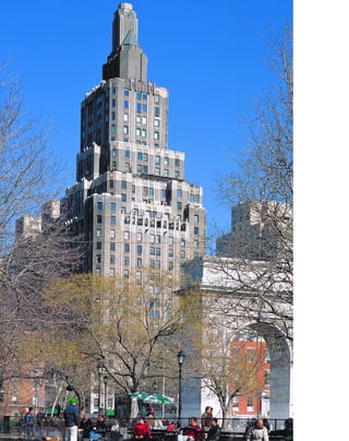
![L
O O M I N G O V E R the sedate,
four-story Greek Revival flats of
Washington Square, One Fifth
Avenue’s tapering, setback silhouette
represents the ascendancy of the Art Deco style
in the popular imagination. Sophisticated New
Yorkers no longer needed the trappings of the
past to feel at home in the twentieth century.
In One Fifth Avenue, the “shadow brick”
piers that Harvey Wiley Corbett used for the
party walls of his Bush Tower a decade earlier
become the central message of the façade. Two-
dimensional trompe l’oeil piers are limned in
two-tone brick, so that the darker brick seems to
be a shadow cast by projecting triangular
masonry. Corbett reveals his conjurer’s trick in
the finials that project beyond the parapets,
which are plainly two-dimensional, colored
stone. Streamlined limestone gargoyles reinforce
the sketchy impression of the trimmings. By
reducing historicist detailing to a cartoon, the
design architect Corbett announced the
supremacy of modernism.
Set on a corner site among low buildings,
the 27-story building is distinguished by its
massing and in particular its setback silhouette,
rather than its vestigial styling, nominally
Venetian or Byzantine. Chamfered corners add
a sense of lithic solidity. At the setbacks, cor-
beled blind arcades demarcate the cornices. The
massive Fifth Avenue front, which rises for 17
stories, is organized into eight bays above a four-
story limestone base with bracketed limestone
balconies. The balustrades of the balconies are
tiny Doric columns, anticipating the 12 tree-like
fluted Doric columns in the severe, double-
tiered, oak-paneled lobby. A sleek, frameless
Deco lobby clock set directly onto the paneling
epitomizes Corbett’s modernistic updating of
historicist styles.
Corbett wanted to establish a visual land-
mark for the base of Fifth Avenue, so the build-
ing is remarkably contextual. The octagonal
chimney around which the wings are massed
[ 1] Though modernistic in style, One Fifth also appealed to picturesque sensibilities. [ 2] One Fifth was a bold, early
expression of the setback silhouette.
49
One Fifth AvenueHARVEY WILEY CORBETT, 1929
forms a campanile-like image against the open
sky of Washington Square Park, and even the
silhouette of a sloped roof split by a chimney can
be seen as a reference to the older Federal style
houses of Greenwich Village. The stripped-
down Doric lobby is a neat overlay for the Greek
Revival mansion that formerly occupied the site.
Real estate ads in the New Yorker magazine
of August 1927 touted terraced apartments, 17-
foot by 28-foot living rooms, and depicted the
tower dwarfing Stanford White’s Beaux-Arts
monument of Washington Square Arch at its
foot. Unfortunately, a botched restoration of the
tower’s brown brickwork has left a piebald
result, so it is difficult to discern the architect’s
original visual pun of reducing historicist detail
to a two-dimensional graphic image.
1
2](https://image.slidesharecdn.com/catzl6xr7qjbywzl3adu-signature-ec0ec1356cdf1cf66b46a9db24b432b8b8c5d53476da6de461fc6b32c36da610-poli-180116170250/85/Manhattan-skyscrapers-65-320.jpg)
![rounded by sheaths of wheat burst forth in cor-
nucopias, symbolizing the bounty of American
agriculture carried by rail. The rococo gloire is a
marvelously syncretic image, at once resembling
a baroque sunburst and an abstract Art Deco
skyline. On the exterior, the piers end in giant,
terra-cotta buffalo heads, connoting the rail-
road’s connection with the West. Alas, the gilded
cage elevators with their heavenly blue domes
that resembled Victorian birdcages, have been
remodeled.
E
v e n t h o u g h Beaux-Arts orna-
mentation no longer makes sense at
skyscraper scale, the Helmsley
Building, like its forerunner the
Municipal Building, is so graciously urban that
you almost don’t notice. The best part of Beaux-
Arts design in terms of its civic function is the
clarity of its parti—you always know where you
stand, and what all the parts of the building are
for. The building originally served as the head-
quarters of the New York Central railroad com-
panies. Warren & Wetmore unobtrusively
resolved the siting’s complex challenges: the 1.2
million-square-foot building reroutes vehicular
traffic on Park Avenue through raised viaducts,
provides through-block walkways for pedestri-
ans, complements the style of the monumental-
ity of Grand Central Terminal, and presents a
visual capstone to Park Avenue.
The separation of vehicular and pedestrian
traffic has been a feature of the ideal city dating
back to Leonardo da Vinci, but the Pershing
Viaduct that connects the two halves of Park
Avenue is one of the few working examples in
existence today. Balustrades hide the cars until
they disappear into overscaled Georgian arches
at the second-story level, and then debouch onto
Park Avenue below a gilded, ornamental clock
flanked by figures of Mercury and Ceres (repre-
senting the business of shipping grain by rail) by
the sculptor Edward McCartan.
The 34-story, 567-foot-tall, buff-brick and
limestone building features 15-story, U-shaped
wings, and a gilded, oval-dormered, pyramidal
roof that is surmounted by a copper-clad
lantern. Even critics of the day considered the
building’s ornamental motifs hopelessly retar-
dataire. In a 1930 article in Architectural Forum,
Thomas Tallmadge snickered: “Classic columns,
chased out of New York’s thoroughfares, are
reported to have take a final refuge on the top
story of the New York Central Building.” The
bracketed colonnade of eight three-story-tall
Corinthian limestone columns supports nothing
[ 1] The pyramidal roof, under construction, provides a visual capstone to Park Avenue.
51
Helmsley Building(originally New York Central Building) 230 PARK AVENUE » WARREN & WETMORE, 1929
in turn but another pair of brackets, violating
the visual sense of weight.
Nonetheless, the grand, Louis XIV-style
lobby, paneled in glossy travertine and trimmed
in jaspé Oriental marble, provides a palace for
the people and celebrates the prestige of the rail-
roads. The iconography of winged wheels
emerging from cloud banks is as strange as any-
thing Magritte could have conceived. Above the
elevator doors, bronze reliefs depict a winged
helmet surrounding a globe, symbolizing the
American empire’s global reach. Lightning bolts
and pickaxes represent electricity and labor, the
power behind the railroads. Steel wheels sur-
1](https://image.slidesharecdn.com/catzl6xr7qjbywzl3adu-signature-ec0ec1356cdf1cf66b46a9db24b432b8b8c5d53476da6de461fc6b32c36da610-poli-180116170250/85/Manhattan-skyscrapers-67-320.jpg)
![classical and modern classical motifs: two classi-
cally garbed workmen rest on their sledgeham-
mers, flanking an octagonal clock against an
abstract skyline of setback towers.
The lobby celebrates the achievements of
the Fuller Company in its floor mosaics: the
Tacoma Building in 1889, the first all-steel struc-
ture; the Fuller Flatiron Building, here given its
rarely used full name; and the Fuller Building
itself, in a schematic black-and-white representa-
tion with shaded blue tile. Bronze elevator door
panels form a tableau of the building trades: a
workman “rides the ball” of a swinging derrick;
bricklayers set bricks with mortarboards; plaster-
ers lay up laths; stone masons set blocks with a
tackle; pneumatic drill operators chip out the
foundation; carpenters frame out the rooms;
and pipe fitters adjust the plumbing.
[ 1] Setback skyscrapers were also appreciated for their picturesque qualities. [ 2] The Fuller’s classically styled workers
rest before an abstract Art Deco skyline.
53
Fuller Building41 EAST 57TH STREET » WALKER & GILLETTE, 1929
A
f t e r e x p e r i m e n t i n g with
low massing, Walker & Gillette
arrived at the classic Art Deco silhou-
ette in their Fuller Building, which
was until recently the headquarters of the Fuller
Construction Company. Here, the skyscraper
form is codified into a wide, multiuse base that
conforms to the street cornice; a relatively unor-
namented, slender shaft for prime office space;
and a signature decorative crown.
One of the first tall buildings north of
midtown, the 40-story Fuller Building’s striking,
black-and-white Deco/Aztec crown, promi-
nently sited on the northeast corner of Madison
Avenue and East 57th Street, can be seen for
great distances. Story-tall oculi framed in mono-
chromatic sunburst patterns look out over the
city in three directions, and are surmounted by a
triple setback crown capped with black terra
cotta in vibrant motifs of zigzags and triangles.
The six-story base, framed in black granite,
contains luxury shops and galleries. Eight bays of
Chicago-style windows on the 57th Street front
provide light for the galleries. The thin tower
slab, clad in light-colored stone with smaller fen-
estration, contains offices, and the boldly deco-
rated crown accented by three-sided balconies is
the Fuller headquarters, still one of the largest
construction companies in the country.
By the late 1920s, modern classicism (or
Deco, as we now call it) was well accepted by the
public as the contemporary style, and no longer
had to state its case so emphatically. Historicist
ornament is transformed into two-dimensional
representation. In place of a typical classical
columned entrance, the Fuller Building features
flat pilasters with two-dimensional black-granite
triangles instead of capitals, and lines to repre-
sent fluting. The cornices of the upper setbacks
suggest crenellations in patterns of black-and-
white terra cotta.
The sculptural clock above the entry by
Elie Nadelman in black Swedish granite and
white Rockwood stone is a syncretic image of
1
2](https://image.slidesharecdn.com/catzl6xr7qjbywzl3adu-signature-ec0ec1356cdf1cf66b46a9db24b432b8b8c5d53476da6de461fc6b32c36da610-poli-180116170250/85/Manhattan-skyscrapers-69-320.jpg)
![veined red were used in the richly patterned
Cosmatesque floor.
The slender tower projecting from a slab-
like platform dominates downtown Brooklyn
like a medieval castle. It was the tallest structure
on Long Island for 60 years, until the 48-story,
663-foot Citicorp office building was completed
in Hunters Point, Queens, in 1989. The
Williamsburgh’s four-sided clock tower, with
clock faces measuring 27 feet in diameter, was
the world’s largest when it was built. The gilded
copper dome was the bank’s symbol, modeled
after the original bank designed by George B.
Post at 175 Broadway in 1875 (also a New York
City landmark), which was the inspiration for
the tower’s Byzantine and Romanesque styling.
The tower’s sense of height is accentuated
by the narrow 2:1 proportions of the platform,
which consists of 10 bays of two windows each
on the Ashland Place front and five bays on
Hanson Place. The centrally massed, buff-brick
and terra-cotta tower rises almost sheerly from
the Ashland front except for a few shallow set-
backs, but sets back dramatically from the sides
of the platform. The Williamsburgh has the sur-
rounding sky all to itself. Unfortunately, the
arcaded twenty-sixth-floor observatory—with
unimpeded views in four directions of the
Manhattan skyline and Brooklyn’s low blocks,
punctuated by church steeples—is now closed to
the public.
[ 1] The tower was meant to anchor a new urban hub that never quite took off. [ 2] The grand banking floor was designed
to inspire Brooklyn’s immigrants with respect for savings.
55
Williamsburgh Savings Bank Tower
(now Republic National Bank) 1 HANSON PLACE, BROOKLYN »
HALSEY, MCCORMACK & HELMER, 1929
B
y t h e end of the 1920s, the setback
skyscraper, originally built in
response to a New York zoning code,
became a style that caught on from
Chicago to Shanghai. The slender spire of the
former Williamsburgh Savings Bank is one of
the best examples of the style, and was meant to
put Brooklyn on the map as a rival to Man-
hattan in terms of both architecture and finance.
The iconography of pre–World War II
skyscrapers is charmingly literal: the 30-story,
512-foot-tall Williamsburgh Savings Bank Tower
is a Byzantine basilica devoted to the virtues of
thrift. Its six-story limestone base above rainbow
granite at street level abounds with savings
motifs: cagey lions guard a padlocked strongbox
with the bank’s initials, squirrels store up nuts,
and bees zoom over a beehive surmounted by a
head of Mercury.
The procession through the grand, 128-
foot-long, 72-foot-wide, and 63-foot-high
vaulted banking room is an allegorical journey.
At the gates, modern classical metal figures by
Réné Chambellan depict the trades of the
bank’s immigrant savers: a fruit seller, a
mechanic, a cook, and a carpenter (a capital
inside the bank depicts a sewing-machine oper-
ator). The cast-stone capitals of the columns
demonstrate reasons to save: a woman with her
hair in a bun and a strongbox symbolizes secu-
rity in old age, while a man with a long beard
reading a scroll shows a happy retirement. The
real incentive is the immigrants’ dream, that
their children can enter the professional classes:
a woman reading by the lamp of knowledge
stands for education; and two young men, one
contemplating a model train and the other with
a caduceus, represent engineers and doctors.
The gold-mosaic, barrel-vault ceiling adorned
with symbols of the zodiac glitters like a dream
of future riches. Banks wanted to impress the
public with their wealth and security, so the
chamber is paved in marmoreal splendor: 22
kinds of marble, from dark purple to green and
1
2](https://image.slidesharecdn.com/catzl6xr7qjbywzl3adu-signature-ec0ec1356cdf1cf66b46a9db24b432b8b8c5d53476da6de461fc6b32c36da610-poli-180116170250/85/Manhattan-skyscrapers-71-320.jpg)
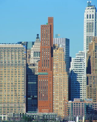
![The tower springs up in three major set-
backs, minimally highlighted with limestone
copings, and ends in a Gothic-style turret that
conceals a water tank. The only decorative
touches are metal-trimmed chevrons in the win-
dows and glass spandrels, painted an opaque
rust brown. The window bays are continuous
glazed strips suppressed behind uninterrupted
brick piers. Though not quite as plush as it was
in the 1930s, when six barbers waited on call and
a raw oyster bar adjoined the locker room, the
club is still devoted to the manly pleasures of
Clubman talc, Shine-O-Mat automatic
shoeshine machines, and proper decorum: “con-
gregating in the Lobby area with athletic attire is
strictly forbidden.” A charming detail: the club’s
emblem of a diving seagull over the harbor
shows a skyline of close-packed, flat-roofed tow-
ers rather than fanciful geometric shapes—a
vision of the city as it actually became.
T
h e e x t r e m e l y tall and narrow,
35-story, 534-foot-tall Downtown
Athletic Club is the apotheosis of the
Art Deco skyscraper aesthetic, because
each floor is devoted to a different function. A
regulation boxing ring takes up most of the
eighteenth floor; there is a full-court basketball
gym on eight; a four-lane, Olympic-sized pool
on 12, and a rooftop sun deck with panoramic
views in three directions. In its heyday, the club
even featured a landscaped indoor miniature
golf course. As Rem Koolhaas writes in his indis-
pensable Delirious New York, “nature is now res-
urrected inside the Skyscraper as merely one of
its infinite layers.”
The club is a dizzying fantasia that lifts all
the aspects of urban living into the clouds, just
as the earliest skyscraper theorists had imagined.
The top 15 floors are devoted to 111 hotel rooms
for sky-dwellers—tiny, ocean-liner-like cabins
with spectacular views of the harbor. Every form
of recreation is provided for—billiards, ban-
quets, massage, squash courts—each on a differ-
ent level connected by banks of elevators. The
swimming pool, under a double-height ceiling,
is the pièce de résistance. Koolhaas captures the
over-the-top aim of the architects: “At night, the
pool is illuminated only by its underwater light-
ing system, so that the entire slab of water, with
its frenetic swimmers, appears to float in space,
suspended between the electric scintillation of
the Wall Street towers and the stars reflected in
the Hudson.”
The enigmatic exterior of variegated
orange-glazed brick gives little hint of the exclu-
sive (if somewhat dated) luxuries within (the
club was all-male until 1972). There are no win-
dows at street level on the narrow, 78-foot, 8-
inch-wide West Street front, and the frontispiece
above the entry consists only of unetched lime-
stone blocks. The platform is fortress-like; in
fact the window bays do not even begin until
the eighth floor. This is a building whose archi-
tectural plan is only for the initiated.
[ 1] A stylish woman of the 1930s passes the club’s cryptic exterior. [ 2] The starkly undecorated tower rises over its
historically detailed neighbors.
57
Downtown Athletic Club
19 WEST STREET » STARRETT & VAN VLECK, 1930
2
1](https://image.slidesharecdn.com/catzl6xr7qjbywzl3adu-signature-ec0ec1356cdf1cf66b46a9db24b432b8b8c5d53476da6de461fc6b32c36da610-poli-180116170250/85/Manhattan-skyscrapers-73-320.jpg)
![The lobby, with its faceted dome lined
in black glass above a sunken globe, is an
Expressionist dream straight out of Superman
comics. The “ten-foot terrestrial globe,” eerily lit
from below, spins in the black chamber, meant
to suggest the void of space. Brass dials keep
track of the temperature and wind speed, while
points in the spiraling, sloping terrazzo floor
mark off distances and directions of major cities
(Beijing is 6,882 miles due west). A 1960 annex
by Harrison & Abramovitz blends in tastefully,
matching the wide plate-glass look of the origi-
nal entrance.
[ 1] The cornices are unornamented, a radical step at the time. [ 2] The Expressionist black grotto of the Daily News lobby
evokes infinite space. [3] Hugh Ferriss’s rendering would be a suitable home for Superman’s DAILY PLANET.
59
Daily News Building220 EAST 42ND STREET AT SECOND AVENUE » RAYMOND HOOD AND JOHN MEAD HOWELLS, 1930
T
h e 3 6 - s t o r y , 476-foot, two-inch-
tall Daily News Building was one of the
first skyscrapers in the world with a vir-
tually unornamented top and cornices,
a prototype for the postwar Internationalist
office building. The white-brick piers of the
Daily News simply come to a halt at the set-
backs without decoration, as if they had been
clipped off. Hood insisted this was a result of
pragmatism: “I tried the simple expedient of
stopping without searching for or causing the
owner to pay for an effect.” The depth of the
slab was a response to the desirable 27-foot
3
2
throw of light from the windows, and the fenes-
tration was determined by the width of a win-
dow that a typical office worker could open with
ease (Hood calculated 4.5 feet) in an era before
air-conditioning.
Despite the boldly modernist gesture of
undecorated vertical strips, Hood was unable to
give up a vestigial Gothic leaning that he inher-
ited from his training with the great American
Gothic revivalists Ralph Adams Cram and
Bertram Goodhue. The red-and-black-brick
spandrels taper slightly back at the cornices, so
that the piers seem to stand out, like the crenel-
lations of a Gothic tower.
Hood arrived at the asymmetrical massing
by carving away at plasticene blocks, rather than
using the more common renderings. But unlike
Ralph Walker and Hugh Ferriss, Hood did not
romanticize the skyscraper as a carved mountain.
The skin of the Daily News Building is paper-
thin, plainly a façade of bricks hung on a steel
skeleton. Its lack of mass emphasizes the abstract
arrangement of its components. Hood also aban-
doned the model of a tall building as a classical
column in favor of a grouping of slab-like forms.
Critics at the time still found a bit of archi-
tecture parlant in the design, and remarked that
the white piers looked like bundled newspapers
hot off the press. An even more literal interpre-
tation of the building’s color scheme might be
the punch line of the old joke, “What’s black
and white and read all over?” Hood specified red
window shades in the multiple, repeating bays.
The three-story, pierced-granite tableau
over the entrance depicts a 1920s street scene
under a city of towering skyscrapers. The period
details are wonderful—tycoons stroll by in top
hats, women in cloches, and a boy in knickers.
The Daily News Building itself is presented as a
stadtkröne, or crown of the city, with the sun
rising behind the tower. This image is a direct
descendant of the Gothic cathedral as the
symbol and image of the city, and a link with
the heavens.
1](https://image.slidesharecdn.com/catzl6xr7qjbywzl3adu-signature-ec0ec1356cdf1cf66b46a9db24b432b8b8c5d53476da6de461fc6b32c36da610-poli-180116170250/85/Manhattan-skyscrapers-75-320.jpg)
![Forty Wall Street was completed in 11
months, a record-breaking feat for a building
containing nearly one million square feet of
floor space. The foundations were begun before
the site was even cleared in May 1928 by Starrett
Brothers and Eken, which also constructed the
Empire State Building. New leases in New York
were traditionally signed on the first of May, and
the bank moved in on schedule in 1929. Overall,
the building is the very model of American effi-
ciency, from the way seven adjoining lots were
secretly assembled to make up the site, to the
meticulous construction schedule, the details of
which include dates for applying finish carpen-
try and installing mail chutes.
[ 1] Wall Street’s towers were refuges for a privileged few. [ 2] A mason applies finishing touches to parapets
below the copper crown.
61
40 Wall Street(originally the Bank of Manhattan Company Building) H. CRAIG SEVERANCE
AND YASUO MATSUI, 1930
T
h o u g h n e a r l y eclipsed in a
thicket of tall buildings downtown,
the 71-story, 927-foot-tall Bank of the
Manhattan Company was once part of
a celebrated three-way race to become the tallest
building in the world; it finished as the bronze
medalist, behind the Empire State Building and
the Chrysler Building.
Forty Wall is proof of the power of sym-
bolic ornament in making a building memo-
rable to the public. Its setbacks and clean-lined
shaft are thoroughly modern, and, from street
level, the building looks just like Hugh Ferriss’s
bold renderings. However, the roof is retar-
dataire: a French Renaissance-style, dormered
pyramid topped by a lantern that gives 40 Wall
the appearance of being a much older building.
The pyramid was the bank’s symbol, but in the
1920s, newness was everything, and 40 Wall was
promptly forgotten. More recently, postmodern
architects like Philip Johnson have come about
180 degrees to appreciate the picturesque quali-
ties of such spires.
1
2
Despite its height, 40 Wall loses much of
its impact because it is a midblock site, surrealis-
tically situated next to the mighty Greek Revival
Federal Hall National Memorial. The Trump
Organization acquired the building as a specula-
tive venture in 1995, and the block-through
lobby was renovated by Der Scutt with lots of
marble and glittery bronze surfaces—even the
simple limestone rosettes on the façade have
been gilded.](https://image.slidesharecdn.com/catzl6xr7qjbywzl3adu-signature-ec0ec1356cdf1cf66b46a9db24b432b8b8c5d53476da6de461fc6b32c36da610-poli-180116170250/85/Manhattan-skyscrapers-77-320.jpg)
![to publicize the race to the top. Lewis Hine took
dramatic, social-realist-style pictures of the
workmen poised vertiginously in the clouds for
the Empire State. Margaret Bourke-White cap-
tured the strange, Gothic feel of the Chrysler’s
silver eagle heads glaring over the city.
The Chrysler’s reign as the world’s tallest
lasted only 11 months, until it was topped by the
Empire State Building, which opened in May
1931. Without its mast, the Empire State was
only two feet higher than the Chrysler, at 1,050
(a 200-foot-tall mast brought the height to 1,250
feet, and a 204-foot-tall television antenna added
in 1950 brought the overall height to 1,452 feet,
8-9
/16 inches, to the top of the lightning rod).
The world’s record was broken again by
the 110-story, 1,350-foot World Trade Towers in
1973–74, then later in 1974 by the 110-story,
1,454-foot-tall Sears Tower in Chicago. The title
is currently held by Cesar Pelli’s 88-story, 1,483-
foot-tall Petronas Towers in Kuala Lumpur,
Malaysia, soon to be topped by Shanghai’s
1,509-foot World Financial Center. The Sears
still has the world’s highest occupiable floor, 150
feet above the Petronas’s, and the world’s highest
elevator ride. The tallest man-made object in the
world remains Toronto’s 1,815-foot Canadian
National Tower, completed in 1975.
The Chrysler is surely one of the strangest
office buildings designed for an American cor-
poration. Its lobby is just short of a German
Expressionist stage set. Folds of black Belgian
granite drape the entrances like parting prosce-
nium curtains, and metal zigzag motifs that look
as if they could have been taken from Fritz
Lang’s Metropolis run above the entrances. The
triangle-shaped lobby is a dark, bizarre cavern of
crystalline angles and indirect lighting behind
onyx stone, more the kind of place to encounter
a Valkyrie than make a business appointment.
A representation of the Chrysler Building itself
appears in a ceiling mural.
The original observation lounge could
have been a film set for The Cabinet of Dr.
[ 1] This early rendering of the Chrysler Building shows an alternative crown.
63
Chrysler Building405 LEXINGTON AVENUE » WILLIAM VAN ALEN, 1930
T
h e c h r y s l e r b u i l d i n g was
built at the fever pitch of the skyscraper’s
delirious development before the Great
Depression, when midtown Manhattan
resounded with jackhammers and pile drivers. It
shows the extraordinary influence of German
Expressionism on skyscraper design and the fren-
zied push for height that consumed architects of
the 1920s. In this discontinuous, postmodern age,
one can only gaze in wide wonder at the Chrysler’s
unified symbolism as a chrysalis between automo-
bile and flying machine.
One of New York’s most entertaining
buildings, the silver-hooded Chrysler Building
had its origins in the amusement parks of Coney
Island. A real-estate developer named William
H. Reynolds, who conceived of Coney Island’s
Dreamland, commissioned the architect
William Van Alen to design what would have
otherwise been known as the Reynolds Building.
Reynolds’s chief contribution was insisting that
the building have a metallic crown, overriding
Van Alen’s objections.
The 77-story Chrysler was part of a mad-
cap, three-way dash to become the tallest build-
ing in the world. Its rivals were the now largely
neglected Bank of the Manhattan Company at
40 Wall Street, designed by Van Alen’s ex-part-
ner and archrival H. Craig Severance, and the
Empire State Building. When Severance got
wind that the Chrysler was going to top out at
925 feet, he added a 50-foot flagpole that made
his building two feet taller, at 927 feet. Then, in
August 1930, Van Alen unveiled his secret
weapon—the “vertex”—a spire made of chrome
nickel steel that was secretly assembled inside
the Chrysler’s dome and raised from within to
bring the building’s height to 1,048 feet. Van
Alen’s vertex had the distinction of being the
first man-made structure to top the 1,024.5-foot-
tall Eiffel Tower,which had reigned in solitary
grandeur since the Paris World’s Fair of 1889.
The Empire State and the Chrysler
each had their own in-house photographer
1](https://image.slidesharecdn.com/catzl6xr7qjbywzl3adu-signature-ec0ec1356cdf1cf66b46a9db24b432b8b8c5d53476da6de461fc6b32c36da610-poli-180116170250/85/Manhattan-skyscrapers-79-320.jpg)
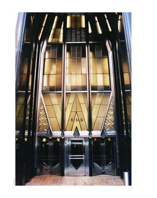
![Caligari with its faceted ceiling, walls painted to
resemble stars emerging in an evening sky, and
Saturn-shaped lighting fixtures. The double-sto-
ried Cloud Club featured unobstructed four-
sided views of New York, below the Chrysler’s
distinctive triangular windows. In the cigar
room, Prohibition-era millionaires stashed their
liquor in special caches below the tobacco-col-
ored upholstery. Walter P. Chrysler slept in baro-
nial splendor in a Tudor-style bedroom
complete with a walk-in fireplace.
The building materials are luxe and
exotic—red flame-patterned Moroccan marble,
whose hectic layers seem to capture the spirit
of the Jazz Age, and yellow Siena marble floors.
The marquetry elevator doors and cabs are
exquisite, a poem to recite: teakwood,
Philippine mahogany; Cuban plum-pudding
wood; English gray harewood; African and
South American prima vera; aspen, curly maple,
and walnut from America; and Australian silky
oak. The rich wood inlay is another literal repre-
sentation of the automobile, because cars of the
day often had wooden dashboards and trim.
Many attempts have been made to decode
the Chrysler’s façade, particularly the spire,
which was derided by leading critics of the time
as a “stunt design,” with “all this inane romanti-
cism, this meaningless voluptuousness, this void
symbolism,” an “upended swordfish,” and as
“Little Nemo architecture” referring to the
futuristic comic strip. The thirty-first floor of
the white-brick tower with gray-brick trim is
decorated with a frieze of stylized motor cars
surmounted by winged urns that evoke the radi-
ator cap of a 1929 Chrysler automobile. At the
next setback, eight giant metal eagle-head gar-
goyles guard the points of the compass like pro-
tective emblems on a medieval castle.
The leitmotif is of a car metamorphosing
into a flying machine, or machinery becoming
organic flight. Urns sprout wings, eagle heads
are made of metal. In this context, the spire can
be seen as a feather made of metal, with the tri-
angular windows and patterned metal panels
[ 1] The entry’s zigzag lines resemble a German Expressionist dynamoelectric generator. [ 2] Car showroom on the
ground floor of the Chrysler Building, 1936. [ 3] Andy Warhol said of New York’s silver-trimmed skyscrapers, “They look
like money.” [ 4] 1937 model of Chrysler's Airflow sedan on display in the showroom.
65
representing barbules and rachis. Whatever it
represents, Andy Warhol summed up the sky-
scraper’s essence in an insight both profound
and superficial: “They look like money.”
2
3
4](https://image.slidesharecdn.com/catzl6xr7qjbywzl3adu-signature-ec0ec1356cdf1cf66b46a9db24b432b8b8c5d53476da6de461fc6b32c36da610-poli-180116170250/85/Manhattan-skyscrapers-81-320.jpg)
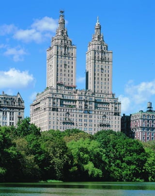
![vacant because of the stock market crash. The
duplex tower apartments shared no party walls
with other apartments and offered terraced
views in nearly all directions. Some living rooms
are 22 by 36 feet, under 11-foot ceilings.
Semiprivate elevators carried tenants to within a
few feet of each apartment. Roth’s biographer
Steven Ruttenbaum rightly calls these residences
“mansions in the clouds.” The San Remo is the
last of the great premodern luxury residences.
Even Roth’s El Dorado, completed the next year,
sported finials that resemble miniature setback
skyscrapers.
I
n t h e San Remo Apartments, Emery
Roth successfully combined nostalgia for
Old World elegance with the modernist aes-
thetic of skyscraper living. The San Remo’s
Italian Renaissance styling, though pared down
to a picturesque minimum, is sufficient to con-
vey the status of its residents. Garlanded car-
touches and curved broken pediments top twin
entries that lead to separate towers. Inside, the
small lobbies are paneled in exotic shades of
beige, oxblood, and salmon marble.
Above a three-story rusticated limestone
base, the massive, relatively plain platform with
a 200-foot frontage on Central Park West rises
to a 17-story setback. The two nearly identical
10-story towers, modeled after the Choregic
Monument of Lysicrates, are what make the San
Remo such a landmark on the skyline of Central
Park West. There is something grandly
American about doubling the image of an
ancient monument: it is as if to say things are
twice as good in America, which Roth, who
immigrated as a penniless Hungarian orphan,
no doubt believed. Magically, the towers, origi-
nally built to conceal water tanks, are doubled
again in shimmering reflections in the Lake of
Central Park. Like the park itself, the San Remo
epitomizes the romantic nineteenth-century
ideal of subordinating nature to culture.
Glimpsed through stands of broad-leafed north-
ern catalpa trees in the park, the San Remo looks
like a vision of the White City idealized by the
World’s Columbian Exposition of 1893 in
Chicago, where Roth apprenticed.
From a compositional point of view, the
towers play powerfully against the background
element of the sky, etching the setback image in
negative space, much as Cesar Pelli’s Petronas
Towers do in Kuala Lumpur. Sixteen-foot-tall
limestone Corinthian columns stand out against
the beige-brick towers, surrounded by eight-
foot-tall urns meant to be seen from the street.
The finials of the illuminated copper beacons
are 400 feet above the sidewalk. The palette is
[ 1] The San Remo’s romantic towers were inspired by the drum of the Choregic Monument of Lysicrates.
67
San Remo Apartments
(originally San Remo Hotel) 145 AND 146 CENTRAL PARK WEST » EMERY ROTH, 1930
subtly picturesque, as if daubed in watercolor: a
few courses of red roof tile, beige brick, whitish
limestone, tan terra cotta, and green metal rail-
ings under the green copper lanterns.
When the San Remo opened in 1930, it
was advertised as the “Aristocrat of Central Park
West”; however, a year later it was still one-third
1](https://image.slidesharecdn.com/catzl6xr7qjbywzl3adu-signature-ec0ec1356cdf1cf66b46a9db24b432b8b8c5d53476da6de461fc6b32c36da610-poli-180116170250/85/Manhattan-skyscrapers-83-320.jpg)
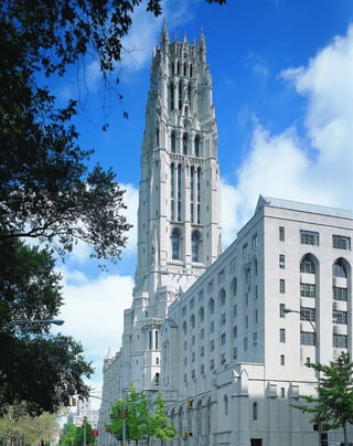
![served by the tallest elevators of any church in
the world. But precisely because of its scale,
Riverside is lacking in monumentality. The
shrimpy buttresses, which are ornamental rather
than structural, are impossibly meager to sup-
port the weight of a 30-story building, so the
mind scales down the height to more believable
proportions. From any distance, the church
commands Riverside Drive, but the closer you
get to it, the more it seems to shrink.
Inside, the architects Henry C. Pelton
(Columbia University, class of 1890), Charles
Collens, and the chief designer Burnham Hoyt
also fiddled with proportions to meet the needs
of a modern church. The 215-foot-long, 89-foot-
wide, 100-foot-tall nave, which seats 2,500 peo-
ple, is lower and much broader than the original
at Chartres, because Riverside, an interdenomi-
national Christian church, is more oriented to
the spoken sermon than the sacramental rituals
of the Catholic Church. The apse is suppressed,
bringing the choir and pulpit closer to the con-
gregation, and there is no transept. Most radi-
cally, the narthex with its bank of four elevators
completely resembles a modern office building
rather than a church entrance. To some degree,
the designers must have recognized the absur-
dity of cloaking a steel-cage building in Gothic
drag, and used the humorous tradition of
Gothic caricature to spoof the anachronisms. In
a phone booth on the ground floor, two gar-
goyles gab into hook-and-receiver telephones,
while a pig, the proverbial “hog on the line,” ties
up the lines.
[ 1] The steeple was reinforced with extra steel to bear the carillon’s weight. [ 2] The office tower steeple dominates
Riverside Drive, but seems to dwindle as you approach it.
69
Riverside Church490 RIVERSIDE DRIVE » ALLEN & COLLENS, 1930
R
i v e r s i d e c h u r c h is New
York’s last great eclectic skyscraper.
Even though it was completed well
into the modernist era, it hearkens
back to an earlier period when architects
attempted to disguise their tall buildings under
layers of historicist detail. Though modeled after
the thirteenth-century French Gothic cathedral
of Chartres and sheathed in ornately carved
Indiana limestone, Riverside Church is in fact a
30-story office building. In its massing of a 10-
story nave and a 392-foot-tall tower, Riverside
more resembles the platform and tower of the
Woolworth Building than it does Chartres.
Here, Gothic historicism thus comes full circle,
with a church modeled after an office building
that was modeled after secular Gothic design.
Because of its steel-frame construction com-
bined with faithful copies of limestone sculp-
ture, Riverside is the ultimate syncretic image of
the skyscraper as stadtkröne, or medieval crown
of the city.
The site is enormous, taking up two full
blocks between West 120th and West 122nd
Streets, bordered by Riverside Drive and
Claremont Avenue. Much like the Downtown
Athletic Club, Riverside exemplifies the mod-
ernist’s desire to include the world under one
roof, like a luxury liner, with each level provid-
ing a new experience. A cross section reveals
lounges, offices, and studios in the belfry tower.
Below ground is a full-length basketball court, a
theater, and a four-lane bowling alley. Even the
modernist yearning for unlimited transportation
is catered to: there is an underground parking
lot, and the tower is equipped with blinking
lights for the safety of airplanes.
At the same time, Riverside is a throwback
to the eclectic era in its desire to achieve monu-
mentality. It features the world’s largest carillon,
weighing more than 100 tons, supported by
unusually stout I beams. The carillon features
the largest tuned bell ever cast. Other records are
anachronistic: the 355-high observation deck is
1
2](https://image.slidesharecdn.com/catzl6xr7qjbywzl3adu-signature-ec0ec1356cdf1cf66b46a9db24b432b8b8c5d53476da6de461fc6b32c36da610-poli-180116170250/85/Manhattan-skyscrapers-85-320.jpg)
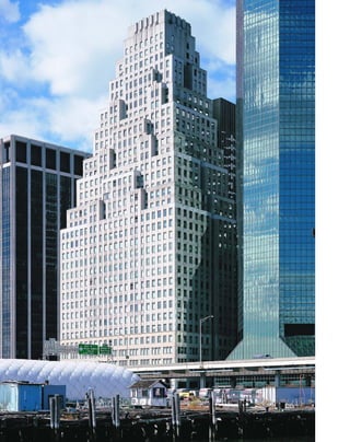
![shape, proportion and color. The texture of its
surface, the rhythms of the elements that break
that surface either into planes or distinct areas of
contrasting interest, becomes ornament.”
The materials of 120 Wall Street are rich,
but spare. Polished red-granite panels frame
wide-paned commercial windows at street level
as part of the five-story limestone base. A gold
metallic grille of pagoda-like geometric forms
surmounts the entry. Relief moldings are the
only feature of the gorgeous rose-marble lobby.
The heavily embossed labyrinthine patterns of
the nickel chrome elevator doors are fine exam-
ples of Kahn’s influential modern classicist
aesthetic. “The modernist uses his material so
as to make it beautiful in itself,” Kahn wrote.
“Marble, glass, fabrics, wood, do not need
applied decoration to glorify their beauty or tex-
ture. The problem, simplifying itself to a matter
of form, contrast or proper use of material, now
demands particular study.”
The ceiling mural of the entrance depicts
a syncretic image of the low village of Dutch
Manhattan mirrored by a skyline of abstract set-
back towers. Who is to say whether some spirit
of place, the pointed teepees of the original
Algonquin settlement, the traditional stepped-
back gables of Dutch colonial architecture, or
the ubiquitous wooden water towers—which
themselves resemble setback turrets—influenced
modernist dreams of the future?
[ 1] Kahn’s abstract geometrical artistry is reflected in the entrance grille.
71
120 Wall Street ELY JACQUES KAHN, 1930
K
n o w n f o r his modern classicist
designs, Ely Jacques Kahn’s chief
concern was finding a decorative
style that had no reference to the
past. The 1925 Exposition des Arts Décoratifs,
which introduced what is now called the Art
Deco style, was a turning point in his life:
“There I felt that the pompous sterility of 1900
with its white lines of columns was over.” At
first, Kahn thought the revolution lay in brightly
colored terra cotta, as in his paganly polychro-
matic Two Park Avenue Building (1928), but the
façades of his later buildings rely more on tex-
ture and monochrome abstract patterns.
Kahn’s 33-story, white-brick 120 Wall
Street Building is a three-sided pyramidal set-
back that forms the classic “wedding-cake”
tiered silhouette of a New York Deco skyscraper.
In fact, its appearance is the result of closely
conforming to the envelope prescribed by the
1916 Zoning Code with low masses rather than a
base and tall tower. The setbacks recede in shal-
low formations from a massive, 16-story plat-
form that takes up the block front on South
Street between Wall and Pine Streets. The nar-
row building is oriented toward Wall Street
because of the address’s prestige. Sited at the far
end of Wall Street, 120 Wall was the first of the
phalanx of similarly sized skyscrapers that now
line the East River on South Street.
Kahn, whose eldest sister, the artist Rena
Rosenthal, was involved in the Wiener
Werkstätte movement, looked to textile patterns
and abstract geometrical forms as the vocabulary
for his non-historicist designs. The façade of 120
Wall, composed of four bays of three windows, is
integrated by subtle, textile-like variations in
brick patterning. The center spandrels are hori-
zontally coursed, with alternating flush and
deeply inset bands, while the corner spandrels
are recessed slightly and incised with shallow ver-
tical lines, to form a warp and woof. “Decoration
is not necessarily ornament,” Kahn wrote. “The
interest of an object has primarily to do with its
1](https://image.slidesharecdn.com/catzl6xr7qjbywzl3adu-signature-ec0ec1356cdf1cf66b46a9db24b432b8b8c5d53476da6de461fc6b32c36da610-poli-180116170250/85/Manhattan-skyscrapers-87-320.jpg)
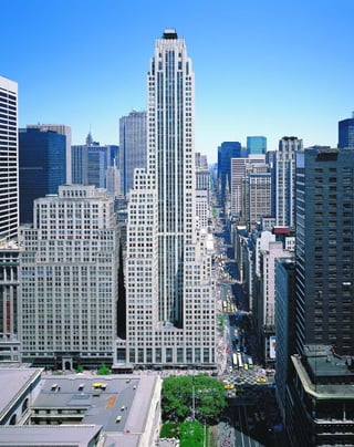
![The four-story limestone base of 500 Fifth
is minimally decorated with celadon-colored
metal spandrels, and incised foliate and frozen-
fountain motifs in shallow relief. The cornices of
the shallow setbacks are accented with tan panels
of abstract-patterned terra cotta, and a central
bay of dark stone spandrels runs up the center of
the Fifth Avenue and 42nd Street fronts. The
only nod to the skyscraper’s grandiose self-image
of the period is a relief of a gilded modern classi-
cal female figure above the entry, delicately fin-
gering an architect’s model of the building itself.
Inside, the lobby is almost shorn of orna-
ment. The walls consist of pink-gray matched
marble with little trim, under recessed lights.
The only historicist touch is a pair of griffins
that support the lobby clock. Without references
to the past, the setback itself becomes the leit-
motif, repeated in the base, and in the glass-and-
bronze entryway. As the Exposition des Arts
Décoratifs of 1925 mandated: “Reproductions,
imitations and counterfeits of ancient styles will
be strictly prohibited.” The next step was clear:
architects looked at such a building and realized
that little else needed to be removed in order to
reduce architecture to its fundamentals of form,
massing, volume, and structure.
T
h e 5 8 - s t o r y , 625-foot-tall buff-
brick 500 Fifth Avenue is the plain
vanilla of modern classicism. Shreve,
Lamb & Harmon’s asymmetrically
massed tower is perhaps the closest realization of
Eliel Saarinen’s influential “styleless” entry for
the Chicago Tribune competition because it has
almost no overt historicist references.
Built by the same architects who did the
Empire State Building, in the same year, and on
an equally prominent site on the northwest cor-
ner of 42nd Street, 500 Fifth Avenue nonetheless
remains virtually anonymous. This is in part due
its scale; the plot of 500 Fifth is less than a quar-
ter the size of the Empire State, so the setbacks
have less impact. But the lack of symbolic deco-
ration cannot be discounted as the main reason
for the lack of public recognition. The flat
crown, which once featured the giant red
numerals 500, is now just an exposed cooling
tower. The tower lacks both the distinctive spire
of the Empire State Building, and its dramatic
contrast between plinth and shaft. In 500 Fifth,
surface ornament and even the setbacks them-
selves become vestigial, so the emphasis is on the
slab of the sheer, square-topped tower, a forerun-
ner of the postwar office building. Shallow set-
backs on the corner street fronts lead to a flush
party wall on the uptown side that runs the
entire length of the building.
[ 1] Starrett Company workers were renowned for putting up their buildings in record time. [ 2] The entrance of 500 Fifth
Avenue, right, is the façade’s most decorative feature. [3] The asymmetrical tower rises over “the most congested traffic
section in the world.”
73
500 Fifth AvenueSHREVE, LAMB & HARMON, 1931
2
3
1](https://image.slidesharecdn.com/catzl6xr7qjbywzl3adu-signature-ec0ec1356cdf1cf66b46a9db24b432b8b8c5d53476da6de461fc6b32c36da610-poli-180116170250/85/Manhattan-skyscrapers-89-320.jpg)
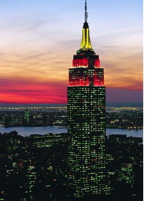
![T
h e e m p i r e s t at e b u i l d i n g
is the archetypal skyscraper, the one to
which all others must inevitably be
compared. Its silhouette of a broad,
197-by-425-foot platform; low, massed setbacks;
free-standing tower; and romantic, winged spire
can be recognized in a thousand tchotchkes,
from pencil erasers to key-chain thermometers.
It is perhaps the ultimate example of the sky-
scraper as stadtkröne, the crown of the city, which
derives from the tradition of the Gothic cathe-
dral. The lobby is dominated by a marble panel
with aluminum relief that depicts the Empire
State with the sun rising behind its mast.
But as the architectural historian Carol
Willis makes clear in her iconoclastic book, Form
Follows Finance, the renowned parti was deter-
mined as much by economic considerations as by
architectural design. William Lamb, the chief
designer, tersely summed up the plan he was given:
The program was short enough—a fixed budget,
no space more than 28 feet from window to corri-
dor, as many stories of such space as possible, an
exterior of limestone, and completion date of
May 1, 1931, which meant a year and six months
from the beginning of the sketches.
The configuration of base, setbacks, and
shaft was largely determined by the grouping of
the elevators in the core, and the arrangement of
floor space so that no office was more than 28
feet from a window, to maintain a desirable level
of natural lighting. Again, Lamb presents the
concept with admirable clarity:
The logic of the plan is very simple. A certain
amount of space in the center, arranged as com-
pactly as possible, contains the vertical circulation,
toilets, shafts and corridors. Surrounding this is a
perimeter of office space 28 feet deep. The sizes of the
floors diminish as the elevators decrease in num-
ber....The four groups of high-rise elevators are
placed in the center of the building with low-rise
[ 1] A misguided army B-25 bomber struck the building on July 28, 1945, killing 14.
75
Empire State Building
350 FIFTH AVENUE » SHREVE, LAMB & HARMON, 1931
1](https://image.slidesharecdn.com/catzl6xr7qjbywzl3adu-signature-ec0ec1356cdf1cf66b46a9db24b432b8b8c5d53476da6de461fc6b32c36da610-poli-180116170250/85/Manhattan-skyscrapers-91-320.jpg)
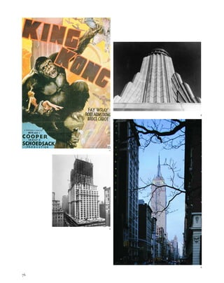
![But we do not love buildings because they
are efficient; we love them because they make us
dream. Part of the Empire State Building’s allure
is that it reigned so long unchallenged—42
years—as the world’s tallest building, into the
age of jet travel and moon landings. The obser-
vatory is visited by 3.5 million people annually
and was an important source of revenue during
the lean rental years of the Great Depression,
when it was known as the “Empty State
Building.” The building did not turn a profit
from its leases until 1950.
The Empire State Building is an intensely
romantic, even foolish, building. The films King
Kong and An Affair to Remember are as much a
part of its lore as its construction (“It’s the near-
est thing we have to heaven in New York!”
Deborah Kerr tells Cary Grant). Improbably,
the 16-story, 200-foot, hypodermic-shaped spire
with wing-like buttresses was planned as a
mooring mast for zeppelins. High winds made
the idea completely unfeasible, and in fact the
designers had so little grasp of the logistics
involved that they showed passengers disem-
barking from the nose of a docked blimp rather
than from the gondola below it.
Romance is what still draws the public: the
mighty eagles flanking the Fifth Avenue entry,
the imperial lobby lined in richly veined purple
and gray German marble, and the streamlined,
Moderne canopies above the side-street
entrances. Visitors come here to experience
architecture, with the same sense of purpose and
wonder with which one enters a Gothic cathe-
dral. The setback skyscraper form itself is cele-
brated everywhere: in the capitals of the
limestone pilasters outside, in the elevator door
panels, and in the odd little Moderne corbels
that support the metal pedestrian bridges in the
double-story lobby. The building’s top was first
floodlit in white in 1964 to mark the World’s Fair,
and in color for the 1976 National Democratic
Convention. Nearly three dozen couples marry
here every Valentine’s Day in a group wedding.
[ 1] The final sequence of KING KONG (1933), atop the empire State building, is now folklore. [ 2] The mast, without the TV
antenna added in 1950, is a paean to flight. [ 3] The limestone façade helps prevent the structure from bending in the wind.
[4] The Empire State’s archetypal silhouette is unmistakable. [ 5] A playing card shows the Empire State emitting a bea-
con of light. [6] Cost-cutting considerations gave the Empire State a stark purity of line.
77
groups adjoining on the east and west sides so that,
as these drop off, the building steps back from the
long dimension of the property to approach the
square form of the shaft, with the result that instead
of being a tower set upon a series of diminishing set-
backs prescribed by the zoning law, the building
becomes all tower rising from a great five-story base.
The construction statistics are stupendous:
10 million bricks, 1,172 miles of elevator cable, 2
million feet of electrical wire, and 200,000 cubic
feet of stone assembled by 3,500 workers in 18
months, with five deaths. The building rose at
an average of four and a half floors a week; in
one crescendo of construction, 14 and a half
floors were built in 10 days. Lunch stands serv-
ing hot food, sandwiches, “near beer,” and ice
cream were installed at five different levels to
save workers the considerable time of descend-
ing to the streets. R. H. Shreve concluded: “The
simplicity of the structure and its freedom from
numerous small and relatively complicated
members aided in making possible the most
rapid delivery and erection of steel tonnage in
the history of New York.”
Everything in the stripped-down façade
was designed to keep costs down. The architects
were concerned that a façade containing 6,400
windows would be monotonous, and look more
like a perforated shell. Their solution was to
make the windows flush with the limestone
skin, eliminating deep reveals and their shadows.
The brick walls are faced in fine gray Salem
limestone from Indiana, “as uniform in color
and texture as bread,” in the words of the natu-
ralist writer Scott Russell Sanders. The stone is
supported directly on the spandrel beams, which
eliminated the need for time-consuming angles
and brackets. Even the flashy chrome and nickel
mullions that run the length of the shaft like
vertical railroad tracks could be applied without
external scaffolding, and handily covered the
joins between the windows, spandrels, and lime-
stone, reducing the finish work.
5
6](https://image.slidesharecdn.com/catzl6xr7qjbywzl3adu-signature-ec0ec1356cdf1cf66b46a9db24b432b8b8c5d53476da6de461fc6b32c36da610-poli-180116170250/85/Manhattan-skyscrapers-93-320.jpg)
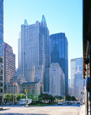
![rooms, ballrooms, bars, shops, and kitchens (the
blind, third-floor façade behind the hotel’s name
in raised, gilded letters conceals a block-long
kitchen). The triple-story ballroom was the
largest in the world when it was built, and the
combined ballrooms could fit 6,000 guests.
Herbert Hoover and Douglas MacArthur lived
their last years in the Waldorf Towers, where
every president since Hoover has stayed. The
ground-floor parking garage below the towers
was built to accommodate the turning radius of
a Rolls-Royce Corniche.
The Waldorf is a seamless synthesis of
modern classical and Expressionist styles. Its
stark, 17-story limestone wings with crenellated
parapets and verdigris copper turrets reflect
Expressionism’s Gothic roots. The zigzag motifs
of the turrets resemble the crisp modern classi-
cism of the urns atop Joseph Urban’s Hearst
Magazine Building. The extraordinary, window-
less, block-through lobby, with its dark panels of
Oregon maple and black granite pilasters, cre-
ates a hidden Expressionist grotto, but the effect
is softened by light-hearted French Deco bas-
reliefs of pipers, dancers, actors, leaping ante-
lope, and frozen fountains.
W
h e n t h e German film direc-
tor Fritz Lang arrived in New
York Harbor in 1924, he was spell-
bound by the verticality of the
city’s skyscrapers.These were eclectic buildings
such as the Gothic Woolworth Building and
the needle-like Beaux-Arts SingerTower (since
demolished), but in his mind’s eye, Lang trans-
formed them into a city of modernistic towers.
“I looked into the streets—the glaring lights
and the tall buildings—and there I conceived
Metropolis,” Lang recalled. (This story is now
considered to be a bit of a Hollywood-type
hyperbole, because Lang had the title and con-
cept of the film before then, but the city’s influ-
ence on the set design cannot be discounted.)
“I roamed the streets all day.The buildings struck
me as a vertical curtain, glistening and very light,
an opulent stage backdrop hung against a gloomy
sky to dazzle, to distract, and to hypnotize.”
Lang returned to Berlin, and two years
later completed his visionary silent classic,
whose futuristic cityscapes in turn influenced a
generation of American architects. The sets of
[1]Vintage cars line Park Avenue outside the main entrance. [2]The Waldorf is a city under one roof with the appurte-
nances of a luxury liner. [3]The turrets seem to have sprung from the imaginations of German Expressionist set designers.
79
Waldorf-Astoria Hotel301 PARK AVENUE » SCHULTZE & WEAVER, 1931
Metropolis, designed by Otto Hunte, Erich
Kettelhut, and Karl Vollbrecht, used 500 scale-
model skyscrapers to create a multitiered city of
aerial causeways, massive, close-set towers and
monstrous boulevards. The finned turrets of the
Waldorf-Astoria bear more than a passing
resemblance to the crown of the central tower
in Metropolis.
The contract for this 29-story, $42-million
hotel that replaced the original Astor Hotel, a
white elephant that was demolished to make
way for the Empire State Building, was signed
on the day of the stock market crash, October
29, 1929. Eighty percent of the site, which takes
up the entire block between Park and Lexington
Avenues and East 48th and East 49th Streets, is
supported on steel pylons over the tracks of the
New York Central Railroad. A separate elevator
once shunted guests directly from their private
railroad cars, in a modernist fantasy of unlimited
transportation.
The Waldorf was conceived as a city under
one roof. A contemporaneous axonometric view
through the hotel shows a cross section of 2,200
1
2
3](https://image.slidesharecdn.com/catzl6xr7qjbywzl3adu-signature-ec0ec1356cdf1cf66b46a9db24b432b8b8c5d53476da6de461fc6b32c36da610-poli-180116170250/85/Manhattan-skyscrapers-95-320.jpg)
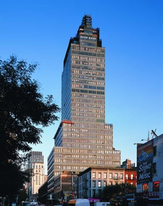
![F
o r t h e i r watershed 1932 exhibi-
tion at the newly founded Museum of
Modern Art, “The International Style:
Architecture Since 1922,” Henry-
Russell Hitchcock and Philip Johnson chose
only one New York City skyscraper: Raymond
Hood’s McGraw-Hill Building. “The lightness,
simplicity and lack of applied verticalism marks
this skyscraper as an advance over other New
York skyscrapers and bring it within the limits of
the International Style,” the critics wrote. “The
setbacks are handled more frankly than in other
skyscrapers, though still reminiscent of the pyra-
midal shape of traditional towers.” However,
they faulted Hood’s billboard top: “the heavy
ornamental crown is an illogical and unhappy
break in the general system of regularity and
weights down the whole design.” Of course, in
the postmodern era, the sign with 11-foot-high
letters that spell out the company’s name is one
of the building’s most welcome aspects.
The McGraw-Hill is anomalous in that
Hood fused the severe International Style with
the commercial New York setback style, and
even more strikingly colored the whole in sea
green. In a 1927 forum on “modernistic views on
color schemes in skyscrapers,” Hood predicted
that entire skyscrapers “will eventually have a
[ 1] A literal representation of the skyscraper as a tiered layer cake. [ 2] A 1931 company newsletter details the logistics
of the move. [3] The original 11-story McGraw Publishing Building in 1907. [ 4 ] The Hill Building in 1914; the two com-
panies merged in 1917.
81
McGraw-Hill Building330 WEST 42ND STREET » RAYMOND HOOD, 1931
distinct color. To color only the architectural
embellishments and a few outstanding cornices
and façades will appear like the rose decorations
on a woman’s white dress. They are hardly
noticeable. It is best for the whole building to be
of one color....New York of the future, I
believe, will consist of gaily colored buildings.”
Almost no one took up Hood’s challenge until
the postmodern era, when entire buildings were
covered in rose granite.
In the McGraw-Hill, continuous bands of
green-metal-framed windows alternate with pan-
els of turquoise terra-cotta blocks. The publisher
James McGraw called the color “perfectly awful”
and said he must have been ill the day he chose
it (curiously, the McGraw-Hill’s color resembles
Babylon’s Ishtar Gate). The McGraw-Hill
was terra cotta’s last gasp; it was increasingly
seen as an old-fashioned material by the Inter-
nationalists, who preferred to build with the
industrial materials of steel, concrete, and glass.
The 35-story, 480-foot McGraw-Hill
reveals Hood’s plastic as opposed to pictorial
sense of architecture; it’s really a setback tower
elongated into slab form. The result looks as if
was cut with a palette knife out of blocks of
green plasticene, an effect enhanced by the bru-
tally plain cornices of the setbacks. The plan of
the building is quite utilitarian: the broad plat-
form housed the printing plant for the publisher,
the slab was for office space, and the fanciful
crown for executive offices. The streamlined,
opaque glass panels of the Moderne lobby are an
ornamental departure, resembling a deck of a
luxury ocean liner. The tiered Deco crown, seen
from the east or west, also looks like the super-
structure of a giant liner.
Rem Koolhaas has the last word on Hood’s
jukebox modernism: “Once again Hood has
combined two incompatibles in a single whole;
its golden shades pulled down to reflect the sun,
the McGraw-Hill Building looks like a fire rag-
ing inside an iceberg: the fire of Manhattanism
inside the iceberg of modernism.”
1 2
3
4](https://image.slidesharecdn.com/catzl6xr7qjbywzl3adu-signature-ec0ec1356cdf1cf66b46a9db24b432b8b8c5d53476da6de461fc6b32c36da610-poli-180116170250/85/Manhattan-skyscrapers-97-320.jpg)
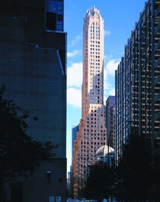
![In the same way that the multitudinous
heavenward-pointing layers of a Gothic cathe-
dral suggested the City of Heaven, the cornices
of the GE Building are themselves miniature
images of the skyline. The setback form is reified
everywhere—at the base of columns, in the win-
dow casings and in the miniature symbolic but-
tresses above the corner clock.
If skeptics think this is an overinterpreta-
tion, read what the architect John W. Cross him-
self wrote about the barrel-vaulted, aluminum-
colored lobby ceiling:
Romantic though radio may be, it is at the same
time intangible and elusive—a thing which can be
captured visually only through symbolism....The
severity of the vertical lines which intersect the
curves of the ceiling with daring abruptness is
intended to convey the directness and penetration
of radio itself.
The building materials are sumptuous: a
base of rose granite, entries and windows framed
in toothsome orange marble, salmon-colored
glazed brick, and polychromatic terra cotta high-
lighted with gilding. The crown fairly sings in
the morning light. The building was also contex-
tual before there was a word for it; it was meant
to harmonize in color and spatial arrangement
with the dome of St. Bart’s at its foot on Park
Avenue. On cannot help but think that the com-
position of spire and dome influenced the Trylon
and Perisphere of the World’s Fair of 1939.
[ 1] A scrolling musical instrument represents RCA’s recording interests. [2] Lavish attention was devoted to the
brickwork and terra-cotta detailing.
83
General Electric Building
(originally RCA Victor Building) 570 LEXINGTON AVENUE » CROSS & CROSS, 1931
D
e s i g n e d a s the headquarters
for the RCA Victor Company—but
taken over only a year later by
General Electric and known ever
since as the GE Building—this slender, orange-
brick tower is one of the most extravagantly
Expressionist buildings in New York. Gothic
and German Expressionist motifs are brilliantly
overlaid in this 40-story, 570-foot-tall tower. The
result is nothing less than a secular cathedral
devoted to the gods of radio.
The spire is an extraordinary image of the
romantic aspirations of American businessmen
as the country entered the Depression. The RCA
Victor Building in particular seems to have been
built with a higher purpose in mind—to cele-
brate the new medium of radio. The diamond-
shape motifs in the façade have a dual meaning,
signifying the piezoelectric crystal by which old
radios operated, and the stylus that produced
sound from records. The marvelous terra-cotta
spandrels in rose, ochre, and verdigris can be
interpreted as a radio dial, or a needle in the
grooves of a record. At the rounded corner of the
12-story platform, a scrolled musical instrument
symbolizes RCA’s recording business. The build-
ing’s theme may have been inspired by early crys-
tal radios, also known as cathedral radios because
of the Gothic styling of their wooden cabinets.
Strange, mummified-looking figures
occupy different levels of the façade. These are
the Tiki gods of radio. One fills a niche at street
level, like the figure of a saint. Crackling energy
fields radiate from behind four grim-faced, dou-
ble-story-tall figures in the crown, with haloed
heads grouped at their feet. Are these disciples?
The enlightened radio audience? It is hard to
believe now that American business ever reached
this dizzy pinnacle of Expressionism. The inter-
secting, gilded radio waves in the crown are
fused with the openwork tracery of a Gothic
cathedral, revealing the Gothic roots of
Expressionism in a breathtaking syncretic image.
Gilded bolts of energy aimed heavenward
replace the finials of a Gothic spire.2
1](https://image.slidesharecdn.com/catzl6xr7qjbywzl3adu-signature-ec0ec1356cdf1cf66b46a9db24b432b8b8c5d53476da6de461fc6b32c36da610-poli-180116170250/85/Manhattan-skyscrapers-99-320.jpg)
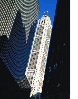
![antique, a surbase of red altico marble, door
enframents, pilaster columns, and stair treads in
rosato d’or with rouge antique risers and walls of
Vaurian stone.
Gorgeously wrought, nickel-silver-alloy,
bas-relief doors and grilles by the sculptor David
Evans depict classically garbed figures represent-
ing Architecture, Engineering, Mechanics, and
Navigation.
F
a r b e it from architects to admit
they are doing anything other than
designing the most practical building
for its site. “The design of a modern
skyscraper is not primarily a matter of aesthetic
expression,” Cross & Cross wrote, presumably
with faces as straight as the bizarre, heroically
scaled heads that gaze down from their City
Bank Farmers Trust Company Building. The
parti of the building—with a blunt, slender,
chamfered tower torqued against a keystone-
shaped 15-story platform—was a response to
factors such as the irregular site, the need to
accommodate 5,000 bank employees and 2,000
additional renters, zoning laws, the intervals
of elevator service, and the height at which the
building would make a profitable return.
But that goes little towards explaining the
[ 1] The symbols, clockwise from top left, are Architecture, Engineering, Mechanics, and Navigation. [ 2] One Wall Street’s
slender shaft evokes the romantic self-image of American business. [3]Easter Island–like stone heads guard ventilation
grilles in the façade.
85
City Bank Farmers Trust Company Building
22 WILLIAM STREET » CROSS & CROSS, 1931
tower’s extraordinary mix of Neo-Renaissance,
Expressionist, and modern classical styles.
Bankers tend to be more conservative than
communications and entertainment people, so
Cross & Cross toned down the extravagant
Expressionism of their earlier RCA Victor
Building for the 57-story, 685-foot, ⅞-inch-tall
tower. With its combination of rich materials
and historicist detailing, the Neo-Renaissance
style bespoke wealth and tradition, an image the
bank certainly wished to convey. But a bank also
needs to look up to date, so there is an overlay
of modern classical styling.
The strangely ambitious scale of the build-
ing gives it an Expressionist quality. Giant coins
of foreign nations with strong agricultural and
mining interests (including Cuba) frame the
semicircular arched entryway, representing the
bank’s foreign investments. The pierced stone
spandrels, which do double duty as air intakes,
are decorated with agricultural motifs—flower
heads, sheaves of wheat, hour glasses (for invest-
ment), balancing scales (for trade), eagles and
fasces (for the role of government). The building
is sheathed in sand-colored Alabama Rockwood
limestone, with (now very sooty) white-brick
piers, spandrels, and mullions in the tower,
interspersed with stone beltcourses. The but-
tresses that resemble sentinels at the first setback
show an Art Moderne influence in their stream-
lined Greek helmets, and are said to represent
“giants of finance.” Perhaps disingenuously,
Cross & Cross insisted that even these Easter
Island heads on the building were functional
because they “serve as a concealment for the
exhaust vents which are conducted through
their backs to invisible louvered outlets.”
The interiors are sheer luxe, meant to
show off the bank’s prestige, with a stenciled sil-
ver-and-gray rotunda inside the William Street
entrance. With its indirect lighting, the rotunda
creates an Expressionist grotto. The main lobby
is floored in golden travertine and polychrome
Cosmatesque marble with a base of rouge
3
1
2](https://image.slidesharecdn.com/catzl6xr7qjbywzl3adu-signature-ec0ec1356cdf1cf66b46a9db24b432b8b8c5d53476da6de461fc6b32c36da610-poli-180116170250/85/Manhattan-skyscrapers-101-320.jpg)
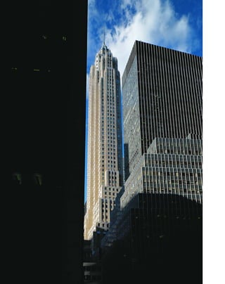
![T
h e s l e n d e r , 67-story spire of
70 Pine Street, the last skyscraper
built in financial district during the
Depression, is one of the most extrava-
gantly Expressionist. It is an eerie snapshot of
the stone skyscraper evolving into glass architec-
ture. The limestone-sheathed shaft, so narrow
that double elevators had to be used to service
all the floors, supports a faceted-glass pinnacle,
illuminated from within, in fulfillment of the
visionary writings of Bruno Taut, Paul
Scheerbart, and other German Expressionist
architects. Glass architecture existed more
on paper than in reality, because there was no
major construction in Germany between the
wars. In his trance-like essay of 1914, “Glass
Architecture,” Scheerbart wrote that society can
be transformed only “if we take away the closed
character from the rooms in which we live. We
can only do that by introducing glass architec-
ture, which lets in the light of the sun, the moon,
and the stars, not merely through a few windows,
but through every possible wall, which will be
made entirely of glass—colored glass.”
Scheerbart’s prediction was almost right,
except that it was the office building more than
the home that would be transformed. His vision
of glass architecture was a bit of an evolutionary
dead-end, because by the time construction
resumed in the postwar boom, Expressionism
was considered wholly outdated, and was
replaced by the pure geometry of Internation-
alism. The Flash Gordon–like green glowing
jewel atop 70 Pine Street is almost sui generis.
However, postmodern architects such as Cesar
Pelli in the World Financial Center, and David
Childs of Skidmore, Owings & Merrill in the
Worldwide Plaza celebrate 70 Pine’s parti of
stone metamorphosing into glass.
Strangely, for a group that sought to break
with the past, the Expressionists held up the
unified artistry of the Gothic cathedral as an
ideal. The Cities Service Building has a charm-
ing, syncretic image at its entry, where a model
[ 1] A dramatic night view of the crown. [ 2] A model of the building occupies a place above the doors usually
reserved for a saint.
87
Cities Service Building
(now 70 Pine Street) CLINTON & RUSSELL, 1932
2
1
of the skyscraper stands between the two portals,
in the space reserved for a saint in a Gothic
cathedral. The observation platform (now
closed), not much bigger than a helicopter bub-
ble, features a brilliant coup de theatre: the tiny,
five-passenger elevator rises up through the floor
like a sidewalk elevator, and then retracts to pro-
vide untrammeled 360-degree views of the city.
The leather-paneled conference room on the
floor below is no longer in use.](https://image.slidesharecdn.com/catzl6xr7qjbywzl3adu-signature-ec0ec1356cdf1cf66b46a9db24b432b8b8c5d53476da6de461fc6b32c36da610-poli-180116170250/85/Manhattan-skyscrapers-103-320.jpg)
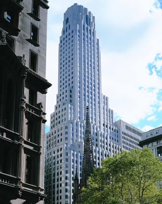
![machine aesthetic of modern classicism. The
coloration is gorgeous, shading from red tiles
against a blue setting to brilliant orange against
black in the ceiling, above a red terrazzo floor
and a burgundy dado. Veins of gold tile flash
amidst the colors, reflecting torchières that turn
the space into an intimate grotto. At night, seen
through the deeply faceted street-level windows,
the chamber glows like a fairyland of riches.
L
i k e d y i n g pharaohs, Wall Street
bankers built extraordinary monu-
ments to themselves in the wake of the
1929 stock market crash. One Wall,
with its 50-story, 654-foot-tall white limestone
towers, is one of the most delicate, even femi-
nine, skyscrapers ever built. Fluted walls, faceted
windows, and chamfered corners give the tower a
mineral grace, like folds of cloth sculpted in
stone. The 180-by-110-foot site without improve-
ments was assessed at $10,250,000—or $520 a
square foot—a fortune in Depression dollars.
This building is the acme of Expressionist
and modern classical styles in New York, from
the triple-story faceted windows of the observa-
tion lounge that loom like the rookery of some
great Gothic flying creature, to the richly
mosaiced first-floor banking hall that glitters like
a hall in tsarist Russia. Here, Wall Street’s cap-
tains unabashedly gave themselves over to the
romance of American business, even while other
Americans stood in soup lines. Softly lumines-
cent kappa shells once adorned the observation
lounge’s faceted ceiling. The walls were deco-
rated with motifs of Native American war bon-
nets, an interesting choice since Wall Street is so
named because of a wall that protected Dutch
settlers from the Munsee Indians.
Best known for his vertically treated yet
massive brick buildings for the New York
Telephone Company, Walker pulled out all the
stops in making the Irving Trust a luxury tower.
The delicately incised, fluted shaft rises straight
from the sidewalk for 20 stories, before begin-
ning a series of subtle transitions to the astylar
crown, with its deeply punched windows.
Depending on the light and angle from which it
is seen, the tower resembles folds of cloth draped
sinuously from a frame, or a natural, cliff-like
object. Walker was moving away from the
Internationalist view that the exterior of a build-
ing should reflect nothing more than its interior
spaces. He later wrote, “once you admit...that
the bones need a skin to protect the interior,
[ 1] Trinity Church’s steeple, right, was once the highest point in Manhattan.
89
One Wall Street(originally Irving Trust Company Building) RALPH WALKER, 1932
then the skin becomes a matter of whatever
ardent experience that man can bring forth to
create delight as well as strength.”
The main banking room, decorated by the
mosaicist Hildreth Meier, is nothing but delight-
ful. Its tent-like walls appear to be folds of rich
brocade hanging from the ceiling. The sumptu-
ous chamber looks back to the lushness and nat-
uralistic motifs of Art Nouveau rather than the
1](https://image.slidesharecdn.com/catzl6xr7qjbywzl3adu-signature-ec0ec1356cdf1cf66b46a9db24b432b8b8c5d53476da6de461fc6b32c36da610-poli-180116170250/85/Manhattan-skyscrapers-105-320.jpg)
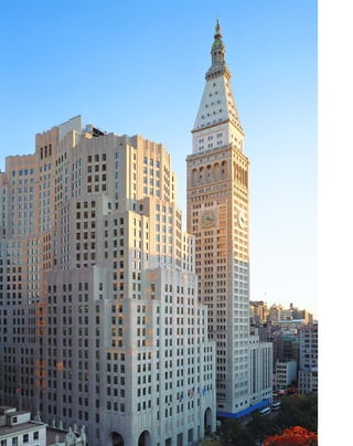
![buildings. The building was designed for Met
Life employees. At its peak in the 1960s, the
company employed 25,000 people. The con-
necting buildings were constructed in four
stages over a ten-year period.
The design by Harvey Wiley Corbett and
D. Everett Waid was forward-looking not only
because of its telescoping shape (the Lipstick
Building is a distant relative) but also because it
would have used triangular metal and glass bays,
even though the city building code required
masonry construction. The overall design bore a
strong resemblance to Hugh Ferriss’s renderings
for crystalline towers sheathed in glass. In his
1929 book Metropolis of Tomorrow, Ferriss often
sounded like he was taking shorthand from
another dimension:
Buildings like crystals.
Walls of translucent glass.
Sheer glass blocks sheathing a steel grill.
No Gothic branch: no Acanthus leaf: no
recollection of the plant world.
A mineral kingdom.
Gleaming stalagmites.
Forms as cold as ice.
Mathematics.
Night in the Science Zone.
Ferriss presciently noted, “The new types
of glass, which modern ingenuity is already
manufacturing, make it quite certain that before
long this material will be utilized not simply as
windows but as walls.”
The North Building is a forerunner of
the giant floor plates that characterize postwar
office buildings. The floors of the base are 80
feet deep, made possible by the use of full air-
conditioning and by indirect lighting to supple-
ment natural lighting from the windows.
Employees worked in enormous, communal
spaces, later made famous as a symbol of
modern impersonality in the 1960 film The
Apartment, which used the actual Met Life
steno pool.
[ 1] The tower replaced Stanford White’s exquisite Madison Square Presbyterian Church (1906), center.
91
Metropolitan Life Insurance Company, North Building
11–25 MADISON AVENUE » HARVEY WILEY CORBETT AND D. EVERETT WAID, 1932
D
e s i g n e d t o be the tallest build-
ing in the world, the uncompleted
Metropolitan Life North Building
stands like a tombstone for the sky-
scraper boom of the 1920s. Other than the pri-
vately financed Rockefeller Center, no new tall
buildings went up until after the war. The
nature of those buildings, too, would change,
because American businessmen were no longer
interested in romantic monuments to them-
selves, but instead were eyeing the bottom line.
Originally meant to be the base for an 80-
to 100-story tower, the building topped out at 28
stories because the Depression intervened.There
is some question whether Met Life seriously
intended to complete the tower, but the platform is
still built to scale for a much larger building.
What’s left is a hulking, limestone-sheathed base.
The scale is gigantic, from the oversized domed
loggia entrances at the four corners to the banks of
30 elevators that service almost as many floors—
absolutely no waiting in this building.The over-
sized round-headed arched entryways in the
middle of East 24th Street could have served as the
inspiration for Philip Johnson’s theatrically scaled
AT&T Building (now the Sony Building).The
bow-shaped base, strongly indebted to Ralph
Walker’s designs with its jagged, faceted corners,
would have made a striking foil for the astylar shaft.
Inside, the grand lobby is Neo-
Renaissance styled, with a coffered, silver-leaf
ceiling above gold-veined walls in Italian cremo
marble and floors of pink Tennessee granite.
Bas-reliefs present the ideals of the insurance
company, with allegorical figures of Recreation,
Health, Thrift, Security, and Industry. In the era
before computers, two lower floors were
designed with ceilings less than seven feet high,
to hold filing cabinets in a space that covers an
entire city block. When the First Boston invest-
ment bank leased the building in 1994, they
punched through the two floors to create a 15-
foot high trading floor for their investment
bankers. A pedestrian bridge, beloved by the
Expressionists, connects the North and South
1](https://image.slidesharecdn.com/catzl6xr7qjbywzl3adu-signature-ec0ec1356cdf1cf66b46a9db24b432b8b8c5d53476da6de461fc6b32c36da610-poli-180116170250/85/Manhattan-skyscrapers-107-320.jpg)
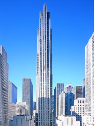
![suggested a roller rink, but that only brought in
young toughs from nearby Hell’s Kitchen.
Finally someone thought of figure skating, an
upper-class pursuit in the Depression, and the
result looks as if it was always meant to be.
As the dominant architect, Hood’s designs
for the center were in many ways a culmination
of the modernist ideal city. Hood in fact was a
champion of the skyscraper’s culture of conges-
tion that Rem Koolhaas writes about.
“Congestion is good,” Hood affirmed, “it’s the
best thing we have in New York. The glory of
the skyscraper is that we have provided for it so
well.” The buildings were designed to be con-
nected by rooftop causeways, but these were
abandoned because of cost and liability consider-
ations. With the center’s rooftop gardens, Hood
straddled both the romance of Art Deco and the
orthodoxy of Internationalism, evoking in his
words the “fabled living tapestry of the hanging
gardens of Babylon” on one hand, and Le
Corbusier’s Plan Voisin (1925), with its pristine
towers set amid verdant gardens, on the other.
Le Corbusier did not return the compli-
ment. He arrived in New York in 1933, peering
through his owlish spectacles, puffing on a mégot
and sneering that “The trouble with New York is
that its skyscrapers are too small. And there are
too many of them.” The RCA Building was
good, he said, but declared that the George
Washington Bridge was the “only seat of grace in
a disordered city.” Le Corbusier’s comment was
prescient, because the bare-bones exposed-steel
architecture of the bridge helped bring about
public acceptance of the Internationalist aes-
thetic of pure structure over ornamentation.
The 70-story, 850-foot-tall, limestone-
clad RCA Building (now the GE Building at
30 Rock) was the last great Deco tower built in
New York, although it is also fused with the
postwar Internationalist slab form. In an even
more dramatic progression of his thinking from
[ 1] Lee Lawrie’s ATLAS was part of an ambitious program of public art.
93
Rockefeller CenterWEST 48TH TO WEST 51ST STREETS, BETWEEN FIFTH AND SIXTH AVENUES »
RAYMOND HOOD; CORBETT, HARRISON & MACMURRAY;
GODLEY & FOULIHOUX; REINHARD & HOFMEISTER, 1932–40
R
o c k e f e l l e r c e n t e r is at
once a summa of the Art Deco
style, and a look ahead to the
Internationalist style that dominated
after World War II. Financed privately by the
Rockefeller fortune at a time when America’s
banks failed, Rockefeller Center was the last
major construction in the city until ground was
broken for the United Nations in 1947. Other
than the World’s Fair of 1939, which consisted
largely of temporary buildings, Rockefeller
Center was the most grandiloquent statement
of the ideals of Depression-era America.
The Rockefellers actually hired a consult-
ing philosopher, Hartley Burr Alexander of the
University of Southern California, to come up
with a “theme for Rockefeller City.” Alexander
saw in the complex the image of “Homo
Fabor—Man the Builder,” as well as capitalism’s
“answer to the Bolshevist challenge.” After a cou-
ple of rewrites, the center’s theme was changed to
the March of Civilization, but not before some
of the major artworks had been commissioned.
Though a remarkably unified urban com-
plex, Rockefeller Center originated as a proposal
for a new home for the Metropolitan Opera,
then evolved into a headquarters, television stu-
dio, and entertainment complex for the RCA
and General Electric companies. John D.
Rockefeller and his right-hand man John R.
Todd developed the site to profit from the leases.
Rarely has a private enterprise given itself over so
extravagantly to public space and works of art.
The plaza and its celebrated skating rink devel-
oped serendipitously in the early 1940s: a
holdover from the opera plan, the below-street-
level plaza was planned as a grand connection to
the subway, but the subway line was not com-
pleted in time for the opening of the plaza. The
developers found themselves with an expensive
hole in the ground. They tried luxe shops and
cafés, with little public response. Someone
1](https://image.slidesharecdn.com/catzl6xr7qjbywzl3adu-signature-ec0ec1356cdf1cf66b46a9db24b432b8b8c5d53476da6de461fc6b32c36da610-poli-180116170250/85/Manhattan-skyscrapers-109-320.jpg)
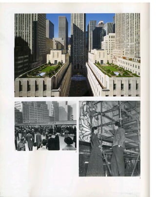
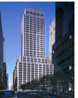
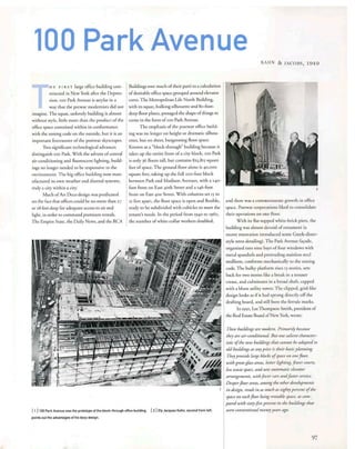
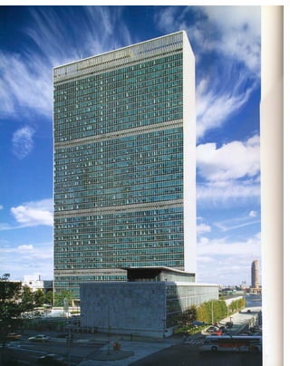
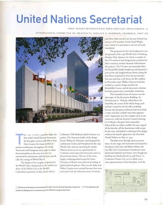
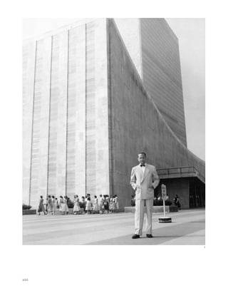
![under plate-glass walls, interspersed with
exposed steel I beam columns. The period
details are perfect: flying stairways with planters
below them, recessed “cheese-hole” ceiling
lights, brushed aluminum bullet lamps, cherry-
wood paneling, and turquoise leather ban-
quettes. The overtly allegorical representational
artwork is very much in the Rockefeller Center
model, with murals culminating in the con-
struction of the UN itself, and optimistic visions
of the world to come.
The Internationalists sought to stamp out
history rather than build upon it. The
superblock plaza of the UN is steeped in the
antiurbanism of Internationalism, but the com-
plex works so well precisely because it is sup-
posed to be a separate zone, in fact not even a
part of the United States. Built out over the
FDR Drive, the plaza looks more like an aircraft
carrier moored along the East River than part of
the city’s fabric. As a symbol of the UN, the
complex oddly glorifies its bureaucracy by mak-
ing the offices of the 14,000 international civil
servants its focus, rather than the General
Assembly, which lurks, blind-walled and
Nautilus-like, at its foot.
slab of the Secretariat piercing the low horizon-
tal block of the combined General Assembly
and Conference buildings. Oscar Niemeyer, Le
Corbusier’s disciple and former employee, came
up with Project 23W, the synthesis that was ulti-
mately adopted, in which the General Assembly
was reduced in scale and moved to the north of
the Secretariat to create a park with buildings.
The slab form of the Secretariat, with glass
curtain walls bookended by 72-foot-deep walls of
white Vermont marble is an evolution of Le
Corbusier’s solid-edged slabs of the Pavillon
Suisse (1932) in Paris and his Ministry of
Education and Health Building with Oscar
Niemeyer in Rio de Janeiro (1938). There were
still battles to be fought: Le Corbusier wanted
windows that opened and were protected by
an awning-like brise-soleil as a natural means of
climate control. Harrison insisted that air-
conditioning was the cornerstone of the Pax
Americana, and designed an innovative curtain
[ 1] Brave new world: Dag Hammarskjold in front of the Secretariat in 1953. [ 2] The UN’s sheer glass façade became an
icon of the Internationalist Style.
101
wall cantilevered two feet, nine inches, in front of
the steel structure so that it formed a flush skin of
blue-green Thermopane heat-absorbing glass.
The Thermopane spandrels between the window
bands were painted black on the inner face.
With French invective, Le Corbusier dismissed
this “cellophane veil” as “sepulchral repression.”
Nonetheless, the slab was a crisp précis of the
Internationalist aesthetic and set the pace for
glass curtain-wall buildings in New York and
around the world. For Americans, International-
ism represented postwar prosperity; for Europe it
was a chance to rebuild; and for developing
countries it stood for a brighter future.
The interior of the five-story, curvilinear
General Assembly at the foot of the Secretariat is
a museum of modernism, circa 1947, preserved
like an insect in amber. Boomerang-shaped, can-
tilevered balconies dominate the open lobby,
below a ceiling of exposed air ducts. A gray-and-
white checkerboard terrazzo paving sweeps
2](https://image.slidesharecdn.com/catzl6xr7qjbywzl3adu-signature-ec0ec1356cdf1cf66b46a9db24b432b8b8c5d53476da6de461fc6b32c36da610-poli-180116170250/85/Manhattan-skyscrapers-117-320.jpg)
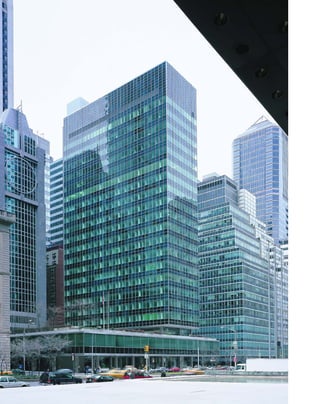
![T
h e d e l i c at e , glass-walled Lever
House stands on Park Avenue like an
outpost of a rarefied, more suburban
civilization. At 21 stories and 302 feet
tall, it qualifies more as a mini-skyscraper, but it
had an extraordinary influence on skyscraper
design as one of the earliest and best glass cur-
tain-wall office buildings.
Glass buildings were proposed after World
War I by Expressionist architects such as Bruno
Taut, who envisioned an Oz-like scenario where
“columns and arches of emerald green glass rise
up over a sea of clouds on the snowy summit of
a high mountain.” Ludwig Mies van der Rohe,
oddly enough the son of a stone mason, pro-
posed the first glass-walled skyscraper in 1921,
before it was quite technically feasible.
Lever House was New Yorkers’ first look at
an all-glass building.The contrast with the stately
stone Rue Corridor of Park Avenue could not
have been more startling. One need only look at
early photos of the Lever with clunky black
automobiles in the foreground to realize that
Americans had rarely seen anything so spanking
new. All exposed sides are covered with sea-green
glass and opaque blue-green glass spandrels
superimposed with an aluminum grid (the ser-
vice core is discreetly hidden behind white brick
in the northwest corner). Unlike a lot of modern
architecture from that period, the Lever is still
bright, minty-fresh, and smacks of prosperity.
“Thin skin was in the air,” Gordon
Bunshaft, the stocky, buzz-cut, creative force
behind Skidmore, Owings & Merrill, said about
[ 1] Lever House profligately spent valuable square footage on open space, unthinkable today. [ 2] Lever House presented
a leafy, suburban idyll in the city. [3]The window-washing platform that runs on steel tracks was widely imitated.
103
Lever House390 PARK AVENUE » GORDON BUNSHAFT, 1952
the postwar period. He synthesized prevailing
ideas in modern architecture: “I owned a lot of
books, especially about Le Corbu and Mies, but
I never studied them the way some people did,”
he once recalled. “I have a bad habit, which is a
lazy one, of not reading the texts.”
From Le Corbusier’s Ville de Savoie,
Bunshaft took the idea of setting his slabs on
pilotis, as a statement of pure geometry. As
with Mies, the structure is readily apparent to
the eye: The slabs are cantilevered out from
steel columns and wrapped in a glass skin.
Americans rediscovered Frank Lloyd Wright via
the Internationalists. With its plaza that sweeps
uninterruptedly through the glass-membraned
lobby, Lever House looks like a formulation of
Wright’s blending of interior and exterior space.
Perhaps because his ideas had been adopted so
completely, Wright carped that Lever House was
nothing more than “a box on sticks.”
But Lever House is something more: it is
a perfect tabletop model of postwar American
idealism. Charles Luckman, the head of Lever
House who had been trained as an architect,
told Bunshaft only that he wanted something
new, clean (befitting of a soap company), spec-
tacular, and American. Bunshaft came up with a
suburban idyll. With a 63-car underground
garage, the Lever was designed so that an execu-
tive could drive from the suburbs, park, have
lunch in the third-floor company cafeteria, even
play a round of shuffleboard on the landscaped
second-floor terrace, and go home—all without
ever setting foot in the dirty, chaotic city.
Lever House was the first sealed, fully climate-
controlled building, with fixed windows held
in place by aluminum mullions, so that Lever
employees did not even breathe the same air as
city dwellers. Even the stainless-steel pilotis are
shod with little black-concrete plinth blocks, as
if the building was afraid of getting its feet dirty.
The parti is wildly impractical from a real-
estate point of view, and was never copied,
although the glass skin was so influential. Three-
quarters of the site is occupied by empty air. The
18-story tower contains a relatively scanty 8,700
square feet per floor. The overall floor space is
280,000 square feet, the equivalent of only an
eight-story building covering the site—the most
imperious disdain for economic height since J. P.
Morgan’s five-story headquarters at the corner of
Wall and Broad Streets.
1
2
3](https://image.slidesharecdn.com/catzl6xr7qjbywzl3adu-signature-ec0ec1356cdf1cf66b46a9db24b432b8b8c5d53476da6de461fc6b32c36da610-poli-180116170250/85/Manhattan-skyscrapers-119-320.jpg)
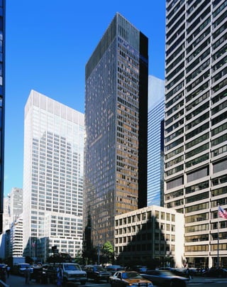
![The Seagram is so powerful because its
modernism is deeply rooted in the classical
model. The bronze-clad pilotis lift the building
above the ceremonial space of the plaza to estab-
lish it as an exercise in pure geometry. The
bronze mullions of the façade are a brilliantly
syncretic detail, referring at once to the struc-
tural properties of the Ionic pillar and the steel
I beam that is the foundation of modern archi-
tecture. Like the classical Greek pillar, the
miniature I beams enliven the façade with a play
of light and shadow as a decorative device. Mies
clearly meant the curtain wall to be perceived for
what it is, a curtain or wrapping for the build-
ing: the mullions terminate just inches from the
ground to show they are not structural.
Although the building presents itself as the
ultimate manifestation of a machine-made,
modular aesthetic, the design abounds in con-
tradictions: in fact, it is the ultimate handmade
A
lt h o u g h g o r d o n Bunshaft
designed the first all-glass curtain-
wall building six years earlier just
catercorner across Park Avenue, the
Seagram Building remains the iconic glass box.
Here was the magister delivering a seminar on
his architecture of pure volume, structure,
transparency, and reflection, and his sorcerer’s
apprentice Philip Johnson, completing the
vision right down to the doorknobs. It was the
most expensive building of its day, costing $36
million in addition to the $5-million land acqui-
sition, and was the first building in the world
with floor-to-ceiling glass walls.
The 38-story, 516-foot bronze-and-topaz-
tinted glass slab is an expression of Mies van der
Rohe’s near-mystic faith in structure as the foun-
dation of architecture. “Structure is spiritual,”
said Mies, who was even more gnomic than Le
Corbusier. The Seagram’s plan is based on a
modular unit of four feet, seven and a half
inches, followed throughout with a tolerance of
only one-sixteenth of an inch, so that you always
know where you are within a perfect, Cartesian
grid. The structural columns are set 27 feet, nine
inches apart in both directions, to form a classi-
cal ratio of five bays wide by three bays deep. In
turn, the bays are divided by extruded bronze-
covered I-beam mullions that run the entire
length of the façade. The gridding of the pink
Vermont granite plaza that runs under the plate-
glass lobby walls to form the lobby floor also
reflects the modular design.
Mies, more or less, worked on the same for-
malist problems his entire career—“One does not
invent a new architecture every Monday morn-
ing,” he said—balancing minimalist structure
with pure volume and negative space. Set back
100 feet on a 200-foot-wide by 300-foot-deep
block front of Park Avenue, the massless volume
of the Seagram plays off magnificently against the
plaza’s negative space, achieving a unity in oppo-
sites. “The serene effect of pure space itself...
has once again been recaptured,” the critic Lewis
[ 1] The gridding of the pink Vermont granite plaza that runs under the plate-glass lobby walls, and the structural columns,
reflect the modular design.
105
Seagram Building375 PARK AVENUE » LUDWIG MIES VAN DER ROHE WITH PHILIP JOHNSON, DESIGN ARCHITECTS;
KAHN & JACOBS, ASSOCIATE ARCHITECTS, 1958
Mumford noted of the Seagram. In the monu-
mental yet lighter-than-air lobby, interior and
exterior space are perceived as continuous.
Volume becomes contained space, visually bal-
anced with mass and regulated by structure.
At a stroke, Mies replaced the setback sky-
scraper with a new paradigm: the glass tower in
a plaza. The model was almost universally
adopted after changes in the 1961 Zoning Code
allowed developers extra height as a tradeoff for
providing public amenities such as plazas and
improved subway stops. Though visually inven-
tive, the setback style, itself a response to 1916
Zoning Code changes, suddenly seemed as
quaint and outmoded as a Flash Gordon film set
in the face of Mies’s austere aesthetic formula-
tion. To achieve the perfect proportions of
building and plaza in relation to the street, Mies
assembled a mock-up of Park Avenue on a high
table, so that he could sit and view it at eye level.
1](https://image.slidesharecdn.com/catzl6xr7qjbywzl3adu-signature-ec0ec1356cdf1cf66b46a9db24b432b8b8c5d53476da6de461fc6b32c36da610-poli-180116170250/85/Manhattan-skyscrapers-121-320.jpg)
![art object, going back to an earlier tradition of
artisanship rather than factory production.
Among its deviations from mass production, the
mullions were custom-made specifically for the
Seagram because Mies liked their crisp detailing.
Even the screws that hold in the fixed glass-plate
windows are made of brass. Because brass weath-
ers, the building has to be hand-polished with a
water-and-lemon spray annually to keep it from
turning the color of the Statue of Liberty.
The lobby and ground-floor restaurants by
Philip Johnson remain one of the city’s most gor-
geous displays of high modernism. The range of
inventiveness within a minimalist aesthetic is
astonishing: the textile-like, cartridge-belt stain-
less steel and brass lining of the elevator cabs, the
gold-anodized aluminum chain curtains in the
Pool Room restaurant that sway gently in air cur-
rents from the vents, and the side canopies that
are as nakedly structural as a dinosaur skeleton.
But the Seagram is not as structurally hon-
est as its façade might indicate.The floor plates
provide the only visual horizontal line, giving no
indication of how the building is wind-braced
(the braces are actually disguised in the elevator
core, and in concrete bracing in the rear).The
façade also does not tell you that much of the
floor space is hidden in a T-shaped bustle behind
the building. Some other details are curious: the
24-foot illuminated travertine lobby is a powerful
corporate image, but the windowless conference
rooms on the fourth floor are only nine feet tall.
The Seagram was a built at a time when
American corporations were lining up their head-
quarters like iconic chess pieces on the playing
board of Park Avenue: the new, improved Lever
House; the globe-girdling colossus of the Pan
Am; and the ever-young, aluminum-faced Pepsi
Building (Gordon Bunshaft, 1960).The critic
William Jordy noted that the bronze Seagram was
“the first metal-and-glass skyscraper consciously
designed to age as masonry buildings age—as
appropriate for Seagram’s whisky as sheen for
Lever’s soap.” (As a footnote, Charles Luckman,
the executive who commissioned Lever House
and then returned to practice as an architect,
designed a competing model for the Seagram
with an oversized logo above the door that looked
exactly like a gift-wrapped bottle of Scotch.)
[ 1] The tenth-floor plan. [ 2] The Seagram is an archetype of modular design.
106
1](https://image.slidesharecdn.com/catzl6xr7qjbywzl3adu-signature-ec0ec1356cdf1cf66b46a9db24b432b8b8c5d53476da6de461fc6b32c36da610-poli-180116170250/85/Manhattan-skyscrapers-122-320.jpg)
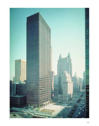
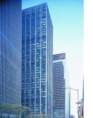
![Roth’s Sperry-Rand (1962) and ABC Buildings
(1965), William B. Tabler’s Hilton Hotel (1963),
and Shreve, Lamb & Harmon’s J. C. Penney
Building (1965). The copycat quality of the
buildings actually adds a pleasing architectural
unity to the area, with its broad, plaza-like side-
walks and retroceding glass boxes.
The Time & Life Building was con-
structed before the 1961 revision of the zoning
code that allowed builders extra height in
exchange for developing public plazas, so the
corporation had to buy the Roxy Theater to the
west in order to acquire its air rights. With the
air rights, the 48-story tower occupied only one
quarter of its lot, as mandated by the old code.
The plaza and lobby are a bright spot of
1960s-style optimism. The wavy-gravy terrazzo
pattern employed by Harrison at the UN sweeps
from the azure-colored fountain through the
plate glass doors into the lobby. Alar, can-
tilevered aluminum canopies project over the
entrances like V-for-victory signs. Architects of
the era may have felt a bit guilty about foisting
the abstract art on an uneducated public. A
Mondrianesque mural by Fritz Glarner is
accompanied by an explanatory note: “The
artist considers the theme of this abstract mural
to be the rhythm and movement of the city.”
W
a l l a c e k . h a r r i s o n ’ s
Time & Life Building gets short
shrift in architectural accounts of
New York, yet its banded lime-
stone-and-glass façade was one of the most-
imitated prototypes for midtown skyscrapers.
Harrison saw his design as a pragmatic solution
to the client’s demands: as much floor space
as possible to accommodate the magazine’s
expanding staff, and a relation to the older
buildings of Rockefeller Center across the
avenue. The result is a crisp corporate update,
the architectural equivalent of the striped shirts,
sack suits, and rep ties that Harrison favored.
The postwar aesthetic was the pure expres-
sion of structure. Harrison started from the
outside in, placing the steel supporting columns
outside the floor area to create a free span of
32,500 square feet from exterior wall to the core
on each floor. The columns, set 28 feet apart,
are sheathed in limestone on the exterior to
[ 1] Decorative panels alternated with sweeping city views at the Hemisphere Club, a bar and lounge (now closed) in the
Time & Life. [ 2] The bar at the Hemisphere Club, shown here in 1960.
109
Time & Life Building1271 SIXTH AVENUE » HARRISON & ABRAMOVITZ, 1959
complement Raymond Hood’s design for
Rockefeller Center, which Harrison also worked
on. The Time & Life’s grid of dark metal-
framed, smoked-glass windows with opaque
mesh spandrels set behind the glass and protrud-
ing aluminum mullions expresses the building’s
basic modular layout. The building terminates
with the Internationalist disdain for cornices, as
if the height was determined solely by economic
and structural concerns, rather than anything so
superfluous as “style.”
The proportion of the lightweight piers in
the glassy face is a transition toward abandoning
stone façades entirely. In the postwar economy,
rising construction costs and a dearth of skilled
stoneworkers led architects to embrace the glass
box, as seen in the metastasis of inferior knock-
offs. The Time & Life parti was copied in a num-
ber of buildings on Avenue of the Americas in
the West 50s, including Skidmore, Owings &
Merrill’s Equitable Life Building (1961), Emery
21](https://image.slidesharecdn.com/catzl6xr7qjbywzl3adu-signature-ec0ec1356cdf1cf66b46a9db24b432b8b8c5d53476da6de461fc6b32c36da610-poli-180116170250/85/Manhattan-skyscrapers-125-320.jpg)
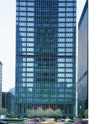
![ents us as to its scale, we are invited to perceive
the building for its sculptural, rather than just
architectural, qualities.
The Union Carbide is flawed architec-
turally: its awkwardly proportioned plaza is a
dead zone, rather than a true public space, and
the protruding stainless steel mullions are
coarsely derivative of the hand-tooled perfection
of the Seagram façade. But it is too easy to over-
look that Gordon Bunshaft was reconstruing
architecture as minimalist sculpture, as radical a
departure as modern architecture was from the
Renaissance architecture of mass and form, light
and shadow.
O
f t e n g l o s s e d over as a
Skidmore, Owings & Merrill clone
of the Seagram Building, the Union
Carbide is a bold commitment to
Internationalism as a sculptural aesthetic.
Within the Miesian architectural framework of
pure structuralism, SOM’s principal partner
Gordon Bunshaft was interested in pursuing the
same esoteric questions that minimalist sculp-
tors such as Tony Smith, David Smith, Donald
Judd, and Isamu Noguchi were engaging with:
What is the nature of the relationship between
viewer and object; What are the effects of scale;
What constitutes a material’s surface; and What
is the interplay between two-dimensional and
three-dimensional forms?
The 25-foot-high glass-walled lobby,
designed by Natalie de Blois, one of the few
women in the man’s world of Internationalism,
and the interior designer Jack G. Dunbar, neatly
articulates the building’s structure with color.
The weightless, wraparound skin of the 41-story
tower’s lobby is clear glass, the supporting
[ 1] The lobby masterfully uses minimalist materials to define its structure. [2] The tower is supported on steel pilings
above the Park Avenue subway lines. [ 3] The elevators are to the rear, right, to maximize the tower’s open floor space.
111
Union Carbide Building
(now Chase Manhattan Bank) 270 PARK AVENUE » SKIDMORE, OWINGS & MERRILL, 1960
columns are black matte finish, the plaza and
lobby floor are gray granite, the soffits are white,
the trim is stainless steel, and the walls of the
elevator core are a startling red under a luminous
white plastic ceiling.
Like the minimalists, Bunshaft was begin-
ning to look at his buildings simply as objects in
the world. His materials become increasingly
specific, and are used for their objective quali-
ties. As Donald Judd said of sculpture in the
same period: “Most of the work involves new
materials, either recent inventions or things not
used before in art....Materials vary greatly and
are simply materials—Formica, aluminum,
cold-rolled steel, Plexiglas, red and common
brass, and so forth. They are specific. If they are
used directly, they are more specific. Also, they
are usually aggressive. There is an objectivity to
the obdurate identity of a material.”
The red elevator core is aggressive in Judd’s
sense, because it confronts us with the issue of
surface. As the critic Michael Fried points out in
Art and Objecthood, “the color of a given sculp-
ture, whether applied or in the natural state of
the material, is identical with its surface; and
inasmuch as all objects have surface, awareness
of the sculpture’s surface implies its object-
hood.” Particularly at night, when the red core
glows like a rocket flame under the black bulk of
the building, we are confronted with the object-
hood of this building.
The building is based on a five-foot mod-
ule with 20-foot-wide by 40-foot-deep bays, but
the big red core is what turns an ordinary struc-
ture into a sculptural object. We are first chal-
lenged by the question of its scale: How big is it,
and how big are we in relation to it? Tony Smith
was once questioned about his six-foot cube Die
(1962), “Why didn’t you make it larger so that it
would loom over the observer?” “I was not mak-
ing a monument,” Smith said. “Then why didn’t
you make it smaller so that the observer could
see over the top?” “I was not making an object,”
Smith said. Because the Union Carbide disori-
1
2
3](https://image.slidesharecdn.com/catzl6xr7qjbywzl3adu-signature-ec0ec1356cdf1cf66b46a9db24b432b8b8c5d53476da6de461fc6b32c36da610-poli-180116170250/85/Manhattan-skyscrapers-127-320.jpg)
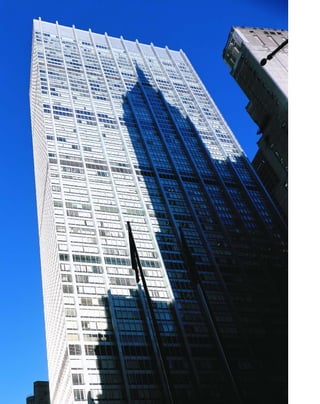
![F
o r b e t t e r and worse, it was
Rockefeller money that revitalized
New York in the 1960s, when corpora-
tions were writing off American cities
at fire-sale prices. Chase Manhattan Plaza, the
sleek $121-million headquarters of David
Rockefeller’s bank, was the start of a new wave
of office construction in the lagging financial
district. Chase was also a prime mover in financ-
ing such megaprojects as Lincoln Center, the
World Trade Center, South Street Seaport, and
Madison Square Garden.
Although flawed architecturally, Chase
Manhattan Plaza is significant because it repre-
sents the Internationalists’ attitude toward the
old city infrastructure: stamp on it like Godzilla
and build over it. The sheer, 60-story, 813-foot-
tall aluminum-and-glass-sheathed tower con-
tains 1.8 million square feet. The building’s two-
and-a-half-acre plot realigned the old street pat-
terns by “demapping” (literally, removing a
street from the city plan) a block of Cedar Street
to form a superblock, bordered by Pine, Liberty,
William, and Nassau Streets. Chase was the first
tower in a plaza built downtown under the new
Zoning Code of 1961 and led the way for other
plazas including Marine Midland, Liberty Plaza,
the World Trade Center, and the World
Financial Center.
Individual parts of this building are better
than the sum. Its big-shouldered parti is monot-
onous, and seems to muscle aside the surround-
ing delicate stone towers of the 1930s. It is top
[ 1] Dubuffet’s GROUP OF FOUR TREES adorns Chase Plaza. [ 2] The Chase, right, epitomized the postwar push for sheer
floor space in buildings. [3] A waving flag indicates the Chase has topped out in September, 1959. [ 4 ] Chase construc-
tion workers gather for a group photo in 1959.
113
Chase Manhattan Plaza
LIBERTY AND NASSAU STREETS » SKIDMORE, OWINGS & MERRILL, 1961
heavy, and Bunshaft later said he was dissatisfied
with the undernourished columns and the
“emphasis on vertical ribbons.” But the shining,
anodized-aluminum skin stood out among the
dark towers of Wall Street like a newly minted
coin. Bunshaft seemed to be reaching back to
the glittering treasure metaphors of the Chrysler
and Cass Gilbert’s gold-pyramided New York
Life Insurance Company Building (1928) for ref-
erences. Among the best details are the aggres-
sively minimalist interior walls of the below-
grade plaza, where surfaces are defined by single
colors. The views from the top-floor executive
lounge are Zeus-like, on eye-level with the green
bronze pyramidal top of 40 Wall.
Chase is a transition from the building as
an object to which you apply sculpture to the
building itself as a sculptural object. As if apolo-
getic for not giving the public enough with the
architecture, Rockefeller allotted a kingly
$500,000 for the plaza’s art budget. Bunshaft, a
connoisseur of modern art, approached Isamu
Noguchi, who was well represented in
Bunshaft’s private collection, to design the
Sunken Garden (1964). The garden, set 16 feet
below grade, consists of seven basalt stones from
the bed of the Uji River in Kyoto that seem to
float on concentric patterns of paving. The gar-
den also functions like a Roman oculus, letting
daylight into the banking floor below. Jean
Dubuffet’s papery-looking, 42-foot-high Group
of Four Trees was added in 1972. Although
appealing in their own right, neither sculpture
relates particularly well to the slab, and Bunshaft
would find a more successful aesthetic resolution
with his masterful Marine Midland Bank plaza.
4
3
2
1](https://image.slidesharecdn.com/catzl6xr7qjbywzl3adu-signature-ec0ec1356cdf1cf66b46a9db24b432b8b8c5d53476da6de461fc6b32c36da610-poli-180116170250/85/Manhattan-skyscrapers-129-320.jpg)
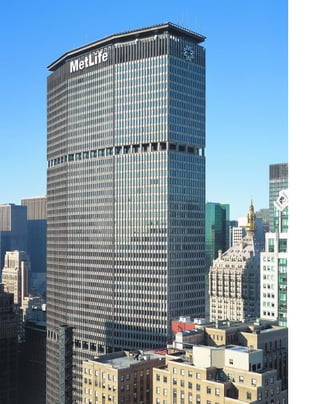
![frequency sound that mimics a bird in distress,
to keep away pigeons. When it opened in April
1963, the 2.4-million-square-foot building was
the largest, rather than the tallest, office building
in the world, and was an instant success: 93 per-
cent of the space was already leased.
The Pan Am represents not only the post-
war disdain for history and emphasis on sheer
burgeoning floor space, but continues the mod-
ernist love affair with transportation. The banks
of whooshing escalators that connect the Pan
Am with the Beaux-Arts elegance of Grand
Central’s concourse are one of its most successful
elements. Fourteen escalators connect the
through-block Pan Am concourse with 61 pas-
senger elevators at the second floor lobby level,
in a dream of efficiency in motion. (Normally
below grade, the elevator pits are on the first
floor, because the tracks of the Metro North
Railroad run under the Pan Am.) Like the over-
the-top transportation fantasies in the Chanin
and Empire State buildings, the Pan Am’s roof
was used as a helicopter landing pad until a fatal
accident in 1977. Frank Lloyd Wright antici-
pated the use of helipads on tall buildings with
his visionary Mile High Illinois project of 1956.
T
h e y e a r 1963 was traumatic for
city lovers. First, McKim, Mead &
White’s supernal Pennsylvania Station
(1910) was dismantled stone by stone
and hauled off to a dump in New Jersey, only to
be replaced by the meretricious, mean-spirited
Madison Square Garden. Second, a foreboding
giant blotted out the sky over Park Avenue. This
giant—the Pan Am Building—and the immi-
nent destruction of the jewel in the city’s dia-
dem, Grand Central Terminal, finally woke
up citizens to the fact that they might be losing
something valuable in exchange for all the
new construction. The New York City Land-
marks Preservation Commission was formed
two years later.
The 55-story, 808-foot-tall Pan Am, built
at a cost of $100 million and clad in precast con-
crete panels, is vilified more for where it is than
what it is. Not only did the Pan Am wander off
the grid, but it had the effrontery to turn its
broad side uptown, violating Manhattan’s tradi-
tional north-south alignment. The ultimate
responsibility for siting the broad slab across one
of the city’s most pleasant and open boulevards
was Walter Gropius’s. Internationalist monu-
ments apparently were not meant to be enjoyed
from the sidewalk: Gropius referred to Europe’s
[ 1] A map emphasizing the building's ideal midtown location was included in a promotional packet for prospective tenants.
[ 2] A typical floor plan of the office space, this one on the 18th Floor.
115
Pan Am Building(now Met Life Building) 200 PARK AVENUE » WALTER GROPIUS, PIETRO BELLUSCHI,
AND RICHARD ROTH OF EMERY ROTH & SONS, 1963
great cities as “stony deserts” and prophesied
that, “Seen from the skies, the leafy house-tops
of the cities of the future will look like endless
chains of hanging gardens.” Pietro Belluschi
defended the design from an urbanist point of
view: “I’d like to put in a good word for urban
congestion,” he said. “It’s an excitement you can
only find in New York City.”
What New Yorkers were left with was a
coarse rip-off of Gio Ponti and Luigi Nervi’s
trimly elegant Pirelli Building (Milan, 1959),
which itself had historical roots in Florence’s
Palazzo Vecchio of 1314. From the east and west,
the elongated octagon of the Pan Am with its
narrow ends works quite well as a campanile.
The façade of the 47-story tower above an eight-
story platform that matches the cornice of
Grand Central Terminal is broken into three
sections by recessing the curtain wall behind the
columns, throwing deep shadows. Unfortun-
ately, concrete does not age well—even the
Solomon R. Guggenheim Museum looks more
like a potsherd than a new building—so that the
Pan Am, one of New York’s monuments, resem-
bles nothing more than a gritty sidewalk. In
addition, the building emits a grating, high-
1
2](https://image.slidesharecdn.com/catzl6xr7qjbywzl3adu-signature-ec0ec1356cdf1cf66b46a9db24b432b8b8c5d53476da6de461fc6b32c36da610-poli-180116170250/85/Manhattan-skyscrapers-131-320.jpg)
![in its own plaza, which has been criticized for its
lack of urban contextualism. But Saarinen felt
he was being considerate of the streetscape: “We
tried to place the building on the site so that we
could have a plaza and still not destroy the street
line,” he said. “A plaza is a very necessary thing
in a city. It lets people sit in the sun and look at
the sky....These arrangements should be
orderly and beautiful so the streets do not look
like torn things and the towers like isolated teeth
sticking up from a gaping mouth.” Yet Saarinen’s
sunless, seatless, and sunken plaza would appear
to be the antithesis of what he had in mind. No
one uses it, except to nip through the midblock,
and it is too shallow even to get a good look at
the building. The plaza can be thought of as a
forbidding moat around a castle, in keeping
with the Gothic theme.
In a number of ways, the CBS is the last
great Gothic tower in Manhattan. Because it is
supported by masonry rather than a steel cage,
its antecedants date to John Wellborn Root and
Daniel Burnham’s Monadnock Building
(1884–1991), and it is a refinement of Raymond
Hood’s dark American Radiator Building.
Although the projecting piers terminate at the
flat roofline, they visually appear to form crenel-
lations, a vestigial trace of Gothicism.
E
e r o s a a r i n e n said he wanted
to make the “simplest skyscraper in
New York” with his sheer, 38-story,
490-foot-tall headquarters for CBS.
This is the only skyscraper designed by Saarinen,
who died in 1961, without seeing his building
completed.
The tower is elegantly conceived and
structurally innovative. Rib-like salient columns
support the weight of the building, lashed
together by the floor plates and anchored by the
reinforced concrete elevator core. It was the first
building in New York to use pillars made of
reinforced concrete rather than a steel frame.
Because the 35-foot-deep floor plates on the
135-by-160-foot site have no internal columns,
the building contains an ample 800,000 square
feet of office space. This is a tower without
tricks: there are no hidden bustles like those of
the Seagram or the Citicorp to make up floor
space. Saarinen fulfilled his Sullivanesque joy in
creating a “building that would stand firmly on
the ground and grow straight up.”
[1] Los Angeles’s CBS Building (c. 1950) reflects the strong Bauhaus influence on West Coast architecture, an interesting
contrast to the Black Rock of 1960s Manhattan. [2] Early Byrds: members of the California-based rock group the Byrds
flock at the base of Black Rock after signing with CBS Records.
117
CBS Building51 WEST 52ND STREET » EERO SAARINEN, 1965
Five-foot-wide triangular columns clad in
black granite project from a surface of smoked
glass and black granite spandrels, which accounts
for the tower’s Gothic nickname, Black Rock.
The façade functions like a minimalist sculpture:
seen obliquely, the piers seem to form a solid wall
but appear open and glassy when viewed directly.
There is a tremendous visual energy as the
observer walks around the building, and the piers
ripple open and closed like accordion pleats.
Few other buildings succeed so directly in
making the viewer aware of the building as both
a container of space and as a volume of space.
The windows of gray-tinted vision glass play
tantalizingly with the relationship of surface and
interior space: from some angles the interior
lights can be seen, and from other viewpoints
the windows reflect only sky. The black skin was
enormously important in Gordon Bunshaft’s
thinking for another minimalist masterpiece, his
Marine Midland Bank.
Saarinen wanted the sculptural qualities of
his building to be appreciated, so he set it apart
21](https://image.slidesharecdn.com/catzl6xr7qjbywzl3adu-signature-ec0ec1356cdf1cf66b46a9db24b432b8b8c5d53476da6de461fc6b32c36da610-poli-180116170250/85/Manhattan-skyscrapers-133-320.jpg)
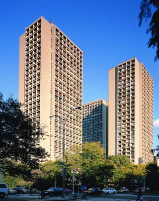
![ing interacts naturally with environment: the
deeply overhanging soffits function like a brise-
soleil, and the windows slide open for natural air
circulation. “There were no teachers to teach us
the new architecture,” Pei recalls of his early
education in Shanghai before he attended the
Massachusetts Institute of Technology, “so we
turned to Corbu’s books, and these were respon-
sible for half our education.” Le Corbusier’s
influence can be seen even in Pei’s choice of
round, horn-rim eyewear.
Pei also used the deep window sockets to
provide a sense of privacy and shelter, the way
Frank Lloyd Wright did. “I know you,” Frank
Lloyd Wright said upon meeting Pei. “You
belong to Zeckendorf.” It took the slightly built,
self-assured Pei a number of years to emerge
from the shadow of his reputation as the in-
house architect for the megadeveloper William
Zeckendorf.
Bust of Sylvette, the 36-foot-tall, 60-ton,
concrete interpretation by the Swedish sculptor
Carl Nesjar of the much smaller Picasso bronze,
sits in the center of the plaza. The porous
perimeter of the towers provides a nice balance
between openness and enclosure.
B
u i lt a s housing for New York
University faculty and graduate stu-
dents, I. M. Pei’s Silver Towers has all
the earmarks of a high-modernist
superblock: demapped streets, slabs without
relation to surrounding buildings, ample under-
ground parking, and unused greenswards.
Though usually mentioned only in connection
with its centerpiece Picasso sculpture, Silver
Towers is a fine composition that creates a mod-
ernist dialogue between openness and enclosure.
The sheer, 30-story, reinforced concrete
and glass towers are an elegant synthesis of many
strains of modernist design, and at the same
time express Pei’s minimalist sculptural sensibil-
ity. A “slightly skeptical acolyte” of Walter
Gropius, in the words of his biographer Michael
Cannell, Pei clearly expresses the structure of
Silver Towers, but improves on Gropius’s
unlovely precast concrete façade for the Pan Am
Building. The warm, buff-colored concrete
façades of the three Silver Towers are organized
into four by eight structural bays of deeply
recessed plate-glass windows. The wedge-shaped
[ 1] The wedge-shaped piers and sloping windowsills soften what would otherwise be a cold, office-building-like grid.
[ 2] The site plan shows the three-block setting.
119
Silver Towers(originally University Plaza) 100 AND 110 BLEECKER STREET, AND 505 LAGUARDIA PLACE »
I. M. PEI, 1966
piers and sloping windowsills soften what would
otherwise be a cold, office-building-like grid.
The articulated concrete frame with deep-
set windows gives the impression of a sheltering,
lithic building, yet at the same time forms an
open cage of space. The façades are sculptural
because the bays vary from open glass panels to
completely recessed stone frames. The transi-
tional points on the façades between a regular
grid and sharp zigzags change, depending upon
which angle they are viewed from, so that the
buildings always have a kinetic sense of energy.
Backgrounded against the low-set, landmarked
neighborhood of SoHo, few skyscraper com-
plexes have so much open sky around them, and
the flow of space is almost palpable. The build-
ings are set on a pinwheel plan, and seem to
swim forward in space.
Pei wanted to provide a sense of home
comfort: the glassed-in, Miesian lobby is coun-
terbalanced with a traditional wall of buff brick
to provide a human scale. Like Le Corbusier’s
cast concrete collective housing unit, Unité
d’Habitation (1947–53) in Marseilles, the build-
2
1](https://image.slidesharecdn.com/catzl6xr7qjbywzl3adu-signature-ec0ec1356cdf1cf66b46a9db24b432b8b8c5d53476da6de461fc6b32c36da610-poli-180116170250/85/Manhattan-skyscrapers-135-320.jpg)
![things, we are now offered the illusion of modali-
ties: namely, that matter is incorporeal, weight-
less, and exists only optically like a mirage.”
The Marine Midland is transcendent
architecture because it presents an office build-
ing frankly, as a container of commercial space
(we can see through its reflective and transparent
skin), but at the same time, the containment of
space becomes the image of the building itself in
the form of flat rhomboidal planes. The com-
mercial and aesthetic functions of the building
are one. Arthur Drexler, director of the Museum
of Modern Art’s architecture and design depart-
ment wrote about Marine Midland: “The ‘func-
tion’ of the building is recognized as analogous
to that of a package; what is offered is a com-
modity: portions of space.”
Minimalism was the final expression of the
unified aesthetic of modernism. “The era of the
1960s, as epitomized by Minimal art, saw the
future optimistically,” wrote the critic Frances
Colpitt. “It evidenced an unmatchable enthusi-
asm for progressive invention and a passionate
commitment to intellectual inquiry. It was, then,
a world without fragmentation, a world of seam-
less unity.” The Marine Midland is one of the
last, best expressions of modernist unity. After
architecture had been reduced to such a purely
visual form, the question became where to go
from there. In retrospect, the return to symbol-
ism, fragmentation, and discontinuity of post-
modernism seem inevitable.
G
o r d o n b u n s h a f t ’ s designs
have been widely imitated for all the
wrong reasons. Like his seminal Lever
House, his Marine Midland Bank
Building, sheathed in flush black glass, was appre-
ciated more for its skin than its parti. After Marine
Midland, everybody raced to build in black and
flush glass, but few understood Bunshaft’s under-
lying minimalist sculptural aesthetic.
Marine Midland was not the first flush
glass curtain-wall building; Pietro Belluschi had
done it with his extraordinarily far-sighted
Equitable Life Assurance Building (1944–47) in
Portland, Oregon. Bunshaft further explored
minimalist questions of the relation of surface to
volume, and opticality versus objecthood. The
entire composition of the white travertine plaza,
Isamu Noguchi’s vermilion sculpture Cube
(1973), and the trapezoidal, 51-story black tower
form brilliant variations on the relationship of
two-dimensional and three-dimensional space.
Bunshaft took his leitmotif from the irreg-
ular site itself, bordered by Cedar, Liberty, and
Nassau Streets and Broadway. Seen from the air,
the way an architect would look at it on a blue-
[ 1] Noguchi’s rhomboidal sculpture enriches the building’s spatial experiments. [ 2] The Marine Midland’s trapezoidal
floor plan reflects the site’s configuration.
121
Marine Midland Bank Building
(now 140 Broadway) GORDON BUNSHAFT, 1967
print, the block forms a two-dimensional rhom-
boid. The building’s footprint is trapezoidal,
wider on the Nassau Street front with four bays
tapering to three bays on Broadway. The result-
ing acute and oblique angles make the façades
appear to be purely two-dimensional surfaces.
Because the walls of bronzed glass and black
matte anodized aluminum are so flat and with-
out scale, the parallax effect of their height
becomes more apparent, and they in turn recre-
ate the plaza’s irregular rhomboidal angle.
Noguchi’s 28-foot-tall elongated cube in
the plaza is a densely layered synthesis of the
architectural themes.The rhombohedron seems
to be pulled out of two-dimensional space, a
transitional object between the flat canvas of the
plaza and the three-dimensional tower. Noguchi
also plays with the idea of surface and space: the
cube has a hole drilled through it, so that it is
seen simultaneously as surface and as container of
space. “To render substance entirely optical, and
form, whether pictorial, sculptural, or architec-
tural, as an integral part of ambient space—this
brings anti-illusionism full circle,” wrote art critic
Clement Greenberg. “Instead of the illusion of
1
2](https://image.slidesharecdn.com/catzl6xr7qjbywzl3adu-signature-ec0ec1356cdf1cf66b46a9db24b432b8b8c5d53476da6de461fc6b32c36da610-poli-180116170250/85/Manhattan-skyscrapers-137-320.jpg)
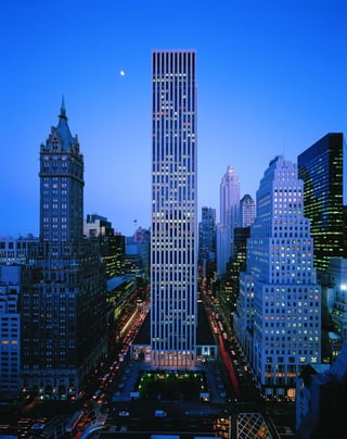
![of the last great stone-supported tall buildings,
and Daniel Burnham’s Flatiron Building. Perhaps
to lend an air of modernity, Stone called his glass
bays “vision panels,” and pointed out their energy
efficiency. Because the bays provided views up
and down the avenue, Stone said that they “give
the occupant of each office a welcome sense of
individuality.” Oddly, the paper-white slab
resembles nothing so much as that icon of 1960s
impersonality, the IBM punch card.
Stone’s problem was that he single-
handedly tried to find a way out of the glass box
that modernism built itself into, without post-
modernism’s theoretical apparatus of disconti-
nuity and pastiche. The GM is a failed offshoot
because Stone tried to incorporate historicism
into modernism’s unyielding mold, rather than
to explore and celebrate the discontinuities, as
later architects did. Stone wandered into increas-
ingly idiosyncratic, filigreed masonry designs,
and his career remains in critical neglect.
Emery Roth & Sons, the associate archi-
tects on the GM Building, did more to change
the face of Manhattan than any single builder.
Between 1950 and 1970, the firm built a whop-
ping 30 million square feet of office space, or
half the total created in that period. They cared
little for the building’s external wrapper. What
they delivered was the belly of the beast: maxi-
mum open-plan floor space, high-speed eleva-
tors, and advanced climate control systems.
Roth “econo-boxes” completely changed the
character of Third Avenue in midtown after the
El was ripped out in 1955.
The GM’s moribund sunken plaza,
deserted even in the best of weather, is often
cited as an example of poor urban planning.
“To achieve the most bulk possible under the
new law, it will have an open plaza facing an
existing plaza,” the critic Ada Louise Huxtable
wrote about the siting across the avenue from
Grand Army Plaza’s urbane fountain and statue
of General Sherman. “Ever hear of a redundant
plaza? This is it.”
A
f t e r b e i n g summarily
drummed out of the Internationalist
ranks for his kitschy One Columbus
Circle (1958, now slated for the
wrecking ball possibly to make way for nothing
more than another redundant plaza), Edward
Durell Stone designed his first skyscraper, the
New York headquarters and showroom for
General Motors. The 50-story tower with stubby
wings is an interesting, albeit failed attempt to
transcend Internationalism’s “glass-boxitis,” as
Philip Johnson called it.
Stone was a lone voice in the wilderness
when he defied the high-modernist orthodoxy of
the late 1960s. “I am critical of the steel and glass
monolithic structures, inspired by Mies,” he said,
“particularly the type one finds along Park
Avenue now, because I believe architecture
should be more permanent in character.” Stone’s
method of making the GM more “permanent”
was to return to the skyscraper’s masonry origins
in the Chicago School.The GM Building’s three-
sided, alternating bays of white marble and black
glass recall the oriels of Chicago’s Manhattan
Building (William Le Baron Jenney, 1891), one
[ 1] Since the 1960s, the GM showroom has featured their latest model cars. [ 2] The slim-lined GM Building was an early
attempt to break out of the glass box.
123
General Motors Building
767 FIFTH AVENUE » EDWARD DURELL STONE; EMERY ROTH & SONS, ASSOCIATE ARCHITECTS, 1968
1
2](https://image.slidesharecdn.com/catzl6xr7qjbywzl3adu-signature-ec0ec1356cdf1cf66b46a9db24b432b8b8c5d53476da6de461fc6b32c36da610-poli-180116170250/85/Manhattan-skyscrapers-139-320.jpg)
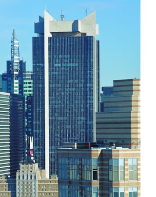
![by the pedestrian corridor of Shubert Alley,
except for a token fringe of minuscule plazas.
The office tower, containing 1.4 million square
feet, is set back 135 feet from the Broadway front.
The blind, five-story concrete wall of the Astor
Plaza movie theater is as overtly hostile to the
street as the Marriott Marquis next door:
together, the buildings resemble a phalanx of
stone policemen making sure that nobody actu-
ally lingers on the street.
The building also contains the lavish
1,621-seat Minskoff Theater, which is large
enough to handle Broadway musicals and is
entered through a covered plaza in the building’s
center. The underground Astor Plaza movie the-
ater is one of the great, latter-day movie palaces
with 1,500 seats and 1960s-style leopard-skin car-
peting. The dual function of office building and
entertainment complex (MTV has studios here)
is an extension of the design for the Deco-era
Paramount Building just down the street, and
shows that what keeps a building vital is that it
meets a city’s many needs.
O
n e a s t o r p l a z a ’ s tower, a
sharply angled limestone crown by
Der Scutt, the lead architect for the
project for Kahn & Jacobs, is a signif-
icant precursor of postmodernism’s movement
away from structural expression and toward
symbolism for its own sake. By placing a non-
functional crown—and a stone one at that—
atop a glass building, Der Scutt was beginning
to undermine basic Internationalist assumptions
such as the ban on applied symbolism. The
spiky crown was even more affronting in 1972
when it featured the giant orange logo of the
W. T. Grant five-and-dime chain.
The 54-story building seems to be assem-
bled from pieces of other buildings; Der Scutt
was one of the first architects to employ this kind
of pastiche. Flaring limestone pylons stick out
from the sides of the tower, sheathed in black
glass superimposed with sectional aluminum
mullions. Oddly projecting glass bays at the cor-
ners anticipate Der Scutt’s experiments with the
glass curtain wall in such later buildings as
[ 1] The Minskoff Theater creates a glittering array of lights at night. [ 2] The pinwheel motif is carried though in a typical
tower floor. [3] The ground floor reflects multiuse for theaters and rental office space.
125
One Astor Plaza1515 BROADWAY » DER SCUTT OF KAHN & JACOBS, 1972
Trump Tower. With a budding postmodernist’s
sense for sleight of hand, the blank mass of the
Astor Plaza movie theater on West 44th Street is
revealed from another angle as a thin façade,
because its wall projects beyond the cornice.
Built on the site of the old Astor Hotel
and its celebrated bar, Astor Plaza epitomizes the
antiurban sentiment of planners in the late
1960s. Rather than a congested, vital urban
arena, Times Square, with some justification,
was seen as a seedy breeding ground of pornog-
raphy and crime. The solution was to eradicate
street life, and turn the neighborhood into a
parched and untraversable desert like Oscar
Niemeyer’s designs for the main state institu-
tions in Brasilia, Brazil. Astor Plaza was the first
building to exploit an easement of the 1961
Zoning Code that allowed developers to put up
taller and bulkier than usual buildings as an
incentive to build new legitimate theaters in the
ailing Theater District.
The 327-foot by 201-foot plot is simply
huge, absorbing the entire half-block bordered
1
2
3](https://image.slidesharecdn.com/catzl6xr7qjbywzl3adu-signature-ec0ec1356cdf1cf66b46a9db24b432b8b8c5d53476da6de461fc6b32c36da610-poli-180116170250/85/Manhattan-skyscrapers-141-320.jpg)
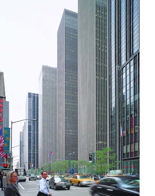
![The very anonymity of the XYZ buildings
works to their advantage in forming a kind of
abstract, gridded background that thrusts the
avenue into the foreground. These are surely
among the most reticent towers ever built. The
McGraw-Hill and Exxon (originally Standard
Oil) Buildings sit back 117 feet from the avenue
to create plazas with extra-wide sidewalks. From
certain angles up and down the avenue, the tow-
ers seem to disappear entirely, freeing up the sky
around them. This receding visual quality is
heightened by the towers’ lack of scale. Super-
numerary piers, twice as many as are structurally
necessary, splinter the façades into thin vertical
strips. Continuous bands of opaque glass span-
drels and bronzed-glass windows provide no
indication of floor levels.
In plan and in their façade treatments, the
XYZ towers are essentially knockoffs of Harri-
son’s earlier and better Time & Life Building,
down to their alar cantilevered canopies, but
lack the original’s clarity of structural expression.
The 54-story, 784-foot-high, 2.1 million-square-
foot Exxon Building (1967–71) was the first of
the three to be built. The structural exoskeleton,
which holds the building up without internal
columns, is clad in limestone as a contextual
tribute to the older Rockefeller Center buildings
across the avenue. The 51-story, 645-foot-tall,
1.8-million-square-foot McGraw-Hill Building,
clad in plummy red granite, was completed in
1973. The 45-story, 1.6-million-square-foot
Celanese Building varied only slightly from the
others in that it had a smaller, L-shaped plaza,
and the glass and limestone façade formed a
nearly flush curtain.
The XYZ plan is the closest approxima-
tion of what Le Corbusier’s proposed City of
Towers would look like in the context of
Manhattan, or what a city might be like if it
were all designed by one person. In fact, the
F
e w h av e kind words for this super
complex of three nearly identical tow-
ers built as an extension of Rockefeller
Center on the west side of Sixth
Avenue. Even Wallace Harrison’s biographer,
Victoria Newhouse, calls them “monotonous,”
“tedious,” “overbearing,” and “arid”—all in one
paragraph. Yet they form the background tex-
ture of one of city’s most viable and densely uti-
lized areas, just south of Central Park. How can
both assessments be true?
The buildings are most criticized for their
prosaic presentation of the tall office building as
shoe boxes for commercial space; in fact, the
slabs were considered so interchangeable that
they were called “the XYZ plan.” Harrison origi-
nally wanted to enliven their profiles by setting
[ 1] The site for the new McGraw-Hill Building was a motley assortment of bars and small shops.
127
XYZ BuildingsExxon Building 1251 AVENUE OF THE AMERICAS » HARRISON, ABRAMOVITZ & HARRIS, 1971
McGraw-Hill Building 1221 AVENUE OF THE AMERICAS, 1973
Celanese Building 1211 AVENUE OF THE AMERICAS, 1974
the slabs in a voguish pinwheel formation, but
this would have probably made them more dis-
tracting rather than more interesting. Harrison’s
original scheme had more in common with the
original Rockefeller Center across the avenue:
the three slabs framing a large, landscaped,
sunken plaza, with the McGraw-Hill Building
oriented north-south along a private street. In
shaky block lettering, Harrison wrote across a
copy of this plan, “My scheme for the west side
turned down by”—two names are then
scratched out, but the second is plainly legible,
“Mike Harris,” the associate architect. By the
time the Celanese Building was completed in
1974, Harrison was nearly 80, and was becoming
a seigniorial background figure in the firm; new
clients asked for Max Abramowitz.
1](https://image.slidesharecdn.com/catzl6xr7qjbywzl3adu-signature-ec0ec1356cdf1cf66b46a9db24b432b8b8c5d53476da6de461fc6b32c36da610-poli-180116170250/85/Manhattan-skyscrapers-143-320.jpg)
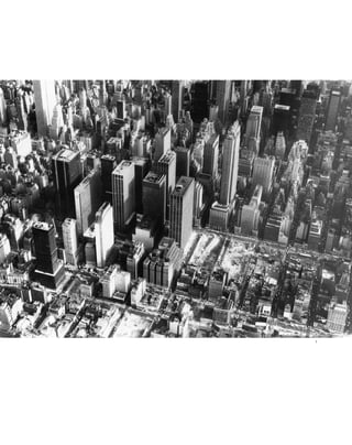
![towers do not eliminate the traditional Rue
Corridor, but create a new one. “Typical Plan is
empty as possible: a floor, a core, a perimeter,
and a minimum of columns,” Rem Koolhaas
writes in his S,M,L,XL. “It’s unsung designers—
Bunshaft, Harrison and Abramovitz, Emery
Roth—represent vanishing acts so successful
that they are now completely forgotten.”
The XYZ buildings have as much impact
for what is not there as for what is there. The
open space between the square-topped towers
makes the observer aware of the vast volume of
space contained behind their subdued, pin-
striped exteriors. The forthright geometrical sil-
houettes cut the sky into vibrant patterns. There
is a certain satisfying corporate symbolism at
work here: bluff, no-nonsense, but restrained
behind a business-like front.
Unfortunately, almost everybody, includ-
ing Nelson and John D. Rockefeller Jr., hated
the buildings. “Nelson criticized the Sixth
Avenue buildings and said John didn’t like them
either,” Harrison recalled. “There was a com-
plete change of attitude. Nelson said he wouldn’t
give me any more work....I was broken-hearted
about it. What the hell, I had done the very best
I knew how.”
Critics differ on whether the plazas work
or not, but they are a lively part of the urban
fabric, and are well used in good weather.
“Perhaps the key to success here is that whatever
these buildings are doing to the public space of
the city they are doing it together,” wrote the
critic Gerald Allen when they opened. The vest-
pocket parks, frequently an afterthought, are
quite intimate and pleasant. The park in back of
the McGraw-Hill Building features a walk-
through waterfall that recalls Harrison’s design
for the Electric Utilities Exhibit at the 1939
World’s Fair.
As Cesar Pelli remarked “Cities are made
up of foreground and background buildings, yet
no one, whether architect or client, wants to
do a background building. Therefore, all our
[ 1] The Exxon Building, to the left of the empty lots, was the first of the three buildings to be completed.
[ 2] The waterfall outside Wallace K. Harrison’s consolidated Edison’s City of Light exhibition at the 1939 New York
World’s Fair resembles the park behind the McGraw-Hill Building.
129
buildings need to be both foreground and
background.” The XYZ buildings fail in the
foreground because of their lack of style, but
are overlooked as among the city’s best back-
ground buildings.
The lower concourses, meant primarily
for the 80,000 office workers on the east and
west sides of Rockefeller Center, are unadver-
tised at street level and are remarkably well used.
The social effects of turning street life into pri-
vate property could be debated: these “streets”
are patrolled by watchful private security forces.
It could also be argued that turning the street
life inward is part of a “malling” or “themeing”
of American life, along the lines of James Rouse,
who created the Faneuil Hall Marketplace
(1976) in Boston, and Manhattan’s South Street
Seaport (1984).
2](https://image.slidesharecdn.com/catzl6xr7qjbywzl3adu-signature-ec0ec1356cdf1cf66b46a9db24b432b8b8c5d53476da6de461fc6b32c36da610-poli-180116170250/85/Manhattan-skyscrapers-145-320.jpg)
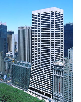
![T
h i s i s Internationalism’s last gasp;
the brilliant minimalist opticality of
Gordon Bunshaft’s Marine Midland
becomes a gimmicky optical illusion in
the ski-shaped, 47-story, white-travertine and
bronzed-glass W. R. Grace Building. Bunshaft
seems to have explored Mies’s reductionist aes-
thetic as far as it would go and in the end only
found a structure devoid of symbolic value. The
Grace Building literally seems to be stretching to
find some new meaning that might be provided
by postmodernism.
Bunshaft arrived at the building’s shape by
covering the setbacks required by the Zoning
Code with a smooth, curved wall instead of
angular steps. “We got the idea that instead of
going up straight on the property line and then
setting back...we would keep reducing the
floors as we went up, on a curved line from the
second floor,” he told his biographer, Carol
Hershelle Krinsky in 1988. “I don’t think a build-
ing is very handsome with a big podium 86 feet
high and then a tower set way back,” he contin-
ued, somewhat defensively, considering that the
headquarters for the giant chemical company
stands on 42nd Street among some of the best
examples of the setback style. “That is ugly and
we still feel it is ugly. If we had a similar job
today, we would probably do it somewhat like we
did then.” Bunshaft also designed the similarly
sloped, 49-story, 725-foot-tall 9 West 57th Street,
completed a year later as a real-estate venture.
The Grace Building’s tapering façade,
organized into seven rectangular, bronzed-glass
window bays divided by travertine-covered
piers, is always good for a double-take the first
time someone sees it, but eventually passersby
start to ignore it altogether—there is simply not
enough going on here, beyond the fact that the
illusion of concavity produced by towering ver-
tical elements is exaggerated. Classical architects
employed entasis, a rounded swelling in the cen-
ter of their columns, to counteract this illusion,
which is caused by the curvature of the human
[ 1] Travertine paving extends to the curb on 42nd Street and in an open plaza, upper left. [2] The Grace’s broad lower
floor plates taper up to the regular shaft.
131
W. R. Grace Building1114 AVENUE OF THE AMERICAS (ALSO 41 WEST 42ND STREET) » GORDON BUNSHAFT, 1973
eyeball. The façade also makes use of the “phan-
tom square” optical illusion, in which grayish
squares seem to appear at the intersections of the
white lines. The interior blinds are set in special
tracks so that they do not hang vertically and
spoil the sweeping effect.
Rather than reinterpreting and refining
classicism as Mies did, Bunshaft is reduced to
making visual puns. The building is classically
organized—the piers are arranged like columns
on a stylobate above a projecting second-floor
travertine ledge that acts as a rain gutter—but
the variations are symbolically empty. The slop-
ing piers pierce the ledge to provide an open-
glass ground floor. In better buildings, the effect
is of weightlessness, of volumes floating on air,
but here the curved legs are kitschy, like the cute
slanted feet on a 1950s davenport.
The Grace Building is not a building for
the ages, but its location on the border of Bryant
Park and its idiosyncratic design solution make
it one of the city’s most visually prominent sky-
scrapers. The building was criticized mainly for
breaking with the traditional wall of buildings
that line the park. Bunshaft spoke resignedly
about contextualism: “In New York City, if you
built to conform with your neighbors in some
cases before you were finished your neighbors
would be demolished.”
1
2](https://image.slidesharecdn.com/catzl6xr7qjbywzl3adu-signature-ec0ec1356cdf1cf66b46a9db24b432b8b8c5d53476da6de461fc6b32c36da610-poli-180116170250/85/Manhattan-skyscrapers-147-320.jpg)
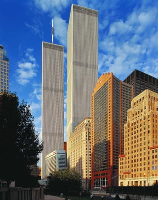
![windows are only 18 inches wide, set between 18-
inch-wide columns and sheathed in aluminum
alloy that project 12 inches from the surface of
the glass. The spacing had as much to do with
Yamasaki’s fear of heights as with structural and
design considerations. Apparently, the architect
did not feel comfortable unless the floor-to-ceil-
ing windows were narrower than his own shoul-
der span. Yamasaki wrote of his earlier Reynolds
Building, “These relatively narrow windows
offer magnificent views of the river and the city
yet they give a sense of security and relieve the
feelings of acrophobia that many people experi-
ence in high-rise buildings.”
The major criticism of the complex is that
it totally ignores the Manhattan skyline, but
Yamasaki received the commission in part
because of his thoughtful letter to the design
board. “In my opinion, this should not be an
overall form which melts into the multitiered
landscape of Lower Manhattan,” he wrote, “but
it should be unique, have excitement of its own,
and yet be respectful to the general area. The
great scope of your project demands finding a
way to scale it to the human being so that, rather
than be an overpowering group of buildings, it
will be inviting, friendly and humane.” While
nobody would use the words inviting, friendly,
and humane to describe the result, the oddly
delicate, Italian Gothic–tipped windows at the
base were an attempt to humanize the towers,
along the lines of the St. Mark’s campanile in
Venice. (A planned arcade was never built.)
Despite their complete disregard for urban
contextualism, the towers play off each other
wonderfully as pieces of minimalist sculpture.
Following the archetype laid out by Mies with his
Lake Shore Drive Apartments (1948–51) in
Chicago, Yamasaki staggered the towers so that
the observer is always aware of their spatial rela-
tionships. One building appears in the foreground
with a lesser, perspectively distorted version
behind it, so that the viewer is constantly con-
fronted with the subjectivity of his viewpoint.
M
i n o r u y a m a s a k i was an
unlikely choice for lead architect of
the World Trade Center megade-
velopment. He was not one of the
troika of Internationalist corporate architects:
Gordon Bunshaft, Wallace K. Harrison, and
Edward Durell Stone (before his apostasy); he
was best known for modestly scaled, sculptural
buildings, such as his 30-story Reynolds
Building in Detroit (1958); and he was morbidly
afraid of heights. The design he delivered was
even more unusual—not a glass slab at all, but
twin towers, supported by external columns,
that function as minimalist sculpture.
Like the Empire State Building, which it
superseded by a calculated 100 feet, the World
Trade Center is a marvel of logistics and engineer-
ing. Its sheer bulk is difficult to take in: two sheer,
flat-topped, 110-story, 1,362- and 1,368-foot-tall
towers which together contain an unheard-of 10
million square feet of office space. Each floor
[ 1] When they were erected, the Twin Towers upended the Manhattan skyline.
133
1 and 2 World Trade Center
CHURCH TO WEST STREETS AND LIBERTY TO VESEY STREETS »
MINORU YAMASAKI AND EMERY ROTH & SONS, 1973 AND 1974
takes up an entire acre because of the column-free
floor plates and the distribution of elevators.
The list of construction materials reads
like a list of war preparations: 43,000 windows,
or 600,00 square feet of glass; 200,000 tons of
structural steel (more than was used for the
Verrazano Narrows Bridge from Staten Island to
Brooklyn); 6 acres of marble; 40,000 door-
knobs; 200 elevators; 1,200 restrooms. Yamasaki
was so used to small-scale projects that when he
won the commission for the $280-million pro-
ject, he thought it was simply a typo and that
they meant $28 million.
The site was problematic because it was
reclaimed river, and bedrock was 70 feet down.
The engineers John Skilling and Leslie
Robertson adopted an ingenious Italian tech-
nique called slurrying to build a solid founda-
tion for the world’s tallest buildings. As dirt and
rock were removed, the pit was filled with slurry,
a mixture of water and absorbent clay, to keep
the excavation walls firm. Reinforced blocks of
concrete were lowered into the slurry until they
touched bedrock and then concrete was poured
over them. The 500-square-foot foundation
became known as “the bathtub” when it hard-
ened. This engineering feat was also remarkable
because the newly dug tunnels of the PATH
train to New Jersey stood exposed, five stories
above bedrock, until the foundation was laid.
The World Trade differs from many of its
glass-box contemporaries because it is supported
by an external, rather than internal, steel-frame
skeleton. The structure is essentially that of a
rigid, hollow box, with load-bearing steel piers
lashed together by the floor trusses, which
extend to the central service core. In a widely
imitated model, the elevators were distributed
by sky lobbies with express elevators to the forty-
fourth and seventy-eighth floors.
The most idiosyncratic aspect of the
design is that the windows cover only 30 percent
of the building’s surface instead of the virtually
all-glass façades of the International Style. The
1](https://image.slidesharecdn.com/catzl6xr7qjbywzl3adu-signature-ec0ec1356cdf1cf66b46a9db24b432b8b8c5d53476da6de461fc6b32c36da610-poli-180116170250/85/Manhattan-skyscrapers-149-320.jpg)
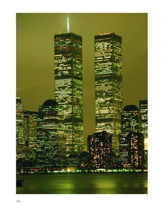
![way to scale it to the human being so that, rather
than be an overpowering group of buildings, it
will be inviting, friendly and humane.”
Despite their disregard for urban contextu-
alism, the towers played off each other wonder-
fully as pieces of minimalist sculpture. Following
the archetype laid out by Mies with his Lake
Shore Drive Apartments (1948–51) in Chicago,
Yamasaki staggered the towers so that the observer
is always aware of their spatial relationships. One
building appeared in the foreground with a lesser,
perspectively distorted version behind it, so that
the viewer was constantly confronted with the
subjectivity of his viewpoint.
The customized aluminum-alloy skin,
chosen by Yamasaki because it was warmer in tone
than standard aluminum, was visually engaging
as a reflector for the broad skies over Lower
Manhattan.The chamfered corners gleamed
with the same sense of limitless opportunities
provided by the chrome-nickel alloy mullions of
the Empire State Building. At sunset, the trans-
parent glass cages became sculptural containers
of space.
[1] The World Financial Center brought the World Trade Center towers back into the skyline. [2] Tokens of commemora-
tion of 9/11 line the Brooklyn Heights promenade, looking out over the harbor at the World Trade Center site. [3] The lob-
bies were connected to a large underground shopping and commuter concourse.
135
2
3](https://image.slidesharecdn.com/catzl6xr7qjbywzl3adu-signature-ec0ec1356cdf1cf66b46a9db24b432b8b8c5d53476da6de461fc6b32c36da610-poli-180116170250/85/Manhattan-skyscrapers-151-320.jpg)
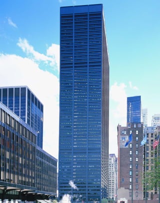
![T
h e s k y wa r d trend of thought,”
as the criticThomas A. P. van Leeuwen
refers to the evolution of skyscraper
design, periodically hits a dead end and
must be reimagined.The U.S. Steel Building is
the endgame of Mies’s reductionism, just as the
1915 Equitable Building catercorner across Broad-
way represents the exhaustion of the eclectic style.
The two behemoths squaring off across Broadway
have much in common; both buildings make no
bones about being raw containers of office space
through the sheer multiplication of layers.
The symbol of the New York headquarters
of U.S. Steel is loud and clear: structural steel.
The 150- by-250-foot trabeated slab, organized
into three by five extraordinarily wide 50-foot
bays, looks like a stack of steel girders, a solid
promotion for U.S. Steel’s principle product.
The bays are spanned by heavily flanged, six-
foot-deep steel-plate girders that act as span-
drels. The structural frame and elevator core
support the enormous, 40,000-square-foot floor
plates without internal columns. Cass Gilbert
would have appreciated how the U.S. Steel
Building fulfills his definition of a skyscraper as
“a machine that makes the land pay”: each floor
is almost an acre in area. The building is 53 sto-
ries and 772 feet tall, containing 1.8 million
square feet of space.
This was the first New York skyscraper
with exposed perimeter beams, but the façade is
not completely honest. The structural steel had
to be fireproofed, and the material was designed
to be covered with another layer of steel so that
the piers and the flanges of the spandrels appear
even bigger. As a result, the rap of a knucklebone
on one of the giant piers that runs straight up
from the pavement gives a disconcertingly hol-
low sound, as if the building is an illusion. The
strips of black window glass disappear into the
deeply shadowed recesses of the skeletal façade.
In a brilliant design gesture, the overscaled H-
beam piers rise uninterruptedly to pierce the cor-
nice line, as if the building could go on forever.
[ 1] The U.S. Steel Building is a steel cage with glass slots, rather than a glass box [ 2].A Chock Full o’ Nuts coffee bar
was a famous holdout on the open plaza, bottom.
137
One Liberty Plaza(originally U.S. Steel Building) ROY ALLEN OF SKIDMORE, OWINGS & MERRILL, 1974
“This is not a glass building with a skele-
ton frame,” noted the Museum of Modern Art’s
Arthur Drexler. “It is a steel building with glazed
slots, hypnotically compelling, especially as the
eye climbs the rungs of the façade and the glass
disappears altogether.” The sheer weight of the
steel seems to press the tower down into its curi-
ous sunken plaza.
The tower was allowed to take up the bulk
of the block bordered by Church, Corlandt, and
Liberty Streets and Broadway in exchange for
providing the pedestrian-only Liberty Plaza
across the street, one in an archipelago of plazas
that extends west from Chase Manhattan to
Marine Midland to the World Trade Center.
The respective towers stand in their squares like
the last, lonely, kinged pieces on a checkerboard.
U.S. Steel is a well-conceived, if intimidat-
ing presence, similar to Skidmore, Owings &
Merrill’s aggressive work in Chicago during the
same period. This type of muscular architecture
works better in the city of the big shoulders,
which has a more spread-out skyline than
Manhattan.
The building’s ownership reflects the vicis-
situdes of New York’s economic base, from man-
ufacturing to finance to real-estate shell game.
Beset by shrinking domestic steel production,
U.S. Steel sold the building to Merrill Lynch,
which downsized in response to stock market
declines and sold the building to the Canadian
real-estate giant Olympia & York, which went
spectacularly bankrupt. The building is cur-
rently owned by World Financial Properties, the
considerably scaled-down reorganization of
Olympia & York. Perhaps a building made of
Cor-Ten, U.S. Steel’s naturally weathering steel
product that oxidizes to rust-brown, would be a
more apt symbol of the American steel industry,
which for the first time became an importer in
the early 1980s.
1
2](https://image.slidesharecdn.com/catzl6xr7qjbywzl3adu-signature-ec0ec1356cdf1cf66b46a9db24b432b8b8c5d53476da6de461fc6b32c36da610-poli-180116170250/85/Manhattan-skyscrapers-153-320.jpg)
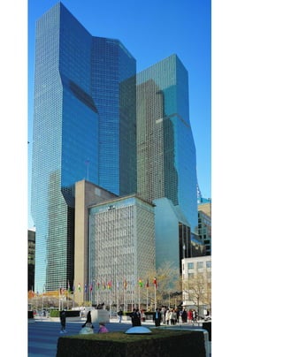
![acute rather than orthogonal, highlighting their
stylistic rather than structural role. No. 1 is quite
anthropomorphic, with a “shoulder” and squar-
ish head like a sphinx. There is a delicate contex-
tualism for such large buildings: in color and
structure, both towers are a tribute to their
iconic neighbor, the UN Secretariat. The illu-
sory scale of the grids is an indirect reference to
the opaque glass panels on the north wall of the
UN General Assembly. The 40-story No. 2 folds
in at the corner up to its twelfth story, in defer-
ence to William Lescaze’s high-modernist
Church Peace Center (1962) at the corner of
First Avenue and East 44th Street.
The mirrored interior is like a fun-house,
fracturing space into planes of reflections, solids,
and clear space. The beehive-pyramided recep-
tion area creates an infinity of mirrors and lights,
a counterpart to the deceptions of the reflective
façade. This is a postmodern update of the dark,
faceted, Expressionist Chrysler and Daily News
Buildings. There are a few modernist fantasy
touches as well: a skybridge connects the towers,
and there is a swimming pool on the twenty-sev-
enth floor. More recently, Donald Trump has
sewn together a package of air rights and zoning
easements, and plans to build the world’s tallest
residential skyscraper, an 861-foot-tall glass
tower, at First Avenue and 48th Street that
would overshadow the Secretariat.
L
i k e t h e Citicorp Center, the UN
Plaza buildings are an early departure
from the Internationalist aesthetic of
structural expression. While Kevin
Roche and John Dinkeloo’s Ford Foundation
(1963–68) two blocks away reveals the anatomy
of a skyscraper, like a building turned inside out,
their glass-sheathed UN towers are as cryptic as
possible, like a man hiding behind mirrored
sunglasses.
The blue-green skin, gridded with near-
flush aluminum mullions, has the weightless,
abstract quality of folded graph paper, or
origami in glass. The surface tells you next to
nothing about the building’s internal steel cage
construction. The aluminum grid does not cor-
respond the interior floor levels—the horizontal
4-foot, 7-inch by 2-foot, 7.5-inch panels divide
the floors into four—so there is no way of telling
visually how tall the building is. The lack of
scale is heightened by volumetric illusions. From
some angles, the creases of the building are so
[ 1] The UN Secretariat and Plaza guard the East River waterfront. [ 2] Unlike 1 and 2 UN Plaza, Roche and Dinkeloo’s
Ford Foundation Building at 320 East 43rd Street reveals the anatomy of a skyscraper.
139
1and 2 UN PlazaFIRST AVENUE AND EAST 44TH STREET » KEVIN ROCHE JOHN DINKELOO & ASSOCIATES, 1976 AND 1983
sharp that the planes of glass look perfectly two-
dimensional. At night, when interior lights are
on, the sudden perception of depth in a wafer-
thin plane appears to be an optical illusion. At
street level, the façade billows into an unsup-
ported glass skirt that floats like a hydrofoil.
The buildings are marvelously responsive
to atmospherics. Against a clear blue sky, the
glass seems to dematerialize altogether, leaving
only the gleaming grid of mullions so that the
steel-cage is expressed after all, but in a refined
and idealized way. The glaucous-colored glass
looks different in shade and sunlight, adding a
textured appearance. On overcast days, the mass
of the building seems to simply drift off into the
sky like trailing clouds. The tower forms play off
of each other and the void of sky between them.
The towers recapitulate and extend the
history of skyscraper design. The earlier, 39-
story, 505-foot-tall No. 1 building is in the set-
back tradition, with a recognizable podium,
shaft, and crown, but the transitions are steeply
1
2](https://image.slidesharecdn.com/catzl6xr7qjbywzl3adu-signature-ec0ec1356cdf1cf66b46a9db24b432b8b8c5d53476da6de461fc6b32c36da610-poli-180116170250/85/Manhattan-skyscrapers-155-320.jpg)
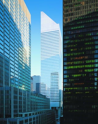
![of concrete in the crown that slides on a thin
layer of oil to convey its inertia to the building’s
structure under high-wind stress. The mass is
“tuned” to counteract the oscillation of the
swaying building, and reduces the motion by
almost half. Diagonal windbraces, repeated on
an eight-story module, run along the perimeter
and are concealed by the skin. After Citicorp
was built, an engineer discovered a fatal design
flaw: the bolted joints were vulnerable to stress
in the extremely high winds that occur once
every 16 or so years in New York. Welders
worked around the clock to add bolted, steel-
reinforced plates over the joints.
The quality of public space here is quite
good. Not since Rockefeller Center have such
pleasant plazas and interior spaces been accessi-
ble from the subway. The steps leading from
street level down to the main entrance double as
seating, and Citicorp’s open base makes the
space seem more like a plaza than a pit at the
foot of a skyscraper.
Citicorp exemplifies a fascinating transi-
tional stage in postmodern design, because it
embraces symbolism over structural expression,
but still adheres to the unity of modernism in its
lack of contextualism and its uniform style. The
signage replaces traditional city lampposts and
street signs, as if delivering a message from the
future. Even the little corner newsstand is
painted a futuristic silver.
T
h e 5 9 - s t o r y , 915-foot-tall
Citicorp Center, containing 1.3 million
square feet, is sheathed in space-age
aluminum and mirrored glass, and
floats on 114-foot tall supercolumns. This is the
city’s first postmodern skyscraper, and it
changed the playing field forever.
The Boston-based architect Hugh Stub-
bins violated two axioms of the Internationalist
aesthetic in the construction of this building.
The first was the absolute ban on applied sym-
bolic decoration. The Citicorp’s distinctive
triangular top was the first purely decorative
crown on a skyscraper since the Art Deco era.
The crown had an ostensible function—it was
intended to be a solar panel in the energy-
conscious 1970s, but it was never used as such,
and ultimately became simply a design expres-
sion. There was a ripple effect in the architecture
world, like the discovery of the emperor’s new
clothes: flat tops were not an absolute verity
after all, but simply another style among many
to chose from. Citicorp laid the groundwork for
[ 1] Citibank’s slick exterior does not reveal the tower’s structural secrets.
141
Citicorp CenterLEXINGTON AVENUE BETWEEN EAST 53RD AND EAST 54TH STREETS » HUGH STUBBINS, 1978
the fanciful variations of the 1980s and 1990s,
such as Philip Johnson’s Chippendale top for the
AT&T Building, Helmut Jahn’s ball-topped 750
Lexington Avenue (1987), and the faceted Louis
Vuitton headquarters (1999) by Christian de
Portzamparc on East 57th Street.
Citicorp is also a departure from the rule
of strict structural expression. Just what holds
this building up, anyway? The flush glass curtain
wall with aluminum spandrels does not offer
any clues. There is a bit of engineering leger-
demain going on here: four supercolumns, flush
with the sides but moved in and centered at 72
feet from the cantilevered corners, support the
building along with the octagonal elevator core,
which stands exposed in the center. Additional
support is provided by the discreet bustle of the
shopping mall in the rear, which functions like
an anchorage on a suspension bridge to counter-
act the weight of the cantilevered structure.
The skyscraper was one of the first build-
ings in the world to use a tuned mass damper, a
400-ton, 30-foot-square, 8-½-foot-thick block
1](https://image.slidesharecdn.com/catzl6xr7qjbywzl3adu-signature-ec0ec1356cdf1cf66b46a9db24b432b8b8c5d53476da6de461fc6b32c36da610-poli-180116170250/85/Manhattan-skyscrapers-157-320.jpg)
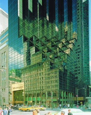
![G
l i t z y ” i s an adjective often
applied to Scutt’s work, and with all
things glitzy—Liberace’s wardrobe,
Las Vegas, the Academy Awards—
there is a strong component of kitsch, vulgarity,
and glamour. Visitors come to Trump Tower to
experience architecture in a way one does in few
other spaces: they ride the escalators wide-eyed,
heads atilt, video and flash cameras at the ready.
The 58-story, 664-foot-tall tower’s six-story
atrium is a sensory overload.
Scutt learned his lessons from Las Vegas.
His materials are sensuous to the point of giddi-
ness: acres of glowing apricot Breccia Pernice
marble (no wonder Italian quarrymen call marble
carne, or “flesh”—there is a Rubenesque carnality
to the whole interior). Flattering bronze mirrors
reflect the surfaces into infinity.The detailing is
exact, down to the bronze Chippendale-topped
showcases capped withT’s forTrump. Real-estate
magnate DonaldTrump is reified throughout,
from awards on the wall to his personal books on
display, like a latter-day Caesar.
The surface glamour almost gets in the
way of perceiving what a fine postmodern space
this is. The building is about surface or, more
[ 1] Trump residences are typically one-third empty, because the owners have multiple homes. [ 2] The Trump’s vertically
aligned setbacks create a sawtooth profile against the sky. [3] Inside: open vs. enclosed space, solids vs. voids, and
reflected vs. transparent surfaces.
143
Trump Tower725 FIFTH AVENUE » DER SCUTT OF SWANKE HAYDEN CONNELL, 1983
accurately, the interpenetration of surface and
space. The skylit atrium is like a carnival hall of
mirrors that splinters and refracts space. From
any vantage point, it is not immediately clear
what is solid surface, what is reflection, and
what is space perceived through glass. The result
is that the whole volume of interior space is
pulled apart, and left that way, like open drawers
in a chest.
Scutt does not try to impose a modernist
unity on the space: it is fragmented and discon-
tinuous in a way that buildings never were
before. Structural columns disappear behind
mirrored panels that make their support seem
illusory. Escalator riders seem to float on air
above mirrored panels, and appear fragmented
and even headless from other angles. Modernists
were always on the verge pulling space apart, but
sought unity; Der Scutt is happy to leave space
in pieces like the shards of a broken mirror. The
disjunctive properties of the interior space are
even clearer now that the atrium is connected by
an interior passage in a postmodern collage to
the oversized basketball gym of Niketown and
the IBM Building courtyard nearby.
The bronze glass exterior is not quite as
exciting, and may have contributed to the build-
ing’s generally low critical rating.The façade sets
back horizontally rather than vertically and cas-
cades into a series of small, planted setbacks in the
base. Philip Johnson and John Burgee used a sim-
ilar technique in their streamlined glassTransco
Tower in Houston, completed the same year.
1
2
3](https://image.slidesharecdn.com/catzl6xr7qjbywzl3adu-signature-ec0ec1356cdf1cf66b46a9db24b432b8b8c5d53476da6de461fc6b32c36da610-poli-180116170250/85/Manhattan-skyscrapers-159-320.jpg)
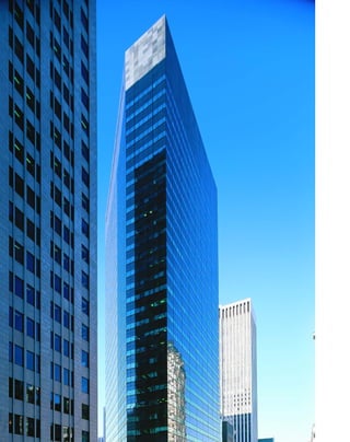
![because Barnes’s principal interest was in unify-
ing interior and exterior spaces. This is a won-
derfully penetrable building. The granite paving
sweeps through a glass-wrapped lobby. The mir-
rored ceiling in the triple-height lobby makes
observers aware of the volume of space that sur-
rounds them, and their relationship to the space.
There is a sense of unity in the detailing: the
floor indicators are floating bands of light,
almost like a Donald Judd sculpture, which in
turn echo the organization of the façade and the
IBM logo itself. The 65-foot-high, 10,000-
square-foot glass-walled atrium that borders on
56th Street unifies the interior with the street.
Lobby, plaza, and street all flow into each other
in the best traditions of Wright and Mies.
T
h e 4 3 - s t o r y IBM Building is a
transitional object between the self-
imposed severity of high modernism
and the new freedom of postmod-
ernism. The building’s principal deviations from
Internationalist orthodoxy are in its use of mate-
rials and its daring lack of structural expression.
Edward L. Barnes luxuriates in shape and color.
The building is boldly sculptural rather than
structural, a faceted, five-sided chunk of green-
gray granite and glass, like a piece of the
Emerald City of Oz. This is one of the more suc-
cessfully lithic new buildings: the heavy cornice
looks like solid stone, and the lobby corridors
look as if they were mined out of a central core.
Barnes was interested in symbolic rather than
purely structural expression: the building corner
that juts over Madison and 57th Street is wildly
cantilevered.
“I think we’re going through a rediscovery
of the entranceway as a space of consummate
importance,” Mary Barnes, a designer for the
firm and wife of Edward Larrabee Barnes, said
[ 1] The glass-enclosed atrium is one of the most successful public spaces in the city. [ 2] The open lobby is accessible
from many entrances.
145
IBM Building590 MADISON AVENUE » EDWARD LARRABEE BARNES, 1983
when the building was opened. “It is once again
seen as a principal part of a building, one that
draws attention to itself, draws the public in and
has a life of its own.”
The façade is organized into a flush cur-
tain wall of alternating bands of continuous
windows and granite spandrels that seem to float
on top of one another. The subaqueous-colored
windows make the building’s skin look slick and
solid, but lights shine through, showing that it is
still a container of space.
Both the banded structure and the lithic
quality of the building have roots in modern
architecture, but their use at such a late stage
makes them postmodern. The bands of windows
that end in razor-thin mullions and make the
building seem to float recall Frank Lloyd
Wright’s Johnson Wax Laboratory Tower in
Racine, Wisconsin (1936–39), and the greenish
stone skin evokes Raymond Hood’s McGraw-
Hill Building.
Despite these postmodern variations, the
IBM remains strongly in the modern tradition,
1 2](https://image.slidesharecdn.com/catzl6xr7qjbywzl3adu-signature-ec0ec1356cdf1cf66b46a9db24b432b8b8c5d53476da6de461fc6b32c36da610-poli-180116170250/85/Manhattan-skyscrapers-161-320.jpg)
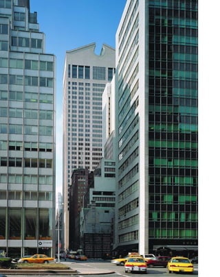
![As Paul Goldberger noted at the time, “it is the
only major skyscraper of the current generation
in New York that will have floor plans of stan-
dard rectangular shape, instead of parallelograms
or polygons.” The individual parts, even if they
do not make for an organic whole, stem from
traditional sources: what is most often called the
Chippendale top was inspired by Hadrian’s
arches in Asia Minor, and the colonnaded base
recalls Rome’s Palazzo Massimo, according to
Johnson. “Idiosyncratic. Self-indulgent.
Frivolous,” scoffed the historian James Marston
Fitch. “This preposterous design is perhaps a
logical denouement for decades of increasingly
mannered historicism.” Johnson himself seemed
delighted with the brouhaha. His name was
once again in the vanguard of design, and peo-
ple were talking passionately about architecture.
Some of the original design’s monu-
mentality was toned down by Sony, who leased
the building in 1991. For example, Genius of
Electricity (1916)—a gilded, 24-foot-tall statue of
a winged man bearing lightning bolts and elec-
trical cable by Evelyn Longman that topped the
former AT&T headquarters at 195 Broadway—
once dominated the 65-foot-high loggia under a
gilded, cross-vaulted arch ceiling. The statue
now resides at AT&T’s operating headquarters
in Basking Ridge, New Jersey. A 1994 remodel-
ing by the firm Gwathmey Siegel turned the
base’s drafty, seldom-used, open arcade into a
livelier, glassed-in, commodity-filled mall.
A
s a critic who helped define the
International Style, as Mies’s associate
architect on the Seagram Building,
and as the designer of his own iconic
Glass House (1949), Philip Johnson has impec-
cable high-modernist credentials. But his 42-
story, rose granite–clad AT&T Building was
designed specifically to stand all the received
knowledge of Internationalism on its head.
Johnson deliberately made the decorative
elements of the AT&T Building its most salient
feature. With its overscaled, broken-pediment
top and giant arched entryway, the AT&T was
one of the most controversial buildings of the
decade. Nobody had seen anything this aggres-
sively postmodern on such a large scale before.
The brilliant formalist reversal of the
scheme is that the decorative elements have true
weight and heft, while the structure seems a bit
two-dimensional and sketchy. The giant 34-foot-
in-diameter keyhole oculus looks like a core
sample was augered out of solid granite, and has
more weight than the rather flimsy-looking
[ 1]These elegant elevation drawings reflect the tower’s Renaissance origins. [ 2] Johnson’s once-controversial
Chippendale broken pediment is now a familiar landmark.
147
AT&T Building(now Sony Building) 550 MADISON AVENUE » PHILIP JOHNSON / JOHN BURGEE, 1984
shaft. The base features an overscaled Renais-
sance arch with a thickly articulated molding,
heavier even than the skinny, continuous
mullions.
The result is a shade cartoonish—a monu-
mental top and a monumental base on a
stretchy, hyperextended tower, set on an avenue
so narrow that the viewer cannot even take in
the whole thing at one time. “It was a normal
thing to break the pediment somehow, though it
is so much against the canons,” Johnson recalled
in his oral biography. “I had a classicist working
for me at the time who said, ‘You can’t do that!
You have to put back the molding.’ That was
fun and games for us.” Some critics were less
than amused, however. “It is a very funny place
in which all of the grand gestures have gone
foolishly or fatuously awry,” Ada Louise
Huxtable sniffed, “but one doubts this was the
kind of wit the architects intended.”
Or perhaps it was. There are a lot of inter-
esting twists here. In many ways, despite its
bizarrerie, this is a resolutely classicist building.
2
1](https://image.slidesharecdn.com/catzl6xr7qjbywzl3adu-signature-ec0ec1356cdf1cf66b46a9db24b432b8b8c5d53476da6de461fc6b32c36da610-poli-180116170250/85/Manhattan-skyscrapers-163-320.jpg)
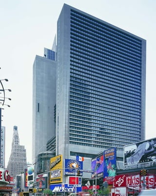
![hermetic verisimilitude of the tritest science fic-
tion sets, like Logan’s Run. The building required
so many zoning variations and easements in the
course of its 12-year development that its style
was already out of date by the time it was built.
The atrium looks as if it was designed on laugh-
ing gas but provides the same pleasures as an
amusement park: test-tube-shaped exposed glass
elevators rocket up and down the vertiginously
narrow space, disappearing through holes in the
ceiling and floor. The city’s only revolving
restaurant is located here; there is also a revolv-
ing bar on the eighth floor, but it has no views
worth speaking of. The series of exits from the
1,600-seat Marquis Theater, which supplanted
three older theaters, is so complicated that it
resembles a Rube Goldberg device. The exterior
street level is sprouting new electronic signs like
lichenous growths. As Rem Koolhaas wrote:
“Since the Romans, the atrium had been a hole
in a house or a building that injects light and
air—the outside—into the center; in Portman’s
hands it became the opposite: a container of
artificiality that allows its occupants to avoid
daylight forever—a hermetic interior, sealed
against the real....With atriums as their private
mini-centers, buildings no longer depend on
specific location. They can be anywhere.”
T
h e a r c h i t e c t and developer
John Portman is best known for build-
ing destination points for cities that no
longer had urban centers, such as
Atlanta’s Peachtree Center (1976) and Detroit’s
Renaissance Center (1977). His 54-story, H-
shaped concrete slab is the closest thing New
York has to the forbidding but interesting pro-
jects of the Italian futurist architects Antonio
Sant’Elia and Mario Chiattone, with their mul-
tistoried blind walls. The building is situated in
the bow tie of Times Square and epitomizes an
era of urban planning. Although it is thoroughly
un-New York in character, the building is fasci-
natingly effective taken on its own terms.
Planned in the mid-1970s, when Times
Square’s reputation was as its lowest, the whole
building seems to turn its back defensively on the
street. Like Ifill, Johnson & Hanchard’s awe-
somely hostile Harlem State Office Building
(1973), the Marquis shuns the street. “We knew
we had to overcome the negative image of Times
Square,” Portman said, so he “created a design
that looks to security, though not in a negative
way.” How negative is a matter of opinion; the
[ 1] Portman’s Marquis Theater creates a sea of red plush. [ 2] The Marriott Marquis’s atrium evokes science-fiction
imagery. [3] A cross-section shows see-through elevators ascending to a revolving restaurant.
149
Marriott Marquis Hotel
1531–1549 BROADWAY » JOHN PORTMAN, 1985
Marriott’s soulless blank concrete wall is even
less giving toward the street than its neighbor,
One Astor Plaza. Between them, they create a
concrete wind tunnel rather than a city block.
From street level, the deeply recessed windows
behind concrete sills seem to close up like a
giant Venetian blind, an appropriate image for
an overscale hotel of 1,900 rooms. Like the
Mongols, who despised cities so much they tore
them down stone by stone, the architects of the
Times Square revival “created a desert and called
it peace,” in the words of historian Harold Lamb.
The detailing is ghastly—minimally tex-
tured concrete, rough edges, and bare bulbs
stuck in gutters in keeping with the “show-
biz” environment. But the antiurbanism here is
insidiously brilliant—the entrance is not from
the Broadway front, but from a pedestrian-
unfriendly interior private road, so that it makes
more sense to enter by car than on foot. The
lobby was designed to filter out the unsavory
mix of street life from Times Square: the 400-
foot-high atrium, one of the tallest indoor spaces
in the world, does not even begin until the
eighth floor; and a glass-encased ground floor,
dominated by a security desk, connects with
the atrium via a series of escalators. The struc-
ture, though brutal, is directly expressed: a 112-
foot steel truss joins two vertical, 36-foot-deep
concrete-clad steel slabs.
“When you are in them, Portman’s worlds
are completely convincing,” Vincent Scully
noted, but this building has the same kind of
1
2
3](https://image.slidesharecdn.com/catzl6xr7qjbywzl3adu-signature-ec0ec1356cdf1cf66b46a9db24b432b8b8c5d53476da6de461fc6b32c36da610-poli-180116170250/85/Manhattan-skyscrapers-165-320.jpg)
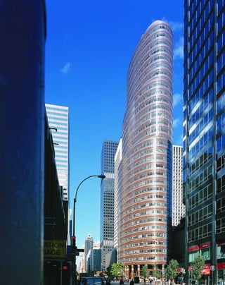
![expresses volume, the Lipstick has a bumptious,
segmented curve that calls attention to itself not
as a container of space, but as an irregular sculp-
tural line. The principle of regularity, too, goes
by the boards. The Lipstick’s ellipsoidal ceilings
are wildly impractical from the point of view of
installing standardized lighting and ventilation
fixtures. Discontinuity is emphasized at every
level; the twinned columns at the base look
ready to march off in different directions like
giant soldiers from The Nutcracker Suite. The
capitals do not quite seem to touch the lintels,
which adds to the impression of instability.
“I’m a jumper-arounder anyhow,”
Johnson wrote in the foreword to the 1995 edi-
tion of The International Style. “Architecture’s
hold as art on professional and public intent is
as precarious as it was in 1932.” In his latest
work, Johnson appears to be abandoning all
notions of Euclidean geometry with his project
for the boneless Peter Lewis Guest House (1995)
in Lyndhurst, Ohio.
[ 1] The ellipsoidal floor plan added to the cost of lighting and HVAC installation.
151
Lipstick Building885 THIRD AVENUE » JOHN BURGEE WITH PHILIP JOHNSON, 1986
I
n t h e Lipstick Building, Philip Johnson
put forth an even more heretical proposi-
tion than the assertion that applied symbol-
ism was more interesting than structural
expression: they dared to say that architecture
was a game of passing styles, more akin to fash-
ion than a search for perfect forms. Johnson
began to refer to a building’s exterior cladding as
“heavy dress,” implying that architectural style
had no more real significance than hemline
lengths. Such talk made the architects who were
looking to add their designs to the canon of
twentieth-century architecture nervous. But if
fashion is so transient, why does the Lipstick
work so hard to be a singularity?
The 36-story story, elliptical, dusty-rose
glass and granite façade evokes the glamour of
Art Deco. Immediately dubbed “the Lipstick”
because of its three-tiered telescoping parti, the
off-center tower recalls the smokestacks of a lux-
ury steamship, but does not quite look like any-
thing that came before it. The whole building
has a nervous, unstable energy, a faster-motion
version of the Flatiron’s forward-looking mod-
ernism. The brushed steel bands of the wobbly
façade catch the light like bangles on the arm of
a woman making a hectic gesture at a party.
Further, glass buildings were usually envisioned
as faceted crystals, whereas this one is smooth;
they are supposed to be light, while this one has
the ponderousness of stone. Buildings are sup-
posed to be enduring statements, but Johnson
and Burgee seem to have chosen a nail-polish
color from the mid-1980s and applied it to their
façade, making it as much a period piece as
Raymond Hood’s sea-green McGraw-Hill
Building.
From his offices on the sixteenth floor of
the Lipstick, Johnson seems to have gone com-
pletely against his early manifesto with Henry-
Russell Hitchcock, The International Style
(1932), which grew out of their definitive exhibit
at the Museum of Modern Art that same year.
Instead of a smooth, continuous surface that
1](https://image.slidesharecdn.com/catzl6xr7qjbywzl3adu-signature-ec0ec1356cdf1cf66b46a9db24b432b8b8c5d53476da6de461fc6b32c36da610-poli-180116170250/85/Manhattan-skyscrapers-167-320.jpg)
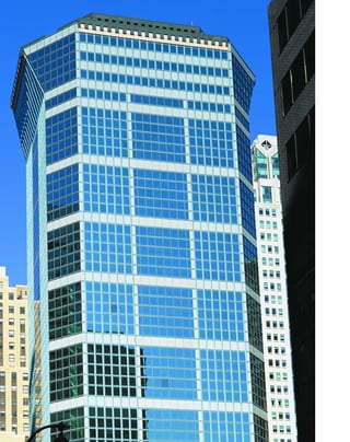
![Building a tower next door to perhaps the
most famous and beloved skyscraper in the
world could be a thankless task, but Jahn han-
dles it graciously. He pays the Chrysler the ulti-
mate compliment by simply mirroring it; 425
Lexington provides a life-size image of the
Chrysler in its own reflective glass, with a kind
of postmodern twist provided by the distortions
in the glass itself. Jahn’s crown supports rather
than competes with the Chrysler’s baroque spire,
another subtle and generous gesture. The angled
top of 425 echoes the angles of the urn-like radi-
ator caps on the Chrysler at a similar height.
The façade of 425 Lexington also recalls the
Chrysler’s organization of horizontally aligned
framing corners and vertical central bays.
In other aspects 425 Lexington is very
much a product of the late 1980s, with its
overkill use of costly looking materials, and par-
ticularly in its rose and aqua coloring, the signa-
ture colors of the period. The triple-height,
marble-lined lobby is vacuous but, once again,
generous to its neighbors; the glass entryway
nicely frames the Art Deco glories of the
Graybar Building (Sloan & Robertson, 1927)
across Lexington Avenue.
[ 1] The mid-1980s were marked by conspicuous consumption of stone and of space. [ 2] The architect’s sketches
emphasize the façade’s textural qualities. [3] Retail space and a vast lobby wrap around the elevator core.
153
425 Lexington Avenue
HELMUT JAHN, 1988
U
n l i k e m a n y postmodern archi-
tects, who seem burdened by the
weight of history and stultified in try-
ing to find some new wrinkle, the
prolific Helmut Jahn appears to be enjoying
himself. Some of the best examples of the
German-born, Chicago-based architect’s work
are the bizarre, 17-story sliced-cylinder aerie of
Chicago’s State of Illinois Center (1985), and the
joyously retro glass spire of Philadelphia’s Liberty
Place (1987). But there is a lot of Jahn’s work in
New York, including the 36-story Park Avenue
Tower at 65 East 55th Street; the 69-story, 830-
foot-tall, Moorish-domed CitySpire (1989) at 150
West 56th Street; and the 31-story 750 Lexington
Avenue (1989). The latter, a mushroom-topped
structure, is a very good building, especially con-
sidering its challenging site, and is highly repre-
sentative of mid-1980s postmodernism.
The best part of 425 Lexington is its sense
of play with historical forms. Jahn designed the
building as a free-standing column, with a dis-
tinct podium, shaft, and cornice. However,
unlike eclectic buildings, the crown, which juts
out at an angle over the sidewalk, is actually
functioning office space. From inside, the occu-
pants, should they choose, can look straight
down the sheer face of the building. The silhou-
ette that flares at the top has historical origins in
the Palazzo Vecchio of 1314 in Florence, and fas-
cinating postwar Milanese experiments such as
Ernesto Nathan Rogers and Enrico Peressutti’s
Torre Velasca (1956–58).
Jahn’s sly wit emerges in his dialogue with
neighboring buildings. This is an architecturally
rich and dense area: the Chrysler Building is just
across the street, and the Citicorp Headquarters,
the UN Plaza Buildings, and the UN
Secretariat—all distinctive glass towers—are
within sight. Jahn’s work complements its prede-
cessors: the blue-green glass is a tribute to the
Secretariat, the massless folded glass planes
evoke the UN Plaza towers, and the angled top
is a variation on the Citicorp’s perfect triangle
top. Its chamfered, octagonal parti is a nod to
the Pan Am Building.
1 2
3](https://image.slidesharecdn.com/catzl6xr7qjbywzl3adu-signature-ec0ec1356cdf1cf66b46a9db24b432b8b8c5d53476da6de461fc6b32c36da610-poli-180116170250/85/Manhattan-skyscrapers-169-320.jpg)
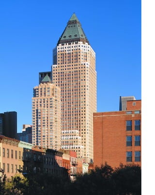
![Building, with its wasp-waisted shaft was truly
the last of its kind before the Depression; after
World War II, the squat 100 Park Avenue became
the model. Postmodernists synthesized the two,
to make fat, blocky, setback skyscrapers that do
not sacrifice any floor space for the sake of
design. Childs’s Worldwide Plaza contains acres
of space, from the vacuous, Mussolini-scaled
lobby to the fatuous subway “improvement” that
provides picture windows with nothing more to
show than the tiled hole of the subway entrance
three stories below grade.
The building’s best feature is its elliptical,
barrel-vaulted pedestrian loggia at the base,
evocative of the Renaissance, although on a
grander scale. The shaft of maize- and rust-
colored patterned brick above the granite-
sheathed platform is organized into an overly
fussy rhythm of one and two window bays, but
the setbacks are appealingly decorated with
lighter brick, like snowcaps. The payoff comes
at the last setback, when the double bays are
deeply recessed to form an arcade reminiscent
of Trowbridge & Livingston’s monumental
Bankers Trust Company Building (1912), and
especially Cass Gilbert’s stout New York Life
Insurance Company Building (1928), which
served as an overall inspiration for Childs. It
appears that the designers took real joy in the
ornamental, internally lit, glazed pyramid atop a
steeply sloped copper crown. At night, with the
carminative mists emanating from the HVAC
system, the building has the drama of a rocket
ready for liftoff.
The complementing, 38-story condo-
minium tower on the south side of the plaza by
Frank Williams of Skidmore, Owings & Merrill
is as open and glassy as the Worldwide is lithic.
The tower’s window corners end in thin steel
mullions, where the clear blocks alternate with
the solid ones. The building scales itself down
nicely to the surrounding low-lying neighbor-
hood of Clinton with five-story mansionettes
that match the tenements across the street in
height. Even a decade later, the gentrifying effect
has not quite taken hold, and much of the retail
space here, the site of the second Madison Square
Garden of A. J. Liebling’s day, is still vacant.
[ 1] The Worldwide’s shaft is proportionally broader than in eclectic skyscrapers. [ 2] An overscaled Renaissance rotunda,
bottom, is one of the site’s best features. [ 3] The crown reflects the glamour of earlier eras.
155
Worldwide PlazaWEST 49TH TO WEST 50TH STREETS, BETWEEN EIGHTH AND NINTH AVENUES »
OFFICE TOWER, DAVID CHILDS; CONDOMINIUMS, FRANK WILLIAMS;
BOTH OF SKIDMORE, OWINGS & MERRILL, 1989
T
o o m u c h complexity and contra-
diction can be exhausting. The mind,
like a classicist, seeks integrated pat-
terns in the world, and the task of
breaking down patterns into their component
pieces in order to decode them can be frustrating.
Parts of Skidmore, Owings & Merrill’s stone-
clad, retro, 48-story, 770-foot-tall Worldwide
Plaza are very good; the silhouette, too, is good,
but it does not necessarily make as good a whole.
The tower has a splashy base and crown
and a bloated shaft that looks better from far
away on the skyline than close up. David Childs,
the design architect, said he wanted to make his
tower “the perfect example of what we all imag-
ine around the world to be the great American
classical skyscraper.” Rather than just a high-
rise, he wanted his building to have the panache
of “the drum major in the Rockefeller band.”
The tower lacks Rockefeller Center’s sweetly
naïve spirit, yet still manages to be a distinctive
presence on the midtown skyline.
The chief difference between Art Deco
spires and their postmodern cousins is in the
amount of sheer floor space. The Cities Service
1
2 3](https://image.slidesharecdn.com/catzl6xr7qjbywzl3adu-signature-ec0ec1356cdf1cf66b46a9db24b432b8b8c5d53476da6de461fc6b32c36da610-poli-180116170250/85/Manhattan-skyscrapers-171-320.jpg)
![a special zoning code for the scale and location of
all new signage in the area to preserve some of
Times Square’s carnivalesque atmosphere.)
The building is organized into three main
sections, with its platform oriented toward the
diagonal of Broadway. A blind, curved, mechani-
cal floor of heating and ventilation grilles pan-
eled in shiny aluminum facilitates the transition
to the office tower, which is laid out orthogonally
along the street grid. Shallow setbacks at the
crown evoke Art Deco skyscrapers. Only from a
distance does the sloping, ornamental roof spring
into view to provide a distinctive silhouette.
The grand, through-block lobby provides
one of those great disjunctive postmodern
moments. In contrast to the flashy mutability of
the façade, the interior materials are solid and
luxurious. The glossy black, white, and green
marble floor echoes the tricky gridded patterns
of the façade. A deeply coffered wood ceiling
adds a modernist sense of warmth to the space.
The detailing of the overall motif of circles in
squares is excellent, from the shiny metal disks
under the revolving doors to the round struc-
tural columns and the circular light fixtures set
in wood coffers.
O
n c e t h e modernist aesthetic of
unity and structural expression was
abandoned as yet another historical
style, rather than the irreducible
essence of architecture, architects adopted an
“a-little-bit-of-everything” approach. Gwathmey
Siegel’s first skyscraper is one of the more suc-
cessful, because seeing the building from differ-
ent vantage points makes you perceive it
differently.
The 52-story office tower’s graphic façade
of blue-green glass, white patterned glass, mir-
rored glass, silvery gray aluminum, and stainless
steel can be read in many different ways,
depending on light and atmosphere. It is both
reflective and transparent, giving an illusion of
metallic solidity and glassy evanescence. Details
of the façade, such as the curved aluminum
midsection and the corners tipped with mirror
glass, catch and reflect sunlight. The building
refuses to be perceived as a coherent whole, in
[ 1] Cross sections. [ 2] The disjuncture of the unified interior and the fragmented exterior is itself postmodernist.
157
1585 Broadway(originally Solomon Equities Building) GWATHMEY SIEGEL AND ASSOCIATES, 1990
keeping with the disjunctive aesthetic of post-
modernism, and the jittery, electronic character
of the Times Square area.
The cornice of the platform is defined by
three amber-colored, 157-foot-long zip strips that
flash stock quotes. Pixellated advertisements play
on corner billboards, another step toward the
electronic architecture anticipated in films like
Blade Runner. In reaction to the Internation-
alists’ suppression of applied symbolic elements,
façades are now verging on pure symbolism in
the form of electronic information.
The tower has a sleek, hide-and-seek struc-
ture, with massive framing piers at street level,
but nearly invisible mullions in the tower. One
scans the restless façade the same way one tries to
decipher meaning from the cascading financial
figures of the zip strip. (In the early 1990s, archi-
tectural historian Robert A. M. Stern and
graphic designer Tibor Kalman were retained by
the State Urban Development Corporation to set
2 1](https://image.slidesharecdn.com/catzl6xr7qjbywzl3adu-signature-ec0ec1356cdf1cf66b46a9db24b432b8b8c5d53476da6de461fc6b32c36da610-poli-180116170250/85/Manhattan-skyscrapers-173-320.jpg)
![jumble of signs but the sign with the building’s
name forms a traditional cornice line.
Like Trump Tower, the interior is a shop-
ping mall by any other name, but it is a good
one. Here, deconstructionist architecture is used
for its entertainment value, an appropriate motif
for the multimedia Tower Records store: the
three-level, 140,000-square-foot underground
space is carved into unusual angles and ellipses,
under a ceiling exposed to look like the lighting
grid of a stage set. Structuralism is treated as an
illusion; the supports change from square, mar-
ble-clad pillars to round, plaster-covered
columns as they change levels. What looks like a
major structural core covered in stainless steel
turns out to be a hollow kiosk from another
angle. Even the escalators are sided with glass to
reveal their inner workings.
[ 1] This plan was modified to put the movie theater two stories underground. [ 2] An early version of the atrium, which is
now almost entirely below grade. [3] The Bertelsmann building at night.
159
Bertelsmann Building
(originally 1540 Broadway) SKIDMORE, OWINGS & MERRILL, 1990
E
v e r s i n c e Times Square became
the city’s entertainment district, its
lure has been densely packed public
space for people watching, and a
kinetic cavalcade of electronic pop art in the
form of advertising signs. Discontinuity and
bricolage existed before French deconstruction-
ism; it just took postmodern philosophy to
elevate them to an aesthetic. With post-
modernism, architects no longer felt they had
to unify a building’s image; the 45-story
Bertelsmann Building presents different, and
unrelated, faces.
From the uptown side, the Bertelsmann
resembles a classic Internationalist aquarium,
with its grid of flush, opaque, green glass-cov-
ered spandrels and green-tinted windows con-
nected by aluminum mullions. This orientation
is in keeping with the more business-like neigh-
borhood of upper Sixth Avenue. The hyper-
modern façade seems to terminate next to a row
of low dingy brick buildings, but this is illusory:
the main entrance on Broadway sneaks around
behind them, preserving the block’s clutter and
discontinuity. On the south façade, an extruded
black glass sheath appears to contain squares of
a lighter glass building within, and the top ends
in strangely overscaled parapets. The blank
podium of the entrance maintains the cornice
line of Herts & Tallant’s ornate Lyceum Theater
(1903) next door, the city’s oldest surviving legit-
imate playhouse.
The Broadway front is dominated by a
triangular bay that ends in a skeletal, decon-
structionist pinnacle that hearkens back to
such visionary experiments as Vladimir Tatlin’s
project for the Monument to the Third
International of 1919–20, which resembled the
Cyclone at Coney Island. Skidmore, Owings &
Merrill cannily presents the exposed scaffolding
of a billboard as the image of a Times Square
skyscraper. The bare crown reflects the busy
ground level: they are the same, except for the
veneer of billboards. The podium dissolves in a
1
2
3](https://image.slidesharecdn.com/catzl6xr7qjbywzl3adu-signature-ec0ec1356cdf1cf66b46a9db24b432b8b8c5d53476da6de461fc6b32c36da610-poli-180116170250/85/Manhattan-skyscrapers-175-320.jpg)
![appearing weightless yet providing a textured
play of light and shadow with subtle articula-
tions in the depths of the windows. The different
reflective properties of glass and stone make 712
Fifth succeed as both a foreground and a back-
ground building. The palette is subtly colorful,
with accents of polished black and thermal green
granite. Paradoxically, the detailing makes the
big building feel like a Persian miniature.
William Pedersen has written that he
seeks an architecture that “attempts to combine
simultaneously the formal with the informal,
the figural with the abstract, the monumental
with the human, and the modern with the tra-
ditional,” in a state of what Robert Venturi calls
“difficult unity.”
M
i d - 1 9 8 0 s postmodernism drew
attention to itself by not looking
remotely like anything else around
it. But by the early 1990s, Kohn
Pedersen Fox’s 712 Fifth Avenue was so tastefully
contextual that it is easily overlooked.The
designers seem to have swallowed an architectural
history textbook whole, and integrated nearly all
the surrounding buildings in their slender 55-
story marble- and limestone-clad campanile.
The tower is set back 55 feet from the
avenue in order to preserve the grand façades of
Harry Winston diamonds on the corner, and the
former Rizzoli bookstore and Coty cosmetics
buildings (now Henri Bendel couture). Bendel
was the jewel that preservationists fought to
save, because its Art Nouveau etched-glass win-
dows from 1913 are New York’s only example of
architectural glass by the French designer René
Lalique. William Pedersen of Kohn Pedersen
Fox devised a way to preserve the swank French
[1] The tower synthesizes all the elements of the block front [ 2] The façade integrates seamlessly with Bendel’s
five-story atrium, left
161
712 Fifth AvenueKOHN PEDERSEN FOX, 1991
maison by connecting it as an entrance to 712
Fifth’s lobby, and Beyer Blinder Belle revamped
the store interior with a four-story atrium of
marble and French limestone.
The façade of 712 Fifth takes its keynote
from the small, elegant boutiques at its base.
The lattice-work mullioned windows in the
tower’s central bays reflect Bendel’s delicately-
mullioned shop front, and the materials of
Indiana limestone and white Vermont marble
are a tribute to the luxe retail shops on Fifth
Avenue. The longer one looks at 712 Fifth’s
façade, the more it seems to pick up elements of
every building around it. Aren’t those gilded
spandrels a part of the Crown Building across
the street, and don’t the courses of rock-faced
granite look like the venerable brownstone exte-
rior of the Fifth Avenue Presbyterian Church
on the corner? Even the top, with is flat stone
crown divided into planes, seems to refer to
Edward Durell Stone’s GM Building and
Gordon Bunshaft’s 9 West 57th Street. The two-
in-one façade of 712 Fifth looks right at home
with the gray limestone of Rockefeller Center in
the background, and the marble front of
Bergdorf Goodman in the foreground.
At street level, the cornice of 712 Fifth’s
entrance on West 56th Street fits in unobtru-
sively with the established four- and five-story
cornice line. Etched glass figures of the zodiac
above the entrance echo the Lalique glass. The
“baby grand” lobby is a minor letdown because
of its diminutive scale, but there are some nice
historicist references, such as the customized,
mirror-finish mail chute.
The tower’s concrete tube structure seems
to float masslessly overhead, partly because it is
set so far back from the street as to appear a little
unreal, and because its flush skin and narrow
proportions negate its volume, so that it appears
as a dimensionless plane. The mirror windows
further dematerialize the façade by making it an
abstract grid against the sky. The façade accom-
plishes the seemingly contradictory tasks of
1
2](https://image.slidesharecdn.com/catzl6xr7qjbywzl3adu-signature-ec0ec1356cdf1cf66b46a9db24b432b8b8c5d53476da6de461fc6b32c36da610-poli-180116170250/85/Manhattan-skyscrapers-177-320.jpg)
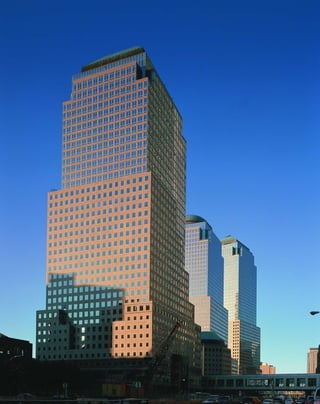
![T
h e w o r l d Financial Center has lit-
tle of the épater le bourgeois confronta-
tionalism of such earlier postmodern
landmarks as Philip Johnson’s AT&T
Building. Instead, the courtly, Argentinean-born
Cesar Pelli, who was the dean of Yale’s graduate
department of architecture, uses postmodernism
as an evolution rather than a negation of mod-
ernism. The four blunt towers of his World
Financial Center, which range in height from 34
to 51 stories, recap and extend the development
of skyscraper style.
The setback façades recount the history of
the skyscraper. Each tower is divided into five
major sections. The platforms appear to be
largely lithic, with windows punctuating a gran-
ite-framed façade, evoking the first masonry sky-
scrapers. The proportions of stone and glass
change at the setbacks. At the second setback the
balance of stone and glass is more even, recalling
the regularity of Rockefeller Center and its
extension west of Sixth Avenue. The third set-
back before the attic is more open and glassy,
with only the thinnest grid of superimposed
granite mullions, like postwar high-modernist
skyscrapers. At the very top stories, the form of
the pure glass cube emerges, like Skidmore,
Owings & Merrill’s flush glass towers, but Pelli
caps these with purely ornamental copper
crowns in the form of a pure pyramid, a
stepped-back pyramid, a dome, and a mastaba.
The setback heights at the third, ninth,
and twenty-fourth floors were determined by the
New York State Urban Development Council, so
that the complex would relate to the predomi-
nant building heights of Lower Manhattan.
Pelli’s towers are wittily contextual: the mastaba
atop the 40-story-tall No. 1 is a visual echo of the
mansard roof of Cass Gilbert’s West Street
Building, across the street. The orthogonal shaft
of No. 3 is torqued on its irregular base, like the
influential modernist parti of Ralph Walker’s
catercorner Barclay-Vesey Building. “The city is
more important than the building,” Pelli said.
[ 1] The Winter Garden, center, a glass-enclosed atrium housing a baroque marble staircase and live Mojave palm trees, is
the heart of the complex.
163
World Financial Center
WEST STREET BETWEEN LIBERTY AND VESEY STREETS » CESAR PELLI, 1985–92
1
“The building is more important than the
architect. I connect with what is strongest in
each place.”
Pelli’s towers reveal themselves to be layers
of buildings, or buildings within buildings. He
refers to the levels of cladding as “jackets.” The
setbacks also penetrate inward, like missing cake
slices, revealing the core structure of glass and
steel beneath the granite. The façades balance
contradictory elements; corner pillars that
appear to be square blocks of granite stand
revealed from another angle as thin façades cov-
ering round steel columns. All three stages of the
illusion are revealed in one vista: fully sheathed
column, column standing beside façade, and
fully exposed column. Similarly, flush windows
appear next to windows with deeply punched
reveals, each negating the validity of the other: Is
the granite wall thick and weight-bearing, or a
mere screen? Pelli’s contribution is to make struc-
ture and nonstructure appear as part of a unified,
modernist-inspired continuum. However, critic
Vincent Scully called the result “bulbous chunks
bloated with rentable floor space. At the same
time, they are thin and brittle in surface, because
Pelli believes that only curtain walls are economi-
cally viable. There is a running argument as to
whether or not he is right.”
Pelli finds a synthesis in the protostruc-
turalism of Victorian glass and steel architecture,](https://image.slidesharecdn.com/catzl6xr7qjbywzl3adu-signature-ec0ec1356cdf1cf66b46a9db24b432b8b8c5d53476da6de461fc6b32c36da610-poli-180116170250/85/Manhattan-skyscrapers-179-320.jpg)
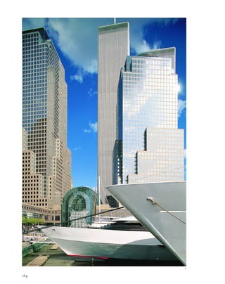
![which he demonstrates as the foundation of
modern and postmodern architecture. The heart
of the complex is the glass-enclosed Winter
Garden. This organiform, Art Nouveau-esque
atrium is 125 feet high, 120 feet wide, and 200
feet long, for a total of 18,000 square feet. A
baroque marble staircase spills into a court lined
with “living columns” of Mojave palm trees.
Some modernist mythology is amazingly
durable: this is the garden under glass of the
Victorian hothouse, with a direct lineage
through Raymond Hood’s hanging gardens at
Rockefeller Center, Roche & Dinkeloo’s glass-
encased Eden of the Ford Foundation Center,
and the atrium of Edward Larrabee Barnes’s IBM
Building. The World Financial Center also has a
dock for luxury yachts, one of which even has a
helicopter on its top deck for quick escapes.
The Winter Garden is a tribute to Joseph
Paxton’s Crystal Palace, built for London’s Great
Exhibition of 1851. Paxton, a gardener by train-
ing, produced the prototype of all steel and glass
architecture to follow with his three-tiered, over-
scaled hothouse, which featured a flush glass
perimeter. This is the basis of modern architec-
ture, Pelli says; the rest is just various states of
dress or undress. Pelli’s essentially Victorian
leanings in the World Financial Center are also
revealed in the choice of fabric applications,
which recall the designs of William Morris.
The different reflective properties of the
materials in the towers give the visual effect of a
skyline in miniature. At sunset, the stone base
darkens before the towers. Interior lights shine
from the stone base, while the glassier midsec-
tion reflects the last rays of color, and the pure
glass tops gleam like distant towers. This is a ref-
erence to the roots of the stone skyscraper in the
Gothic cathedral, where the concept was to pre-
sent an image of the entire city of heaven.
The complex is most effective from an
urbanistic point of view, because it provides a
frame that visually integrates the colossi of the
World Trade Center towers into the skyline.
This was a megaproject seemingly to end all
megaprojects: built at a cost of $1.2 billion, con-
taining six million square feet of offices, and
covering 13.5 acres of World Trade Center land-
fill with a 3.5-acre landscaped outdoor plaza, still
it retains a human scale.
[ 1] The World Financial Center’s waterfront park is a playground for yachtsmen. [ 2] The elevations recap the sky-
scraper’s evolution in their proportions of stone to glass. [3] The spread-out footprint of No. 2 helps integrate the
towers into the skyline. [ 4 ] The footprint of No. 1 features a partial octagon. [ 5] No. 1 is topped by a mastaba, an
Egyptian tomb structure.
165
2 3
4 5](https://image.slidesharecdn.com/catzl6xr7qjbywzl3adu-signature-ec0ec1356cdf1cf66b46a9db24b432b8b8c5d53476da6de461fc6b32c36da610-poli-180116170250/85/Manhattan-skyscrapers-181-320.jpg)
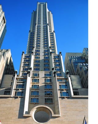
![into 57th Street, and how it sums up skyscraper
development. The obelisk-shaped lanterns recall
the parti of the Ritz Tower down the street, the
world’s first residential skyscraper, and evoke a
sense of shelter appropriate for a hotel.
Alternating flush and recessed windows add tex-
ture to the façade, and there are a few anachro-
nistic symbols of domesticity, such as molded
windowsills punctuated with Edwardian drip-
stones, in keeping with the boldly superfluous
gesture of the ox-eye motif. From certain angles,
the Four Season’s slender shaft, almost unorna-
mented except for its chamfered corners, is
remarkably similar to the Fuller Building next
door, reflecting the Fuller’s Deco glamour. On
the top floor of the Four Season’s east and west
elevations, there are even small, three-sided bay
windows that echo the Fuller’s balconies. The
faceted crown evokes the mansarded Pierre
Hotel down the avenue, and celebrates the joy
of a sculptural object in sunlight.
The monumental, cubic 32-foot-square by
33-foot-tall lobby feels like a not entirely benign
stage set, maybe from a retro-fascist future such
as that in Brazil. A ceremonial Mussolini-esque
reception desk with giant Art Deco lamps is ele-
vated by six steps, more like a desk for a High
Inquisitor than hotel staff. Octagonal columns
that repeat the chamfered exterior reach up to
the softly luminescent, backlit onyx ceiling. The
walls are lined in limestone and mellow Danish
beechwood. The net effect of the interior is
oddly subdued, like the peristyle and hortus of a
classical Roman house.
[ 1] This rendering echoes elements of neighboring towers, including the Fuller, the Ritz, and the Pierre. [ 2] Interior and
exterior surfaces are integrated with matching French limestone. [3] The reception desk, center, is ceremonially raised
above the hotel’s sunken forecourt.
167
Four Seasons Hotel57 EAST 57TH STREET » I. M. PEI, 1993
M
a n y a r c h i t e c t s saw post-
modernism as a return to romance.
I. M. Pei, who worked within an
exacting minimalist lexicon for
much of his career, let out the more playful side
of his character with the Four Seasons Hotel. As
a young student in China, Pei was impressed by
the construction of the 23-story Art Deco Park
Hotel in Shanghai, an event that inspired his
decision to become an architect. Pei had sky-
scraper daydreams early in his career, like his
unrealized project for a helical tower in New
York that looked remarkably like the Capitol
Records Building (1956) in Hollywood.
His 52-story, 682-foot-high Four Seasons
Hotel, the tallest hotel in New York, captures
the romance of a Josef von Sternberg film set for
Shanghai Express. The $360-million, 367-room
hotel features some of the most expensive suites
in the city with panoramic views from the top
floors. The ceiling heights are more than 10 feet.
The top-of-the-line room—the 3,000-square-
foot, two-bedroom presidential suite—costs
$10,000 a night.
The setbacks of warm Magny de Louvre
limestone are demarcated with 12-foot-high
lanterns, which add drama to the sleek setbacks at
night.The base is dominated by a hollow, over-
scale symbol: a giant ox-eye window framed by a
shallow light court—this symbol qua symbol, like
the AT&T’s Chippendale top, has no referent
outside of itself,and is meant to be a visual land-
mark. A steel and frosted glass canopy cantilevers
over the square-arched, 28-foot-wide entrance.
“This was Pei’s attempt to make a big
urban skyscraper,” carped detractors such as
Robert A. M. Stern. “It comes off as overbear-
ing. A hotel should be a delightful place, not an
exalting experience. It’s just vulgar in my view
with all those cheap jewel-like lights.” But the
usually self-effacing Pei, known for his mouse
gray suits and brown shoes, is smarter than that.
The Four Seasons is slyly contextual. It takes a
while to appreciate how well the building fits
1
3
2](https://image.slidesharecdn.com/catzl6xr7qjbywzl3adu-signature-ec0ec1356cdf1cf66b46a9db24b432b8b8c5d53476da6de461fc6b32c36da610-poli-180116170250/85/Manhattan-skyscrapers-183-320.jpg)
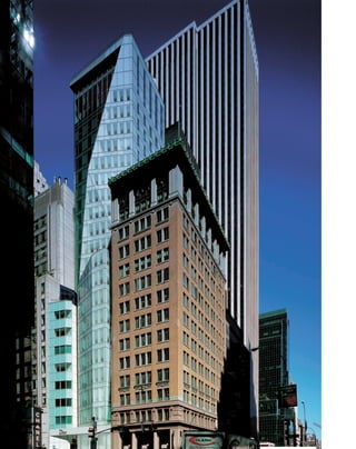
![create a startling contrast between the building
and the volume of space surrounding it. This
factor, perhaps more than any other, turns
de Portzamparc’s design into a true skyscraper
in miniature.
De Portzamparc has realized a German
Expressionist vision of Glasarchitektur—a phan-
tasmagoric, crystalline jewel lit from within. At
night the grid and windows disappear, and facets
of the building glow in cool shades of green.
This makes the LVMH a tribute to the ambi-
tions of great Deco skyscrapers like the Cities
Service Building (70 Pine St.) and the Chrysler
Building to create a cityscape that appeals to the
visual imagination.
L
ouis vuitton moët hennessy’s
24-story, 328-foot-tall American flag-
ship tower—part boutique, part office
headquarters, and seemingly part ice-
berg—is not tall as skyscrapers go, but nonethe-
less has a great impact on the cityscape. Like a
Gothic cathedral, whose myriad turrets and
finials are meant to suggest a vision of the city of
heaven, the LVMH looks like an entire skyline
in miniature. The tricky folds and slices of its
glass curtain wall provide an illusion of much
greater height, so that it vies with older sky-
scraper neighbors like the Fuller Building across
Lexington Avenue.
Even though the site is only 60 by 100 feet,
the building’s footprint is irregular and set back
from the street line. The glass walls angle inward
invitingly. Slender as a Parisian runway model
with a nipped-in waist at the 11th floor, the
tower has a distinctly feminine silhouette.
French architect Christian de Portzamparc
169
LVMH Building
19 EAST 57TH STREET » CHRISTIAN DE PORTZAMPARC, 1999
found an unusual solution to the city’s long-
standing zoning code—after the setback, the
glass wall cants outward at a five-degree angle to
create a little extra floor space for the notori-
ously compact office. The tower at first seems
radically noncontextual, but its jewel-like,
faceted façade makes sense as a symbol for the
luxury goods produced by the owner. It also suc-
ceeds as an emblem of 57th Street, one of the
most expensive retail corridors in the world. A
glowing diamond building does not look out of
place near the granite vault of Tiffany’s. The
façade even contains a gem—a small, angled
blue glass box at the setback.
The two-story base, unified by a shiny
metal belt course emblazoned with the Dior
label, consists of two boutiques that would not
be out of place in the Paris or Berlin of the
1920s. The tower is difficult to take in all at once
because its sweeping zigzag edges take the eye in
all directions, but it is essentially divided into
three major sections atop the stores. Each sec-
tion is distinguished by the use of a different
type of glass. The turret to the west is of light
green glass made opaque with particles of
ceramic, the irregularly angled east side consists
of sand-blasted translucent glass and clear panes
etched with narrow horizontal lines, while the
main tower above the setback at the 11th floor is
of a more traditional International Style dark
green glass, befitting an office headquarters.
A single bay of windows on the east side
slopes back vertiginously like a ski jump, so that
the main setback and the neighboring buildings
seem to loom over the observer like the set of an
Expressionist film. The angled outline of the
main setback and the fact that it tilts out slightly
exaggerate the perspective of traditional vanish-
ing points, so that it seems to taper off into
celestial distances. The heavy cornice also
swoops down to make a giant figure seven across
the building, emphasizing the vertical sweep.
Like the more traditional Lever House, the
LVMH dares to “waste” a lot of its air rights to
1
2
[ 1] The glass silhouette of the LVMH tower is as delicate as that of a Parisian runway model. [ 2] Intricate folds of glass
give the 24-story tower an illusion of greater height.](https://image.slidesharecdn.com/catzl6xr7qjbywzl3adu-signature-ec0ec1356cdf1cf66b46a9db24b432b8b8c5d53476da6de461fc6b32c36da610-poli-180116170250/85/Manhattan-skyscrapers-185-320.jpg)
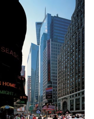
![N
e w y o r k ’ s Urban Development
Corporation’s plan for Times Square
called for four antiurbanistic office
towers by Philip Johnson and John
Burgee to stand guard like cops on the beat over
what was viewed as a squalid street scene. A
subsequent plan, known as “42nd Street Now!”
and created by a consortium of state, city, and
private groups under the stewardship of Robert
A. M. Stern and the graphic designer Tibor
Kalman, prevailed in 1993 and turned
Times Square into a tourist-friendly, themed
outdoor mall.
The plan worked, for better or worse.
Visitors have returned in droves to the eye-
popping, Las Vegas–like blocks radiating from
the bowtie of Times Square, bedizened with all
manner of Jumbotrons and “spectaculars,” as
billboards with special effects are called in the
trade. Even locals can sometimes only gaze
agape at the carnival.
The scheme of four towers was replaced
with four postmodern skyscrapers that cater to
the neighborhood’s eclectic nature. The build-
ings are all taller and more capacious than the
original Johnson-Burgee designs, but are much
more integrated into the street.
The 48-story, 809-foot-tall Condé Nast
Building presents a “collage of visual experiences,”
in the words of architect Bruce S. Fowle. There
are two main experiences: a curvilinear glass
tower that faces the intersection of Times Square
and a more sober-sided granite façade that pre-
sents itself to Manhattan’s traditional business
core to the south and west. The effect is best seen
from a great distance when the shaft’s smart, sil-
very skin glistens like a marlin’s scales. From far
west on 42nd Street, the two distinct sections
appear like parts of a well-integrated cityscape.
[ 1] The collage of the Condé Nast Building reflects the hyperkinetic quality of its environs.
171
Times Square Buildings
Condé Nast Building 4 TIMES SQUARE » FOX & FOWLE, 2001
Reuters Building 3 TIMES SQUARE » FOX & FOWLE, 2001
Ernst & Young Building 5 TIMES SQUARE » KOHN PEDERSEN FOX, 2002
Times Square Tower 7 TIMES SQUARE » DAVID CHILDS, 2004
1
1](https://image.slidesharecdn.com/catzl6xr7qjbywzl3adu-signature-ec0ec1356cdf1cf66b46a9db24b432b8b8c5d53476da6de461fc6b32c36da610-poli-180116170250/85/Manhattan-skyscrapers-187-320.jpg)
![[1] The Condé Nast cafeteria is the only example of the work of Frank Gehry in New York City. Unfortunately, it is not open to
the public. [2] The riot of colors in the Reuters Building reflects the kaleidoscope experience of Times Square. [3] The
glass lobby lets in the kaleidoscope of Times Square.
The element of showmanship is satisfied at
street level on the northwest corner with the
NASDAQ drum, a 90-by-120-foot video screen
wrapped around a circular extension of the
office building, with windows peeping surrealis-
tically through the surface. When images sweep
across the screen, the whole building seems to be
in motion, an example of what Robert Venturi
calls “iconography and electronics upon a
generic architecture.”
Despite its show-biz exterior, the interior
uses a large amount of “green” technology.
Spandrels at the upper level contain photo-
voltaic cells to generate up to 5 percent of the
building’s energy load, and the windows are
treated to block heat from sunlight to lessen the
burden on the cooling system.
1](https://image.slidesharecdn.com/catzl6xr7qjbywzl3adu-signature-ec0ec1356cdf1cf66b46a9db24b432b8b8c5d53476da6de461fc6b32c36da610-poli-180116170250/85/Manhattan-skyscrapers-188-320.jpg)
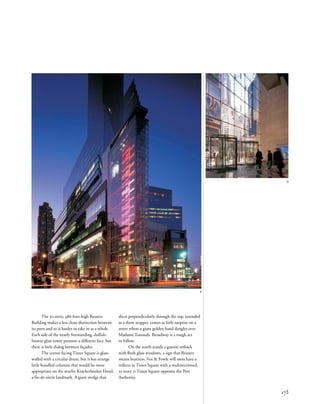
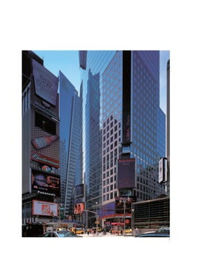
![[1] The 30-story Reuters Building stands in front of the 40-story Ernst & Young Building. [2] David Child's 7 Times Square
made use of a special zoning allowance so that it could rise straight up for 47 stories without setbacks to maximize the
interior space.
175
2
Kohn Pedersen Fox’s 40-story, 575-foot
Ernst & Young Building is built in the spirit of
the other two towers, but has fewer ideas at play.
The applied iconography is less splashy (no
Jumbotrons). Interestingly, KPF arrived at the
parti of two sections split by a beam of white
light, independent of that at the Westin New
York at Times Square by Arquitectonica. Perhaps
both were an homage to the notion of the Great
White Way.
This is a traditional brand of postmod-
ernism. Diagonally sliced metal spandrels seem
to etch a glass triangle on the façade, and a
wraparound glass sheath twists at an odd angle.
Unfortunately, there is not enough tension or
dialectic between the parts, which is what makes
other postmodern designs interesting.
With his boxy, 47-story, 726-foot-tall
Times Square Tower, David Childs is on the
verge of becoming the postmodern equivalent of
the ubiquitous 1960s architect Emery Roth as
New York’s premier packager of commercial
space. The tower takes advantage of a zoning
exclusion and rises without setbacks to provide
maximum square footage.](https://image.slidesharecdn.com/catzl6xr7qjbywzl3adu-signature-ec0ec1356cdf1cf66b46a9db24b432b8b8c5d53476da6de461fc6b32c36da610-poli-180116170250/85/Manhattan-skyscrapers-191-320.jpg)
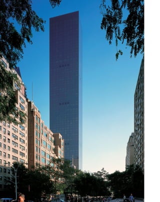
![between the floors. The all-concrete construc-
tion method allowed the building to go up in a
mere 18 months, cutting down on construction
costs and perhaps circumventing community
opposition at the same time. Anchored in
bedrock two stories below the ground, 27 con-
crete columns outline the perimeter of the base,
lessening in number as the height increases. The
columns are lashed together with a full-story
concrete “belt” midway that creates a tube
around the outside of the columns. A similar
concrete band at the top provides lateral
strength. At the crown, a 600-ton damper mass
that responds by computer to wind forces gives
the tower stability in high winds; this is the first
such system to be used in a residential building.
Set atop a broad, two-story base, the
tower rises without setbacks, with its broad side
along the axis of the riverfront to maximize
views and harmonize with the alignment of the
UN Secretariat. The most appealing aspects of
the slab are its dark-bronze, ultra-slick skin and
its daringly narrow proportions. It is one of the
slenderest towers in the city, and its great height
only serves to exaggerate the effect.
The glass skin is one of the sheerest walls
in New York, outside of Gordon Bunshaft’s
Marine Midland Bank Building at 140
Broadway. Except for a barely traced grid of sili-
con seams between the panes, the sleek skin
appears to be a single sheet of glass towering
two-dimensionally over the observer. The
uncompromising smoothness of the surface, its
stark verticality, and its narrowness give the slab
the integrity of a minimalist object.
Kondylis, who has designed about 50
buildings in New York, says the Trump World
Tower is his own tribute to the tower-in-a-plaza
model of Mies van der Rohe’s Seagram Building.
Its dark color works well with the atmospherics
Mies predicted for glass towers, reflecting pat-
terns of clouds and light on sunny days, looking
somber and impenetrable on overcast days, and
blending with the romantic lights of the city by
night. Traditional rather than innovative,
Kondylis’s flat-topped slab is an elegant wafer.
W
h e n t h e developer Donald
Trump announced that he was
planning to build the world’s
tallest residential building next to
the United Nations, local residents understand-
ably feared it would obstruct views and over-
whelm the neighborhood. The initial renderings
certainly looked threatening: a glitzy, bronze-
skinned slab that stood out like a nouveau-riche
arriviste against the staid older buildings of
Turtle Bay and Sutton Place and outshone the
iconic UN Secretariat.
Then came the argument over just how
tall the city was going to allow the Trump World
Tower to be. Civic groups like the Municipal Art
Society—who tend to like the city the way it is,
or, better yet, as it used to be—tried to put a cap
on the building’s height even as steel was being
set in the ground. Local residents, including
Walter Cronkite, railed publicly that the build-
ing would block their million-dollar river views,
which it ultimately did.
Trump craftily cobbled together what are
called “transferable development rights,” buying
up air rights of seven surrounding properties,
including the Japan Society and the Holy Family
Catholic Church. A bonus height addition for
creating a public plaza at the base allowed
Trump to reach his goal—a 72-story, 863-foot
tall tower. Trump originally touted the building
[ 1] Trump World Tower provides floor-to-ceiling views and extra high ceilings.
177
Trump World Tower
1
845 UNITED NATIONS PLAZA » COSTAS KONDYLIS, 2002
as 90 stories tall, because that would be its
height if the floors were the conventional height
of 8 feet. Some of the Trump apartments are pre-
war scale with maid’s rooms, floor-to-ceiling
windows, and unusually luxurious 10- to 16-foot
ceiling heights. For two years, the Trump World
Tower reigned as the tallest all-residential tower
in the world, until it was surpassed by the 883-
foot-tall 21st Century Tower in Dubai, United
Arab Emirates.
If one can say such a thing about a Trump
production, the design by the New York archi-
tect Costas Kondylis is reticent rather than
brash. The curtain wall is a deep bronze, appear-
ing almost black under overcast skies, so that the
freestanding tower recedes and blends into the
East River skyline instead of overpowering it.
The Trump World Tower provides an
interesting contrast to New York’s earlier sky-
scraper apartments such as the Ritz Tower and
the San Remo Apartments by Emery Roth. The
super-rich have long since abandoned attempts
to display status through the trappings of a clas-
sical past, in favor of modernism’s minimalist
aesthetic. In a city as dense as New York, space
and spectacular views are status symbols.
The construction is unusual in that the
building is framed in extra-high-strength, rein-
forced concrete that does not require the added
width of steel beams, allowing for greater height](https://image.slidesharecdn.com/catzl6xr7qjbywzl3adu-signature-ec0ec1356cdf1cf66b46a9db24b432b8b8c5d53476da6de461fc6b32c36da610-poli-180116170250/85/Manhattan-skyscrapers-193-320.jpg)
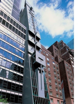
![the façade. The tension between the two equates
steel-and-glass construction with more primitive
stone building.
Blocky stone sections correspond to three
different uses: the rectangle of the director’s
office juts out at the eighth floor; the middle sec-
tion houses a small, wood-paneled performance
space for film and music; and the top is an extra-
ordinary four-level apartment for the director
and his family. Public exhibition galleries occupy
a below-grade space, the street level, and a mez-
zanine. The floor space of the entire building is
an exiguous 33,000 square feet.
Inside the grim visage of this tower beats
the icy heart of a Norn maiden. Materials of
glass, steel, and brushed aluminum give the
lobby an almost clinical feel. The exhibit spaces
are narrow, crammed around the giant stainless
steel drum of the elevator core. But at the same
time everything seems to float weightlessly.
Gorgeous bluestone paving runs throughout the
lobby and up the stairs, hovering over a stainless
steel gutter on one side and empty space on
the other.
As if to compensate for the ponderous
construction and defensive aspect of the exterior,
the interior is as free-flowing and airy as its nar-
row space allows. A rear skylight throws light
over the lobby. The mezzanine goes one step
beyond the floating planes of Mies’s Barcelona
Pavilion to merely suggest spatial divisions with
waist-high planes of glass secured below the
stone flooring, creating almost the Platonic idea
of a wall. There are some lovely illusionistic
details: the turned ends of the tubular metal
handrails stop just short of touching the walls, as
if defying gravity.
By building something brutish and chal-
lenging, rather than attractive and easy,
Abraham has thrown a gauntlet to future New
York architects to go beyond conventional design.
L
i k e t h e lv m h b u i l d i n g ,
the Austrian Cultural Forum presents
both a vertical impact disproportion-
ate to its height and a novel solution to
the setback zoning code. Built on a miniscule
25-foot-wide, 81-foot-deep midblock site meant
for a townhouse, Raimund Abraham’s design
aggressively breaks the vertical row of the street
front with its massive, sloping planes.
The 24-story, 280-foot-tall infill building is
ferociously uncompromising. The Austrian-born
architect said, “It is in the great tradition of the
guillotine.” Its tilting, slablike sections invert tra-
ditional setbacks, overlapping and sliding over
each other so that they appear to be at risk of slip-
ping off the building like an avalanche. Abraham
grew up in the Tyrolean Alps, and his familiarity
with the region’s jagged cliff sides and massively
fortified stone farmhouses is evident here.
The tilted façade exaggerates the conver-
gence lines of perspective, making the distances
[ 1] The interior of the Austrian Cultural Forum is a severe exercise in minimalism, with a “barely there” floating staircase.
179
Austrian Cultural Forum
11 EAST 52ND STREET » RAIMUND ABRAHAM, 2002
seem much greater so that the building looks
like a skyscraper in miniature. Its slippery set-
backs add just the touch of vertigo needed for a
tall building. The proportions of the 25-foot
base compared to the height also make the
building appear much taller than it is.
Anthropomorphic metaphors are nearly
impossible to escape in describing the zinc-and-
glass surfaced building’s physiognomy. Seen
from the street, especially in profile, the façade
resembles a primitive mask with deep punctured
slots like an early Picasso sculpture or an ancient
Greek helmet. The architect himself uses body-
related terms to describe the parti: the heavy
glass façade is the mask, the structure and inte-
rior space are the core, and the sculptural zigzag-
ging concrete fire stairs to the rear are the
vertebrae. The different anatomical pieces are
also meant to represent qualities of architecture:
the vertebrae are lift or ascension, the core is
support, and the mask is suspension.
The forum was built as a high-visibility
showpiece for Austrian culture, but Abraham
rejects any cozy associations with Viennese
finger cookies or similar ornate symbols. His
building is a deliberate atavism to early forms of
modernism, the industrial design of the
Secessionist Movement, whose starkly angular
geometries were so much a matrix of twentieth-
century architecture.
Abraham emphasizes construction above
all, and the strongly expressed structure clearly
shows the influence of the building’s structural
engineers, Ove Arup & Partners. The glass cur-
tain is used for its weight and thickness rather
than its transparency, but the structural cross-
beams are clearly visible through the glass. They
seem to press outward against the buildings to
either side. Zinc sections bump out from the
glass surface like deeply incised stone carvings.
Despite the building’s impenetrable front, one
of its projections looks from the side very much
like a magnified chunk of an International Style
glass curtain wall stuck onto the sloping plane of
1](https://image.slidesharecdn.com/catzl6xr7qjbywzl3adu-signature-ec0ec1356cdf1cf66b46a9db24b432b8b8c5d53476da6de461fc6b32c36da610-poli-180116170250/85/Manhattan-skyscrapers-195-320.jpg)
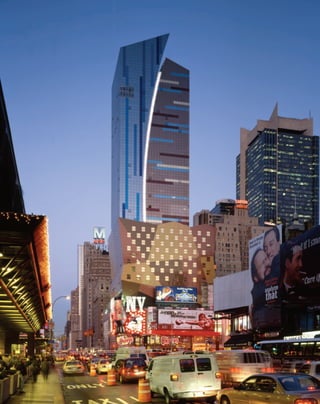
![[ 1] The original parti of the Westin suggests earth and sky split by a comet’s trail. [ 2] The elevations of the building are as
variegated as its surroundings. [ 3] Details of the lobby, including wood paneling and strip lighting in the ceiling, reflect
details of the exterior.
181
Westin New York at Times Square
270 WEST 43RD STREET » ARQUITECTONICA, 2002
D
e s i g n e d b y the Miami-based
firm Arquitectonica, the colorful,
bifurcated 45-story, 532-foot-tall
Westin Hotel looks like nothing else
on the Manhattan skyline and was treated like a
rank upstart by New York critics. The New York
Times called it an “outsider,” but celebrated it as
a breath of Latin modernism. The New Yorker
observed scathingly, “The glass must be the
ugliest curtain in New York.”
But Laurinda Spear, half of the
Arquitectonica team along with her husband
Bernardo Fort-Brescia, says the critics got it all
wrong. “The Westin had nothing to do with
Miami, nothing to do with ‘Latin,’ and every-
thing to do with that particular site,” she insists.
“My mentor, Robert A. M. Stern, was with us at
every stage of the development.”
The Westin stands out because it dares to
use color—lots of it—in the city that cultivated
the monochrome green-glass International Style
curtain wall. Colors, especially the sky-blue and
copper tones chosen by the architects, seemed to
some too upsetting against the general pigeon-
gray background. The color scheme works best
under atmospheric conditions rarely seen in
New York—blue skies and flawless sunsets that
occur all the time...in Miami.
The western façade is silvery-blue deco-
rated with vertical stripes of bright blue, purple,
and lavender that the architects refer to as
“brushstrokes,” while the slightly shorter tower
to the east is covered in coppery glass with hori-
zontal bands of blue and brown. An illuminated
glass arc streaks between the two sections and
lights up like a searchlight at a Hollywood pre-
miere at night. Rather than applying electronics
to the surface like most other architects of Times
Square buildings, Arquitectonica chose to incor-
porate the sign within the structure itself.
An unusually shaped, 17-story “bustle”
clad in colored steel panels brings the 863-room
hotel down to street level on the Eighth Avenue
front. The bustle looks like a child’s cartoon
1 2
3](https://image.slidesharecdn.com/catzl6xr7qjbywzl3adu-signature-ec0ec1356cdf1cf66b46a9db24b432b8b8c5d53476da6de461fc6b32c36da610-poli-180116170250/85/Manhattan-skyscrapers-197-320.jpg)
![183
2
that game, too. Here, the striped motif is carried
out monochromatically in strips of shiny black
and white marble set in gray granite. There are
many elegant details throughout—the principal
motif is picked up in the pastel colors of the ele-
vator banks, recessed copper-colored ceiling
lights, and in the rugs and an etched glass screen
designed by Spear.
The sense of luxury requisite for a $300
million hotel is conveyed through its materials.
Burnished, geometrically angled wooden panel-
ing behind the reception area echoes the serrated
edges of the bustle in warm, rich tones. The
quiet little Bar 10 is paneled in extraordinary,
creamy teakwood stone from Pakistan, and the
floors are zebrawood.
Still, the atrium is not quite grand or spa-
cious enough. There is a lot of wasted space. The
zigzag mezzanine balcony is little more than an
elaborate gangway to the bar, and the big potted
plants only serve to highlight the problem, mak-
ing one think of Frank Lloyd Wright’s observa-
tion that doctors can bury their mistakes but
architects can only plant vines.
[ 1] The Westin stands out in the Manhattan skyline because of its bold use of color. [ 2] The elevators carry through the
hotel’s brightly striped motifs.](https://image.slidesharecdn.com/catzl6xr7qjbywzl3adu-signature-ec0ec1356cdf1cf66b46a9db24b432b8b8c5d53476da6de461fc6b32c36da610-poli-180116170250/85/Manhattan-skyscrapers-199-320.jpg)
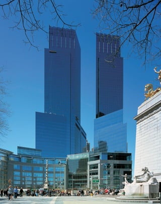
![D
av i d c h i l d s may be the most
self-effacing star architect at work on
the New York skyline. He is nothing
if not contextual. His 53-story, 750-
foot-tall twin-towered Time Warner Building
pays tribute to nearly every element in its envi-
rons, providing a transition from the glassy
office slabs of midtown to the lower, masonry
apartment buildings of the residential Upper
West Side.
The parti is itself contextual. The parallel-
ogram-shaped towers reflect the diagonal swath
that Broadway cuts across the street grid, while
the thick, arced stone base conforms to
Columbus Circle. The finials are a tribute to
modernist apartments such as the Century that
line Central Park West.
Sited between two neighborhoods with
distinct functions, the building creates a sympa-
thetic dialog between height and horizontality.
Because of the towers’ acute and oblique angles,
[ 1] Cornering the market: the Time Warner Building brings an abundance of shopping to an underutilized corner of the city.
[ 2] The building’s footprint conforms to Columbus Circle.
185
Time Warner Building
1 CENTRAL PARK WEST » DAVID CHILDS, 2004
the masses appear to shift depending on from
where they are seen. From certain viewpoints,
reflexive angles make the towers appear stubby
and proportionate to their base, but as perspec-
tive shifts, the façade appears to be thin, almost
evanescent sheets of glass. This effect is opti-
mized when driving through Columbus Circle.
From across the park, the towers appear like
slate-colored mirrors reflecting the sky.
Such responsiveness to the site has gone in
and out of favor in modernism’s checkered his-
tory. Columbus Circle itself once provided both
extremes—the Coliseum convention center that
once stood where the Time Warner is now was a
Robert Moses–era monolith that turned a win-
dowless brick wall on the park. Edward Durell
Stone’s oddly charming Venetian turret, origi-
nally the Gallery of Modern Art at 2 Columbus
Circle, was once mocked for daring to throw in
a curved line, but is now an endangered cause
celebre among modernist preservationists.
2
1](https://image.slidesharecdn.com/catzl6xr7qjbywzl3adu-signature-ec0ec1356cdf1cf66b46a9db24b432b8b8c5d53476da6de461fc6b32c36da610-poli-180116170250/85/Manhattan-skyscrapers-201-320.jpg)
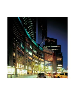
![187
Childs wisely celebrates the Central Park
site with a supersized show window, which also
symbolizes the building’s function as a high-end
shopping center. This is event architecture—
visitors become acutely aware of the volume of
the atrium and the vista of the park through the
window that fills the entire lobby. The best spe-
cial effect is found riding the escalator up from
the subterranean Whole Foods supermarket, an
experience in pure Romantic ascension, rising
effortlessly into the sky like a Valkyrie.
Childs’s personal touch appears to be a
Frank Lloyd Wright–like treatment of floating
planes, but with a Darth Vader leadenness. Seen
from deep within the building, the massive floor
plates hover weightlessly on walls of glass, but at
the same time there is something dark and
oppressive about them, as if they do not let in
enough light. Even the Wrightian built-in
planters on the south façade seem to have a
wicked edge.
The Time Warner Building is at heart cor-
porate architecture, designed to move goods, and
there is something soulless behind its glossy
lobby. Though enlivened with reflections from
glass and polished surfaces, the space itself is not
all that inviting. After taking in the view from an
upper balcony, or lounging on one of the Mies
Barcelona chairs (a nice touch of luxury), there is
little to engage the attention beyond the glitter-
ing distractions of the interior shop windows.
2
[ 1] The Time Warner Building’s stone base contrasts with its ethereal glass towers. [ 2] The open atrium faces on the
statue of Christopher Columbus and leads to shops above and below street level.](https://image.slidesharecdn.com/catzl6xr7qjbywzl3adu-signature-ec0ec1356cdf1cf66b46a9db24b432b8b8c5d53476da6de461fc6b32c36da610-poli-180116170250/85/Manhattan-skyscrapers-203-320.jpg)
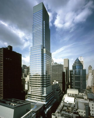
![only provide layouts by a world-renowned archi-
tect, but interiors by French designer Jacques
Grange. The kitchens feature Brazilian granite
floors and restaurant-style refrigerators, while
the baths have marble counters and custom
maple cabinets. Known for his eclectic mix
of classical and modernist elements, Grange
finished the interiors in Tuscan pastels to
counter the cool glass exterior. The setbacks
function as spectacular mullioned extensions of
the living rooms, a conflation of bay window
and corner office.
The Bloomberg Building has a significant
impact on the East Side skyline because of its
full-block site and the lower-lying neighboring
buildings. Pelli said he was pleased to see that his
sky-blue tower was visible from across Central
Park, but the architect is contextual in a gentle-
manly way: the height of the Third Avenue
retail podium acknowledges its neighbor
Bloomingdale’s, while the nautically trim bands
of blue and white are the inverse of the Citicorp
Center a few blocks down the avenue and akin
to Helmut Jahn’s 425 Lexington Avenue. Even
the elliptical atrium is related to the granite-
columned drum in front of 135 East 57th Street,
which frames the tower like a bull’s-eye.
O
n e t h i n g Cesar Pelli, who
designed the World Financial Center,
excels at is delivering a maximum
amount of commercial space. The
Bloomberg Building and its integrated tower of
105 condominiums is an enormous building—
1.25 million square feet (more than 20 percent of
one of the original World Trade Center towers,
by comparison).
Occupying the entire block bordered by
East 58th and East 59th streets and Lexington
and Third avenues, the building’s bulk is dimin-
ished by a clever distribution of volumes. A slen-
der, 55-story tower with an illuminated glass
crown that brings it to 849 feet stands with its
narrower façade facing Lexington Avenue. An
85-foot-tall base unites the tower with an 8-story
podium on Third Avenue, separated by a block-
through porte-cochere with a 7-story conical
glass-walled atrium that is the showpiece of the
composition.
The building is a microcosm of Midtown
pushed skyward, seemingly by sheer real-estate
pressure. The base is given over to retail; the
tower is framed in steel up to the 30th floor to
provide office space, largely as the headquarters
of multimillionaire Mayor Michael Bloomberg’s
financial information company; while the 30th
[ 1] The Bloomberg Tower features a seven-story canoidal, or sloping elliptical, atrium.
189
Bloomberg Tower
731 LEXINGTON AVENUE » CESAR PELLI, 2004
to 54th floors are made of cast-in-place, flat-
plate concrete to provide 10-to-12-foot ceiling
heights for luxury condominiums.
Pelli, like his fellow corporate architects
David Childs and Costas Kondylis, provides a
style that by now could be labeled traditional
postmodernism. Their buildings are solidly
grounded in the modernist tradition, rather
than flying in the face of it. They provide emi-
nently practical programs and just enough com-
mentary on the history of modernism to create a
critical distance. In the Bloomberg Building,
Pelli not only shows he is up to date with the
latest curving computer-generated lines of the
conical atrium, but also provides the simpler
pleasure of reflecting on the nature of steel-and-
glass construction. Horizontal window bands of
tinted blue glass are separated by narrow white
spandrels covering floor plates that resemble
plain steel I-beams. In the corners of the set-
backs, reflections of the I-beams seem to form
steel latticeworks suspended in the sky. The
effect expresses the “truth of construction” in the
modernist tradition, but adds a postmodern illu-
sion of symbolic reflections rather than actual
structure. Retro shallow setbacks add to the
tower’s sense of height.
Pelli admixes symbols of commercial and
residential architecture, befitting the tower’s dual
nature. Seen one way, the I-beams resemble raw
office-tower construction, but from another
point of view they are in the tradition of belt
courses that marked off floors of apartments in
what were once called “French flats,” so that the
individual tenant could have a sense of town-
house-like ownership. The profile of the tower is
clean-lined where the bands of windows meet
with simple mullions but at the same time looks
rather bumpy compared to its neighbors—from
certain angles the I-beams resemble rows of
clapboard.
The bar for luxury living in Manhattan
keeps getting raised higher, so the Bloomberg
condominiums, called One Beacon Court, not
1](https://image.slidesharecdn.com/catzl6xr7qjbywzl3adu-signature-ec0ec1356cdf1cf66b46a9db24b432b8b8c5d53476da6de461fc6b32c36da610-poli-180116170250/85/Manhattan-skyscrapers-205-320.jpg)
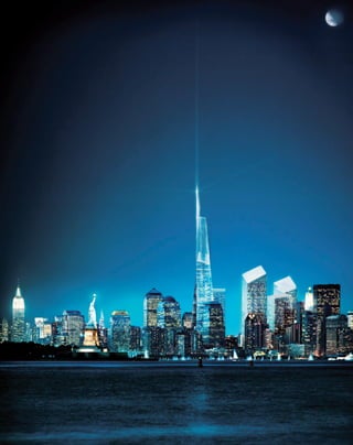
![T
h e f r e e d o m t o w e r , the
centerpiece of the World Trade Center
restoration, has gone through many
permutations but as of this writing still
remains a shimmering mirage on the drawing
board. This much is definite: the spire of the
tower will reach the symbolic height of 1,776
feet, representing the country’s date of indepen-
dence, and the building itself will be 70 stories
tall. The top three stories will contain an obser-
vation deck and restaurants. The tower’s asym-
metrical spire recalls the torch of the Statue of
Liberty, and its open-work steel construction
works on several levels as a representation of
strength, a contextual reference to the suspen-
sion cables of the Brooklyn Bridge, and a ghostly
evocation of the original towers. Libeskind says
his concept of the open fretwork of the tower
“includes the world of the sky above. It becomes
this very open, ethereal building that lets light
right through it.”
David Childs’s 52-story, 750-foot-tall
7 World Trade Center was the first to be under
construction after the attack. Its 10-level base,
which houses a Con Ed substation, was con-
ceived of as a stainless steel block from which a
45-foot-high lobby is carved. The developer
Larry A. Silverstein put a premium on safety, so
the glass façade is made from shatterproof glass
similar to automobile windshields, and the
core is cast-in-place concrete instead of the
former towers’ steel and drywall core, which
melted from the heat of the explosion after the
terrorist attack.
The master plan for the site has a convo-
luted history. The original developer’s proposal
was rejected as uninspired. Then an open com-
petition was held between master architects.
United Architects’ plan showed a group of
torqued towers leaning into each other as if they
were giving a group hug. “The structural con-
cept for the towers has been developed with the
intention of establishing a new tower typology,”
the group declared. Norman Foster weighed in
[ 1] The open fretwork spire of the Freedom Tower will in part be an homage to the cables of the Brooklyn Bridge.
191
Freedom Tower
CHURCH TO WEST STREETS AND LIBERTY TO VESEY STREETS »
DAVID CHILDS, DANIEL LIBESKIND, 2008
with paired 1,764-foot towers that touched at
different points, looking either as if they were
kissing, like the well-known Brancusi sculpture,
or knock-kneed. A consortium of Richard
Meier, Peter Eisenman, Charles Gwathmey, and
Steven Holl designed two provocative, interlock-
ing towers set at right angles like multiplied
stacks of the letter H, with airy “skyway” con-
courses at different levels.
Libeskind’s more conventional design with
its historical connotations won the day. In
commemorating tragedy, there is a pull towards
tradition and the past, to create a sense of conti-
nuity. This is one reason why Maya Lin’s mini-
malist design for the Vietnam Memorial was so
controversial, and veterans demanded a repre-
sentational monument of human figures to
stand beside it.
Further internecine wrangling followed.
Silverstein, who owns the lease to the site,
wanted to bring his own architect, David
Childs, aboard to design the Freedom Tower.
It was agreed that Libeskind would remain the
master planner and his general guidelines and
placement of the tower would be followed, but
specifics for the central symbolic skyscraper
would be left to Childs. They were a Mutt and
Jeff pairing from the beginning—Libeskind is
five feet three inches, mercurial, European,
dressed all in black, while Childs is tall, tweedy,
and stolidly American.
Many features of the 16-acre site have been
determined: Fulton and Greenwich streets will
be reconnected to run through what was an
unused, windblown superblock. “The super-
block was a bad moment in the 1960s,” Childs
says. “Being able to connect neighborhoods is
very different from Yamasaki’s program. There
will be views, corridors, access to buildings.”
Libeskind agrees that “there will be the connec-
tivity of life on the site to all the spaces in
between. The spaces will have a human scale
that offers intimacy and also grandeur.”
The commemorative site will include an
1
exposed section of the slurry wall that formed
the foundation of the original towers and the
“Wedge of Light,” a space between the buildings
that marks the position of the sun during the
time the towers were hit and collapsed. The
footprints of the buildings will feature pedes-
trian ramps leading 30 feet below ground level to
pools of water as part of a memorial called
Reflecting Absence by Michael Arad and the land-
scape architect Peter Walker. Frank Gehry has
been awarded the contract for a new center to
make the complex even more of an architectural
destination.
The jewel in the crown will be Santiago
Calatrava’s World Trade Center Path Station that
alights like a dove of peace at the base of the
center. The columnless, underground space will
be larger than the great room of Grand Central
Terminal. Its glass-and-steel ribbed retractable
canopy will play off the Freedom Tower’s skeletal
steeple.
The task of designing at Ground Zero is
more than replacing the old towers, according to
Libeskind. “I see it as a new neighborhood that
is being created,” he says. “Nobody really needs
skyscrapers, but there is something visceral and
spiritual to put yourself at risk from the cosmos.
That part of New York is not whimsical, and it is
something deeply rooted in why people come to
New York.”](https://image.slidesharecdn.com/catzl6xr7qjbywzl3adu-signature-ec0ec1356cdf1cf66b46a9db24b432b8b8c5d53476da6de461fc6b32c36da610-poli-180116170250/85/Manhattan-skyscrapers-207-320.jpg)
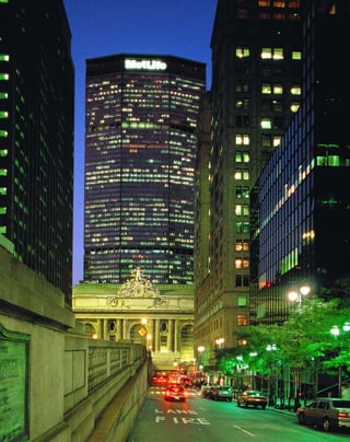
The American Tract Society Building was one of the earliest skyscrapers in New York City, completed in 1895. It was designed in the Romanesque style by architect R.H. Robertson and featured a granite base that took inspiration from Florentine palaces. At 23 stories and 291 feet tall, it was a pioneering tall building but still organized the design horizontally rather than emphasizing its verticality like later skyscrapers would. The building housed the American Tract Society, a Protestant organization that published Bibles, and decorative elements featuring religious motifs adorned the exterior.


