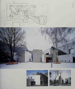
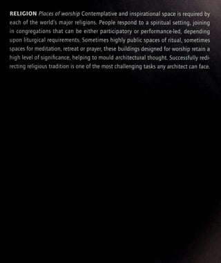
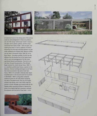
Downloaded 64 times


![iiiiq|i]l
raSliiii111
ilil!!
Iiilllll](https://image.slidesharecdn.com/contemporaryworldarchitecture-151008001113-lva1-app6891/85/Contemporary-world-architecture-49-320.jpg)


![o
o
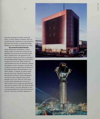
brickwork and decoration. Although Saudi Arabia
can produce a building such as the Palace of Justice
Mosque in Riyadh, 1992, by the Jordanian architect
Rasem Badran - a highly successful fusion of tradi-
tional Nadji architecture with modern techniques -
more normal are historicist mosques such as those
designed by the London-based architect Abdel Wahed
El-Wakil: most notably, his Al Qiblatain Mosque of
1987 in Medina. The divergent approaches of Badran
and El-Wakil have equal validity (the latter's has
more in common with Hindu temple builders), though
Badran is the more interesting to those who believe
that architecture is simultaneously capable of being
progressive and traditional. Badran's mosque, though
rich in ornament to mmimalistically inclined eyes, in
fact starts gently to abstract the elements of its tradi-
tion, which is entirely in keeping with a desert archi-
tecture. One might cite the precedent of Arthur
Shoosmith's Garrison Church in New Delhi, 1928-30,
which abstracts the image of the square-towered
Anglican church in brick rather as Edwin Lutyens pro-
duced the eternal form of the Cenotaph, the empty
tomb. Again, one can point to the return of traditional
forms. The British may not exactly have ushered in an
age of radical architecture during their stewardship of
India, but the promise of Shoosmith's Garrison Church
seemed to have faded by the time AGK Menon came
to design St Mary's Cathedral in Varanasi, 1990-3 -
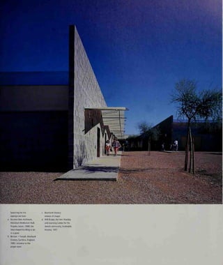
:;
'
—tar —1]7 I
i I
mt uv /](https://image.slidesharecdn.com/contemporaryworldarchitecture-151008001113-lva1-app6891/85/Contemporary-world-architecture-161-320.jpg)


![while the tall prow of the church (the bows of the
ark, If you like) faces away from the village towards
the higher ground that was the source of the
avalanche. Inside, two arches of Cyclopean scale
form the spine of the building while the walls, mas-
sively thick at ground level, gradually taper towards
the top, giving the interior a funnel shape. At their
thickest point behind the altar, a Romanesque apse
IS virtually quarried out, its banded stonework recall-
ing the rural chapels of the Normans. 'The attempt,'
remarked Botta, 'more symbolic than actual, [was] to
handle huge forces.' Sheltered within this dam-like
stone shell, one looks up past the arches and sees
the sky. The interior plan is rendered more subtle by
the fact that the rectangular nave plan of the lost
church is carved out of the thickness of the oval plan
of the new one. Angled, deeply incised, doors lead
defensively from a walled courtyard into the church
either side of the arch-spine. The building, like the
windowless fortress-churches of frontier districts,
appears more secure than it is, for it is still a puny
relative to the forces that could be ranged against it.
But its task is to represent sanctuary and security.
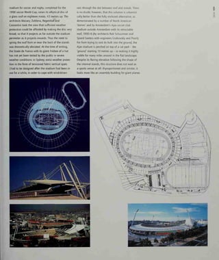
Having designed the Mogno church in
response to a natural calamity, Botta then with
seeming casualness took what amounted to a mould
of the tapering interior of Mogno, inverted it, and
expressed it externally as the cone-shaped roof of
the Church of Beato Odorico, Pordenone, 1987-92;
placed a cylinder within a cube for a church at
Sartirana, 1987-95, and finally re-applied the
Mogno form, on a large scale, at Evry Cathedral,
1988-95. No-one could accuse Botta, as they might
Jean Nouvel, of being profligate with his shape-
making and materials. Evry is so similar to Mogno,
that It appears to deny it its allegedly site-specific
reason for being. It is circular in plan, with a more
complex variant of Mogno's glazed roof on the angle.
The great thickness of the walls here used for ancil-
lary rooms and stairs, with a related apsidal arrange-
ment behind the altar, has a funnelling effect on the
interior, and is plugged into an enclosing courtyard.
But for Botta, the surroundings at Evry are no less
potentially hostile than those at Mogno. The differ-
ence is that, while Mogno shelters the community
symbolically against the forces of nature, Evry does
exactly the same against the forces of modern archi-
tecture. For Botta, Evry's New Town represents the
o
o
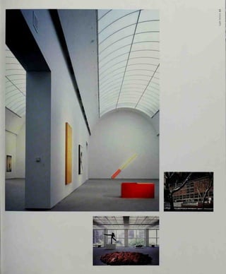
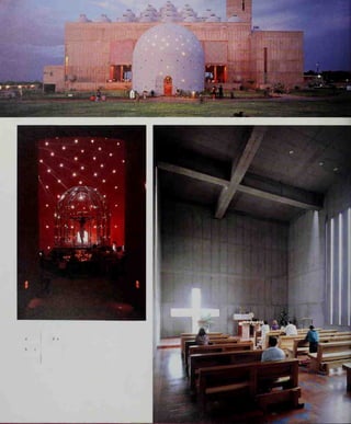
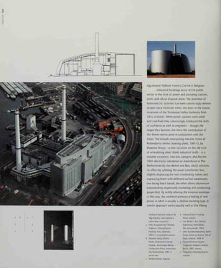
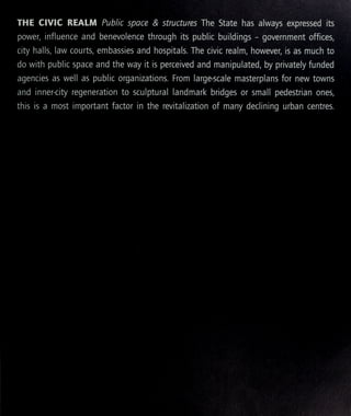
Botta's architecture is ready-
made for churches. The ark,
the sanctuary, the tomb:
Mario Botta, Church, Mogno,
Switzerland, 1986-96: the
elliptical drum is sliced by the
disk forming the roof
Mario Botta, Church, Sartirana,
Switzerland, 1987-95: altar
Mogno Church: the striations
of light from the skylight
crossing the masonry bands
evoke strong compansons
with Evry Cathedral
Sartirana Church: the cylinder
withm the cube
Mario Botta, Church of Beato
Odorico, Pordenone, Italy,
1987-92: looking up towards
the top of the cone
Church of Beato Odorico: view
from beyond the altar
Church of Beato Odorico: the
'beehive' cone of the church](https://image.slidesharecdn.com/contemporaryworldarchitecture-151008001113-lva1-app6891/85/Contemporary-world-architecture-167-320.jpg)
![o
u
very worst kind of modernist planning - rigidly func-
tional, with no room, as he says, for anything but
working and sleeping. 'The objective,' he declared,
'was to offer the city a call to believers that could,
even more importantly, [my italics] have strong mean-
ing for non-believers ... For them, the cathedral can
be seen as a moment of silence and meditation, not
necessarily religious or as a response to the need for
certain functions, but as a place where any citizen
may pause for a while.' In short, Botta wanted to
recapture the perceived community role of the
medieval cathedral, with the modernist housing
estates around standing in for the hovels of the peas-
ants of the Dark Ages. Nevertheless, there are some
highly original touches, although most had previous-
ly occurred on his secular buildings: Botta designed
Evry with a circlet of trees running round the perime-
ter on top, with a covered walkway beneath the tree-
line. While the glazed roof aspires to heaven, the
building thus has a more prosaic function as a van-
tage point. In a way, Botta has evolved his own myth
of church-making that, while clearly personal, he
applies with exactly as much flexibility or rigidity as
those designing mosques. For them, it is the symbol-
ism of the Prophet's House: for him, it is the shelter-
ing cave and the hillside above. And if proof were
needed of the old dictum that museums are the
cathedrals of today - why, Botta took the form of
Mogno and Evry and made it the centrepiece of his
Museum of Modern Art in San Francisco, 1989-95,
(see 'Visual Arts') and for identical reasons: to assert
its presence in the city, to constitute a point of
reference, to bring light washing down from above,
to set up a dialogue with the community, and to act
as an ark of tradition against the glassy vacuousness
of the business district round about. There is even an
apsidal detail at the root of the great circular atrium
beneath that slanting eye-on-the-sky (which at one
point Botta wanted to crown with trees). Wasting
not a single idea, Botta then took the idea of the
walkway round the roof, as used at Evry, and applied
it right back down the scale for his little chapel at
Monte Tamaro in the Ticino. This time he used the
Mogno giant arch element externally, as a bridge
leading to the apex of the roof. Like any medieval
church builder, Botta has his specialized vocabulary:
it is simply that it is personal to him, rather than to
any generalized tradition or system of belief.](https://image.slidesharecdn.com/contemporaryworldarchitecture-151008001113-lva1-app6891/85/Contemporary-world-architecture-168-320.jpg)


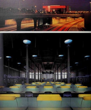
![s
o
'The merchant has always been and will always be
most successful where his activity is integrated with
the widest possible palette of human experiences
and urban expressions.'
Victor Cruen, 1973.
There are shops, and there is retail. A 'shop' -
a term which includes bars and restaurants - can be
the most designed object on earth, subject to the
attentions of the best and most fashionable archi-
tects, and has a glorious, brief, life. One thinks of
Los Angeles watering holes such as the 1986 Kate
Mantilini Restaurant in Beverly Hills by Morphosis, or
RoTo's Nicola Restaurant of 1992-5, or of Branson
Coates' series of Tokyo bars in the 1980s, or of any
hotel restaurant by the designer Philippe Starck.
Retail, in contrast, is a huge and multi-headed organ-
ism. Retail means zoning. Retail means high-streets,
malls, edge-of-town superstores, great big metal
sheds, enormous car parks. Retail has a relatively
long, and usually inglorious, life. One thinks of the
West Edmonton Mall in Canada, or the Mall of
America in Minnesota, both involving Maurice
Sunderland architects - themed private kingdoms.
The world of big retail is a world where architects
with famous names seldom venture. Small wonder: it
is a highly specialized discipline which, like hospital
design, a relatively few practitioners guard jealously
working closely with an equally tightly drawn
circle of financiers and developers. Retail develop-
ments scarcely ever show up in architectural
awards schemes, nor, usually, do their originators
want them to.
A perusal of the standard art-historical
accounts of twentieth-century architecture reveal
that retail gets short shrift if it is mentioned at all.
It is as if it does not exist, yet by any standards the
shopping mall, to take one manifestation of the
genre, has since the Second World War had a greater
impact than almost any other building form, both on
the way people conduct their lives and on the
appearance and usage patterns of towns and cities.
For example: if a modern mall is carved out of a town
with an inherited medieval street pattern, then the
maximum force for physical change is dictated not
so much by swarms of people and their cars, nor
even by the very large areas needed for the big
stores, important though these are - but by the
turning circle of the maximum permitted length of
delivery truck, which is enormous. Towns have to be
broken up to accommodate this dimensional need.
Why the curious silence about retail develop-
ments, save for those rare nineteenth-century exam-
ples that fall within the art-historical ambit because
of their use of advanced materials - the Calleria in
Milan, say, or the great Parisian department stores of
the belle epoque? Robert Venturi has noted the
'mental-aesthetic blackout and photographic crop-
ping' used by architectural historians to focus in on
the things they want to see, to the exclusion of the
rest of the built environment. Venturi notes the way
Japanese temples and shrines are described as dis-
crete objects when they are sited - especially in the
case of Kyoto - in teeming and highly commercial
urban surroundings. This, of course, exemplifies
Venturi's 'complexity and contradiction' theory. In
general American architects and some critics are
more comfortable with commercialism than their
European counterparts - and Venturi's and Denise
Scott Brown's 1972 homage to the Las Vegas com-
mercial strip. Learning from Las Vegas, is rightly cele-
brated. But when Venturi and Scott Brown returned
to the Strip in 1994, they found that it had changed.
The original Strip, rising from the desert, had been
urban sprawl 'at its most pure'. By the mid-1990s, the
Strip had been built up and renamed Las Vegas
Boulevard. '[It] has become in some ways the equiva-
lent of the shopping mall that accommodates the
pedestrian in safe and explicitly artificial environ-
ments,' Venturi noted. He was making no overt value
judgements - his commentary suggests that he saw
this as merely part of the evolution of cities over time
in all kinds of ways. Vegas had changed from pop
culture to gentrification, from pop taste to 'good'
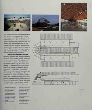
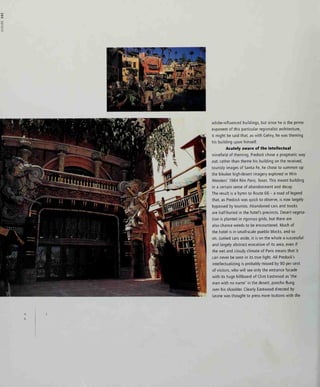
Impermanence offers the
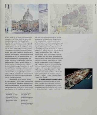
radical an outlet:
a Branson Coates, Caffe Bongo,
Tokyo, 1986
b Branson Coates, Bohemia
Jazz Club, Tokyo, 1986
c RoTo Architects,
Nicola Restaurant,
Los Angeles, 1992-5
d Nicola Restaurant:
interior view](https://image.slidesharecdn.com/contemporaryworldarchitecture-151008001113-lva1-app6891/85/Contemporary-world-architecture-178-320.jpg)


![o
c
=...=:] *^
>
n n an n n
1
rr
":"•"•
t"~™"3
^:^
„
—
=^](https://image.slidesharecdn.com/contemporaryworldarchitecture-151008001113-lva1-app6891/85/Contemporary-world-architecture-323-320.jpg)


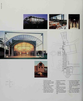
![moved on by the time it came to the 1 50-bed
Kandalama Hotel at Dambuila, 1991-5. Built deep
in the dry-zone jungle of the interior, it is positively
Miesian in the rigour of its timber-framed detailing,
the horizontals extending into timber-slatted balconies
and green planted roofs and terraces. However, it is
not a rectilinear plan but a ribbon. Its narrow wings
are cranked along a contour against a rock face, over-
looking an extensive reservoir. It manages to be at
one with its setting, probably precisely because of its
ultra-simple post-and-beam construction, raised on
pilotis above the otherwise undisturbed landscape.
The Kandalama is an example of an 'eco-hotel',
designed for minimum environmental impact, draw-
ing water from its own wells and with its own
sewage-treatment plant: a model for other regions.
Nouvel, the sophisticated Westerner, is not
such a curious name to yoke with that of Bawa.
Nouvel's Hotel Les Thermes, 1990-2, in the spa town
of Dax, southwest France, has an external facade of
full-height timber shutters, a related solar canopy at
eaves level, and big awnings all round the double-
height common areas at the base - details drawn
from, but not directly copying, the hot-climate indige-
nous architecture. Similarly his earlier Hotel
St James in Bordeaux, 1987-9, broken down into a
cluster of smaller forms rather than being a single
imposing structure as in Dax, sports an external gril-
lage of oxidized steel. Instead of the folding external
shutters of Dax, the grilles rise on gas struts where
they cover the windows. The appearance of the com-
plex makes clear reference to the tobacco-drying
sheds of the region. Inside, the rooms were finished
in plain waxed plaster and concrete - an early exam-
ple of the luxury monk's cell look that was to become
one of the architectural cliches of the 1990s as 'mini-
malism' came back into fashion and architects led by
John Pawson indulged in interiors of 'exquisite
restraint' for exquisitely wealthy clients.
By 1997, even London's boutique hotelier
Anouska Hempel had abandoned her other oriental
cluttered chic look in order to create her eponymous
minimalist-with-a-twist hotel. The Hempel. A noted
stickler for detail, Hempel was quoted as saying,
when her hotel was finished but not yet open:
'Terrible things go wrong when you're working in the
minimalism [sic] because there's nothing for the eye
to look at except light and shade, so it sees all the
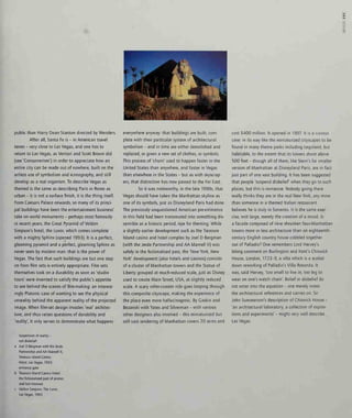
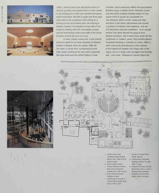
The 'boutique hotel' is now an
established type:
a Jean Nouvel, Hotel Les
Thermes, Dax, France, 1990-2:
exterior view
b Jean Nouvel, Hotel St James,
Bouiliac Bordeaux, France,
1987-9
c Hotel Les Thermes:
swimming pool
d Anouska Hempel Designs,
The Hempel, London, 1997
Kisho Kurokawa, Hotel
Kyocera, Kagoshima, Japan,
1991-5: the legacy of John
Portman's atrium hotels
Philippe Starck, Penninsula
Hotel, Hong Kong, 1987
Aldo Rossi, Hotel II Palazzo,
Fukuoka, Japan, 1987-9](https://image.slidesharecdn.com/contemporaryworldarchitecture-151008001113-lva1-app6891/85/Contemporary-world-architecture-334-320.jpg)


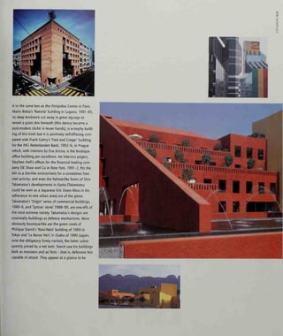
![^^-.^r^
if
*j '4 f# fi • t ' t 'i i
•B IL
i Ml
aHH
who refused to design to any theme but his own -
paradoxically found himself both involved and rea-
sonably happy with the process. Significantly Cehry's
long-term artist collaborator, Claes Oldenburg,
refused to work with him for Disney. Cehry's conclu-
sion was that both Oldenburg and Venturi had the
same problem: Those two get very close to the
Mouse,' he said, 'but Oldenburg and Venturi are also
commentators.' It was that implied commentary that
the Disney organization could not take, and it was
the lack of it in Cehry's case that they appreciated.
Venturi and Scott Brown agreed with Cehry's
analysis of the situation when I put the transcript
to them. 'Denise Scott Brown and I think Frank
Cehry's reporting and interpretations are sound,'
Venturi wrote, adding in parentheses: 'I remember
also at a later meeting with the Disney Imagineers
in California, Steven Izenour [another partner] and I
were called vulgar ...'
One pauses to consider the delicious irony of
the Disney organization convincing itself that one of
America's most academically inclined architects was
a vulgarian. It is a mark of just how seriously Walt's
empire takes itself that it could not recognize a
parallel seriousness m the work of Venturi. He is
clear on the credentials of his practice, concluding:
'There is the irony that Denise Scott Brown was the
first "respectable" architect - along with Charles
Moore - to acknowledge Disneyland, taking her
UCLA students there in the mid-60s. And we both
are fundamentally in our work as a whole (rather
than just for Disney) employers of iconography,
symbolism as valid (and historically substantiated)
elements of architecture.'
Interestingly it is Cehry's view that the forbid-
den ironic view of Mickey as proposed by Venturi,
would have worked in France in a way that it could
not in the United States, presumably on the grounds
that the French, with their European self-awareness
and un-American cynicism, would have noticed and
appreciated the wry gesture.
Such national stereotyping works both ways.
As Jean Baudrillard once acidly observed, Disneyland
exists in order for Americans to believe that what lies
outside it is real. What this stinging generalization
overlooks is that the likes of Venturi and Cehry, with
their Europhile scholarliness, are also 'Americans', no
less than the perhaps more naive Robert Stern, of
whom more in a moment, and Craves. However, the
fact that Crumbach was the only European architect
to get to build at EuroDisney - out of an initial trawl
that also included Bernard Tschumi, Hans Hollein,
Rem Koolhaas, Jean Nouvel, Jean-Paul Vigier and
Aldo Rossi - tells its own story. Rossi got a certain
way down the line but then resigned under pressure.
He wrote to Eisner, astutely (especially given Craves'
built references to the same sculptor-architect in
Florida) comparing his problems with those of Cian
Lorenzo Bernini. Bernini had fallen foul of an over-
demanding and petulant Sun King, Louis XIV, when
asked to produce designs for the Louvre. Rossi told
Eisner: 'I realize I am not Bernini, but you are not the
king of France. I quit.'
Venturi makes no reference to his Parisian
disappointment in his published writings, although
there is a tantalizing essay, written in bursts from
1993 to 1995, comparing the Americanization of
Pans with what he saw as the 'Parisification' of
Philadelphia, his home city. In it he remarks, 'What
if I were to say there's nothing wrong with the
Champs-Elysees that a few billboards won't cure?
Is that so different from saying how about 'grands
projets for South Broad Street?' Despite the
EuroDisney setback, the Mouse did not entirely
forget Robert Venturi and Denise Scott Brown;
the projects they got to do - 'in the interstices'
as Venturi puts it - include a minor office building
on the Burbank campus and a fire station, the
ponderously named Reedy Creek Emergency Services
Center at Lake Buena Vista, part of Walt Disney
World in Florida.
At Lake Buena Vista, Venturi Scott Brown
and Associates produced a building that looks as if
it is a child's building-brick composition - a true
b c
d
e
Venturi Scott Brown and
Associates, Reedy Creek
Emergency Services Center,
Orlando, Florida, 1992-4
Aldo Rossi, Celebration Place,
Orlando, Florida, 1991-6:
Rossi's office buildings at the
heart of Celebration
Celebration Place: serious
urban planning for Disney
Robert A IVl Stern, Wlasterplan,
Celebration, Florida, 1991
Philip Johnson, Town Hall,
Celebration, Florida, 1994-6](https://image.slidesharecdn.com/contemporaryworldarchitecture-151008001113-lva1-app6891/85/Contemporary-world-architecture-340-320.jpg)


![^..
,;-i>:>:'rj5^f/|/2tj
TTwiras
**ii''5
3^Ii
'^i^'O-'^i^l^-i^'i:'!
,
i-S'i5^'i'^5'»*-i^*2'
» >>
i' A- A' i. ^ A' A.
:i§';§)d^^4! lit' :]&:'&'
>»^
qjfi^%%^^ # « ^ » ft « :f {£ « « » Ji'
^^i^^^qj^^^^^^'<|^ ^||: ^' ^i t§: i^ ig:
^'% tg;
^K^ n^^ri^!^''W^l<-'i'i-v'i"r-i'l''l--i-'X](https://image.slidesharecdn.com/contemporaryworldarchitecture-151008001113-lva1-app6891/85/Contemporary-world-architecture-398-320.jpg)


![00
]
5.
^^^."ll
W^ '«inin>»Atij|^^^pUf HtJ: :: J ^^ - _sr«=^H^^5, ^". SSfci:^'
,
^g^lffigl^M ^^MjjS
"Sp;-, . •- ,
l^_ ._.^r''
f-r.,^^ <'i.'^ K«^H^i^r!|V^'''j^SL ^^' '4
m.MSEr^
^
capital for the first time - despite its extreme conti-
nental climate and smog problem - yet its solitary
appearance as the first part of the plan was especial-
ly effective. In its simplicity it can be compared with
another Spanish building, the Sports Centre in
Cirona by Esteve Bonell and Josep Gil, which again
is an expression of the appropriate form - in this
case, the large enclosed clear-span volume - but
steering clear of tin-shed functionalism. Bonell (who
with his then partner Francesc Ruis designed the
well thought-of basketball stadium for the Barcelona
Olympics of 1992) takes the stadium trick of sinking
the arena into the ground, here cutting the volume
of the hall into the sloping site to reduce its appar-
ent volume. Placing a terrace of sloping seating
against the south-east elevation also reduces the
apparent bulk and gives an otherwise internalized
building an eye on the outside world (compare
David Morley's Indoor Cricket School at Lord's,
London, later in this section). Its flanks are relieved
by well-judged openings and canopies for escape
stairs. The resulting relatively low building, finished
in plain concrete set off with heavily veined local
golden stone, is a calm presence in the landscape.
There is always a geometric problem
involved with wrapping a building full of spectators
around a given shape of games area. At the
Colosseum in Rome, the Roman builders overcame
Design engineering in the
service of large-span enclosure:
a RAN International Architects
and Engineers (Rod Robbie
with Michael Allen), Skydome,
Toronto, 1989: Toronto skyline
b Skydome: the roof retracts in
sections
c Lobb Partnership, McAlpine
Stadium, Huddersfield,
Yorkshire, England, 1993-5
d Hellmuth, Obata -I-
Kassabaum, Hong Kong
Stadium, Hong Kong, 1991-5:
underneath the arched lattice
truss of the roof canopy
e Hong Kong Stadium:
aerial view](https://image.slidesharecdn.com/contemporaryworldarchitecture-151008001113-lva1-app6891/85/Contemporary-world-architecture-404-320.jpg)


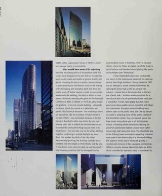
![^
mm
]
1
i M
m
fll'^'
%
^mL .7.-.3^H ^^^1
the invention of the high-speed elevator, coupled
with the progressive refinement of the steel-frame
structure. Today, the latter is no less vital than the
former, since going steadily higher not only requires
an equally steady improvement in the speed and
efficiency of vertical transport, but also demands an
increasingly stiff structure which simultaneously must
not consume too much of the floor area of the lower
regions. The higher you build, the less efficient the
net-to-gross fioorspace ratio of the entire building
tends to become, as the structure thickens towards
the point of maximum load (for services as well as
structure) at the base. Similarly, the higher you go,
the more it costs per gross square foot to build, and
the more it costs to run the finished building.
Therefore from the economic standpoint, skyscrapers
are a very strange way of achieving large amounts of
covered space - unless land is very scarce and expen-
sive indeed, and ground conditions are favourable.
Both conditions apply in rocky, sea-girt
Manhattan and to a lesser extent in lakeside
Chicago, but a financial or corporate district does not
have to be physically restricted and geologically help-
ful in order for its buildings to go high. Proximity of
the main institutions is more often what counts, and
as these expand on their historic sites, up is the only
way to go. As a we shall see, saving land is becoming
increasingly crucial for other reasons, most of them
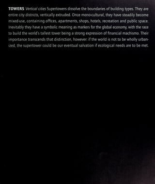
residential as much as commercial. Finally and
inevitably, the symbolic value of the tall building -
to an institution, to a city, or to a nation - can be
sufficient to outweigh any purely financial or space
consideration. Macho it most certainly is. The femi-
nist critic Camille Paglia claimed in 1993 that it was
impossible to imagine a skyscraper designed by a
woman. Nobody contradicted her.
Primitive powered elevators were relatively
common in British factories and warehouses by
1835, transferred soon after to hotels. They were
transformed in the United States when, in 1851,
Elisha Craves Otis devised a safety brake to halt
the car if the hoisting rope broke. Confidence in
the modern elevator arrived at the New York Crystal
Palace exhibition in 1853-4, when Otis personally
cut the rope of his steam-powered elevator in the
observation tower, and visibly did not plummet to
his death. Around this time, the technology of high-
pressure water and gas pipes, and steam-heating sys-
tems, had also evolved to a point where they were
safe for use in high-rise buildings. Hydraulic power
for elevators arrived in 1870 (and was used on the
Eiffel Tower in 1889) and finally, by the turn of the
century, reliable electric power. In the late 1990s
cable-free electro-magnetic lifts, able to move later-
ally as well as vertically, are being developed, liberat-
ing towers such that they can do almost anything.
Even before this technology was adopted, the 1990s
had already seen an extraordinary outbreak of tower-
building, much of it in the Far East. The trend is
inevitably ever upwards. Moreover, it is becoming
normal for such buildings to have a layered mix of
uses - retail, offices, housing, hotels being the usual
ingredients, sometimes combined with a telecommu-
nications function - each normally requiring its own
entrance lobby at the relevant height. While mixed-
use developments can function at almost any size,
skyscrapers seems to work better on a large scale: the
different functions are stacked rather than shuffled.
Frank Lloyd Wright claimed to have
been there first, of course. He toyed intermittently
with towers all his life - the unbuilt National Life
Insurance scheme of 1924 was a stratified twenty-
five-storey tower clad in permeable copper and
glass screens - and m 1933 he conceived the idea
of a half-mile high building to house the entire
Chicago World's Fair. He conceived it as:
'a great skyscraper in which the Empire State Building
might stand free in a central interior court space ...
Instead of the old stage-props of the previous fairs,
the same old miles of picture buildings faked in
cheap materials, wrapped around a lagoon, fountain
or theatrical waterfall in the middle ... let there be,
for once, a genuine modern construction.'
After the Fair, he suggested, the tower could
Only now are architects
beginning to come near
Wnght's prophecy of 1956:
Jean Nouvel, Tour Sans Fins,
Pans, 1989-93: model
Skidmore, Owings and Merrill
(SOM), John Hancock Center,
Chicago, 1965-70
Pel, Cobb, Freed & Partners,
Bank of China, Hong Kong,
1985-90
Frank Lloyd Wright, Mile High
Tower, Illinois, 1955](https://image.slidesharecdn.com/contemporaryworldarchitecture-151008001113-lva1-app6891/85/Contemporary-world-architecture-474-320.jpg)


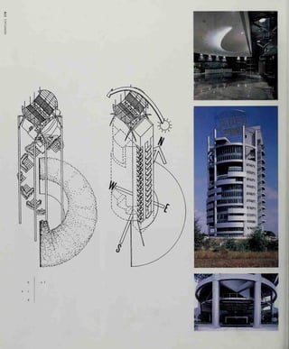
![Mary and Peter Doyle
The Architecture of Mary & Peter
Doyle 1970-1990, Dublin, 1990
Andres Duany and Elizabeth
Plater Zyberk
Mohney, D, and K Easterling (eds),
Seaside: Making a New Town in
America, London, 1991
Charles and Ray Eames
Kirkham, Pat, Charles and Ray Eames:
Designers of the Twentieth Century,
Cambridge, MA, 1995
Edmond + Corrigan
Hamann, Conrad, Cities of Hope:
Australian Architecture and Design by
Edmond and Corngan, 1962-92,
Melbourne, 1993
Peter Eisenman
Eisenman Architects: Selected and
Current Works, Mulgrave, 1995;
Bedard, Jean-Fran^ois (ed). Cities of
Artificial Excavation.The Work of Peter
Eisenman 1978-1988, Montreal and
New York, 1994;
Moneo, Rafael, etal, Wexner Center
for the Visual Arts: The Ohio State
University, New York, 1989
Abdel Wahed El-Wakil
'The Mosque; Architecture of El-Wakil',
Albenaa, vol. 6, no. 34, 1987
Craig Ellwood
McCoy, Esther, Craig Ellwood,
Venice, 1968
Richard England
Abel, Chris, Transformations -
Richard England, 25 Years of
Architecture, Malta, 1987
Ralph Erskine
Egelius, Mats, Ralph Erskine, Architect,
Stockholm, 1990;
Collymore, Peter, The Architecture
of Ralph Erskine, London, 1982
Terry Farrell
Terry Farrell: Selected and Current
Works, Mulgrave, 1994;
Terry Farrell, London, 1993
Hassan Fathy
Steele, James, Hassan Fathy,
Architectural Monograph,
London, 1988;
Richards, J M, I Serageldm and D
Rastorfer; Hassan Fathy, London, 1985
Sverre Fehn
Norberg-Schultz, Christian, Sverre Fehn:
opera completa, Milan, 1997;
Fjeld, Per Olaf, Sverre Fehn:
The Thought ofConstruction,
New York, 1983
Norman Foster
Treiber, Daniel, Norman Foster,
London, 1995;
Lambot, Ian (ed), Norman Foster...
Buildings and Projects, vol. 1
,
1 964-1973,Codamnq, 1991, vol 2,
1971-1978, Hong Kong, 1990, vol. 3,
1978-1985, Hong Kong, 1990
Massimiliano Fuksas
Massimiliano Fuksas: neue Bauten und
Projekte, lunch and London, 1994
Future Systems
Pawley Martin, Future Systems -
Story of Tomorrow, London, 1993
Frank Gehry
Futagawa, Yukio (ed), Frank Cehry,
Tokyo, 1993;'
Arnell, Peter, et al, Frank Cehry:
Buildings and Projects,
New York, 1985
Bruce Coff
Saliga and Woolever, (eds), The
Architecture of Bruce Coff Munich
and New York, 1995
Teodoro Gonzalez de Leon
Heyer, Paul, Mexican Architecture:
The Work ofAbraham Zabludovsky
and Teodoro Conzalez de Leon,
New York, 1978
Michael Graves
Michael Craves; Buildings and Projects
1990-1994, New York, 1995;
Vogel Nichols, Karen, Patrick] Burke
and Caroline Hancock, Michael
Craves: Buildings and Projects
/5S2-/9S9, New Haven and
London, 1990
Allan Greenberg
Allan Creenberg, Selected Work,
London, 1995
Vittorio Gregotti
Tafuri, Manfredo, Vittono Cregotti:
progetti e architetture, Milan and
New York, 1982
Nicholas Grimshaw
Architecture, Industry and Innovation:
The Early Work of Nicholas Crimshaw
and Partners (introduction by Colin
Amery), London, 1995;
Moore, Rowan (ed). Structure, Space
and Skin, The Work of Nicholas
Crimshaw & Partners, London, 1993
Walter Gropius
Ciedion, Sigfried, Walter Cropius,
New York, 1992
Cwathmey Siegel
Cwathmey Siegel, Buildings and
Projects 1982-1992, New York, 1993
Zaha Hadid
Futagawa, Yukio (ed), Zaha Hadid.
Tokyo, 1986;
Zaha Hadid 1983-1991, El Croquis
monograph, Madrid, 1991
Hiroshi Hara
Stewart, David B and Yukio Futagawa
(eds), Hiroshi Hara. Tokyo, 1993
itsuko Hasegawa
Itsuko Hasegawa, 1993;
Itsuko Hasegawa: Recent Buildings
and Projects, Basel, 1997
Zvi Hecker
m
q
Feireiss, Kristin (ed), Zvi Hecker: die
sCD
r-
Heinz-Calinski Schule in Berim, g
Tubingen, 1996 5uX-<
John Hedjuk
Five Architects: Eisenman, Craves,
Cwathmey, Hejduk, Meier,
New York, 1972
Ron Herron
Banham, Reyner, The Visions of Ron
Herron, London, 1994
Herman Hertzberger
Herman Hertzberger: Accommodating
the Unexpected: Projects 1990- 1995,
Rotterdam, 1995
Herzog & de Meuron
Herzog & de Meuron, Tokyo, 1995;
Herzog & de Meuron, Madrid, 1993;
Wang, Wilfried, Herzog & de Meuron,
luuch. 1992;
Wang, Wilfried, Herzog & de Meuron,
Projects and Buildings 1982- 1990.
New York, 1990
Hodgetts + Fung
Hodgetts + Fung: Scenarios and
Spaces (introduction by Kurt Foster),
New York, 1997
Steven Holl
Steven Holl. Tokyo. 1996
Hans Hollein
Pettena, Giani, Hans Hollein: Works
1960-1988. Man. 1988;
Architekten Hans Hollein,
Stuttgart, 1987;
Mackler, ChrJstoph, Hans Hollein.,
Aachen, 1978;
Michael Hopkins
Davies, Colin, Hopkins: The Work of
Michael Hopkins and Partners,
London, 1993
Ingenhoven, Overdeik,
Kahlen & Partner
Hochhaus RWE AC Essen,
Dusseldorf, 1997](https://image.slidesharecdn.com/contemporaryworldarchitecture-151008001113-lva1-app6891/85/Contemporary-world-architecture-497-320.jpg)


This document provides a summary of the book "Contemporary World Architecture" by Hugh Pearman. It discusses how the book comprehensively surveys international architecture at the turn of the new century, focusing on modern building types and the forces that shape them. It analyzes thirteen separate building categories and traces the pluralistic paths of architectural thinking from the 1970s to the start of the new millennium. The summary highlights how the book tells the evolving story of new forms and their underlying quest for aesthetic consensus during this time period.