Lenny Lavers
   I took a sample of my target audience to look at
    some potential magazine templates. I ask them
    for feedback in reflection to the codes and
    conventions that I had used.
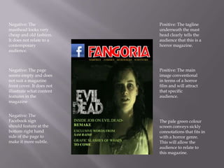
Negative: The              Positive: The tagline
masthead looks very        underneath the mast
cheap and old fashion.     head clearly tells the
It does not relate to a    audience that this is a
contemporary               horror magazine.
audience.


Negative: The page         Positive: The main
seems empty and does       image conventional
not suit a magazine        in terms of a horror
front cover. It does not   film and will attract
illustrate what content    that specific
features in the            audience.
magazine


Negative: The
Facebook sign              The pale green colour
should feature at the      screen conveys sickly
bottom right hand          connotations that fits in
side of the page to        with a horror genre.
make it more subtle.       This will allow the
                           audience to relate to
                           this magazine.
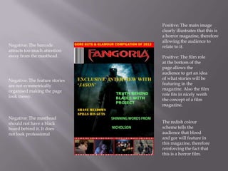
Positive: The main image
                                clearly illustrates that this is
                                a horror magazine, therefore
                                allowing the audience to
Negative: The barcode           relate to it.
attracts too much attention
away from the masthead.         Positive: The film role
                                at the bottom of the
                                page allows the
                                audience to get an idea
Negative: The feature stories   of what stories will be
are not symmetrically           featuring in the
organised making the page       magazine. Also the film
look messy.                     role fits in nicely weith
                                the concept of a film
                                magazine.

Negative: The masthead
should not have a black         The redish colour
board behind it. It does        scheme tells the
not look professional           audience that blood
                                and gor will feature in
                                this magazine, therefore
                                reinforcing the fact that
                                this is a horror film.
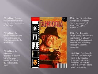
Negative: The red           Positive: the red colour
colour scheme drowns        scheme fits in with the
out the other attractions   horror genre and will
of the page.                attract that type of
                            audience.

Negative: the               Positive: The main
feature stories are not     image is very conventional
very visible, due to        in reflection to a horror
little contrast with the    magazine. Consumers will
main image.                 easily be able to identify
                            themselves with this
                            magazine.

Negative: the
additional                  Positive: The film role
incentive at the top        that runs down the right
left of the page            hand of the page is a
should feature at           good conventional way
the bottom of the           to present the feature
page.                       stories in way that a film
                            lover can relate to.
   After gathering this feedback, it is clearer to me
    what codes and conventions work best to
    appeal to my target audience. For example it is
    clear that my audience would like a lot of
    illustration as to what content will be featuring
    in the magazine. This means that the front page
    should be full in terms of captions and visual
    images.

Magazine templates

  • 1.
  • 2.
    I took a sample of my target audience to look at some potential magazine templates. I ask them for feedback in reflection to the codes and conventions that I had used.
  • 3.
    Negative: The Positive: The tagline masthead looks very underneath the mast cheap and old fashion. head clearly tells the It does not relate to a audience that this is a contemporary horror magazine. audience. Negative: The page Positive: The main seems empty and does image conventional not suit a magazine in terms of a horror front cover. It does not film and will attract illustrate what content that specific features in the audience. magazine Negative: The Facebook sign The pale green colour should feature at the screen conveys sickly bottom right hand connotations that fits in side of the page to with a horror genre. make it more subtle. This will allow the audience to relate to this magazine.
  • 4.
    Positive: The mainimage clearly illustrates that this is a horror magazine, therefore allowing the audience to Negative: The barcode relate to it. attracts too much attention away from the masthead. Positive: The film role at the bottom of the page allows the audience to get an idea Negative: The feature stories of what stories will be are not symmetrically featuring in the organised making the page magazine. Also the film look messy. role fits in nicely weith the concept of a film magazine. Negative: The masthead should not have a black The redish colour board behind it. It does scheme tells the not look professional audience that blood and gor will feature in this magazine, therefore reinforcing the fact that this is a horror film.
  • 5.
    Negative: The red Positive: the red colour colour scheme drowns scheme fits in with the out the other attractions horror genre and will of the page. attract that type of audience. Negative: the Positive: The main feature stories are not image is very conventional very visible, due to in reflection to a horror little contrast with the magazine. Consumers will main image. easily be able to identify themselves with this magazine. Negative: the additional Positive: The film role incentive at the top that runs down the right left of the page hand of the page is a should feature at good conventional way the bottom of the to present the feature page. stories in way that a film lover can relate to.
  • 6.
    After gathering this feedback, it is clearer to me what codes and conventions work best to appeal to my target audience. For example it is clear that my audience would like a lot of illustration as to what content will be featuring in the magazine. This means that the front page should be full in terms of captions and visual images.