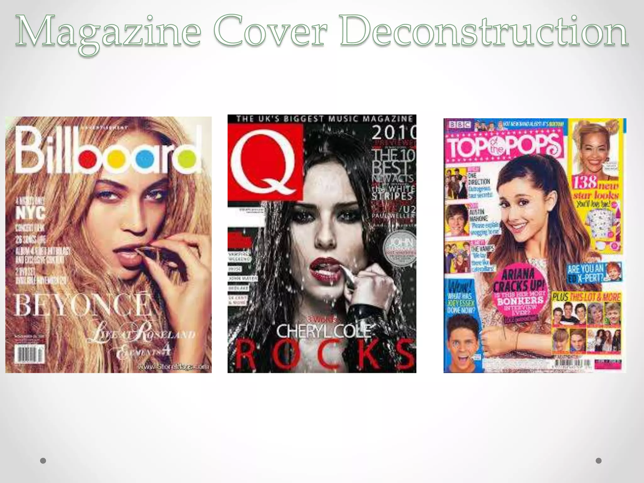
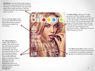
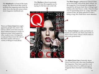
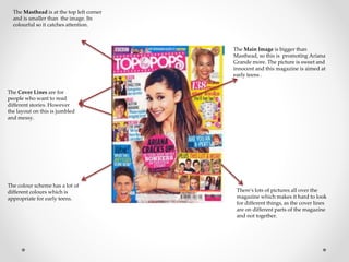
Masthead is in front of the maim image as 
they want to promote the brand more than 
the artist. It is spread all the way across the 
page which stands out more, it also has 
colours inside the title which also makes it 
stand out more. 
The Main Image is Beyoncé. For this 
particular cover the readers would be 
mostly female, although she has male fans 
as well. The image is seductive by the way 
she is looking out towards the reader. The 
image is also captivating which will also 
catch the readers attention. This is aimed 
at mostly all aged ranges who are 
interested in music, as Billboard covers all 
different genres of music. 
The Colour Scheme is 
simple with 4 different 
colours. The colours in the 
title will catch the readers 
attention due to them 
being bright. The rest of 
the colour scheme is white 
but it stands out due to 
the writing being bold. 
There is also different 
styles of writing to make it 
different and more 
appealing. For the 
background there is no 
colour its her hair and that 
takes up all the 
background. 
The Main Cover Line on this cover is 
just the artists name, this is because she 
is well known around the world and 
people can recognise her by her name. 
These are Cover Lines which 
may not be about Beyoncé but 
about other artists or stories 
which people might find 
interesting.
The Masthead is in front of the main 
image, this shows how they want to 
promote the magazine more than the 
artist. Its in the top left corner where 
most magazine mastheads are. 
The Main Image is different to Cheryl’s look 
as its more dark with all the dark colours on 
the magazine. Even though the magazine is 
popular for all music fans, this is trying to get 
readers who don’t know or like Cheryl to buy 
it as it’s promoting more of a edgy and rock 
version of her. Its quite seductive as she’s 
biting a ring, this could draw more attention. 
The Main Cover Line is basically about 
Cheryl and how she’s the main headline in 
the magazine. They have used the word 
rock to show how it’s a different type of 
magazine than what she’s used to being 
on. 
These are Cover Lines that might 
appeal to people who aren't into 
Cheryl. These cover lines may be 
about different genres of music or 
different artists which appeal to 
other readers more. Q magazine 
would put these down the side so 
that their readers still have a 
variety of things to read about. 
This Skyline is there to persuade 
people to buy the magazine as it’s 
saying it’s the best one in the UK. 
The Colour Scheme is dark and bold as it 
stands out with the red, black and white. It 
doesn’t have many colours which makes it 
look more professional.
The Main Image is bigger than 
Masthead, so this is promoting Ariana 
Grande more. The picture is sweet and 
innocent and this magazine is aimed at 
early teens . 
The Masthead is at the top left corner 
and is smaller than the image. Its 
colourful so it catches attention. 
The Cover Lines are for 
people who want to read 
different stories. However 
the layout on this is jumbled 
and messy. 
There's lots of pictures all over the 
magazine which makes it hard to look 
for different things, as the cover lines 
are on different parts of the magazine 
and not together. 
The colour scheme has a lot of 
different colours which is 
appropriate for early teens.
Overall Summary 
• Overall I prefer Billboard and Q Magazine as it doesn’t have too many colours 
and its not as jumbled as Top of the pops. I like how the Billboard Magazine is 
set out as its got little amounts of colour and has got text set out nicely instead of 
all over the place. 
• The Top of the pops magazine has too much going on as its for early teenagers, 
however I am going to do a magazine for late teenagers.

Deconstructions

  • 2.
    Masthead is infront of the maim image as they want to promote the brand more than the artist. It is spread all the way across the page which stands out more, it also has colours inside the title which also makes it stand out more. The Main Image is Beyoncé. For this particular cover the readers would be mostly female, although she has male fans as well. The image is seductive by the way she is looking out towards the reader. The image is also captivating which will also catch the readers attention. This is aimed at mostly all aged ranges who are interested in music, as Billboard covers all different genres of music. The Colour Scheme is simple with 4 different colours. The colours in the title will catch the readers attention due to them being bright. The rest of the colour scheme is white but it stands out due to the writing being bold. There is also different styles of writing to make it different and more appealing. For the background there is no colour its her hair and that takes up all the background. The Main Cover Line on this cover is just the artists name, this is because she is well known around the world and people can recognise her by her name. These are Cover Lines which may not be about Beyoncé but about other artists or stories which people might find interesting.
  • 3.
    The Masthead isin front of the main image, this shows how they want to promote the magazine more than the artist. Its in the top left corner where most magazine mastheads are. The Main Image is different to Cheryl’s look as its more dark with all the dark colours on the magazine. Even though the magazine is popular for all music fans, this is trying to get readers who don’t know or like Cheryl to buy it as it’s promoting more of a edgy and rock version of her. Its quite seductive as she’s biting a ring, this could draw more attention. The Main Cover Line is basically about Cheryl and how she’s the main headline in the magazine. They have used the word rock to show how it’s a different type of magazine than what she’s used to being on. These are Cover Lines that might appeal to people who aren't into Cheryl. These cover lines may be about different genres of music or different artists which appeal to other readers more. Q magazine would put these down the side so that their readers still have a variety of things to read about. This Skyline is there to persuade people to buy the magazine as it’s saying it’s the best one in the UK. The Colour Scheme is dark and bold as it stands out with the red, black and white. It doesn’t have many colours which makes it look more professional.
  • 4.
    The Main Imageis bigger than Masthead, so this is promoting Ariana Grande more. The picture is sweet and innocent and this magazine is aimed at early teens . The Masthead is at the top left corner and is smaller than the image. Its colourful so it catches attention. The Cover Lines are for people who want to read different stories. However the layout on this is jumbled and messy. There's lots of pictures all over the magazine which makes it hard to look for different things, as the cover lines are on different parts of the magazine and not together. The colour scheme has a lot of different colours which is appropriate for early teens.
  • 5.
    Overall Summary •Overall I prefer Billboard and Q Magazine as it doesn’t have too many colours and its not as jumbled as Top of the pops. I like how the Billboard Magazine is set out as its got little amounts of colour and has got text set out nicely instead of all over the place. • The Top of the pops magazine has too much going on as its for early teenagers, however I am going to do a magazine for late teenagers.