Download to read offline
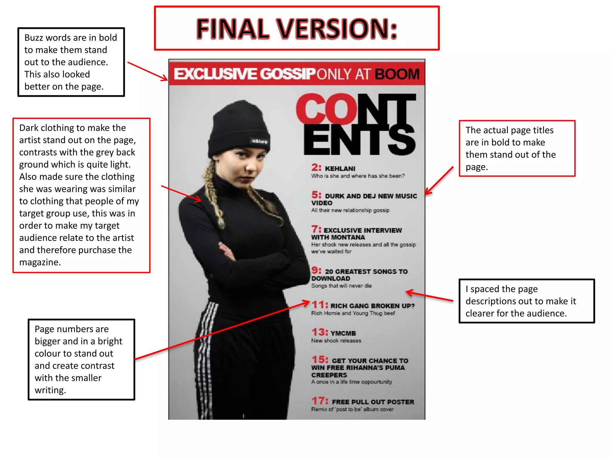
The document discusses design choices made for a magazine page, including making page titles bold to stand out, using larger bright colored page numbers for contrast, and dressing the artist in dark clothing against a light grey background to make her stand out. Word spacing and bolding of buzz words were also used to make the page clearer and looking better for the target audience and to help them relate to the artist.


