1. Double Page Spread Analysis –
Kerrang.
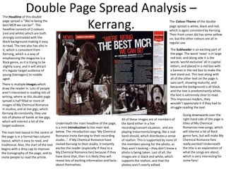
The Headline of this double
page spread is “We’re being the
best MCR we can be!”. This
headline consists of 2 colours
(red and white) which are both
strongly contrasted with the
black background making it easy
to read. The text also has slits in
it, which is consistent from
Kerrang, which is a way of
emphasising the magazine is a
Rock genre, as it is trying to be
slightly scary, and it will attract
it’s regular target audience of
young (teenagers) to middle
aged.
There is multiple Images which
draw the reader in. Lots of people
aren’t interested in reading lots of
writing, where as this double page
spread is half filled or more of
images of My Chemical Romance
in studios, and at live gigs, which
Kerrang do constantly, they use
lots of photos of bands at live gigs,
which will interest a lot of the
target audience.
Underneath the main headline of the page,
is a mini Introduction to the main text
The main text layout in the centre of below. The introduction says ‘My Chemical
Romance invite Kerrang to their recording
the page is in a formal two column
studio…’. If My Chemical Romance have
layout, which is easy to read, and
traditional. Also, the start of the text invited Kerrang to their studio, it instantly
excites the reader (especially if they’re a
begins with a drop cap to improve
the iconography of the page, and to My Chemical Romance fan) because if they
have done that, then it is likely they will
invite people to read the article.
reveal lots of exciting information and facts
about themselves.
The Colour Theme of the double
page spread is white, black and red,
which is again consistent by Kerrang.
Their front cover did has some yellow
on, but the other colours are all in
regular use.
The Subheader is an exciting part of
the page. The word ‘news’ is in large
red text, and along side it is the
words ‘world exclusive’ all in capital
letters, and placed in a red box with
a banner in the red box to make the
text stand out. This text along with
all of the other text on the page is
sans serif, showing maturity, and
because the background is all black,
and the text is predominantly white,
the text is extremely clear to read.
This impresses readers, they
wouldn’t appreciate it if they had to
struggle reading the text.
All of these images are of members of
the band either in a live
recording/concert situation, and are
playing insturments/singing, like a real
band should, which distributes a sense
of realism. This is supported by none of
the members posing for the photo, as
they aren’t looking – they don’t know a
photo is being taken. Last of all, the
images are in black and white, which
supports the realism, and that the
photos aren’t overly edited.
Going downwards over the
right hand side of the page is
titles of My Chemical
Romances new songs, which
will interest a lot of Rock
genre fans, but will make My
Chemical Romance fans
really excited! Underneath
the title is an explanation of
what the songs are about,
which is very interesting for
some fans!
2. Double Page Spread Analysis – Q.
The Image takes up half of the
double page spread (one whole
page). This is a close up of Jay-Z
who doesn’t really fit into the
category of Rock music, but he
is doing the same job as a Rock
star would in this photo. He is
pulling a stern face, showing
strength, and looking slightly
scary/intimidating.
The Colour Theme of the
double page spread is red,
white and black as usual,
showing consistency, and with
a hint of yellow outlining a bit
of the text on Jay-Z’s chest.
The Headline is at the top, in
the centre of the right hand
page, and uses two different
colours to stand out more.
The font is very
plain/readable, yet the text is
reasonably small.
Underneath the main part of
the headline, (the strapline)
introduces Jay-Z.
Interestingly, the main text is in a
two column format, with is very
formal. The main text starts some
of the paragraphs with drop caps
to draw a reader into the read the
text, which makes the large
amount of text look more
appealing to read. Because the
whole double page spread is
based on Jay-Z, there is a huge
red J placed over the top of the
article’s text. This looks
impressive, and works because it
attracts people to read the article,
and the J is transparent, allowing
people to read the text
underneath it which is vital.
The Q Logo although it is small,
is still on the page (in the
bottom left corner, of the right
hand page). This repeatedly lets
the reader know they’re
reading Q, and is great
advertisement, as the more
pages/places they can fit their
logo in the better!
The Pull Quote on the image of
Jay-Z is interesting for a lot of
people, because it is a quote from
Jay-z (who plenty of people
aspire) and in the quote Noel
Gallagher is included, who is an
idol of a mass amount of people.
3. Double Page Spread Analysis – NME.
The Image on this
NME double page
spread is important
because it is in front
of the text to make
it stand out more.
The woman in the
image is a femme
fatale, which will
attract a male
audience, but she
isn’t smiling, she is
pulling quite a
strong face to
continue the trend
in Rock magazines,
as most of the
people in the images
try to look at least
slightly intimidating.
The Colour Theme of NME,
and the regular colour theme
of Rock magazines is found
again in this double page
spread. Red, white and black
have a strong contrast when
applied with each other, to
make the whole pages easy to
read, but also these colour
represent Rock, due to their
connotations of darkness,
danger, and excitement, which
show maturity. Younger
children would not be
attracted by these colours.
The Headline on this
double page spread starts
off in extremely large/bold
text, and turns into
smaller, yet darker text.
Part of the title is behind
the woman/celebrity in
the image. The title would
stand out a little more if it
was in front of the image.
Because the title changes
size and colour, it looks
more effective because it
catches the reader’s eye.
The title is very plain, and
sophisticated, similarly to
the woman in the image,
and to the colour theme
which shows a strong
consistency.
The text in this article is in a 3 column format, which again shows the consistency and
maturity in the magazine as a whole. The column format is usually easy to read because
the lines aren’t very long, and because there is 3 columns, the columns aren’t excessively
long either. Because there is 3 columns, and they vary in length, it looks better, where as
if every column was the same size, the page would look a little more plain.
The text in the title, relates to the image, because firstly, one of Florence’s songs goes:
‘You’ve got the love’, and the title uses a play on words and says ‘USA got the love’
which is a bit of humour, and it tells the reader how successful Florence is in America.
This is also shown by the strapline saying the has ‘America at her feet’, and then in the
image at her feet she has the American flag.
The Strapline gives an
introduction as to what the
article is about, and draws
the reader in by asking a
rhetorical question.
The Drop Cap at the
beginning of the article again
is another features used to
catch the reader’s eye, and
encourage them to read the
text, or at least the beginning
so they know what it’s about.