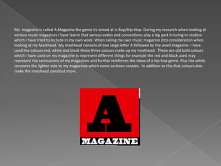
My magazine is called A Magazine the genre its aimed at is Rap/Hip-Hop. During my research when looking at
various music magazines I have learnt that various codes and conventions play a big part in luring in readers
which I have tried to include in my own work. When taking my own music magazine into consideration when
looking at my Masthead. My masthead consists of one large letter A followed by the word magazine. I have
used the colours red, white and black these three colours make up my masthead. These are old bold colours
which I have used on my magazine to represent different things for example the red and black used may
represent the seriousness of my magazines and further reinforces the ideas of a hip hop genre. Plus the white
connotes the lighter side to my magazines which some sections contain. In addition to this that colours also
make the masthead standout more.
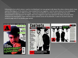
Following on from which colours I used on my Masthead I am now going to talk about the colour scheme which i have
used on the majority of the elements I have created form my magazine. I use the same colours on my masthead as
the colours used represent different things. I have also included the use of the colour green this has many
representation it may represent the lighter side of my magazine it also may represent the ideas of money which
reinforces my chose genre. I have used the colour scheme across all my elements it seen on my front cover my
contents page and on my double page spread.
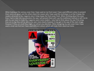
When looking at the various cover lines I have used on my front cover I have used different colour to present
them some are green and the others black the reason why I have used this technique is so that it keeps the
readers attracted to the magazine also it helps keeps the front cover fresh. When thinking about the cover
lines I had to take into consideration the way I will present them will I use the traditional method or will I try to
add my own twist to make the magazine seem more modern. I also had to think about the size if the strap
lines are to big they will be able to be seen more clearly however it may get in the way of the main image.
However if they are small they might not attract any attention. When designing my own cover lines I have
used a small size font but I have used different colours which will make them stand out more.
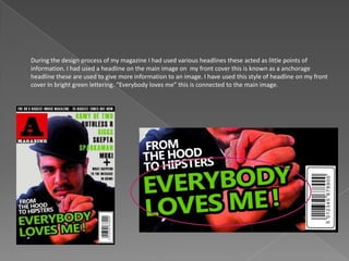
During the design process of my magazine I had used various headlines these acted as little points of
information. I had used a headline on the main image on my front cover this is known as a anchorage
headline these are used to give more information to an image. I have used this style of headline on my front
cover In bright green lettering. “Everybody loves me” this is connected to the main image.
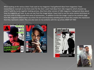
When looking at the various shots I had used on my magazine I had gathered ideas from magazines I have
researched for example on my front cover for the shot I used I had ideas from vibe magazine which showed rap
artist TI with his hands together looking serious. Also from other version of VIBE magazine i had gained ideas about
how my magazine will look. As you can see from the image below I have tried to use the same camera technique on
my front cover to help create that sense of seriousness. In addition to this the image I used on my contents page
from XXL magazine which shows rap artists 50 cent and Soulja boy standing back to back this creates the impression
that they represent a team. This was also seen on my contents with the rap artists ARMY OF TWO
The social groups that are being represented in my magazine are teenagers the majority of people who
took part in my questionnaire were males and enjoyed the genre of Hip Hop. To target these social
groups I have featured artists who come under the category of the hip hop genre. The majority of hip
hop artists now target a younger audience. An example of this is rap artist Chief Keef who targets a
younger generation by relating to his school life and going to party’s etc. He also talks about how he is
making money when once he was poor. The idea of this is popular this is why one my front cover I have
used a strap line. “From the hood to hipsters”.
Bauer Media group is an institution that is based in Germany. The reason why i think. that it may distribute my media
product is because it reaches many young audiences throughout the UK the institution has no hip hop magazines on
their marker instead they have magazines such as Q and Kerrang. For this reason i believe that they will sell my media
product because its a different music genre therefore my magazine brings something new to the table. This will mean
that the audience number will increase. In addition to this Bauer media also has a radio station which includes Q radio.
Therefore having a hip hop magazine may encourage them to start a broadcast channel for hip hop music this will
increase Bauer Medias revenue overall as well as attracting new customers
IPC Media is an institution that is based in the UK. The company has distributed many different and well
known magazines such as NME, which reaches a wide audience. Therefore adding my media product to the
range of magazines will help them increase sales because my both magazines have the same target audience
which is teenagers. Also because IPC sells magazines such as NME which genre is based Rock/Pop and my
produced is based around Hip Hop the two genres will not clash with each other. The reason why I picked IPC
is because they have links with supermarkets therefore meaning a wider audience.
When designing my music magazine I had tried to make sure that I had my target audience correct and I used the right
skills and techniques to make them interested in my magazine. I tried to aim for the right target audience which was 18
– 21 year olds. To learn more about my audience I produced a questionnaire which helped me create my magazine. The
magazine was available to both males and females. From my findings I found that more men read magazines that had a
hip hop genre also I found that the main purpose why people read magazine is because to get all the latest gossip from
featured artists. To conclude I found that the majority of people that would read my magazine would be males in their
early teens and they enjoy reading about the latest from the hip hop music scene. I believe that I have targeted my
audience which is males because I have used strong colours such as black and red rather than rinks and purples which
may appeal to a female audience. When looking at the age group I have featured artists that are around the same age
so audiences can relate to the artists. When looking at the purpose of my magazine which from my findings I found that
people look to find out the latest from the artists I used this information and created a double page spread which
consists of an interview with hip hop artists.
I believe that to attract my audience I have made my designs look professional and sophisticated I did this by
thinking outside the box for example adding slanted text, using various filters on Photoshop which made my
magazine have a unique feel to it. To attract my audience I thought the first element they would see is my
front cover so I used various masculine colours which connate different things such as the red = seriousness.
Another way in which I have attracted my audience is by using various strap lines. On my magazine I have put
various names of hip hop artists that would feature in my magazine this relates to the audience because I
found out the main purpose why people would read my magazine is to find out more about hip hop artists.
The main image also attracts my audience because it is a picture of an artist with his hat to the side this may
represent his lifestyle of being gangster like which would appeal to a male audience and this further reinforces
the genre of hip hop.
When creating my music magazine technology and software played a very big part when it came to my
final designs. When looking at the devices I had used which were a camera and a PC. I had used the
camera to take pictures of people who would then play a part in my magazine. I had to take certain
things into consideration when taking these pictures such as the shot type mid shot, high angle etc. Plus
where these images would be situated front cover, contents page, or on the double page spread. I used
the PC to upload these images and then manipulate them this was also used to complete my research
and planning into codes and conventions used in Music and School magazines. When using software I
had used the package Adobe Photoshop CS6 I also used this software in my A level Graphics class which
means I’m familiar with various techniques and skills used to manipulate images to make them look
better. I personally like this piece of software because I was able to apply certain image filters to certain
images which gave them a different and professional feel.
When looking back at my preliminary task I have felt that I have progressed because I have
learned new skills and developed my understanding into the codes and conventions used in
music magazines by doing more research. For example by doing the questionnaire I have learnt
about target audiences and different ways of presenting information to give them more
significance, for example when I used the text on an angle which gave the text more meaning. I
have also learnt about how various colours can be used to create different meanings and
feelings.
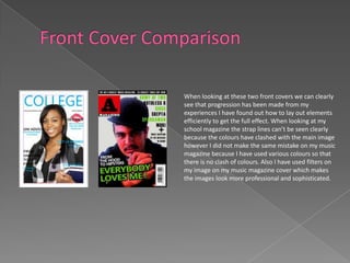
When looking at these two front covers we can clearly
see that progression has been made from my
experiences I have found out how to lay out elements
efficiently to get the full effect. When looking at my
school magazine the strap lines can’t be seen clearly
because the colours have clashed with the main image
however I did not make the same mistake on my music
magazine because I have used various colours so that
there is no clash of colours. Also I have used filters on
my image on my music magazine cover which makes
the images look more professional and sophisticated.
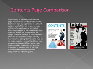
When looking at these two front contents
pages we can clearly see that progression has
been made from my experiences I have found
out that certain filters can be used to create
different effects to images to get the full
effect. When looking at the images I have used
I have not applied any filters to make the
images look more effective. In addition to this
I have not positioned the images correctly.
However when looking at my contents page on
my music magazine I believe that it looks very
professional I have used filters on the main
image to make it look enhanced. Also the
positioning of elements such as the page
numbers and the titles has improved
compared to the school magazine.

Media studies Music Magazine Evaluation

  • 3.
    My magazine iscalled A Magazine the genre its aimed at is Rap/Hip-Hop. During my research when looking at various music magazines I have learnt that various codes and conventions play a big part in luring in readers which I have tried to include in my own work. When taking my own music magazine into consideration when looking at my Masthead. My masthead consists of one large letter A followed by the word magazine. I have used the colours red, white and black these three colours make up my masthead. These are old bold colours which I have used on my magazine to represent different things for example the red and black used may represent the seriousness of my magazines and further reinforces the ideas of a hip hop genre. Plus the white connotes the lighter side to my magazines which some sections contain. In addition to this that colours also make the masthead standout more.
  • 4.
    Following on fromwhich colours I used on my Masthead I am now going to talk about the colour scheme which i have used on the majority of the elements I have created form my magazine. I use the same colours on my masthead as the colours used represent different things. I have also included the use of the colour green this has many representation it may represent the lighter side of my magazine it also may represent the ideas of money which reinforces my chose genre. I have used the colour scheme across all my elements it seen on my front cover my contents page and on my double page spread.
  • 5.
    When looking atthe various cover lines I have used on my front cover I have used different colour to present them some are green and the others black the reason why I have used this technique is so that it keeps the readers attracted to the magazine also it helps keeps the front cover fresh. When thinking about the cover lines I had to take into consideration the way I will present them will I use the traditional method or will I try to add my own twist to make the magazine seem more modern. I also had to think about the size if the strap lines are to big they will be able to be seen more clearly however it may get in the way of the main image. However if they are small they might not attract any attention. When designing my own cover lines I have used a small size font but I have used different colours which will make them stand out more.
  • 6.
    During the designprocess of my magazine I had used various headlines these acted as little points of information. I had used a headline on the main image on my front cover this is known as a anchorage headline these are used to give more information to an image. I have used this style of headline on my front cover In bright green lettering. “Everybody loves me” this is connected to the main image.
  • 7.
    When looking atthe various shots I had used on my magazine I had gathered ideas from magazines I have researched for example on my front cover for the shot I used I had ideas from vibe magazine which showed rap artist TI with his hands together looking serious. Also from other version of VIBE magazine i had gained ideas about how my magazine will look. As you can see from the image below I have tried to use the same camera technique on my front cover to help create that sense of seriousness. In addition to this the image I used on my contents page from XXL magazine which shows rap artists 50 cent and Soulja boy standing back to back this creates the impression that they represent a team. This was also seen on my contents with the rap artists ARMY OF TWO
  • 8.
    The social groupsthat are being represented in my magazine are teenagers the majority of people who took part in my questionnaire were males and enjoyed the genre of Hip Hop. To target these social groups I have featured artists who come under the category of the hip hop genre. The majority of hip hop artists now target a younger audience. An example of this is rap artist Chief Keef who targets a younger generation by relating to his school life and going to party’s etc. He also talks about how he is making money when once he was poor. The idea of this is popular this is why one my front cover I have used a strap line. “From the hood to hipsters”.
  • 9.
    Bauer Media groupis an institution that is based in Germany. The reason why i think. that it may distribute my media product is because it reaches many young audiences throughout the UK the institution has no hip hop magazines on their marker instead they have magazines such as Q and Kerrang. For this reason i believe that they will sell my media product because its a different music genre therefore my magazine brings something new to the table. This will mean that the audience number will increase. In addition to this Bauer media also has a radio station which includes Q radio. Therefore having a hip hop magazine may encourage them to start a broadcast channel for hip hop music this will increase Bauer Medias revenue overall as well as attracting new customers
  • 10.
    IPC Media isan institution that is based in the UK. The company has distributed many different and well known magazines such as NME, which reaches a wide audience. Therefore adding my media product to the range of magazines will help them increase sales because my both magazines have the same target audience which is teenagers. Also because IPC sells magazines such as NME which genre is based Rock/Pop and my produced is based around Hip Hop the two genres will not clash with each other. The reason why I picked IPC is because they have links with supermarkets therefore meaning a wider audience.
  • 11.
    When designing mymusic magazine I had tried to make sure that I had my target audience correct and I used the right skills and techniques to make them interested in my magazine. I tried to aim for the right target audience which was 18 – 21 year olds. To learn more about my audience I produced a questionnaire which helped me create my magazine. The magazine was available to both males and females. From my findings I found that more men read magazines that had a hip hop genre also I found that the main purpose why people read magazine is because to get all the latest gossip from featured artists. To conclude I found that the majority of people that would read my magazine would be males in their early teens and they enjoy reading about the latest from the hip hop music scene. I believe that I have targeted my audience which is males because I have used strong colours such as black and red rather than rinks and purples which may appeal to a female audience. When looking at the age group I have featured artists that are around the same age so audiences can relate to the artists. When looking at the purpose of my magazine which from my findings I found that people look to find out the latest from the artists I used this information and created a double page spread which consists of an interview with hip hop artists.
  • 12.
    I believe thatto attract my audience I have made my designs look professional and sophisticated I did this by thinking outside the box for example adding slanted text, using various filters on Photoshop which made my magazine have a unique feel to it. To attract my audience I thought the first element they would see is my front cover so I used various masculine colours which connate different things such as the red = seriousness. Another way in which I have attracted my audience is by using various strap lines. On my magazine I have put various names of hip hop artists that would feature in my magazine this relates to the audience because I found out the main purpose why people would read my magazine is to find out more about hip hop artists. The main image also attracts my audience because it is a picture of an artist with his hat to the side this may represent his lifestyle of being gangster like which would appeal to a male audience and this further reinforces the genre of hip hop.
  • 13.
    When creating mymusic magazine technology and software played a very big part when it came to my final designs. When looking at the devices I had used which were a camera and a PC. I had used the camera to take pictures of people who would then play a part in my magazine. I had to take certain things into consideration when taking these pictures such as the shot type mid shot, high angle etc. Plus where these images would be situated front cover, contents page, or on the double page spread. I used the PC to upload these images and then manipulate them this was also used to complete my research and planning into codes and conventions used in Music and School magazines. When using software I had used the package Adobe Photoshop CS6 I also used this software in my A level Graphics class which means I’m familiar with various techniques and skills used to manipulate images to make them look better. I personally like this piece of software because I was able to apply certain image filters to certain images which gave them a different and professional feel.
  • 14.
    When looking backat my preliminary task I have felt that I have progressed because I have learned new skills and developed my understanding into the codes and conventions used in music magazines by doing more research. For example by doing the questionnaire I have learnt about target audiences and different ways of presenting information to give them more significance, for example when I used the text on an angle which gave the text more meaning. I have also learnt about how various colours can be used to create different meanings and feelings.
  • 15.
    When looking atthese two front covers we can clearly see that progression has been made from my experiences I have found out how to lay out elements efficiently to get the full effect. When looking at my school magazine the strap lines can’t be seen clearly because the colours have clashed with the main image however I did not make the same mistake on my music magazine because I have used various colours so that there is no clash of colours. Also I have used filters on my image on my music magazine cover which makes the images look more professional and sophisticated.
  • 16.
    When looking atthese two front contents pages we can clearly see that progression has been made from my experiences I have found out that certain filters can be used to create different effects to images to get the full effect. When looking at the images I have used I have not applied any filters to make the images look more effective. In addition to this I have not positioned the images correctly. However when looking at my contents page on my music magazine I believe that it looks very professional I have used filters on the main image to make it look enhanced. Also the positioning of elements such as the page numbers and the titles has improved compared to the school magazine.