Digipak Analysis
Arctic Monkeys – WhateverPeople Say I Am, That’s What I’m Not
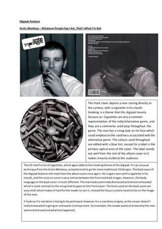
The front cover depicts a man staring directly at
the camera, with a cigarette in his mouth.
Smoking is a theme that this digipak heavily
focuses on. Cigarettes are also a common
representation of the indie/alternative genre, and
they are a commonly used prop throughout the
genre. The man has a smug look on his face which
could emphasise the cockiness associated with the
alternative genre. The colours used throughout
are edited with a blue tint, except for a label in the
primary optical area of the cover. The label stands
out well from the rest of the album cover so it
makes it easily visible to the audience.
The CD itself isfull of cigarettes,whichagainaddstothe smokingtheme of the digipak.Itisanunusual
technique fromthe ArcticMonkeys,asbandstendto go for more traditional CDdesigns.The backcoverof
the digipakfeaturesthe male fromthe albumcoveronce again.He isagain seenwithacigarette inhis
mouth,and the mise enscene isverysimilarbetweenthe frontandbackimages.However,the body
language onthe back cover ismuch different.The manlooksextremelydistressedandalmostexhausted
whichisstark contrast to the smuglookhe gave onthe frontcover.The fontsusedon the back coverare
verysmall whichmakesithard forthe readerto see it,insteadthe focusissolelymeanttobe on the image
of the man.
It looksas if a narrative istryingto be portrayed,howeveritisa narrative enigma,asthe viewerdoesn’t
reallyknowwhatisgoingon andwants to know more.Forexample,the viewerwantstoknowwhythe man
seemsdistressedandwhathashappened.

Digipak analysi2

  • 1.
    Digipak Analysis Arctic Monkeys– WhateverPeople Say I Am, That’s What I’m Not The front cover depicts a man staring directly at the camera, with a cigarette in his mouth. Smoking is a theme that this digipak heavily focuses on. Cigarettes are also a common representation of the indie/alternative genre, and they are a commonly used prop throughout the genre. The man has a smug look on his face which could emphasise the cockiness associated with the alternative genre. The colours used throughout are edited with a blue tint, except for a label in the primary optical area of the cover. The label stands out well from the rest of the album cover so it makes it easily visible to the audience. The CD itself isfull of cigarettes,whichagainaddstothe smokingtheme of the digipak.Itisanunusual technique fromthe ArcticMonkeys,asbandstendto go for more traditional CDdesigns.The backcoverof the digipakfeaturesthe male fromthe albumcoveronce again.He isagain seenwithacigarette inhis mouth,and the mise enscene isverysimilarbetweenthe frontandbackimages.However,the body language onthe back cover ismuch different.The manlooksextremelydistressedandalmostexhausted whichisstark contrast to the smuglookhe gave onthe frontcover.The fontsusedon the back coverare verysmall whichmakesithard forthe readerto see it,insteadthe focusissolelymeanttobe on the image of the man. It looksas if a narrative istryingto be portrayed,howeveritisa narrative enigma,asthe viewerdoesn’t reallyknowwhatisgoingon andwants to know more.Forexample,the viewerwantstoknowwhythe man seemsdistressedandwhathashappened.