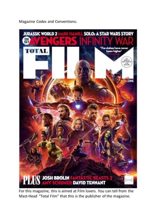
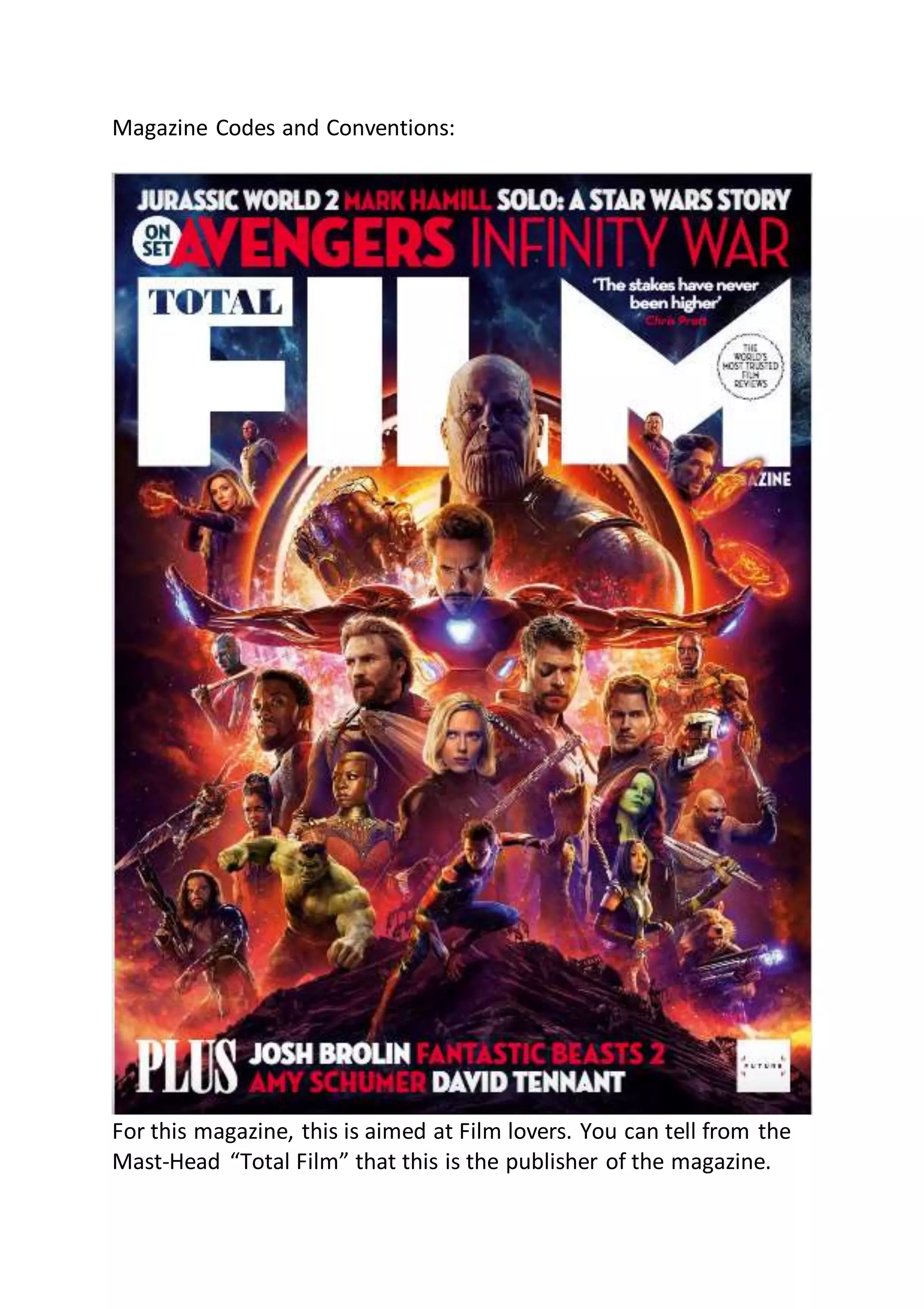
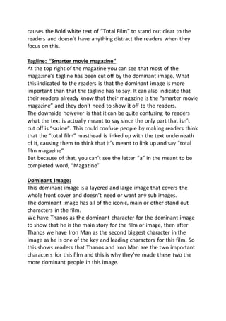
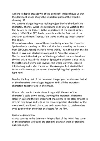
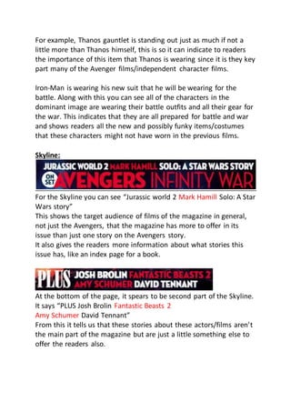
This magazine cover is aimed at film lovers. It features a large dominant image of characters from the upcoming Avengers film Infinity War. The main characters Thanos and Iron Man are featured most prominently. Text throughout the cover highlights other upcoming films and actors to entice readers. Red text draws the eye to important details like character names. The cover effectively presents key information about films in an engaging visual layout to attract its target audience of movie fans.
This is the first evaluation question I am required to answer as part of my A2 Media Studies coursework. This answer looks at the ways my media products (magazine cover, film poster and film trailer) resemble real products out there
Script for my pitch, but i decided to freely speak for it instead to remove the risk of stuttering or just staring at the script and not presenting correctly.
A Strategic Approach: GenAI in EducationPeter Windle
Artificial Intelligence (AI) technologies such as Generative AI, Image Generators and Large Language Models have had a dramatic impact on teaching, learning and assessment over the past 18 months. The most immediate threat AI posed was to Academic Integrity with Higher Education Institutes (HEIs) focusing their efforts on combating the use of GenAI in assessment. Guidelines were developed for staff and students, policies put in place too. Innovative educators have forged paths in the use of Generative AI for teaching, learning and assessments leading to pockets of transformation springing up across HEIs, often with little or no top-down guidance, support or direction.
This Gasta posits a strategic approach to integrating AI into HEIs to prepare staff, students and the curriculum for an evolving world and workplace. We will highlight the advantages of working with these technologies beyond the realm of teaching, learning and assessment by considering prompt engineering skills, industry impact, curriculum changes, and the need for staff upskilling. In contrast, not engaging strategically with Generative AI poses risks, including falling behind peers, missed opportunities and failing to ensure our graduates remain employable. The rapid evolution of AI technologies necessitates a proactive and strategic approach if we are to remain relevant.
How to Make a Field invisible in Odoo 17Celine George
It is possible to hide or invisible some fields in odoo. Commonly using “invisible” attribute in the field definition to invisible the fields. This slide will show how to make a field invisible in odoo 17.
Synthetic Fiber Construction in lab .pptxPavel ( NSTU)
Synthetic fiber production is a fascinating and complex field that blends chemistry, engineering, and environmental science. By understanding these aspects, students can gain a comprehensive view of synthetic fiber production, its impact on society and the environment, and the potential for future innovations. Synthetic fibers play a crucial role in modern society, impacting various aspects of daily life, industry, and the environment. ynthetic fibers are integral to modern life, offering a range of benefits from cost-effectiveness and versatility to innovative applications and performance characteristics. While they pose environmental challenges, ongoing research and development aim to create more sustainable and eco-friendly alternatives. Understanding the importance of synthetic fibers helps in appreciating their role in the economy, industry, and daily life, while also emphasizing the need for sustainable practices and innovation.
Unit 8 - Information and Communication Technology (Paper I).pdfThiyagu K
This slides describes the basic concepts of ICT, basics of Email, Emerging Technology and Digital Initiatives in Education. This presentations aligns with the UGC Paper I syllabus.
Macroeconomics- Movie Location
This will be used as part of your Personal Professional Portfolio once graded.
Objective:
Prepare a presentation or a paper using research, basic comparative analysis, data organization and application of economic information. You will make an informed assessment of an economic climate outside of the United States to accomplish an entertainment industry objective.
Embracing GenAI - A Strategic ImperativePeter Windle
Artificial Intelligence (AI) technologies such as Generative AI, Image Generators and Large Language Models have had a dramatic impact on teaching, learning and assessment over the past 18 months. The most immediate threat AI posed was to Academic Integrity with Higher Education Institutes (HEIs) focusing their efforts on combating the use of GenAI in assessment. Guidelines were developed for staff and students, policies put in place too. Innovative educators have forged paths in the use of Generative AI for teaching, learning and assessments leading to pockets of transformation springing up across HEIs, often with little or no top-down guidance, support or direction.
This Gasta posits a strategic approach to integrating AI into HEIs to prepare staff, students and the curriculum for an evolving world and workplace. We will highlight the advantages of working with these technologies beyond the realm of teaching, learning and assessment by considering prompt engineering skills, industry impact, curriculum changes, and the need for staff upskilling. In contrast, not engaging strategically with Generative AI poses risks, including falling behind peers, missed opportunities and failing to ensure our graduates remain employable. The rapid evolution of AI technologies necessitates a proactive and strategic approach if we are to remain relevant.
The French Revolution, which began in 1789, was a period of radical social and political upheaval in France. It marked the decline of absolute monarchies, the rise of secular and democratic republics, and the eventual rise of Napoleon Bonaparte. This revolutionary period is crucial in understanding the transition from feudalism to modernity in Europe.
For more information, visit-www.vavaclasses.com
Introduction to AI for Nonprofits with Tapp NetworkTechSoup
Dive into the world of AI! Experts Jon Hill and Tareq Monaur will guide you through AI's role in enhancing nonprofit websites and basic marketing strategies, making it easy to understand and apply.
Honest Reviews of Tim Han LMA Course Program.pptxtimhan337
Personal development courses are widely available today, with each one promising life-changing outcomes. Tim Han’s Life Mastery Achievers (LMA) Course has drawn a lot of interest. In addition to offering my frank assessment of Success Insider’s LMA Course, this piece examines the course’s effects via a variety of Tim Han LMA course reviews and Success Insider comments.
Magazine codes and conventions emma assignment Emma
1. Magazine Codes and Conventions:
For this magazine, this is aimed at Film lovers. You can tell from the
Mast-Head “Total Film” that this is the publisher of the magazine.
2. We have a few headings for this magazine, as the purpose of this
magazine is to entertain and inform.
These headings consist of bold white words. But they use red letters
for key parts of what readers can find entertaining. For example, we
some famous and main stars for the upcoming movies are written in
red bold letters to stand out to readers, it also does this for some of
the upcoming movies that were coming out at that time.
On the front cover you also have a quote from Chris Pratt saying
“The stakes have never been higher”
This is mean to pull readers in by making them curious as to what the
higher stakes Chris could be on about and make them wonder if they
will be given information on the story or any little bits of teaser
information that readers could be informed on.
You notice that Chris Pratt’s name is colored in red for this and this is
because it stands out since it’s not white text like the rest of the
normal text. So along with it being red text, having Chris Pratt’s
name also pulls readers in since he’s a famous actor and one of the
stars in the film so readers will naturally be curious as to what he has
to say.
In a white bubble it says in transparent text “On set”
This is a very interesting bubble due to the text it is placed between.
The bubble is placed between “Jurassic world 2 Mark Hamill Solo: A
Star Wars story” and “Avengers Infinity War”
This bubble doesn’t give any information on what story/film the “On
Set” is meant to be on, so it makes readers curious and intrigued to
find out what set they magazine is on about.
On this front cover you can also see their sell-line for their
magazines.
3. “The world’s most trusted film reviews”
This also intrigues readers that this magazine publisher is really good
at film reviews and persuades them to take their word for what is
said than anywhere else.
“Total Film” – Masthead
For the masthead also, it has the word “total” inside the F for film.
This makes the masthead take up a lot less space so that it doesn’t
take up too much space that other images or text don’t fit into the
cover. It also gives it a unique design that stands out for the
masthead. But also blends into the “Film” so it all seems connected
and part of each other.
Due to it being bold, large white text, it stands out to the audience
straight away right after you notice the dominant image.
A lot of the text around the dominant image is also white, but since
quite a bit of it is in red, it causes the white text around to stand out
less due to the red text wanting to stand out to readers. This in turn,
4. causes the Bold white text of “Total Film” to stand out clear to the
readers and doesn’t have anything distract the readers when they
focus on this.
Tagline: “Smarter movie magazine”
At the top right of the magazine you can see that most of the
magazine’s tagline has been cut off by the dominant image. What
this indicated to the readers is that the dominant image is more
important than that the tagline has to say. It can also indicate that
their readers already know that their magazine is the “smarter movie
magazine” and they don’t need to show it off to the readers.
The downside however is that it can be quite confusing to readers
what the text is actually meant to say since the only part that isn’t
cut off is “sazine”. This could confuse people by making readers think
that the “total film” masthead is linked up with the text underneath
of it, causing them to think that it’s meant to link up and say “total
film magazine”
But because of that, you can’t see the letter “a” in the meant to be
completed word, “Magazine”
Dominant Image:
This dominant image is a layered and large image that covers the
whole front cover and doesn’t need or want any sub images.
The dominant image has all of the iconic, main or other stand out
characters in the film.
We have Thanos as the dominant character for the dominant image
to show that he is the main story for the film or image, then after
Thanos we have Iron Man as the second biggest character in the
image as he is one of the key and leading characters for this film. So
this shows readers that Thanos and Iron Man are the two important
characters for this film and this is why they’ve made these two the
more dominant people in this image.
5. A more in-depth breakdown of the dominant image shows us that
the dominant image shows the important parts of the film it is
showing off.
You can see a large ring type looking object behind the dominant
character, Thanos. What this is showing us (if you’ve watched the
film before or the trailers) is the importance of the object as this
object (SPOILER ALERT) lands on earth and is the first part of the
attack on earth from Thanos, so it shows us the key importance of
this object.
We also have a few more of these, one being where the character
Spider-Man is standing on. This rock that he is standing on, is a rock
from (SPOILER ALERT) Thanos’s home world, Titan, the planet that he
failed to save and started his conquest to “save the universe”
The last one is the dark part of the image behind the masthead and
skyline, this is just a little image of Space/the universe. Since this Is
the battle of a lifetime and involves the whole universe, space is
infinite long and is also the reason the Avengers first started their
team and is also now the reason they’re fighting their possible last
fight now.
Besides the key part of the dominant image, you can also see that all
of the characters are collaged together to fit all the important
characters together and in one image.
We can also see in the dominant image with the rest of the
character’s scale down in size, showing the important characters
larger in size and the less important characters to the story smaller in
size. So this shows and tells us the more important characters or the
more iconic and loved characters and causes them to catch readers
eyes quicker than the other characters for the film.
Costume Association:
As you can see in the dominant image a few of the items that some
of the characters are using are standing out with them or standing
out even more.
6. For example, Thanos gauntlet is standing out just as much if not a
little more than Thanos himself, this is so it can indicate to readers
the importance of this item that Thanos is wearing since it is they key
part many of the Avenger films/independent character films.
Iron-Man is wearing his new suit that he will be wearing for the
battle. Along with this you can see all of the characters in the
dominant image are wearing their battle outfits and all their gear for
the war. This indicates that they are all prepared for battle and war
and shows readers all the new and possibly funky items/costumes
that these characters might not have worn in the previous films.
Skyline:
For the Skyline you can see “Jurassic world 2 Mark Hamill Solo: A Star
Wars story”
This shows the target audience of films of the magazine in general,
not just the Avengers, that the magazine has more to offer in its
issue than just one story on the Avengers story.
It also gives the readers more information about what stories this
issue has, like an index page for a book.
At the bottom of the page, it spears to be second part of the Skyline.
It says “PLUS Josh Brolin Fantastic Beasts 2
Amy Schumer David Tennant”
From this it tells us that these stories about these actors/films aren’t
the main part of the magazine but are just a little something else to
offer the readers also.
7. You can see that some of the words being highlighted in red separate
films and actors but also highlight key actors or upcoming films that
may interest the target audience.
Target Audience:
How this front cover suits its target audience of film lovers,
information seekers (reviews) and entertainment is by giving you a
large dominant image of the upcoming, highly anticipated film
Avengers Infinity War. Where normally magazines can have multiple
images on their front cover, this magazine only has one image that
fits the whole front cover. It also highlights a few other key words
like “Fantastic Beasts 2”, “Mark Hamill” and “Amy Schumer” Letting
readers who aren’t that interested in Avengers other things to read
by highlighting key actors who star in hit, legendary films or giving
the film name itself.
The target Audience for this magazine are movie goers or watches of
all different types of ages, social, demographic and psychographic. As
all films are different or the same, so everyone can have at least one
film that they enjoy.
Colour Scheme:
For the colour scheme that this magazine has used they haven’t used
many colour’s but the ones that they’ve used stand out very well to
the readers and are very unique and bright for a magazine.
At the top of the page behind the Skyline and masthead the
magazine have used very dark colour’s and designs to show as the
black abyss of space. But not only is it good for design wise, but
they’ve also done it very smartly by making it darker colour’s so it
doesn’t distract or make readers struggle to read the masthead and
skyline. Since the rest of the dominant image use bright and colorful
colour’s, if they used those same colour’s at the top of the page with
the Skyline and masthead, it would of caused the readers to struggle
8. to read the skyline and masthead as it would have caused the
colour’s of the masthead and the skyline to blend in with the
dominant image’s colour’s.
Publisher:
The publisher for this magazine have their own small logo in the
bottom right of the magazine. It is a basic design for the logo and
doesn’t distract anyone from the dominant image or anything else
that the front cover has to offer. But because of its simple and basic
colour and design scheme, they also get noticed by readers when
they have a quick look at the magazine.
The target audience, because of the lack of text, images and other
small information that the front cover offers, indicated that the age
range of the magazine could be anywhere from 14 or 15 up to
around 30 to 35.
The psychographic for this issue of the magazine could really be
anything since films are made for all types of people.
Profession: Any, possibly more likely to be student, or full time job
workers
Age: 14 to 35
Gender: Majority male, but females are quickly making the gender
target audience more even.
Country: Worldwide. Since the Marvel films are taking over the film
industry worldwide and are filmed and released all over the world. It
doesn’t really matter where a person is located to watch the film
anymore.