
Recommended
More Related Content
What's hot
What's hot (19)
Viewers also liked
Viewers also liked (16)
Similar to Magazine analysis covers
Similar to Magazine analysis covers (20)
Recently uploaded
Recently uploaded (20)
Magazine analysis covers
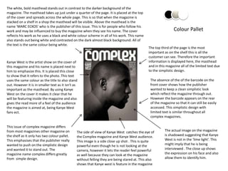
- 1. The white, bold masthead stands out in contrast to the darker background of the magazine. The masthead takes up just under a quarter of the page. It is placed at the top of the cover and spreads across the whole page. This is so that when the magazine is stacked on a shelf in a shop the masthead will be visible. Above the masthead is the name ‘MARC ECKOS’ who is the publisher of this issue. This is for people who follow his work and may be influenced to buy the magazine when they see his name. The cover Colour Pallet reflects his work as he uses a black and white colour scheme in all of his work. This name also stands out being white and contrasted on the dark almost black background. All of the text is the same colour being white. The top third of the page is the most important as on the shelf this is all the customer can see. Therefore the important Kanye West is the artist show on the cover of information is displayed here, the masthead this magazine and his name is placed next to and in this magazine all of the limited text due him to emphasize this. It is placed this close to the simplistic design. to show that it refers to the photo. This text uses the same colour as the title to also stand The absence of the of the barcode on the out. However it is in smaller text as it isn't as front cover shows how the publisher important as the masthead. By using Kanye wanted to keep a clean simplistic look West on the cover it makes it clear that he which reflect the magazine through out. will be featuring inside the magazine and also However the barcode appears on the rear gives the read more of a feel of the audience of the magazine so that it can still be easily the magazine is aimed at, being Kanye West accessed. This simplistic design with fans ect. limited text is similar throughout all complex magazines. This issue of complex magazine differs from most magazines other magazine on The side of view of Kanye West catches the eye of The actual image on the magazine the shelf as it only has two colour pallet. the Complex magazine and Kanye West audience. is shadowed suggesting that Kanye This emphasises that the publisher really This image is a side close up shot . This is quite West is not in the ‘lime light’. This wanted to push on the simplistic design powerful even though he is not looking at the might imply that he is being and wanted it to stand out. The camera, however it lets the reader feel powerful interviewed . The close up shows magazine name complex differs greatly as well because they can look at the magazine the expression on his face and also from simple design. without felling they are being stared at. This also allow them to identify him. shows that Kanye west is feature in the magazine
- 2. PAPAER magazine forwards towards covering and discovering cultural movements with a focus on fashion The masthead in this magazine differs from the common bold, covering the width of the hole page and instead appears down the left hand side. This is odd as when on a shelf all of the title with not be visible. It stands out in in contrast to the lighter background however the designer linked it with the background by making the lines go through the text. The front cover looks arty with Colour Pallet more that seven colours being shown. This links with the rest of the magazine as you cant see from the front cover this is an ART issue. Paper magazines masthead differs from The three boxes contain all the text displayed on most other magazines firstly because it is the front cover. This is to make it look neat and also positioned down the left hand side of the the boxes look pop arty with ties in with the theme cover and secondly the style, however this of art. All of the text in these boxes contrasts with creates a unique factor about it and makes the background of them to make the text easily it easily recognisable. The masthead gives readable. All of the text is trying to lure the the impression on stencils which ties in customer into buying the magazine. One way it with the arty theme. I like the design of the does this is buy including famous name. For magazine and I think the transfer from a example in this issue editor Shepard Fairey is plain look on the right to a burst of colour clamed as being there ‘guest’, claiming that he is an in the left works well. important person and the customer needs buy this issue because they wont get the opportunity again. Pharrell , who is shown in a low angle mid Paper magazine differs from The barcode is a convention of an everyday shot is looking down at the camera most magazine as throughout magazine. It is usually small and making it’s a strong ‘dominant’ photo. He the different covers the title placed, hidden away, in the corner not is show normal on the write then merges moves around to different standing out. This is so it doesn’t take the into a cartoon picture on the left. He is in positions on the cover. This readers eye away from the image. The barcode black and white which makes him stand keeps the customer interested contains all the information needed in order to out compared to the colourful but looses the effected of a solid sell the magazine. The barcode can sometime background. This suggests Pharrell will identifiable cover. contain the price next to it and even a website. feature in the magazine.
- 3. The white, bold masthead stands out in contrast to the darker background of the magazine. The masthead takes up just under a quarter of the page. It is placed at the top of the cover and spreads across the whole page. This is so that when the magazine is stacked on a shelf in a shop the masthead will be visible. Above the masthead is the name ‘MARC ECKOS’ who is the publisher of this issue. This is for people who follow his work and may be influenced to buy Colour Pallet the magazine when they see his name. This name also stands out being white and contrasted on the dark All of the text is the same colour being white. The hole cover is aimed at Kid Cudi as an artist which shows he will be a main feature in the magazine. This text on the right hand side of the cover ‘putting Kid Cudi is the artist show on the cover of this the peaces together’ is a cleaver way magazine and his name is placed next to him the designer has linked the design with to emphasize this. This is continues through a Kid Cudi. The design of the cover make number of Complex magazines. It is placed Kid Cudi fans want to read more hoping this close to show that it refers to the photo. to get an insight into his life and also This text uses the same colour as the title to walkers by that are interested by the also stand out, however it is in smaller text as design and want to see more. it isn't as important as the masthead. By using Kid Cudi on the cover it makes it clear The absence of the of the barcode on the that he will be featuring inside the magazine front cover shows how the publisher and also gives customer that aren't regular wanted to keep a clean simplistic look buyers more of a feel of the audience the which reflect the magazine through out. magazine is aimed at, being Kid Cudi fans ect. However the barcode appears on the rear The Picture in this issue stands out compared of the magazine so that it can still be easily to the background unlike the previous accessed. This simplistic design with magazine. This may be because there is so limited text is similar throughout all The design of this magazine is much detail in this cover. complex magazines. interesting and one I have never seen anything similar to both before and The picture of Kid Cudi is a close up. during my research. The design is both This gives the audience a detailed cleaver and interesting and is not view of him and makes him easily instantly clear. I catches the eye of the identifiable to walking customers customer and takes second look to when the magazine is staked on the take in all of the cover. shelve.