The Empire Masthead is prominently displayed at the top of the magazine cover in large capital letters to represent its importance. The main image features actor Leonardo DiCaprio in a close-up that aims to draw in his fans. DiCaprio is positioned to appear as though he is dominating the New York skyline, linking him and the magazine's title to themes of sophistication and dominance. The film title "Inception" is given equal prominence to the masthead through its large size and central positioning across the cover, ensuring attention is drawn to Leonardo's involvement in the film.
This is my second magazine analysis of a general movie magazine, promoting comedy film, 'Anchorman 2'. I analysed this in order to find out more about conventions of general movie magazines, in order to help me when creating my own magazine.
This is my second magazine analysis of a general movie magazine, promoting comedy film, 'Anchorman 2'. I analysed this in order to find out more about conventions of general movie magazines, in order to help me when creating my own magazine.
Welcome to TechSoup New Member Orientation and Q&A (May 2024).pdfTechSoup
In this webinar you will learn how your organization can access TechSoup's wide variety of product discount and donation programs. From hardware to software, we'll give you a tour of the tools available to help your nonprofit with productivity, collaboration, financial management, donor tracking, security, and more.
Francesca Gottschalk - How can education support child empowerment.pptxEduSkills OECD
Francesca Gottschalk from the OECD’s Centre for Educational Research and Innovation presents at the Ask an Expert Webinar: How can education support child empowerment?
June 3, 2024 Anti-Semitism Letter Sent to MIT President Kornbluth and MIT Cor...Levi Shapiro
Letter from the Congress of the United States regarding Anti-Semitism sent June 3rd to MIT President Sally Kornbluth, MIT Corp Chair, Mark Gorenberg
Dear Dr. Kornbluth and Mr. Gorenberg,
The US House of Representatives is deeply concerned by ongoing and pervasive acts of antisemitic
harassment and intimidation at the Massachusetts Institute of Technology (MIT). Failing to act decisively to ensure a safe learning environment for all students would be a grave dereliction of your responsibilities as President of MIT and Chair of the MIT Corporation.
This Congress will not stand idly by and allow an environment hostile to Jewish students to persist. The House believes that your institution is in violation of Title VI of the Civil Rights Act, and the inability or
unwillingness to rectify this violation through action requires accountability.
Postsecondary education is a unique opportunity for students to learn and have their ideas and beliefs challenged. However, universities receiving hundreds of millions of federal funds annually have denied
students that opportunity and have been hijacked to become venues for the promotion of terrorism, antisemitic harassment and intimidation, unlawful encampments, and in some cases, assaults and riots.
The House of Representatives will not countenance the use of federal funds to indoctrinate students into hateful, antisemitic, anti-American supporters of terrorism. Investigations into campus antisemitism by the Committee on Education and the Workforce and the Committee on Ways and Means have been expanded into a Congress-wide probe across all relevant jurisdictions to address this national crisis. The undersigned Committees will conduct oversight into the use of federal funds at MIT and its learning environment under authorities granted to each Committee.
• The Committee on Education and the Workforce has been investigating your institution since December 7, 2023. The Committee has broad jurisdiction over postsecondary education, including its compliance with Title VI of the Civil Rights Act, campus safety concerns over disruptions to the learning environment, and the awarding of federal student aid under the Higher Education Act.
• The Committee on Oversight and Accountability is investigating the sources of funding and other support flowing to groups espousing pro-Hamas propaganda and engaged in antisemitic harassment and intimidation of students. The Committee on Oversight and Accountability is the principal oversight committee of the US House of Representatives and has broad authority to investigate “any matter” at “any time” under House Rule X.
• The Committee on Ways and Means has been investigating several universities since November 15, 2023, when the Committee held a hearing entitled From Ivory Towers to Dark Corners: Investigating the Nexus Between Antisemitism, Tax-Exempt Universities, and Terror Financing. The Committee followed the hearing with letters to those institutions on January 10, 202
A Strategic Approach: GenAI in EducationPeter Windle
Artificial Intelligence (AI) technologies such as Generative AI, Image Generators and Large Language Models have had a dramatic impact on teaching, learning and assessment over the past 18 months. The most immediate threat AI posed was to Academic Integrity with Higher Education Institutes (HEIs) focusing their efforts on combating the use of GenAI in assessment. Guidelines were developed for staff and students, policies put in place too. Innovative educators have forged paths in the use of Generative AI for teaching, learning and assessments leading to pockets of transformation springing up across HEIs, often with little or no top-down guidance, support or direction.
This Gasta posits a strategic approach to integrating AI into HEIs to prepare staff, students and the curriculum for an evolving world and workplace. We will highlight the advantages of working with these technologies beyond the realm of teaching, learning and assessment by considering prompt engineering skills, industry impact, curriculum changes, and the need for staff upskilling. In contrast, not engaging strategically with Generative AI poses risks, including falling behind peers, missed opportunities and failing to ensure our graduates remain employable. The rapid evolution of AI technologies necessitates a proactive and strategic approach if we are to remain relevant.
Palestine last event orientationfvgnh .pptxRaedMohamed3
An EFL lesson about the current events in Palestine. It is intended to be for intermediate students who wish to increase their listening skills through a short lesson in power point.
Acetabularia Information For Class 9 .docxvaibhavrinwa19
Acetabularia acetabulum is a single-celled green alga that in its vegetative state is morphologically differentiated into a basal rhizoid and an axially elongated stalk, which bears whorls of branching hairs. The single diploid nucleus resides in the rhizoid.
Introduction to AI for Nonprofits with Tapp NetworkTechSoup
Dive into the world of AI! Experts Jon Hill and Tareq Monaur will guide you through AI's role in enhancing nonprofit websites and basic marketing strategies, making it easy to understand and apply.
Introduction to AI for Nonprofits with Tapp Network
Magazine analysis
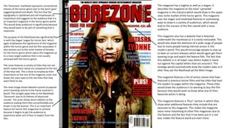
1. The ‘Gorezone’ masthead represents conventional
themes of the horror genre due to the word ‘gore’
suggesting blood and death. The fact that the
typography is capitalised and red emphasises its
importance and suggests to the audience that it is
an important magazine in the horror genre world.
This would draw audiences in significantly because
they would want to be part of something that is
important.
The purpose of the Masthead also significantly fits
in with the slogan ‘vogue for horror fans’ which
again emphasises the significance of the magazine
within the horror genre and the film associated. It
also reaches out to the niche market of females
for the horror genre which opens the magazine up
to a mass target audience that is not usually
achieved with the horror genre.
The cover features a variety of titles that are red
which makes them stand out compared to the rest
of the blue text. This is done to emphasise their
importance on the rest of the magazine cover and
draws the users eyes to the red titles that they
want them to see.
The main image shows Natasha Lyonne (a popular
actor) standing central to the frame covered in
blood. This straight away links to the Masthead
‘Gorezone’ due to its themes of blood and
murder. The actor shows direct address to the
audience making them feel uncomfortable and
drawn in by the woman. This is an important
feature for horror film magazines to achieve
because it begins to get the audience to
experience what sort of fear to expect from the
film.
This magazine has a tagline as well as a slogan. It
describes the magazine as the most ‘upmarket’
magazine in the industry which would draw in the upper
class niche market of the horror genre. This magazine
uses the slogan and masthead features in contrasting
ways to draw in a variety of audiences, which would
lead to the success of the film overall with a mass
audience.
This magazine also has a website that is featured
underneath the masthead so it is easily noticeable. This
would also draw the attention of a wide range of people
due to many people having internet access in the
modern world. This would encourage people to stay up
to date on current releases which would again get them
wanting to go and watch the feature film. The fact that
this website is in all lower case letters makes it stand
out against the capital letters that are around it. This
strategy would automatically draw the readers eyes to it
after they see the Masthead ad the Main Image.
The magazine features a list of actors names that have
featured in previous horror films and has titles that lead
the readers to pages within the magazine. These titles
would draw the audience in to wanting to buy the film
because they would want to know what one of their
favourite actors is doing.
This magazine features a ‘Plus!’ section in which they
show what additional features they include that are
exclusive to this magazine. This makes the magazine
seem more interesting to other film magazines due to
this feature and the fact that it has been put in a red
box, makes the feature stand out even more.
2. The Masthead has been cleverly made
large, red, capitalised and prominent on the
front of this magazine cover. The name
‘Empire’ creates the sense of sophistication
which can be associated to large companies
over the world, most particularly within
New York, America. This draws in a higher
class audience as well as a lower class
audience that looks up to and dreams of
upper class companies and people.
The Main Image overpowers this magazine
unlike the previous Gorezone poster. In this
magazine, the famous actor Leonardo
Dicaprio is placed in front of the masthead
to show his importance and to ensure that
his fans are instantly drawn to him. He is
seen in a suit, which again reinforces the
theme of sophistication around this
magazine and also makes the magazine
appear more dominant over other
magazines within the entertainment
industry.
The image behind Leonardo Dicaprio is
carefully edited to look as though the actor
is dominating the New York sky line. Due to
New York being such a conventional place
for popular films to be set, this draws in the
audience and would make them want to
watch the featured film. This again creates
a link between the Empire title which is
associated with New York, and the
sophistication and dominance that
Leonardo shows in the main image.
This magazine promotes features of other popular
films and these film features are laid out cleverly to
frame Leonardo Dicaprio so that all of the attention
is on him. They are each individually slanted inwards
towards Leonardo which makes the writing look
dramatic and important. As a result the audiences
focus is pulled to the film name as well as the main
image which are important for the promotion of the
film.
The strapline ‘the dark knight returns’ also links in
with the famous actor and again makes the audience
fully aware of how famous he is. It also links to
connotations of other popular films such as Batman,
which are very popular with the male demographic.
The fact that this strapline is right at the very top of
the cover and is quite large also makes the
importance of the film Inception seem more
prominent because of how famous the actor in it is.
This would lead them wanting more and therefore
going to watch the film as a result.
The main title is just as big as he masthead in this
magazine and even dominates over the main image.
This has been done to prevent it from being over
looked by the famous actor. The fact that it is read
and straight across the middle of the magazine
makes the audience instantly draw their eyes to it
and make a link between the film and the actor. They
would be made aware that Leonardo features in the
film and would be more than willing to buy the
magazine to learn more about it.
3. The Empire Masthead is large and
capitalised to represent its importance as
it dominates over the image. It is in front
of the main image and is the largest
typography on the magazine which makes
it stand it the most to the audience.
The main image is a close-up of the main
character within the Tron Legacy. This aims
at a niche market who knows the actor
and the film which means the largest fans
of the film will want to buy the magazine.
The use of colour is done effectively in this
magazine. The blue of the characters eyes
matches the background and the fact that
he is giving direct address makes the
audience feel dominated by the actor and
intrigued as to what their character is.
The main title ‘Tron legacy’ is in all capital
letters and in white and blue to make it
contrast and stand out the rest of the
typography on the magazine cover. This is
effective for the audiences eyes to be
drawn to the name of the film leading
them to be intrigued as to what it is.
The strapline for this magazine is
‘Magazine of the year’. The strapline is
plain and simple and this shows its
dominance within the entertainment
industry in a sophisticated way.
The strapline suggests to the audience that they are
special because they are experiencing an award
winning event and film that is the best of its kind this
year. This would encourage them to go and see the
film.
This film magazine uses titles that are yellow. Yellow
is the first colour that the human eye is drawn to
according the scientific research, therefore by them
using this very contrasting colour the audience would
have no trouble noticing events such as the Oscars
and the rhetorical questions that are on the cover in
yellow. This makes the magazine look interesting
which would draw them into watching the films that
are featured.
This magazine features a small tab showing other
magazines within this special collectors edition set for
this particular film. This would encourage the readers
to go out and buy the other magazines in order to be
involved with the film even more.
The word ‘god’ is put in red so that the audience are
drawn to it after the see the title due to them being
the same colour. This makes them aware that this is
what the actor in the front cover plays within the film,
Tron Legacy. The fact that they have used the colour
red which is only featured in the Masthead and the
word Ultimate on the cover shows how important
this character is. This would make the audience want
to know more about the character as a result and
they would therefore want to watch the film that is
featured in the magazine.