The VIBE magazine cover uses bright contrasting colors to catch readers' attention, featuring an interview with Kanye West taking up the center. It employs Guttenberg's theories well with an eye-catching headline area and strong secondary story boxes. In contrast, the ROLLING STONE cover has a more muted, traditional design befitting its focus on older genres. It draws readers' eyes across the cover using the rule of thirds composition and large bold text boxes. Overall, VIBE has a more vibrant, modern design aimed at younger audiences while ROLLING STONE's simpler design appeals more to established fans of its featured artists.
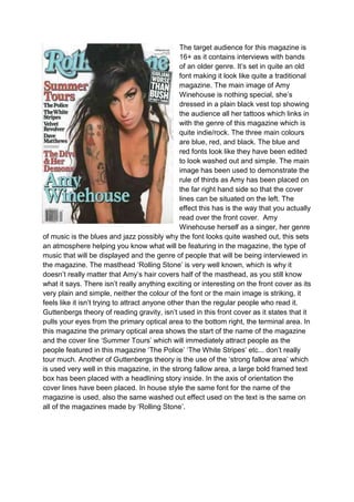


![Cover page essay[1]](https://cdn.slidesharecdn.com/ss_thumbnails/coverpageessay1-120306090038-phpapp01-thumbnail.jpg?width=640&height=640&fit=bounds)