This double page spread from an NME magazine features an article about singer Lana Del Rey. The black and white photo of Lana Del Rey contrasts with the bright blue and orange colors used in the text, which helps draw the reader's eye. The title "Mission Accomplished" and Lana winking in the photo intrigue the reader about what mission was accomplished, enticing them to read the article. A blue box with statistics on Lana's success also catches the reader's attention and informs them about her popularity. The overall layout and design elements on the page aim to attract and engage the reader in learning more about Lana Del Rey.
This double-page magazine spread focuses on Nicki Minaj. The dominant color is pink, matching Nicki Minaj's known girly public persona. Her name and a photo of her wearing pink lipstick are featured. The simple color scheme of pink, black, and white matches elements of Nicki Minaj's identity and style. Sections of text have titles to allow readers to choose which parts to read. Imagery, fonts, and pull quotes are designed to draw the reader in and encourage reading the full article.
The document discusses how the media product, a music magazine called STRAZ, uses and challenges conventions of real music magazines to appeal to its target audience of young females. The magazine's title, layout, images, and written content all incorporate conventions of pop magazines like bold mastheads, colorful designs, celebrity photos, and interviews, but make some unique design choices to stand out. The goal is to attract readers by looking professional while putting a fresh spin on typical magazine styles.
The Digipak cover uses simple black and white imagery and minimal text to convey emotion and mystery. Images of the artist with tears suggest the album will provide insight into her feelings and give the audience a sense of her true identity. While she is portrayed as a "monster", the crying implies she does not want this label and seeks sympathy from listeners. The monochrome color scheme reinforces the unknown nature of her identity.
This magazine article uses a double page spread with a large sepia toned photograph taking up most of the pages. The photograph and its vintage style represents the musician's classic rock style. There is minimal use of color with black text on one side of the page. The informal language and inclusion of a lighter in the photograph help provide context about the musician's rock and roll lifestyle. Overall, the simple yet effective layout and design inspire the creator to consider simplicity in their own magazine spreads.
The Macabees are featured in the article. They are an indie/rock band from London that will attract a young audience interested in that genre of music. The language used in the article is informal and casual to be accessible to a wide readership. Bright colors like orange and blue are used in the design which relates to the band's grungy rock and roll style. Images appear to be candid shots from concerts and portray the band as fun and playful.
The double page spread features the indie rock band The Macabees in NME Magazine. A variety of informal, candid photos from gigs and backstage are used. The main image on the left page shows the band looking disinterested. Smaller polaroid-style images spill onto the opposite page to connect the two. Bold orange and blue colors are used throughout in a grungy style befitting the band. Mixing fonts maintain clarity while overlapping text elements enhance cohesion. The informal, colorful presentation targets NME's young, creative readership interested in indie music.
The document analyzes and compares the design elements of magazines from different eras. It summarizes the mastheads, main images, cover lines, and layouts of a modern Rolling Stone magazine cover featuring Taylor Swift and an older Country Music magazine cover featuring Faith Hill. Key differences noted include fonts, image quality, and use of color. The document also examines contents pages and double page spreads, noting similarities and differences in elements like columns, images, and language.
The document summarizes the common features found on music magazine front covers, including a masthead, main artist image, rule of thirds layout, and coverlines. It then analyzes the covers of four magazines - Q, Top of the Pops, Vibe, and Kerrang - in more detail, noting similarities like these standard features but also variations in things like use of additional images, shot types (close-up vs. full-length), and target audiences (teens vs. adults). One magazine, Kerrang, is examined especially closely for its dark, aggressive rock music-focused style and 18-30 year old male target readership.
The main image takes up one full page, maintaining the band's brand identity across issues. It features Kings of Leon looking directly at the camera to create a personal connection with readers. The large, eye-catching image of the well-known band is intended to draw readers in. The dark, indie-rock styled image portrays the band's genre through icons like leather jackets and conveyed attitude. The interview article aims to promote and inform readers about the band through a mostly formal tone with some humor.
The document analyzes a double page spread from NME Magazine featuring the indie rock band The Macabees. It examines the target audience, language, colors, fonts, and images used. The target audience is suggested to be young, as the band plays festivals and has a playful side, portrayed by songs like "Dinosaurs." The language is informal and the colors are grungy, relating to the band's style. Images appear candid and backstage to portray the band's fun personality. The font and layout connect the two pages to form a cohesive double page spread.
Florence and the Machine magazine advertisement:
1) Florence is featured prominently to grab attention as a recognizable figure
2) Visual references to her album title and release date encourage readers to buy the album
3) Information about popular songs gives a taste of what's on the album to drive sales
Jessie J magazine advertisement:
1) Jessie takes up space to represent her big personality and encourage appreciation of her music
2) Mystery is created around what she has to say on the album to pique interest
3) References to chart success and popularity aim to join fans to the trend of her music
Gwen Stefani magazine advertisement:
1) Mysterious and
The document discusses plans for photography for an indie music magazine. It describes choosing a young male model for the cover to attract female readers. Photos on the contents page will show a variety of settings from studios to concerts. A double-page spread will feature sisters Anais and Molly Gallagher in natural outdoor settings to focus on their music. Costumes, locations, props and lighting are considered to achieve the magazine's indie style and showcase music-related content professionally.
This document analyzes a double page spread from a rock magazine. The spread uses typical conventions like columns of text and a large central image. The image shows a female model with a serious expression, dark makeup, and revealing clothing to portray a "rock chick" image and appeal to both male and female readers. The layout, colors, and fonts are also analyzed in terms of their symbolic meanings and how they represent the band and target demographics.
The document analyzes several album covers and digipaks, summarizing key details about each:
- The Ed Sheeran album cover uses a simple orange background and focuses only on the artist, aimed at teenagers.
- The JAY-Z LINKIN PARK digipak uses graffiti and urban imagery to represent genres colliding.
- The Lady Gaga digipak uses her tears on the cover to represent conveying her emotions through the album.
- The "Desert Rose" digipak depicts a mysterious woman in a desert setting, likely about romance in that environment.
- The Stendeck album suggests themes of loneliness and conflict through its bare tree images and use of red
This document analyzes magazine images and features related to different genres of music like jazz, pop, and their hybrid "Japop". It compares the styles, colors, poses, and other visual elements portrayed in the images to elements commonly associated with jazz, pop, and how they combine aspects of both. Over multiple paragraphs, specific similarities between the images are pointed out, like facial expressions, makeup, clothing, and how they target a younger audience demographic.
The document provides details on planning and designing a music magazine. It includes the results of an audience interview which found the target readership is mainly female teenagers interested in rock music. It discusses font and color scheme selections as well as ideas for photo spreads. The front cover concept is to feature a young male musician busking to appeal to both male and female readers. A double page story idea focuses on a personal profile of one band member rather than a group interview.
The document summarizes the creation of a music magazine called "Riot". Key details include:
- The target audience for the magazine was males and females aged 16-25, with a focus on music festivals and new bands.
- The magazine was designed with extensive research into conventions of existing music magazines and input from the target audience.
- A photoshoot captured images of artist Krissie Dawn that were featured prominently on the cover and contents page.
- The color scheme and layout elements like fonts and page sections were carefully planned to be consistent across pages and tie back to the genre of music covered.
This document provides a review and analysis of several magazine covers, merchandise items, and other products related to music genres like rap and hip hop. For each product, the reviewer analyzes design elements like images, colors, fonts, and layout to understand how they relate to the artist or genre and appeal to target audiences. The reviewer chose to analyze these specific products to gain inspiration for their own work in magazine design and merchandise creation focused on similar music genres.
Evaluations and preperation for main task keliroddy
The document provides details on organizing locations, props, costumes, and layout for a photo shoot and magazine focused on urban/edgy music. Two locations were chosen: a white brick wall for its rebellious feel, and a back garden to provide childhood contrast. Props included a fur leopard coat, hooped earrings, and exaggerated makeup to portray the music industry as sexual yet normal. The magazine masthead "URBANised" was chosen for its bold, edgy font in red to match the model's lips on the cover. Photos were taken and analyzed to select shots portraying preparation, scenery, and interviews to best represent the genre.
Evaluations and preperation for main task eliroddy
The document provides details on organizing locations, props, costumes, and layout for a photo shoot and magazine focused on urban/edgy music. Two locations were chosen: a white brick wall for its rebellious feel, and a back garden to provide childhood contrast. Props included a fur leopard coat, hooped earrings, and exaggerated makeup to portray the music industry as sexual yet normal. The masthead "URBANised" was chosen for its bold, edgy font in red to match the model's lips on the cover. Test photos were taken to select the best images to portray the magazine's genre.
This document provides information about several music magazines published in the UK, including Q, NME, and Mojo. It summarizes their target demographics, circulation numbers, and other details. Q targets all ages and genres but has more male (68.3%) than female readers. NME targets males aged 15-35 and has a circulation of 18,184. Mojo has a mixed-age readership and circulation of 98,484. It also provides examples of magazine spreads, discussing layout, images, and design choices.
The target audience for the music magazine is young people interested in pop and indie music based on research. Most respondents were ages 18-25 and listened to a variety of music genres including pop, hip hop, rap, indie, and rock. While few regularly buy music magazines, they look for headlines and articles about their favorite celebrities along with interesting pictures. The magazine will aim to cover these music styles with relevant content to appeal to this audience.
This double-page magazine spread features David Bowie as the central image. The large black and white portrait of Bowie dominates the left page, drawing the reader's eye. The bold masthead displays the magazine's name in capital letters against a white background. Text on the right page is divided into three columns in a formal style. The monochrome colour palette reflects the theme of the magazine and Bowie's image and career. It appears to be a music/interview magazine focused on profiling Bowie at the height of his career through this striking central image and accompanying article.
The target audience for the music magazine will be people interested in pop and indie music between the ages of 18-25. Research found most potential readers listen to a variety of music genres but prefer pop, rock, and indie. They want headlines and articles about their favorite artists along with interesting pictures. Advertisements for concerts and new music would attract readers the most. The magazine should focus on real music artists rather than just celebrities.
This document analyzes and compares the target audiences of three music magazines: Kerrang, DJ, and Top of the Pops. Kerrang targets an older, heavy metal audience as indicated by scruffy musicians on the cover and intense imagery. DJ targets a younger, 20-35 audience with references to partying and a scantily clad woman on the cover. Top of the Pops targets teenage girls with pink coloring, celebrities appealing to girls, and appropriate imagery of a covered female celebrity.
This document analyzes and compares the target audiences of three music magazines: Kerrang, DJ, and Top of the Pops. Kerrang targets an older audience that is into heavy metal music, as evidenced by scruffy musicians on the cover and use of intense imagery. DJ targets a mixed gender audience ages 20-35 with a focus on electronic music, using bright colors and images of women. Top of the Pops targets teenage girls with pink colors, topics they can relate to, and images of young popular artists.
Vibe is a magazine focused on R&B and hip-hop music, launched in 1993 by Quincy Jones. While it shut down print production in 2009, it was purchased by a private equity firm and continues online. The magazine features artists and entertainers predominantly from the hip-hop world. Its target audience is between ages 18-34, especially those interested in hip-hop culture.
This document analyzes advertisements for albums by Lana Del Rey, Coldplay, and Ed Sheeran.
For Lana Del Rey's advertisement, the analysis notes her sophisticated yet confident posture and subtle makeup. It discusses symbolic meanings of the advertisement's color scheme of orange, white, and blue. The rural setting depicts an American backyard.
The Coldplay advertisement features a collage of graffiti samples, suggesting rebellious or alternative music. A colorful piece of art in the center balances the graffiti's negative connotations.
Ed Sheeran's shy, flirtatious expression in his advertisement breaks male stereotypes. His body language suggests an introverted personality timidly flirting
The front cover of Nicki Minaj's album "Pink Friday" portrays a very feminine and pink theme that matches the album title. Her legs appear digitally edited to look like a "Barbie doll" and portray an image of flawless perfection. The back cover continues the Barbie doll comparison with Minaj's pink outfit and frozen facial expression on the CD resembling a doll. Both covers conform to stereotypes of women as sexual objects and always needing to look perfect.
The image takes up most of the album cover, showing Christian Grey and Anastasia Steele in an intimate embrace. Their closed eyes and her submissive pose imply a relaxed, passionate feel. The solid black background directs attention to the image and suggests a serious, powerful theme. The greyscale color scheme targets an adult audience by avoiding bright colors appealing to children. Placing the image prominently and using a serious font and color for the title and description at the bottom further emphasizes a sophisticated, adult-oriented message focused on passion and intimacy.
The back cover of the album continues the color scheme and imagery from the front cover. The main image from the front is split down the middle, with the track list in between. This draws attention to the list of songs. The plain white background helps the black text for the track list stand out as the focal point. Information on the spine matches the front cover for easy identification when stacked. The consistent style and colors tie the front and back covers cohesively together.
Research similar product analysis articleshollyetty123
This document discusses the layout and design conventions used in magazine double page spreads. It provides details on the structure, including ordered columns, informal tone, capitalized headings, and adherence to a consistent color scheme. Large images of artists are featured to engage readers and represent the subject's personality. Introductory paragraphs and pull quotes are used to grab attention and tease exciting interview content. Page numbers and social media links are also typical magazine elements.
Research similar product analysis articleshollyetty123
The document analyzes the layout and design of a double-page magazine article about artist Nicki Minaj. It discusses the use of columns, colors, images, headings, and other stylistic choices that adhere to magazine conventions. The large central image depicts Minaj in an outfit representing her confident personality. The heading "The Gospel According to Nicki Minaj" presents her as an influential icon. Overall the document examines how the article's visual elements are strategically designed to engage readers and represent the artist.
Research similar product analysis articleshollyetty123
The document provides an analysis of the layout and design conventions used in magazine double page spreads featuring artist interviews and profiles. It discusses the use of columns, headings, images, pull quotes, and color schemes that adhere to magazine codes. The specific example analyzed is a double page spread from NME featuring Nicki Minaj. Key details include the large colorful image of Minaj in an attention-grabbing pose, the heading "The Gospel According to Nicki Minaj" in pink and black, and the adherence of page numbers and colors to the magazine's style.
Research similar product analysis articleshollyetty123
The document analyzes the layout and design elements of magazine double page spreads featuring celebrity interviews. It discusses how NME, Kerrang, and Q magazines structure their spreads, with ordered columns, informal tone, capitalized headings, and consistent color schemes. It also examines the large celebrity images used and how they represent the artists' personalities. Details like page numbers, pull quotes, and headings are meant to engage readers and adhere to magazine conventions.
The document analyzes the album cover of Beyoncé's self-titled album "Beyoncé". It discusses various design elements of the cover including the placement and styling of Beyoncé's name at the top in bold capital letters. It also analyzes the large image of Beyoncé herself on the cover which takes up most of the space, emphasizing that she wants to be the main focus. Additional elements like the cool blue color scheme and subtle blank background are also examined. Overall, the analysis concludes that the album cover is intended to portray Beyoncé as confident, proud of her heritage, and sexually appealing to her target audience of young adults and teenagers.
digipak analysis lorde, lana del rey, charli xcx, team music covers i am only doing this for the dicoverability score. this is getting super annoying man, public team speaking do this at the same time, pull the exmas now this is not working god i will break. my laptop is AMAZING. ahh the struggle
The image of Beyoncé takes up most of the album cover to draw attention to her. Her name is in a large, bold font at the top to ensure it is one of the first things noticed. The album title, "4", is much smaller at the bottom, implying her celebrity persona is more important than her music. Overall, the cover emphasizes Beyoncé's image over her music and positions her as proud, confident, and in control.
The document discusses the layout and design of a double-page magazine spread about Nicki Minaj in NME magazine. It follows standard magazine conventions, with columns, informal text, and Nicki Minaj's pink and black color scheme. A large image of Minaj portrays her confident and unique personality. The headline calls her article "The Gospel According to Nicki Minaj," presenting her as an icon to her fans. Overall the design aims to engage readers with Minaj's image and personality and make them want to learn more about her from the article.
To summarize the research:
Fanzines are publications made by enthusiasts about a particular topic like music or films. They are used to express feelings and share art, research, and findings. The document provides examples of fanzine covers from different genres and highlights design elements like images, fonts, colors, and layout. It also notes that digital fanzines can be customized online. Examining fanzine covers in the genre of drum and bass music provided ideas for an energetic, colorful design for a music-focused fanzine.
The document discusses conventions for Digipak album covers and analyzes three album covers. Digipaks became popular in the early 2000s and are designed to promote artist sales through extra features like DVDs, lyric books, and photos. They give fans more reasons to purchase physical copies over digital downloads. The analysis finds that two covers prominently feature the artist's name and image to identify them as the focus, while background elements relate to the artist's genre and themes. Font size and color are used intentionally across the covers analyzed.
The document provides analyses of three album covers and three music videos. The analyses examine elements like text, color, images, narratives, and how they relate to the artist's style and message. Specific details are given about each element and how they work together to represent concepts like rebellion, sophistication, and individualism. The relationship between the music and visual components is also discussed based on music video theories.
The document analyzes the digipak for Jess Glynne's album "I Cry When I Laugh". It discusses several key elements of the digipak design and their intended meanings. The vertical text on the cover is meant to represent crying and show that Jess is unique. Her makeup is slightly smudged to seem natural but also mysterious. The close-up shot helps connect with the audience and feels intimate. The ripped magazine pages on the cover suggest Jess has layers to hide who she is. The CD design and layout of information is meant to show Jess focusing on her music rather than other elements.
This document analyzes and summarizes the digipaks of several albums, including Kanye West's Graduation, Taylor Swift's 1989, Rihanna's Loud, and Lana Del Rey's Born to Die. Key elements summarized include album covers featuring artists, symbolic imagery, color schemes, fonts, and inclusion of lyrics or booklets. Design choices are discussed in relation to conveying themes of the albums and appealing to target audiences.
The document analyzes magazine covers and contents pages featuring hip hop artists. Key points analyzed include color schemes, fonts, images of artists, and how design elements relate to the artists' brands and music genres. Specific artists mentioned include The Game, Lady Gaga, Wiz Khalifa, and Nicki Minaj. Design features are discussed in relation to attracting audiences and representing the artists.
The poster summarizes Rihanna's album "Unapologetic" using typical conventions of her genre. It features the house style colors of black and gold, with black giving an edgy feel and gold relating to "bling". The large sans-serif text allows the album title to stand out among other texts of varying sizes and fonts, including a graffiti style for the main title and rounded letters appealing to her female audience. While Rihanna's name is prominently displayed, her picture is not needed due to her fame. The date released is also bolded to stick in viewers' minds.
This magazine cover features Justin Bieber dressed in a rock and roll style to appeal to both his fans and non-fans by showing he enjoys more than just singing for teen girls. The word "super" emphasizes how amazing he is. Little text is included so readers are enticed to buy the magazine to learn more. The cover uses red, black and white colors and features Justin in a medium shot that makes him look tough.
The document provides an analysis of the layout and design elements of magazine spreads featuring hip hop artists. Key points analyzed include:
- The use of bold fonts, colors, positioning and sizing of images and text to draw attention to important details and guide the reader through the content.
- Symbolic meanings and messages conveyed through artistic choices such as costumes, poses, colors and styles that relate to the themes and subjects featured.
- Formats and styles used that are tailored for younger audiences to make the content easy to read and engaging.
- Branding and identifying elements included to clearly indicate the publication and topic of coverage.
Executive Directors Chat Leveraging AI for Diversity, Equity, and InclusionTechSoup
Let’s explore the intersection of technology and equity in the final session of our DEI series. Discover how AI tools, like ChatGPT, can be used to support and enhance your nonprofit's DEI initiatives. Participants will gain insights into practical AI applications and get tips for leveraging technology to advance their DEI goals.
Introduction to AI for Nonprofits with Tapp NetworkTechSoup
Dive into the world of AI! Experts Jon Hill and Tareq Monaur will guide you through AI's role in enhancing nonprofit websites and basic marketing strategies, making it easy to understand and apply.
A workshop hosted by the South African Journal of Science aimed at postgraduate students and early career researchers with little or no experience in writing and publishing journal articles.
This slide is special for master students (MIBS & MIFB) in UUM. Also useful for readers who are interested in the topic of contemporary Islamic banking.
How to Fix the Import Error in the Odoo 17Celine George
An import error occurs when a program fails to import a module or library, disrupting its execution. In languages like Python, this issue arises when the specified module cannot be found or accessed, hindering the program's functionality. Resolving import errors is crucial for maintaining smooth software operation and uninterrupted development processes.
Strategies for Effective Upskilling is a presentation by Chinwendu Peace in a Your Skill Boost Masterclass organisation by the Excellence Foundation for South Sudan on 08th and 09th June 2024 from 1 PM to 3 PM on each day.
Biological screening of herbal drugs: Introduction and Need for
Phyto-Pharmacological Screening, New Strategies for evaluating
Natural Products, In vitro evaluation techniques for Antioxidants, Antimicrobial and Anticancer drugs. In vivo evaluation techniques
for Anti-inflammatory, Antiulcer, Anticancer, Wound healing, Antidiabetic, Hepatoprotective, Cardio protective, Diuretics and
Antifertility, Toxicity studies as per OECD guidelines
How to Add Chatter in the odoo 17 ERP ModuleCeline George
In Odoo, the chatter is like a chat tool that helps you work together on records. You can leave notes and track things, making it easier to talk with your team and partners. Inside chatter, all communication history, activity, and changes will be displayed.
Exploiting Artificial Intelligence for Empowering Researchers and Faculty, In...Dr. Vinod Kumar Kanvaria
Exploiting Artificial Intelligence for Empowering Researchers and Faculty,
International FDP on Fundamentals of Research in Social Sciences
at Integral University, Lucknow, 06.06.2024
By Dr. Vinod Kumar Kanvaria
Exploiting Artificial Intelligence for Empowering Researchers and Faculty, In...
Double Page Spread Analysis
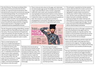
1. There isonlyone maincolouron thispage,and it dominates
the whole double page spread.The backgroundtothe textand
image ispink,Nicki Minaj’sname iswritteninbigcapital
lettersthisisalsoinpink,andin the photoof Nicki she is
wearingbrightpinklipstickwhichmatchesasimilarshade of
pinkto the colourin whichhername iswrittenin.The reason
inwhichthisis done isto match the identityandreputationof
Nicki.She isknownasa verygirlyartistand oftenis
photographedinasexual way.The brightpinkmatchesthis
perfectlyasof course pinkisrecognisedasa girlscolour.
The title of the text‘The Gospel accordingto Nicki
Minaj’doesn’tfitthe personalitythatshe often
portrays.As I have previouslymentionedshe often
portraysherself as sexyandiscommonlyseenwearing
minimal/revealingclothing.Thiscertainlydoesn’tfit
the title due tothe fact the work‘gospel’has
connotationsof religion.Thismaydrawa potential
readerto readthe textafteronlyreadingthe title.This
isbecause theymayhave seenthe wayNicki Minaj
presentherselftothe mediaandwill be intriguedto
findoutwhat she feelsis‘the gospel’asthe title
indicatedthiswill be revealedwithinthe text.
Thispull quote isseparatedupintotwoseparate
colours,blackand white thiscreatesacontrast and
makesthe quote standout a lotmore.It is also
highlightedinadarkershade of pinkwhichis
anotherwayin whichitmakesitstand out even
more.The font usedisalsodifferenttothe main
bodyof textandis a lotbolder,boththese
techniqueswill gainthe reader’sattentionand
effectivelyforce themtoreaditas itwill standout,
evenif theyare justglancingat the page.This pull
quote mayinterestthemthereforemakingthem
wantto read the bodyof textbelow.
The ring inwhichNicki iswearinghasletteringonit
whichspellsout‘ICON’thiswillsuggestthatNicki
herself isaniconwithinthe musicindustry.Someone
whomay not knowa lotabout hermay feel inclined
to readthe texttodiscovermore aboutthisicon
withinthe musicindustry.The ringisalsoblackand
white andisa similarfonttothe letteringusedinthe
pull quote justtothe leftof Nicki.
The colouringonthispage is
extremelysimple,consistingof pretty
much 3 colours,pink,black and white.
The pinkbeingthe background,a
darkershade for the title which
matchesthe shade of pinkof her
lipstick.Andthe blackandwhite
theme inthe pull quotesresemble the
blackand white inherdress,ring,eyes
and false eye lashes.
The bodiesof textare all splitup
intosmall sectionsandtheyall have
titlesinformingthe readeronwhat
the bodyof textbelowisabout.This
will allowthe readertoknowrealise
if theyare interestinreaderthe
paragraph below.Theycanpickand
choose whichpartsof the textthey
wantto read ratherthan readerthe
whole page.
The title ‘the gospel accordingtoNicki Minaj’isbroken
intotwo bythe use of twodifferenttypesof fontand
fontcolour. Thisensuresthatthe firstthingthat the
viewerwillreadwhenthe openthe page,is hername
whichI usedto lure the readerin, theywill thenread
the whole title whichisabove hername insmaller
font.
Althoughthe maincolouronthe page ispinkthere is
alsoa lotof boldblack onthe page as well,for
example the subtitles,herring,dressandhair.The
emphasisonthe thinkblackcouldbe there to reflect
the divaside to Nicki’spersonalityandthe factthat
she isalso sometimesseenasabad girl.
Nicki ismakingdirectaddresswiththe readerwithis
usedto lure the readerinand make themfeel a
connectiontothe magazine. The highkeylighting
ensuresthatthe picture of her isbrightand reflecting
the fact alt of her musiccouldbe consideredaspop
music.
There isa kickerbelowthe main
title,itisina smallerfonthoweverit
still standsoutdue to the fact that is
isin a blacktextand has some
selectedwordsinbold.The words,
‘queenof hiphopi ssandingbefore
you’inin boldwhichwill ensure the
readernoticesitafterreadingthe
title,thiswill intrigue themtoread
the mainbody of text.Also,the
words’10 commandments’isinbold
whichagainhas connotationsof
religion,muchlike the wordgospel
that featuresinthe title aswell.
2. Otherthan the picture the firstthingmyeye was
drawnto on the double page spreadwasthe pull
quote “It keepsdraggingme back”.The artist
featuredisDavidBowie one of the mostrecognised,
iconicand successful artistsever.Andthe pull quote
isclearlya quote fromhim.He has a huge amountof
fansthat wouldbe interestedinwhathe had to say,
so by usinga quote like that,will intriguethe reader,
theywill wanttoknowexactlywhatitis that is
dragginghimback, andfrom whathe isbeing
draggedback from.It’sa cleverpull quote andwill
certainlymake the readerwantto readthe textto
see whathe has to say.
The title of the textwhichalsodoublesupas a pull quote “Itkeepsdraggingme back..”iswell linkedwith the image onBowie
on the lefthandside.If somethingwasdraggingyouback,thiswouldbe frustratingasyouare notable to reach whatyou
shouldbe able to.The picture on the leftshowsa stressedoutfrustratedlookingBowie withhisheadinhishandsandglumly
usingdirectaddress.The readerwill automaticallybe able tolinkthe factthatBowie looksdestressedwiththe quoteonthe
rightand will wanttofindout exactlywhyhe feelsthisway,andof course,thiswill feature inthe text,drawingthe readerto
readit. Also,the factthat there isno colourin the image makesitlookdull andsombre,thiscoupleswiththe factthatthe title
suggeststhathe is frustrated,the title andimage reflectasimilaridea.
The black and white thatisnot onlyusedin
the image of bowie butalsoin the whole
page,there isno colourat all on the whole
page,thisrepresentsthe factthatbowie is
icon– he is a prominentBritishartistwhois
extremely well knownin Britishindierock
and general musicculture.The blackand
white theme mayalsorelate tothe fact that
althoughhismusicislistenedtomymanyin
thismoderndayan age, hismusicwas
writtenandproducedmainlyin70s. the
blackand white couldreflectthe factthat
hismusicwas releasedyearsagoandisnot
consideredtobe modernmusic.
There isalso a standfirstwhichisjust 4 lines
of textbelowthe maintitle.Thisisan
introductiontothe textandis justa small
previewtowhatmaybe featuredwithinthe
text.Thiswill allowthe readertodecide if
theywantto read the article withouthaving
to start readingthe maintextitself.
The majorityof the musicinwhichBowie
producedfallsunderthe ‘rock’genre.Inthe
image of him,whichisa mediumclose up,
the onlyitemof clothingvisibleof David’s
bodyis a blackleatherjacket.The black
leatherisa popularclothingitemwithinthe
rock industryandcouldbe seenas reflecting
hisgenre of music.
WhenDavidwas producingmusiche wascommonly
featuredinthe media,howeverusuallywithbrightcolours
aroundhimor wearingbrightclothes.The colourredwasa
commontheme witha lotof the photographstakenof him.
Thisis whyseeinghiminblackandwhite mayintrigue the
reader,theymaywonderwhyhe isin blackand white and
whythere isno colourwithinthe image,itdoesn’tsuitthe
standardimage portrayedof Bowie mythe media,thismy
make the readerwant to readthe textto findout.
At the start of each article a
drop cap isused,the font
size isa lot biggerthanthe
restof the textand the
lettersare a lotbolderthis
will drawattentiontothe
start of eacharticle and will
encourage the readerto
readthe text.
The image usedof bowie
isone of himwhenhe was
a lot younger,inhisprime.
Thisis to intrigue the
readerand make them
wonderwhyan oldimage
of bowie hasbeenused,
therefore makingthem
wantto read the text.
3. Thisdouble page spreadisfroman issue of an NME magazine.The
colouringof the photousedgoesagainstregularconventionsof an
NME magazine due tothe fact itis inblack andwhite.Thiscreates
a huge colourcontrast on the page due to the fact the texthas
brightblue andorange coloursaround it.
The photo of Lana Del Rey isinblack and
white,there isareasonbehindthisother
than to lookaestheticallypleasing.The
majorityof Lana Del Reysmusicis slow,
sad music,whichiswhythe dull,blackand
white photoof herfitsappropriately.The
dull image reflectshermusicaswhatshe
producesisn’t‘vibrant’or‘popgenre’her
musicisa lotmore traditional.Hermusic
ismore jazzand bluesreflectiverather
than contemporary.
The use of blue andorange also reflectsheras
an artist.Due tothe fact he brightcoloursand
reflectherage as she is a youngerartist.Orange
isseenas a rich colour,so the orange on the
page couldbe usedtosuggestthe fact her music
issophisticated.Thesecoloursalsohelpadabit
of colourto the page,usuallyona double page
spreadthe most colourful partof the page is the
picture,howeverasthispicture isblack and
white youlose thiscolour.Soinorderfor the
page to looksomewhatinterestingandvibrant
the textmusthave some kindof colourto it.
The title of the article and the fact that
Lana Del Reyis winkinginthe photograph is
cleverlythoughtthrough.The title is
‘MissionAccomplished’thisautomatically
makesthe readerwonderwhatmissionhas
beenaccomplishedandmaywantto make
themreadthe article tofindout,it isused
to pull the readerin,the title doublesupas
not onlya title butalsoa pull quote.
Althoughitisn’ta quote assuch it still
relatestothe textbeneathandto the
image,makingthe readerwantto readthe
text.The readermay looktothe picture for
cluesof what she hasaccomplishedandas
she iswinkingitmayintrigue the reader
evenmore. Sometimeswinkingis
associatedwithsomethingnaughtyor
doingsomethingyoushouldn’thave,soby
titlingthe text‘missionaccomplished’ and
pairingthisupwitha image of herwinking,
it maysuggestthat the ‘mission’wasone
that she wasn’tsupposedto take part in, it
maybe suggeststhatshe wasn’t allowedto
do whatevershe hasaccomplished,and
thiswill definitely intriguethe readerto
readthe text.
In the middle of the texttheyhave includedabox featuringstatisticson
Lanas Success.The box is a brightblue box whichstandsouton the
surroundingcoloursof white backgroundandblack text.The box will
catch the reader’sattentionandthe statsfeaturinginthe box will inform
the readerabout Lana del rey.Thismay drawpeople whodon’tusually
listentohermusicto read the article.Theymaysee howsuccessful she
has beenbyquicklyreadingthe statsandthenwantto read the article
on herafterthis.
The indie rockgenre isone that is generallyseen
as veryBritish.The fact that Lana Del Rey
appearswiththe Americanflaginthe
backgroundand the headerforthe DPS is
‘missionaccomplished’suggeststhathermission
may have possiblybeentobe recognisedinthe
UK and that’swhy the magazine iscelebratingit
withthe Americanflag.