Brenda Bokoe completed a preliminary task to design the front cover and contents page for a music magazine called "St. Paul's Vibe" as part of her AS Level Media Studies course. She provides step-by-step explanations and images documenting the design process for each page. Brenda also includes market research on established music magazines to inform her work, focusing on conventions like the use of prominent images and cover lines to attract readers. She determines her target audience will be students at St. Paul's Catholic College interested in music and school events.
Brenda Bokoe completed the preliminary task, log book, and evaluation for her music magazine production unit. She chose the name "St. Paul's Vibe" as the masthead as it represents giving out the feeling of St. Paul's students and teachers. For her front cover, she took a step-by-step approach over 11 steps to design the layout and integrate the images, text, and other elements. Her contents page followed a similar process over 9 steps. In her log book, she researched the genres, target audience, and conventions of established music magazines to inform her own production.
This log book details the research and planning done by the student for their music magazine preliminary task. It includes genre research on established music magazines, analysis of conventions like mastheads and cover lines. The target audience is identified as fans of hip hop and the cover star, aiming to fulfill social and diversion needs. The unique selling point discussed is the use of exclusive interviews and headlines to pique reader interest. Research on publishers is also included. The log book documents the process of understanding magazine conventions in preparation for the preliminary task.
This document provides a log book and evaluation for a student's preliminary task creating a music magazine. It includes 12 steps describing the process for creating the front cover and contents page. Key elements included a school logo and colors, main image, cover lines, social media links, and promotions. The target audience is described as 16-25 year old students. Conventions from established magazines are analyzed, including mastheads, headlines, images, and page numbers. The genre of hip hop is researched, focusing on popular magazines XXL and Vibe.
The document summarizes the process of creating a school magazine focused on pop music. It discusses researching conventions of magazines like Smash Hits and Top of the Pops to understand their layout, design, and target audiences. Conventions for the front cover, contents page, and double page spreads are analyzed. The intended audience is girls aged 9-15, and the magazine will be published by a company like Bauer Media or DC Thompson.
This document contains analyses of magazine front covers, contents pages, and double page spreads. Some key points made:
- Covers use prominent images of celebrities/artists and attention-grabbing headlines to attract readers interested in those people.
- Contents pages advertise the magazine's exclusive articles on popular musicians to draw in readers wanting the latest news.
- Double page spreads employ techniques like large central images, pull quotes as headers, and alternating text colors to make articles visually appealing and easy to read. Layouts aim to represent artists in a way that matches readers' interests.
The document is an evaluation of a student's media magazine project. The student analyzed existing music magazines to inform the design of their magazine covers, contents page, and double-page article spread. Throughout the project, the student conducted research through questionnaires to understand their target audience of 14-22 year olds and ensure the magazine appealed to and represented this group. Key elements included a focus on indie music, images of bands and artists, and articles on new and unsigned acts. The student distributed the magazine to the intended audience of teenagers and young adults interested in indie music.
The document discusses a media studies coursework assignment evaluating a student's mock magazine. It provides details on the magazine's design elements, conventions used, target audience, and how it represents and attracts that audience. Specifically, it summarizes that the magazine draws inspiration from Kerrang magazine's style and targets young adult rock music fans, using formal language, fashion photography, and references to bands like Florence and the Machine to appeal to and represent that social group.
This document is a student's log book and evaluation for a music magazine production project. It includes:
1) A progression of steps taken to design the magazine's front cover and contents page, including choosing fonts, images, and layout.
2) Research on the established music magazine Q, including its genre focus, circulation, readership demographics, and conventions.
3) Analysis of Q's target audience based on its price, readership data, and focus on aspiring social groups per Maslow's hierarchy.
4) Identification of Q's unique selling point as its special edition releases alongside its sister magazine.
This document provides an evaluation of Lauren Cudworth's media studies magazine project. It summarizes the key aspects of the magazine, including its target audience (originally 14-18 year olds but changed to 17-21), genre (chart music), and unique selling point (covering multiple music genres). It also analyzes elements of the magazine, such as how the cover page conforms to music magazine conventions and how the magazine represents older music stars to appeal to both younger fans and their parents. The document recommends IPC as a potential media institution to distribute the magazine due to their experience with music magazines.
The document provides an evaluation of a student's magazine cover and contents by their teacher. The student analyzed an NME magazine cover that influenced their design. Their cover includes conventions like the masthead, images, headlines, and puffs. The contents page layout is simple yet attractive. Images of both genders and a variety of stories aim to appeal to a wide audience. Typography, colors, and design elements were chosen to represent the target genre and age group. Feedback from peers found the magazine appeals to and is aimed at 16-25 year olds interested in indie/alternative rock music. Most said they would purchase this magazine.
The document summarizes Hannah Sweeney's media evaluation project creating a pop music magazine. It discusses how the magazine uses and develops conventions of real music magazines through elements like the cover design, contents page, double-page spread, and interviews. It also addresses how the magazine represents young women and how the target audience of 16-25 year olds was identified and addressed. The document reflects on the software tools used and what was learned through the process about constructing a media product from preliminary ideas to the final magazine.
This document is a log book for a student named Katherine Hulatt completing a preliminary task for an AS Level Media Studies course. It details her process for creating a front cover and contents page for a fictional music magazine called "Clash Magazine" for St. Paul's Catholic College. The log book provides step-by-step explanations of design choices and includes images of the work in progress. Research is also presented on conventions of music magazines and the target audience and unique selling points of the existing magazine "Clash Magazine," which served as inspiration.
This document is a log book and evaluation for a student's AS Level media studies foundation portfolio. It includes documentation of the student's preliminary task progression for creating a music magazine, including front cover, contents page, and double page spread. It also includes research on existing magazines like Billboard and Top of the Pops to inform the design. The student evaluates their use of industry conventions in the mock magazine and assesses its representation of social groups and target audience. They conclude by reflecting on the software and publishing processes involved.
This document provides an evaluation and log book for a student's media studies project creating a music magazine. It includes:
1) An overview of the student's preliminary task progression for the front cover and contents page, including step-by-step explanations.
2) Research on existing magazines like Billboard and Top of the Pops to inform the student's magazine design.
3) An evaluation of how the student's magazine uses and develops conventions of real magazines and represents its target audience.
4) Reflections on what was learned from the research and creation process, including the technologies used.
The document summarizes the key aspects of an underground magazine created for a media studies assignment. It discusses conventions used and challenged in the magazine's design, such as cover lines, mastheads, images, and barcodes. Social groups represented include young people aged 14-20 interested in indie/rock music. A double page spread on a band called "The Pretty Suicides" uses different text colors and includes photos and a quote. The gender portrayed is strong, dominant teenage girls rather than stereotypical quiet ones. IPC Media is suggested as a suitable distributor since it produces magazines like NME that the underground magazine is similar to. The target audience is described as those who read magazines aimed at people interested in pop culture and
This document contains a student's log book and evaluation for their AS Level Media Studies foundation portfolio project on creating a music magazine. The log book details the student's research process, including exploring existing magazines like Billboard and Top of the Pops as models. It also contains preliminary sketches and explanations of designing the magazine's front cover, contents page, and a double-page spread. The evaluation reflects on how the student's magazine employs, develops, or challenges real magazine conventions and how it represents its target audience.
AS Media Studies- Music Magazine EvaluationNickySahota
The document discusses a music magazine created by the author. It follows conventions of real music magazines, such as having the magazine title, date, and issue number. The front cover features a central image of an artist looking at the camera to create a connection with readers. The contents page includes typical sections like pictures, headings, and subheadings. The author aims the magazine at males aged 16-21 interested in indie hip hop music. They chose to feature an artist in this genre and used pricing and design informed by a survey of the target audience. The author has learned new skills in photo editing and layout using software like Photoshop and how to better appeal to audiences through research and planning.
This document provides an overview of the contents for a presentation on magazine design. It includes mind maps for magazine ideas, proposals for two magazine concepts ("M" and "E"), graphic layouts, mood boards, and details on the development of "My Magazine" including genre, layout, style, content, audience, subscription offers, and masthead font designs.
Abbie fowler - 6402 - log book & evaluationAbbie Fowler
This document is a log book and evaluation for a student's preliminary task creating a music magazine. It includes step-by-step progressions and photos of the student designing the magazine's front cover and contents page. Research was also conducted on established music magazines to identify conventions like using high definition images and consistent mastheads. A survey provided feedback that images should stand out and represent various music genres to appeal to a wide audience.
This document is a log book and preliminary task progression for a student named Abbie Fowler completing an AS Level Media Studies course. It documents the process of designing magazine covers and contents pages for a music magazine project. The log book includes step-by-step progressions showing how the designs were developed, research on established magazines, target audiences, and survey results which informed the designs. The overall goal was to create magazine pages that met industry standards by applying lessons learned from analyzing professional publications.
The document provides details on two magazine pitches by the author - magazines titled "JKZ" and "HA".
For the JKZ magazine, the target audience is 15-25 year olds and will focus on pop, R&B and hip hop music. It will have articles, reviews and song lyrics. The style will use red, black, grey and dark green colors.
The HA magazine targets 11-17 year old girls and will include images, games and toys. It will have 62 pages including fold-out posters. The style uses light blue to seem superior in the market.
Both magazines aim to attract their audiences with entertaining content on the covers and inside. The author created layouts
This document is a log book and evaluation for a student's preliminary task creating a music magazine. It documents the student's process, including researching existing magazines, surveying audiences, and creating draft pages like the front cover and contents page. The student refined the pages over multiple steps, adding details. Research found the target audience is ages 15-25 and magazines should use high quality images. The completed magazine accurately reflects conventions of the genre.
This document is a log book and evaluation from a student named Abbie Fowler on their preliminary task to design a music magazine. It includes step-by-step progressions of the front cover and contents page designs. It also includes research on existing music magazines like Q Magazine and Mixmag to understand their conventions, target audiences, and unique selling points. A survey was conducted that provided feedback on preferences around music genres and magazine design. The conclusion recognizes how the research into other magazines will help the student produce a high quality music magazine that aligns with reader expectations.
The document discusses a student's media coursework project to create a new British music magazine focused on the genre of electro-pop. The student conducted research and found no existing electro-pop magazines, seeing an opportunity. The student believes the magazine will be popular given the growing popularity of electro-pop music and artists. The document includes questions about representing audiences, distribution partners, the target audience, and attracting readers.
The document discusses conventions of real pop music magazines that the media product challenges or develops. It summarizes that the masthead draws attention, cover lines correlate with content, and cover models attract the target audience. Imagery includes a relevant artist and plugs to attract readers. Text uses bright colors and engaging fonts for young audiences. The contents page includes the magazine title, date, page numbers, and captions to entice readers. Overall, the media product develops conventions through strategic use of images, text, and page design to appeal to its target demographic.
The document is an evaluation of a music magazine created by Shannon Abraham. It analyzes how the magazine uses and develops conventions of the media form. The evaluation discusses the magazine cover, contents page, and a feature article. It is noted that the magazine title, use of images and text grabs, and focus on popular artists helps attract its target audience of 12-16 year old females interested in new music artists. Real magazine covers from similar publications are included for comparison.
This document provides an in-depth profile of rapper Nicki Minaj as she prepares for the release of her sophomore album "Pink Friday: Roman Reloaded." It discusses her rise to fame and crossover success, as well as her evolving public persona. Minaj emphasizes that she no longer feels the need to prove herself and is focused on having fun with her music. While some criticized her debut for being too pop, she believes it validated her artistic choices. Minaj also discusses her close working relationship with Drake and maintaining control over her career and image.
The document outlines the author's vision for an ideal state. It describes establishing a presidential republic with power shared between the president and parliament. The president would be democratically elected and head of state. Successful politicians are described as risky, tolerant, popular, hardworking, and pliable. The branches of government would be executive, legislative, and judicial. The legislative branch is bicameral with a senate and council. The executive branch is headed by a democratically elected government. The bill of rights protects social programs, equality, freedom of speech, press, and right to petition the government. The state does not allow private property and families are an important social unit.
El desarrollo humano es un proceso complejo que involucra cambios físicos, cognitivos y emocionales. Los bebés pasan por etapas como gatear, caminar y hablar. A medida que los niños crecen, desarrollan habilidades más avanzadas como la lectura, escritura y pensamiento abstracto. El desarrollo continúa en la adolescencia y la edad adulta con el crecimiento emocional y la madurez.
3. l5 Textual Analysis of 2 soap opera trailers7483
This document contains an analysis of two soap opera trailers. For the first trailer, the analysis notes the ominous tone set by the voiceover and soundtrack. It examines the worried facial expressions of characters and themes of trust, hurt, and accusations in their dialogue. Camera zooms and shot reverse shots are also discussed. The second trailer is praised for its fast pacing created by editing and soundtrack. Costumes and facial expressions suggest conflict and betrayal among characters. Both trailers effectively use multiple storylines and verbal and nonverbal codes to intrigue audiences and convey what they will see.
The document provides details about the production of a music magazine by the author. Some key points:
- The author researched conventions of other music magazines to incorporate into their magazine.
- Conventions included color schemes, fonts, and elements like the masthead, cover lines, and barcode placement.
- The author challenged some conventions as well, such as the strapline and social media link placement.
- Inside pages replicated conventions but also added new elements like promotions and the artist's social media.
- The goal was to produce a magazine that represented the hip-hop/rap genre and targeted younger audiences.
Veredus Energy, Manufacturing and Infrastructure. UK Energy conference 2014Marghaid Howie
Our clients trust us to deliver on one of their most important
investment decisions - their leadership.
Our industry knowledge, functional expertise and
extensive networks ensure that our clients can trust us
to deliver on one of their most important investment
decisions – their leadership, both on a permanent and
interim basis.
The meeting notes document does not contain any substantive information about what was discussed in the meeting. It consists entirely of blank lines and page break symbols. In summary, the document provides no useful information about the meeting due to being completely blank.
Pig is a platform for analyzing large datasets that sits on top of Hadoop. It provides a simple language called Pig Latin for expressing data analysis processes. Pig Latin scripts are compiled into series of MapReduce jobs that process and analyze data in parallel across a Hadoop cluster. Pig aims to be easier to use than raw MapReduce programs by providing high-level operations like JOIN, FILTER, GROUP, and allowing analysis to be expressed without writing Java code. Common use cases for Pig include log and web data analysis, ETL processes, and quick prototyping of algorithms for large-scale data.
This document summarizes the results of a media survey about soap operas. It finds that 45% of people do not currently watch soap operas, so the soap will need interesting storylines and differentiation. It also finds that people prefer soaps that emphasize real-world issues and air on Mondays, Wednesdays, and Fridays. To attract viewers, the soap will need great characters, famous actors, high production quality, and storylines based on real-world issues.
A empresa de tecnologia anunciou um novo smartphone com câmera aprimorada, processador mais rápido e bateria de maior duração. O novo dispositivo também possui tela maior e armazenamento expansível. O lançamento está programado para o próximo mês com preço inicial sugerido de US$799.
Brenda Bokoe completed the preliminary task, log book, and evaluation for her music magazine production unit. She describes brainstorming potential magazine names before selecting "St. Paul's Vibe" as a suitable name representing the school. Brenda then provides a step-by-step account of designing the magazine cover and contents page in Photoshop, adding elements like grids, colors, fonts, images, and text. Her log book details genre and publisher research on established music magazines to inform her work. Brenda evaluates conventions like prominent images and cover lines used to attract readers.
Preliminary task and planning and research pregnaul99
This document provides details about Phoebe Regnault's media studies project to design a music magazine called "The Saints". It includes step-by-step progress on designing the magazine's front cover and contents page. Phoebe researches established music magazines like Q Magazine and XXL to identify conventions and target audiences. The publisher of XXL, Townsquare Media, is also researched.
This log book details the research and planning done by the student for their music magazine preliminary task. It includes genre research on established music magazines to understand conventions like mastheads, cover lines, and headlines. The student analyzed the target audiences and unique selling points of specific magazines like XXL and Vibe. They looked at publishers like Bauer Media and how they have helped magazines grow. The log book demonstrates the student's understanding of relevant media theories and how magazines attract audiences through techniques like using famous cover stars.
The document provides a log book and evaluation for a student's preliminary task creating a music magazine. It includes step-by-step progressions and evidence of creating the front cover and contents page, with explanations of design choices and techniques used at each step. Research is also presented on established music magazines, their target audiences and conventions, as well as on the publisher of one of the researched magazines.
Emma walker planning & research - templateewalker1252
The document provides details about a student's media studies coursework. It includes a preliminary task progression showing the steps taken to design a music magazine cover and contents page in Photoshop. It also includes research on the music magazine genre, an established magazine used for research, conventions of music magazines, and research on the publishers of Q Magazine and Billboard Magazine.
This document is a log book for a student named Katherine Hulatt completing a preliminary task for an AS Level Media Studies course. It details Katherine's process for creating a front cover and contents page for a fictional music magazine called "Clash". The log book provides step-by-step explanations and images showing how Katherine designed each element, choosing fonts, images, and conventions based on her research of established music magazines.
This document is a log book and evaluation for a student's media studies coursework to create a music magazine. It includes research on existing magazines, conventions of music magazines, target audiences, and the results of a questionnaire. It also documents the process of creating preliminary tasks - a school magazine front cover and contents page. The student analyzed each step and included it to show their planning and research before creating the final music magazine coursework project.
This document contains a student's log book and evaluation for their media studies coursework on creating a music magazine. It includes step-by-step progressions of the front cover and contents page designs, with explanations of design choices. It also contains research on music magazine genres and target audiences, as well as results from a questionnaire distributed to gather feedback. The student summarized the findings to apply to their own magazine design, focusing on features and contents preferred by readers.
Log book and evaluation aaron thomas templateAaron Thomas
This document outlines the steps Aaron Thomas took to create the front cover and contents page for a music magazine called "The Sixth" as part of an OCR Media Studies coursework assignment. It provides a log of the design decisions made at each step, including choosing fonts, images, and layout elements. The document also includes research Aaron conducted on music magazine genres and target audiences to inform the design of the magazine.
William Hennegan created a front cover and contents page for a music magazine called Friday Club as a preliminary task. For the front cover, he added elements like the masthead, main image, barcode, and cover lines. For the contents page, he included a masthead, editorial, magazine contents, and page numbers. In his research log, William analyzed the genres, target audiences, conventions, and publishers of established music magazines like Q and Uncut to inform his own magazine design.
This document is a log book and evaluation for a student's music magazine production project. It outlines the steps the student took to create the front cover, contents page, and conduct research on established music magazines. The student analyzed conventions of the XXL magazine such as bold mastheads, minimal text on covers, and quotes from artists in double page spreads. The target audience for XXL is identified as young adults aged 18-25 interested in hip hop. The unique selling points are said to be the use of well-known artists and exclusive information. XXL magazine is published by Harris Publications in New York.
This document provides a log book and evaluation for a student's preliminary task to design a front cover and contents page for a school music magazine as part of their OCR Media Studies AS Level course. The log book outlines the step-by-step process taken to design each element, including choosing colors, layouts, and conventions. Research was also conducted on the genre of R&B music magazines and the publication Vibe Magazine to help inform the design choices. An analysis of Vibe Magazine's front cover and contents page identifies features such as mastheads, cover lines, images, and categories to structure content.
Preliminary task and planning & researchShazlehurst
This document contains planning and research for a music magazine project by a student named Shaune Hazlehurst. It includes step-by-step descriptions and evidence of creating a front cover and contents page. It also contains research on the hip hop genre by analyzing magazine covers from 1986 and recent years. Additionally, it provides research on established music magazines including conventions, target audiences, and publishers.
This document is a log book and evaluation for a student's media studies coursework on producing a music magazine. It includes documentation of the student's preliminary task process for designing the front cover and contents page of a sample music magazine. It provides step-by-step explanations and photos of the design process. The log book also includes research conducted on music magazine genres and conventions, as well as analysis of established music magazines like Q and XXL that were used as models. The chosen genre was hip hop and XXL was the magazine selected to model the sample magazine after.
The document provides details of a student's log book and evaluation for their AS Level Media Studies portfolio project on creating a music magazine. It includes step-by-step progressions for designing the magazine's front cover and contents page with annotations. It also includes research on magazine genres, target audiences, and conventions. The student analyzed established music magazines and included information on publishers and circulation. Survey results on readership demographics were also included from research on their chosen magazine for inspiration.
The document provides details on the preliminary tasks, log book, and evaluation for a music magazine production project. It includes step-by-step progressions for designing the front cover and contents page with annotations. It also includes a brainstorm for magazine name ideas. The log book section describes research conducted on established music magazines, their conventions, target audiences, and publishers. A survey was conducted to gather information from the target audience. The survey results are summarized.
Maximilian Stainer created a front cover and contents page for a music magazine as a preliminary task. For the front cover, he selected colors and fonts to match the school brand, added a barcode with social media icons, and used editing tools to refine the main image. For the contents page, he organized subsections and added frames, images, and text boxes. Research included analyzing popular music genres, conventions of established magazines, target audiences, and the publisher. The USP identified was the use of a famous artist on the cover to attract readers through star appeal.
The document provides details on the planning and research for a music magazine front cover and contents page project. It describes the step-by-step process taken to create the front cover, including adding graphics, images, and text. It also outlines the steps to create the contents page layout. Research is presented on established music magazines like Q and Billboard to identify conventions and the target audiences. Key points about the publishers and statistical information about circulation and readers are also summarized.
The document is a log book and evaluation for a student's preliminary task, production, and evaluation of a music magazine. The student created front cover, contents page, and interview spread prototypes as part of their preliminary task. For the full product, they conducted research on music genres, existing magazines, publishers, and target audiences. They also planned photographs. In their evaluation, the student analyzes their use of conventions and representation of audiences, and discusses what they learned about technologies and the production process.
This document contains Jack Sharpling's planning and research for a music magazine project. It includes step-by-step progressions of creating the magazine's front cover and contents page, with explanations of design choices. It also includes research on established music magazines, analyzing their mastheads, headlines, images and straplines. The research discusses techniques used by magazines to create brand identity and appeal to readers through celebrity images and articles.
Similar to Log book & evaluation brenda bokoe1 (20)
The students are requesting permission to use elements of the song "Sweet Dreams (Are Made Of This)" in their soap opera trailer for their A Level Media Studies coursework. They explain that using the song in a slower style would add irony and allow for symbolic relationships between the lyrics and visuals. Their trailer must be between 45 seconds and 1 minute 30 seconds. They provide contact information for their teacher and school in case of any issues.
11. letter permission to the film in sunbury - jordan brace7483
The students are requesting permission to film on public pathways in Lower Sunbury and around Sunbury Cross on December 3rd and 17th from 8:30am to 3:00pm for their A Level media coursework. They will be filming a soap opera trailer and have chosen quiet, desolate locations away from busy areas to avoid disturbing the public or causing issues. They assure that their actors will remain professional and in control, and that no harm or disturbance will come to the environment or people in the area during their filming.
1. The document discusses potential filming locations for a student media project about a soap opera called "The Corner Pub". The main location is The Grizzly Bear pub in Sunbury which has interior and exterior shots needed. A secondary option is The Hare & Hound pub which also has interior, exterior, and garden areas suitable for filming. Other potential backup locations discussed are The Three Horseshoes pub and areas around Sunbury Cross shopping center and local Sunbury roads to show social class contrasts. The goal is to choose locations that capture the working-class feel of a British soap opera.
The document is a prop list for a media production called "The Corner" created by students Jordan Brace, Eleanor Watson, and Brenda Bokoe. It details various props including a gun, lipstick, makeup, car, dress, heels, beer bottles, phone, camera, and tripod that were gathered by the group members for their production. A handheld mirror and pint glasses are also listed but do not have the group member assigned.
This document contains the script for a film called "The Corner" with 20 scenes. It details the shots, camera movements, dialogue and actions for unnamed main characters Brenda and Liam. The story follows Brenda from climbing out of a pond and getting ready in her car. She arrives at a pub called "The Corner" where inside she pulls out a gun from her bag, pointing it at the pub patrons as Liam enters, trying to stop her. The final scene fades to black on Brenda smiling with a gun in her hand, setting up for ending credits.
The document provides a storyboard for a film scene with 20 shots. It details the camera shots, angles, movement, sounds and characters in each shot. This includes shots such as Brenda walking out of a graveyard and into a pub, a point-of-view shot of a gun in a bag, characters taking a selfie with Brenda in the background, and Brenda pulling out a gun and aiming it at someone while smiling. The storyboard culminates with Brenda's smiling face fading to black as ending credits and a voiceover begin.
From the document, the author chose the name "Dope" for their music magazine because other options like "replay" or "tuned up" did not feel distinctive enough. The author ensured the magazine had high quality images by planning photo shoots since most people notice images first in magazines. Interviews and articles focused on an artist's personal and music life were included as over 60% of people expected to see this.
Brenda Bokoe created a music magazine as part of her Foundation Portfolio in Media Studies coursework. Over the course of several months, she planned and created various elements of the magazine such as the front cover, contents page, and a double page spread feature. She documented her process on a blog page, including research, hand drawn drafts, feedback received, and revisions made based on that feedback. Her goal was to produce a professional looking music magazine that incorporated standard conventions and layout techniques used in existing magazines.
From the document, the author chose the name "Dope" for their music magazine because they felt it was more outstanding than other suggested names. They also priced the magazine between £1.99-£2.99 based on reader surveys showing most people willing to pay within that range. To attract readers, the magazine features high quality images as surveys found images are the first thing noticed, and includes interviews and features on artists as most readers expect to see about musicians' personal lives.
This document outlines pre-production planning for a media project through a mind map. It discusses generating initial ideas, researching the topic, creating a treatment, developing a schedule and budget, securing locations and equipment, and assembling a crew and cast. The mind map helps organize and visualize all elements needed before principal photography can begin.
This document is a collection of random symbols and characters that does not convey any clear information. It consists of repeated symbols and letters arranged without apparent meaning or structure. The document contains no discernible words, sentences, or concepts that could be summarized.
How to Manage Your Lost Opportunities in Odoo 17 CRMCeline George
Odoo 17 CRM allows us to track why we lose sales opportunities with "Lost Reasons." This helps analyze our sales process and identify areas for improvement. Here's how to configure lost reasons in Odoo 17 CRM
Main Java[All of the Base Concepts}.docxadhitya5119
This is part 1 of my Java Learning Journey. This Contains Custom methods, classes, constructors, packages, multithreading , try- catch block, finally block and more.
it describes the bony anatomy including the femoral head , acetabulum, labrum . also discusses the capsule , ligaments . muscle that act on the hip joint and the range of motion are outlined. factors affecting hip joint stability and weight transmission through the joint are summarized.
This presentation was provided by Steph Pollock of The American Psychological Association’s Journals Program, and Damita Snow, of The American Society of Civil Engineers (ASCE), for the initial session of NISO's 2024 Training Series "DEIA in the Scholarly Landscape." Session One: 'Setting Expectations: a DEIA Primer,' was held June 6, 2024.
हिंदी वर्णमाला पीपीटी, hindi alphabet PPT presentation, hindi varnamala PPT, Hindi Varnamala pdf, हिंदी स्वर, हिंदी व्यंजन, sikhiye hindi varnmala, dr. mulla adam ali, hindi language and literature, hindi alphabet with drawing, hindi alphabet pdf, hindi varnamala for childrens, hindi language, hindi varnamala practice for kids, https://www.drmullaadamali.com
This presentation includes basic of PCOS their pathology and treatment and also Ayurveda correlation of PCOS and Ayurvedic line of treatment mentioned in classics.
Strategies for Effective Upskilling is a presentation by Chinwendu Peace in a Your Skill Boost Masterclass organisation by the Excellence Foundation for South Sudan on 08th and 09th June 2024 from 1 PM to 3 PM on each day.
ISO/IEC 27001, ISO/IEC 42001, and GDPR: Best Practices for Implementation and...PECB
Denis is a dynamic and results-driven Chief Information Officer (CIO) with a distinguished career spanning information systems analysis and technical project management. With a proven track record of spearheading the design and delivery of cutting-edge Information Management solutions, he has consistently elevated business operations, streamlined reporting functions, and maximized process efficiency.
Certified as an ISO/IEC 27001: Information Security Management Systems (ISMS) Lead Implementer, Data Protection Officer, and Cyber Risks Analyst, Denis brings a heightened focus on data security, privacy, and cyber resilience to every endeavor.
His expertise extends across a diverse spectrum of reporting, database, and web development applications, underpinned by an exceptional grasp of data storage and virtualization technologies. His proficiency in application testing, database administration, and data cleansing ensures seamless execution of complex projects.
What sets Denis apart is his comprehensive understanding of Business and Systems Analysis technologies, honed through involvement in all phases of the Software Development Lifecycle (SDLC). From meticulous requirements gathering to precise analysis, innovative design, rigorous development, thorough testing, and successful implementation, he has consistently delivered exceptional results.
Throughout his career, he has taken on multifaceted roles, from leading technical project management teams to owning solutions that drive operational excellence. His conscientious and proactive approach is unwavering, whether he is working independently or collaboratively within a team. His ability to connect with colleagues on a personal level underscores his commitment to fostering a harmonious and productive workplace environment.
Date: May 29, 2024
Tags: Information Security, ISO/IEC 27001, ISO/IEC 42001, Artificial Intelligence, GDPR
-------------------------------------------------------------------------------
Find out more about ISO training and certification services
Training: ISO/IEC 27001 Information Security Management System - EN | PECB
ISO/IEC 42001 Artificial Intelligence Management System - EN | PECB
General Data Protection Regulation (GDPR) - Training Courses - EN | PECB
Webinars: https://pecb.com/webinars
Article: https://pecb.com/article
-------------------------------------------------------------------------------
For more information about PECB:
Website: https://pecb.com/
LinkedIn: https://www.linkedin.com/company/pecb/
Facebook: https://www.facebook.com/PECBInternational/
Slideshare: http://www.slideshare.net/PECBCERTIFICATION
ISO/IEC 27001, ISO/IEC 42001, and GDPR: Best Practices for Implementation and...
Log book & evaluation brenda bokoe1
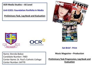
1. OCR Media Studies – AS Level
Unit G321: Foundation Portfolio in Media
Preliminary Task, Log Book and Evaluation
Name: Brenda Bokoe
Candidate Number: 7483
Center Name: St. Paul’s Catholic College
Center Number: 64770
Set Brief - Print
Music Magazine – Production
Preliminary Task Progression, Log Book and
Evaluation
4. I started with a normal photo shop page,
and drew gridlines across to guide me
through. I also added the school maroon
and blue color to keep the magazine
unique and show that it’s a St. Paul’s
school magazine.
Step 1
5. I then added a background
color which is white using the
‘Paint Bucket tool’ (G).
Step2
6. I went onto “dafont.com” to choose a font style
and then saved it to the available font styles in
my photo shop page. Then I wrote my mast
head in a good size which could be easily read
across the whole page.
Step 3
7. I then added my barcodes and the
magazine’s social media sites next to it in
order to broaden the appeal of the
magazine to the target readership.
Step 4
8. I added my strap line
at the left top of the
page.
The verbal code
‘Written by you, for
you’ connotes that the
magazine contains
information for the
students on what is
going on in the school
and gossips from the
staffs and students
Step 5
9. I added St. Paul's log at the top of
the page to make the magazine
seem more official.
I added my main image but made
sure I used the ‘Quick Selection
Tool’ (W) to select and then inverse
the areas not wanted. I also used
the refine edge tool to touch up
the image and place it in front of
the masthead, which I noticed was
conventional in other magazines.
Step 6
10. I then added my main headline and the name
of the person in the main image, which is a
well known and respected student in the
school that people would be interested to read
about.
Step 7
11. I then added my promotion and my
magazine issue number.
The offer should act as a further tool
To help entice the readers to purchase the
magazine.
Step 8
12. I added two important cover stories
linking with the themes of life at school.
These were carefully positioned around
the main image using the ‘Pen tool’ (P).
Step 9
13. I added more cover stories at the left
side, again using the pen tool to
carefully integrate the text around
the images.
Step 10
14. I added a handprint on
the right side to make
the magazine standout
and look eye catching.
The handprint says “we
are 99%” boosting out
the magazine ‘s USP
(unique selling point)
I realized that the right
side was empty so
decided to add more
cover stories.
Step 11
15. Lastly, I duplicated my mast head
using “CMD - J” and resized it then
dragged it down to the right bottom
of the page.
Step1
17. I started my contents page by inserting most of
the shapes I am going to need to indicate where
certain conventions are going to be placed.
Step 1
18. I then added the grey shape color
which will be used for my cover
lines and features to appear in the
first issue.
Step 2
19. I added the contents’ heading and
duplicated the name of my
magazine at the side in order to
increase the brand identity of the
magazine for the readership.
Step3
20. I then added my
general
headlines, an
“SP” text next to
St. Paul's vibe
and my
signature at the
bottom of the
page.
I also added the
page number at
the bottom of
the page.
Step 4
21. I added my editorial and my
image next to it.
The editorial was carefully
positioned around the
image using the ‘Pen tool’
(P).
Step 5
23. I inserted social media
websites, the magazine
website and also the link of
my editorial page in order
to increase the awareness
of the magazine across the
media platforms.
Step 7
24. I added the St. Paul's
logo at the left side top
of the page.
I also added my main
image and manipulated it
using the ‘Quick Selection
Tool’ (W) and ‘Quick Mask
Mode’ (Q) to inverse the
selection and remove the
background.
Step 8
25. I added my main cover
stories, the pages where
they could be found and
my promotion.
Step 9
26. Last but not the least, I added
the rest of my secondary stories
at the left side which brought be
to the completion of my
contents page.
28. Music Magazine – Genre research
The image clearly shows the different genres of music that are involved in the magazine, we see that it isn’t just
one genre that is mainly focused on but a variety. This Is very effective and widens the target audience of the
magazine by them dealing with a wide range of artists.
From other secondary research completed, I have seen that young adults are the target audience of Q
magazine. They are doing everything possible to keep them interested such as getting their favorite bands and
artists involved. For instance at the right hand side of this magazine, Rihanna the famous celebrity who is so
loved by younger music fans has been included in the magazine photo. This is to connote that Q magazine is
trying its best to get everyone involved in the magazine across a variety of demographics and music fans.
29. Publisher research
http://miaspicerx.wordpress.com/2012/11/22/existing-
target-audience-q-magazine/
Gender: As shown above , 75% of Q magazine readers are males and the rest of the 25% are females, which
implies that their main target are the male gender.
Age: Although Q magazine fan base is between a wide range of ages, it connotes that the target audience of
younger generations more than elderly. Putting this into consideration, it is clear that this magazine is aimed
at people aged 15-24
It is also clear that the circulation of the magazine is broad and it is stated above as the UK’s biggest
magazine with 88,420 so we know from the huge amount of number that this is very popular magazine
30. Established Magazine for my Research
• The use of social media such as Facebook and twitter should be introduced as this will help promote
the magazine.
• Also a website could be very helpful especially for their target audience to look up their new
activities
Mast head
Main image consists of
different artist which drops a
hint that the magazine
includes hip-hop, rap and
rock or country music.
Cover lines which makes the
magazine interesting and
helps sells the magazine
The image also oozes ‘star appeal’
(Richard Dyer) for the readers and
is clearly going to attract a mass
readership by itself as they are
some of the biggest names across
the music industry.
The Strap line
used are
interesting as
people will want
to know who are
the most
exciting people
in music are
now so that
promotes the
magazine
31. Target Audience –
Age “ Hartley’s seven subjectivities” - The target audience for Q magazine are young adults. Q
magazine do every thing they can to keep them interested such as getting their favorite bands and artist
involved.
Survivors “Maslow’s hierarchy of needs” - Q magazine ensure they included concert dates as well as
the artist personal lives/music life in order to feed this demographics need for security in knowing the
latest and most important information to do with their favorite acts/ artists.
“Katz’ Uses & gratification theory“ - Q magazine advertise opportunities for readers to get involved and
they sometimes use representation of people who may reflect us and how we are. So they use ‘personal
identification’ so that we can relate to the people on the cover or double page spread.
What is the USP of this magazine?
From research into a series of Q front covers, the unique selling point is the powerful
main image, ‘star appeal’ and the Main headline which is used perfectly to describe the image
representing the story. They use good color for the font and keep the background less busy, as that is
plain or fewer things in the way of the image and cover line stories. For example looking at the
magazine cover at the right side of his page , they placed black cats around the main image and used this
to describe her as “sexy beast Lily Allen and her wicked ways”. This already passes a lot of information to
the main readers and pulls their attention as they will want to know what Lily has done or what wicked
ways she has.
32. After researching an established and eclectic music magazine, I have decided to research and
produce a 4-page spread for a new Hip-Hop magazine. These are some examples of Hip-Hop
magazines who have more of a niche following compared to Q magazine.
33. Conventions of a Music Magazine
• . Main Image - Well known sexy
celebrity Ciara Harris. The posture and
the style of the image attracts more
people to buy it especially the male
gender as she encourages a ‘male gaze’
(Laura Mulvey).
The Strapline at the top of the mast head
brings out something striking, with verbal
code “illest” a slang term commonly used
amongst rappers in the genre.
Secondary cover lines help sell the
magazine
The verbal code below the Main
Headline describes the picture so
drops a hint of the diva celebrity.
Magazines brings out humor, telling
the audience that there is some
interesting information and makes it
more fun
Her clothing and the lollipop looks quite
provocative which matches her personality
and she has a provocative stage present and
everyone knows her as a sexy performer
34. Publisher research
The publisher of VIBE magazine is Len Burnett
The magazine’s target demographic is predominantly young, urban followers of hip-hop. It is now
issued every other month with double covers, with a larger online presence.
VIBE records the celebrities, sounds, fashion, lifestyle, new media, and business born from urban
music. As an authoritative voice, VIBE creates trends as much as it records them. It covers music,
educates its readers, and gives back to the community. VIBE serves as a gateway to a growing young,
trendsetting, multicultural audience. As excellent journalists and innovative marketers, VIBE is the
voice of urban music and culture. VIBE provides a democratic digital experience where users are
encouraged to provide content. At VIBE print and online will seamlessly relate.
Circulation of VIBE magazine
VIBE lifestyle network represents over 25 sites and reaches over 19 million unique users per month.
The new vibe is the premier destination for urban music, entertainment, culture and lifestyle for 16+
35. Target Audience –
Vibe is an entertainment music magazine
The magazine has a total audience of around 2.4 million people, 55% of which are male 45% are
female. Personal identification(Katz) because readers will want to have the same clothing or
items as their desired artist and the. Age(Hartley) would be strictly for readers above the age 18 –
34 years old due to the content inside such as strong language or artists wearing revealing
clothing. Social climbers(Maslow) reading the magazine will be attracted to information regarding
their favorite artists allowing them to increase their social status.
What is the USP of this magazine?
From the research completed into this media product, I think the USP is the layout of the magazine. The
font on the magazine cover is immediately and noticeably Bold. It is also a Serif Font. The peripheral text
surrounding the image also appears to be very important and informative for this reason. The font is
quite modern due to its bold aesthetics and size. The font is intentionally large. This is because the
image on the cover is also large and it would be easy for the image to detract from the surrounding sub-
heading, which obviously are important for the reader to read, firstly to become interested in the
magazine and therefore buy it. Due to this the font is large and bold to serve its purpose to advertise
the inside stories. Its serif font, get the point across quickly and efficiently with little fuss.
36. Non stop
• Frankie
DOPE!I chose dope because it means excellent, cool, outstanding or awesome. The reason I chose
this name is because after carrying out my research like survey and questionnaire, I realized
that the other ideas of names were not very outstanding and did not really match the type
of magazine. So I did some brainstorming and realized that dope best defines my magazine
as it brings out how special or excellent the magazine is and what it is bringing to the
audience.
Replay
Tuned up
DTB
Brainstorming names for my magazine